kottke.org posts about design
The winners have been announced in the 2015 edition of the always-charming DWR Champagne Chair Contest in which contestants compete to build the coolest little chairs using only a single champagne cork. The winner and the runner-up:


I actually like the second place chair more than the winner. You can check out all of the submissions to the contest on the main contest page, including this fantastic swiveling chair:

(via @fromedome)
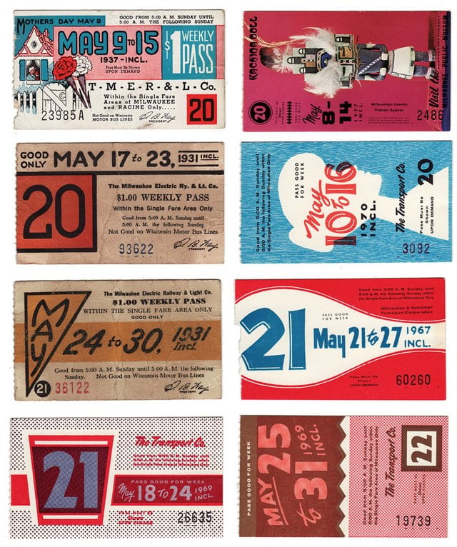
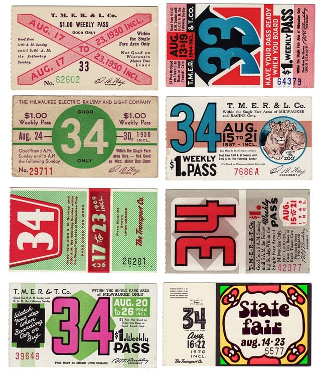
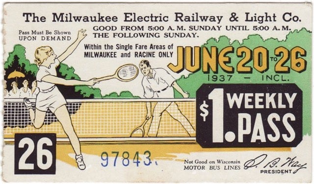
A collection of weekly bus passes from Milwaukee, WI. Years covered are 1930-1979. Was there a new design every single week? (via @slowernet)
If you’ve ever noticed most ski trail maps look kinda the same, the reason is many of them have been painted by a single individual: James Niehues.
Each view is hand painted by brush and airbrush using opaque watercolor to capture the detail and variations of nature’s beauty. In many instances, distortions are necessary to bring everything into a single view. The trick is to do this without the viewer realizing that anything has been altered from the actual perspective.
Here’s a selection of his work:


Responsive web design is a technique used by web builders where the design adapts to different screen sizes. Designer Joe Harrison has built a page with responsive logos for several well-known brands, including Coca-Cola, Nike, Disney, and Levi’s. If you resize the page, you can see the logos change. Here’s how the Disney logo looks as your browser window gets smaller (from L to R):

As the browser gets smaller, the logos lose detail and become more abstract. By the time you get to the smallest screen width, you’re down to just the Disney “D” or Nike swoosh or Heineken red star, aka the bare minimum you need to render the logo recognizable, if only on a subconscious or emotional level. Which reminds me of Scott McCloud’s discussion of iconic abstraction (and The Big Triangle) in Understanding Comics, which is still one of the best books on design and storytelling I’ve ever read. Here’s a bit of the relevant passage:
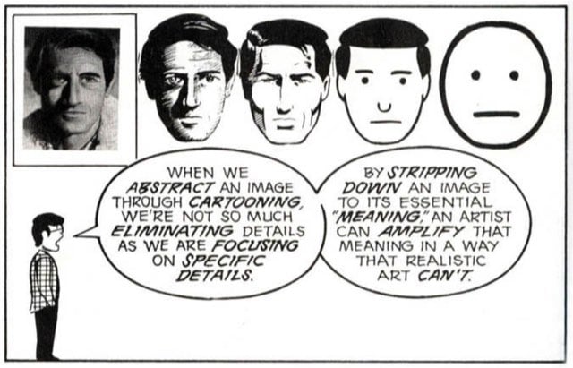
Defining the cartoon would take up as much space as defining comics, but for now, I’m going to examine cartooning as a form of amplification through simplification. When we abstract an image through cartooning, we’re not so much eliminating details as we are focusing on specific details. By stripping down an image to its essential “meaning”, an artist can amplify that meaning in a way that realistic art can’t.
The reason why those particular logos work responsively is because they each have abstract representations that work on that meaningful emotional level. You see that red Levi’s tag or Nike swoosh and you feel something.1 I think companies are having to design logos in this way more frequently. Contemporary logos need to look good on freeway billboards, on letterhead, as iOS icons, and, in the case of the Facebook, Twitter, or Pinterest logos, affixed to tiny tweet/like/pin buttons. (via ministry of type)
Khoi Vinh is coming out with a book soon called How They Got There: Interviews With Digital Designers About Their Careers. It is, as Tyler Cowen would say, self-recommending. Vinh explains a bit more:
You can read terrific profiles of many of these folks elsewhere, but the conversations that I conducted with them are both narrower and more in-depth. They focus squarely on how these folks discovered their callings in the design profession, how they got their first big breaks, how they put together successful careers in digital media. There are some wonderful, insightful, brilliant, hilarious and amazing stories captured here.
Basically, this is the book that I wish that I could have had handy when I was just starting out, when I was trying to figure out how to get from A to B career-wise. Even better, what I found when I was writing it was that the conversations were so interesting that I felt newly inspired myself. I think you’ll feel similarly.
Forget the book (I mean, it looks great), but Khoi, where do you find the time for everything? Three kids, two or three side projects, regular blogger, startup VP…you’re almost as productive these days as Beyonce is.
Update: How They Got There is now out and available for purchase.
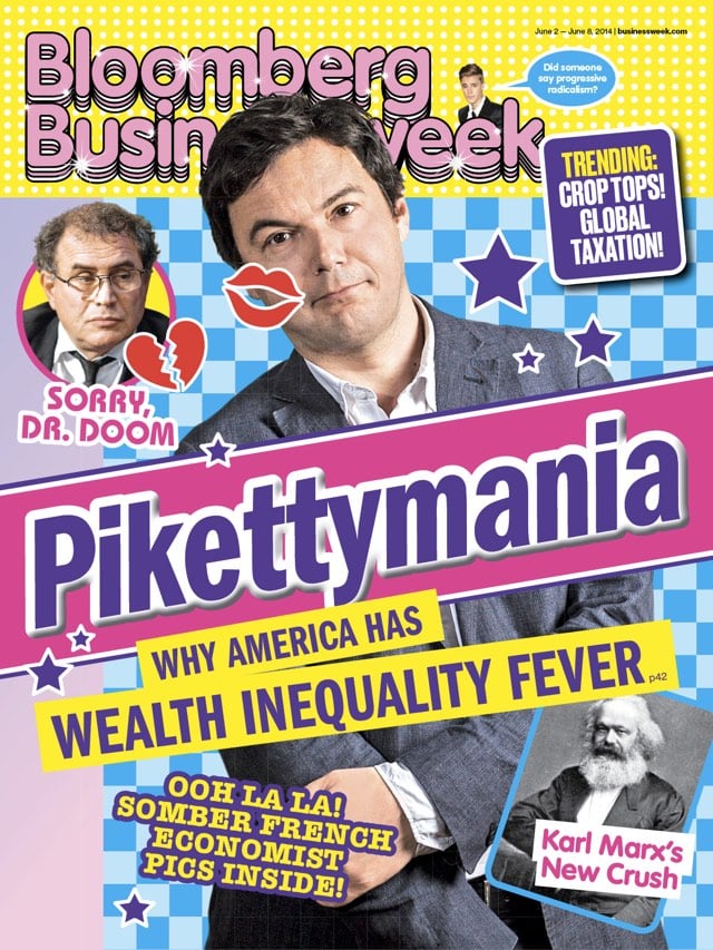
The picks for the finest magazine covers of the year are starting to trickle out. Coverjunkie is running a reader poll to pick the most creative cover of 2014. Folio didn’t pick individual covers but honored publications that consistently delivered memorable covers throughout the year; no surprise that The New York Times Magazine and Bloomberg Businessweek were at the top of the heap.
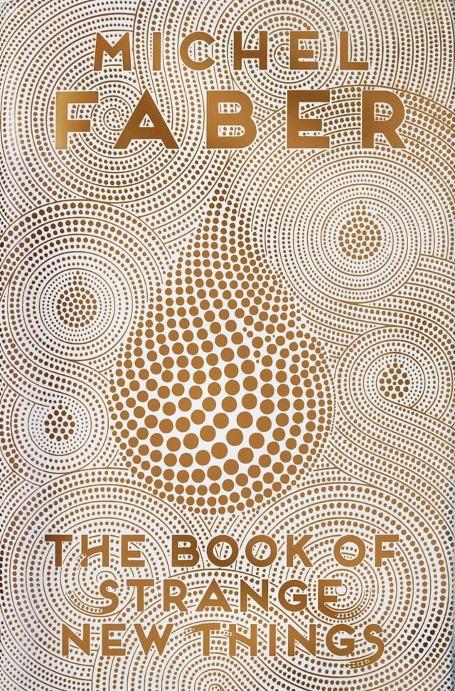
See also the best book covers of 2014.
At the NY Times, Nicholas Blechman weighs in with his picks for the best book covers of 2014.
Dan Wagstaff, aka The Casual Optimist, picked 50 Covers for 2014.
From Jarry Lee at Buzzfeed, 32 Of The Most Beautiful Book Covers Of 2014.
Paste’s Liz Shinn and Alisan Lemay present their 30 Best Book Covers of 2014.
And from much earlier in the year (for some reason), Zachary Petit’s 19 of the Best Book Covers of 2014 at Print.
Adrian Curry selects his favorites for the best movie posters of 2014. This one, for Gabe Polsky’s Red Army, caught my eye:
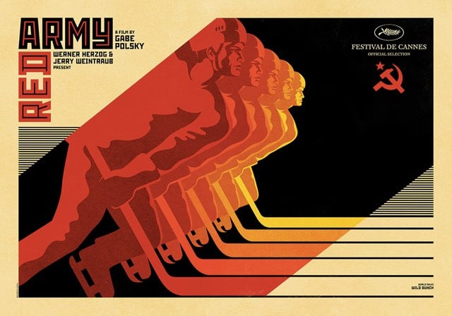
See also the best poster lists from Empire, Entertainment Weekly, and Indiewire. (via subtraction)
If you’ve ever wondered how a designer does their thing (or even if you haven’t), this look-over-the-shoulder view of Aaron Draplin designing a logo for a fictional company in about 10 minutes is great. A nice reminder that design is truly about making it up as you go along.
I love Draplin. Internet treasure, that guy. And that lefty writing claw! Go lefties!
Totally sweet and charming video of Apple co-founder Steve Wozniak talking about the early days at the company while setting up and using an old Apple II.
Of Apple’s two founding Steves, Wozniak was the technologist and Jobs was the one with the artistic & design sense, right? But it’s obvious from watching this video that Woz cared deeply about design and was a designer of the highest order. Those early Apple circuit boards are a thing of beauty, which is echoed in the precision and compactness with which Apple currently designs iPhone and Mac hardware. They each have their own unique way of expressing it, but Woz and Jony Ive speak in a similarly hallowed way about how their products are built.
Update: Wozniak still has improving the Apple II on his mind. From earlier this year:
I awoke one night in Quito, Ecuador, this year and came up with a way to save a chip or two from the Apple II, and a trivial way to have the 2 grays of the Apple II be different (light gray and dark gray) but it’s 38 years too late. It did give me a good smile, since I know how hard it is to improve on that design.
(via @samryan)
Update: From Founders at Work, an interview with Woz that goes a bit deeper into the genesis of the Apple I and the early days at Apple.
By the time I was done, the design of the Nova was half as many chips as all of the other minicomputers from Varian, Digital Equipment Corp., Hewlett-Packard, all of the minicomputers of the time (I was designing them all). And I saw that Nova was half as many chips and just as good a computer. What was different? The architecture was really an architecture that just fit right to the very fewest chips.
My whole life was basically trying to optimize things. You don’t just save parts, but every time you save parts you save on complexity and reliability, the amount of time it takes to understand something. And how good you can build it without errors and bugs and flaws.
I am loving these posters for non-existent movie sequels, but the names might be even better. A sampling:
Fight Club: The 2nd Rule
Bigger Trouble in Little China
Spaceballs III: The Search for Spaceballs II
Titanic 2: Above Zero
Prints are available for all of these. (via @cabel)
When the new Airbnb logo was introduced, the company caught a lot of flack from the internet because the logo resembled an odd combination of almost every sexual body part. I actually liked the logo right away and after a few months with it, the juvenile connotations have faded.
But you know what makes Airbnb’s logo really really really look like a cartoonish vagina butt? Putting arms and legs and hats on the logo and animating it.
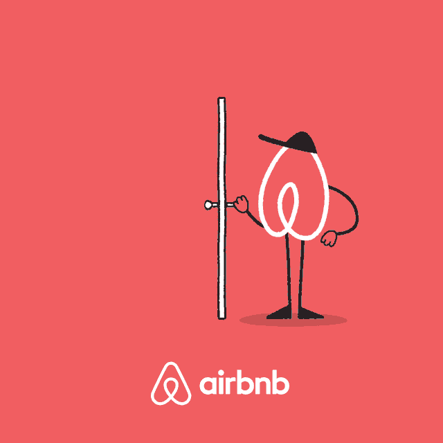
Airbnb is sponsoring the NYC Marathon this year, and the logo characters were created for the event. Maaaaybe they’d like to rethink this?
This is the design that Norway has chosen for their banknotes starting in 2017:
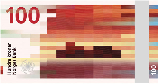
From now on, I’m paying for everything with kroner. (via co.design)
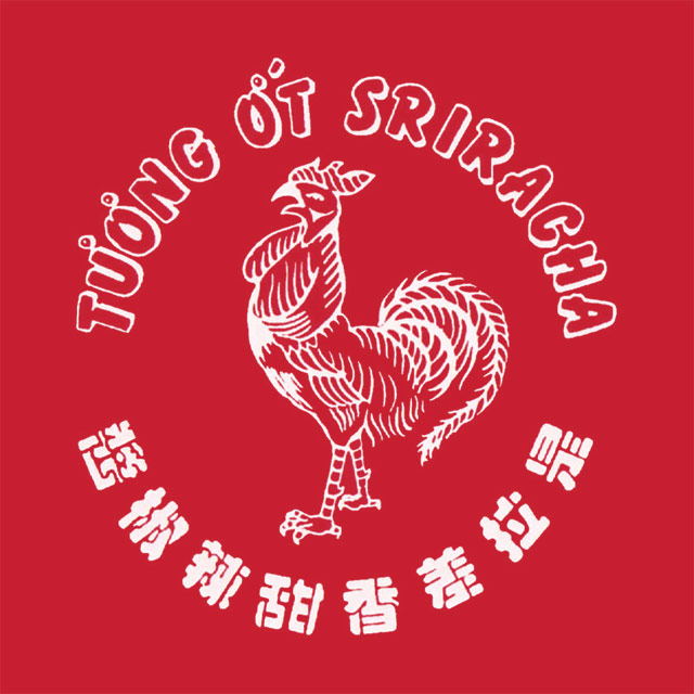
The rooster on the Sriracha bottle has made its way to iPhone cases, t-shirts, and water bottles. But no one (not even the founder of the company) knows the name of the street artist who created the now famous logo.
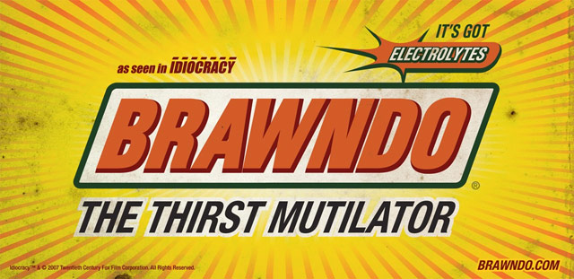
Over at Trivia Happy, Phil Edwards interviewed Ellen Lampl, who designed the logos for Mike Judge’s underrated Idiocracy.
Some logos came from the script, while some came from the designers’ brainstorming sessions. Brawndo and Carl’s Jr. were written, while Lampl made logos for companies like Nastea and Fedexx once the overall look was approved. For Lampl, it was a great release, because “coming from the past constraints of advertising, it was cathartic to have the liberty to be bawdy and irreverent. Making everything ridiculously over-emphasized with bright colors, outlines upon outlines, and exaggerated drop shadows was my personal jab at the world of branding and in-your-face typography.”
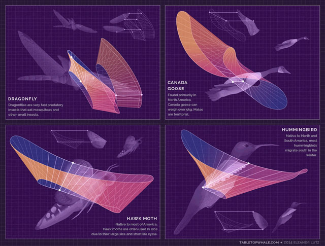
Eleanor Lutz has a degree in molecular biology, works as a designer, and loves to combine the two interests by making these wonderful information graphics on her site, Tabletop Whale. Her most recent post is an animated graphic showing how several animals (birds, bats, insects) move their wings while flying.
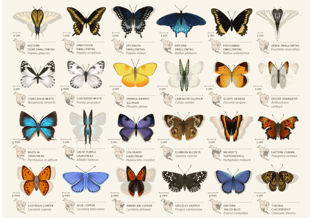
I love love love Lutz’s animated chart of North American butterflies. So playful!
There are only four posts on the site so far, but she’s done other stuff as well; this woodcut map for instance. Prints are available…I’m getting one of the butterflies for sure.
After writing Design is a Job and noticing no one had written a book for clients who hired designers, Mike Monteiro of Mule Design decided to write one: You’re My Favorite Client.
Whether you’re a designer or not, you make design decisions every day.
Successful design projects require equal participation from both the client and the design team. Yet, for most people who buy design, the process remains a mystery.
In his follow-up to Design Is a Job, Mike Monteiro demystifies the design process and helps you prepare for your role. Ensure you’re asking the right questions, giving effective feedback, and hiring designers who will challenge you to make your product the best it can be.
Monteiro recently wrote 13 Ways Designers Screw Up Client Presentations and gave an interview to fellow designer Khoi Vinh.
I’ve been doing the primary research for this book for 20 years. I deal with clients every day and I see what works and doesn’t work and I’ve screwed up more times than I’d like to think about. But every lesson in that book is field tested. This book has zero percent theory in it. It was written on a factory floor.
Join designer James Victore for an opinionated tour of the typography of Brooklyn and Queens.
We’re going to do a typographical tour of Brooklyn and Queens, We’re going to look at type on the street and signage on the street and try to figure out what the hell it’s for.
Favorite quote: [Pointing at a logo for a waxing salon] “There’s been a designer here. Which is not always a good thing.” (via gothamist)

The 2013 Personal Annual Report for Nicholas Felton is available for pre-order and online perusal. Pre-ordered…I own a copy of every one except for the first year.
ps. The NY Times did a video about Felton and his annual reports.
The Art of the Title has a look at the Emmy nominees for best title design for 2014: Black Sails, Cosmos, Masters of Sex, Silicon Valley, and True Detective. As noted, the excellent titles for Halt and Catch Fire missed the eligibility period by a day. Spoilers: True Detective’s titles won.
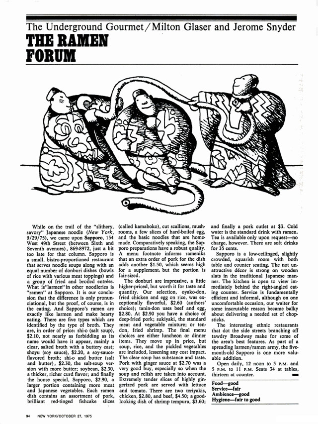
Today I learned that iconic designer Milton Glaser co-wrote a column for New York magazine (which he co-founded) about where to find cheap-but-good food in NYC. It was called The Underground Gourmet. Here’s a typical column from the October 27, 1975 issue, reviewing a ramen joint in Midtown called Sapporo that is miraculously still around:
Glaser and his co-authior Jerome Snyder eventually packaged the column into a series of books, some of which you can find on Amazon…I bought a copy this morning.
I found out about Glaser’s food enthusiasm from this interview in Eye magazine about The Underground Gourmet and his long collaboration with restaurateur Joe Baum of the Rainbow Room and Windows on the World.
We just walked the streets … When friends of ours knew we were doing it we got recommendations.
There were parts of the city where we knew we could find good places … particularly in the ethnic parts. We knew if we went to Chinatown we would find something if we looked long enough, or Korea Town, or sections of Little Italy.
More then than now, the city was more locally ethnic before the millionaires came in and bought up every inch of space. So you could find local ethnic places all over the city. And people were dying to discover that. And it was terrific to be able to find a place where you could have lunch for four dollars.
In 2010, Josh Perilo wrote an appreciation of The Underground Gourmet in which he noted only six of the restaurants reviewed in the 1967 edition had survived:
Being obsessed with the food and history of New York (particularly Manhattan), this was like finding a culinary time capsule. I immediately dove in. What I found was shocking, both in the similarities between then and now, and in the differences.
The most obvious change was the immense amount of restaurants that no longer existed. These were not landmarked establishments, by and large. Most of them were hole-in-the wall luncheonettes, inexpensive Chinese restaurants and greasy spoons. But the sheer number of losses was stunning. Of the 101 restaurants profiled, only six survive today: Katz’s Delicatessen, Manganaro’s, Yonah Schimmel’s Knishes Bakery, The Puglia and La Taza de Oro. About half of the establishments were housed in buildings that no longer exist, especially in the Midtown area. The proliferation of “lunch counters” also illustrated the evolution of this city’s eating habits. For every kosher “dairy lunch” joint that went down, it seems as though a Jamba Juice or Pink Berry has taken its place.
Man, it’s hard not get sucked into reading about all these old places…looking forward to getting my copy of the book in a week or two.
Update: Glaser’s co-author Jerome Snyder was also a designer…and no slouch either.
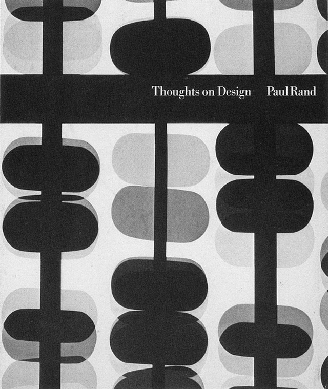
Legendary designer Paul Rand’s Thoughts on Design is back in print for the first time since the 1970s. The new version, which will be out on Aug 19, is available for preorder and comes with a foreword by Michael Bierut.
One of the seminal texts of graphic design, Paul Rand’s Thoughts on Design is now available for the first time since the 1970s. Writing at the height of his career, Rand articulated in his slender volume the pioneering vision that all design should seamlessly integrate form and function. This facsimile edition preserves Rand’s original 1947 essay with the adjustments he made to its text and imagery for a revised printing in 1970, and adds only an informative and inspiring new foreword by design luminary Michael Bierut. As relevant today as it was when first published, this classic treatise is an indispensable addition to the library of every designer.
An extensive collection of book covers featuring books. Confused? Maybe an example will help:

I love these book posters by Gunter Rambow from the 1970s, especially this one:
(via @michaelbierut)
The New Yorker has got a new web site and with it, they are offering everything they’ve published since 2007 online for free all summer. From the editor’s note:
Beginning this week, absolutely everything new that we publish — the work in the print magazine and the work published online only — will be unlocked. All of it, for everyone. Call it a summer-long free-for-all. Non-subscribers will get a chance to explore The New Yorker fully and freely, just as subscribers always have. Then, in the fall, we move to a second phase, implementing an easier-to-use, logical, metered paywall. Subscribers will continue to have access to everything; non-subscribers will be able to read a limited number of pieces — and then it’s up to them to subscribe. You’ve likely seen this system elsewhere — at the Times, for instance — and we will do all we can to make it work seamlessly.
Previously, only select articles from each issue were available for free online…everything else was for subscribers only. (Umlaats and extensive commas will be forever freely available on all the New Yorker’s publishing platforms.) Longform has a solid list of their 25 favorite now-unlocked pieces.
See also: In Praise of Slow Design, a piece by Michael Bierut about The New Yorker’s careful design evolution.
Audacity is a sound editing program, but it turns out you can open and edit image files with it. With varying results, mostly of the glitch art variety:

(via 5 intriguing things)
Somehow I lived in WI for the first 17 years of my life, was a Brewers fan for many of those years, and never realized the old Brewers logo contained the letters “m” and “b” hidden in the ball and glove.

Wow. If your mind is blowing right now too, there’s a Facebook group we can join together: Best Day of My Life: When I Realized the Brewers Logo Was a Ball and Glove AND the Letters M and B. (via kathryn yu)
ps. If you’ve somehow missed the hidden arrow in the FedEx logo, here you go. Best kind of natural high there is.
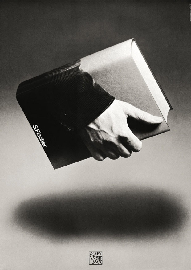
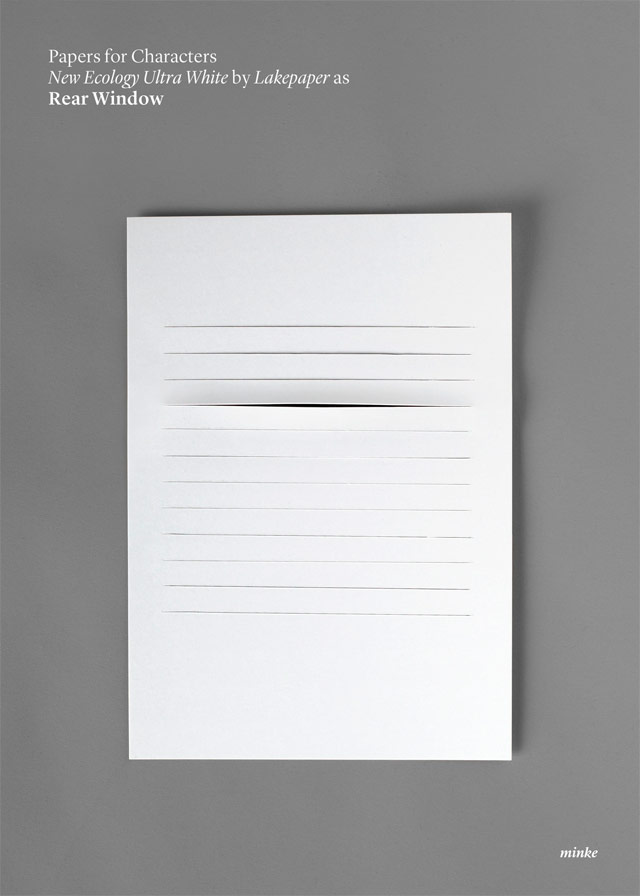
Spanish design firm Atipo made these nifty minimalist movie posters out of card stock. I really like the one for Rear Window:
The book cover for Naive Set Theory by Paul Halmos is so so good:

The cover is a riff on, I think, Russell’s Paradox, a problem with naive set theory described by Bertrand Russell in 1901 about whether sets can contain themselves.
Russell’s paradox is based on examples like this: Consider a group of barbers who shave only those men who do not shave themselves. Suppose there is a barber in this collection who does not shave himself; then by the definition of the collection, he must shave himself. But no barber in the collection can shave himself. (If so, he would be a man who does shave men who shave themselves.)
Reminds me of David Pearson’s genius cover for Benjamin’s The Work of Art in the Age of Mechanical Reproduction.
Newer posts
Older posts
Socials & More