kottke.org posts about Jonathan Hoefler

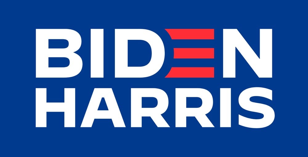
Jonathan Hoefler, who worked on logos for both Obama and Biden, shares how intense the process is for developing political campaign logos, the quick work that the Harris/Walz campaign did over a matter of weeks & days, and the tweaking that continues as time allows.
I read a lot of comments about political logos… Having helped shape the logo of every Democratic president in the twenty-first century (hflr.io/biden, hflr.io/obama), let me say from experience that campaign typography is *completely* unlike graphic design: it’s a strange and fascinating agility sport, marked by limited information, a ticking clock, unimaginable pressures, and serious consequences. It’s Iron Chef, but in Adobe Illustrator.
Imagine a client asking for a logo in 24 hours, but not telling you the name of the company! That’s what it’s like to participate in the veepstakes. Nobody who commented on the Biden/Harris logo realized that Robyn Kanner and I were busy developing *dozens* of possible identities in parallel, completely firewalled from the political side of things, awaiting the news until 40 minutes before press time.
The current Harris/Walz logo is based on the design of Harris’s presidential campaign materials from 2020, which “smartly riffed on the 1972 Shirley Chisholm campaign”.
On Tuesday, Joe Biden announced that Senator Kamala Harris would be his vice-presidential running mate. The campaign was quickly updated to include a new Biden-Harris logo designed by Hoefler&Co. in collaboration with Biden campaign advisor Robyn Kanner:

But the designer of the logo wasn’t told who the running mate would be beforehand, so how did the campaign get it out so quickly? According to Jonathan Hoefler, the design team designed a whole collection of logos for potential candidates gleaned from reading the media tea leaves.
A consequential decision at an unpredictable time, conducted under absolute secrecy, poses an interesting dilemma to the typographer: how do you create a logo without knowing for certain what the words will say? Logos, after all, are meaningfully informed by the shapes of their letters, and a logo designed for an eisenhower will hardly work for a taft. The solution, naturally, involves the absurd application of brute force: you just design all the logos you can think of, based on whatever public information you can gather. Every credible suggestion spotted in an op-ed was added to the list that we designers maintained, and not once did the campaign even hint at a preference for one name over another.
I would love to see some of those alternate designs (Biden-Warren!), but there’s no way in hell they’ll ever see the light of day, especially before the election.
Update: Several designers weigh in on the new logo. I love Debbie Millman’s take:
I never, ever thought I’d say this after a lifetime in professional branding, but on the spectrum of good branding versus effective branding, I’d say at this point it is irrelevant. Frankly, the Biden-Harris logo could have been scribbled on a napkin and I’d be happy. Trump’s brand is beyond repair and is now more dangerous than ever. The soul of our country is at stake.
That logos don’t matter that much (unless they are either great or horrible) is probably true more often than designers and branding folks would care to admit.
Abstract: The Art of Design is back for a second season on Netflix beginning September 25. The folks featured this time around are artist Olafur Eliasson, architect & designer Neri Oxman, type designer Jonathan Hoefler (whose company provides the fonts for kottke.org), costume designer Ruth E Carter (did the costumes for Do the Right Thing and Black Panther), Ian Spalter (former head of design at Instagram), and toy designer Cas Holman.
While the story covers both sides of the dispute with detail and pathos, the most affecting bits treat how H & FJ worked together and the tiny details of the letters they made and loved:
At his computer, he drew an uppercase H, O, and D, because they contained flat and round elements that would determine how other letters looked. When he moved on to the G, the R, and the S, he started to deviate from the mathematical grid, hoping to give the font a subliminal playfulness. As he filled out the alphabet, the letters revealed a promising flexibility; if Frere-Jones set text in caps and spread the spacing out, the words felt authoritarian, imposing, and if he set them in lowercase and pulled the spacing in, they felt fresh and young. He tried to think of a name for the font that would showcase some of the more distinctive letters: the stark, powerful G; the circular o; the strange-tasting a. For a name, he thought about Goats, and Gomorrah. He finally settled on Gotham.
If the deep dive into the beauty and business of lettermaking doesn’t grab you, the essay’s packed with other-cultural analogies. My favorite is probably this: “According to a designer who used to work with Frere-Jones, his eye is so sharp that he can look at a printout of a letterform and tell if it’s one pixel off, the same way Ted Williams was said to be able to hold a baseball bat and tell if it was a half-ounce too heavy.”
Disclosure: Jason Fagone is my friend. Kottke.org uses Whitney Screensmart, a version of one of the fonts discussed in the article. Also one time Jonathan Hoefler got really mad at me because of a story I wrote about iPad magazines. The font people don’t play.
Update: If you want to know just how much the font people don’t play, I immediately was contacted by a friend to change “typographer” to “type designer.” I’ve spent years writing about this, and if I ever manage to get all of the terms right, the universe will collapse on itself.
Oh, wow. Tobias Frere-Jones is suing his business partner Jonathan Hoefler over ownership of world-reknowned type foundry Hoefler & Frere-Jones.
Type designer Tobias Frere-Jones claims he has been cheated out of his half of the company by his business partner, Jonathan Hoefler. In a blistering lawsuit filed today in New York City, Frere-Jones says he was duped into transferring ownership of several fonts, including the world-famous Whitney, to Hoefler & Frere-Jones (HFJ) on the understanding that he would own 50% of the company.
“In the most profound treachery and sustained exploitation of friendship, trust and confidence, Hoefler accepted all of the benefits provided by Frere-Jones while repeatedly promising Frere-Jones that he would give him the agreed equity, only to refuse to do so when finally demanded,” the suit claims.
The full complaint is here. A descendant of Whitney (Whitney ScreenSmart) is what you’re reading right now and I was an early beta tester of H&FJ’s webfont service. This is gobsmacking news…I have no idea what to think about it. What a sad and strange situation. (via @khoi)
Update: H&FJ has released a statement from their general counsel:
Last week, designer Tobias Frere-Jones, a longtime employee of The Hoefler Type Foundry, Inc. (d/b/a “Hoefler & Frere-Jones”), decided to leave the company. With Tobias’s departure, the company founded by Jonathan Hoefler in 1989 will become known as Hoefler & Co.
Update: According to a document filed with the New York County Clerk, the matter between Hoefler and Frere-Jones “has been settled”. No other details are available at this time.
From the AIGA, a lovely short film on type designers Jonathan Hoefler and Tobias Frere-Jones. I love the bit about starting a typeface design with the O, H, and D. Elsewhere, Hoefler recommended other potential starting points:
Work out the B, the ampersand, and the bullet before you get too far: you’ll have to confront decisions about thinning strokes, intersections, and shapes without any counters, which might inform what you do on the other letters.
(via daring fireball)
An excellent 26-minute talk by Jonathan Hoefler of the Hoefler & Frere-Jones about how they think about designing typefaces and webfonts in particular.
Today, as webfonts are buoyed by a wave of early-adopter enthusiasm, they’re marred by a similar unevenness in quality, and it’s not just a matter of browsers and rasterizers, or the eternal shortage of good fonts and preponderance of bad ones. There are compelling questions about what it means to be fitted to the technology, how foundries can offer designers an expressive medium (and readers a rich one), and what it means for typography to be visually, mechanically, and culturally appropriate to the web. This is an exploration of this side of web fonts, and a discussion of where the needs of designers meet the needs of readers.
I love Typekit, but I am very much looking forward to switching Stellar over to Whitney or somesuch when H&FJ’s webfonts are released (if the price and performance are right).
As you might have heard, MoMA recently acquired 23 typefaces for its Architecture and Design collection. I was curious about how such an acquisition works, so I sent a quick email to Jonathan Hoefler, one of the principals at Hoefler & Frere-Jones, a New York City type foundry that contributed four typefaces to the MoMA.
Kottke: Three of the four H&FJ typefaces acquired by MoMA are available for purchase on your web site. Did they just put in their credit card info and voila? Or was there a little more to it?
Hoefler: MoMA’s adopting the fonts for their collection was much more complex than buying a copy online (and not only because Retina, one of our four, isn’t available online.) I should start by stating that you can never actually “buy fonts” online: what one can buy are licenses, and the End-User License that surrounds a typeface does not extend the kinds of rights that are necessary to enshrine a typeface in a museum’s permanent collection. The good news is that H&FJ has become as good at crafting licenses as we have at creating typefaces, an unavoidable reality in a world where fonts can be deployed in unimaginable ways. This was a fun project for our legal department.
It was actually a fascinating conversation with MoMA, as we each worked to imagine how this bequest could be useful to the museum for eternity. What might it mean when the last computer capable of recognizing OpenType is gone? What will it mean when computers as we know them are gone? How does one establish the insurance value of a typeface: not its price, but the cost of maintaining it in working order? Digital artworks are prone to different kinds of damage than physical ones, but obsolescence is no less damaging to a typeface than earthquakes and floods to a painting. On the business side there are presumably insurance underwriters who can bring complex actuarial tables to bear on the issue, but I think it’s an even more provocative issue for conservators. 472 years after its completion, the frescoes of the Sistine Chapel underwent a restoration that scholars still find controversial. What might it mean for someone to freshen up our typefaces in AD 2483?
—
Thanks, Jonathan.
The pixel font circa 1567 is cool, but more interesting is Jonathan Hoefler’s assertion that the pixel is nearly dead — except as a design cliche.
The pixel will never go away entirely, but its finite universe of digital watches and winking highway signs is contracting fast. It’s likely that the pixel’s final and most enduring role will be a shabby one, serving as an out-of-touch visual cliche to connote “the digital age.”
Over at H&FJ, the H talks about the &.
As both its function and form suggest, the ampersand is a written contraction of “et,” the Latin word for “and.” Its shape has evolved continuously since its introduction, and while some ampersands are still manifestly e-t ligatures, others merely hint at this origin, sometimes in very oblique ways.
He goes on to describe several ampersands they’ve designed for their typefaces. When designing the ampersand for Silkscreen, I came up with a solution that many continue to dislike:

If you’re logged in to Flickr, you can see it action at a more appropriate size in the “prints & more” label above a photo. The symbol is basically a capital E with a vertical line through the middle…an e-t ligature that’s really more of an overstrike. I fashioned it after the way I hand-write my ampersand, which I got from my dad’s handwriting1. I don’t know where he got it from; it’s not a common way to represent that symbol, although I did find a few instances in the list of fonts installed on my computer.
I didn’t think about this way at the time, but the odd ampersand is one of the few distinguishing features of Silkscreen. There’s only so many ways you can draw letterforms in a 5x5 pixel space so a lot of the bitmap fonts like Silkscreen end up looking very similar. The ampersand gives it a bit of needed individuality. (The 4 is the other oddish character…it’s open at the top instead of diagonally closed.)
[1] Now that I think about it, I borrowed several aspects from my dad’s handwriting. I write my 7s with a bar (to distinguish them from 1s), my 8s as two separate circles rather than a figure-eight stroke, and my 4s with the open top. Oh, and a messy signature. ↩
Jonathan Hoefler on how a joke version of OCR-A with swashes came about…and then ended up in an issue of Rolling Stone.
I tacked this specimen of Estupido Espezial!!! to my wall, where it immediately became a litmus test for visitors. Most people would say nothing, but woe be unto anyone who admired the thing in earnest: “hey, cool font!” would immediately land any visitor on the Suspicious Persons list. The best were those who would stare for a moment with bafflement before bursting out laughing, a few of whom became good friends, good clients, or both.
Robots need type too.
Short video piece about fonts and typography, featuring Steven Heller, Jonathan Hoefler, Tobias Frere-Jones. (via quipsologies)


Socials & More