The amazing invisible spacer GIF hack
In his post about 1990s web development techniques, Zach Holman praises the 1-pixel transparent GIF.
1x1.gif should have won a fucking Grammy. Or a Pulitzer. Or Most Improved, Third Grade Gym Class or something. It’s the most important achievement in computer science since the linked list. It’s not the future we deserved, but it’s the future we needed (until the box model fucked it all up).
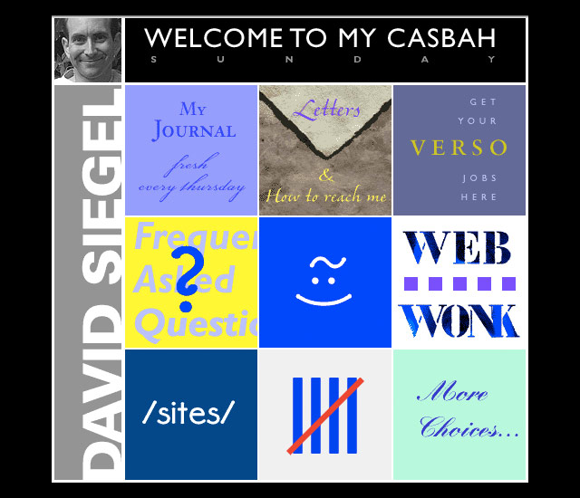
Given all of the awards Holman desires to present, I’m surprised he didn’t mention the inventor of the spacer GIF, David Siegel. Siegel was perhaps the first celebrity web designer — well, a celebrity among web designers anyway. He dispensed opinionated design knowledge from his personal homepage and used the High Five award to showcase his idea of cutting edge web design. (Fun fact: Siegel’s own site was the first High Five award winner.)

Somewhere along the way, Siegel came up with the idea of using a 1x1 pixel transparent GIF to introduce whitespace on web pages. The file size was very small but you could scale it up visually using the height and width attributes of the tag and use it hundreds of times on a site because it was cached by the browser the first time it loaded.
Popularized in the pages of his web design book, Creating Killer Web Sites, Siegel’s spacer GIF was completely non-standard and hacky but had the great advantages of 1) giving designers superb control over a site’s design and 2) working more or less the same in every graphical browser. The designers of the time weren’t content to wait around for the SGML nerds at W3C to figure out better ways of displaying web pages, so when Siegel pulled this beautiful kludge out of his pocket, everyone quickly adopted the technique. For years the spacer GIF dominated web design, for better and for worse. So yeah, maybe Siegel does deserve a Grammy or something.


Socials & More