kottke.org posts about design
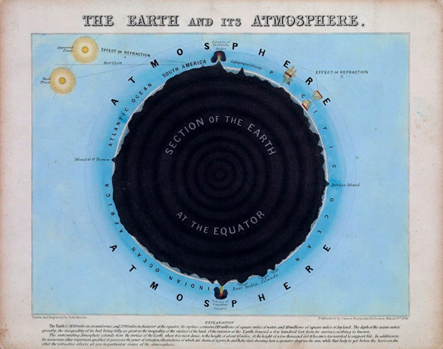
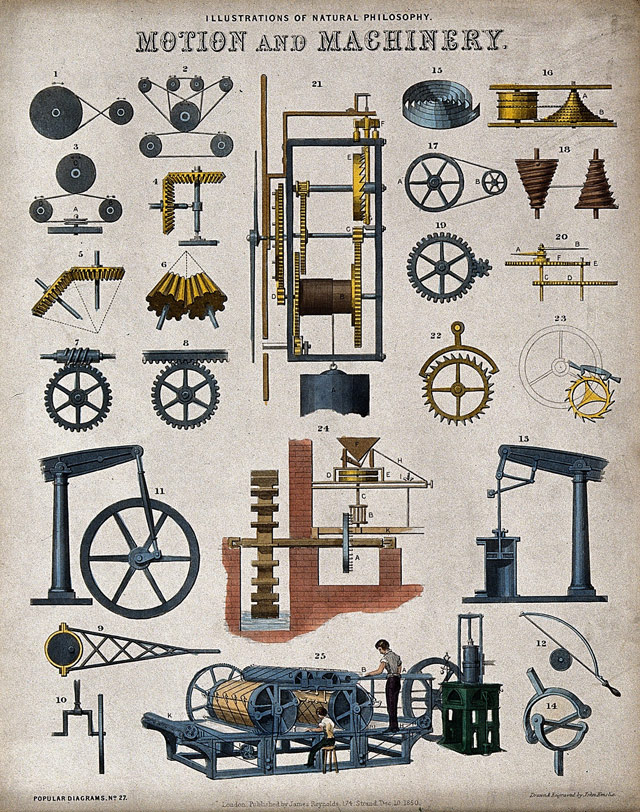
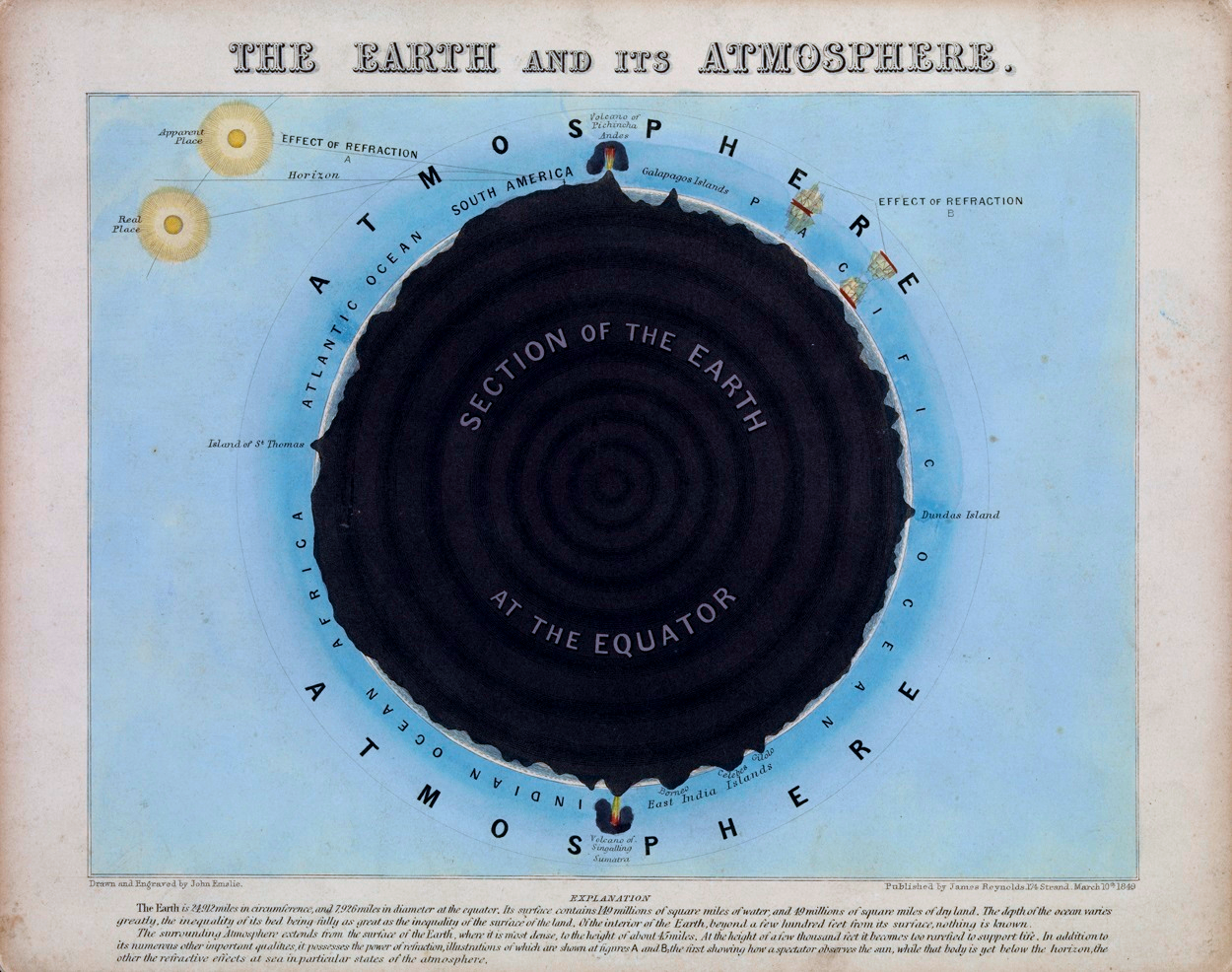
These maps, diagrams, and charts by John Philipps Emslie done in the mid-to-late 1800s are gorgeous.
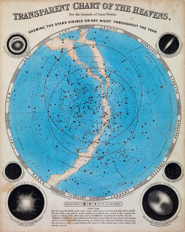
Intrigued, I went searching for more examples. I loved this one just for pure compositional beauty:
And this lithograph from 1850 showing various machines of the time:
(thx, greg)
While the story covers both sides of the dispute with detail and pathos, the most affecting bits treat how H & FJ worked together and the tiny details of the letters they made and loved:
At his computer, he drew an uppercase H, O, and D, because they contained flat and round elements that would determine how other letters looked. When he moved on to the G, the R, and the S, he started to deviate from the mathematical grid, hoping to give the font a subliminal playfulness. As he filled out the alphabet, the letters revealed a promising flexibility; if Frere-Jones set text in caps and spread the spacing out, the words felt authoritarian, imposing, and if he set them in lowercase and pulled the spacing in, they felt fresh and young. He tried to think of a name for the font that would showcase some of the more distinctive letters: the stark, powerful G; the circular o; the strange-tasting a. For a name, he thought about Goats, and Gomorrah. He finally settled on Gotham.
If the deep dive into the beauty and business of lettermaking doesn’t grab you, the essay’s packed with other-cultural analogies. My favorite is probably this: “According to a designer who used to work with Frere-Jones, his eye is so sharp that he can look at a printout of a letterform and tell if it’s one pixel off, the same way Ted Williams was said to be able to hold a baseball bat and tell if it was a half-ounce too heavy.”
Disclosure: Jason Fagone is my friend. Kottke.org uses Whitney Screensmart, a version of one of the fonts discussed in the article. Also one time Jonathan Hoefler got really mad at me because of a story I wrote about iPad magazines. The font people don’t play.
Update: If you want to know just how much the font people don’t play, I immediately was contacted by a friend to change “typographer” to “type designer.” I’ve spent years writing about this, and if I ever manage to get all of the terms right, the universe will collapse on itself.
Apple recently announced their annual design awards for 2014. Some nice work there.
From a book by Hartmut Esslinger, a collection of photographs of prototypes his company Frog Design worked on for Apple Computer.
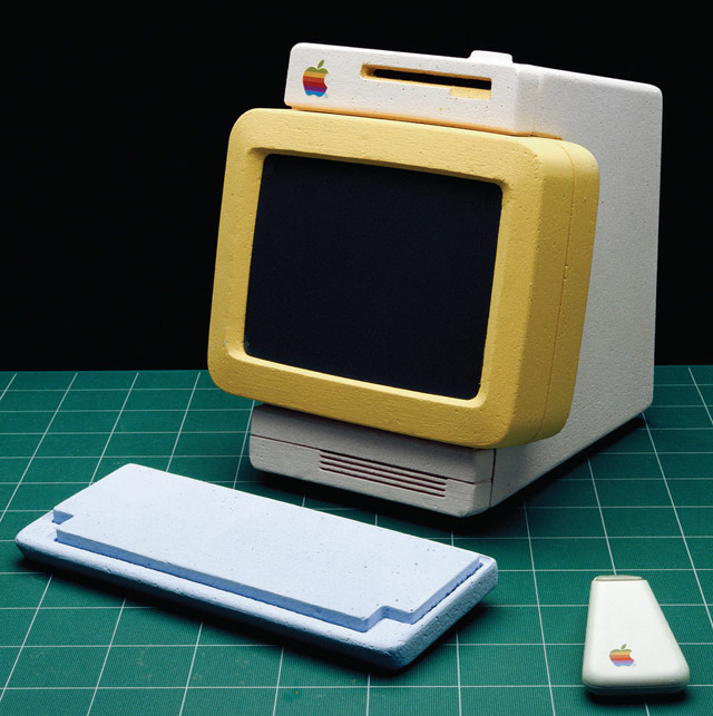
The portables and phones are especially interesting.
A giant in the world of design, Massimo Vignelli, passed away this morning at the age of 83. Michael Bierut, who worked for Vignelli, has a nice remembrance of him.
Today there is an entire building in Rochester, New York, dedicated to preserving the Vignelli legacy. But in those days, it seemed to me that the whole city of New York was a permanent Vignelli exhibition. To get to the office, I rode in a subway with Vignelli-designed signage, shared the sidewalk with people holding Vignelli-designed Bloomingdale’s shopping bags, walked by St. Peter’s Church with its Vignelli-designed pipe organ visible through the window. At Vignelli Associates, at 23 years old, I felt I was at the center of the universe.
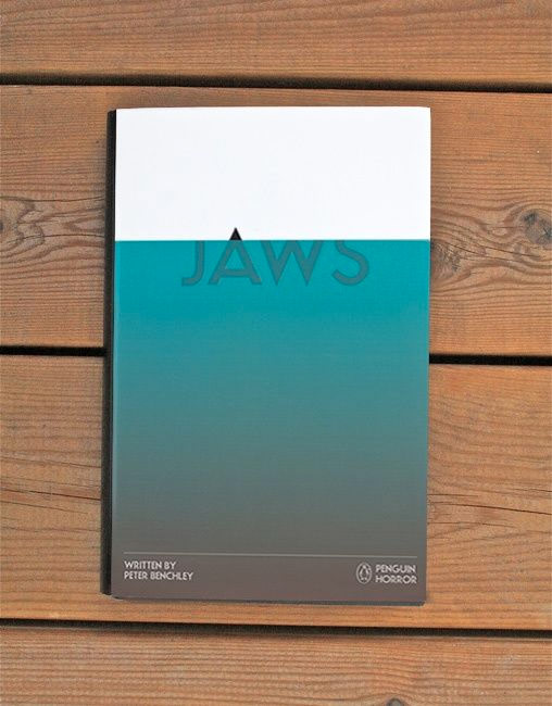
No idea if this is for sale anywhere (I couldn’t find it) or if it’s just a design exercise, but this cover for Peter Benchley’s Jaws designed by Tom Lenartowicz is inspired. (via ★interesting)
One of the greatest designers in the world, Massimo Vignelli, is very sick and “will be spending his last days at home”. His son is requesting that if you were influenced at all by Vignelli’s work, you should send him a letter:
According to Pentagram partner Michael Bierut, “Luca said that Massimo would be thrilled to get notes of good wishes from people whom he’s touched or influenced — whether personally or remotely — over the years. Luca has visions of huge mail bags full of letters. I know that one of Massimo’s biggest fantasies has been to attend his own funeral. This will be the next best thing. Pass the word.”
Here’s the address:
Massimo Vignelli
130 East 67 Street
New York, New York 10021
USA

Andrew Kim of Minimally Minimal got his hands on an original Sony Walkman and provides an interesting look back at a seminal piece of personal technology. Initially, the Walkman was billed as the “Walking Stereo with Hotline”:
Next to the dual headphones is a button labeled “Hot Line”. This was another key feature of the TPS-L2. When the user pressed the Hot Line button, the device would would override the music with audio from the built in microphone. It allowed you to listen to Subway announcements or talk to a friend without taking off your headphones. I find it to be a particularly clever idea as it uses existing parts from tape recorders. Hot Line wasn’t really a sought after feature though, and was axed in later models.
(via @sippey)
The MoMA is hosting a series of debates on the intersection of design and violence. The first one took place last week and pitted Rob Walker against Cody Wilson on the topic of open source 3D printed guns. The next two center on a machine that simulates the “pain and tribulation” of menstruation and Temple Grandin’s humane slaughterhouse designs.
The debates this spring will center upon the 3-D printed gun, The Liberator; Sputniko!’s Menstruation Machine; and Temple Grandin’s serpentine ramp. Debate motions will be delivered by speakers who are directly engaged in issues germane to these contemporary designs — the Liberator’s designer Cody Wilson; Chris Bobel, author of New Blood: Third-Wave Feminism and the Politics of Menstruation, and distinguished professor of law Gary Francione, to name a few. We want them — and you — to explore the the limits of gun laws and rights, the democracy of open-source design, the (im)possibility of humane slaughter, and design that supports transgender empathy.
Tickets are still available; only $5 for students!
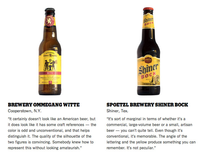
Legendary designer Milton Glaser (of I❤NY fame) critiques craft beer labels.
(via @bn2b)
For her Uncomfortable Project, Katerina Kamprani redesigned useful objects; they’re still technically functional but are a pain in the ass to use. Like this key:

Or this awkward broom:

A cool short documentary about neon sign making, a dying industry in Hong Kong.
As Jonathan Hoefler notes, the letters are designed so that the designers don’t burn their hands while bending the glass over an 800°C flame.
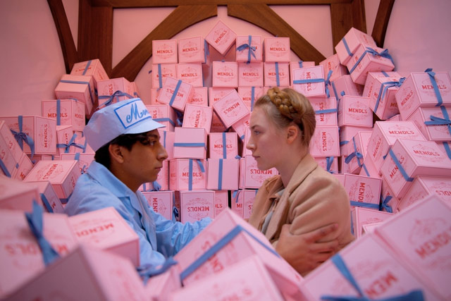
The Grand Budapest Hotel is Wes Anderson’s most design-y film, and that’s really saying something. Typography is present in almost every frame; at times, it was almost oppressive. Creative Review interviewed designer Annie Atkins, who was responsible for the film’s graphic design elements.
Oh my goodness, so many signs in the 1960s hotel lobby! I have to give credit to Liliana for this work, as she took care of nearly all of these. She had three sign-writers from Berlin painting non-stop for a week to get them all done in time for our first day of shoot, as that set was first up. Wes and Adam had seen so many examples of quite officious signage in what had been communist East Germany — don’t do this, don’t do that, do this but only like that! The signs really added to the claustrophobic feeling of that set, and Wes had asked for them all to be black with simple white hand-painted lettering — based on the style of the old sign at Yorckstrasse subway station in Berlin.
You’ve probably seen instances of knolling without knowing there was a word for it. Knolling at the Apple Store:

Knolling the contents of your bag:

Knolling a recipe for a book:

Knolling the parts of a machine:
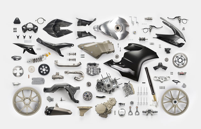
Knolling is the practice of organizing objects in parallel or at 90° angles. The term has been popularized by artist Tom Sachs; he picked it up from Andrew Kromelow when both were working at Frank Gehry’s furniture fabrication shop. Gehry was designing chairs for furniture company Knoll, and Kromelow would arrange unused tools in a manner similar to Knoll furniture. Hence, knolling.
Update: Things Organized Neatly is really something. Lots of knolling.
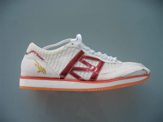
That is a bespoke running shoe made by a small company started by Hitoshi Mimura, who is considered one of the top shoe designers in the world. Mimura had great success at Asics, outfitting Olympic gold medal runners with shoes lighter, grippier, and more breathable than those worn by competitors, but now he has struck out on his own.
“I take 13 measurements of the foot, each foot has to be measured separately,” explains the sensei of shoemaking. “I only trust hand-measuring. Currently, each shoe takes about three weeks to make, mainly due to determining which materials to use.” Preparation is also key. “For a world championships or Olympics I check the course once or twice. I went to Beijing three times.”
A NY Times feature on Mimura written before the 2008 Olympic Games in Beijing emphasized the designer’s reliance on rice husks in the soles for grippiness. Mimura takes his job and his responsibility to the runners very seriously:
Surreptitiously, Mimura made soles of two slightly different thicknesses, to compensate for the fact that Takahashi’s left leg was eight millimeters — about a third of an inch — longer than her right leg. She had tried a pair of the uneven soles before the Sydney Olympics, but felt uncomfortable.
Still, Mimura felt Takahashi needed such shoes to win and to avoid a recurrence of pain caused by the disparity in her legs. Without Takahashi’s knowledge, Mimura gave her the uneven soles, then wrote a letter of resignation, in case she failed to win gold.
“I decided to take full responsibility because I made this pair against her wishes,” Mimura said of the letter. “I didn’t have to hand it over. It’s still in my desk.”
That is belief in yourself and in your craft. Many people believe in “giving people not what they want but what they need” but how many of them will put their livelihood on the line for it?
John Arlidge scores a very rare sit-down interview with Apple design chief Jony Ive for Time magazine.
He spent “months and months and months” working out the exact shape of the stand of the desktop iMac computer because “it’s very hard to design something that you almost do not see because it just seems so obvious, natural and inevitable”. When he has finished a product, even one as fresh and iconic as the white headphones that came with the first iPod, he is haunted by the idea: could I have done it better? “It’s an affliction designers are cursed with,” Ive frowns.
It was an affliction he shared with Jobs, although he seemed to apply it to everything, with — almost — funny consequences. Ive recalls traveling with Jobs. “We’d get to the hotel where we were going, we’d check in and I’d go up to my room. I’d leave my bags by the door. I wouldn’t unpack. I’d go and sit on the bed and wait for the inevitable call from Steve: ‘Hey Jony, this hotel sucks. let’s go.’”
Would have preferred more of the actual interview — lots of biographical filler in this to make it accessible for the general public — but there are good bits here and there.
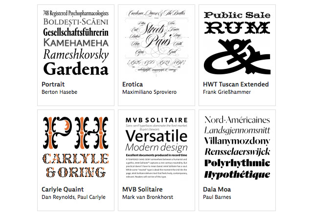
From Typographica, a list of their favorite typefaces from 2013. As you’ll see, good type design is happening all over the globe.
As evidence of that diversity, the 53 typefaces selected from 2013 were created by designers from at least 20 countries. […] This new phase of globalization and democratization of the font market began in earnest about a decade ago, propelled by newly accessible digital tools, online commerce, and post-graduate education in type design. It is a sea change. For centuries, places like Argentina, Brazil, Croatia, Lebanon, and New Zealand were vastly underrepresented in a type design community that was dominated by western Europe and North America. (And this only goes for Latin-based type. The burgeoning production of fonts in other scripts tells another fascinating story.) We will have much more detail about these changes in an upcoming report by Ruxandra Duru on the current state of typefounding around the world.
One that caught my eye is Clear Sans.
In his post about 1990s web development techniques, Zach Holman praises the 1-pixel transparent GIF.
1x1.gif should have won a fucking Grammy. Or a Pulitzer. Or Most Improved, Third Grade Gym Class or something. It’s the most important achievement in computer science since the linked list. It’s not the future we deserved, but it’s the future we needed (until the box model fucked it all up).
Given all of the awards Holman desires to present, I’m surprised he didn’t mention the inventor of the spacer GIF, David Siegel. Siegel was perhaps the first celebrity web designer — well, a celebrity among web designers anyway. He dispensed opinionated design knowledge from his personal homepage and used the High Five award to showcase his idea of cutting edge web design. (Fun fact: Siegel’s own site was the first High Five award winner.)

Somewhere along the way, Siegel came up with the idea of using a 1x1 pixel transparent GIF to introduce whitespace on web pages. The file size was very small but you could scale it up visually using the height and width attributes of the ![]() tag and use it hundreds of times on a site because it was cached by the browser the first time it loaded.
tag and use it hundreds of times on a site because it was cached by the browser the first time it loaded.
Popularized in the pages of his web design book, Creating Killer Web Sites, Siegel’s spacer GIF was completely non-standard and hacky but had the great advantages of 1) giving designers superb control over a site’s design and 2) working more or less the same in every graphical browser. The designers of the time weren’t content to wait around for the SGML nerds at W3C to figure out better ways of displaying web pages, so when Siegel pulled this beautiful kludge out of his pocket, everyone quickly adopted the technique. For years the spacer GIF dominated web design, for better and for worse. So yeah, maybe Siegel does deserve a Grammy or something.
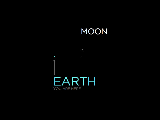
Nice visualization of the solar system; the Moon is one pixel across and everything else is scaled to that, including the distances between planets. Get ready to scroll. A lot.
It would be neat to do this with a plutonium atom or something. Related: typographically speaking, what’s the point size of the Moon?
Great book cover design alert:
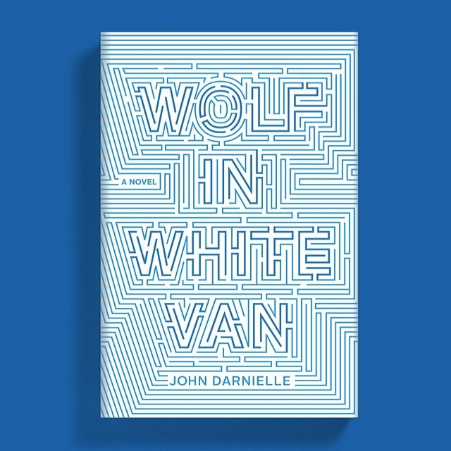
The book is the forthcoming Wolf in White Van by John Darnielle. Cover art direction by Rodrigo Corral, designed by Timothy Goodman. (via @robinsloan)
Pop Chart Lab has produced a print of grammatical diagrams of the opening lines of notable novels. Here’s Hemingway’s The Old Man and the Sea:
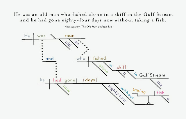
There are also sentences from DFW, Plath, and Austen. Prints start at $29.
Love this concept cover for Fahrenheit 451 by designer Elizabeth Perez…the 1 is a match and the spine is striking paper for lighting it.
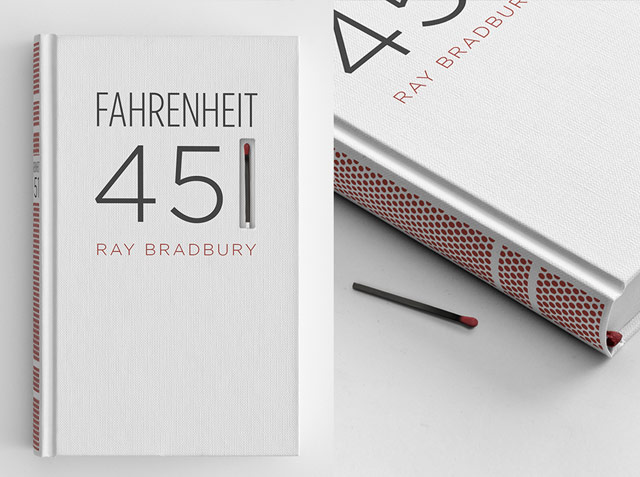
Fahrenheit 451 is a novel about a dystopian future where books are outlawed and firemen burn any house that contains them. The story is about suppressing ideas, and about how television destroys interest in reading literature.
I wanted to spread the book-burning message to the book itself. The book’s spine is screen-printed with a matchbook striking paper surface, so the book itself can be burned.
(via @daveg)
Fine work as usual from Christian Annyas: a look at the design of the Warner Bros logo from 1923 to the present. The classic “WB” shield of my Bugs-and-Daffy-saturated youth will always be a favorite, but I do like the Saul Bass logo of the 70s and early 80s:
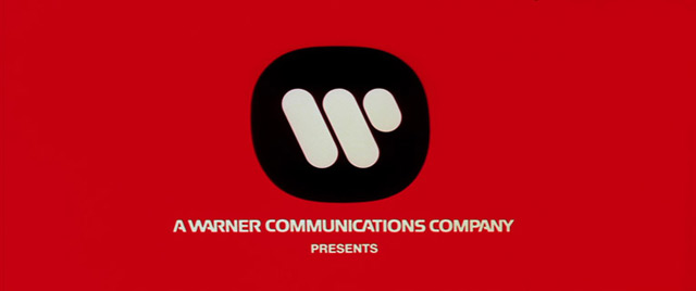
Affleck’s Argo and Soderbergh’s Magic Mike both used the Bass logo in place of the contemporary logo, which is the kind of little detail I love.
This is called a billing block:
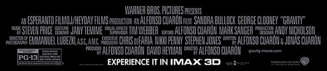
You find it at the bottom of movie posters and often at the end of movie trailers. In an Op-Art piece from last year, Ben Schott explains how the billing block is carefully constructed with information from contracts and legal agreements.
The content, order and format of the billing block are governed by two things: personal service contracts with cast and crew, and industrywide agreements with professional guilds — notably the Directors Guild of America (D.G.A.) and the Writers Guild of America (W.G.A.). Thus, while some elements of the billing block remain consistent, others depend of the type of film and on individual negotiations. That said, there has been a marked inflation in billing block credits. An “Ocean’s 11” poster from 1960 credited just three noncast individuals; the 2001 remake poster credited, coincidentally, 11.
Shopping in a supermarket can be visually overwhelming. Designer Mehmet Gozetlik took the packaging of some well-known brands and simplified them (part two). It’s interesting how some of these work and some don’t. Duracell works really well because the batteries themselves still carry most of the branding:
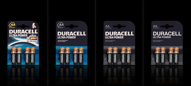
The simplified branding of Guinness and Evian works pretty well too…the packaging is itself iconic and distinctive enough to carry them. The Pringles and Red Bull are missing something, but in almost all cases, I like one of the simplified options more than the original. (via @dunstan)
In a presentation for the Visualized conference, Jonathan Corum says that he looks for the “weight of rain” when working on data graphics.
So when I’m looking at data, or working on an explanatory graphic, these are the moments I’m looking for. Little “Aha!” moments that I can point to, and say “Look here, something happened,” and then try to explain. Often those small moments can help lead a reader into the graphic, or help to explain the whole.
The actual non-metaphorical weight of rain is surprisingly heavy; an inch of rain on an acre of land weighs 113.31 tons.
The Art of the Rap Logo is a collection of rap logos from NWA to Snoop Dogg to Def Jam.
On Daring Fireball, John Gruber reflects on the 30th anniversary of the Macintosh by noting what seems particularly Apple-like about the Mac.
The second aspect of the original Mac that stands out today as Apple-like is putting just enough whimsy into the experience. Most famously, the smiling Mac you saw as the system booted. Had anyone prior even considered a smiling computer? But fundamental to the genius of the smiling Mac is that it didn’t come across as silly or corny. Friendly and fun: yes. Goofy: no. Getting that right required that most Apple-y of talents: taste.
And he’s spot on in that second footnote about the lack of whimsy in iOS 7. There’s nothing funny about those Settings and Safari icons.
Oh, wow. Tobias Frere-Jones is suing his business partner Jonathan Hoefler over ownership of world-reknowned type foundry Hoefler & Frere-Jones.
Type designer Tobias Frere-Jones claims he has been cheated out of his half of the company by his business partner, Jonathan Hoefler. In a blistering lawsuit filed today in New York City, Frere-Jones says he was duped into transferring ownership of several fonts, including the world-famous Whitney, to Hoefler & Frere-Jones (HFJ) on the understanding that he would own 50% of the company.
“In the most profound treachery and sustained exploitation of friendship, trust and confidence, Hoefler accepted all of the benefits provided by Frere-Jones while repeatedly promising Frere-Jones that he would give him the agreed equity, only to refuse to do so when finally demanded,” the suit claims.
The full complaint is here. A descendant of Whitney (Whitney ScreenSmart) is what you’re reading right now and I was an early beta tester of H&FJ’s webfont service. This is gobsmacking news…I have no idea what to think about it. What a sad and strange situation. (via @khoi)
Update: H&FJ has released a statement from their general counsel:
Last week, designer Tobias Frere-Jones, a longtime employee of The Hoefler Type Foundry, Inc. (d/b/a “Hoefler & Frere-Jones”), decided to leave the company. With Tobias’s departure, the company founded by Jonathan Hoefler in 1989 will become known as Hoefler & Co.
Update: According to a document filed with the New York County Clerk, the matter between Hoefler and Frere-Jones “has been settled”. No other details are available at this time.
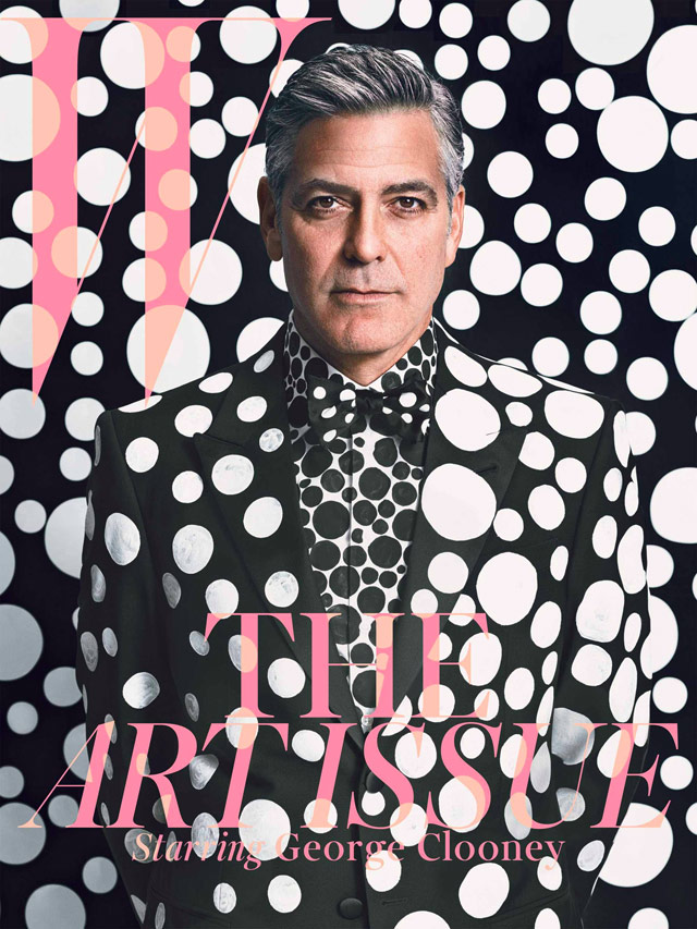
Magazine covers, movie posters, and book covers all have the same basic job, so it seemed proper to group these lists together: 50 [Book] Covers for 2013, The 20 best magazine covers of 2013, The 50 Best Posters Of 2013, Top [Magazine] Covers 2013, The Best Book Covers of 2013, The 30 Best Movie Posters of 2013, Best Book Covers of 2013. Lots of great work here. I still can’t figure out whether I love or hate this cover of W with George Clooney on it:
Newer posts
Older posts
Socials & More