kottke.org posts about Wes Anderson
I’m gonna call it: Every Frame a Painting, my all-time favorite YouTube channel, is back. Tony Zhou and Taylor Ramos stopped producing their fantastic video essays back in 2017 and while they have popped up here and there since then, they’ve mostly stuck to their retirement.
But for the past few months, the duo have been releasing video essays produced in partnership with Criterion: Night of the Living Dead: Limitations into Virtues, The Blade (1995): The Edges of Wuxia, and just yesterday, The Visual Comedy of Isle of Dogs (embedded above).
For the past three decades, Wes Anderson has left a distinctive fingerprint in American comedy, with his penchant for artificial worlds, deadpan performances, literary devices, and snappy narration. But there’s something else. These movies are funny to look at. Over the years, Anderson has experimented more and more with visual comedy. And none of this is more apparent than in Isle of Dogs.
It looks like they’re doing about one video a month. I hope they keep it up…I love their videos.
(Ok, maybe don’t read this bit until you’ve watched the Isle of Dogs video, but did you detect that Zhou’s narration seems to be synced to the mouth movements of the characters in the clips he’s talking over? Such a great little detail of visual comedy…I clapped my hands in glee like a toddler when I noticed.)
For his 2004 film The Life Aquatic with Steve Zissou, Wes Anderson enlisted Brazilian musical artist Seu Jorge to perform several of David Bowie’s songs in Portuguese. Jorge released an album of the songs about a year or so later.
A few weeks ago, to mark the 10th anniversary of Bowie’s death, Jorge released a hour-long set of him performing those songs:
Just an acoustic guitar, a microphone, and the beautiful coastline of São Paulo.


I don’t think anything could be more up my alley, in my wheelhouse, in my lane, my cup of tea, my speed than this upcoming retrospective of Wes Anderson’s work at London’s Design Museum.
The Design Museum has been granted unprecedented access to Wes Anderson’s personal archives, which the filmmaker has built up over three decades. This is the first time most of these objects will be displayed in Britain.
This landmark exhibition will chart the evolution of Wes Anderson’s films from early experiments in the 1990s to recent productions as well as collaborations with key long-standing creative partners. Explore the design stories behind award-winning and iconic films such as ‘The Grand Budapest Hotel’, ‘The Wonderful Story of Henry Sugar’, ‘Fantastic Mr. Fox’ and ‘Isle of Dogs’.
The exhibition starts on Nov 21, 2025 and runs through Jul 26, 2026.
Clocking in at almost an hour, this “definitive interview” with Wes Anderson by Vanity Fair about all 12 of his films is perhaps only for Wes stans or cinephiles, but then again, listening to thoughtful, creative people talking earnestly about their work is almost always worth the time.
Hi, I’m Wes Anderson. I have made, apparently, 12 films and I’m now going to walk us through every one of them in some way.
(via open culture)

The Criterion Collection is releasing a new boxset of Wes Anderson films, The Wes Anderson Archive: Ten Films, Twenty-Five Years.
Wes Anderson’s first ten features represent twenty-five years of irrepressible creativity, an ongoing ode to outsiders and quixotic dreamers, and a world unto themselves, graced with a mischievous wit and a current of existential melancholy that flows through every captivating frame. This momentous twenty-disc collector’s set includes new 4K masters of the films, over twenty-five hours of special features, and ten illustrated books, presented in a deluxe clothbound edition.
The boxset’s trailer is predictably Andersonian:
More details:
New 4K digital masters of Bottle Rocket, Rushmore, The Royal Tenenbaums, The Life Aquatic with Steve Zissou, The Darjeeling Limited, Fantastic Mr. Fox, Moonrise Kingdom, The Grand Budapest Hotel, Isle of Dogs, and The French Dispatch of the Liberty, Kansas Evening Sun, supervised and approved by director Wes Anderson, with 5.1 surround DTS-HD Master Audio soundtracks
This boxset will set you back a cool $400 ($350 on Amazon), but look at all that stuff!
Ok so I’ve watched the trailer for the new Wes Anderson movie, The Phoenician Scheme, a couple of times and I still don’t know what it’s actually about? But from the looks of things, it is more of the same for people who like that sort of thing, which is lucky for me.
Also, Michael Cera might be the most Wes Anderson-coded actor that’s never before been in a Wes Anderson movie.

London’s Design Museum is hosting a big retrospective of Wes Anderson’s work beginning in late 2025.
This exhibition will be the first time museum visitors have the opportunity to delve into the art of his complete filmography, examining his inspirations, homages, and the meticulous craftsmanship that define his work.
Through a curated collection of original props, costumes, and behind-the-scenes insights, including from his personal collection, this exhibition offers an unprecedented look into the world of Wes Anderson, celebrating his enduring influence on contemporary cinema.
Might have to make my way to London for this. (via daniel benneworth–gray)
Rupert Friend, Jason Schwartzman, and Wes Anderson star in an Anderson-directed commercial for Montblanc pens. You know the drill: it’s twee, it’s charming, it’s art-directed to within an inch of its life. Me personally? I love it.
When you think of directors that have influenced Wes Anderson, you typically think of Truffaut, Godard, Scorcese, and Ashby. But as you’ll see in this video of Anderson pulling out some recommended films from this Paris video store, his taste in movies is broad. There’s Drunken Angel (Kurosawa), A Streetcar Named Desire (Kazan), Vagabond (Varda), Birth (Glazer), Bridge of Spies (Spielberg), and Witness (Weir).
Of Spielberg, Anderson says:
If you make movies, if you direct movies, this is somebody who can help you. You looked at his movies for solutions. He usually found a way to do it right. He’s one of my favorites.
(via open culture)
Precise. Symmetric. Stylized. Controlled (often bright) color palette. Slow-motion. Lateral tracking. These are all hallmarks of Wes Anderson’s films. But as this short video from Luís Azevedo shows, there are plenty of imperfect moments in his movies as well. Anderson is a canny filmmaker and it’s the contrast between the controlled worlds he constructs and these more frenetic, off-kilter, imperfect moments that gives them their weight and impact.
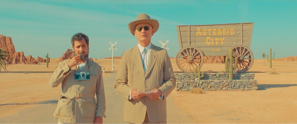
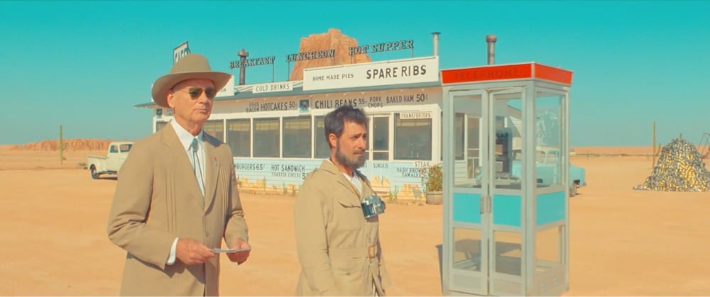
So, ever since I’d heard that Bill Murray had to drop out of filming Asteroid City, I’ve wondered which role he’d meant to play. After seeing the movie, I thought it was either the grandfather (played by Tom Hanks) or the hotel manager (Steve Carell) and it was Carell’s role:
Murray was originally cast as a motel manager in the desert town where the movie is set, in 1955. “Normally, I don’t think it’s such a nice idea to tell everyone the person who didn’t end up in the movie,” Anderson said recently. “But Bill got covid in Ireland, and it was four days before he was supposed to work.” Murray was in Ireland for a family trip (“And usually golf has something to do with it,” Anderson said), en route to Spain, where “Asteroid City” was shooting. With Murray in quarantine, Anderson scrambled to recast the part. “The movie was a jigsaw puzzle of actors’ schedules, so we couldn’t wait,” he recalled. “We were extremely lucky that Steve Carell said yes — and was perfect in the part.”
Murray showed up to the set anyway after he recovered and he and Anderson filmed tongue-so-firmly-in-cheek-I-don’t-even-have-the-right-metaphor-for-it promo for the film that perfectly complements the film’s meta structure.
Then, the day after the movie wrapped, Anderson and Murray concocted an idea: in a metatheatrical curlicue, Murray would play a character who was cut from the film. Anderson corralled Schwartzman, who plays a war photographer (and the actor playing the war photographer), and they shot a short scene in the style of a retro promotional trailer for a Hollywood film, in which a director or a studio executive would give a stilted pitch for an exciting new picture. Think of the Paramount head Robert Evans boosting “Love Story” and “The Godfather,” or Cecil B. DeMille hyping his 1934 production of “Cleopatra.” Anderson recalled, “We made this very peculiar thing that is just a spontaneous creation before the set was going to be struck down. It was the last thing we did. And then we put all our things in the golf cart and drove off into the sunset.”
[I know, this is a lot of Asteroid City stuff — maybe you don’t care about this quite so much? He gets like this about stuff he likes. It’s ok, he’ll grow tired of it in a few days and the site will go back to being about *checks notes* everything else in this whole wide world. -ed]
The other day I posted about how contemporary filmmakers, Wes Anderson in particular, use miniatures in their films. The model/prop maker featured, Simon Weisse, has worked with Anderson on several films, including his latest, Asteroid City. Weisse has been posting behind-the-scenes shots of his studio’s work on Asteroid City to his under-followed Instagram account and I thought a separate post highlighting some of those props and miniatures would be fun.


This video shows a bunch more of the miniatures used in the movie:
I also ran across a few behind-the-scenes videos of the production if you’re in the mood to deep-dive (as I appear to be):
If you’re lucky enough to be in London in the next week and a half, you can go and see some of these props and sets and even eat at the diner at 180 Studios. Very. Jealous.
Vox talks to prop & model maker Simon Weisse, who made miniatures for Wes Anderson’s Asteroid City, about the perhaps surprising popularity of miniatures in contemporary filmmaking, when the technique works and when it doesn’t (e.g. when unscalable elements like rain or fire/explosions are involved), and why certain directors use it instead of CGI.
Miniatures in movies are way more common than you may realize, and one of the most stylish filmmakers keeping them alive is Wes Anderson. In this video we spoke to Simon Weisse, prop maker and model marker for some of Wes Anderson’s recent projects, like The Grand Budapest Hotel, The French Dispatch, and Asteroid City.
Older movies, like 1977’s Star Wars: Episode IV — A New Hope, had no choice but to use miniatures to make their worlds feel real. But even in the modern day of CGI, filmmakers are still using minis — just look at projects like The Mandalorian, Blade Runner 2049, Harry Potter, and The Dark Knight series. In those movies, miniatures are used for expansive sets that establish the world of a film, otherworldly vehicles like spaceships, and more.
It’s perfect for Anderson’s storybook aesthetic, of course…it looks great in Asteroid City (which I really enjoyed overall).
I know, I know. Too much Wes Anderson. Too much AI. But there is something in my brain, a chemical imbalance perhaps, and I can’t help but find this reimagining of the Lord of the Rings in Anderson’s signature style funny and charming. Sorry but not sorry.
See also The Galactic Menagerie, Wes Anderson’s Star Wars.
It’s a no-brainer: what if you handed over a visually rich sci-fi universe with slightly campy origins to a quirky auteur with an overwhelming aesthetic, just to see what you’d get? This short trailer imagines Wes Anderson at the helm of his very own Star Wars movie, complete with Bill Murray as Obi-Wan and Owen Wilson as Darth Vader (wow).
See also, from back in 2012, Conan O’Brien’s take on Wes Anderson’s Star Wars, A Life Galactic. I would totally watch either of these movies tbh.
Wow, I’d never seen these before today! For the 1999 MTV Movie Awards, Wes Anderson created three promo spots, each one a staged re-creation of a nominated movie in the style of the Hollywood-inspired plays in Rushmore (Serpico & the Vietnam War one). All three shorts (Armageddon, Out of Sight, The Truman Show) star Jason Schwartzman as Max Fisher, along with the rest of the Max Fischer Players. (via open culture)
The top two comments on YouTube sum this trailer for Asteroid City up pretty well: “Just when you don’t think it can get more Wes Anderson, it gets more Wes Anderson.” and “You know a Wes Anderson movie is a Wes Anderson movie, but you can’t really describe a Wes Anderson movie to someone who has never seen a Wes Anderson movie.” Here’s the synopsis:
The itinerary of a Junior Stargazer/Space Cadet convention (organized to bring together students and parents from across the country for fellowship and scholarly competition) is spectacularly disrupted by world-changing events.
Does it even matter to know this? At this point, you’re either throwing money at the screen after watching this trailer (*raises hand*) or you’re just not interested. For those in the former camp, Asteroid City opens in theaters on June 16.
Update: Asteroid City marks the first Wes Anderson movie without Bill Murray since Bottle Rocket — the actor came down with Covid-19 just before filming began and had to withdraw.
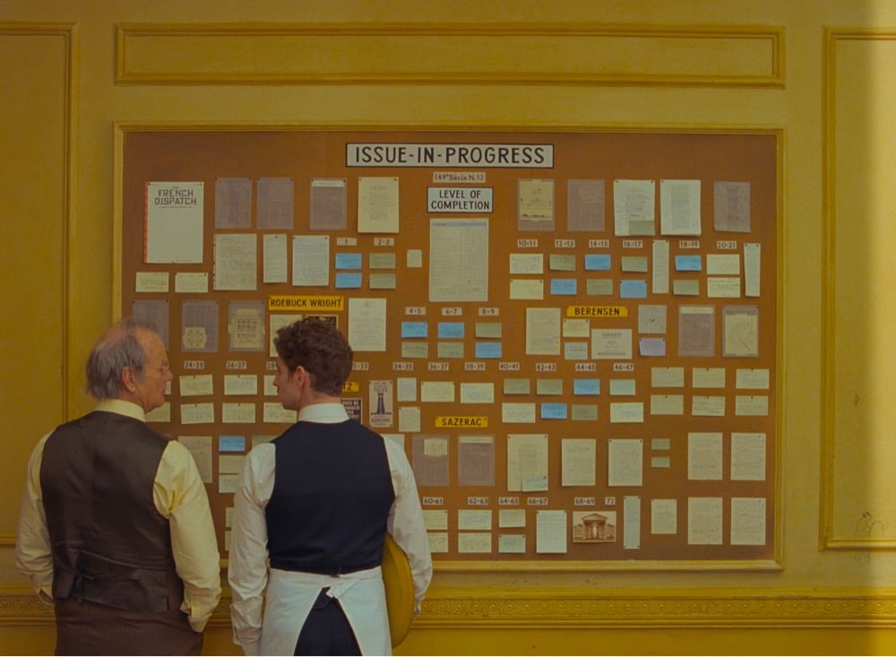
In an interview with Creative Boom, type designer Marie Boulanger talks about Wes Anderson’s use of type and typography in his films, specifically The French Dispatch.
I’m just speaking for myself, but I recently rewatched all of his films in chronological order. You can see typography become a more and more prominent component over time — it’s quite fascinating. In later films like Isle of Dogs and the French Dispatch, it almost becomes its own character rather than a visual or narrative flourish. Especially in a story about writers and publishing, every book, every page, every shop sign, every poster.
Even thinking about the three stories contained within the film, graphic design and typography are really at the core of each one: exhibition posters, protest signs and even menus. You piece a lot of key information together just through certain objects from the set, as well as emotional nuance: humour, joy, sadness. With such a huge part of the narration depending on typography, you have to expect a high level of detail.
Some people can be quite dismissive of Anderson’s work as preoccupied with mere aesthetics, so it’s great to hear Boulanger talk about the depth that something that’s ostensibly aesthetic like typography brings to his films. I loved the use of type in The French Dispatch…so much information conveyed with “just” words. (via sidebar)
I saw The French Dispatch last night and really liked it. Then I read Cassie da Costa’s review/appreciation of the film and I think I like it even more now.
With all due respect to Ganz and other dissenting critics, who are well within their rights to dislike Dispatch or the general direction Anderson’s work is headed in, there is nothing childish or superficial about the film. The similarly maligned-for-her-tastes Sofia Coppola showed us in Marie Antoinette that teas, cakes, and even childhood (or teenagedom) are not frivolous subjects, not even when rendered with ostentatiously luxurious styling. Such exercises in not plainly depicting a set of ideas but entangling them in a detailed visual makeup are best done in films, and for good reason — a medium as prolonged as it is abridged, it ideally requires audience members’ sustained and close observation.
“Sustained and close observation” nails it. I wasn’t bored for a single second during The French Dispatch — more like rapt. I love films that reward paying attention — it’s a form of love, don’t you know.
Wes Anderson has directed a stylish animated music video for Jarvis Cocker’s lovely cover of Christophe’s “Aline”, which was a big hit in France in the summer of 1965. The video, illustrated by Javi Aznarez, also doubles as a trailer/moving poster of sorts for the film in which the song appears, Anderson’s own The French Dispatch.
The song appears on the soundtrack for The French Dispatch, as well as on an album called Chansons d’Ennui Tip-Top, a collection of French pop songs covered by Cocker in character as Tip-Top, the character he voices in the movie. (via open culture)
Wes Anderson’s tenth film, The French Dispatch, is about a fictional magazine published by a group of Americans in France. The movie’s magazine is based on the New Yorker and in advance of its release, Anderson has published an anthology of articles from the actual New Yorker (and other magazines) that inspired the characters in the film. It’s called An Editor’s Burial.
A glimpse of post-war France through the eyes and words of 14 (mostly) expatriate journalists including Mavis Gallant, James Baldwin, A.J. Liebling, S.N. Behrman, Luc Sante, Joseph Mitchell, and Lillian Ross; plus, portraits of their editors William Shawn and New Yorker founder Harold Ross. Together: they invented modern magazine journalism.
Because the world is constantly folding in on itself these days, Anderson explained why he is publishing the book to Susan Morrison in the New Yorker:
Two reasons. One: our movie draws on the work and lives of specific writers. Even though it’s not an adaptation, the inspirations are specific and crucial to it. So I wanted a way to say, “Here’s where it comes from.” I want to announce what it is. This book is almost a great big footnote.
Two: it’s an excuse to do a book that I thought would be really entertaining. These are writers I love and pieces I love. A person who is interested in the movie can read Mavis Gallant’s article about the student protests of 1968 in here and discover there’s much more in it than in the movie. There’s a depth, in part because it’s much longer. It’s different, of course. Movies have their own thing. Frances McDormand’s character, Krementz, comes from Mavis Gallant, but Lillian Ross also gets mixed into that character, too — and, I think, a bit of Frances herself. I once heard her say to a very snooty French waiter, “Kindly leave me my dignity.”
As Morrison then noted, it would be very cool if every movie came with a suggested reading list. The French Dispatch is set for release in the US in late October and An Editor’s Burial will be out September 14 and is available for preorder.
The YouTube channel In Depth Cine has been looking at how directors like Spike Lee, Alfonso Cuarón, Martin Scorsese, and Wes Anderson shoot films at three different budget levels, from the on-a-shoestring films early in their careers to later blockbusters, to see the similarities and differences in their approaches. For instance, Wes Anderson made Bottle Rocket for $5 million, Rushmore for $10 million, and Grand Budapest Hotel for $25 million:
Steven Spielberg shot Duel for $450,000, Raiders of the Lost Ark for $20 million, and Saving Private Ryan for $70 million:
Christopher Nolan did Following for $6,000, Memento for $9 million, and Inception for $160 million:
You can find the full playlist of 3 Budget Levels videos here. (This list really needs some female directors — Ava DuVernay, Sofia Coppola, and Kathryn Bigelow would be easy to do, for starters. And Chloé Zhao, after The Eternals gets released.)
Love it or hate it, we all know what Wes Anderson movies look like by now — the vibrant color palette, use of symmetry, lateral tracking shots, slow motion, etc. etc. In this video, Thomas Flight explores why Anderson uses these stylistic elements to tell affective and entertaining stories.
But what is at the core of those individual stylistic decisions? Why does Anderson choose those things? Why do all those things seem to form a very specific unified whole? And what function, if any, do they serve in telling the kinds of stories Wes wants to tell?
The sources for the video are listed in the description; one I particularly enjoyed was David Bordwell writing about planimetric composition. (via open culture)
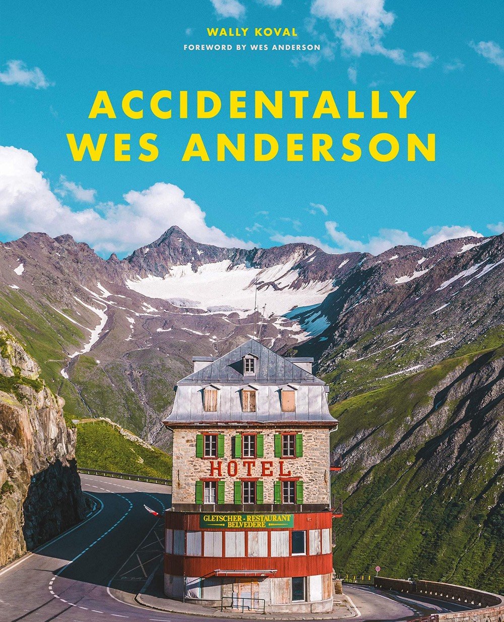
Inspired by the symmetry and color palettes of Wes Anderson’s movies, the Instagram account Accidentally Wes Anderson has been collecting and featuring photos from folks all over the world that wouldn’t look out of place in The Royal Tenenbaums or The Grand Budapest Hotel. The creators have turned it into a new book called Accidentally Wes Anderson, which features many of the best contributions from the account. It sounds like it’s kind of a travel book, a visually oriented Atlas Obscura.
Now, inspired by a community of more than one million Adventurers, Accidentally Wes Anderson tells the stories behind more than 200 of the most beautiful, idiosyncratic, and interesting places on Earth. This book, authorized by Wes Anderson himself, travels to every continent and into your own backyard to identify quirky landmarks and undiscovered gems: places you may have passed by, some you always wanted to explore, and many you never knew existed.
And while we’re here, I picked out a few of my recent favorites from their Instagram:


Characters in Wes Anderson’s films are often misfits, outcasts, or are estranged from one another for various reasons. That apartness is often depicted cinematically using physical distance between individuals onscreen, with the aesthetic side effect of using all of that gorgeous 1.85:1 or even 2.35:1 aspect ratio. Luis Azevedo made a short supercut of moments in Anderson’s movies where the characters are practicing good social distancing techniques.
Trailer ↑. Well, if you like Wes Anderson this looks terrific. And if you don’t, well, perhaps not. The French Dispatch is about a weekly literary magazine in the style of the New Yorker. From the actual New Yorker:
Wes Anderson’s new movie, “The French Dispatch,” which will open this summer, is about the doings of a fictional weekly magazine that looks an awful lot like — and was, in fact, inspired by — The New Yorker. The editor and writers of this fictional magazine, and the stories it publishes — three of which are dramatized in the film — are also loosely inspired by The New Yorker. Anderson has been a New Yorker devotee since he was a teen-ager, and has even amassed a vast collection of bound volumes of the magazine, going back to the nineteen-forties. That he has placed his fictional magazine in a made-up French metropolis (it’s called Ennui-sur-Blasé), at some point midway through the last century, only makes connecting the dots between “The French Dispatch” and The New Yorker that much more delightful.
Amazing…he basically made a movie about the New Yorker archives. And btw, writing “teen-ager” instead of “teenager” is the most New Yorker thing ever — but at least it wasn’t “teën-ager.”
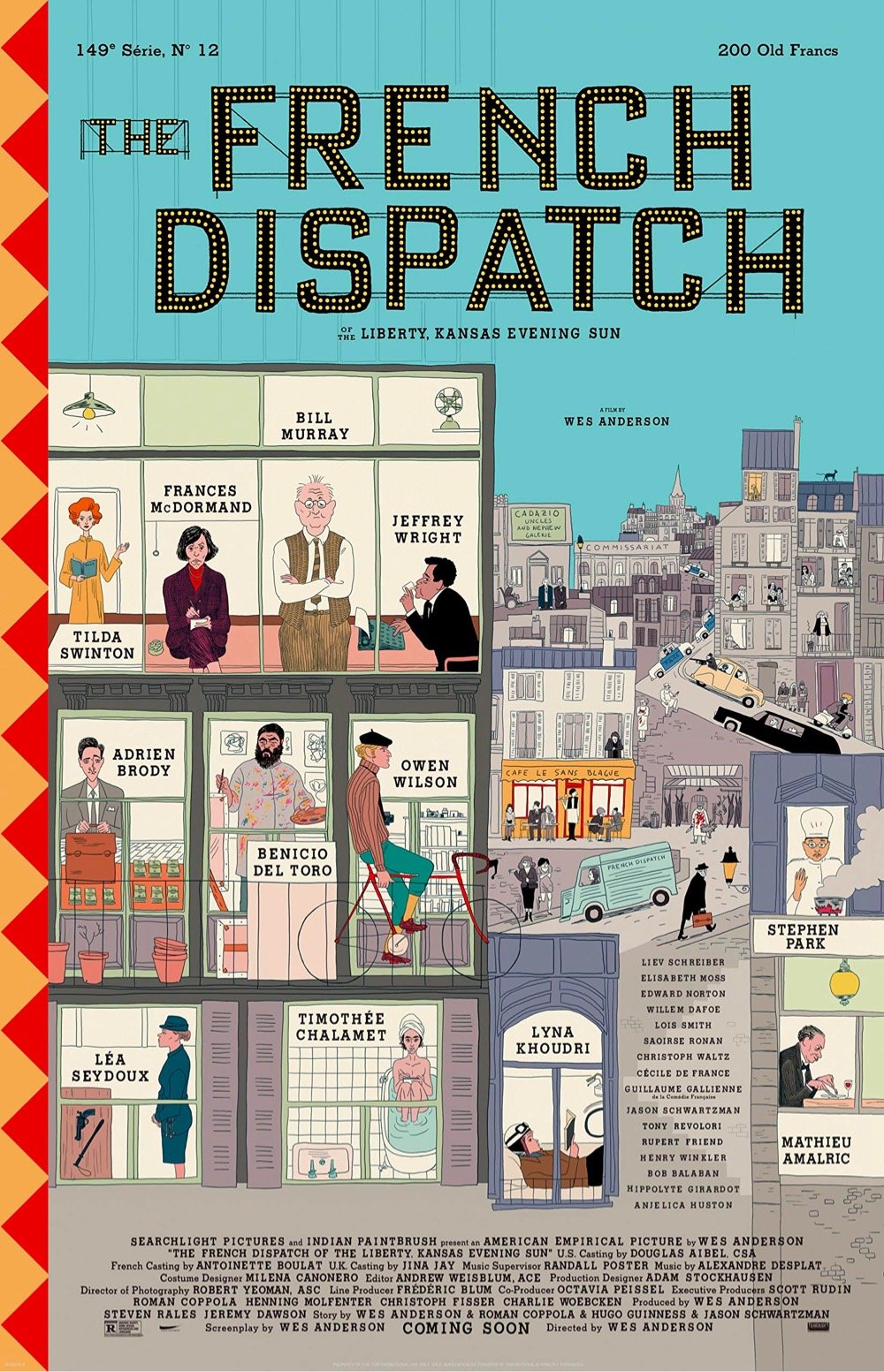
Back to the movie, it’s got a cracking cast: Benicio del Toro, Adrien Brody, Tilda Swinton, Léa Seydoux, Frances McDormand, Timothée Chalamet, Jeffrey Wright, Bill Murray and Owen Wilson all star and then the supporting cast includes Liev Schreiber, Elisabeth Moss, Willem Defoe, Saoirse Ronan, Christoph Waltz, Jason Schwartzman, Anjelica Huston, and even the Fonz, Henry Winkler. The poster is quite something as well:
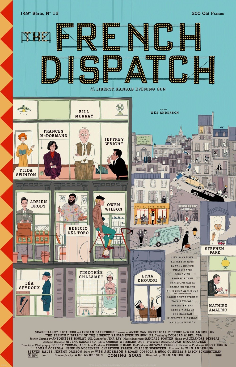
Opens July 24…can’t wait!
For their series The Director’s Chair, Studio Binder pulls together interviews with notable filmmakers to shine some light on how they make their films. In the latest installment, Wes Anderson explains how he writes and directs his uniquely stylistic movies.
The video covers five main points about his approach:
1. Pull from your past.
2. Build a world.
3. Focus on precision & symmetry.
4. Find your spark.
5. Just go shoot.
(#5 is a bit of a head-scratcher. Anderson is pretty much the opposite of a “just go shoot” filmmaker. But I suppose he did have to start somewhere…)
My favorite scene in Wes Anderson’s Isle of Dogs is the sushi-making scene. It’s a pure showcase of stop motion animation goodness and wordless storytelling.
Andy Biddle has posted a behind-the-scenes time lapse video of him and Anthony Farquhar-Smith animating that scene:
From the costume changes, it looks like that 40 seconds of video took about 29 days to complete, although obviously not full days in many cases.
You can see more of Biddle’s work here and Farquhar-Smith’s work here.
Update: Somehow I totally missed the days counter in the upper left corner of the video…the sequence took 32 days to do. (This is like the awareness test with the moonwalking bear.) (thx, all)
Update: Isle of Dogs’ head puppet master explains a bit more about what goes into making these stop motion scenes.
Abbie Paulhus is selling copies of this great illustrated poster she made featuring a Wes Anderson alphabet on her Etsy shop.
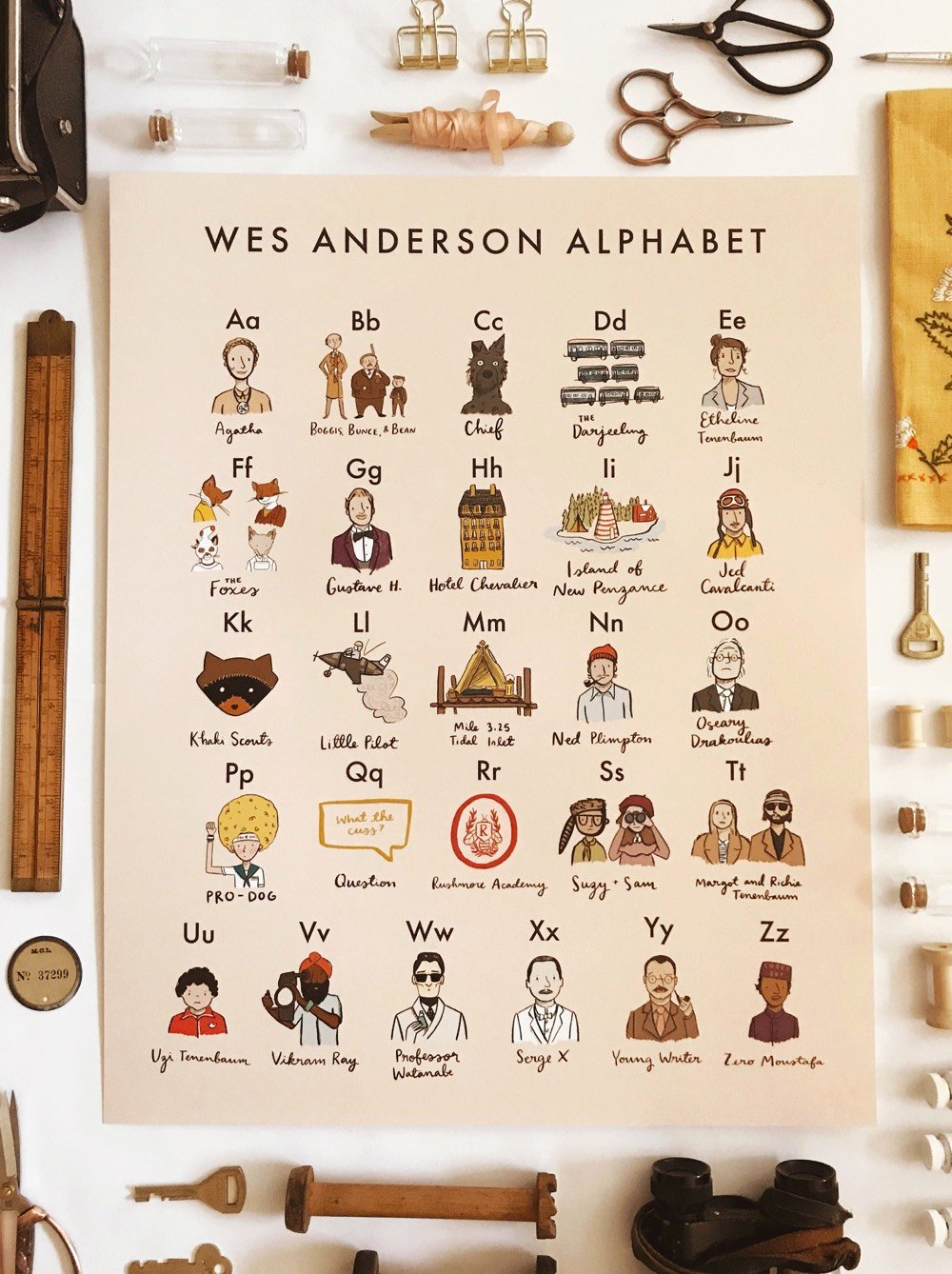
It features people, places, and objects from many of Anderson’s films (I didn’t see any Bottle Rocket references): B is for Boggis, Bunce, and Bean, N is for Ned Plimpton, and T is for Margot and Richie Tenenbaum.

From a visual design standpoint, Isle of Dogs might be my favorite Wes Anderson movie yet. Each frame of the film is its own little work of art — I could have watched a good 20 minutes of this guy making sushi:
The Wes Anderson Collection: Isle of Dogs offers a behind-the-scenes look at how Anderson and his collaborators made the film.
Through the course of several in-depth interviews with film critic Lauren Wilford, writer and director Wes Anderson shares the story behind Isle of Dogs’s conception and production, and Anderson and his collaborators reveal entertaining anecdotes about the making of the film, their sources of inspiration, the ins and outs of stop-motion animation, and many other insights into their moviemaking process. Previously unpublished behind-the-scenes photographs, concept artwork, and hand-written notes and storyboards accompany the text.
The introduction is written by Taylor Ramos and Tony Zhou of the dearly missed Every Frame a Painting.
See also the other books in this series: The Wes Anderson Collection, The Wes Anderson Collection: The Grand Budapest Hotel, and The Wes Anderson Collection: Bad Dads: Art Inspired by the Films of Wes Anderson.
Older posts




Socials & More