The Role of Type in Wes Anderson’s Films
In an interview with Creative Boom, type designer Marie Boulanger talks about Wes Anderson’s use of type and typography in his films, specifically The French Dispatch.
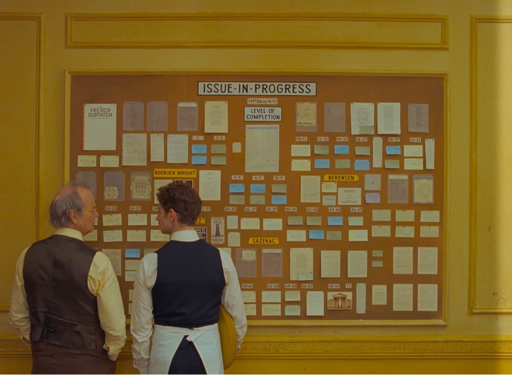
I’m just speaking for myself, but I recently rewatched all of his films in chronological order. You can see typography become a more and more prominent component over time — it’s quite fascinating. In later films like Isle of Dogs and the French Dispatch, it almost becomes its own character rather than a visual or narrative flourish. Especially in a story about writers and publishing, every book, every page, every shop sign, every poster.
Even thinking about the three stories contained within the film, graphic design and typography are really at the core of each one: exhibition posters, protest signs and even menus. You piece a lot of key information together just through certain objects from the set, as well as emotional nuance: humour, joy, sadness. With such a huge part of the narration depending on typography, you have to expect a high level of detail.
Some people can be quite dismissive of Anderson’s work as preoccupied with mere aesthetics, so it’s great to hear Boulanger talk about the depth that something that’s ostensibly aesthetic like typography brings to his films. I loved the use of type in The French Dispatch…so much information conveyed with “just” words. (via sidebar)
Socials & More