kottke.org posts about Apple
Maybe it’s because I’m a little bit allergic to hype, but I just now got around to reading this review of the Macbook Neo by Sam Henri Gold that absolutely everyone has been recommending and, well, this might be the best product review ever written?
The consensus is reasonable: $599, A18 Pro, 8GB RAM, stripped-down I/O. A Chromebook killer, a first laptop, a sensible machine for sensible tasks. “If you are thinking about Xcode or Final Cut, this is not the computer for you.” The people saying this are not wrong. It is also not the point.
Nobody starts in the right place. You don’t begin with the correct tool and work sensibly within its constraints until you organically graduate to a more capable one. That is not how obsession works. Obsession works by taking whatever is available and pressing on it until it either breaks or reveals something. The machine’s limits become a map of the territory. You learn what computing actually costs by paying too much of it on hardware that can barely afford it.
Gold captures something here about every single person I’ve ever known who fell in love with computers as a kid in the 70s, 80s, and 90s experienced — the sense of tremendous possibility represented by these machines paired with the glorious struggle to push them beyond their limits. For many of us, it was our first glimpse of infinity — as long as your curiosity & obsession remained, you could keep going forever.
Unrelatedly-ish, it is also really interesting that Apple’s answer to the AI gold rush is a $499 laptop (Neo price w/ educational discount). I don’t know if it suggests that the multi-trillion dollar, multinational corporation that Apple has become retains some institutional memory of what computing used to mean to people, but it’s something.
After posting the video on the history of HyperCard the other day, I went down a bit of a HyperCard rabbit hole on the Internet Archive. There are a ton of HyperCard programs, manual & packaging scans, and other resources available on IA; among them:
I also found this version of Brian Eno’s Oblique Strategies:
You can see why people call HyperCard “the web before the web”…it’s all right there.
Also, don’t miss this comment from Keith Dawson (who you may remember from the pioneering tech newsletter Tasty Bits From the Technology Front) on how HyperCard was almost called Wildcard.
Soon after, I took a call from Apple. Would we be willing to give up the name Wildcard, or at least license it for their use on a new product? We discussed it. No.
Wild.
This video traces the history of Apple’s HyperCard from Vannevar Bush’s idea of the Memex to the Mother of All Demos to the Xerox PARC Alto to Bill Atkinson, the inventor of HyperCard, who said:
HyperCard is a software erector set. It lets people put things together without having to know how to solder.
There’s a ton of information about HyperCard at hypercard.org, including this HyperCard simulator that runs in your browser.

Apple Macbook Air M4s are on sale again, somehow even cheaper than over the summer. The 13-inch base model is $749 (25% off) while this 15-inch one is $1,149.00 (-18% off). There are other configurations (more/less RAM/HD) too if you click through. Here’s what I wrote a few months ago about the 13-inch base model when it was $50 more:
This is the 13-inch base model and $800 is an absurdly low price for so much computer, especially in the age of the mad king’s tariff scheme.
I have the 15-inch M4 (typing on it now!) and I could not be happier with it. I had a 13-inch M1 Air before that and getting the faster M4 Air with a larger screen has changed where and I how I work, allowing me to be away from my desk a lot more (e.g. at the Tokyo coffee shop I’m sitting in now) but still be productive.

I bought a 15” Apple Macbook Air M4 a few months ago and I love it. Of course, I loved my previous computer (an M1 Macbook Air) too, but bumping up the screen size and quality has been a game-changer for me. More speed and memory is great too for running virtual machines and waaayyy too many tabs in Chrome. And it’s still super portable.
Just the other day I urged a friend (hi, Alex!) to upgrade from an older Intel Air, so when I saw that Amazon was selling M4 Airs for a discount, I figured I’d share the good word with you folks as well:
- Apple 2025 MacBook Air 15-inch Laptop, M4 chip, 16GB RAM, 512GB SSD Storage. $1,199.00 (-14% off). This is the one that I have, in sky blue, which really isn’t blue so much as a vibrant, slightly shimmering gray.
- Apple 2025 MacBook Air 13-inch Laptop, M4 chip, 16GB RAM, 256GB SSD Storage. $799.00 (-20% off). This is the 13-inch base model and $800 is an absurdly low price for so much computer, especially in the age of the mad king’s tariff scheme.
If you click through to either of those, there are more models with differing amounts of memory, hard drive, etc. Oh and all of them come with a 12-megapixel camera so you’ll look sharper on the screens of others during Zooms or FT calls, for better or worse. (via daring fireball)
Chosen by members of the Apple Music teams and a panel of experts (including Pharrell & Charli XCX), this is their list of the 100 Best Albums of all time (see also a text listing on Wikipedia). It’s an interesting list, worthy of argument and comparison to Rolling Stone’s list. Here’s the top 10:
1. The Miseducation of Lauryn Hill by Lauryn Hill
2. Thriller by Michael Jackson
3. Abbey Road by The Beatles
4. Purple Rain by Prince & The Revolution
5. Blonde by Frank Ocean
6. Songs in the Key of Life by Stevie Wonder
7. Good Kid, M.A.A.D City by Kendrick Lamar
8. Back to Black by Amy Winehouse
9. Nevermind by Nirvana
10. Lemonade by Beyoncé
You can stream all 100 albums on Apple Music and (unofficially, cheekily) on Spotify.


Photographer Reuben Wu was commissioned by Apple to take some of his wonderful light-painted photos with Apple iPhone 15 Pro Max in a project called The Inner Landscape.
So proud to be one of the first photographers to reveal a new series of images captured on the Apple iPhone 15 Pro Max and celebrate its launch. “The Inner Landscape” is a series of six unearthly places that feel more intimate than epic, more ambiguous than explicit, making up a body of work that feels cohesive through its sense of connection and psychological space.
I love Wu’s work. More information about this project can be found at Colossal, Petapixel, and on Wu’s Instagram.
The Apple Lisa was the more expensive and less popular precursor to the Macintosh; a recent piece at the Computer History Museum called Lisa “Apple’s most influential failure”.
Apple’s Macintosh line of computers today, known for bringing mouse-driven graphical user interfaces (GUIs) to the masses and transforming the way we use our computers, owes its existence to its immediate predecessor at Apple, the Lisa. Without the Lisa, there would have been no Macintosh — at least in the form we have it today — and perhaps there would have been no Microsoft Windows either.
The video above from Adi Robertson at The Verge is a good introduction to the Lisa and what made it so simultaneously groundbreaking and unpopular. From a companion article:
To look at the Lisa now is to see a system still figuring out the limits of its metaphor. One of its unique quirks, for instance, is a disregard for the logic of applications. You don’t open an app to start writing or composing a spreadsheet; you look at a set of pads with different types of documents and tear off a sheet of paper.
But the office metaphor had more concrete technical limits, too. One of the Lisa’s core principles was that it should let users multitask the way an assistant might, allowing for constant distractions as people moved between windows. It was a sophisticated idea that’s taken for granted on modern machines, but at the time, it pushed Apple’s engineering limits - and pushed the Lisa’s price dramatically upward.
And from 1983, a demo video from Apple on how the Lisa could be used in a business setting:
And a more characteristically Apple ad for the Lisa featuring a pre-stardom Kevin Costner:
Earlier today, I posted a Quick Link to the 2nd-generation AirPods Pro on Amazon because they were $50 off, a good deal for an item that’s rarely on sale. I’ve been using a pair of these for the past month or so after a strong recommendation from John Gruber, and I can’t believe how much better they performed over the 1st-gen ones (which were fine…better than fine even). The sound quality seems better, Transparency Mode (where you can simultaneously hear your music and amplified sound near you) is significantly improved, and the earbuds themselves are more comfortable than their predecessors.
But the real star for me is the noise cancelling. I try to use my treadmill a few times a week during the winter to keep fit/active and generally listen to music or watch some TV on my iPad while I walk/run. With my old AirPods Pro, I could still hear the whirring of the treadmill behind the music even with noise cancelling on. But with these new ones, the treadmill noise is nearly gone, especially if I’m listening to something particularly energetic. I took an airplane trip recently and was amazed to find that nearly all of the airplane noise was cancelled out…even playing some quiet classical music at a reasonable volume felt like I was listening in a quiet room. I’ve even been wearing them to listen to music while I work…they just sound better than my HomePod mini speaker and keep me more focused on my work.
So anyway, I posted that link and then discovered via the ensuing thread on Mastodon that you can tweak AirPods Pro using the accessibility settings on your phone to do stuff like amplifying soft sounds and tuning Transparency Mode to further boost audio to focus on a person in front of you:
Turn on Custom Transparency Mode, then adjust the amplification, balance, tone, and ambient noise reduction to help you hear what’s happening around you. You can also turn on Conversation Boost to focus on a person talking in front of you.
What an amazing feature for people who are hard of hearing or who have trouble focusing their audio attention (definitely me sometimes). And what’s more, you can actually upload an audiogram to create a custom profile that adjusts audio levels specifically to how you hear. What? I had no idea. Here’s Paul Lefebvre:
But, by far, the #1 thing for me is the hearing assistive features. I used the Mimi hearing app to take a hearing test and generate a hearing profile (I have slight high-end hearing loss). I then was able to apply this hearing profile to the AirPods and the sound got even better! I also turned on other settings to make sounds clearer in transparency mode.
Now I sometimes put these AirPods on with just transparency mode and use them to hear things from across the room or to better understand conversations.
And @mtwebb on Mastodon:
I also recently upgraded to the 2nd gen and imported my audiogram from a recent hearing test. They literally changed my life in certain noisy situations. I also recommend them, especially if you have some hearing loss but don’t quite need hearing aids.
And Marques Brownlee’s review is a good one:
To create an audiogram of your hearing, you can use the Mimi Hearing Test or SonicCloud Personalized Sound apps and then import it into your settings. I have no idea how good these audiograms are compared to an actual hearing test…you should talk to your doctor or head to a specialist if you’re in need of something really accurate. But for many people, I bet these apps work just fine. I haven’t done my audiogram yet - I’m gonna do the test after I publish this.
You can get the 2nd-gen AirPods Pro from Apple or at Amazon for $50 off (deal still valid as of 8am on 4/14).
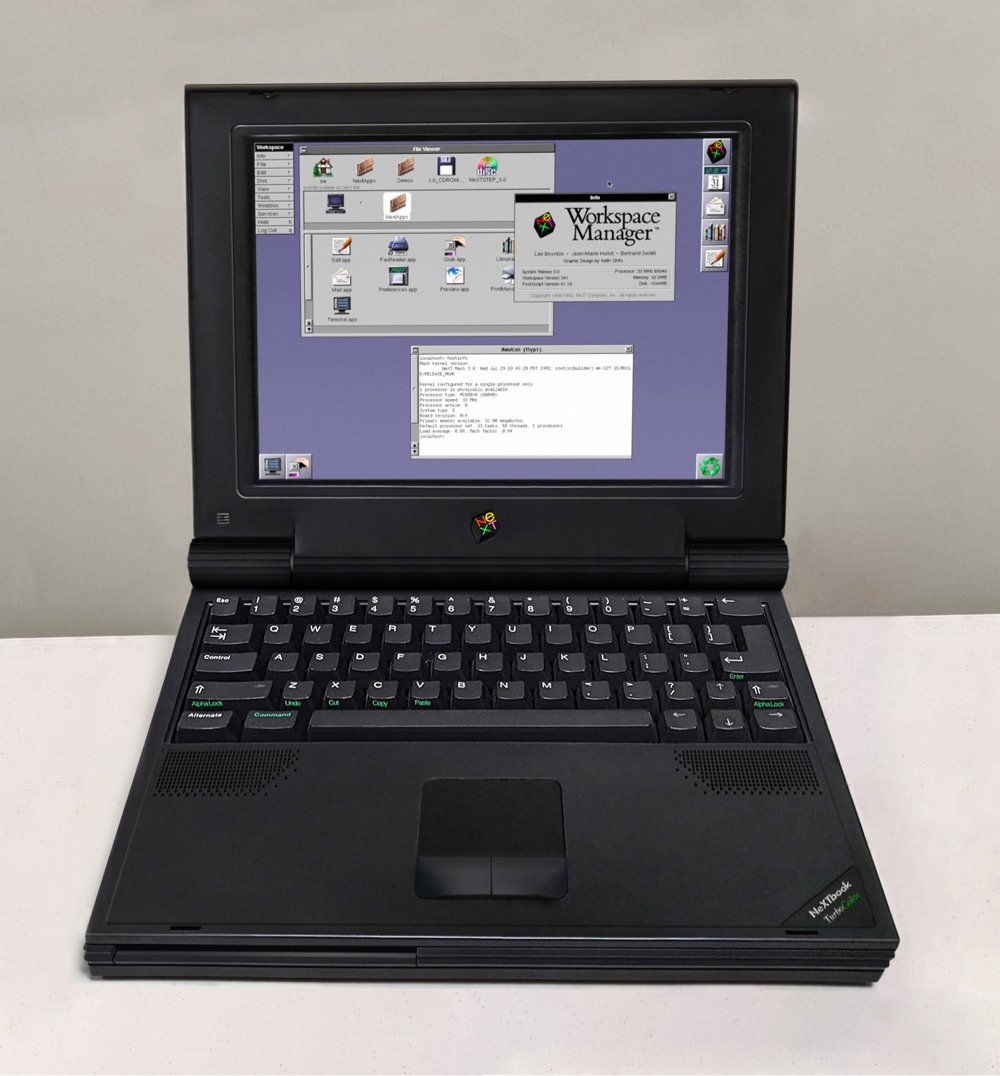
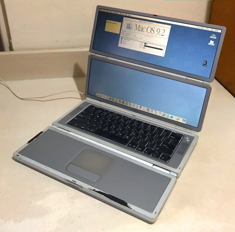
I spent more than a few minutes scrolling through Dana Sibera’s Mastodon feed (also on Twitter) featuring her imagined oddball tech items. Like this marble Mac:

A NeXT laptop? A NeXT laptop!
A foldable Powerbook:
And a widescreen Apple Lisa:
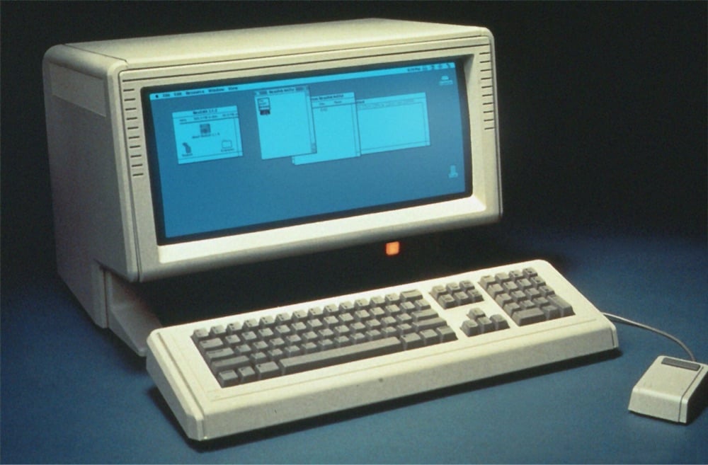
I found out about Sibera’s work via Marcin Wichary’s Shift Happens newsletter — you can find more examples of her work there, on Mastodon, or on Twitter.


Apple recently announced the winners of a competition to highlight the best macro photos shot on the newest iPhones. Amazing photos from a phone. The camera is really the only reason I upgrade my iPhone every year…it just gets better and better.

To mark the 20th anniversary of the iPod, Cabel Sasser shared some photos of one of the coolest artifacts in the Panic Archives: a prototype of the original iPod.
As you can see, it’s… quite large! We’ve always assumed that this mighty shell was designed to fit the large breadboards or circuit boards that were used during the earliest days of iPod development, until everything was eventually sized down to actual iPod-size. (It also has the Jobsian side-benefit of keeping the engineers in the dark about what the final device will look like.) I can’t get enough of those chunky, clunky, clicky black buttons wired up for navigation.
You can see how big it actually is when compared to the size of the actual iPod:
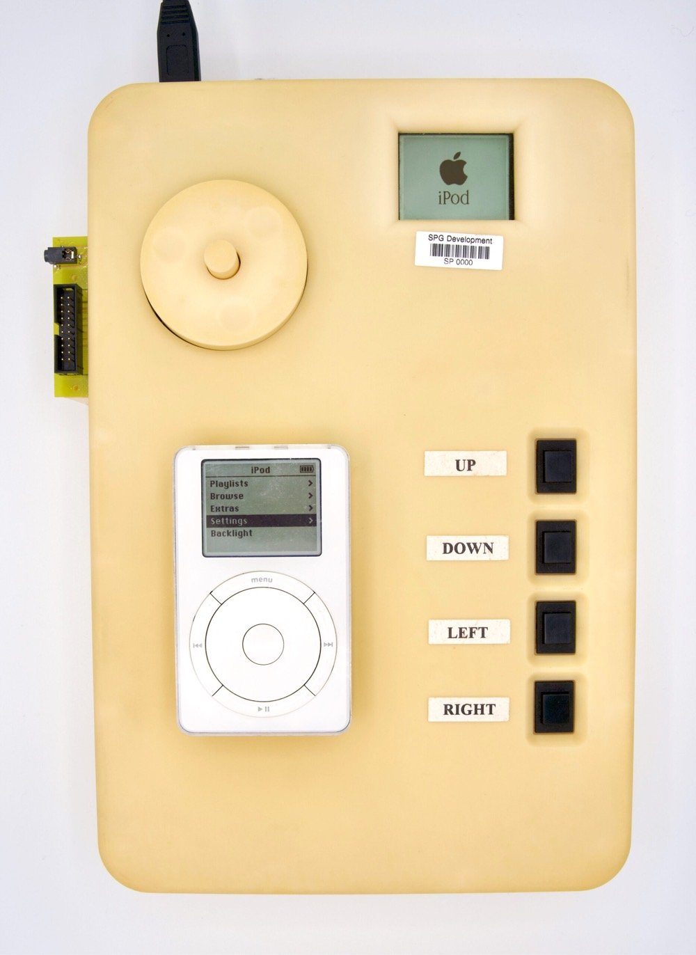
Update: Tony Fadell headed up development of the iPod at Apple and had this to say about the prototype above:
This is a P68/Dulcimer iPod prototype we (very quickly) made before the true form factor design was ready. Didn’t want it look like an iPod for confidentiality — the buttons placement, the size — it was mostly air inside — and the wheel worked (poorly)
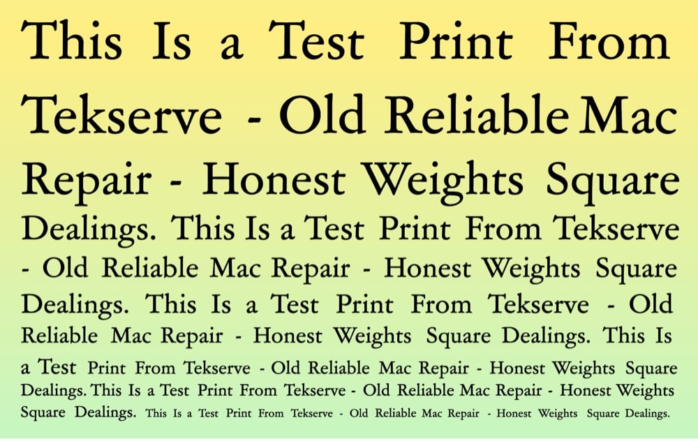
Ahhhh, The Verge has published an excerpt of Tamara Shopsin’s LaserWriter II, “a coming-of-age tale set in the legendary 90s indie NYC Mac repair shop TekServe — a voyage back in time to when the internet was new, when New York City was gritty, and when Apple made off-beat computers for weirdos”.
Joel explains that the LaserWriter II was discontinued almost ten years ago. But Tek always encourages people to fix them. Always. LaserWriter IIs are tanks, one of the most solid printers Apple ever made. The printer has only one design flaw, one thing that consistently breaks, and that flaw takes ten years to surface. Joel pauses for breath. Claire is on the edge of her seat.
He concludes, “The fan blades warp a little over time and suck in dust. This dust eventually gets into the optics and causes pages to ghost.”
Claire prints a test page from the LaserWriter II. The edges of the paper are bright white. They stipple to a black stripe of text in the center, in a kind of reverse ice cream sandwich.
Ghosting is a term used to cover a host of printing problems — double images, an image seen through the backside of the paper. Here Joel uses “ghost” to describe printing so faint it has not actually printed.
I recommend reading LaserWriter II, as well as Shopsin’s memoir Arbitrary Stupid Goal.
Look at this amazing artifact of 20th century computing: official Apple Beige touch-up paint for the Apple II.
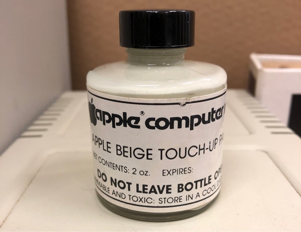
Ben Zotto found this bottle while on a quest to find out the original color of the Apple II.
This is the green-inflected cool beige of the original Apple II computer cases. Unlike later models, these first Apple cases were manufactured with a sprayed-on paint finish. Scrapes and other abuse could damage the surface. Hence the need for a touch-up paint, a handy item apparently available only to dealers for use on their repair benches.
It stands to reason this still-fresh paint may be the closest you can get today to that original color. I made a couple “swatches”, a layer on coated paper (which worked well) and two coats on a primered wood shim (worked less well). And I compared the swatches to a surviving Apple II and to other known color references.
He even found some nearly matching paints at the hardware store, so you could paint your bedroom Apple Beige if you wanted. (via kelli anderson)
Apple might be a $2+ trillion company, but in the TV world they are still relatively small potatoes. Perhaps it’s appropriate then that the company’s first entry into the nature documentary space dominated by BBC and Netflix is Tiny World, a series featuring some animals who have carved out lives in our massive world by going small. You know, spiders, toads, pygmy marmosets, insects, rodents, fish. The series is narrated by Paul Rudd (I love the ageless Rudd as much as anyone but would have loved to hear Ze Frank in this role) and premieres October 2nd on Apple+.
Nicky Case, working with security & privacy researcher Carmela Troncoso and epidemiologist Marcel Salathé, came up with this fantastic explanation of how we can use apps to automatically do contact tracing for Covid-19 infections while protecting people’s privacy. The second panel succinctly explains why contact tracing (in conjunction with quick, ubiquitous testing) can have such a huge benefit in a case like this:
A problem with COVID-19: You’re contagious ~2 days before you know you’re infected. But it takes ~3 days to become contagious, so if we quarantine folks exposed to you the day you know you were infected… We stop the spread, by staying one step ahead!

It’s based on a proposal called Decentralized Privacy-Preserving Proximity Tracing developed by Troncoso, Salathé, and a host of others. Thanks to Case for putting this comic in the public domain so that anyone can publish it.
Update: About two hours after posting this, Apple and Google announced they are jointly working on contact tracing technology that uses Bluetooth and makes “user privacy and security central to the design”.
A number of leading public health authorities, universities, and NGOs around the world have been doing important work to develop opt-in contact tracing technology. To further this cause, Apple and Google will be launching a comprehensive solution that includes application programming interfaces (APIs) and operating system-level technology to assist in enabling contact tracing. Given the urgent need, the plan is to implement this solution in two steps while maintaining strong protections around user privacy.
Update: Based on information published by Google and Apple on their contact tracing protocols, it appears as though their system works pretty much like the one outlined about in the comic and this proposal.
Also, here is an important reminder that the problem of what to do about Covid-19 is not primarily a technological one and that turning it into one is troublesome.
We think it is necessary and overdue to rethink the way technology gets designed and implemented, because contact tracing apps, if implemented, will be scripting the way we will live our lives and not just for a short period. They will be laying out normative conditions for reality, and will contribute to the decisions of who gets to have freedom of choice and freedom to decide … or not. Contact tracing apps will co-define who gets to live and have a life, and the possibilities for perceiving the world itself.
Update: Security expert Bruce Schneier has some brief thoughts on “anonymous” contact tracing as well as some links to other critiques, including Ross Anderson’s:
But contact tracing in the real world is not quite as many of the academic and industry proposals assume.
First, it isn’t anonymous. Covid-19 is a notifiable disease so a doctor who diagnoses you must inform the public health authorities, and if they have the bandwidth they call you and ask who you’ve been in contact with. They then call your contacts in turn. It’s not about consent or anonymity, so much as being persuasive and having a good bedside manner.
I’m relaxed about doing all this under emergency public-health powers, since this will make it harder for intrusive systems to persist after the pandemic than if they have some privacy theater that can be used to argue that the whizzy new medi-panopticon is legal enough to be kept running.
And I had thoughts similar to Anderson’s about the potential for abuse:
Fifth, although the cryptographers — and now Google and Apple — are discussing more anonymous variants of the Singapore app, that’s not the problem. Anyone who’s worked on abuse will instantly realise that a voluntary app operated by anonymous actors is wide open to trolling. The performance art people will tie a phone to a dog and let it run around the park; the Russians will use the app to run service-denial attacks and spread panic; and little Johnny will self-report symptoms to get the whole school sent home.
The tie-a-phone-to-a-dog thing reminds me a lot of the wagon full of smartphones creating traffic jams. (via @circa1977)
Snowbrawl is a fun short film of a children’s snowball fight shot as if it were a John Wick or Mission Impossible action sequence. David Leitch, the uncredited co-director of John Wick and director of Deadpool 2, shot the whole thing for Apple on an iPhone 11 Pro.
For Real Life magazine, Drew Austin writes about wireless headphones and their potential effect on the public sphere if many people start wearing them. The bit that particularly caught my eye was the subtitle of the piece:
Wireless headphones are augmented reality devices.
And further down the page:
Much as phones have enabled and concretized the always-on nature of everyday life, introducing the constant interpenetration of physical and digital space to individual experience, wireless earbuds facilitate a deeper integration, an “always in” existence that we need never interrupt by looking down at a screen. Their aural interface means we don’t have to awkwardly switch attention back and forth between IRL and a screen as though the two are starkly separated. Instead, we can seem to occupy both seamlessly, an experience that other augmented-reality devices, like Google Glass, have promised with varying degrees of success.
I bought some AirPods several months ago thinking I was getting wireless headphones, but very quickly realized they were actually an augmented-reality wearable computer. In my media diet post from May, I called them “the first real VR/AR device that feels seamless”. Like regular wired earbuds or even over-the-ear Bluetooth headphones, AirPods provide an audio track layered over the real world, but they’re so light and let just the right amount of ambient sound in that you barely notice you’re wearing them — it just sounds like whatever you’re listening to is playing in your head, automagically. It feels, at least to me, like a totally different and far more immersive experience. Wearable computing still seems like a futuristic thing a few years away, but with AirPods and the Apple Watch, it’s solidly here right now.
P.S. In Dan Hon’s latest newsletter, he writes:
Given current phone/camera trends (or, I should say, current camera/phone trends), the Star Trek: TNG combadge is unrealistic because by the 24th century it’d be more like 99.9998% camera and 0.0002% phone.
The natural ancestor of the combadge seems more like AirPods than the iPhone. But the likelihood of AirPods 6.0 having a tiny camera embedded in it for, say, the facial recognition of whoever you’re speaking with (a la Miranda Priestly’s assistants in The Devil Wears Prada) or text-to-speech for whatever you’re looking at (signs, books, menus) seems quite high.
The first is by John Gruber at Daring Fireball:
Ive is, to state the obvious, preternaturally talented. But in the post-Jobs era, with all of Apple design, hardware and software, under his control, we’ve seen the software design decline and the hardware go wonky. I don’t know the inside story, but it certainly seems like a good bet that MacBook keyboard fiasco we’re still in the midst of is the direct result of Jony Ive’s obsession with device thinness and minimalism. Today’s MacBooks are worse computers but more beautiful devices than the ones they replaced. Is that directly attributable to Jony Ive? With these keyboards in particular, I believe the answer is yes….
It makes me queasy to see that Apple’s chief designers are now reporting to operations. This makes no more sense to me than having them report to the LLVM compiler team in the Xcode group. Again, nothing against Jeff Williams, nothing against the LLVM team, but someone needs to be in charge of design for Apple to be Apple and I can’t see how that comes from operations. I don’t think that “chief design officer” should have been a one-off title created just for Jony Ive. Not just for Apple, but especially at Apple, it should be a permanent C-level title. I don’t think Ive ever should have been put in control of software design, but at least he is a designer.
I don’t worry that Apple is in trouble because Jony Ive is leaving; I worry that Apple is in trouble because he’s not being replaced.
Stratechery’s Ben Thompson argues that Apple is simply too big now to have a single tastemaker in charge:
Apple sold 278,000 iMacs its first full quarter on the market, 125,000 iPods its first full quarter on the market, and 1,119,000 iPhones its first full quarter on the market. Today Apple sells the same number of iPhones approximately every 11, 5, and 45 hours respectively. That requires a staggering amount of coordination between industrial design, manufacturing design, and operations. It simply isn’t feasible to have any one of these disciplines dictate to the others.
And yet, I understand Gruber’s angst. It is precisely that sort of dictatorship, first and foremost in the person of Steve Jobs, that made Apple, Apple. Again, though, I think Ive is in part a cautionary tale: he did his best work under Jobs, while the last few years have been more fraught from a design perspective; if Ive was not entirely up to the task of being the ultimate arbiter of all things Apple, who can be?
That is why the conclusion I had after WWDC feels more applicable than ever: it is less that Jony Ive is leaving Apple, and more that Apple, for better or worse, and also by necessity, has left Jony Ive and the entire era that he represented. So it goes.
At Vice, Jason Koebler argues against Ive’s design approach altogether:
[H]istory will not be kind to Ive, to Apple, or to their design choices. While the company popularized the smartphone and minimalistic, sleek, gadget design, it also did things like create brand new screws designed to keep consumers from repairing their iPhones.
Under Ive, Apple began gluing down batteries inside laptops and smartphones (rather than screwing them down) to shave off a fraction of a millimeter at the expense of repairability and sustainability.
It redesigned MacBook Pro keyboards with mechanisms that are, again, a fraction of a millimeter thinner, but that are easily defeated by dust and crumbs (the computer I am typing on right now—which is six months old—has a busted spacebar and ‘r’ key). These keyboards are not easily repairable, even by Apple, and many MacBook Pros have to be completely replaced due to a single key breaking. The iPhone 6 Plus had a design flaw that led to its touch screen spontaneously breaking—it then told consumers there was no problem for months before ultimately creating a repair program. Meanwhile, Apple’s own internal tests showed those flaws. He designed AirPods, which feature an unreplaceable battery that must be physically destroyed in order to open.
Ive’s Apple has been one in which consumers have been endlessly encouraged to buy new stuff and get rid of the old. The loser is the environment, and the winner is Apple’s bottom line. Apple has become famous for its design, and Ive has become famous, too. Let’s hope the next great consumer electronics designer is nothing like him.
If these three agree on nothing else, let their arguments show one thing: even Apple’s biggest fans really hate the past few generations of MacBook keyboards. I feel like I hated them (and had endemic problems with mine) before it was cool.
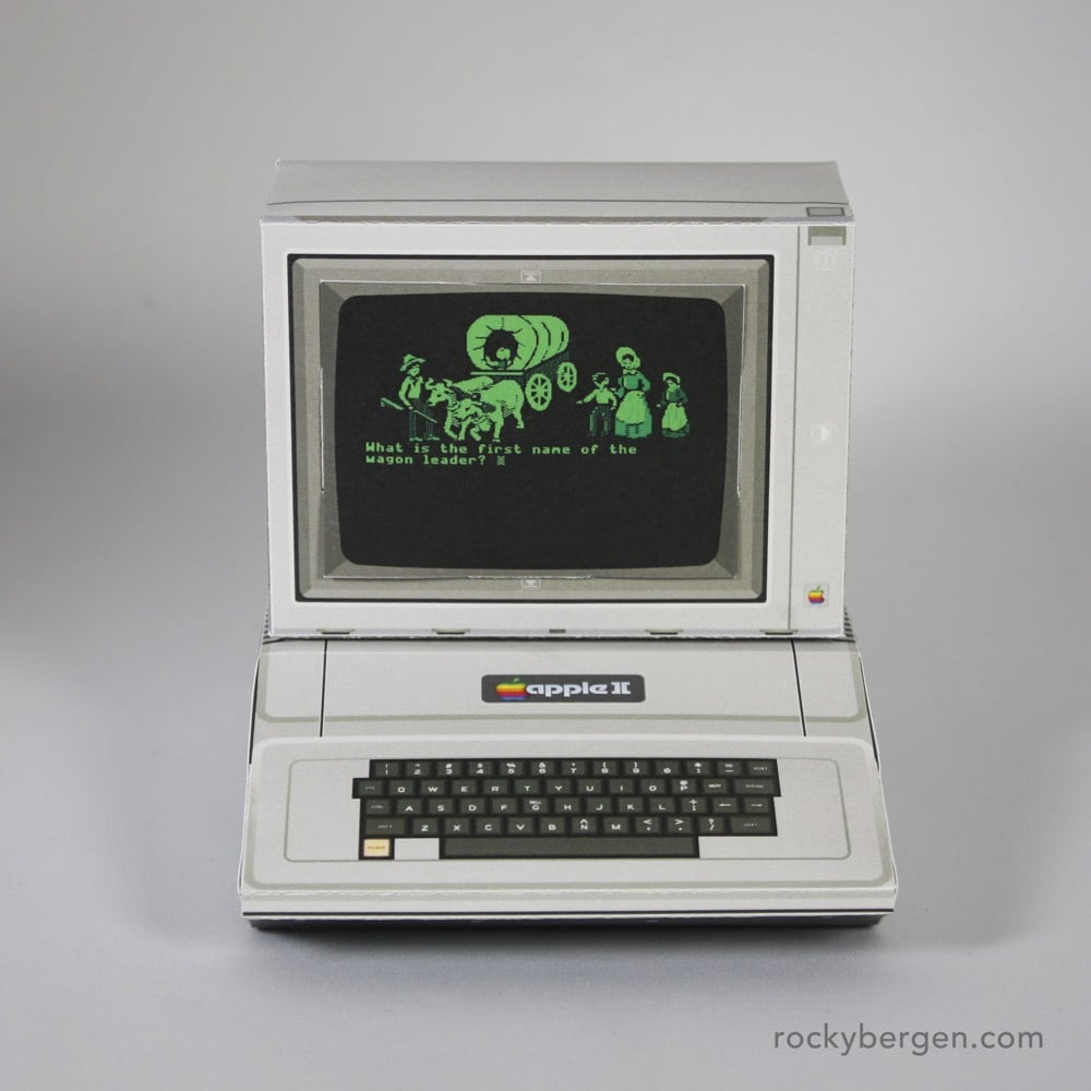
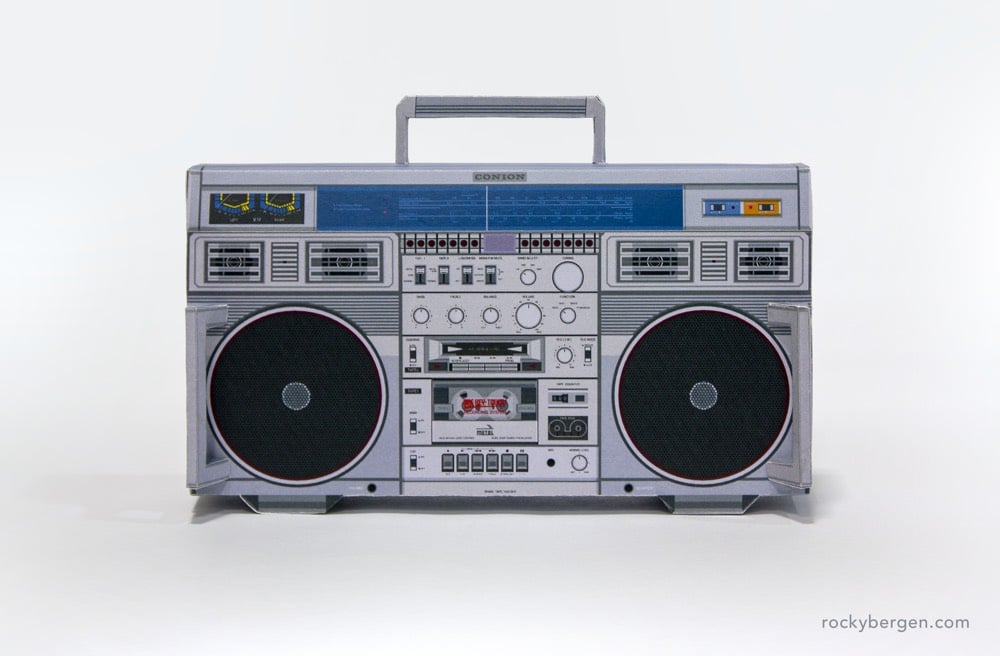
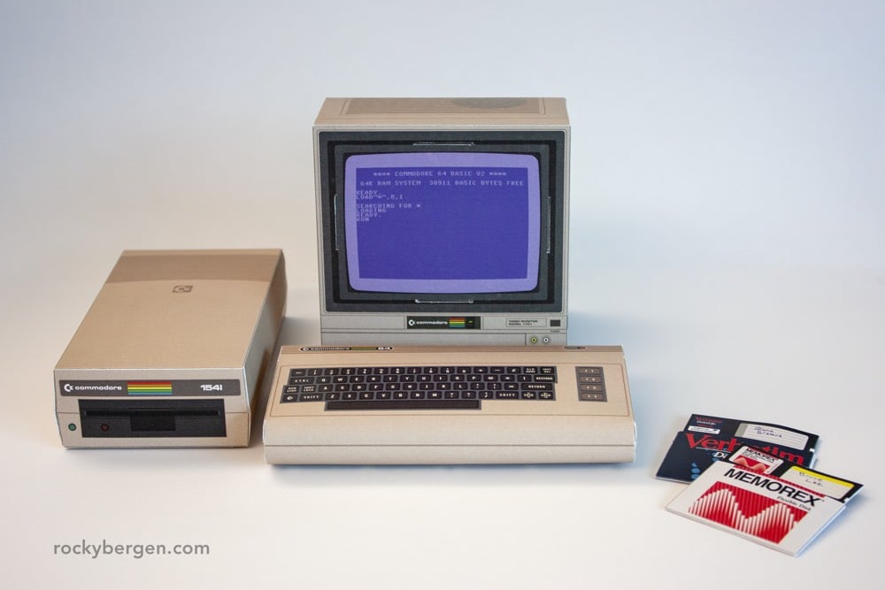
Rocky Bergen makes paper models of vintage electronics and computing gear. And here’s the cool bit…you can download the plans to print and fold your own: Apple II, Conion C-100F boom box, Nintendo GameCube, and Commodore 64.
This is an interesting look at how Apple News approaches curating their product, which reaches 90 million people. Unlike other algorithm-focused Silicon Valley giants, Apple uses human editors to surface news stories. They layer those hand-picked stories, some of which will get a million views each, with trending and topic-based stories via algorithm.
Apple (surprisingly) gave access to their News editor in chief, Lauren Kern, who weighs accuracy above speed.
Ms. Kern criticized the argument that algorithms are the sole way to avoid prejudice because bias can be baked into the algorithm’s code, such as whether it labels news organizations liberal or conservative. She argued that humans — with all their biases — are the only way to avoid bias.
“We’re so much more subtly following the news cycle and what’s important,” she said. “That’s really the only legitimate way to do it at this point.”
To further her point:
When Apple in June unveiled a special section on the midterm elections, it highlighted Fox News and Vox as partners. Apple said there are as many people reading traditionally left-leaning publications as traditionally right-leaning publications on Apple News.
The piece goes further into the business side and raises the question of whether Apple News can, as it aims, help save journalism. While newsrooms are seeing a bump in traffic from Apple News, significant now that Facebook has changed how their algorithm surfaces publishers, the question remains of whether such a closed platform will grow media revenues enough to make a difference.
There are hints of what is to come:
There are ambitious plans for the product. Apple lets publishers run ads in its app and it helps some sign up new subscribers, taking a 30 percent cut of the revenue. Soon, the company aims to bundle access to dozens of magazines in its app for a flat monthly fee, sort of like Netflix for news, according to people familiar with the plans, who declined to be identified because they weren’t authorized to speak publicly. Apple also hopes to package access to a few daily-news publications, like The Times, The Post and The Wall Street Journal, into the app, the people said.
Perhaps this is all related to the press event Apple is hosting in Brooklyn next week?


Culled from thousands of entrants from more than 140 countries around the world, here are the winners of the 2018 iPhone Photography Awards. What’s really interesting is that many of the winners were not shot on iPhone 8 or iPhone X but with iPhone 7s and 6s and even 5s. That’s a good reminder of Clayton Cubitt’s three step guide to photography: “01: be interesting. 02: find interesting people. 03: find interesting places. Nothing about cameras.”
That said, the increase in photo quality from the first contest in 2008, just a year after the iPhone launched, is welcome. The initial iPhone had just a 2 megapixel camera with a mediocre lens while the iPhone X packs a 12 megapixel resolution and an incredible lens.
Photos above by Huapeng Zhao and Alexandre Weber.
Vanity Fair has an excerpt of Small Fry, a memoir by Lisa Brennan-Jobs, the oldest daughter of Apple co-founder Steve Jobs, who named an early computer after her. Jobs notoriously denied paternity from the moment of Brennan-Jobs’ birth.
Then, in 1980, the district attorney of San Mateo County, California, sued my father for child-support payments. My father responded by denying paternity, swearing in a deposition that he was sterile and naming another man he said was my father.
I was required to take a DNA test. The tests were new then, and when the results came back, they gave the odds that we were related as the highest the instruments could measure at the time: 94.4 percent. The court required my father to cover welfare back payments, child-support payments of $385 per month, which he increased to $500, and medical insurance until I was 18. The case was finalized on December 8, 1980, with my father’s lawyers insistent to close. Four days later Apple went public and overnight my father was worth more than $200 million.
But before that, just after the court case was finalized, my father came to visit me once at our house in Menlo Park, where we had rented a detached studio. It was the first time I’d seen him since I’d been a newborn in Oregon.
“You know who I am?” he asked. He flipped his hair out of his eyes.
I was three years old; I didn’t.
“I’m your father.” (“Like he was Darth Vader,” my mother said later, when she told me the story.)
“I’m one of the most important people you will ever know,” he said.
The always pertinent Ben Thompson considers Apple and Amazon (plus Facebook and Google) and how they each focus on customers. He starts by wondering which of these companies has the best chance at hitting the one trillion market cap first. Focusing on the first two, he offers this interesting comparison.
I mean it when I say these companies are the complete opposite: Apple sells products it makes; Amazon sells products made by anyone and everyone. Apple brags about focus; Amazon calls itself “The Everything Store.” Apple is a product company that struggles at services; Amazon is a services company that struggles at product. Apple has the highest margins and profits in the world; Amazon brags that other’s margin is their opportunity, and until recently, barely registered any profits at all. And, underlying all of this, Apple is an extreme example of a functional organization, and Amazon an extreme example of a divisional one.
Two very different business operating in very different ways.
Both, taken together, are a reminder that there is no one right organizational structure, product focus, or development cycle: what matters is that they all fit together, with a business model to match. That is where Apple and Amazon are arguable more alike than not: both are incredibly aligned in all aspects of their business. What makes them truly similar, though, is the end goal of that alignment: the customer experience.
I’ll skip over much of his section on disruption and Clayton Christensen but if you don’t already know about his take on the matter, have a look at his thorough analysis of Apple vs the disruption theory. Basically, the theory doesn’t account for user experience and Apple manages to not overshoot the price customers want to pay because it understands the value its superior user experience provides.
Apple seems to have mostly saturated the high end, slowly adding switchers even as existing iPhone users hold on to their phones longer; what is not happening, though, is what disruption predicts: Apple isn’t losing customers to low-cost competitors for having “overshot” and overpriced its phones. It seems my thesis was right: a superior experience can never be too good — or perhaps I didn’t go far enough. (Emphasis mine.)
Thompson then looks at Amazon’s focus on custom experience, including an important aspect which Bezos explained in his most recent letter to shareholders.
One thing I love about customers is that they are divinely discontent. Their expectations are never static — they go up. It’s human nature. We didn’t ascend from our hunter-gatherer days by being satisfied. People have a voracious appetite for a better way, and yesterday’s ‘wow’ quickly becomes today’s ‘ordinary’. […] (Emphasis mine.)
What is amazing today is table stakes tomorrow, and, perhaps surprisingly, that makes for a tremendous business opportunity: if your company is predicated on delivering the best possible experience for consumers, then your company will never achieve its goal.
By focusing on user experience, Amazon is constantly aiming higher and never overshooting what customers want to pay, thus making itself very hard to disrupt.
He closes with Facebook and Google who are focused on advertisers, which makes them less (end)user focused and less popular.
Both, though, are disadvantaged to an extent because their means of making money operate orthogonally to a great user experience; both are protected by the fact would-be competitors inevitably have the same business model.
Apple has been making a number of moves towards becoming more of a luxury and lifestyle brand (including hires from fashion mainstays like Yves Saint Laurent, and Burberry), as well as advancing its various media projects, like the recent purchase of Texture, the digital magazine distributor, in what many see as plans to be the Netflix of magazines. And then in this piece at The Guardian on those same media advances, comes this:
Rumors have even circulated that Apple is looking to buy parts or all of the troubled magazine publisher Condé Nast, a move that would further its push, initiated with the Apple Watch, to become a luxury fashion accessory, lifestyle and content brand.
So Apple might be buying Condé Nast, publishers of… Wired. Remember this from 1997? Oh, the irony.
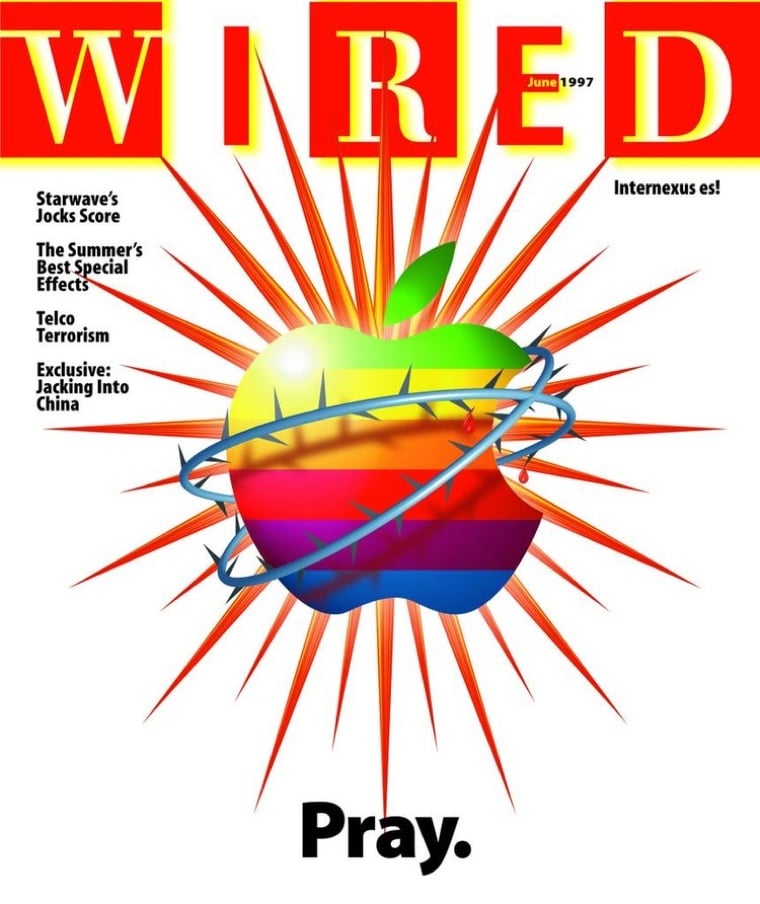
(Via @cfd and @9to5Mac.)


Over on his Instagram account, photographer Vincent Laforet is sharing some 50-megapixel panoramic photos he shot for Apple. He strapped an iPhone 7 to the bottom of a Learjet, set it on Pano mode, and flew it over various landscapes at a height of 20,000 feet. Here’s the first one.
For 7 consecutive days I will be posting a series of 50+ Megapixel Panoramic Photographs shot on an @apple iPhone 7, from the belly of a LearJet from 20,000 feet above the earth.
We set the standard Camera App to “Pano” Mode and flew for 2-7 minutes at 220+ Knots on a perfectly straight line and we witnessed the iPhone effectively paint the landscape like a roller brush. It produced a stunningly high quality image that I’d never before seen before from any smartphone!
Laforet also shot a video from some of those same flights using a RED camera in 8K resolution.
Watch this on as big a screen as you can in 4K. Wonderful.
In his review (finally!) of the iPhone X, John Gruber begins with a zoomed out view of how computer platforms face an adapt-or-die choice.
The more popular a computer platform becomes, the more of a bind in which it inevitably finds itself. A platform is only “finished” when it is abandoned. It needs to evolve to remain relevant, but it’s difficult to change in unfamiliar ways without angering the base of active users. Adding new features on top of the familiar foundation only gets you so far — eventually things grow too complex, especially when what’s needed now is in conflict with a design decision that made sense a decade (or more) prior.
I’d argue this applies equally well to cultural & scientific paradigms, media, companies, technology, and politics. And people too. Who you were in your 20s and the decisions you made for that person often don’t work that well for that same person at 40…which can make long-term relationships difficult to navigate.
It also applies to this here website. I’ve talked before about the changing landscape of web-based media from a revenue perspective, which is why I started the membership initiative.
As I hinted at in the announcement post, the industry-wide drop in revenue from display advertising was beginning to affect kottke.org and just a few months later, the site’s largest source of revenue (ads via The Deck) went from “hey, I can make a living at this!” to zero. Then Amazon slashed their affiliate percentages, resulting in a 30-50% drop for some sites in the network. I found a new ad network partner (with greatly reduced revenue) and my Amazon affiliate revenue didn’t fall as much as that of other sites, but together, those revenue sources would no longer be enough to support my full-time activities on the site.
But I’ve also been thinking a lot about how the information published here is delivered. I love the web and websites and believe the blog format is the best for the type of thing I want to communicate. But fewer and fewer people actually go to websites. I largely don’t. You can follow kottke.org on Facebook, Twitter, Tumblr, Pinterest, and via RSS, but fewer people are using newsreaders and Facebook et al are trying their best to decrease visibility of sites like mine unless I pay up or constantly publish.1
So I’ve been considering other ways of producing content that don’t involve this website. (An experiment along those lines will be launching very soon…although if you’re reading the members-only newsletter, you already know all about it.) But I also know that if you’re reading this, you are likely reading it on the web, as intended, and likely for 8-10 years or more…my loyal base of active readers who I don’t want to alienate. But as Gruber says above, it’s a sticky wicket…adapt or die. kottke.org is a blog, but that’s only a means to an end: sharing information and ideas with other people. How do I continue to do that, stay true to a format that I & my loyal readers love, but also not end up like a vaudevillian in the 1940s, hoofing it on some dusty stage with no one in the audience while the movie houses are packed? All I can say for sure is that kottke.org is very much not “finished”. Stay tuned!
P.S. It’s perhaps not the perfect metaphor in this case, but the thing that always pops into my head when thinking about changing on the go is this clip from Mr. Bean. He’s late for the dentist and has to get ready in his tiny car. The whole thing is great, but the particularly relevant bit starts at ~3:30.
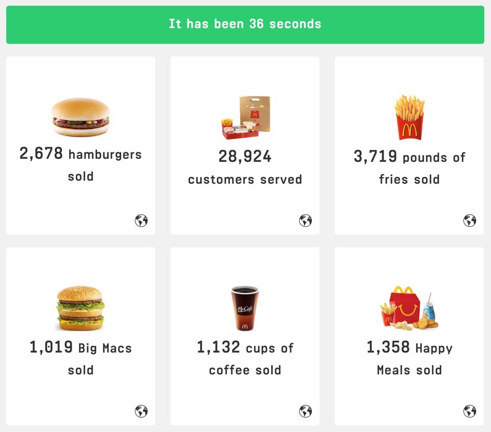
Every Second is a site that keeps track of various things that happen around the world by the second. For instance:
McDonald’s sells ~75 burgers, serves 810 customers, and makes about $800 every second of the day.
On Facebook, each second brings 52,000 new likes, 8500 new comments, and $261 in profit.
Apple sells 6.5 iPhones and handles 460,000 iMessages every second.
In 2016, Taylor Swift earned about $5 every second of the year. (via @daveg)
Older posts




Socials & More