Evolution of the Warner Bros logo
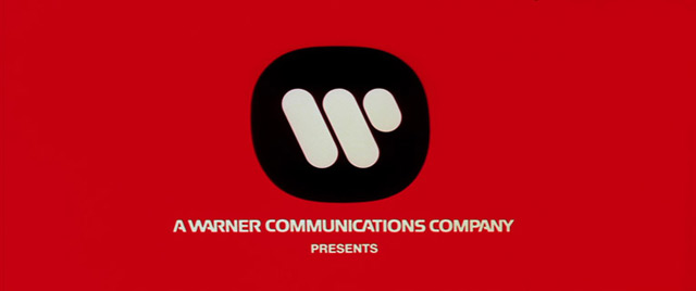
Fine work as usual from Christian Annyas: a look at the design of the Warner Bros logo from 1923 to the present. The classic “WB” shield of my Bugs-and-Daffy-saturated youth will always be a favorite, but I do like the Saul Bass logo of the 70s and early 80s:

Affleck’s Argo and Soderbergh’s Magic Mike both used the Bass logo in place of the contemporary logo, which is the kind of little detail I love.


Socials & More