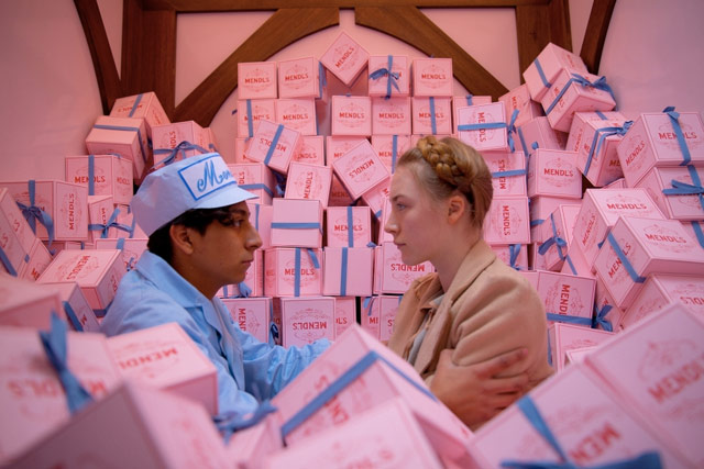
The design of Grand Budapest Hotel

The Grand Budapest Hotel is Wes Anderson’s most design-y film, and that’s really saying something. Typography is present in almost every frame; at times, it was almost oppressive. Creative Review interviewed designer Annie Atkins, who was responsible for the film’s graphic design elements.
Oh my goodness, so many signs in the 1960s hotel lobby! I have to give credit to Liliana for this work, as she took care of nearly all of these. She had three sign-writers from Berlin painting non-stop for a week to get them all done in time for our first day of shoot, as that set was first up. Wes and Adam had seen so many examples of quite officious signage in what had been communist East Germany — don’t do this, don’t do that, do this but only like that! The signs really added to the claustrophobic feeling of that set, and Wes had asked for them all to be black with simple white hand-painted lettering — based on the style of the old sign at Yorckstrasse subway station in Berlin.


Socials & More