kottke.org posts about maps
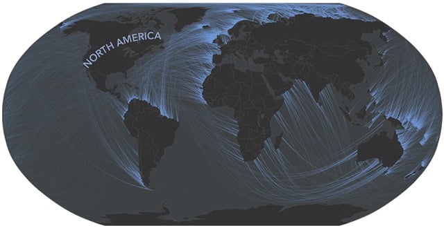
Beyond the Sea is a neat project by Andy Woodruff that visualizes what lies across the ocean from the world’s coastlines. For instance, standing on the coast in North America looking straight out, you might see Brazil or the west coast of Africa, but also the east coast of Africa, India, and even Iran.
In the northern reaches of Newfoundland, near the town of St. Anthony, is the Fox Point Lighthouse. I’ve never been there, but I know it has one of the most impressive ocean views in the world. If you face perpendicular to the right bit of rocky coastline there and gaze straight across the ocean, your mind’s eye peering well beyond the horizon, you can see all the way to Australia.
What’s really across the ocean from you when you look straight out? It’s not always the place you think.
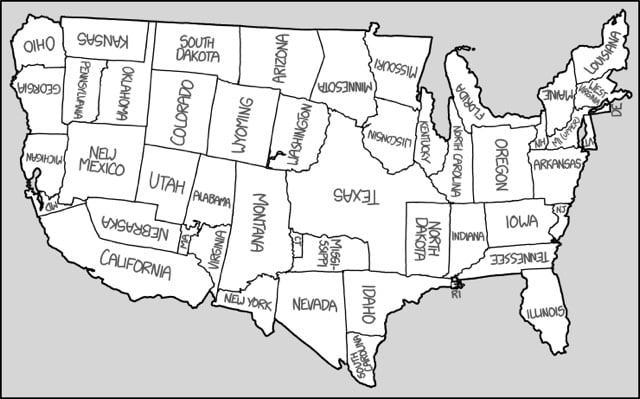
Randall Munroe has made a map of the United States with all of the states in different places but still retaining the same general shape. Particularly clever is the Michigan/Maryland combo to recreate the Bay Area.
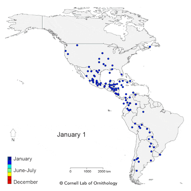
From the Cornell Lab of Ornithology, an animated map of the yearly migratory patterns of 118 bird species in the Western Hemisphere.
La Sorte says a key finding of the study is that bird species that head out over the Atlantic Ocean during fall migration to spend winter in the Caribbean and South America follow a clockwise loop and take a path farther inland on their return journey in the spring. Species that follow this broad pattern include Bobolinks, Yellow and Black-billed cuckoos, Connecticut and Cape May warblers, Bicknell’s Thrush, and shorebirds, such as the American Golden Plover.
“These looped pathways help the birds take advantage of conditions in the atmosphere,” explains La Sorte. “Weaker headwinds and a push from the northeast trade winds as they move farther south make the fall journey a bit easier. The birds take this shorter, more direct route despite the dangers of flying over open-ocean.”
The map was created with data from eBird, a database of crowdsourced bird sightings. They also created a follow-up map which labels each of the species. Look at how far Baird’s Sandpiper (#5) flies…all the way from central Argentina to Northern Canada and back. (thx, kevin)
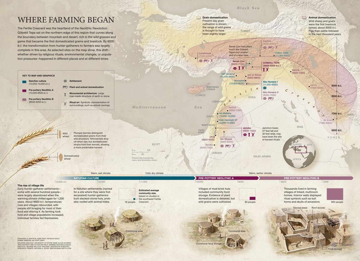
A wonderful map by National Geographic of the Fertile Crescent highlighting where the domestication of grains and livestock first took hold.
I’m currently reading an interesting and provocative book called Sapiens: A Brief History of Humankind by Yuval Noah Harari. He calls the Agricultural Revolution “history’s biggest fraud”.
Rather than heralding a new era of easy living, the Agricultural Revolution left farmers with lives generally more difficult and less satisfying than those of foragers. Hunter-gatherers spent their time in more stimulating and varied ways, and were less in danger of starvation and disease. The Agricultural Revolution certainly enlarged the sum total of food at the disposal of humankind, but the extra food did not translate into a better diet or more leisure. Rather, it translated into population explosions and pampered elites. The average farmer worked harder than the average forager, and got a worse diet in return. The Agricultural Revolution was history’s biggest fraud.
Harari also argues that wheat domesticated humans, not the other way around:
Think for a moment about the Agricultural Revolution from the viewpoint of wheat. Ten thousand years ago wheat was just a wild grass, one of many, confined to a small range in the Middle East. Suddenly, within just a few short millennia, it was growing all over the world. According to the basic evolutionary criteria of survival and reproduction, wheat has become one of the most successful plants in the history of the earth. In areas such as the Great Plains of North America, where not a single wheat stalk grew 10,000 years ago, you can today walk for hundreds upon hundreds of miles without encountering any other plant. Worldwide, wheat covers about 870,000 square miles of the globe’s surface, almost ten times the size of Britain. How did this grass turn from insignificant to ubiquitous?
Wheat did it by manipulating Homo sapiens to its advantage. This ape had been living a fairly comfortable life hunting and gathering until about 10,000 years ago, but then began to invest more and more effort in cultivating wheat. Within a couple of millennia, humans in many parts of the world were doing little from dawn to dusk other than taking care of wheat plants. It wasn’t easy. Wheat demanded a lot of them. Wheat didn’t like rocks and pebbles, so Sapiens broke their backs clearing fields. Wheat didn’t like sharing its space, water and nutrients with other plants, so men and women laboured long days weeding under the scorching sun. Wheat got sick, so Sapiens had to keep a watch out for worms and blight. Wheat was attacked by rabbits and locust swarms, so the farmers built fences and stood guard over the fields. Wheat was thirsty, so humans dug irrigation canals or lugged heavy buckets from the well to water it. Sapiens even collected animal faeces to nourish the ground in which wheat grew.
The body of Homo sapiens had not evolved for such tasks. It was adapted to climbing apple trees and running after gazelles, not to clearing rocks and carrying water buckets. Human spines, knees, necks and arches paid the price. Studies of ancient skeletons indicate that the transition to agriculture brought about a plethora of ailments, such as slipped discs, arthritis and hernias. Moreover, the new agricultural tasks demanded so much time that people were forced to settle permanently next to their wheat fields. This completely changed their way of life. We did not domesticate wheat. It domesticated us. The word ‘domesticate’ comes from the Latin domus, which means ‘house’. Who’s the one living in a house? Not the wheat. It’s the Sapiens.
The book is full of crackling passages like that…and this one:
History is something that very few people have been doing while everyone else was ploughing fields and carrying water buckets.
I am enjoying reading it a lot. (via @CharlesCMann)

If you measure the contours of a river valley with Lidar (like radar with lasers), you get a beautiful map of all the historical river channels. The image above was taken from a poster of the historical channels of the Willamette River…click through to see the whole thing. See also Harold Fisk’s meander maps of the Mississippi River.
Using Neil Freeman’s maps at Fake is the New Real, the Guardian created a quiz: Can you identify the world cities from their ‘naked’ metro maps? As interested as I am in both maps and subways, I did shockingly bad on this quiz. (via @daveg)
Update: Here’s a similar quiz using unlabeled street maps. See also Smarty Pins and GeoGuessr for more geography quiz fun.
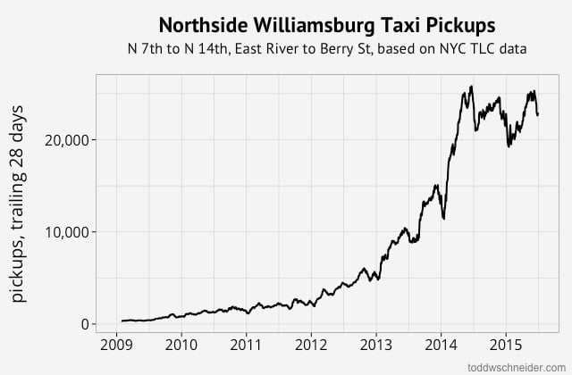
Todd Schneider used a couple publicly available data sets (NYC taxis, Uber) to explore various aspects of how New Yorkers move about the city. Some of the findings include the rise of Uber:
Let’s add Uber into the mix. I live in Brooklyn, and although I sometimes take taxis, an anecdotal review of my credit card statements suggests that I take about four times as many Ubers as I do taxis. It turns out I’m not alone: between June 2014 and June 2015, the number of Uber pickups in Brooklyn grew by 525%! As of June 2015, the most recent data available when I wrote this, Uber accounts for more than twice as many pickups in Brooklyn compared to yellow taxis, and is rapidly approaching the popularity of green taxis.
…the plausibility of Die Hard III’s taxi ride to stop a subway bombing:
In Die Hard: With a Vengeance, John McClane (Willis) and Zeus Carver (Jackson) have to make it from 72nd and Broadway to the Wall Street 2/3 subway station during morning rush hour in less than 30 minutes, or else a bomb will go off. They commandeer a taxi, drive it frantically through Central Park, tailgate an ambulance, and just barely make it in time (of course the bomb goes off anyway…). Thanks to the TLC’s publicly available data, we can finally address audience concerns about the realism of this sequence.
…where “bridge and tunnel” folks go for fun in Manhattan:
The most popular destinations for B&T trips are in Murray Hill, the Meatpacking District, Chelsea, and Midtown.
…the growth of north Williamsburg nightlife:
…the privacy implications of releasing taxi data publicly:
For example, I don’t know who owns one of theses beautiful oceanfront homes on East Hampton’s exclusive Further Lane (exact address redacted to protect the innocent). But I do know the exact Brooklyn Heights location and time from which someone (not necessarily the owner) hailed a cab, rode 106.6 miles, and paid a $400 fare with a credit card, including a $110.50 tip.
as well as average travel times to the city’s airports, where investment bankers live, and how many people pay with cash vs. credit cards. Read the whole thing and if you want to play around with the data yourself, Schneider posted all of his scripts and knowhow on Github.
Update: Using summaries published by the New York City Taxi & Limousine Commission, Schneider takes a look at how taxi usage in NYC is shrinking and how usage of Uber is growing.
This graph will continue to update as the TLC releases additional data, but at the time I wrote this in April 2016, the most recent data shows yellow taxis provided 60,000 fewer trips per day in January 2016 compared to one year earlier, while Uber provided 70,000 more trips per day over the same time horizon.
Although the Uber data only begins in 2015, if we zoom out to 2010, it’s even more apparent that yellow taxis are losing market share.
Lyft began reporting data in April 2015, and expanded aggressively throughout that summer, reaching a peak of 19,000 trips per day in December 2015. Over the following 6 weeks, though, Lyft usage tumbled back down to 11,000 trips per day as of January 2016 — a decline of over 40%.
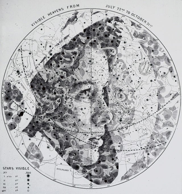
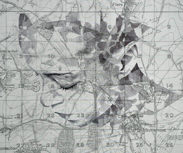
Colossal notes that artist Ed Fairburn has produced a bunch of new work (previously). Love these.
This is an animated map of the lower 48 United States showing every boundary change (country, colony, state, and county) from 1629 to 2000. (via @ptak)
Manhattan is home to many small clusters of businesses around a common theme. For example, the Garment District in the west 30s, the Diamond District on 47th St, and, formerly, the Meatpacking District. Here is a short guide to some of them.
A few weeks ago, as I walked to work in the Flatiron district of Manhattan, I noticed something unusual — not one, not two, but four tile stores, side by side, on 21st Street between Fifth and Sixth Avenue. Strange. Then, I remembered rumors about a magical street in Chelsea populated by dozens of flower nurseries. I already knew of Manhattan’s legendary Garment District. I wondered — how many microdistricts could there be in the city?
(thx, david)
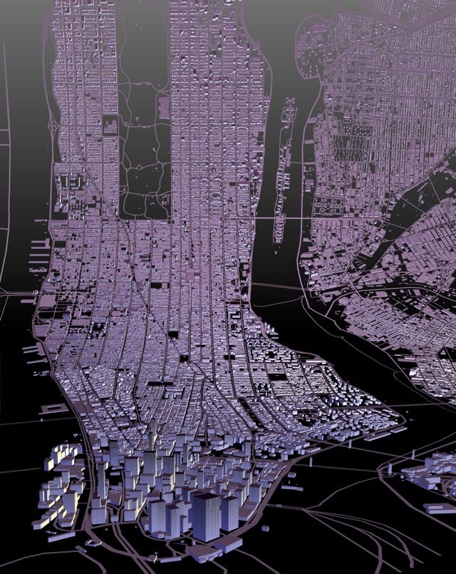
From Mapzen’s exploration of map projections other than the familiar (and often misleading) Mercator, an Inception-style view of Manhattan (or anywhere you want to point the map to…like Paris or London), inspired by Berg’s Here & There project (which I was a fan of, obviously).
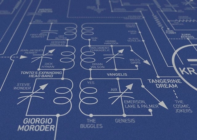
From Dorothy, a beautiful print of the history of electronic music mapped onto the circuit board of a theremin, one of the first electronic instruments.
Our Electric Love Blueprint celebrates over 200 inventors, innovators, composers and musicians who (in our opinion) have been pivotal to the evolution of electronic music from the invention of the earliest known sound recording device in 1857 to the present day. Key pioneers featured include Léon Theremin, Bob Moog, Karlheinz Stockhausen, Brian Eno, Kraftwerk, John Cage, New Order and Aphex Twin.
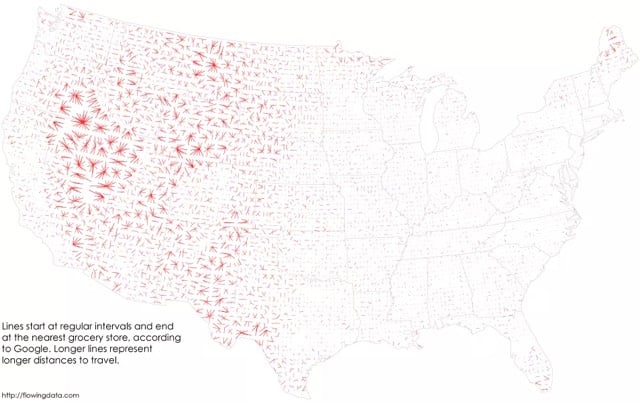
From Nathan Yau at FlowingData, a look at the places in the US where people need to make the longest drives to visit a grocery store.
The nearest grocery store is more than 10 miles away in about 36 percent of the country and the median distance is 7 miles. However, a lot of these areas are rural with few (if any) people who live there.
Wyoming contains very few grocery stores:
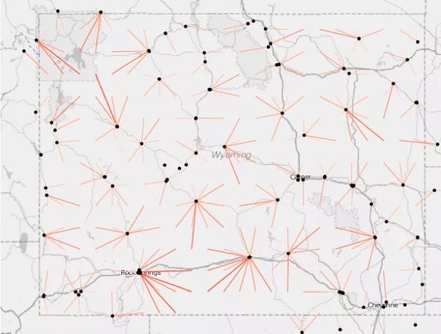
And Nevada is even more of a food desert. Looks like Massachusetts, Delaware, and New Jersey have plenty of grocery stores everywhere. (via feltron)
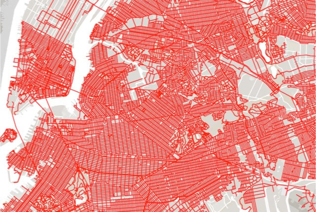
Matt Green plans to walk on every single street in NYC. Of an estimated 8-9000 miles of streets, trails, and paths in the city, he has already covered 7000 miles, including what looks like nearly all of Brooklyn.
I am going to walk every block of every public street in all five boroughs of New York City, excluding only the high-speed expressways and parkways that prohibit pedestrian traffic. I will also walk every bridge with pedestrian facilities, as well as many private streets, multi-use greenway paths, pedestrian paths and trails through parks and cemeteries, boardwalks, and accessible stretches of coastline.
It is my understanding that the total length of all the public streets in NYC is somewhere in excess of 6,000 miles. Add the bridges, private streets, paths, and coastline to that, as well as all the blocks I will end up covering more than once, and I expect to have walked more than 8,000 miles before I’m done.
Matt previously walked across the United States and visited every NYC subway station in one go.
William Helmreich is also attempting to walk every block in the city, and he and Green recently met to compare notes.
That video is wonderful, btw…two curious souls fully engaging with their surroundings. If you click on none of the other links in this post, you should at least watch the video. (thx, mike)
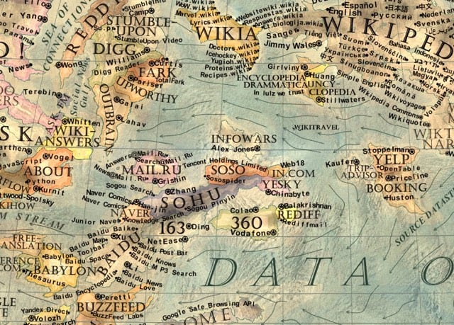
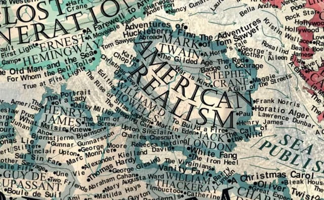
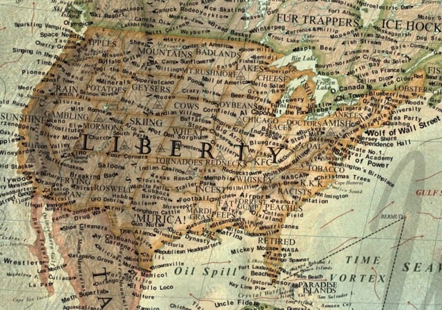
In his upcoming book, Vargic’s Miscellany of Curious Maps, Martin Vargic builds maps of imaginary worlds like the Map of the Internet, the Map of Literature, the Map of Stereotypes, The Music Map, The Map of YouTube, and The Corporate World Map. (via @tcarmody)
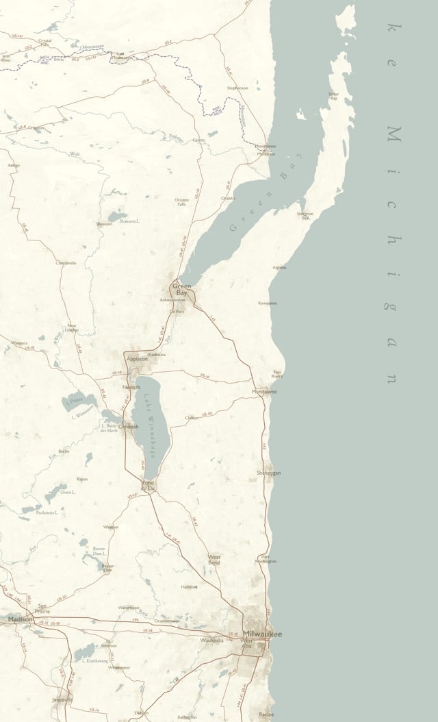
Cartographer Daniel Huffman made a map that imagines the shoreline of Lake Michigan as a straight line. Click through to see the entire map and to read about houw Huffman did it. (thx, mark)
Published in 1987, copies of Volume 1 of The History of Cartography are expensive and difficult to find.1 The subsequent two volumes aren’t much less expensive. So the publisher of the series, The University of Chicago Press, has made PDFs of the books available online for scholars and map enthusiasts to use.
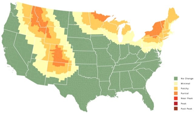
SmokyMountains.com has the best fall foliage map I’ve ever seen. It’s very simply designed and has a slider that lets you check the leaf peeping forecast across the entire US.
P.S. It’s decorative gourd season, motherfuckers.
Brendan O’Connor has sketched a short, poignant, four-dimensional map* of one of Manhattan’s most iconic streets, from the Hudson to the East River, and from 2001 to the present.
There is an idea of New York, and especially of Manhattan, as a place where the wealthy and the less wealthy (and even the not-at-all wealthy!) live in close proximity, even adjacent, to each other, and that this arrangement produces ambition in the latter to attain what the former has, and some amount of respect for the humanity of the latter in the former. This is not just incidental to life here, the thinking goes, but integral to it: Everyone, or almost everyone, suffers the city together.
The story of 14th Street both encapsulates this high-low fantasy and shows how it has been and continues to be erased in favor of something much more lucrative.
[The] High Line is a magnet for more than tourists’ money: According to a study conducted by the New York City Economic Development Corporation, before the park’s construction in 2003, the surrounding West Chelsea neighborhood—a mix of residential properties and light industrial businesses—were valued at eight percent below Manhattan’s overall median. In 2005, the city rezoned West Chelsea for luxury development, and, by 2011, residential property values appreciated beyond borough-wide values. “The park, which will eventually snake through more than twenty blocks, is destroying neighborhoods as it grows,” Jeremiah Moss wrote in the New York Times in 2012. “And it’s doing so by design. While the park began as a grass-roots endeavor—albeit a well-heeled one—it quickly became a tool for the Bloomberg administration’s creation of a new, upscale, corporatized stretch along the West Side.”
*Most street maps lie in at least two ways in order to fit two-dimensional constraints.
- They omit pitch and elevation. This is admittedly a bigger problem in cities like San Francisco than it is in most places, but the experience of walking along any street is shaped by its sloping uphill or downhill, its seat above or below.
- They eliminate the axis of time, which is relegated to real estate transaction documents and local folklore.
Related: The New York Times’ terrific “Reshaping New York” interactive map from 2013.
Bellerby & Co. Globemakers are one of the world’s last remaining makers of globes by hand. Their Instagram account is chock full of their handiwork.

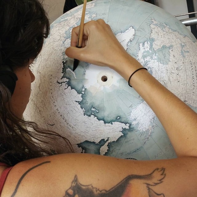
If I could afford it (£2000!), I’d get The Livingstone globe in Prussian blue. Beautiful and wonderful craftsmanship.
Google’s latest project is called Project Sunroof. Sunroof utilizes Google Earth data to estimate the solar energy potential of buildings.
Enter Project Sunroof, my recent 20% project. Project Sunroof is a new online tool we’re testing to help homeowners explore whether they should go solar. Available in the San Francisco Bay Area, Fresno (in central California), and the Boston area for now, the tool uses high-resolution aerial mapping (the same used by Google Earth) to help you calculate your roof’s solar energy potential, without having to climb up any ladders.
If you’re in one of our test regions, simply enter your address and Project Sunroof will crunch the numbers. It first figures out how much sunlight hits your rooftop throughout the year, taking into account factors like roof orientation, shade from trees and nearby buildings, and local weather patterns. You can also enter your typical electric bill amount to customize the results. The tool then combines all this information to estimate the amount you could potentially save with solar panels, and it can help connect you with local solar providers.
Google still has 20% time?
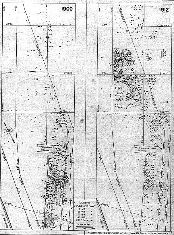
Economist William Easterly and some of his colleagues built a site that focuses on the economic development of a single block in NYC, Greene Street between Houston and Prince. In the past 175 years, use of the block has gone from wealthy residential to sex work to garment manufacturing to artist galleries to luxury retail.
133 Greene Street, for example, has been part of the large Bayard farm, a grand residential home, a brothel, a garment factory, part of a slum, an art gallery, and is today the home of luxury co-op residences and a Dior Homme store.
Many of these shifts took only a decade and could have been very difficult to anticipate.
The site was built to accompany an academic paper on economic development.
By 1870, the Greene Street Block contained 14 brothels, the highest concentration of any block in the City. Just as surprising was the sudden end of prostitution on the block. Brothels still abounded in 1880, but during the next decade entrepreneurs demolished and rebuilt almost the entire block as castiron factories and warehouses, and what was left of the red-light district moved up town.
The site is a little confusing to navigate, but is worth checking out in detail. For instance, check out how quickly the garment manufacturing industry shifted from downtown to the present-day Garment District.
(via wired)
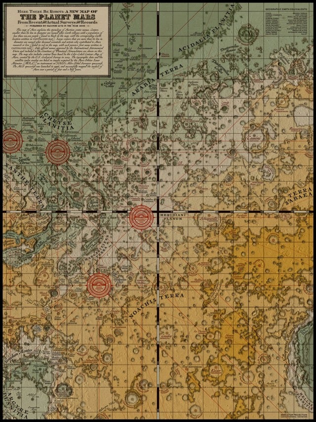
Emily Lakdawalla provides an update on all of the exploration that’s going on in our solar system this month. Here’s a quick map view of the 20+ spacecraft exploring our solar system beyond Earth:
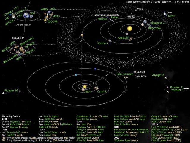
Mars remains the most active spot beyond Earth in the solar system. This week, Mars Reconnaissance Orbiter reaches its 10th anniversary of service in space, but it’s far from the oldest spacecraft in orbit at Mars; Mars Express and Mars Odyssey are still at work up there. Mars Orbiter Mission has ventured into an extended mission and is still returning photos, though apparently none of the full-disk images in a variety of phases that I had hoped for from its 4-Megapixel color camera. Even Mars’ newest resident, MAVEN, is three-quarters of the way through its one-year primary science mission, which began on November 16, 2014. MAVEN’s mission will undoubtedly be extended long beyond that, as it will be needed to support surface missions if and when Odyssey and Mars Reconnaissance Orbiter eventually fail.
Both Opportunity and Curiosity have been very active lately. Opportunity has finally reached Marathon Valley, a site identified from orbit to have signs of clay chemistry. The team is excited about the science prospects even though the rover’s memory problems persist.
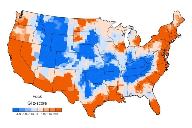
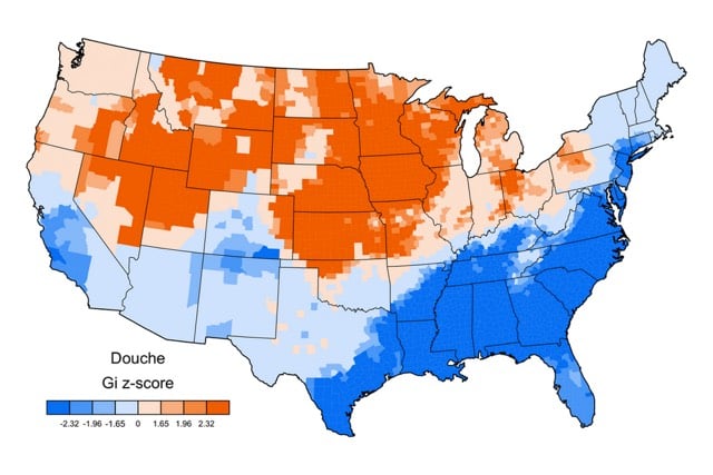
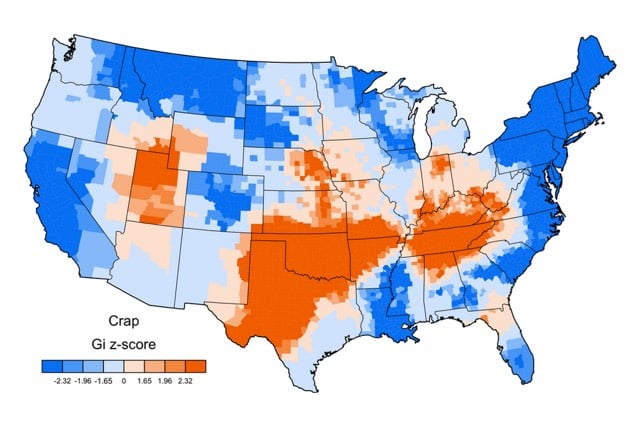
Most everyone in the United States swears, but the specific words used vary by region. For example, “fuck” is popular in California but not so much in Oklahoma, which is the “crap” epicenter of America. “Motherfucker” is unusually popular in Maine, as is “shit” in the Southeast, “douche” in Iowa, and “fuckboy” in Jersey.
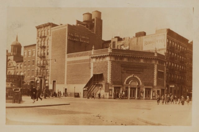
OldNYC offers a map view of old photos of New York City, drawn from the collection at the New York Public Library. This is fantastic, like a historical Google Street View. For instance, there used to be a huge theater on the corner of 7th Avenue and Christopher St, circa 1929:
If I didn’t have a thing to do this afternoon, I would spend all day exploring this. So so good. (via @mccanner)
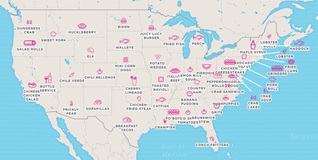
From a Foursquare and Mapbox collaboration, a map of the most popular tastes in each US state.
Every state in the U.S. has a unique flavor, from Chicken Cheesesteak to Chinese Chicken Salad. Foursquare analyzed the data to pinpoint which food or drink is most disproportionately popular in each destination, and worked with Mapbox to create the dynamic map.
Louisiana is crawfish, Vermont is maple syrup, and Texas is breakfast tacos. I love that Nevada is bottle service. All that state wants is to get you drunk in the least fiscally responsible way possible.
A project by Michael Pecirno, Minimal Maps is a collection of US maps that each depict only a single subject with high-resolution data, from deciduous forest cover to cornfields. Here’s where grass grows in the US:
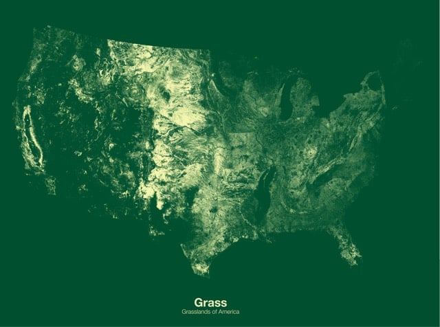
Very little grassland coverage in New England…that’s surprising. Prints are available.
From the David Rumsey Map Collection, a remarkable timeline/history of the world from 4004 BC to 1881 called Adams’ Synchronological Chart. This is just a small bit of it:
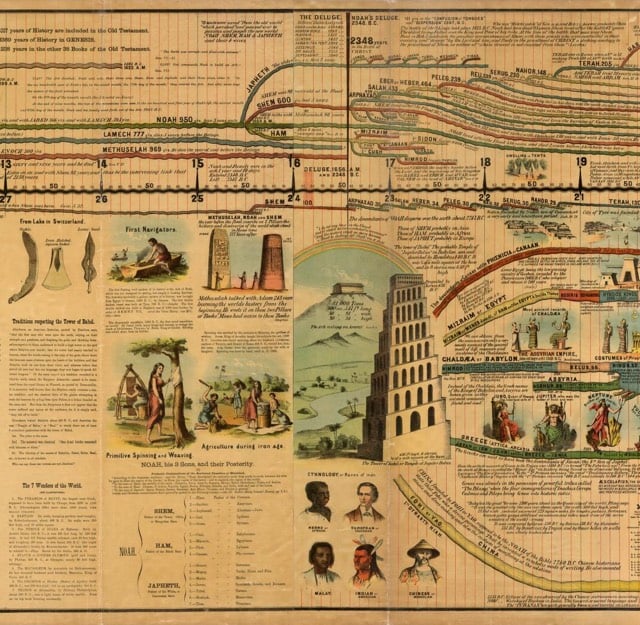
According to Rumsey’s site, the full timeline is more than 22 feet long. (via @john_overholt)
Update: A replica of this chart is available on Amazon in a few different iterations…I’m going to give this one a try. Apparently the charts are popular in Sunday schools and such because the timeline uses the Ussher chronology where the Earth is only 6000 years old.
Newer posts
Older posts
Socials & More