kottke.org posts about maps
This map was compiled using the autocomplete results for “how much does a * cost” for every country in the world.
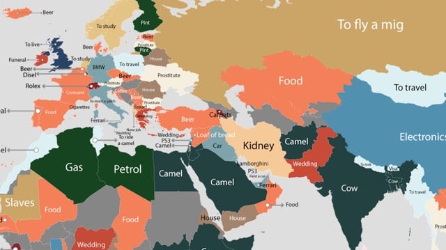
Some notable desires: Mexican tummy tucks, Brazilian prostitutes, Albanian nose jobs, Russian MiGs, Lebanese PS3s, and Japanese watermelons.
See also the desire map of the US.
Ok, April Fools’ is still idiotic, but this is pretty cool: you can play Pac-Man in any neighborhood on Google Maps.
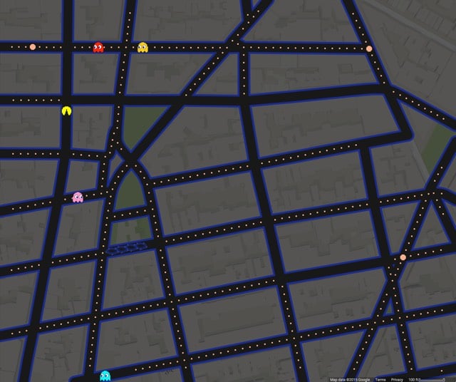
NYC’s West Village is a fun place to play. See also Pac-Manhattan, a real-life game of Pac-Man played on the streets of Manhattan in 2004 by a group of ITP students, including Foursquare CEO Dennis Crowley.
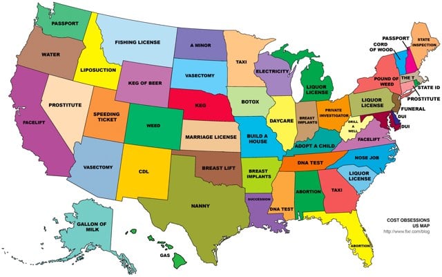
In Alaska, people search for the cost of a gallon of milk. In Alabama and Florida, people search for the cost of abortions. In other states, vasectomies, facelifts, and taxis are popular searches. The map was compiled using the autocomplete results for “how much does a * cost”… for each of the 50 states. (via mr)
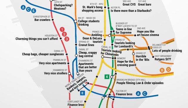
From Thrillist, the real subway map of Manhattan, your one-stop shop for Manhattan neighborhood stereotypes. (via @mkonnikova)
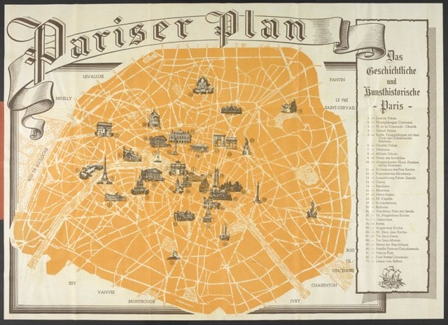
In 1940, Germany published a tourist map of occupied Paris intended for use by German soldiers on leave.
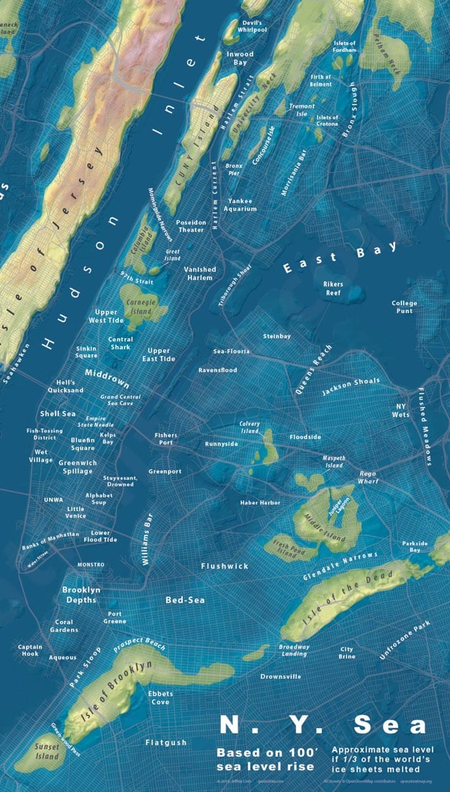
Jeffrey Linn makes maps that show how extreme sea level increase will impact major cities around the globe. Recently he made a map of NYC showing what it would look like if sea levels rose by 100 feet, which is what would happen if a third of the world’s ice sheets melted. So long, most of Manhattan and Brooklyn; hello Coral Gardens, Prospect Beach, and Sunset Island. Prints are available.
See also Linn’s maps of a drowned London, the bay of LA, and islands of Seattle.
National Geographic’s cartographic department celebrates its 100th birthday today. Here’s a look back at their work and some of NG’s most memorable maps.

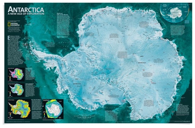
Our family subscribed to National Geographic for awhile when I was a kid. The maps and photos contained within brought this country bumpkin in closer contact with the world at large than even the TV news (which was admittedly all of 13-inches and in B&W to boot).
A bit late for today, but for future snow day reference, here’s a crowdsourced map of good places to go sledding in NYC.
(via @alainabrowne)
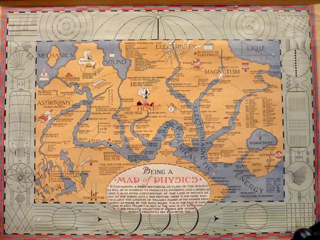
A map published by Bernard Porter in 1939 depicting physics as a landmass through which several rivers corresponding to the main branches (light, sound, heat, etc.) run and converge into one.
Here’s a map showing when slavery was abolished in North and South America:
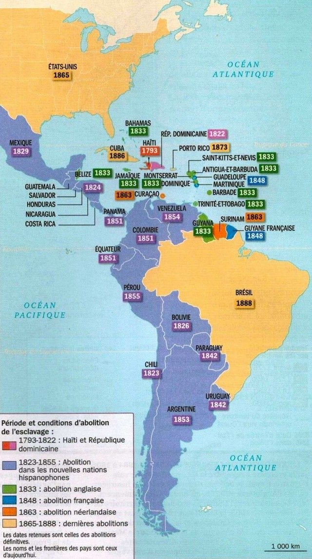
Surprising, right? Along with Cuba, Brazil, and Puerto Rico, the United States was among the last nations in the Americas to abolish slavery. Americans like to think of ourselves as freedom-loving, progressive, and more “evolved” than other countries, particularly those in the “third world” (what a loaded term that is), but this map shows differently.
It’s tempting to dismiss American attitudes toward slavery as something that happened long ago. Except for, you know, the whole Civil Rights Movement and the ongoing racism against African Americans in the US. And there are also many respects in which the US is currently less free, less progressive, and less evolved than some less industrialized nations, e.g. on things like gun control, murder rate, use of the death penalty, prison population, healthcare, and anti-science views (evolution, vaccines). So maybe the lag in abolishing slavery shouldn’t be so surprising, particularly because it was so lucrative and the only thing Americans have historically cared more about than freedom is money. (via civil war memory)
Today I learned that the US government considers the US border as extending 100 miles into the country. This means that states like Maine, Michigan, and Florida are entirely within the border area and 2/3 of the US population lives within the border.
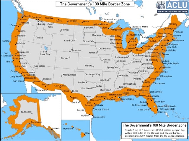
The problem with this, from the standpoint of the ACLU, is that Border Patrol agents have “certain extra-Constitutional powers” within this area and “routinely” overstep their bounds and violate the constitutional rights of innocent people.
See also 35 maps that explain how America is a nation of immigrants. (via @tcarmody)
Update: So, as you may know, I am not a Constitutional lawyer or even a regular lawyer. The ACLU presumably employs and/or utilizes experts on Constitutional and immigration law. But they have a viewpoint, right? They are interested in the civil liberties of individual Americans. Anyway, Scott Bomboy of the National Constitution Center (who is also not a lawyer), notes that the US has a couple of different ideas of what a border is and what can be done at or within each kind of border is slightly different.
Legally, the 100-mile-wide region is called the “extended border” of the U.S., as defined by Title 8 of the Federal Code of Regulations. There is also something called the “functional equivalent” border, which is the area around international airports in the interior region of the U.S.
The DHS ruling from last Friday said its “warrantless searches” applied to the U.S. “border and its functional equivalent,” with no mention of the extended 100-mile border.
Two analysis papers from the Congressional Research Service from 2009 offer some legal insight into what tactics agents can follow within the 100-mile-wide extended border, and why the distinction between the extended border and the other two borders is important.
Searches within the 100-mile extended border zone, and outside of the immediate border-stop location, must meet three criteria: a person must have recently crossed a border; an agent should know that the object of a search hasn’t changed; and that “reasonable suspicion” of a criminal activity must exist, says the CRS. (The service had done the legal analyses to prepare Congress members for legislation.)
“Although a search at the border’s functional equivalent and an extended border search require similar elements, the extended border search entails a potentially greater intrusion on a legitimate expectation of privacy. Thus, an extended border search always requires a showing of ‘reasonable suspicion’ of criminal activity, while a search at the functional equivalent of the border may not require any degree of suspicion whatsoever,” the CRS says.
In November of 2014, This American Life aired a piece on several people who record on video their interactions with Border Patrol agents at inland checkpoints.
So if you haven’t spent much time in the Southwest, you might not know about this. But there are these Border Patrol checkpoints that are just like in the middle of highway interstates and other roads, not at the border, not even near the border. They’re as far as 100 miles from the border.
There are dozens of these interior or inland checkpoints across the country. They’re mostly in California, Arizona, New Mexico, and Texas. But now there are a couple in Vermont, New Hampshire, and Washington state. You know that you’re approaching one of these checkpoints, because the speed limit will suddenly drop to 45 miles an hour and then 25. You’ll slow down, and you stop, you see these orange cones coming up. And then often there’s this big sort of tent-looking structure, like, right in the middle of the highway.
And then you stop, and you’re right in the middle of the highway. And an agent in uniform, an armed agent walks up and asks you questions like, are you an American citizen? Sometimes he asks to look in your trunk. All this so they can catch undocumented immigrants and drug smugglers.
I’ve been through one of these checkpoints in VT, about 40-50 miles from the Canadian border, and hey, these checkpoints really make you feel like a criminal…like if you seem nervous they’re going to pull you over and detain you because you seem like you’ve done something wrong. And that’s what the ACLU is concerned about: Border Agents routinely treating law-abiding US citizens as criminals far from their true areas of jurisdiction. Again from This American Life, one guy got his car window broken at a checkpoint because he did not want to cooperate with the agents:
Violence like this doesn’t happen a lot in these videos, but it does happen. Agents also broke the window of that pastor I mentioned earlier, Steven Anderson. They tased him and bloodied his face.
In Robert’s case, he says the agents seized his cameras, put him in handcuffs, drove him far away to a holding cell, and detained him for hours. Then they drove them even farther away to El Cajon, California, let him out late at night at a bus station, and drove off.
You can watch the video here:
The glass is broken at ~11:00. (thx, @harryh & martha)
From eHistory, a time lapse view from 1776 to the present day of how the US government systematically took land from Native Americans through treaties and executive orders that were rarely honored for long.
There’s a companion piece at Aeon by Claudio Saunt as well as an interactive version of the map featured in the video.
The final assault on indigenous land tenure, lasting roughly from the mid-19th century to 1890, was rapid and murderous. (In the 20th century, the fight moved from the battlefield to the courts, where it continues to this day.) After John Sutter discovered gold in California’s Central Valley in 1848, colonists launched slaving expeditions against native peoples in the region. ‘That a war of extermination will continue to be waged between races, until the Indian race becomes extinct, must be expected,’ the state’s first governor instructed the legislature in 1851.
In the Great Plains, the US Army conducted a war of attrition, with success measured in the quantity of tipis burned, food supplies destroyed, and horse herds slaughtered. The result was a series of massacres: the Bear River Massacre in southern Idaho (1863), the Sand Creek Massacre in eastern Colorado (1864), the Washita Massacre in western Oklahoma (1868), and a host of others. In Florida in the 1850s, US troops waded through the Everglades in pursuit of the last holdouts among the Seminole peoples, who had once controlled much of the Florida peninsula. In short, in the mid-19th century, Americans were still fighting to reduce if not to eliminate the continent’s original residents.
FYI, it’s always a good rule of thumb to not read comments on YouTube, but in this case you really really shouldn’t read the comments on this video unless you want a bunch of reasons why it was ok for Europeans to drive Native Americans to the brink of total genocide.
A project called Maximum Distance. Minimum Displacement. analyzed the lyrics of several popular rappers for geographical mentions and had an industrial robot draw each rapper’s lyrical journey through the world. At a glance, you can see how worldly (N***as in Paris) or locally oriented (Straight Outta Compton) each rapper is. Compare world-traveller Jay Z:

with Kendrick Lamar:

Kendrick Lamar’s analysis is culled from the lyrics of his underground & independent albums and is heavy with Compton references. Over the next few years it will be interesting to see how mainstream successes and personal experience change the travel of his lyrics.
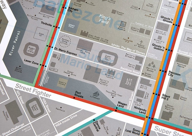
The Game Map from Dorothy is a street map made up of references to more than 500 video games.
The imaginary map is loosely based on an area of Tokyo, a city that was home to some of the all time classic arcade games of the late 1970’s and early 1980’s that paved the way for the modern day gaming industry. The map features districts dedicated to survival horror (Silent Hill, Resident Evil, Sweet Home), beat ‘em ups (Street fighter, Streets of Rage, Double Dragon) and Nintendo classics (Super Mario Kart, Donkey Kong Land, Luigi’s Mansion) as well as many geeky ‘in’ references to entertain the most hardcore (or the oldest) of gamers.
Great piece about The Knowledge, the collection of geographical information that all London taxi drivers must learn before becoming a cabbie.
The guidebook issued to prospective cabbies by London Taxi and Private Hire (LTPH), which oversees the test, summarizes the task like this:
To achieve the required standard to be licensed as an “All London” taxi driver you will need a thorough knowledge, primarily, of the area within a six-mile radius of Charing Cross. You will need to know: all the streets; housing estates; parks and open spaces; government offices and departments; financial and commercial centres; diplomatic premises; town halls; registry offices; hospitals; places of worship; sports stadiums and leisure centres; airline offices; stations; hotels; clubs; theatres; cinemas; museums; art galleries; schools; colleges and universities; police stations and headquarters buildings; civil, criminal and coroner’s courts; prisons; and places of interest to tourists. In fact, anywhere a taxi passenger might ask to be taken.
If anything, this description understates the case. The six-mile radius from Charing Cross, the putative center-point of London marked by an equestrian statue of King Charles I, takes in some 25,000 streets. London cabbies need to know all of those streets, and how to drive them — the direction they run, which are one-way, which are dead ends, where to enter and exit traffic circles, and so on. But cabbies also need to know everything on the streets. Examiners may ask a would-be cabby to identify the location of any restaurant in London. Any pub, any shop, any landmark, no matter how small or obscure — all are fair game. Test-takers have been asked to name the whereabouts of flower stands, of laundromats, of commemorative plaques. One taxi driver told me that he was asked the location of a statue, just a foot tall, depicting two mice sharing a piece of cheese. It’s on the facade of a building in Philpot Lane, on the corner of Eastcheap, not far from London Bridge.
The goal is to install a complete map of London in the brain of every licensed taxi driver. And indeed, according to neuroscientist Eleanor Maguire, the part of the brain responsible for memory becomes physically bigger as The Knowledge is absorbed.
Seeing, for a Knowledge candidate, is everything — at its heart, the Knowledge is an elaborate exercise in visualization. When McCabe called-over, he closed his eyes and toggled between views: picturing the city at street level, the roads rolling out in front of him as if in a movie, then pulling the camera back to take in the bird’s eye perspective, scanning the London map. Knowledge boys speak of a Eureka moment when, after months or years of doggedly assembling the London puzzle, the fuzziness recedes and the city snaps into focus, the great morass of streets suddenly appearing as an intelligible whole. McCabe was startled not just by that macroview, but by the minute details he was able to retain. “I can pull a tiny little art studio just from the color of the door, and where it’s got a lamppost outside. Your brain just remembers silly things, you know?”
I could go on and on…I loved this piece. Don’t miss the video of a prospective cabbie calling out the route he would use to go from Rotherhithe Station to the Natural History Museum, entirely from memory without looking at a map. Compare with Google’s driving directions.
Update: View From the Mirror is a blog written by a London cabbie, which includes his experience training for The Knowledge. (thx, bryan)
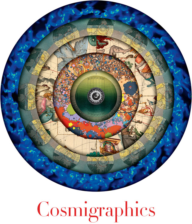
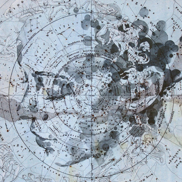
From Michael Benson comes Cosmigraphics, a survey of many ways in which humans have represented the Universe, from antiquity on up to the present day.
Selecting artful and profound illustrations and maps, many hidden away in the world’s great science libraries and virtually unknown today, he chronicles more than 1,000 years of humanity’s ever-expanding understanding of the size and shape of space itself. He shows how the invention of the telescope inspired visions of unimaginably distant places and explains why today we turn to supercomputer simulations to reveal deeper truths about space-time.
The NY Times has an adaptation of the introduction to the book.
Among the narrative threads woven into the book are the 18th-century visual meditations on the possible design of the Milky Way - including the astonishing work of the undeservedly obscure English astronomer Thomas Wright, who in 1750 reasoned his way to (and illustrated) the flattened-disk form of our galaxy. In a book stuffed with exquisite mezzotint plates, Wright also conceived of another revolutionary concept: a multigalaxy cosmos. All of this a quarter-century before the American Revolution, at a time when the Milky Way was thought to constitute the entirety of the universe.
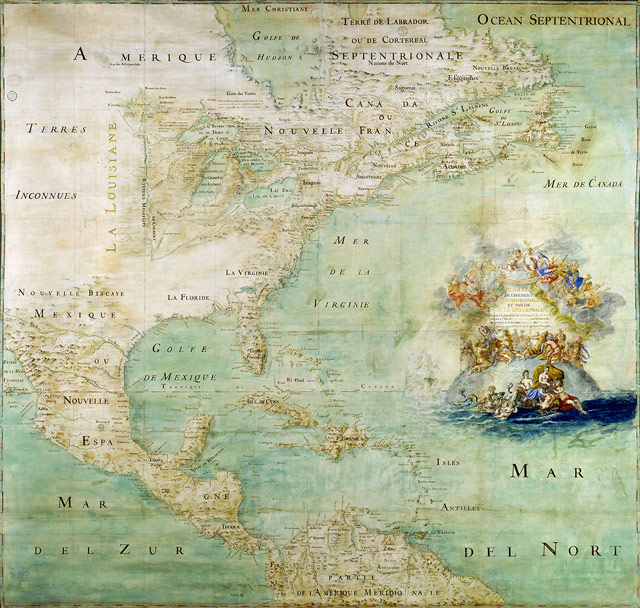
Like it says on the tin: a collection of Beautiful Maps. I wish there was some attribution attached to each map though. The map above is by Claude Bernou circa 1681. (via @khoi)
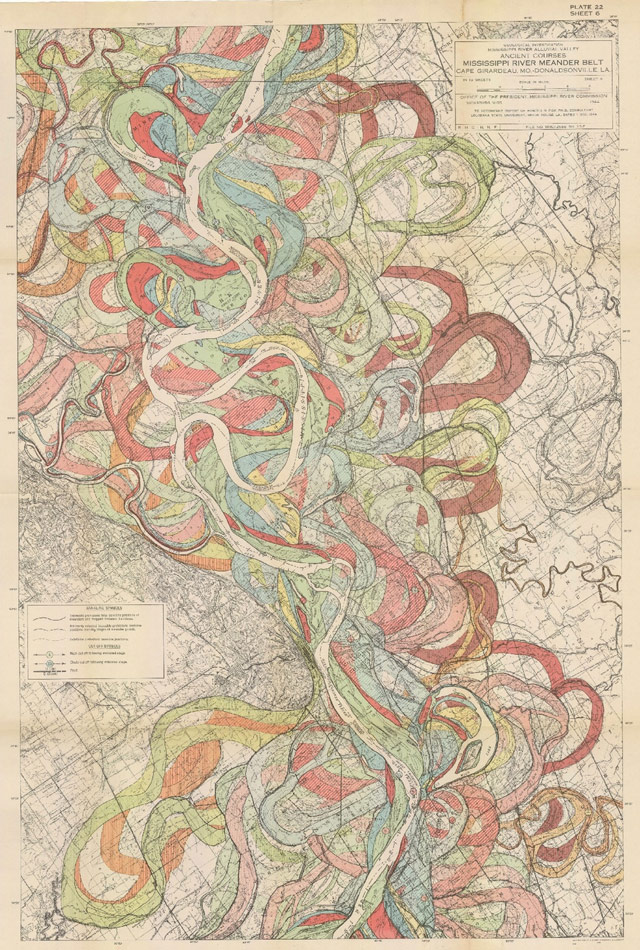
Bill Rankin of radicalcartography picks his five favorite maps. The historical meanderings of the Mississippi River map from an Army Corps of Engineers report is a favorite of mine too:
If you’re thinking of switching mobile carriers (b/c perhaps a certain fruit company is releasing new models), you should check Sensorly for “unbiased” coverage maps of AT&T, Verizon, T-Mobile, Sprint, and even smaller companies like Metro PCS and US Cellular. Looks like the maps are somewhat inaccurate because they rely on contributions only from Sensorly app users. For example, there are large swaths of upper Manhattan and the Bronx which show coverage only along major roads. But still helpful to use beside the companies’ official coverage maps. (via @ludacrisofficia)
Update: Rootmetrics also has coverage maps for the major carriers. (via @ropiku)
In August, the open source mapping project OpenStreetMap turned 10 years old.
When the project was begun by Steve Coast in 2004, map data sources were few, and largely controlled by a small collection of private and governmental players. The scarcity of map data ensured that it remained both expensive and highly restrictive, and no one but the largest navigation companies could use map data. Steve changed the rules by creating a wiki-like resource of the entire globe, which everyone could use without hinderance.
The magic of OSM’s early success was not just its timeliness — GPS was becoming affordable, storage was increasingly cheap, and the iPhone was around the corner — but its provision of a read-write canvas where emerging mapping enthusiasts could convert their frustration into action. Maps, of course, are intimately personal, but also overtly political: as a true, citizens’ map of the world, OSM could address that particular paradox — no longer were mapping resources allocated by revenue potential; instead, all one needed was time and a computer connection to add data about their country or their neighborhood.
As you can see, from a fledgling project, a rich collection of data has taken shape:
Still my favorite use of OSM: Stamen’s watercolor maps. Happy birthday, old thing.
Let’s say you have latitude/longitude coordinates of 40.742041, -73.989579 (my current location). How precise are those 6 digits after the decimal point? Well, five decimal places will get you to within a meter and six will get you to within 11 cm:
The fifth decimal place is worth up to 1.1 m: it distinguish trees from each other. Accuracy to this level with commercial GPS units can only be achieved with differential correction.
The sixth decimal place is worth up to 0.11 m: you can use this for laying out structures in detail, for designing landscapes, building roads. It should be more than good enough for tracking movements of glaciers and rivers. This can be achieved by taking painstaking measures with GPS, such as differentially corrected GPS.
(via teendrama)
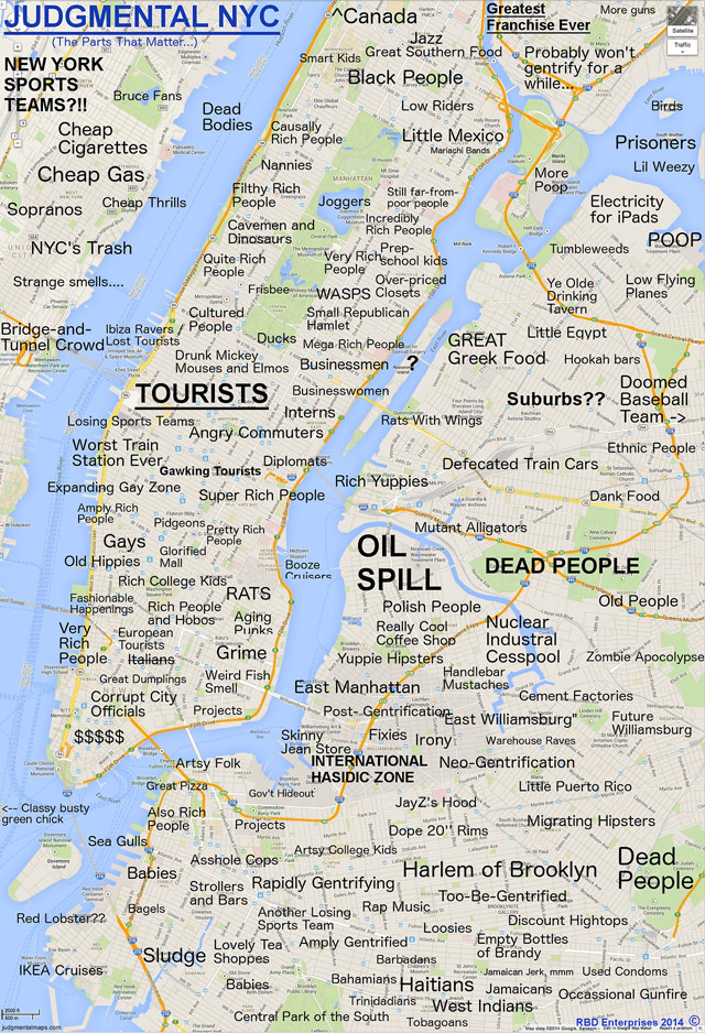
Tumblr of maps of cities with stereotypical labels. For example, NYC, land of Nuclear Industrial Cesspool, Asshole Cops, and Worst Train Station Ever.
(via subtraction)
If the continent of Westeros from Game of Thrones had rail service, this is what the transit map might look like. Here’s the King’s Landing transport hub:
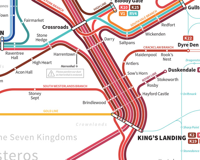
The maps are the work of designer Michael Tyznik and are available as prints: Westeros and The Known World.
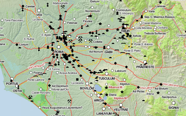
The Digital Atlas of the Roman Empire lets you explore ancient Rome in a Google Maps interface. (via @pbump)
Update: From Vox, 40 Maps That Explain the Roman Empire.
Two thousand years ago, on August 19, 14 AD, Caesar Augustus died. He was Rome’s first emperor, having won a civil war more than 40 years earlier that transformed the dysfunctional Roman Republic into an empire. Under Augustus and his successors, the empire experienced 200 years of relative peace and prosperity. Here are 40 maps that explain the Roman Empire — its rise and fall, its culture and economy, and how it laid the foundations of the modern world.
The Utrecht University Library tells the story of a 1606 edition of Gerard Mercator’s Atlas sive Cosmographicae Meditationes… that was, um, less than perfectly prepared:
In the Utrecht copy shown here the map of Cyprus has been included twice. One time at the right place at the description of the island, and one time incorrectly at the description of Cuba! To err is human, also when making an atlas. In this case the printer used the wrong copperplate when printing the map on the overleaf of the text pages which had been made earlier via another technique, namely letterpress printing. Or a mistake must have been made during the collection of the map prints needed, if the texts had to be printed afterwards. The latter way of working was quite unusual however. As far as we know, only the Utrecht copy contains the mistake of the switched Cuba-Cyprus map. But that is not to say that incorrect placements and switched maps did not occur in other old atlases. In a copy of the same edition of Mercator’s atlas, housed in the University Library of Odense, the continent map of Africa has been switched with the one of America.
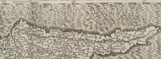
Mercator (of projection fame) had died in 1594. His Atlas the first “book work with maps (1585-1595) which was given the name Atlas,” and popularized the term, but Abraham Ortelius’s “Theatrum Orbis Terrarum” in 1570 was probably the first book we’d recognize as a modern atlas. Mercator wanted to bring scholarly, scientific precision to the work that Ortelius and a generation of mostly-Dutch commercial mapmakers had pioneered.
But the atlas was unfinished, with only 79 of a planned 120 published, and another 34 complete. There were no maps of continents outside Europe, or even of Spain and Portugal. Mercator’s son Gerard Jr. sold his father’s copperplates, and they eventually ended up in the hands of cartographer Jodocus Hondius. Hondius assembled and augmented Mercator’s maps, adding four maps of Africa, eleven of Asia, and five of the Americas, plus correcting that pesky Iberian peninsula problem. He published them as a series, they became hugely popular, and Mercator’s reputation was restored.
But there is that one weird Utrecht edition with Cyprus standing in for Cuba and Africa for America. Still, in fairness to whoever switched the bookplates: they had probably never seen images of any of these places before.
(via @marcovanegmond by way of @burritojustice)
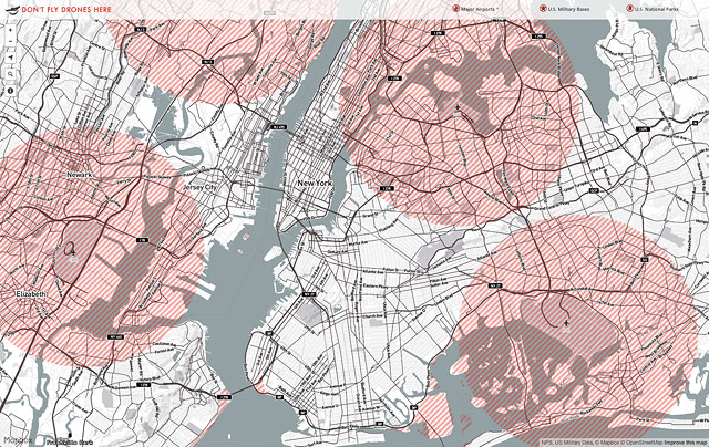
From Mapbox, a map of places in the US where it is unsafe or illegal to fly drones. Forbidden areas include near airports and in National Parks. (via @tcarmody)
Smarty Pins is a Google Maps-based geography quiz…you drop pins on the map to answer questions. You start with a total of 1000 miles and the game subtracts the number of miles you’re off by for each answer.
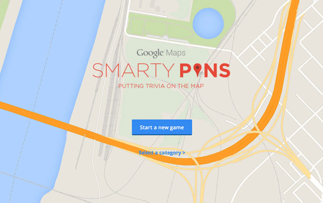
I just spent far too long playing this. Can you beat my score of 39? Also, this reminds me of GeoGuessr, which is a lot more difficult.
This map showing where lighting strikes are happening right now is kind of great:
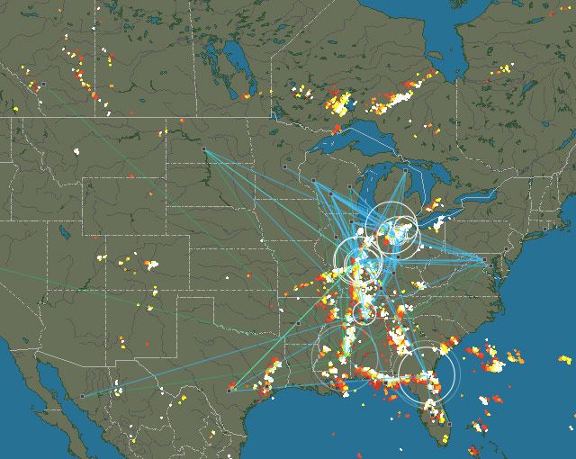
Average delay is about 3-5 seconds. Make sure you turn the sound up too. That’s the North American map…there are also maps for Europe, Asia, Australia, and South America, although only NA, Europe, and Australia seem to have detectors in place.
The detection system is volunteer community effort. Anyone who wants to can buy a detection kit (for around 200 Euro) and hook it up to the Internet to provide strike data. In turn, the data collected from stations is made available to any station owner. See also the wind map of the Earth and the realtime map of global ocean currents.
Newer posts
Older posts
Socials & More