kottke.org posts about maps
What’s your best guess without looking: How many US states are at least partially north of the southernmost part of Canada?
…
(It’s probably way more than you think.)
…
Ok, I’ll give you two hints…
1. Wyoming is almost *entirely* north of the southernmost point in Canada.
…
2. Part of a state that borders Mexico is north of the southernmost point in Canada.
…
One more big hint: more than 25% of US states are entirely north of Canada’s southernmost point.
So, here’s the answer:
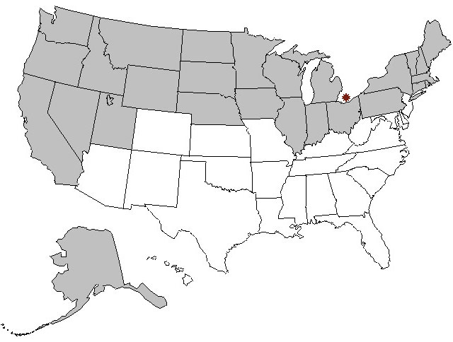
27 US states, more than half, are at least partially north of Canada’s southernmost point. (via @stevenstrogatz)
From the NY Times’ new site, The Upshot, a bunch of maps showing the borders of baseball team fandom, with close-ups of various dividing lines: the Munson-Nixon Line, The Molitor Line, The Reagan-Nixon Line, and the Morgan-Ripken Line.
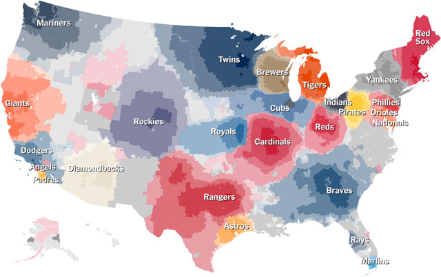
The NYC and Bay Area maps are so sad…the Mets and A’s get no love. (via @atotalmonet)
Using Google Earth, dialect coach Andrew Jack gives a tour of the accents of Great Britain and Ireland.
The audio is originally from this BBC program. See also Peter Sellers doing various English accents. (via devour)
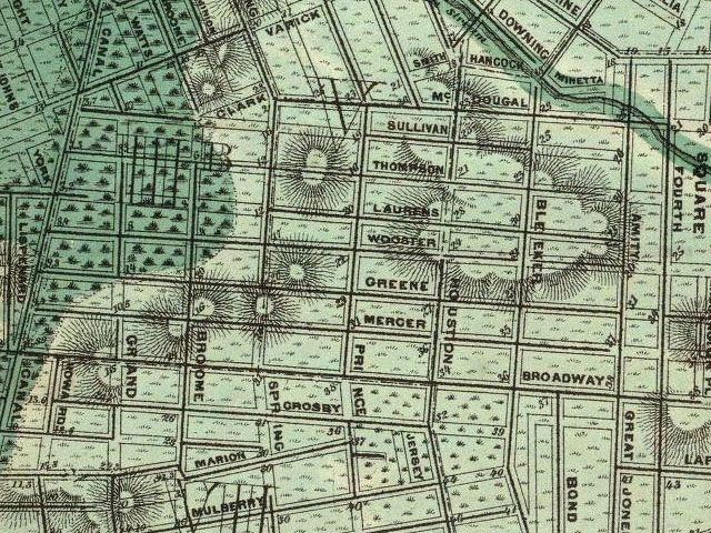
Last week, the New York Public Library released a massive collection of maps online…over 20,000 maps are available for high-resolution download. An incredible resource.
Ben Sack makes these amazingly detailed maps of cities, all drawn by hand.
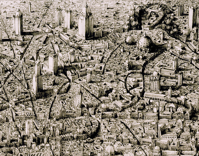
And just so you can get a sense of how large these drawings are:
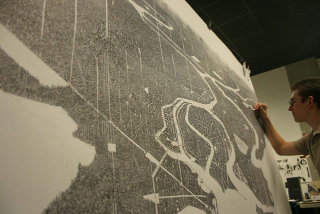
Here’s a peek at his process:
Reminiscent of Stephen Wiltshire’s work. And every time I see something like this, I think about when I went to the Met a few years ago and noticed the sketchbook of this guy working the membership desk. It was filled with beautifully intricate drawings of NYC-style city streets. I chatted with him about them briefly, but I wish I’d asked if he had put any of it online. Would have been neat to share his drawings with you. (via waxy)
From Retronaut, a collection of maps dating from 1000-1300s.
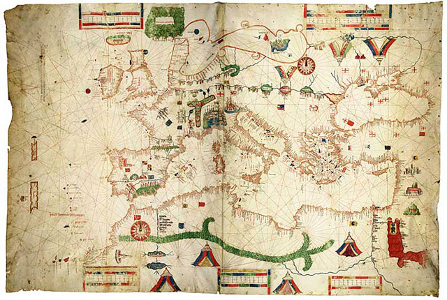
How were maps perceived 1000 years ago? Did they blow people’s minds with physically impossible views of cities, states, and continents? Could a circa-1200 scholar imagine himself looking down from several miles in the air and seeing the same thing he was seeing on a map?
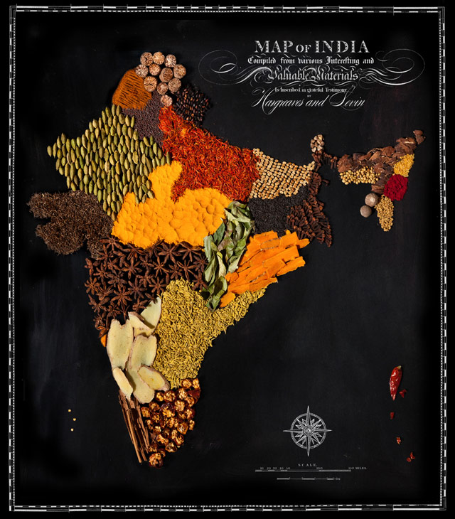
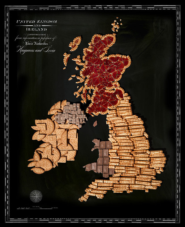
Henry Hargreaves and Caitlin Levin favor food as a medium for creating art. Their country maps made from native foods were cute at first glance, but in many cases the maps also reveal a link between a country’s food and its culture that I’d never really thought about before. For instance, the maps of India and British Isles feel very representative of their respective cultures to me:
It’s only around 30 seconds long, but this video showing a standard web maps interface paired with satellite video is pretty mindblowing:
This quick shot by Skybox’s SkySat-1 shows multiple planes landing at Beijing Capital International Airport (PEK) airport in Beijing on December 30, 2013. You can easily see a large plane landing on the runway at right. Using the video’s timestamp and public flight logs, Bruno identified this plane as Air China Limited flight 1310, a wide-body Airbus 330 flying from Guangzhou to Beijing. Operating as a codeshare, that flight was also listed as Shenzhen Airlines 1310, United Airlines 7564, SAS 9510, Austrian 8010 and Lufthansa 7283.
I remember when satellite photography first became available in online maps; this feels similarly jawdropping. Gonna be more difficult to stitch video together into seamless interfaces than still images, but once it happens, it’ll prove quite useful.
Stefano Maggiolo made a map of how much the time zones of the world vary from solar time. The darker the color, the more the deviation.
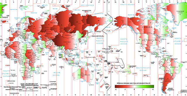
Looking for other regions of the world having the same peculiarity of Spain, I edited a world map from Wikipedia to show the difference between solar and standard time. It turns out, there are many places where the sun rises and sets late in the day, like in Spain, but not a lot where it is very early (highlighted in red and green in the map, respectively). Most of Russia is heavily red, but mostly in zones with very scarce population; the exception is St. Petersburg, with a discrepancy of two hours, but the effect on time is mitigated by the high latitude. The most extreme example of Spain-like time is western China: the difference reaches three hours against solar time. For example, today the sun rises there at 10:15 and sets at 19:45, and solar noon is at 15:01.
Something to note: China is about as big across as the continental United States and has only one huge time zone. (via slate)
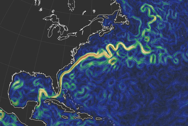
To go along with his wind map of the Earth, Cameron Beccario has made a world map of global ocean currents with data that updates every five days or so. Not quite realtime, but still, er, current enough.
From the Washington Post, an interesting collection of 80 maps (in two parts: one and two) that explain the world and how it works. One of my favorites is this map of actual European discoveries of land previously unknown by humans.
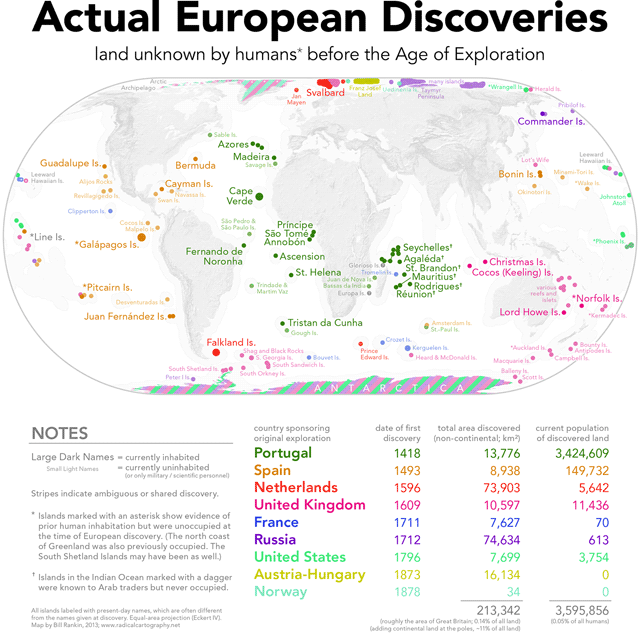
Antarctica is all stripey on that map and I realized I didn’t know who had first clapped their peepers on the only continent discovered in the last millennia, so I did some reading on the subject. From the Holy Book of Wikipedia:
The first land south of the parallel 60° south latitude was discovered by the Englishman William Smith, who sighted Livingston Island on 19 February 1819. A few months later Smith returned to explore the other islands of the South Shetlands archipelago, landed on King George Island, and claimed the new territories for Britain.
In the meantime, the Spanish Navy ship San Telmo sank in September 1819 when trying to cross Cape Horn. Parts of her wreckage were found months later by sealers on the north coast of Livingston Island (South Shetlands). It is unknown if some survivor managed to be the first setting foot on these Antarctic islands.
The first confirmed sighting of mainland Antarctica cannot be accurately attributed to one single person. It can, however, be narrowed down to three individuals. According to various sources, three men all sighted the ice shelf or the continent within days or months of each other: von Bellingshausen, a captain in the Russian Imperial Navy; Edward Bransfield, a captain in the British navy; and Nathaniel Palmer, an American sealer out of Stonington, Connecticut. It is certain that the expedition, led by von Bellingshausen and Lazarev on the ships Vostok and Mirny, reached a point within 32 km (20 mi) from Princess Martha Coast and recorded the sight of an ice shelf at 69°21′28″S 2°14′50″W that became known as the Fimbul ice shelf. On 30 January 1820, Bransfield sighted Trinity Peninsula, the northernmost point of the Antarctic mainland, while Palmer sighted the mainland in the area south of Trinity Peninsula in November 1820. Von Bellingshausen’s expedition also discovered Peter I Island and Alexander I Island, the first islands to be discovered south of the circle.
(via @daveg)
Buzzfeed asked some Brits to label states on a US map. They didn’t do so well:
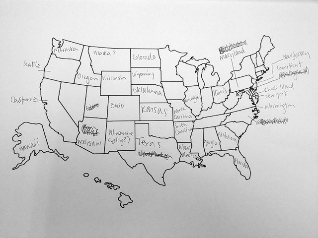
My favorite is “Further South Dakota”. In fairness, most US citizens would be hard pressed to name any of the counties of England, much less place them on a map.
Update: See how Americans fared on placing European countries. (Not well.)
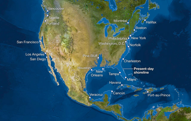
If all the glaciers and snow and ice in the world melted, the sea level would rise 216 feet and, as this National Geographic map of the world shows, things would look a little different.
There are more than five million cubic miles of ice on Earth, and some scientists say it would take more than 5,000 years to melt it all. If we continue adding carbon to the atmosphere, we’ll very likely create an ice-free planet, with an average temperature of perhaps 80 degrees Fahrenheit instead of the current 58.
See also Flood Maps.
Sadly, most infographics these days look like this, functioning as a cheap and easy way to gussy up numbers. But when done properly, infographics are very effective in communicating a lot of information in a short period of time and can help you see data in new ways. In The Best American Infographics 2013, Gareth Cook collects some of the best ones from over the past year. Wired has a look at some of the selections.
A 7-minute time lapse video of the European front line changes during World War II, from the invasion of Poland to (spoilers!) the surrender of Germany.
Surprising to me how much of the war involves no shifting front lines…the map view really emphasizes this in a way that other WWII narratives do not. (via open culture)
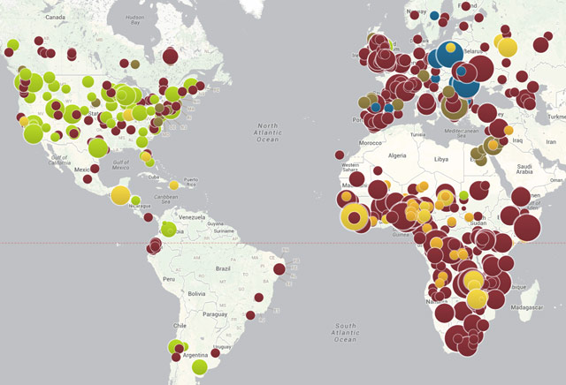
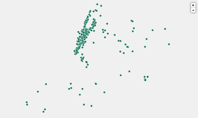
Kottke loves maps. My favorite of last few years is “Local vs Tourists,” but so, so many are fantastic & so is the fact that Kottke loves maps. So there’s that to get out of the way: I would be a rabid Kottke fan just for the maps.
But he also loves, among others, Eggers and Tufte and Morris (if you missed this, go back and read the series) and generally keeps his smart-o-meter well-calibrated and active. There’s also design and sports and computing and po — well, no, not politics, but that’s just not his thing. Jason can sometimes be snarky (this take-down was epic), but he never throws elbows and what’s politics about if not elbows?
I sometimes ask myself, “What don’t I get introduced to by Kottke anymore?” A lot, I suppose (I thought I was introduced to parkour by him, but checked and his first post on the sport was a link to a piece in The New Yorker by Alec Wilkinson, which I would have read) — but what does it say that even if he didn’t introduce me to something, it feels like he did? That is the secret ingredient of Kottke — which will not, must not, ever be distilled or revealed. It certainly can’t be imitated, as those of us posting today learned as one-or-another-time guest-bloggers here on Kottke.org.
And now Jason is 40. Can’t believe how far back on the Wayback Machine I went to write this post, but hope it continues to go Wayforward: Happy Birthday, Jason!
The universal availability of accurate synchronized time is taken for granted in most areas of the world today, but ‘twas not always so. When Big Ben was built in 1859, charts were issued to show the allowance that had to be made for the sound of the bell, traveling at ~768 mph, to reach different parts of London. This one is from 1875:
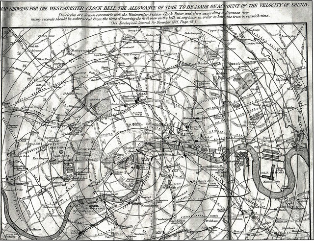
Bigger version here. The correction at Paddington Station was 6 seconds, 8 seconds in Notting Hill, and 13 seconds at the Royal Greenwich Observatory, itself the seat of a fledgling universal time standard. (via @michalmigurski)
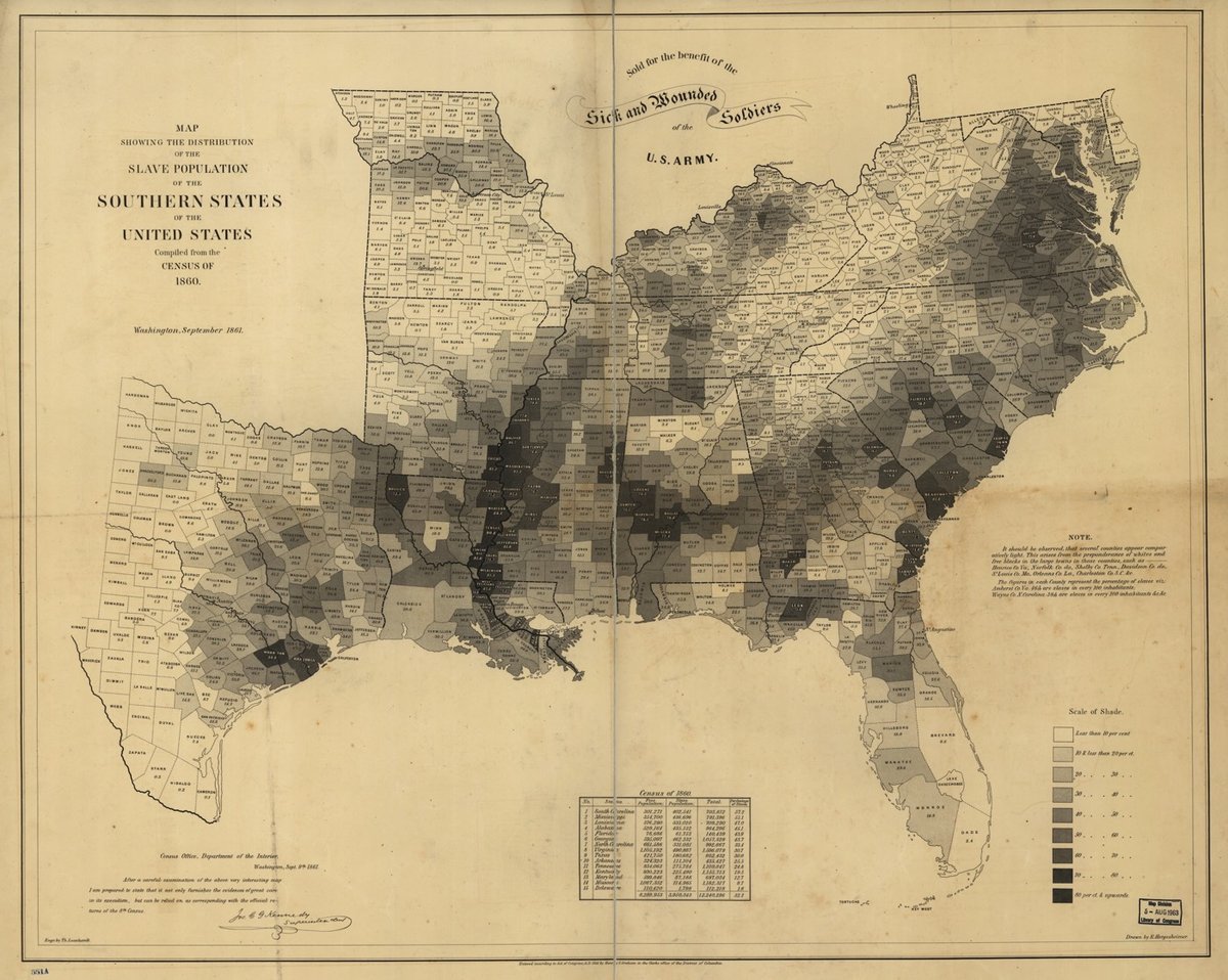
Using data from the 1860 US Census, the Department of the Interior made this map showing the percentages, by county, of the slave population of the southern states.
Though this map was simple, it showed the relationship between states’ commitment to slavery and their enthusiasm about secession, making a visual argument about Confederate motivations.
Schulten writes that President Lincoln referred to this particular map often, using it to understand how the progress of emancipation might affect Union troops on the ground. The map even appears in the familiar Francis Bicknell Carpenter portrait First Reading of the Emancipation Proclamation of President Lincoln, visible leaning against a wall in the lower right-hand corner of the room.
Here’s a larger version. The numbers in some locations are staggering and sickening — in many counties 75% of the population was enslaved and the rate is over 90% in a few places.
It’s NFL season again and it’s time to tune into the NFL TV maps site to find out when your favorite team isn’t on TV because the network is contractually obligated to show the pathetic Jets.
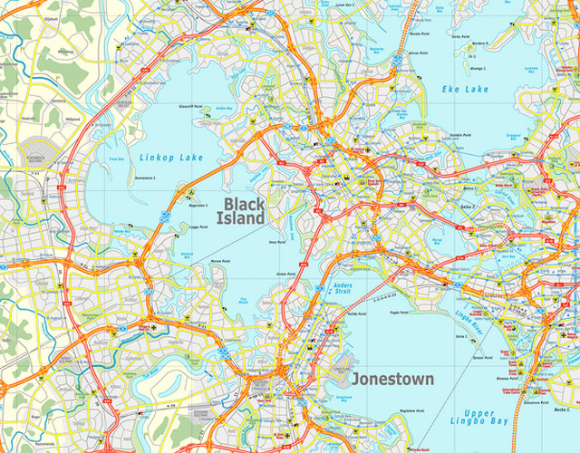
Ian Silva is a Australian commuter train driver who spends his spare time mapping an invented country called the Koana Islands.
People in the Koana Islands love baseball. The first league play started in 1882, barely six years after the MLB. Between the top-tier, Triple- and Double-A leagues, there are over 180 teams spanning the island nation. Fans are so rabid that there’s even talk of expanding to a Single-A league, adding even more teams. If you’re a baseball fan, you might be surprised you’ve never heard of this. You’ll be even more surprised when you try to find the Koana Islands. That’s because the 32-island chain, with its nine major cities, 11 national parks, 93 million residents and a landmass that is equal to Spain and Sweden combined does not really exist.
(thx, toni)

Rachel Evans makes colorful world maps out of Spirograph-produced patterns. Prints are available.
A very pretty but almost completely useless circular map of the NYC subway.
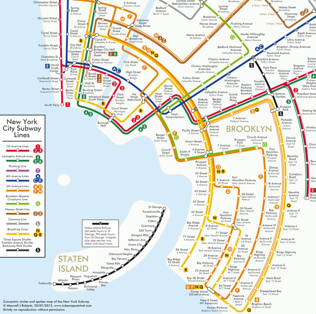
There’s a London Tube version too.
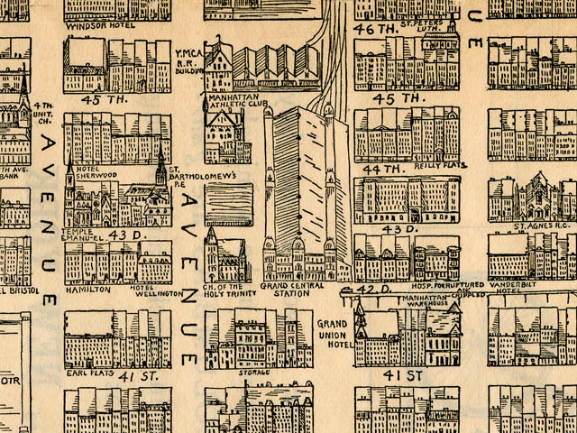
From 1890, a hand-drawn map of Midtown Manhattan “from 34th Street to 59th Street and from 1st Avenue to 6th Avenue”.
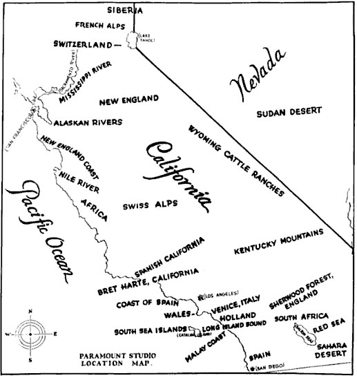
Published in 1927 in a publication called The Motion Picture Industry as a Basis for Bond Financing, this map shows what locations in California look like other places from around the world.
(via flickr)
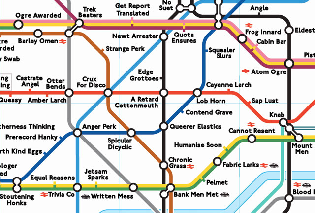
Otter Bends, Queer Spank, Frog Innard, and Lob Horn are some of the stations on the anagram map of the London Underground.
Smithsonian.com has a neat interactive map that shows how the Battle of Gettysburg played out in the Civil War. For best results, do one run through zoomed out a little and then another run-through to at a closer zoom level to see the details. (via digg)
New prints in the Dorothy shop: these really cool Hollywood Star Charts, available in Golden Age and Modern Day editions.
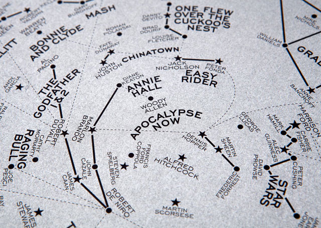
The Modern Day version of our Hollywood Star Chart features constellations named after some of the most culturally significant films to have appeared on the silver screen since 1960 - present day. The stars that make up the clusters are the Hollywood stars that appeared in them.
The chart is based on the night sky over New York on June 16th 1960 — the date of the first showing of Hitchcock’s ‘Psycho’ at the DeMille Theater. With its new approach to storytelling, characterisation and violence it is seen as a key movie in the start of the post-classical era of Hollywood.
The 108 films featured include those chosen for preservation in the US National Film Registry due to their cultural, historical, or aesthetic significance; Academy Award winners; and a few personal favourites. Films include Easy Rider, Bonnie and Clyde, The Exorcist, The Godfather, Chinatown, Star Wars, Pulp Fiction and Avatar.
You may remember Dorothy from their movie name maps.
Perhaps inspired by All Streets, Ben Fry’s map of all the streets in the US, Nelson Minar built a US map out of all the rivers in the country.
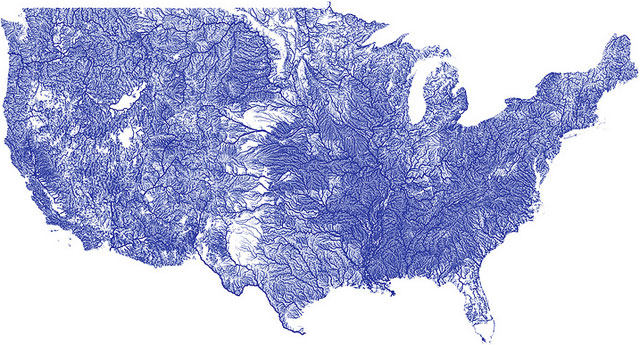
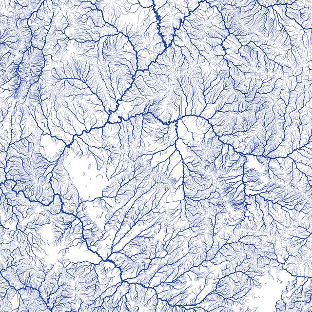
Minar put all the data and files he used up on Github so you can make your own version.
Newer posts
Older posts









Socials & More