kottke.org posts about logos
NASA’s original logo looked something like this:
It was referred to, colloquially, as the meatball. In the 1970s, the meatball was switched out for the worm, a more Modernist take:
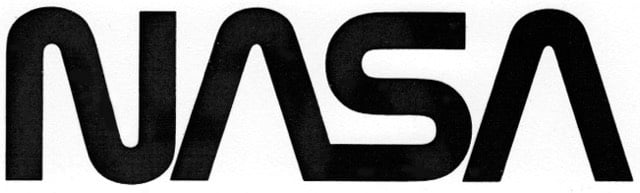
This logo was done by Richard Danne and Bruce Blackburn, and Danne wrote an essay about the experience.
And here is one of the most interesting exchanges I’ve ever witnessed in a design presentation:
Fletcher: “I’m simply not comfortable with those letters, something is missing.”
Low: “Well yes, the cross stroke is gone from the letter A.”
Fletcher: “Yes, and that bothers me.”
Low: “Why?”
Fletcher: (long pause) “I just don’t feel we are getting our money’s worth!”
Others, not just the designers were stunned by this last comment. Then the discussion moved back to the strong red/rust color we were proposing. We had tried many other colors of course, including the more predictable blue range, but settled on red because it suggested action and animation. It seemed in spirit with the Can Do nature of the Space Agency.
Fletcher: And this color, red, it doesn’t make much sense to me.”
Low: “What would be better?”
Fletcher: “Blue makes more sense… Space is blue.”
Low: “No Dr. Fletcher, Space is black!”
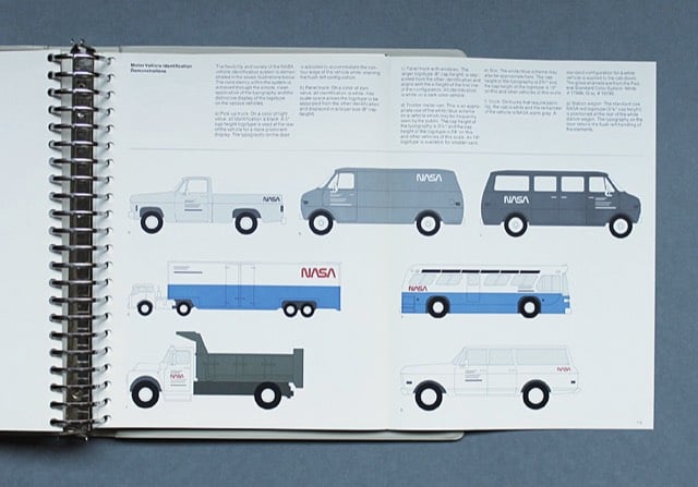
NASA’s Graphics Standards Menu utilizing the worm logo can be seen here.
The space agency switched back to the original logo in 1992. Michael Bierut compared the two:
The worm is a great-looking word mark and looked fantastic on the spacecraft. By any objective measure, the worm was and is absolutely appropriate, and the meatball was and is an amateurish mess.
(thx, jarrett)
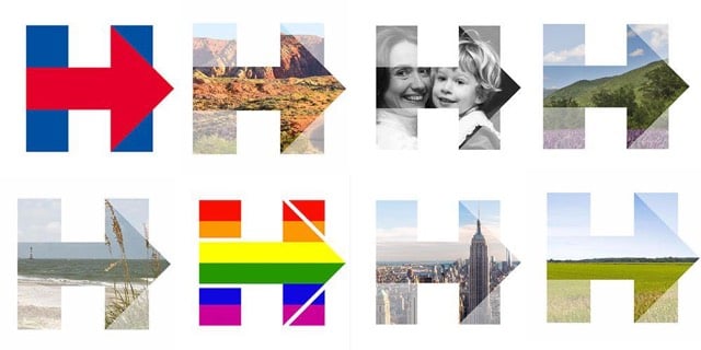
Soon after the logo for Hillary Clinton’s campaign was revealed, I wrote “I am not a big fan of the arrowed H”. Well, the campaign’s clever use of the logo has won me over. Quartz’s Annalisa Merelli explains.
It is through all these iterations that Clinton’s logo fully displays its iconic value: It is highly recognizable despite the changes, and the much-criticized right-facing red arrow is now appears as it was likely meant to: pointing the way forward. The different backgrounds aren’t just an innovative graphic solution-they are the visual embodiment of the values Clinton is building her campaign around. It vehicles a leadership based on collectivity and inclusiveness rather than the elitist individualism Clinton is often accused of.
Seb Lester can somehow freehand draw the logos for the NY Times, Honda, Ferrari, Coca-Cola, and many more.
Watching the video, I didn’t even notice any tracing…it’s all freehand. Keep up with Lester’s drawings on his Instagram account.
Inspired by the logo for Hillary Clinton’s 2016 Presidential run, designer Rick Wolff created an entire uppercase alphabet for a typeface he’s calling Hillvetica.
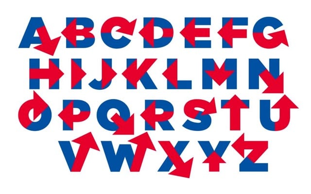
From his Twitter stream, it appears that Wolff is attempting to make an actual Hillvetica font so stay tuned. FYI, Pentagram partner Michael Bierut designed the logo. The simplicity is appealing, but overall I am not a big fan of the arrowed H.
Update: The Washington Post made a little text editor so you can write whatever you want in Hillvetica. The Clinton campaign has already put it to use:
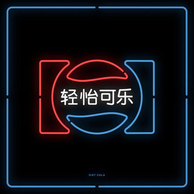
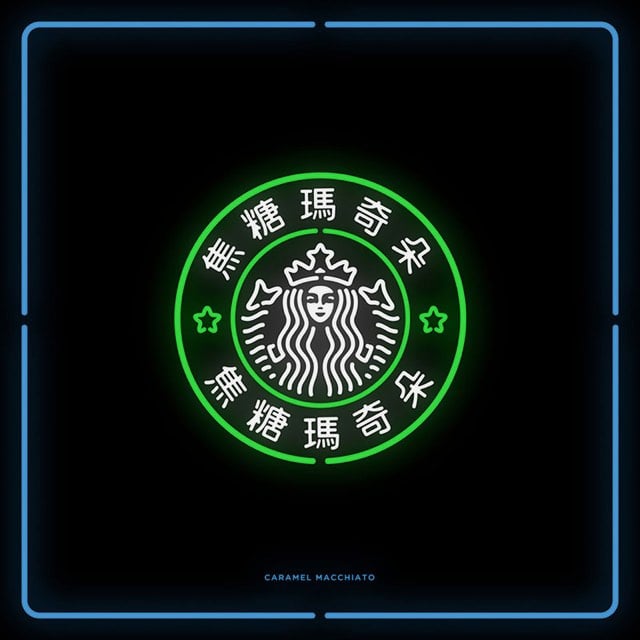
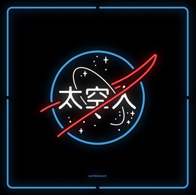
A project called Chinatown takes familiar logos like Pepsi, Starbucks, UPS, and Lego and translates them, imprecisely, into their Chinese equivalents.
It uses basic words for translation, such as “Caramel Macchiato” for “Starbucks” in order to maintain the visual continuity. By arranging the words this way, ‘Chinatown’ pushes viewers to ask themselves what it means to see, hear, and become fully aware. ‘Chinatown’ also demonstrates our strangeness to 1.35 billion people in the world, when you can’t read Chinese.
(via @pieratt)
Responsive web design is a technique used by web builders where the design adapts to different screen sizes. Designer Joe Harrison has built a page with responsive logos for several well-known brands, including Coca-Cola, Nike, Disney, and Levi’s. If you resize the page, you can see the logos change. Here’s how the Disney logo looks as your browser window gets smaller (from L to R):
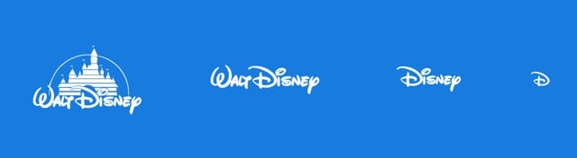
As the browser gets smaller, the logos lose detail and become more abstract. By the time you get to the smallest screen width, you’re down to just the Disney “D” or Nike swoosh or Heineken red star, aka the bare minimum you need to render the logo recognizable, if only on a subconscious or emotional level. Which reminds me of Scott McCloud’s discussion of iconic abstraction (and The Big Triangle) in Understanding Comics, which is still one of the best books on design and storytelling I’ve ever read. Here’s a bit of the relevant passage:
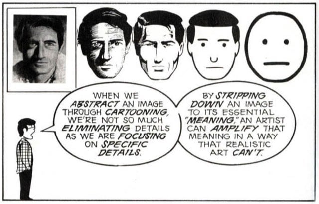
Defining the cartoon would take up as much space as defining comics, but for now, I’m going to examine cartooning as a form of amplification through simplification. When we abstract an image through cartooning, we’re not so much eliminating details as we are focusing on specific details. By stripping down an image to its essential “meaning”, an artist can amplify that meaning in a way that realistic art can’t.
The reason why those particular logos work responsively is because they each have abstract representations that work on that meaningful emotional level. You see that red Levi’s tag or Nike swoosh and you feel something.1 I think companies are having to design logos in this way more frequently. Contemporary logos need to look good on freeway billboards, on letterhead, as iOS icons, and, in the case of the Facebook, Twitter, or Pinterest logos, affixed to tiny tweet/like/pin buttons. (via ministry of type)
If you’ve ever wondered how a designer does their thing (or even if you haven’t), this look-over-the-shoulder view of Aaron Draplin designing a logo for a fictional company in about 10 minutes is great. A nice reminder that design is truly about making it up as you go along.
I love Draplin. Internet treasure, that guy. And that lefty writing claw! Go lefties!
When the new Airbnb logo was introduced, the company caught a lot of flack from the internet because the logo resembled an odd combination of almost every sexual body part. I actually liked the logo right away and after a few months with it, the juvenile connotations have faded.
But you know what makes Airbnb’s logo really really really look like a cartoonish vagina butt? Putting arms and legs and hats on the logo and animating it.
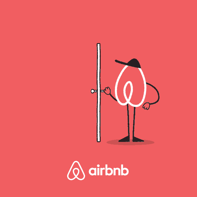
Airbnb is sponsoring the NYC Marathon this year, and the logo characters were created for the event. Maaaaybe they’d like to rethink this?
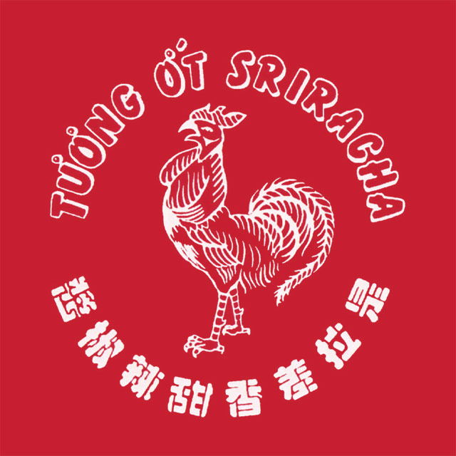
The rooster on the Sriracha bottle has made its way to iPhone cases, t-shirts, and water bottles. But no one (not even the founder of the company) knows the name of the street artist who created the now famous logo.
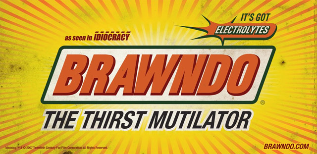
Over at Trivia Happy, Phil Edwards interviewed Ellen Lampl, who designed the logos for Mike Judge’s underrated Idiocracy.
Some logos came from the script, while some came from the designers’ brainstorming sessions. Brawndo and Carl’s Jr. were written, while Lampl made logos for companies like Nastea and Fedexx once the overall look was approved. For Lampl, it was a great release, because “coming from the past constraints of advertising, it was cathartic to have the liberty to be bawdy and irreverent. Making everything ridiculously over-emphasized with bright colors, outlines upon outlines, and exaggerated drop shadows was my personal jab at the world of branding and in-your-face typography.”
Somehow I lived in WI for the first 17 years of my life, was a Brewers fan for many of those years, and never realized the old Brewers logo contained the letters “m” and “b” hidden in the ball and glove.
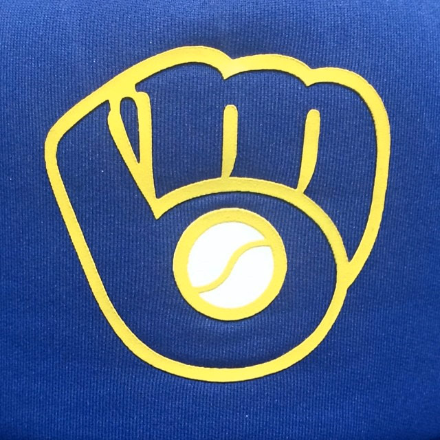
Wow. If your mind is blowing right now too, there’s a Facebook group we can join together: Best Day of My Life: When I Realized the Brewers Logo Was a Ball and Glove AND the Letters M and B. (via kathryn yu)
ps. If you’ve somehow missed the hidden arrow in the FedEx logo, here you go. Best kind of natural high there is.
Fine work as usual from Christian Annyas: a look at the design of the Warner Bros logo from 1923 to the present. The classic “WB” shield of my Bugs-and-Daffy-saturated youth will always be a favorite, but I do like the Saul Bass logo of the 70s and early 80s:
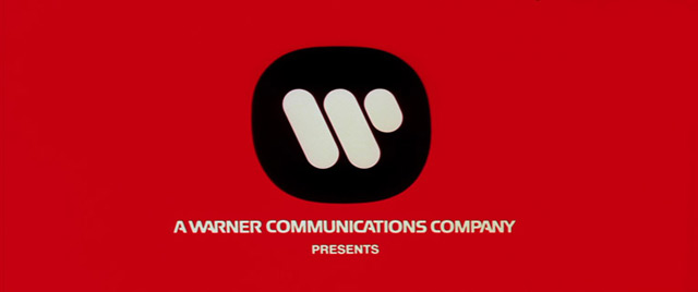
Affleck’s Argo and Soderbergh’s Magic Mike both used the Bass logo in place of the contemporary logo, which is the kind of little detail I love.
The Art of the Rap Logo is a collection of rap logos from NWA to Snoop Dogg to Def Jam.
Football as Football is a collection of American football team logos in the style of European football club badges. Here are badges for the Detroit Lions (in the Italian style) and New England Patriots (in the Spanish style).
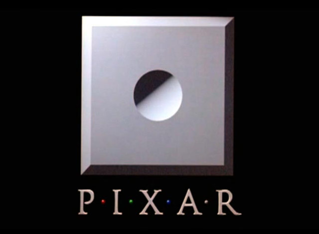
If you’ve watched a movie in the past 20 years, chances are you’ve seen the animation featuring the Pixar logo and Luxo Jr., the company’s mascot. Luxo hops in, squashes the I, and takes its place; here’s what it looks like:
According to the Pixar wiki, there have been several variations of the logo, including the one where Wall-E comes out to fix Luxo Jr’s busted lightbulb:
Others include 20th and 25th anniversary versions, a 3D version that premiered with UP, and versions from Cars 2 and Finding Nemo that incorporate story elements into the logo.
This particular logo debuted with Toy Story in 1995. For the short films Pixar produced before that, they used variations on the not-very-exciting theme of circular indent in beveled square, a shape borrowed from the look of their Image Computer:
Many of the logo animation variations, including the pre-Luxo Jr. versions, can be seen in this video:
Artist Lisa Hanawalt has been sketching big company logos with alternate slogans, including KFC, BMW, Toyota, McDonald’s, Nike, and Subway. The Subway and Toyota ones are my favorite:
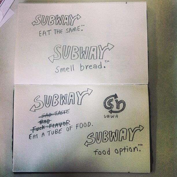
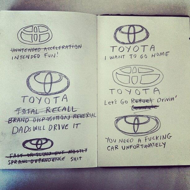
Food option. You need a fucking car unfortunately. Smell bread. Awesome.
An extensive examination of the evolution of the Star Wars logo, which went through too many iterations to count.
..Though the poster contained no painted imagery, it did introduce a new logo to the campaign, one that had been designed originally for the cover of a Fox brochure sent to theater owners….Suzy Rice, who had just been hired as an art director, remembers the job well. She recalls that the design directive given by Lucas was that the logo should look “very fascist.”
“I’d been reading a book the night before the meeting with George Lucas,” she says, “a book about German type design and the historical origins of some of the popular typefaces used today — how they developed into what we see and use in the present.” After Lucas described the kind of visual element he was seeking, “I returned to the office and used what I reckoned to be the most ‘fascist’ typeface I could think of: Helvetica Black.”
(via df)
Some examples of car company logo rip-offs, mostly from China.
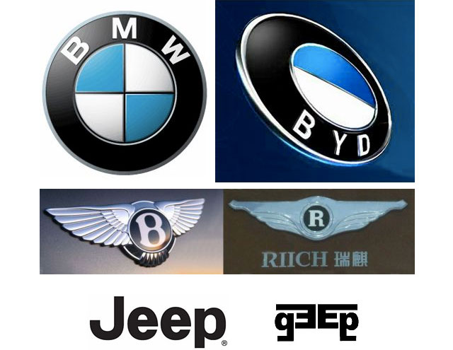
And really, who wouldn’t want a BYD instead of a BMW?
After using the same logo for the past 25 years, Microsoft introduces a new logo that echoes their Windows brand.
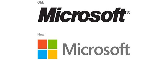
The Microsoft brand is about much more than logos or product names. We are lucky to play a role in the lives of more than a billion people every day. The ways people experience our products are our most important “brand impressions”. That’s why the new Microsoft logo takes its inspiration from our product design principles while drawing upon the heritage of our brand values, fonts and colors.
(via df)
With the Olympics about two weeks away, consider this a final you-can’t-unsee-it reminder that the 2012 London Olympics logo looks like Lisa Simpson performing oral sex.
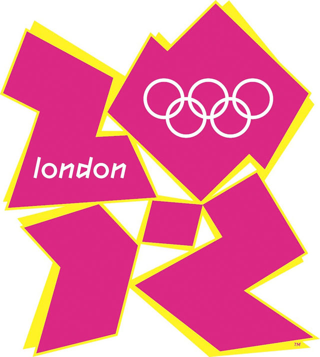
It’s not as bad as some of the others on this list (oh, that Mon-Sat logo), but it’s still exceptionally unforgettable. Enjoy the wall-to-wall Olympic coverage for the next two weeks!
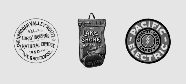
A beautiful collection of railroad company logos that show the evolution of logo design from 1845 to 2000.
Designer Adam Ladd asked his five-year-old daughter for her impressions of several well-known logos. This is great:
(via stellar)
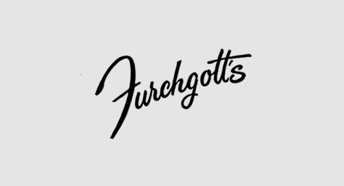
A lovely collection of hand-lettered American department store logos from the late 19th and early 20th century.
Steven Heller writes about the 40th anniversary of Nike’s iconic swoosh, one of the best logos ever designed.
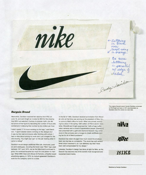
The origin of the mark goes like this: Knight wanted to differentiate BRS’s custom product from the ones they were importing from Onituska in Japan: “…so Knight turned to a graphic design student he met at Portland State University two years earlier.” One day in 1969, the student, Carolyn Davidson, was approached by Knight and offered $2 per hour “to make charts and graphics” for his business. For the next two years Davidson managed the design work on BRS. “Then one day Phil asked me if I wanted to work on a shoe stripe,” Davidson recalled. The only advice she received was to “Make the stripe supportive of the shoe.” Davidson came up with half a dozen options. None of the options “captivated anyone” so it came down to “which was the least awful.”
(via megadeluxe)
Fauxgo is a site that collects fictional logos from movies and TV shows.
Logo Tourist is a project by Risto-Jussi Isopahkala that depicts cityscapes and famous Parisian landmarks made up of famous logos. Here’s the Arc de Triumph (sponsored by Pepsi and Adidas):
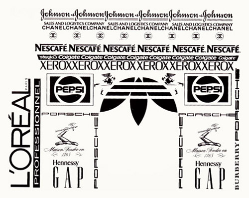
See also Logorama.
IANAHRSYMMV**, but here are some well-known English language logos redesigned and translated into Hebrew language logos. Nice student work from a class taught by Oded Ezer.
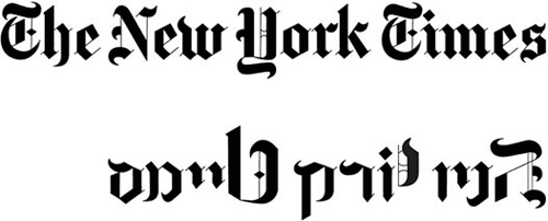
** I am a not a Hebrew reader so your mileage may vary.
Newer posts
Older posts

Socials & More