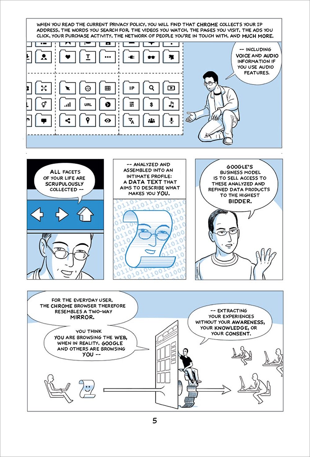
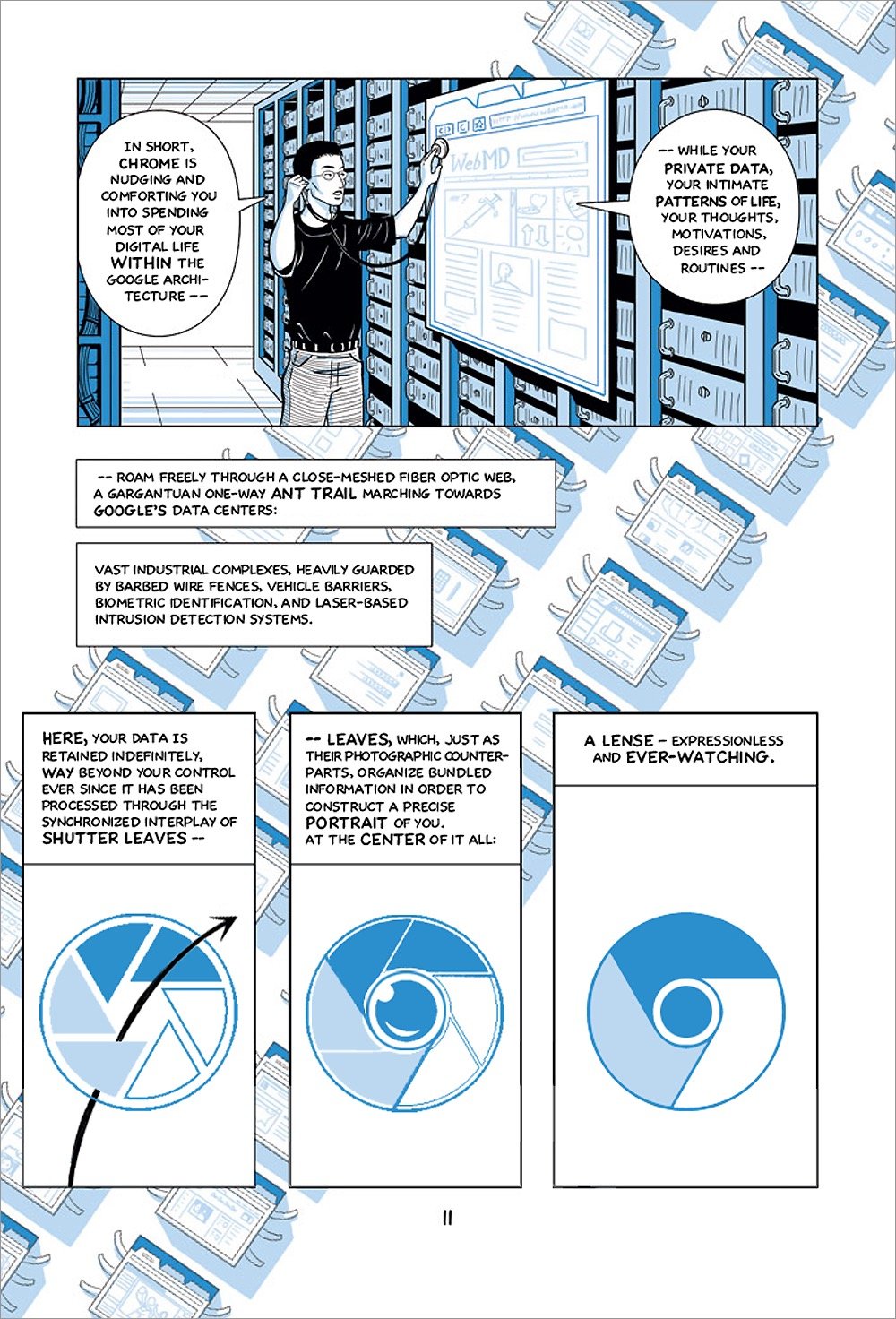
Back in 2008, Google commissioned comic artist Scott McCloud to create a comic book to celebrate/explain the launch of their Chrome web browser. Since then, Chrome has become a vital part of Google’s core business, an advertising juggernaut that works by tracking users and their interests across the entire web. To better reflect the reality that “Google’s browser has become a threat to user privacy and the democratic process itself”, comic artist and activist Leah Elliott has cheekily created an updated comic book in the style of the original. She calls it Contra Chrome.
Responsive web design is a technique used by web builders where the design adapts to different screen sizes. Designer Joe Harrison has built a page with responsive logos for several well-known brands, including Coca-Cola, Nike, Disney, and Levi’s. If you resize the page, you can see the logos change. Here’s how the Disney logo looks as your browser window gets smaller (from L to R):

As the browser gets smaller, the logos lose detail and become more abstract. By the time you get to the smallest screen width, you’re down to just the Disney “D” or Nike swoosh or Heineken red star, aka the bare minimum you need to render the logo recognizable, if only on a subconscious or emotional level. Which reminds me of Scott McCloud’s discussion of iconic abstraction (and The Big Triangle) in Understanding Comics, which is still one of the best books on design and storytelling I’ve ever read. Here’s a bit of the relevant passage:
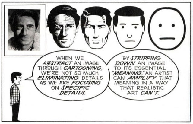
Defining the cartoon would take up as much space as defining comics, but for now, I’m going to examine cartooning as a form of amplification through simplification. When we abstract an image through cartooning, we’re not so much eliminating details as we are focusing on specific details. By stripping down an image to its essential “meaning”, an artist can amplify that meaning in a way that realistic art can’t.
The reason why those particular logos work responsively is because they each have abstract representations that work on that meaningful emotional level. You see that red Levi’s tag or Nike swoosh and you feel something.1 I think companies are having to design logos in this way more frequently. Contemporary logos need to look good on freeway billboards, on letterhead, as iOS icons, and, in the case of the Facebook, Twitter, or Pinterest logos, affixed to tiny tweet/like/pin buttons. (via ministry of type)
Using Blockbuster and Netflix (and Redbox) as an example, James Surowiecki writes about how big incumbent companies can lose out to smaller upstarts.
The problem — in Blockbuster’s case, at least — was that the very features that people thought were strengths turned out to be weaknesses. Blockbuster’s huge investment, both literally and psychologically, in traditional stores made it slow to recognize the Web’s importance: in 2002, it was still calling the Net a “niche” market. And it wasn’t just the Net. Blockbuster was late on everything — online rentals, Redbox-style kiosks, streaming video. There was a time when customers had few alternatives, so they tolerated the chain’s limited stock, exorbitant late fees (Blockbuster collected about half a billion dollars a year in late fees), and absence of good advice about what to watch. But, once Netflix came along, it became clear that you could have tremendous variety, keep movies as long as you liked, and, thanks to the Netflix recommendation engine, actually get some serviceable advice. (Places like Netflix and Amazon have demonstrated the great irony that computer algorithms can provide a more personalized and engaging customer experience than many physical stores.) Then Redbox delivered the coup de grace, offering new Hollywood releases for just a dollar.
From Scott McCloud, here’s Blockbuster’s new logo.


Socials & More