Responsive logos and abstraction in design
Responsive web design is a technique used by web builders where the design adapts to different screen sizes. Designer Joe Harrison has built a page with responsive logos for several well-known brands, including Coca-Cola, Nike, Disney, and Levi’s. If you resize the page, you can see the logos change. Here’s how the Disney logo looks as your browser window gets smaller (from L to R):
![]()
As the browser gets smaller, the logos lose detail and become more abstract. By the time you get to the smallest screen width, you’re down to just the Disney “D” or Nike swoosh or Heineken red star, aka the bare minimum you need to render the logo recognizable, if only on a subconscious or emotional level. Which reminds me of Scott McCloud’s discussion of iconic abstraction (and The Big Triangle) in Understanding Comics, which is still one of the best books on design and storytelling I’ve ever read. Here’s a bit of the relevant passage:
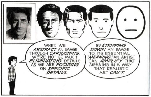
Defining the cartoon would take up as much space as defining comics, but for now, I’m going to examine cartooning as a form of amplification through simplification. When we abstract an image through cartooning, we’re not so much eliminating details as we are focusing on specific details. By stripping down an image to its essential “meaning”, an artist can amplify that meaning in a way that realistic art can’t.
The reason why those particular logos work responsively is because they each have abstract representations that work on that meaningful emotional level. You see that red Levi’s tag or Nike swoosh and you feel something.1 I think companies are having to design logos in this way more frequently. Contemporary logos need to look good on freeway billboards, on letterhead, as iOS icons, and, in the case of the Facebook, Twitter, or Pinterest logos, affixed to tiny tweet/like/pin buttons. (via ministry of type)
I’ve talked about this elsewhere, but in designing the “identity” for kottke.org (such as it is), having an abstract
logoidentifying element has been an important part of the process. I wanted to have an element (currently the blue gradient) that if you saw it and recognized it, you had a reaction to it on a emotional level. Here’s what I wrote about an older kottke.org design: “The yellow-green thing at the top is a tag. Like the red tag on Levi’s jeans or even the red stripe on Prada shoes. It’s small, out of the way, but when you see it on something, you know exactly what you’re holding in your hands.” It’s my favorite design trick and likely influenced by Understanding Comics more than I realize. ↩
Socials & More