A short history of the Pixar logo animation
If you’ve watched a movie in the past 20 years, chances are you’ve seen the animation featuring the Pixar logo and Luxo Jr., the company’s mascot. Luxo hops in, squashes the I, and takes its place; here’s what it looks like:
According to the Pixar wiki, there have been several variations of the logo, including the one where Wall-E comes out to fix Luxo Jr’s busted lightbulb:
Others include 20th and 25th anniversary versions, a 3D version that premiered with UP, and versions from Cars 2 and Finding Nemo that incorporate story elements into the logo.
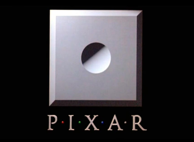
This particular logo debuted with Toy Story in 1995. For the short films Pixar produced before that, they used variations on the not-very-exciting theme of circular indent in beveled square, a shape borrowed from the look of their Image Computer:

Many of the logo animation variations, including the pre-Luxo Jr. versions, can be seen in this video:


Socials & More