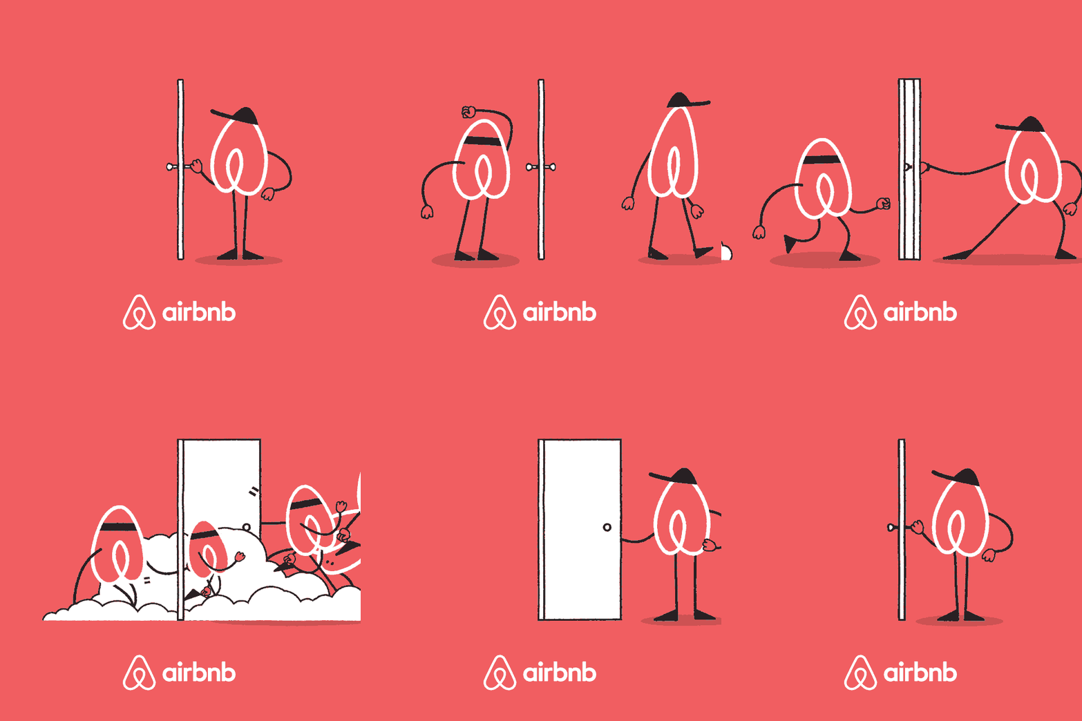
Airbnb’s unfortunate logo characters
When the new Airbnb logo was introduced, the company caught a lot of flack from the internet because the logo resembled an odd combination of almost every sexual body part. I actually liked the logo right away and after a few months with it, the juvenile connotations have faded.
But you know what makes Airbnb’s logo really really really look like a cartoonish vagina butt? Putting arms and legs and hats on the logo and animating it.

Airbnb is sponsoring the NYC Marathon this year, and the logo characters were created for the event. Maaaaybe they’d like to rethink this?


Socials & More