kottke.org posts about design
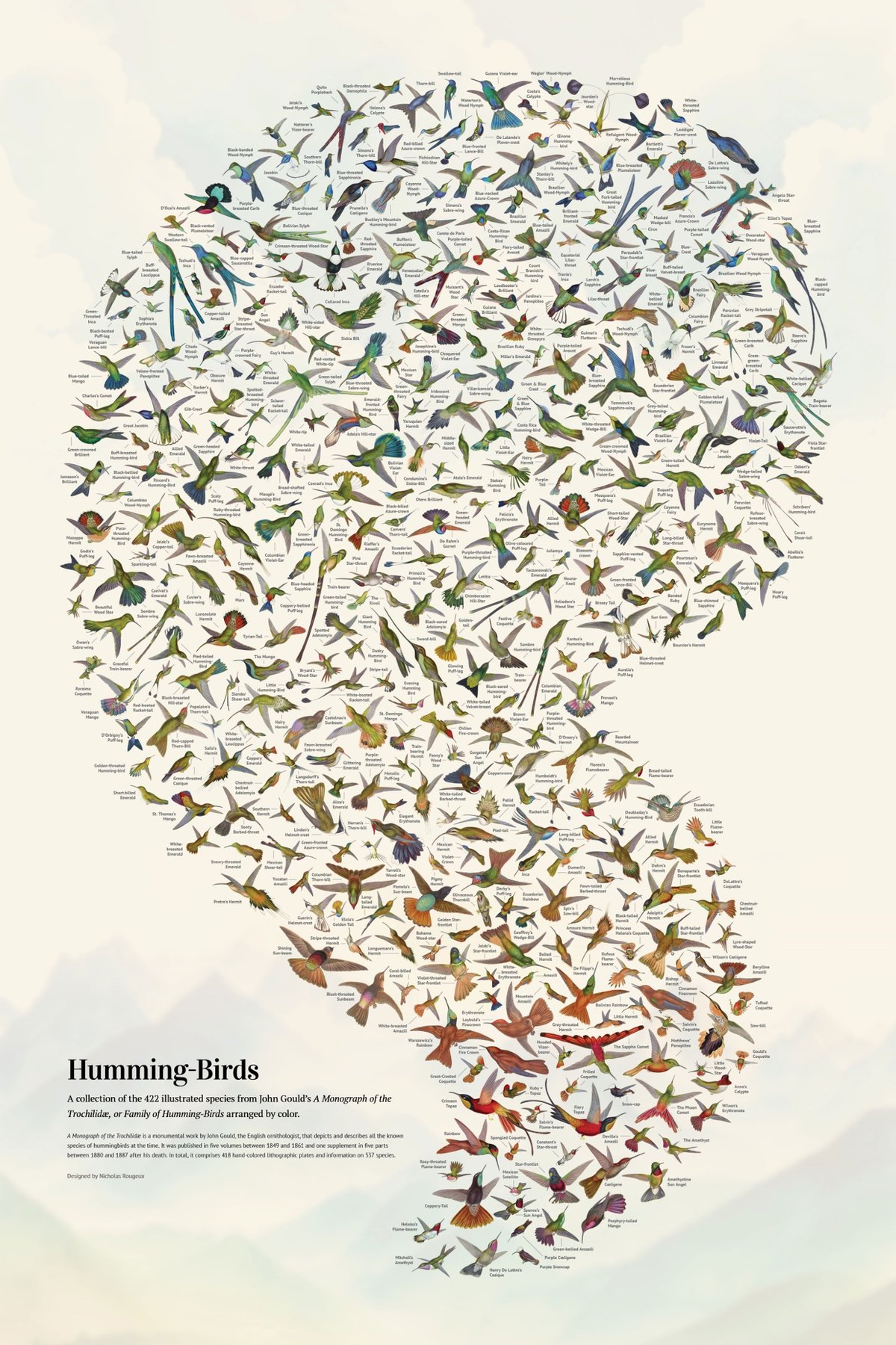
Wow, Nicholas Rougeux has restored John Gould’s A Monograph of the Trochilidæ, or Family of Humming-Birds, which was published between 1848 & 1887 and contains hand-colored lithographic depictions of almost every single hummingbird species known to exist at the time.

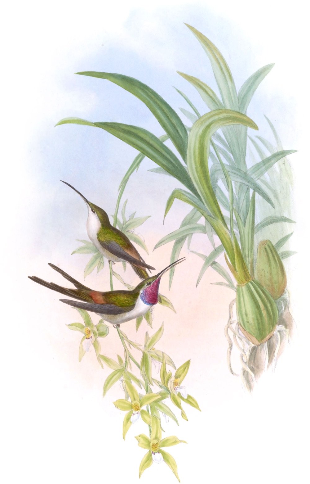
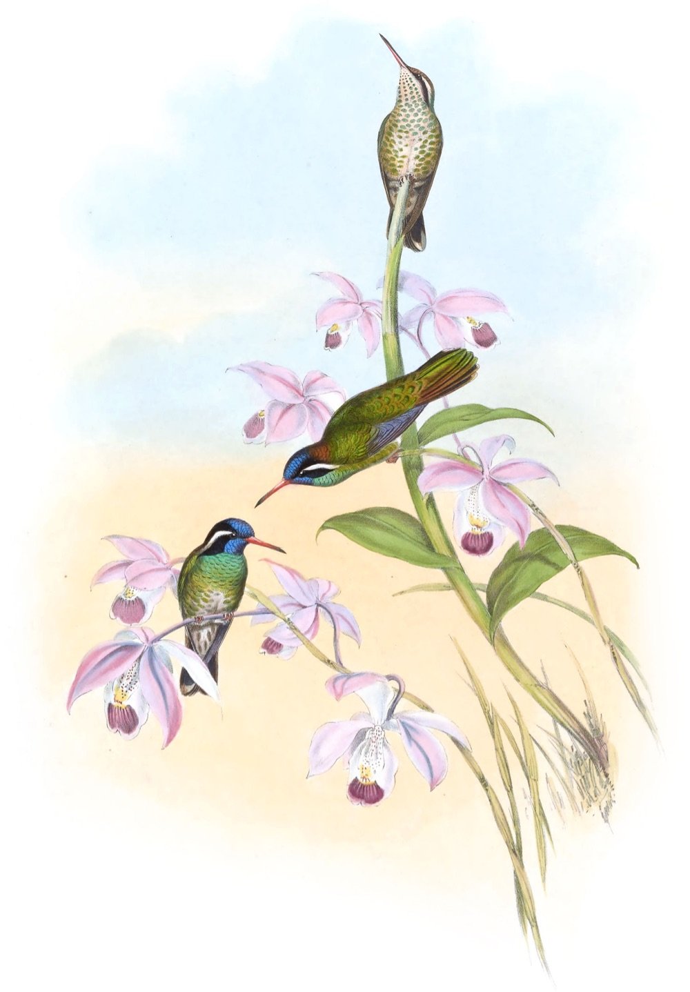
From Rougeux’s page about the project:
The monograph is considered one of the finest examples of ornithological illustration ever produced, as well as a scientific masterpiece. Gould’s passion for hummingbirds led him to travel to various parts of the world, such as North America, Brazil, Colombia, Ecuador, and Peru, to observe and collect specimens. He also received many specimens from other naturalists and collectors.
The image at the top of the post is the gorgeous poster that Rougeux created from the drawings in Gould’s monograph…you can order some for your walls and read a making-of.
See also other projects by Rougeux that I’ve posted about.
Hey folks. Just wanted to check in with how The Process Tee is going. We’ve sold quite of a few of them so far, and I’ve just sent off the first of hopefully many donations to the National Network of Abortion Funds to the tune of $1288 to support their mission of working towards a world “where all reproductive options, including abortion, are valued and free of coercion”.
Thanks so much to everyone who has bought a shirt so far! If you’d like to purchase one of your own, you can check out the original post for more information and the ordering links.
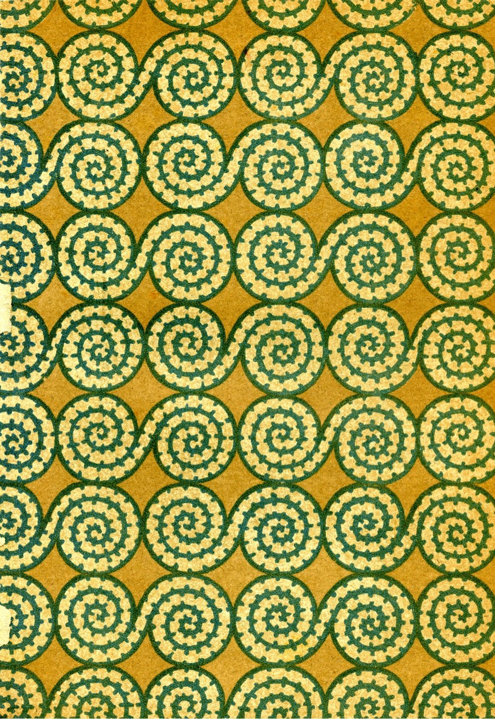
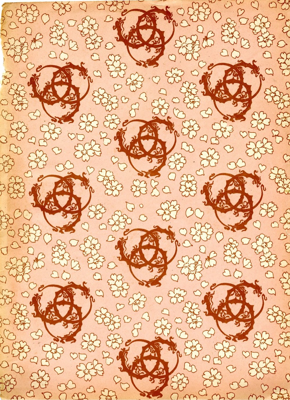
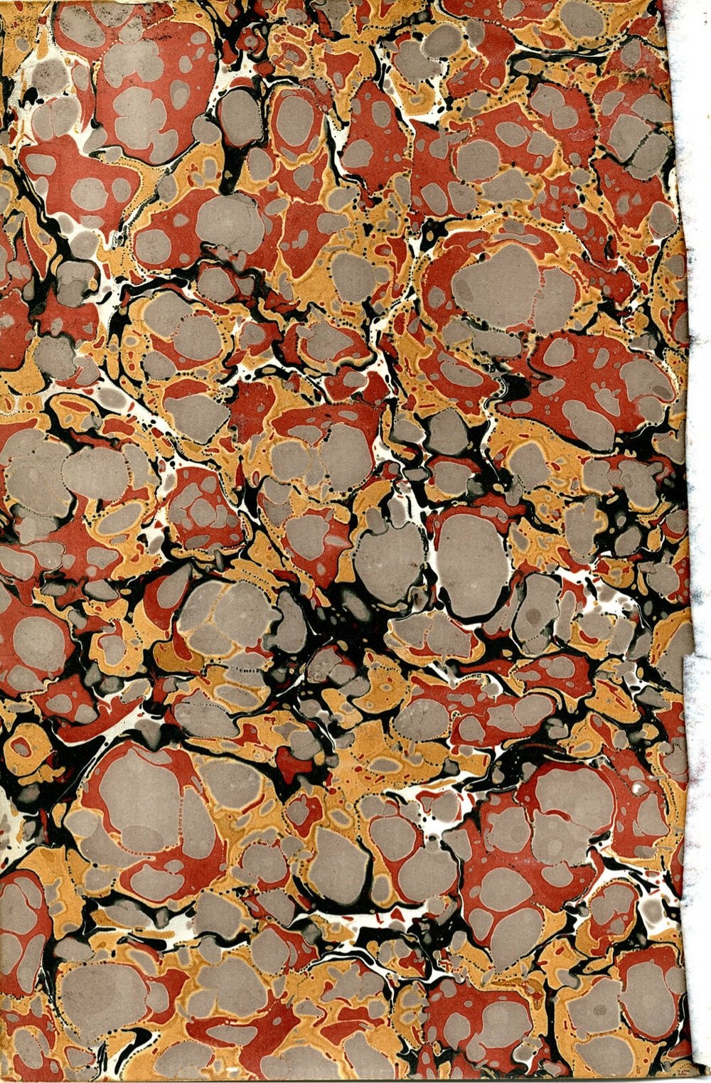
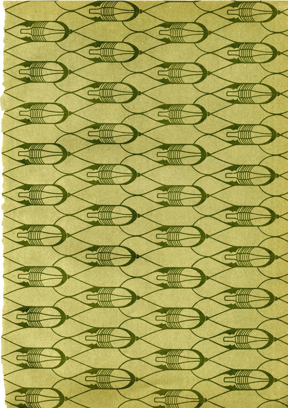
From the Bergen Public Library Norway, a collection of antique book patterns from front or end papers. The books in question are from 1890-1930. Lovely.
Of course, this reminds of one of my favorite videos I’ve posted: a 1970 short film on how to make marbled paper.
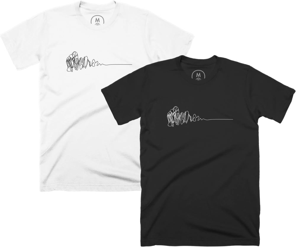
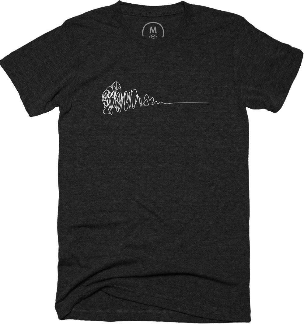
When you start something new, how do you know where you’re going to end up? Most of the time, you don’t — you stumble around for awhile, exploring uncertainly until, slowly, things start to make sense. That messy journey is all part of the process. Designer Damien Newman and I have teamed up with Cotton Bureau to make some t-shirts featuring his Design Squiggle that illustrate this untidy pattern of creativity. The Process Tee is available in two varieties — light design on dark fabric and dark design on light fabric — and 50% of the profits will be donated to a charitable organization (more on that below).
Newman originally came up with the Design Squiggle (aka The Process of Design Squiggle) more than 20 years ago to explain how design worked to some of his clients. Here’s his description:
The Design Squiggle is a simple illustration of the design process. The journey of researching, uncovering insights, generating creative concepts, iteration of prototypes and eventually concluding in one single designed solution. It is intended to convey the feeling of the journey. Beginning on the left with mess and uncertainty and ending on the right in a single point of focus: the design.
Although it originated in the design world, the Squiggle is handy for understanding or describing the process of many different creative endeavors. If you asked a chef, a scientist, a writer, a programmer, or an artist to describe how they got from their starting point to an end result, I think it would look a lot like the Squiggle. So what’s this shirt about? The Process of Design. The Process of Writing. Cooking. Art-making. Science. Learning a New Skill. Creativity. The Messy Process of Becoming a Better Human.
The Process Tee is short-sleeved and available in unisex, fitted, and youth sizes in several light (white, heather white, heather gray, banana, banana cream, pink, gold) and dark colors (black, royal blue, red, green, purple, orange) with sizes ranging from S to 5X, which I hope will work for almost everyone. I ordered a few test shirts to figure out the sizing and placement of the Squiggle and I think they turned out really well: sharp, simple, and even a little enigmatic.
50% of the profits from these tees will be donated to the National Network of Abortion Funds. Access to safe, legal abortion is essential health care and we’re supporting the NNAF in their mission to work towards a world “where all reproductive options, including abortion, are valued and free of coercion”.
Update: I’ve sent two donations to the NNAF so far, for a total of $3,640. Thanks for helping support such a great cause — I will continue to update this post with further donation amounts.
Update: Sent another donation from the past month of sales: $432 for a total of $4,072 donated so far!
Update: It’s been awhile, but I just sent another donation from the sales since November: $656 for a total of $4,728 donated so far!
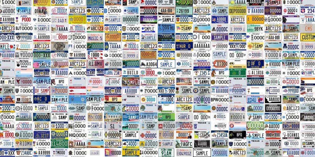
Have you noticed there are a lot of different license plates you can choose for your car these days? So did Jon Keegan; he scraped the DMV websites of all 50 states and DC and came up with over 8,200 different plate combinations you might see out on the road.
By my count, there are currently 8,291 different vehicle license plates offered by the 50 states and the District of Columbia. States now offer a vast menu of personalized plate options for a dizzying array of organizations, professions, sports teams, causes and other groups.
My count was conducted over June and July 2023, so this should be considered a snapshot, as I’m sure some plates have changed already.
Fun fact: finishers of the Iditarod Trail Sled Dog Race are eligible to get a special “Iditarod Finisher” plate for their car.
Less fun fact, per Keegan:
Yes, license plates are still made by cheap prison labor in most states. 80% of all license plates issued in the U.S. today were made by state prisoners, with only 12 states opting out of the practice. According to a 2022 ACLU report on prison labor in the U.S., many states offer no pay at all to prisoners, while the average hourly wage across the country was between 13 and 52 cents per hour.
Here in Vermont, the use of prison labor for manufacturing things like license plates resulted in the image of a pig hidden in a cow’s spots appearing on an official crest emblazoned on state police cars back in 2012.
Yesterday, there was yet another school shooting on a college campus, this time at the University of North Carolina at Chapel Hill. A UNC graduate student walked into a classroom building and murdered a science professor with a gun. The campus was on lockdown for hours. The front page of The Daily Tar Heel today consists of text messages sent to and from students during the lockdown:
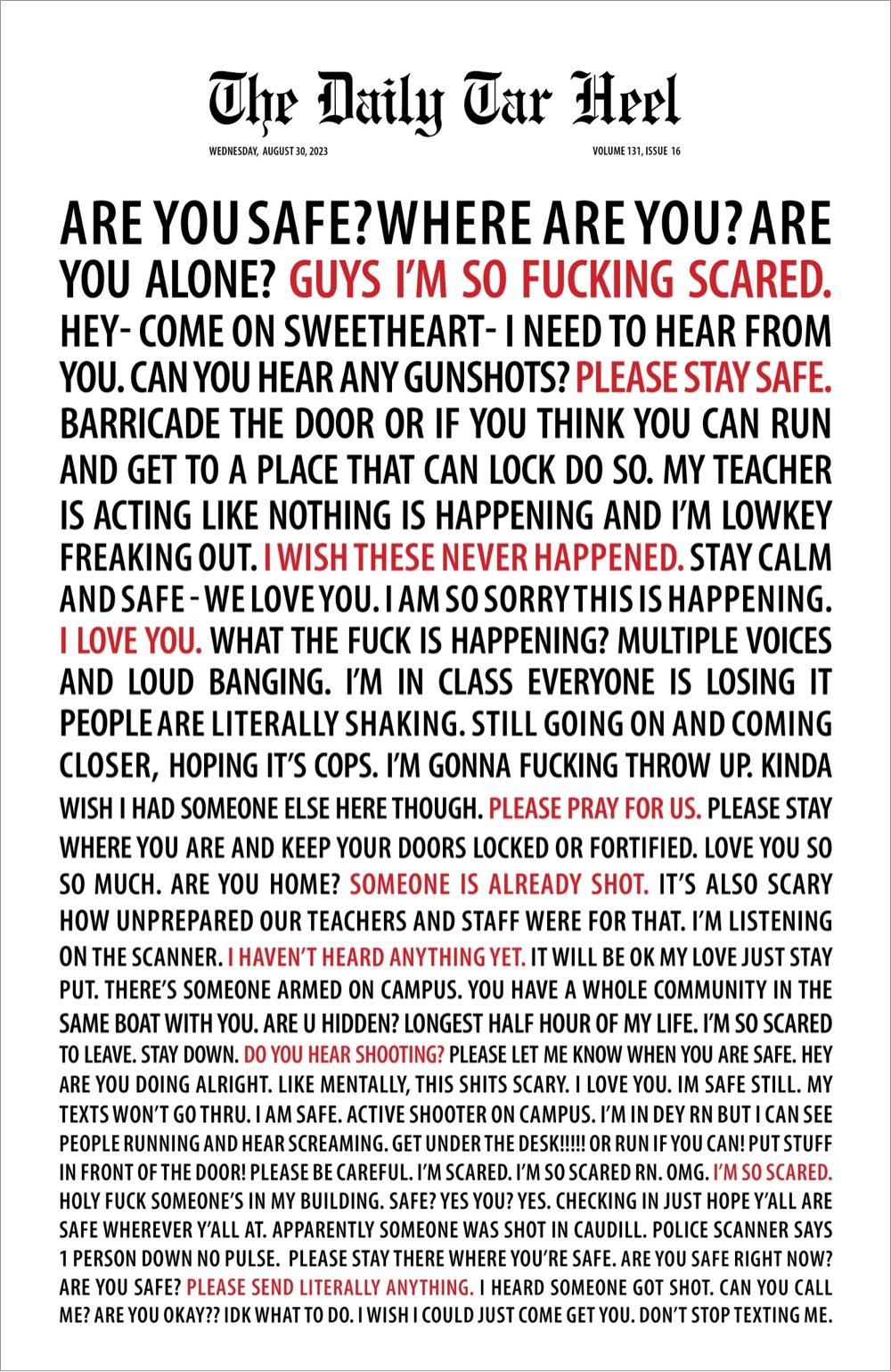
An incredible and powerful design — on Mastodon, Steve Silberman called it “the tombstone of democracy, courtesy of the NRA”. As a nation, we’ve spent more than 20 years and trillions of dollars fighting the “War on Terror” but won’t do a damn thing about the self-imposed terrorism of gun violence. The people sending and receiving those texts — they are TERRIFIED. And this happens regularly in the US, in pre-schools and on college campuses alike. We are a sick nation.
Swiss Post has released a stamp that features concrete, an important material in the history of architecture. But first of all, look at the aesthetics of this thing:
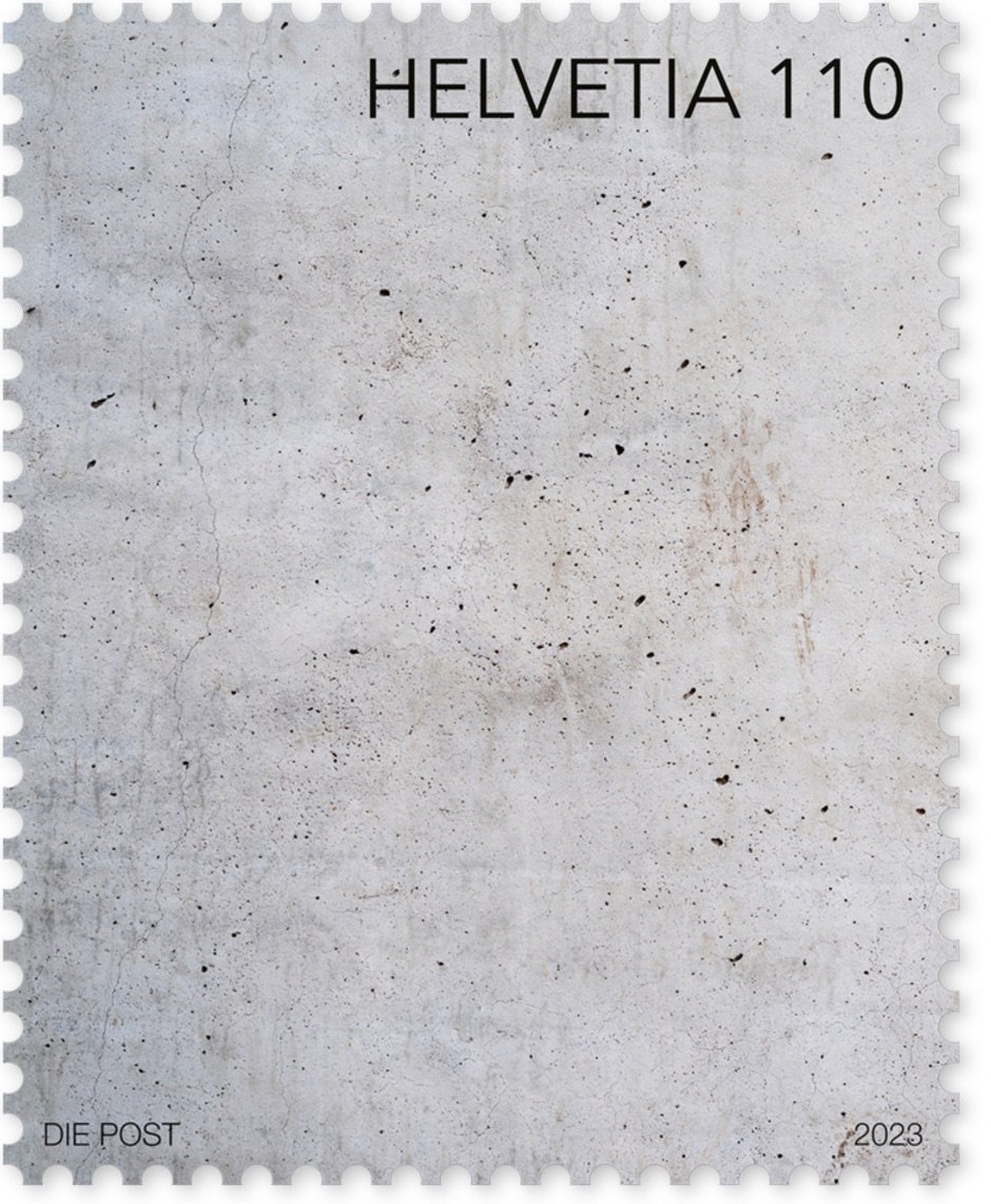
Aaahhh, it looks so nice and clean and Swiss. Love it. Even better: the stamp was designed to feel like concrete:
To give the concrete wall depicted in the design a tactile dimension, cement pigments were added to the ultra-matt finish.
In 2021, Swiss Post made a stamp out of canvas for the same series of stamps regarding art. Not quite as aesthetically pleasing as the concrete one, but still pretty cool.
You can order the concrete stamp from the Swiss Post online shop. (via greg.org)
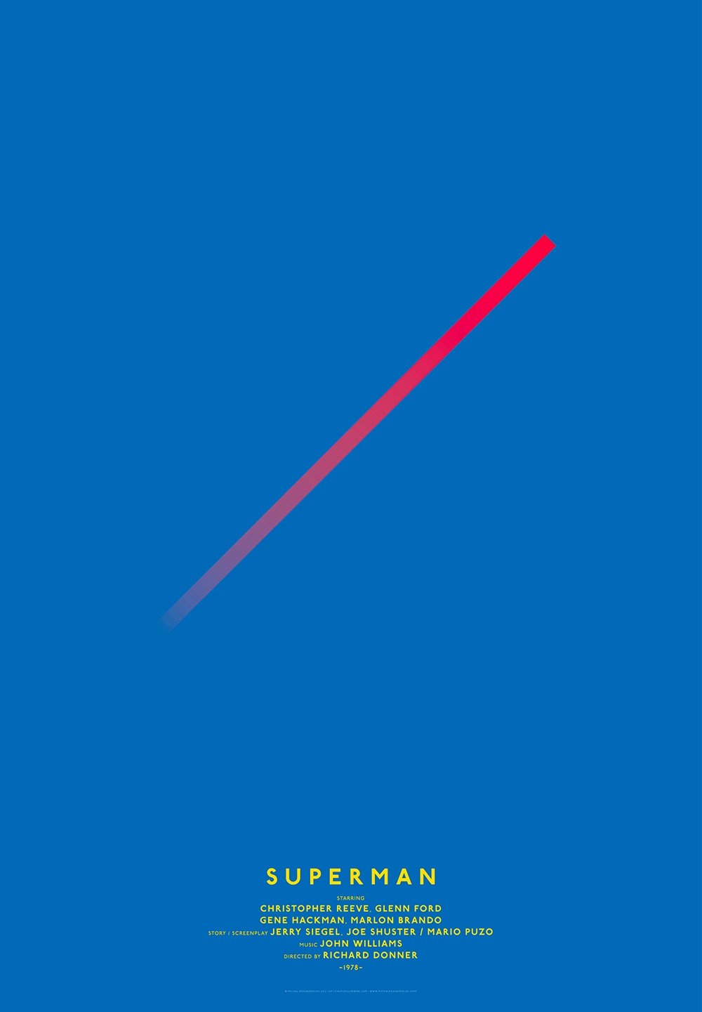
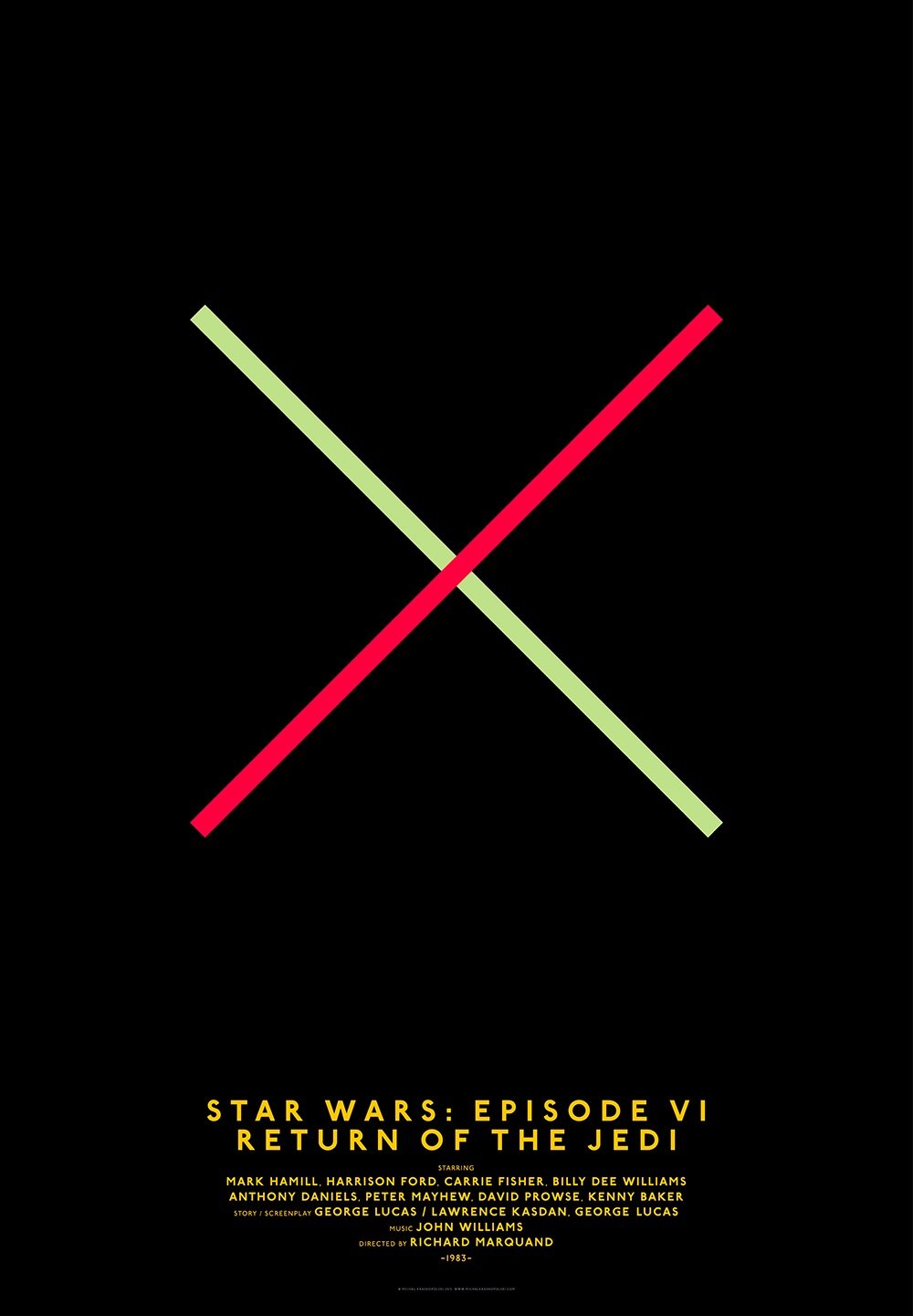
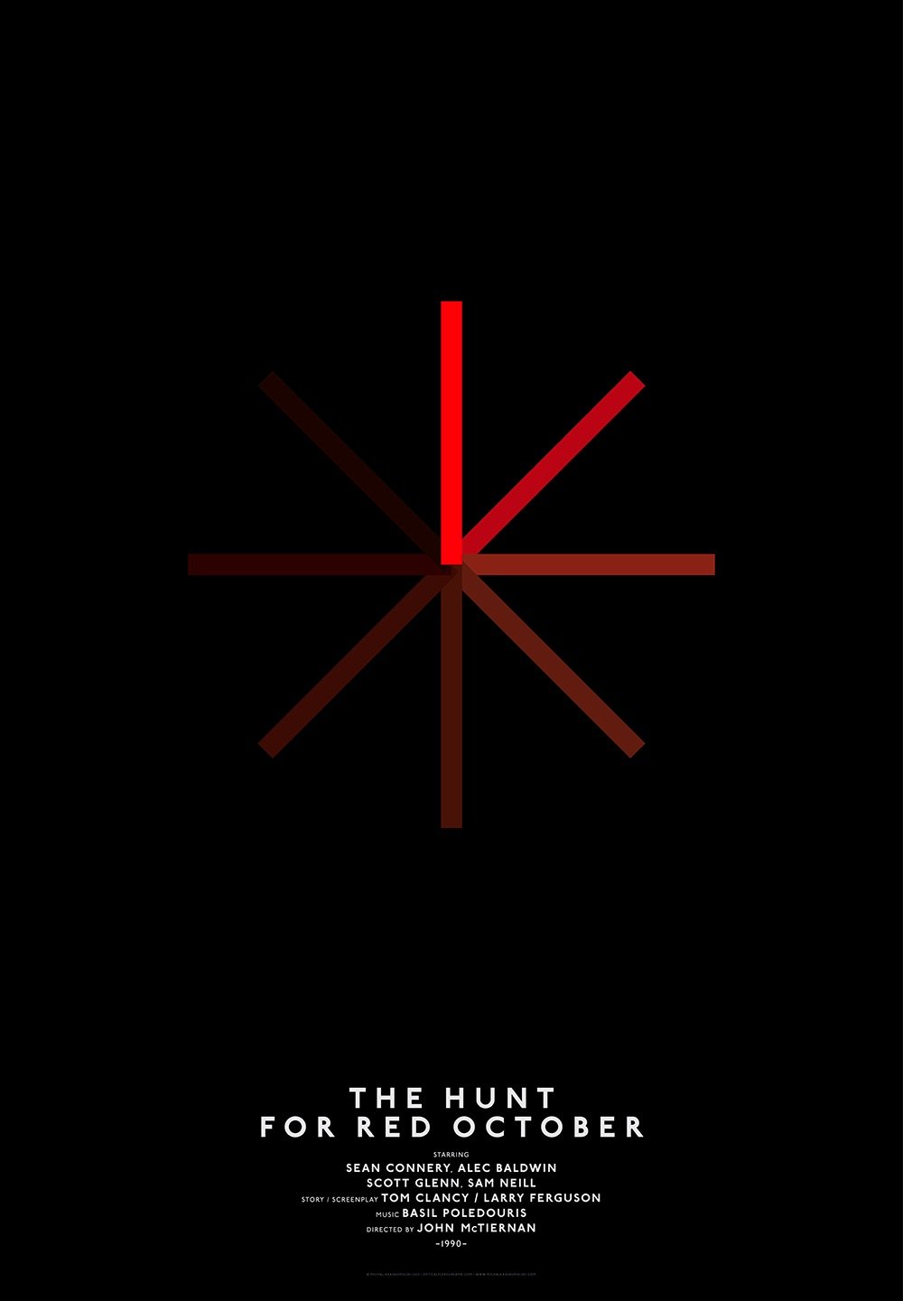
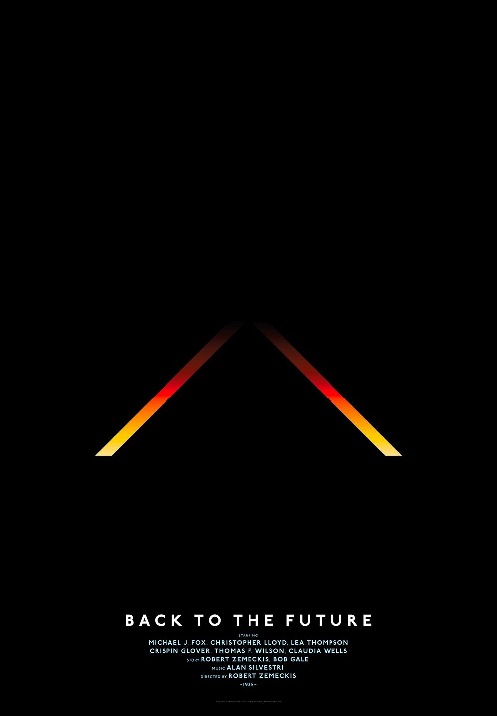
There’s minimalism and then there’s these classic movie posters from Michal Krasnopolski. Each poster is based on a simple grid of a circle, a square, and four intersecting lines. It would be a challenge to come up with a poster for every movie in this style, but the ones he picked work really well. (via moss & fog)
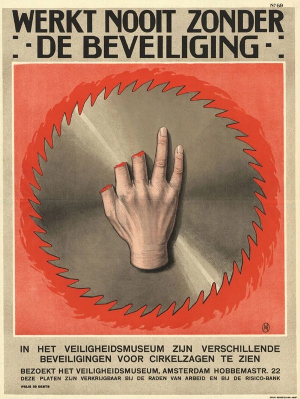
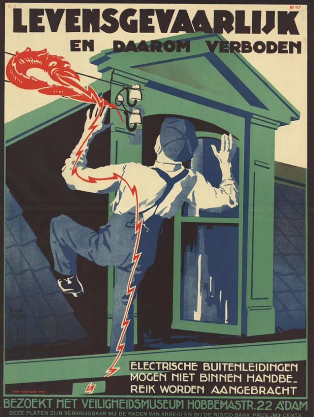
These railway safety posters from Thailand are kind of amazing — very straightforward, graphic, and often gruesome in their illustration of the dangers involved with improper train travel.
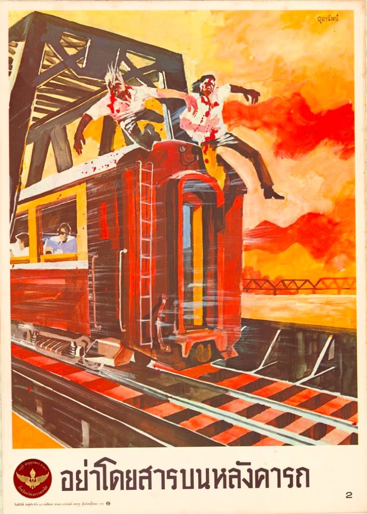
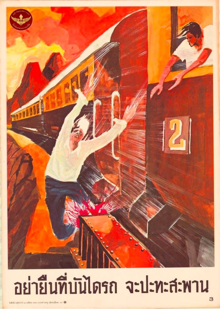
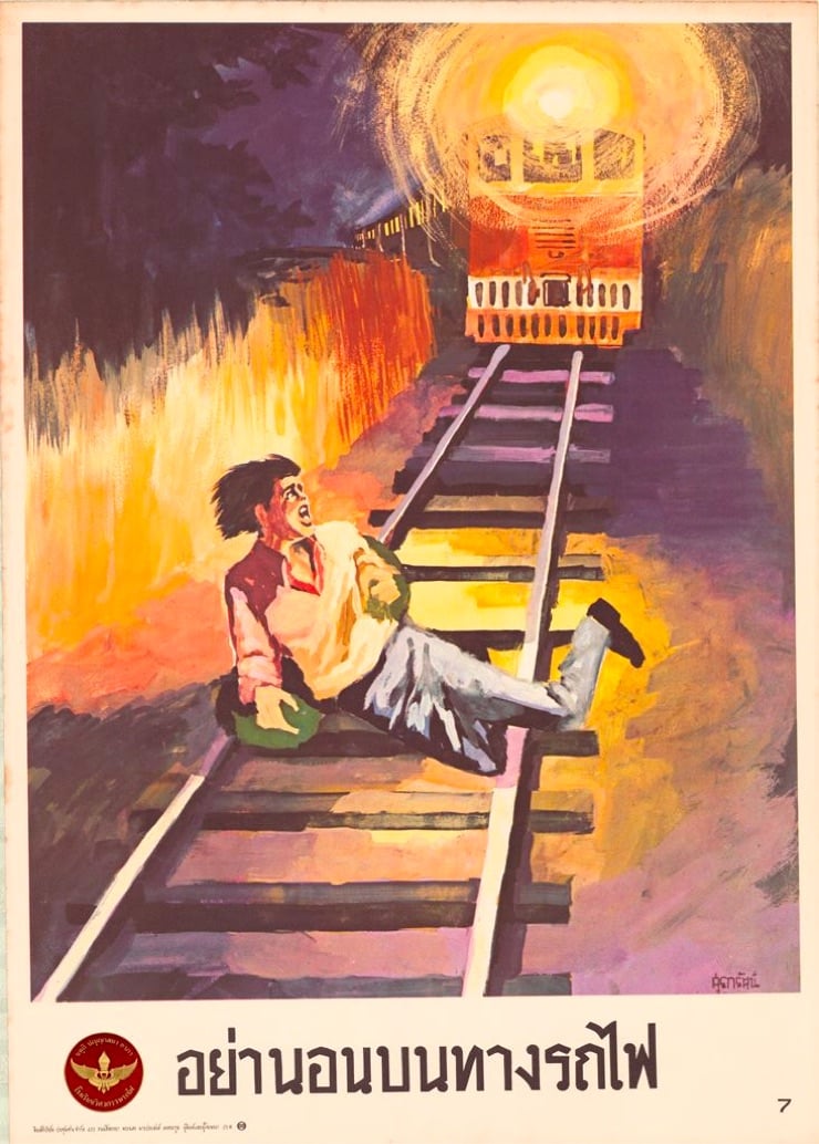
See also The Horror of Vintage Dutch Safety Posters. (thx, chelsea)
Very Expensive Maps is, well, I can’t say it much plainer than host Evan Applegate: “Very Expensive Maps is a podcast by cartographer Evan Applegate in which he interviews better cartographers.” A podcast about a visual medium like maps is maybe a tiny bit like dancing about architecture, but Applegate makes it work. The archives are a key part of the show…lots of links to the maps discussed during each episode. Here’s a sampling of some of the visuals from recent shows:
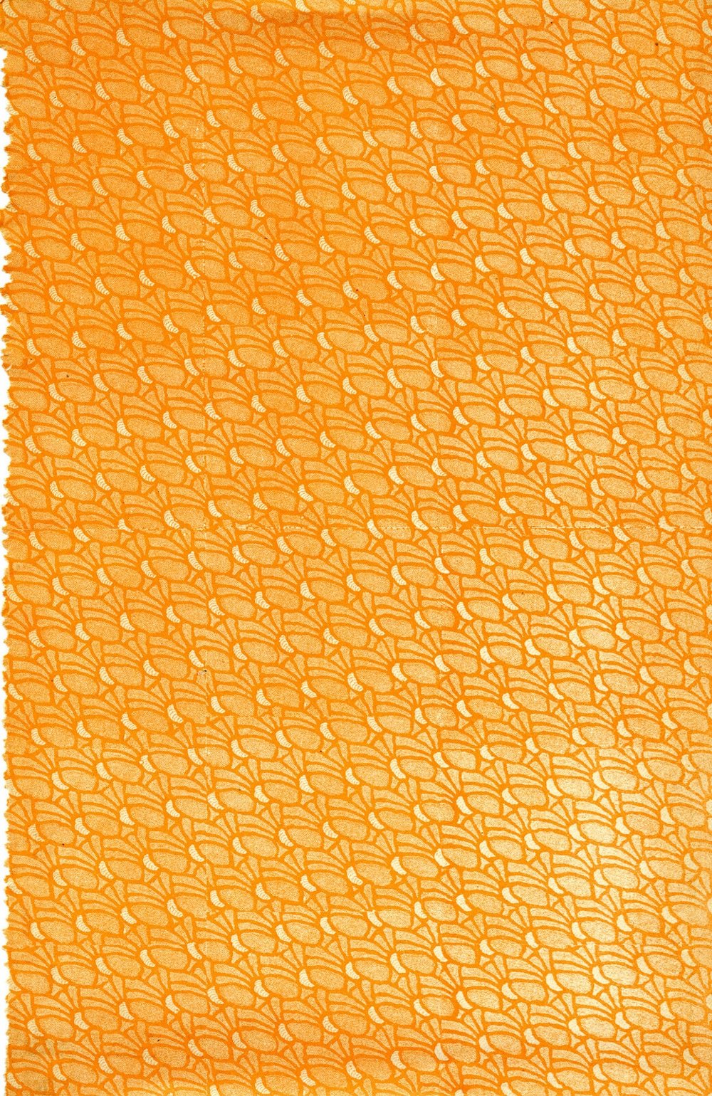
You know me; I love a good book cover. The AIGA’s annual roundup of the best designed books and covers is usually aces and the results of the 2022 competition (announced at the beginning of July 2023) is no exception. Here are a few I picked out that I didn’t feature in The Best Book Covers of 2022 back in December.
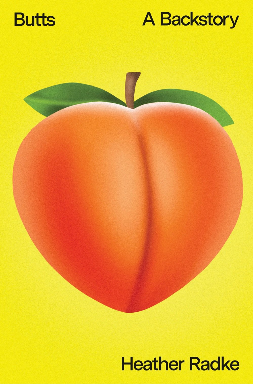
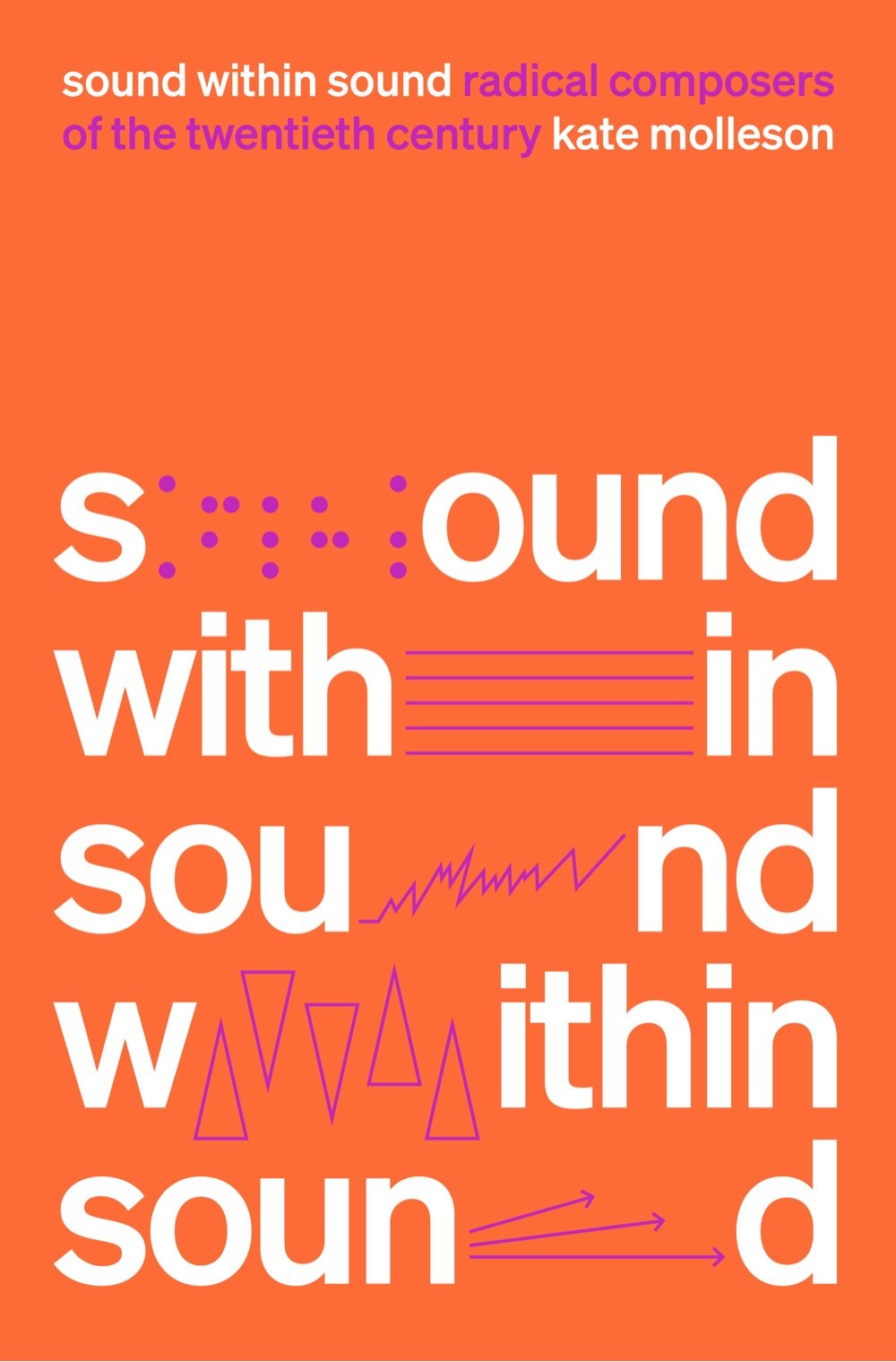
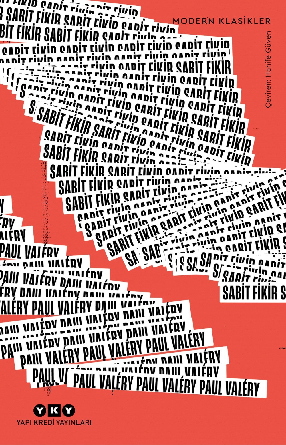
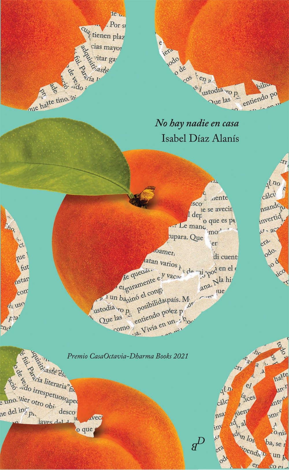
Uh, I guess I’m really into orange today? Anyway, these covers are from:
Butts: A Backstory by Heather Radke.
Sound Within Sound: Radical Composers of the Twentieth Century by Kate Molleson.
Sabit Fikir by Paul Valéry.
No hay nadie en casa by Isabel Díaz Alanís.
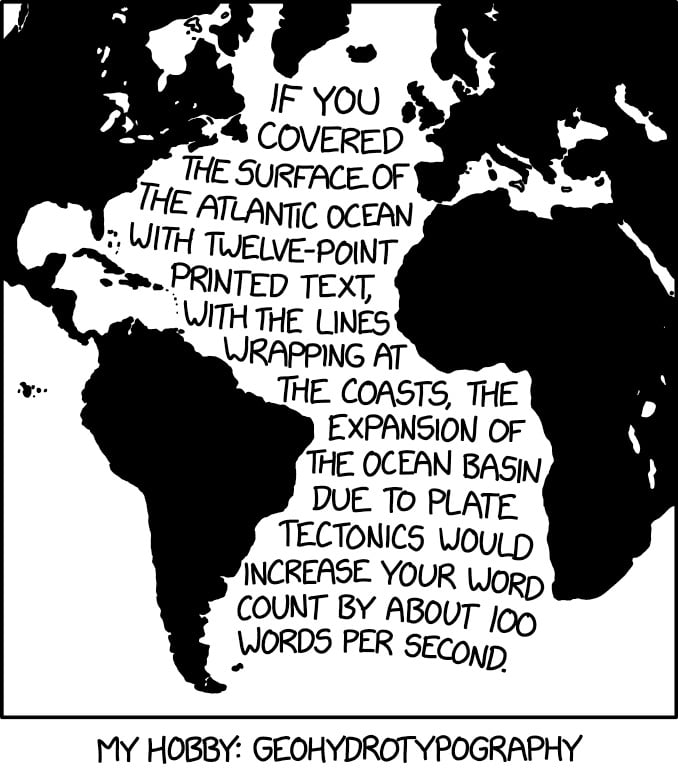
This, from XKCD, hits my science and design interests right in the sweet spot.
If you covered the surface of the Atlantic Ocean with twelve-point printed text, with the lines wrapping at the coasts, the expansion of the ocean basin due to tectonics would increase your word count by about 100 words per second.
This reminds me of Ben Terrett’s calculation of how many helveticas from here to the Moon and my subsequent calculations about the point size of the Earth and the Moon (50.2 billion and 13.7 billion, respectively).
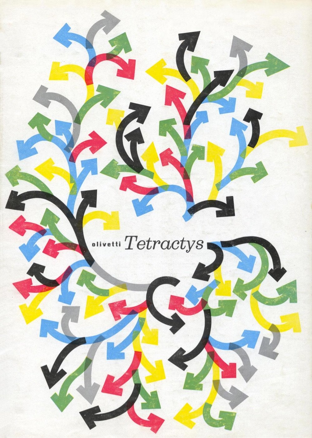
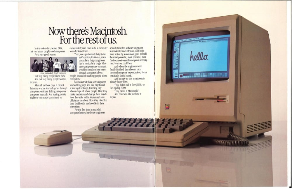
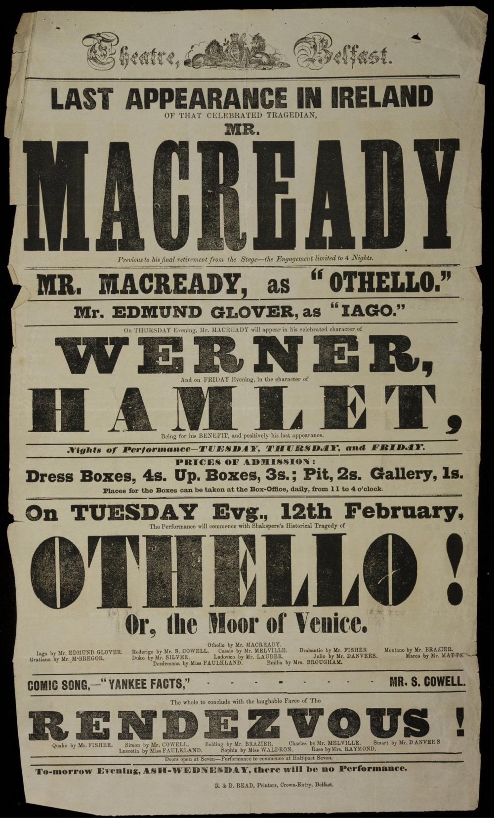
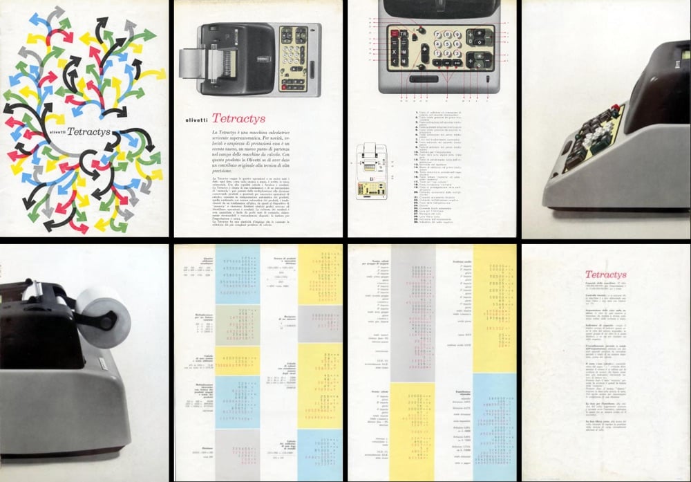
archives.design is a labor of love site run by Valery Marier where she collects graphic design related materials that are available to freely borrow, stream, or download from the Internet Archive. I’ve only scratched the surface in poking around, but so far I’ve found Olivetti brochures, a collection of theater programs from the 19th and early 20th centuries, several Apple things, The Vignelli Canon, a specimen book of wood type from the 1880s, and many issues of Emigre. What a resource!
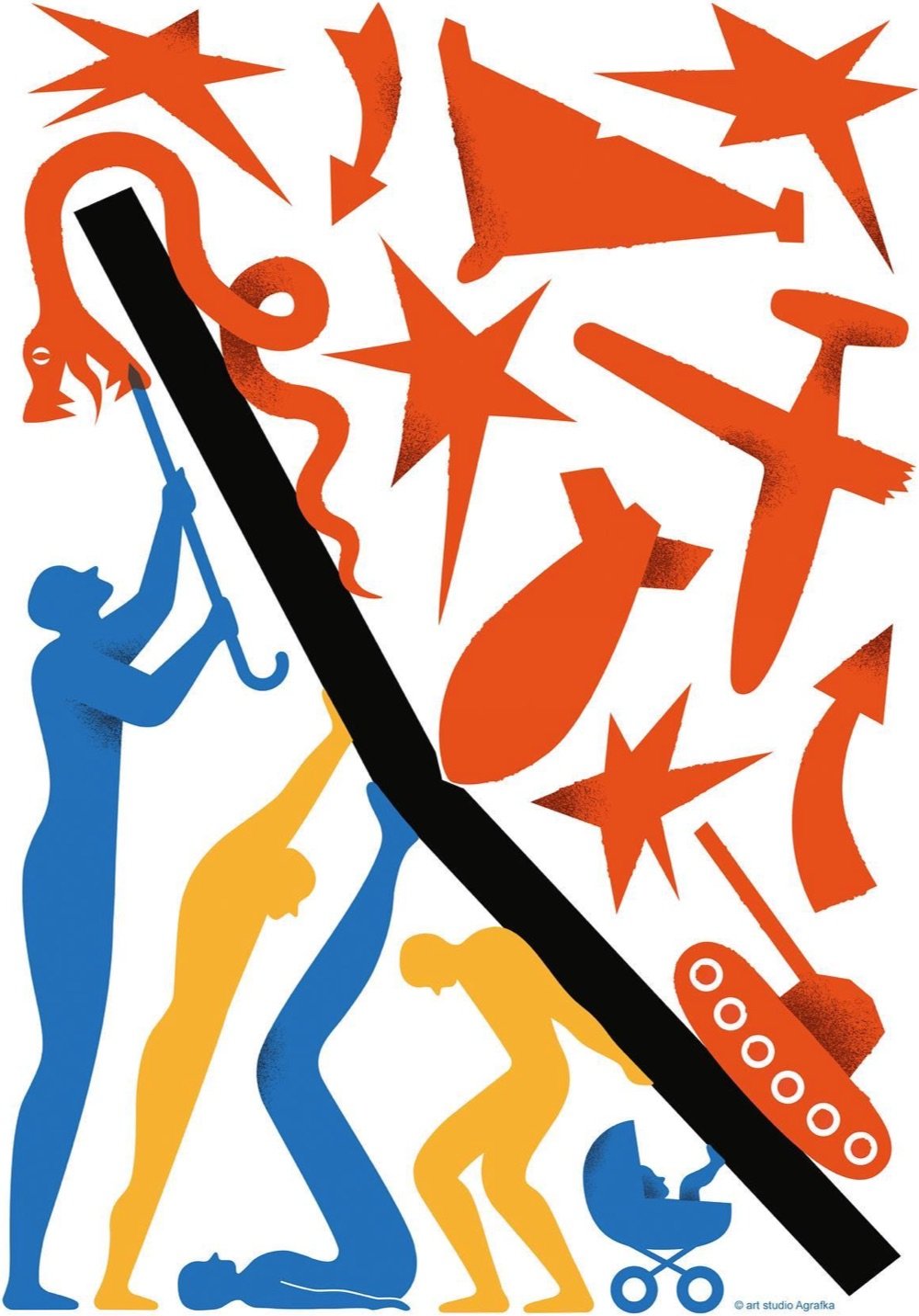
This is a poster for the 2023 International Book Arsenal Festival which recently took place in Kyiv, Ukraine. The poster was designed by Art Studio Agrafka from an illustration they originally did for the cover of Linkiesta Magazine.
A book festival. During a war. In a city under martial law. While schools and legislatures here in the US ban books about Black and LGBTQ+ experiences based on bad faith complaints of tiny fundamentalist parent groups. Tell me, who’s doing democracy better right now? (via @gray)
Yesterday I posted about the 2023 Drone Photo Awards and one of my favorite shots was of a playground/park in Poland. My curious pal Neven tracked down more information about the park and, well, it’s so cool and cute!
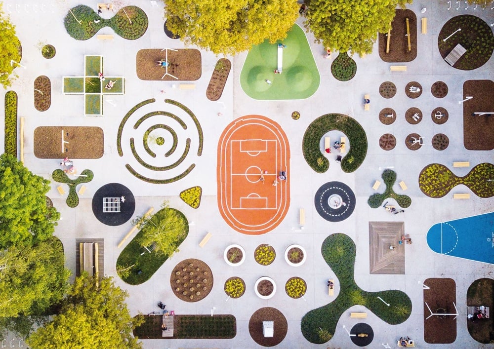
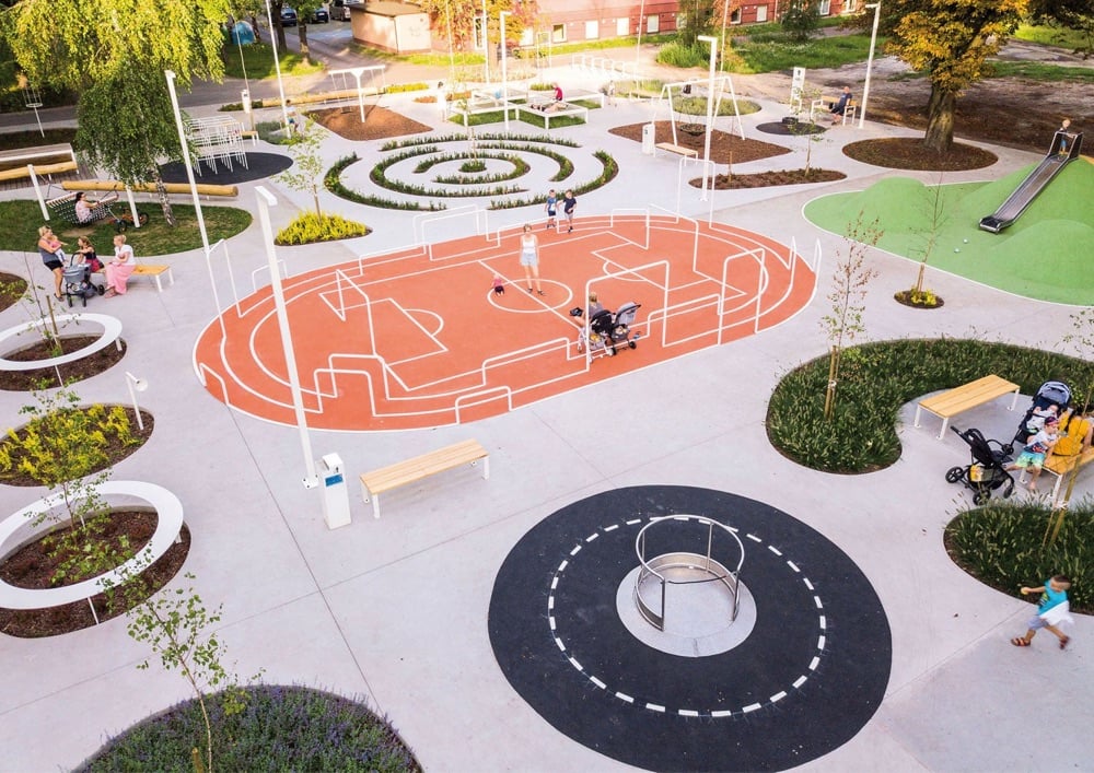
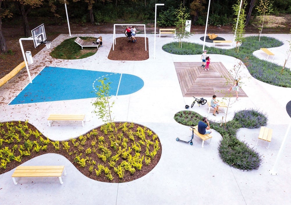
Here’s part of the description from the park’s creators, SLAS Architects:
“Activity zone” is a multifunctional public space which is the first phase of regeneration and integration of the University of Silesia campus with the urban tissue of Chorzów City.
The site is located in the place of the demolished military building with a number of old existing trees. “Activity zone” is designed as concrete platform strongly perforated and filled with a diverse programme that includes: students leisure zone, children’s play devices, fitness, individually designed elements of street furniture and greenery including all existing trees. Some parts of the garden are possible to develop by local seniors. The platform connects the diverse program, intensifies the use of the place and becomes itself an element of play. Variety of attractions enhance interactions between users of all age groups and integrates academic community with local inhabitants and the surrounding nature.
My only complaint: it’s maybe a little too small? But otherwise: top marks.
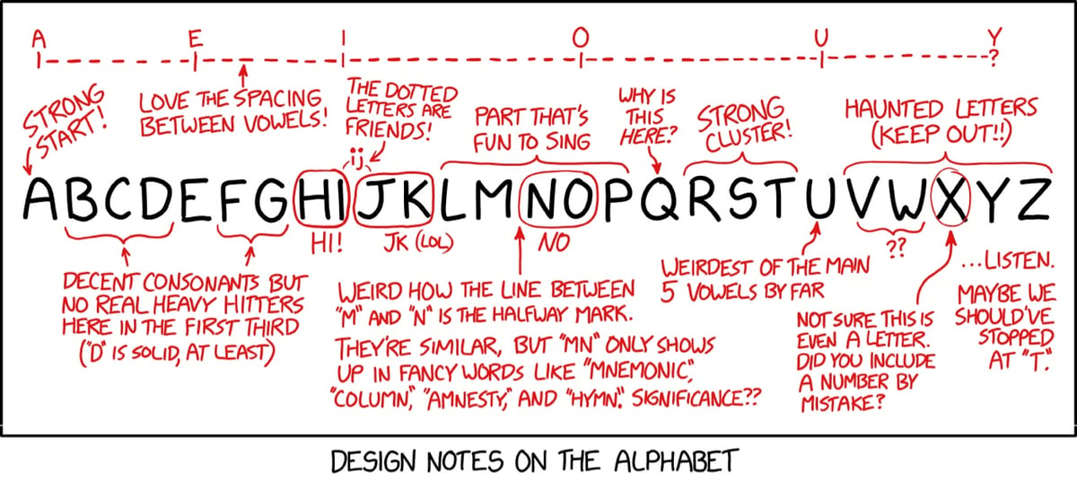
From XKCD, some notes on the design of the alphabet. I actually hadn’t noticed the spacing of the vowels before.
See also The Evolution of the Alphabet.
Yuri Suzuki’s The Ambient Machine is a device for creating atmosphere, playing ambient sounds. The machine has 32 toggle switches on it; each switch actives a different sound (waves, running water, birds, wind, white noise) that you can blend to create your perfect aural backdrop.
The Ambient Machine provides us with a variety of sounds and music that we can use to design our own background ambience. White noise can mask unpleasant sounds around us and give us a sense of relief, Natural sounds can provide the feeling of relocating to a new environment, providing a break from the environments we have been confined to, and musical rhythms can provide patterns for us to find stability with.
Only 20 models of the original machine were created and sold, but you can preorder a slightly different version for ¥143,000 (~$1,000).
Jigar Patel uses 3D modelling software to imagine factory production lines that “build” logos and app icons for brands like Instagram, Netflix, Apple, Spotify, Amazon, and many others. He’s also posted a bunch of behind-the-scenes videos about how he does it — love it when artists show their work.
You can also follow Patel’s work on Instagram and TikTok.(thx, michael)
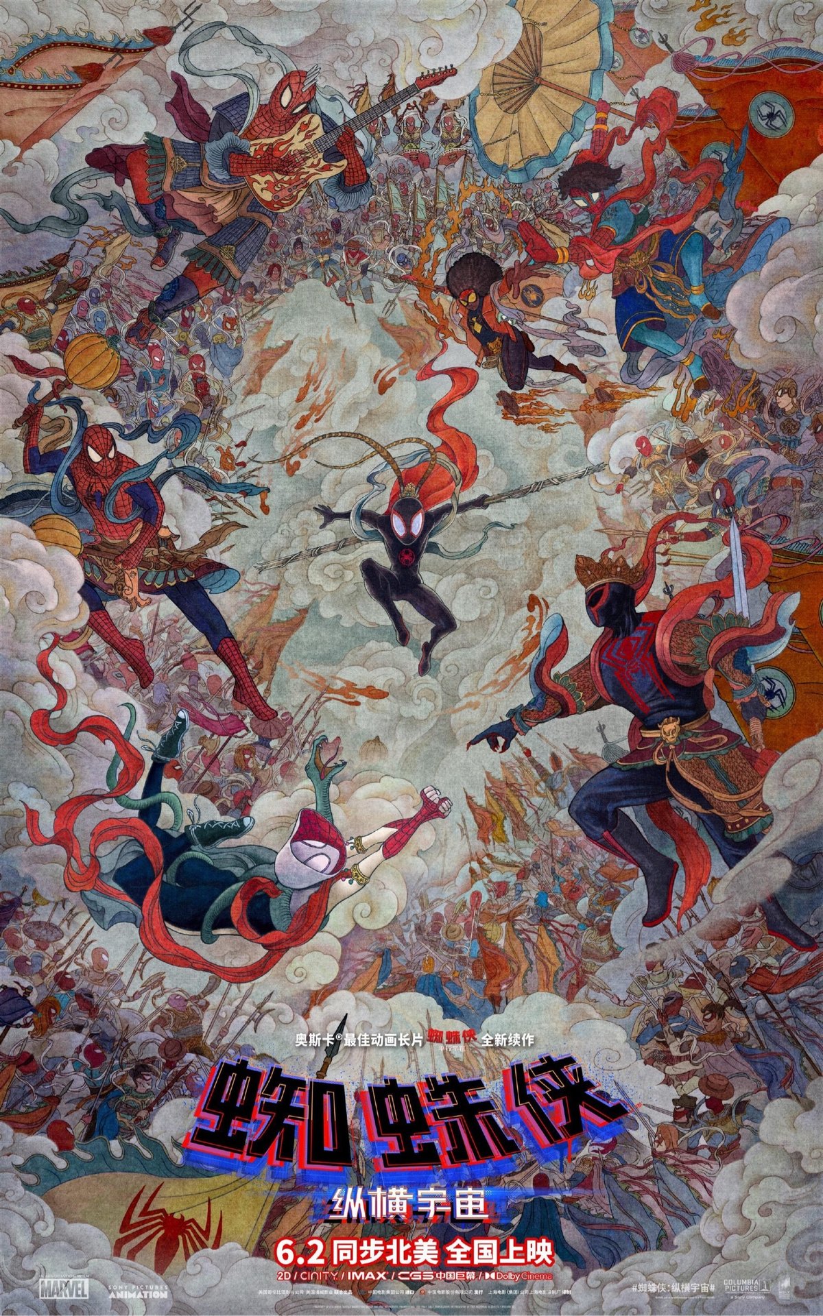
Totally loving this Chinese movie poster for Spider-Man: Across the Spider-Verse (perhaps designed by Huang Hai).
And while we’re on the subject, I watched the movie the other day and loved it. In fact, it might be the most visually inventive movie I’ve ever seen…it’s just one mindbending visual after another, for more than two hours. (via @gray)
In this short video, Norwegian creative director Torger Jansen explains how he designed an unofficial transit map that combines all three of Oslo’s public transportation networks (tram, metro, train) into a single diagram. His four main goals:
1. Showing all the lines on every network, thus making it easier to understand the service patterns.
2. Making it recognisable with the official line colours.
3. Compressing unnaturally long distances between stations.
4. Balancing aesthetics and accessibility. The diagram is clear and easy to read with minimal fuss.
As Jansen notes, this is not how a design process would work in the real world — there’s no user testing or competing stakeholders to please — but from a purely aesthetic and functional standpoint, it’s still an interesting challenge and puzzle to attempt to solve. (thx, david)
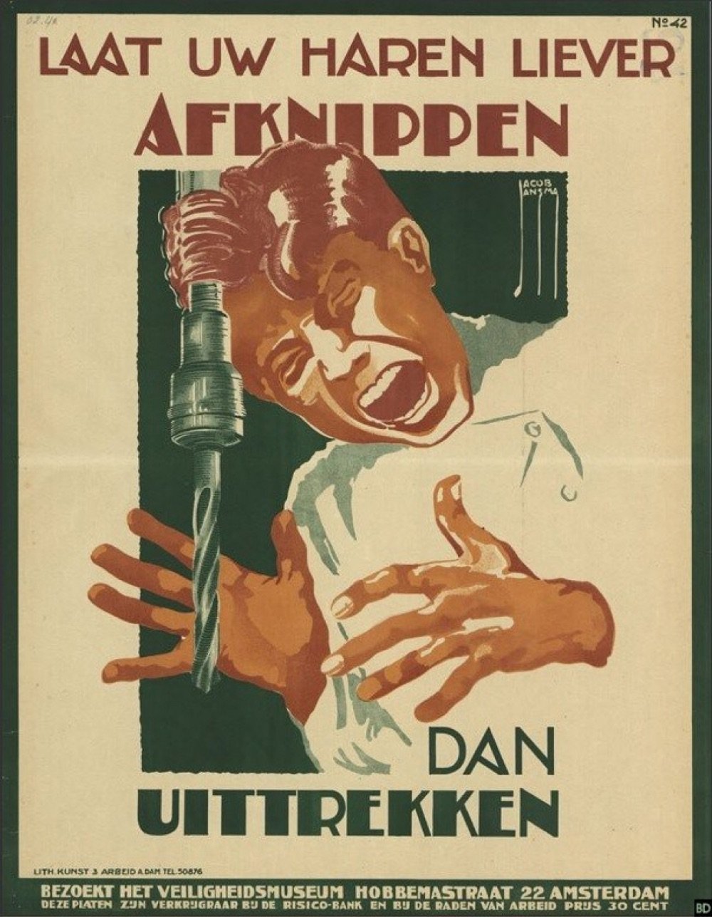
When it came to making safety posters, the Dutch were pretty hardcore — a lot of these vintage posters look more like horror film adverts than safety warnings. (via meanwhile)
Drawing from the materials of The Roddenberry Archive, this video takes us on a virtual tour of the 3D rendered bridges of every iteration of the Starship Enterprise from Star Trek, from the original 1964 sketches to the final scenes of Star Trek: Picard. I’ve watched a bunch of Star Trek recently and it was neat to see the evolution of the design and presumed technology. Designing for the future is difficult and it’s even tougher when, for instance, you need to design something that for the future that looks contemporary to now but also, somehow, predates a design that looked contemporary 30 years ago. (If that makes any sense…)
You can also head over to The Roddenberry Archive to check out all of the Enterprise designs in more detail, inside and out. (via open culture)
Pooja Saxena collects interesting examples of lettering from the streets of cities in India. Here are a few recent examples:
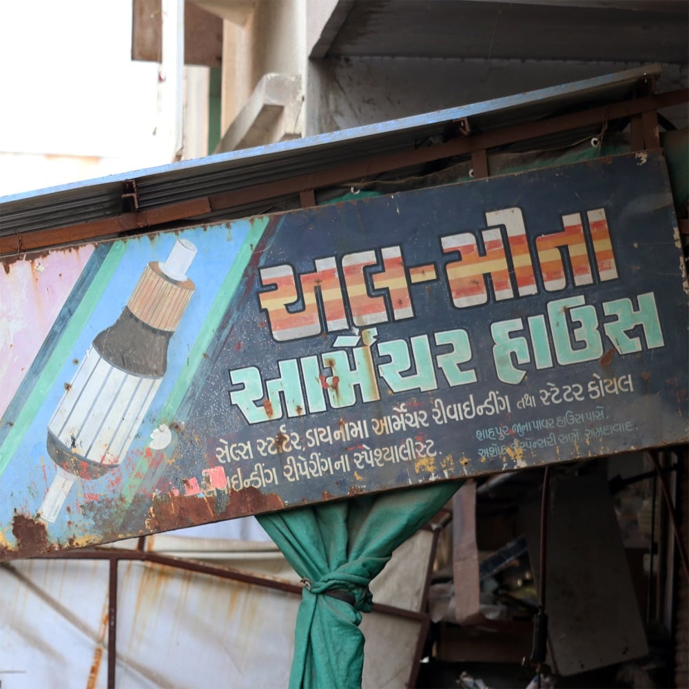
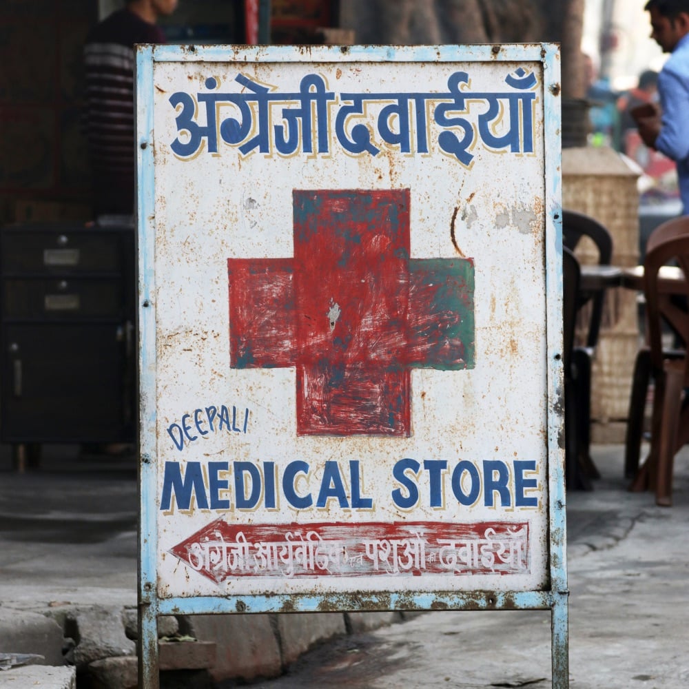
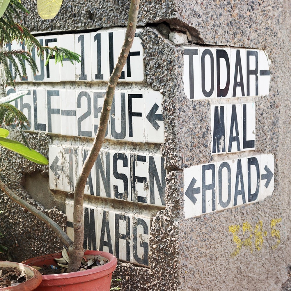
(via @ashur)
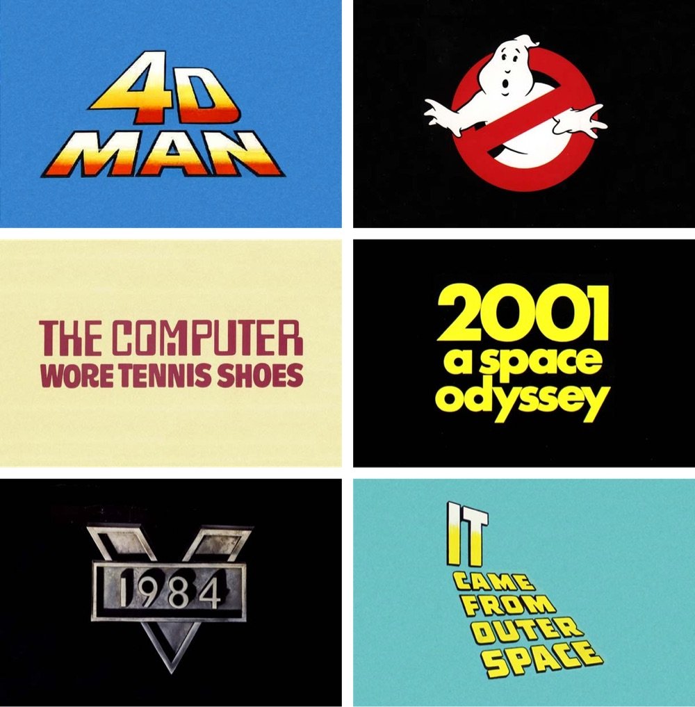
Loving scrolling through this collection of sci-fi movie logos from Reagan Ray.
As is the case with most of my logo posts, it’s been fun to pick up on the trends. There’s the trick where they remove the segments from the top half of the letters like Blade Runner, or the embossed brushed metal of Robocop. Glowing letters were a big trend that started in the late 80s, most likely set off by the Alien franchise. And I can never get enough of the 3D type in early films.
You can check out more of Ray’s logo collections here.
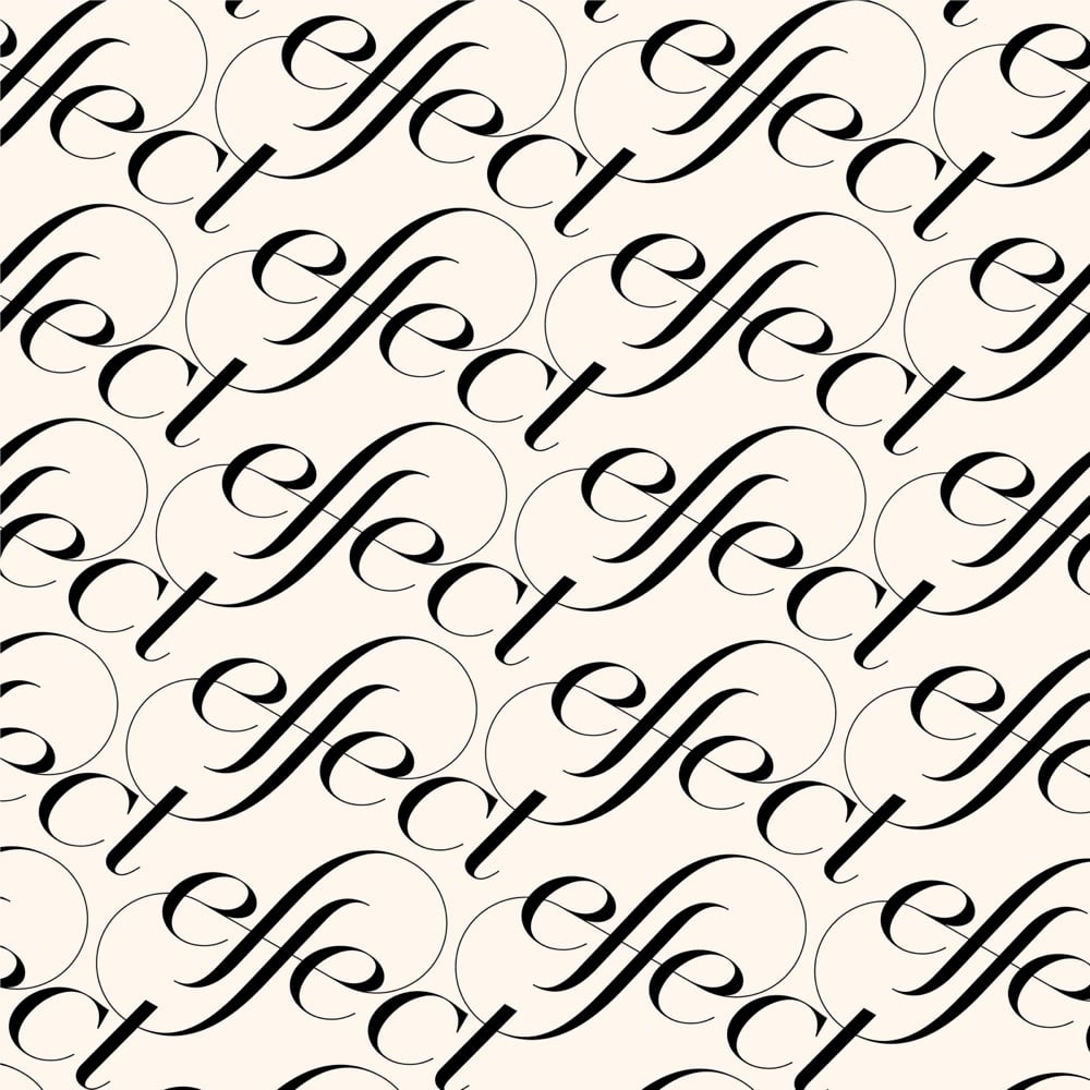
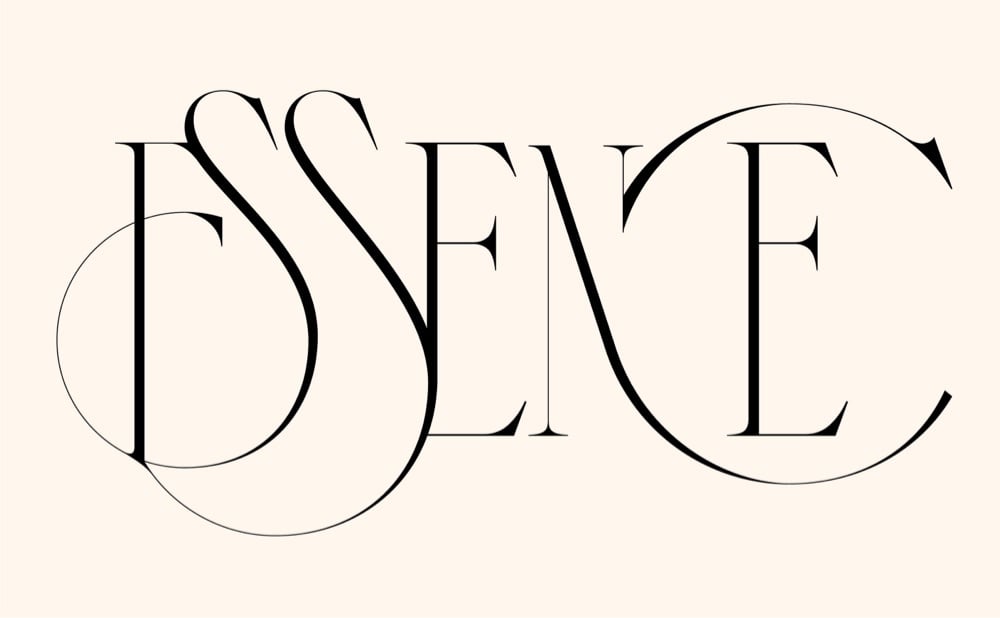
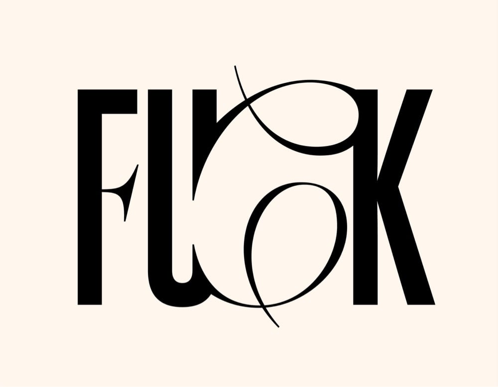
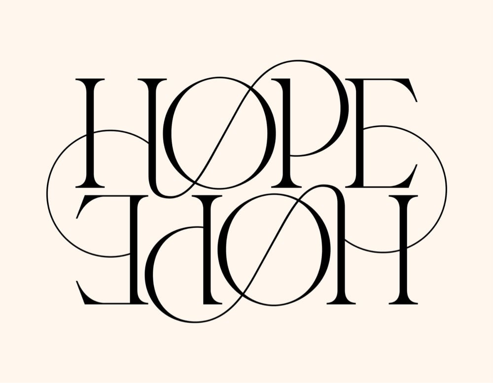
In a pair of collections on Behance, Hungarian designer and artist Miklós Kiss showcases his skill with ligatures and swirling serifs: Type Beast and Type Beast 2.0
I love typography. I love letters. I love to make ligatures and find connections between letters. These are not logos, but sometimes they can be. Sometimes this kind of typography is not readable. Sometimes they look like abstract artworks. Sometimes they look like choreography. I love to watch them move, I love their beauty. I call my little typography monsters my Type Beasts.
(via abdz)
No matter which side you come down on in the debate about using AI tools like Stable Diffusion and Midjourney to create digital art, this video of an experienced digital artist explaining how he uses AI in his workflow is worth a watch. I thought this comment was particularly interesting:
I see the overall process as a joint effort with the AI. I’ve been a traditional artist for 2 decades, painting on canvas. And in the last five years I’ve been doing a lot of digital art. So from that part of myself, I don’t feel threatened at all.
I feel this is an opportunity. An opportunity for many new talented people to jump on a new branch of art that is completely different from the one that we have already in digital art and just open up new way of being creative.
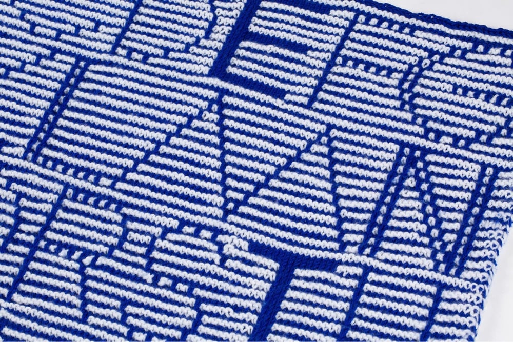
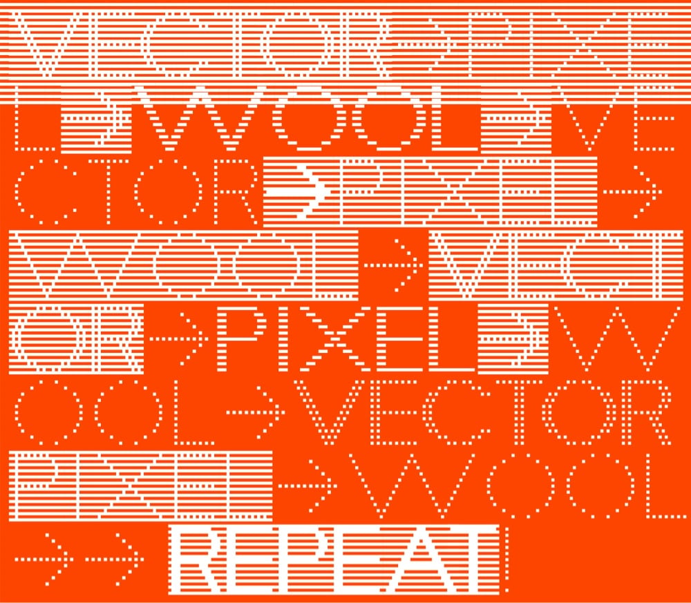
Knit Grotesk is a typeface based on Futura that’s designed specifically for hand knitting. It comes in three different weights and two styles: dots and stripes. Its designer, Rüdiger Schlömer, is also the author of a book called Typographic Knitting: From Pixel to Pattern:
Learn to knit a variety of typefaces modeled on digital designs by well-known type foundries including Emigre, Lineto, and Typotheque, and emblazon your hats, scarves, and sweaters with smartly designed monograms, letters, or words. Beginning with knitting basics, tips, and resources, and progressing through more advanced techniques, Typographic Knitting provides a systematic introduction on how to construct a variety of letter designs using different knitting techniques. This book bridges the gap between craft and design in a new way, and will delight typography connoisseurs, avid knitters, and makers looking for a novel medium.
(via print)
Newer posts
Older posts
Socials & More