In some workplaces, people use Helvetica to conduct business because it conveys a sense of order and authority. In other workplaces, people use Comic Sans, which conveys a sense of casual chaos. Designer Alexander Pravdin decided to combine the two typefaces into one diabolical font: Comic Helvetic. You can download it here.
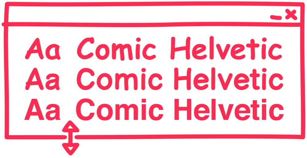
If you need me for the rest of the day, I’ll be over in the corner trying to decide where these three typefaces fit on the alignment chart. (via print)
Update: See also Comic Neue. (via @DirkOlbrich)
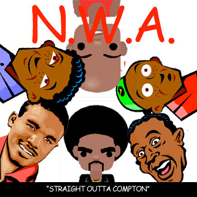
On the Clipart covers blog, you’ll find noted album covers redone with clip art and Comic Sans.


(via @aaroncoleman0)
Researchers at Princeton have found evidence that making something more difficult to learn improves long-term learning and information retention. More specifically, changing the typeface from something legible (like Helvetica) to something more difficult to read (like Monotype Corsiva or Comic Sans) increased retention in actual classroom settings.
This study demonstrated that student retention of material across a wide range of subjects (science and humanities classes) and difficulty levels (regular, Honors and Advanced Placement) can be significantly improved in naturalistic settings by presenting reading material in a format that is slightly harder to read…. The potential for improving educational practices through cognitive interventions is immense. If a simple change of font can significantly increase student performance, one can only imagine the number of beneficial cognitive interventions waiting to be discovered. Fluency demonstrates how we have the potential to make big improvements in the performance of our students and education system as a whole.
I agree with Lehrer…get David Carson on the horn. (thx, lara)


Socials & More