J Is for Jim Crow - Typography and Racial Stereotypes

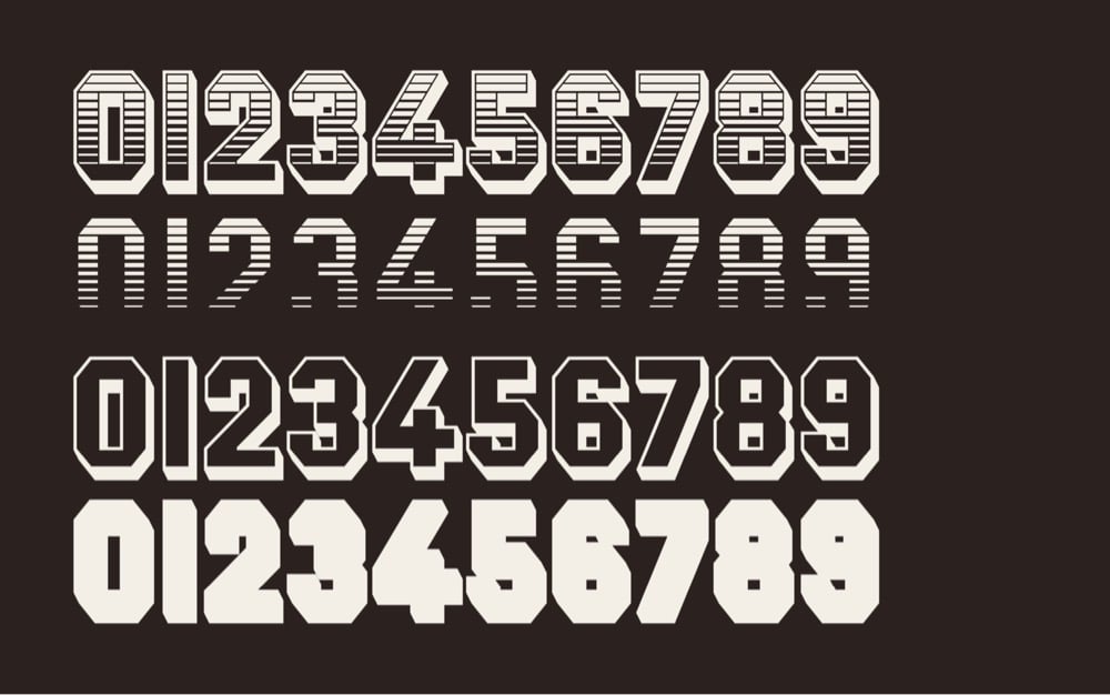
For The Believer, Sarah K. Kramer wrote about a typeface called Jim Crow, how it came to be called that (its original name was Gothic Shade), and what its casual use by designers for decades means.
One of Seals’ pet peeves is “stereo-typography” — things like east Asian restaurants with brush-script logos — and in particular, he takes issue with the way designers often use “black weight” (very thick and bold) font to signify African American culture. For example, the Neuland typeface (designed in 1923 by Rudolf Koch) has been used on many covers of books by Black writers, like Richard Wright’s Native Son. One theory on the origin of the association of these black-weight fonts with Black culture is that they evoke woodblock typefaces printed on nineteenth century tobacco ephemera — an industry closely linked with slavery. Needless to say, much of this material featured racist imagery of African Americans. When Seals was contracted by HarperCollins to design a cover for Charles Blow’s The Devil You Know: A Black Power Manifesto, he definitely was not going to use a “black weight” font. Instead, he designed the cover with Ruby.
Ruby is a reworked version of Jim Crow from Tré Seals’ type foundry Vocal Type Co, which I covered here a few years ago. (thx, reed)


Socials & More