kottke.org posts about Stanley Kubrick
The creepy twins. Jack feverish at the typewriter. Danny riding his Big Wheel through carpeted hallways. The elevators of blood. These familiar scenes from Stanley Kubrick’s horror classic The Shining (and several more) have been recreated in this Lego stop-motion animation. The video took 50-60 hours over a three-week period to make and was an exercise in constraints:
“Mostly, it came down to choosing the right pieces,” he says. “I made this movie only with pieces I already had in my collection, so I had to do with just what I had laying around. For instance, the famous carpet pattern in the hallway could have been more realistic, but with the pieces I had, it became a little more abstract. I went with clay for the bloody elevator scene also because I do not have thousands of red translucent pieces.”
(via boing boing)
In the 60s and 70s, Howard Johnson’s was the largest restaurant chain in the US — the restaurants and their associated hotels were ubiquitous while travelling America’s roadways. So it made sense that when Stanley Kubrick needed a hospitality brand for the Earthlight Room on the space station circling Earth in 2001: A Space Odyssey, he reached for HoJo’s.
And of course, even in 1968, you had to do some sort of cross-promotion and, bizarrely, what Howard Johnson’s came up with was a 2001-themed children’s menu.
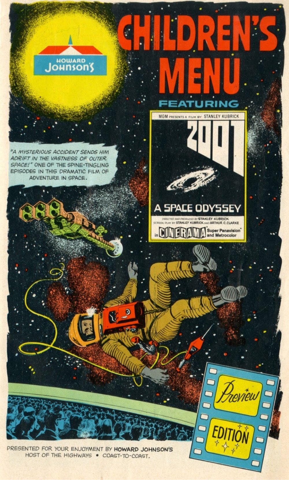
Even more weirdly, the menu is not about the movie itself, it’s about a family that goes to see the movie. The whole opening sequence with the apes is omitted entirely, as is the HAL 9000 (arguably the film’s main character) — I suspect the HoJo’s people didn’t get to see the entire movie while putting this together (as evidenced by the “preview edition” graphic in the bottom right corner of the menu’s cover).
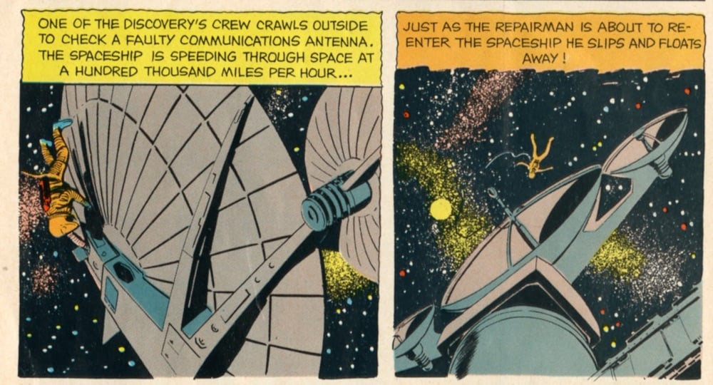
It’s cool to see scenes from the movie rendered in comics form:
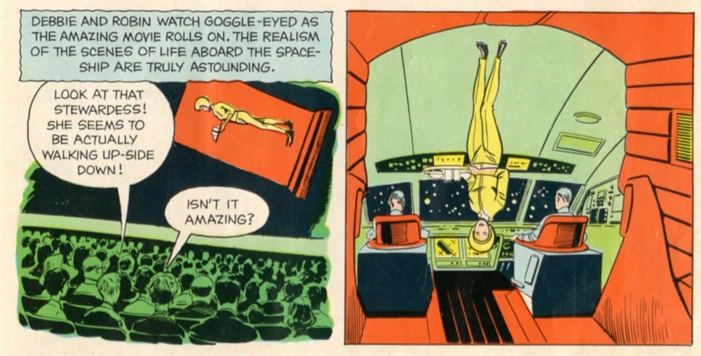
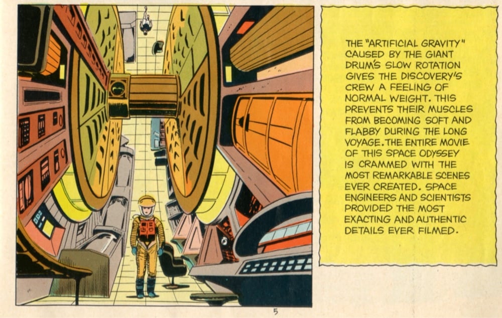
You can see the entire menu here, including the activity page — just click on one of the images to enter slideshow mode. (via meanwhile)
Update: Fun fact: The food on the 2001-themed kids menu would likely have been developed by Jacques Pépin and Pierre Franey, who were the head chefs at Howard Johnson’s. (via @EineKleine)
Yesterday I posted a link to a Twitter thread by Stanley Kubrick scholar Filippo Ulivieri about a previously overlooked (*ahem*) aspect of The Shining: Jack Nicholson breaks the fourth wall by micro-glancing at the camera dozens of times during the film. It turns out that Ulivieri also made a visual essay about this and it’s really worth a watch.
Let’s go back to that glance that has been noticed by a few film critics. Some say it’s a Brechtian effect to expose the artifice of the mise en scène and have the audience reflect on the film medium. But Kubrick’s films are not intellectual, despite what the critics say. “The truth of a thing,” Kubrick said, “is in the feel of it, not in the think of it.” If this look at the camera means anything, for me it means that we are not safe from Jack’s fury. He knows where we are, he may come for us next. But what about the others? Why on Earth is Jack Torrance constantly glancing at us, breaking the fourth wall over and over, and over, and over.
What all of these micro-glances mean is open to interpretation. Ulivieri offers a few theories of his own — e.g. Jack is looking at ghosts, or perhaps just one ghost: the camera ghost — but says one of the reasons he made the video is to hear what other film critics and fans think might be going on here. I thought this response to his thread hit near the mark:
My gf’s read The Shining, and it’s really interesting now that they notice all these fourth wall breaks Jack does. throughout the whole book, Jack feels like he’s being watched and judged, and that’s why he feels so much pressure to keep up appearances.
If Jack is the only one in the MOVIE to consistently break the fourth wall, where it’s always just passing glances, that’s a pretty effective way to show the character’s fear of being watched or judged. Especially if WE don’t notice it at first.
I wonder how many The Shining re-watches this video and thread have inspired…I’m gonna watch it again in the next few days and see how my awareness of the glancing changes the film for me.
From YouTuber poakwoods, a pair of criss-cross mashups of Star Wars and 2001: A Space Odyssey, but with their directors switched. When George Lucas takes the helm of 2001, you get a more crowd-pleasing and freewheeling movie while Stanley Kubrick’s Star Wars becomes more balletic and contemplative. Both are pitch-perfect.
See also Wes Anderson’s Star Wars. (via daringfireball)
Isolation does funny things to people. Just ask designer Lydia Cambron, who recognized a certain kinship between the themes of her lockdown in Brooklyn this spring and Stanley Kubrick’s 2001: A Space Odyssey. Over the course of two months, Cambron meticulously recreated 2001’s ending scene in her apartment, not only shot-by-shot but nearly look-by-look, and produced a tiny masterpiece of her own.
The adapted version delineates the passing of time through wardrobe rather than age, identifying each phase of the character’s journey with a product of self care or PPE. Tools of private entertainment or self betterment are also used as props, questioning our confidence in products and productivity as anchors during times of uncertainty. Multitasking while #wfh, conjuring guilt or longing with unused exercise equipment, your entire being reduced to a measure of time — these scenes all illustrate the absurd comedy of trying to maintain control during this unprecedented and unpredictable time.
(via daring fireball)
From Steve Begg (who I would guess is this Steve Begg, who has done VFX on the recent Bond films) comes an epilogue of Stanley Kubrick’s 2001: A Space Odyssey. The scene picks up 203 years after the events of 2001, following Frank Poole’s body as it encounters a monolith.
Saul Bass is one of the most celebrated designers of movie posters and title sequences in the short history of cinema. He created iconic poster designs for movies like Vertigo, The Shining, Anatomy of a Murder, and Schindler’s List. In this short film, we learn the strategy behind Bass’ designs: symbolize and summarize.
See also several rejected concepts by Bass for The Shining movie poster, with scribbled notes from Stanley Kubrick.
In 1960, the National Film Board of Canada released a short documentary called Universe. The film follows the work of astronomer Donald MacRae at an observatory in Ontario, which is accompanied a special effects-heavy tour of the solar system, galaxy, and universe: “a vast, awe-inspiring picture of the universe as it would appear to a voyager through space”. Universe was nominated for an Oscar in 1961 and also caught the eye of Stanley Kubrick, who used it as inspiration for 2001: A Space Odyssey.
“Stanley had seen the National Film Board movie Universe.” Most of the crew on 2001 were familiar with the Canadian production, made by filmmakers Colin Low and Roman Kroitor, all having seen it at the early stages of 2001’s production, it being “required watching” at the insistence of Kubrick himself, who had seen the documentary “almost 100 times”, “until the sprockets wore out,” 2001 special effects supervisor Con Pedersen remembers.
Kubrick was so taken by the depiction of the celestial objects in the film that he hired the co-director and a special effects technician from Universe to work on 2001. The narrator of Universe, Douglas Rain, also became a integral part of Kubrick’s masterpiece. After ditching the idea that 2001 would be narrated by Rain — “as more film cut together, it became apparent narration was not needed” — Kubrick chose Rain as the now-iconic voice of HAL 9000.
After finally excising the narrator altogether, he simply made Rain the voice of HAL, liking his “bland mid-Atlantic accent”. The decision was entirely Kubrick’s, who had become concerned with the character of the computer. “Kubrick was having,” Rain says, “a problem with the computer. ‘I think I made him too emotional and too human,’ he said. ‘I’m having trouble with what I’ve got in the can. Would you consider doing his voice?’ So we decided on the voice of the computer.”
But back to Universe, which is a marvelous little film (even though it asserts at one point that “it is reasonably certain” that Mars contains vegetation). I love the early sequence of the astronomer setting up his telescope — the way he walks along inside of it and then casually lifts it up into place. It’s really just a bigger version of the small reflector that I have, not any more complicated than a couple of mirrors pointed in the right direction. It’s incredible what we humans have learned about the universe simply by collecting ancient starshine with polished lenses and mirrors. (via clayton cubitt)
Film & design legend Pablo Ferro died this weekend at the age of 83. Ferro was known for designing the iconic opening title sequences for Dr. Strangelove and Bullitt (among others).
He also designed what is probably my favorite movie trailer, for A Clockwork Orange:
I wrote about Ferro’s work with Stanley Kubrick in this post 10 years ago. From a piece by Steven Heller that I linked to in the post:
Kubrick wanted to film it all using small airplane models (doubtless prefiguring his classic space ship ballet in 2001: A Space Odyssey). Ferro dissuaded him and located the official stock footage that they used instead. Ferro further conceived the idea to fill the entire screen with lettering (which incidentally had never been done before), requiring the setting of credits at different sizes and weights, which potentially ran counter to legal contractual obligations. But Kubrick supported it regardless. On the other hand, Ferro was prepared to have the titles refined by a lettering artist, but Kubrick correctly felt that the rough hewn quality of the hand-drawn comp was more effective. So he carefully lettered the entire thing himself with a thin pen.
The Art of the Title also interviewed Ferro about the Strangelove opening credits.
The titles for Strangelove were last-minute; I didn’t have much time to produce it. It came up because of a conversation between Stanley and I. Two weeks after I finished with everything, he and I were talking. He asked me what I thought about human beings. I said one thing about human beings is that everything that is mechanical, that is invented, is very sexual. We looked at each other and realized — the B-52, refueling in mid-air, of course, how much more sexual can you get?! He loved the idea. He wanted to shoot it with models we had, but I said let me take a look at the stock footage, I am sure that [the makers of those planes] are very proud of what they did and, sure enough, they had shot the plane from every possible angle.
Update: The Art of the Title also did a huge three-part interview with Ferro as a career retrospective. Great deep dive into a substantial career.
Few directors allowed their movies to speak for themselves more than Stanley Kubrick. Still, when it came to 2001: A Space Odyssey and its mysterious ending, he did attempt to let viewers know what his intention was. In a 1969 interview with Joseph Gelmis, he quickly summed up the entire plot in two paragraphs:
You begin with an artifact left on earth four million years ago by extraterrestrial explorers who observed the behavior of the man-apes of the time and decided to influence their evolutionary progression. Then you have a second artifact buried deep on the lunar surface and programmed to signal word of man’s first baby steps into the universe — a kind of cosmic burglar alarm. And finally there’s a third artifact placed in orbit around Jupiter and waiting for the time when man has reached the outer rim of his own solar system.
When the surviving astronaut, Bowman, ultimately reaches Jupiter, this artifact sweeps him into a force field or star gate that hurls him on a journey through inner and outer space and finally transports him to another part of the galaxy, where he’s placed in a human zoo approximating a hospital terrestrial environment drawn out of his own dreams and imagination. In a timeless state, his life passes from middle age to senescence to death. He is reborn, an enhanced being, a star child, an angel, a superman, if you like, and returns to earth prepared for the next leap forward of man’s evolutionary destiny.
But recently, an audio clip from a never-released Japanese documentary recorded in 1980 surfaced in which the director shares his view of the ending of the film in more detail.
I’ve tried to avoid doing this ever since the picture came out. When you just say the ideas they sound foolish, whereas if they’re dramatized one feels it, but I’ll try.
The idea was supposed to be that he is taken in by god-like entities, creatures of pure energy and intelligence with no shape or form. They put him in what I suppose you could describe as a human zoo to study him, and his whole life passes from that point on in that room. And he has no sense of time. It just seems to happen as it does in the film.
They choose this room, which is a very inaccurate replica of French architecture (deliberately so, inaccurate) because one was suggesting that they had some idea of something that he might think was pretty, but wasn’t quite sure. Just as we’re not quite sure what do in zoos with animals to try to give them what we think is their natural environment.
Anyway, when they get finished with him, as happens in so many myths of all cultures in the world, he is transformed into some kind of super being and sent back to Earth, transformed and made into some sort of superman. We have to only guess what happens when he goes back. It is the pattern of a great deal of mythology, and that is what we were trying to suggest.
So that’s the plot stated plainly, but luckily it takes nothing away from any of the metaphorical meanings that people have ascribed to the film over the past 50 years.
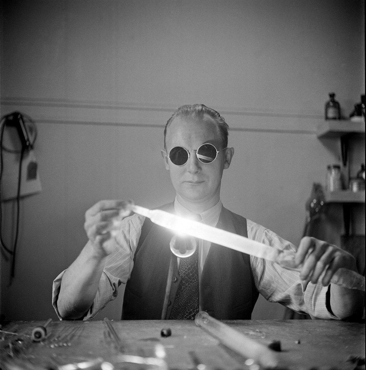
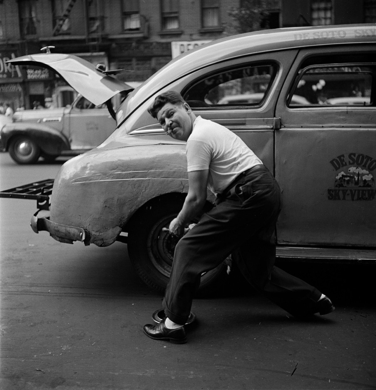
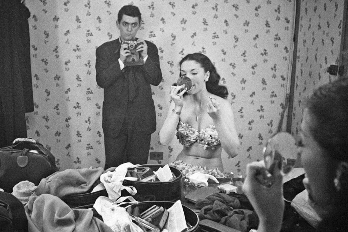
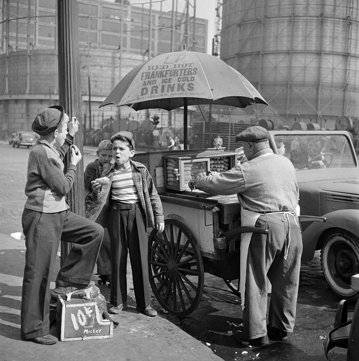
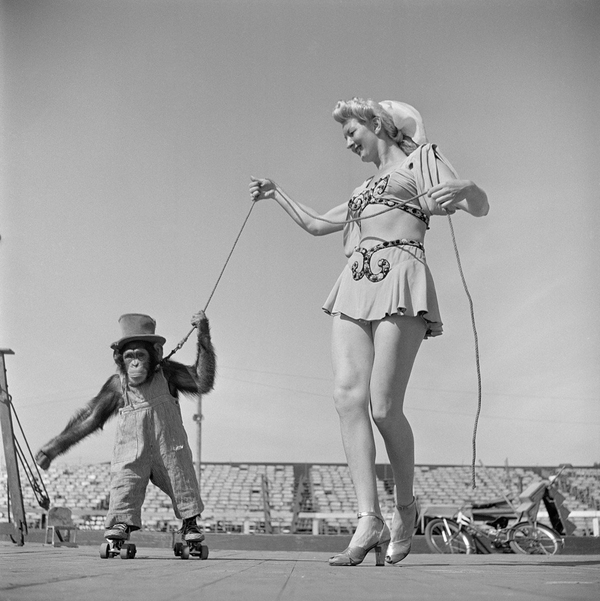
There is much to admire in how Stanley Kubrick’s movies are constructed, but the director’s keen compositional eye is perhaps the most noticeable. Before becoming a filmmaker, Kubrick honed his observational skills as a photographer in NYC. Look magazine hired him when he was just 17 years old to fill the pages of the publication with photos of life in the city. A new book, Stanley Kubrick Photographs: Through a Different Lens, celebrates Kubrick’s photography, showcasing how that youthful talent would eventually translate into a great filmmaking career.
Through a Different Lens reveals the keen and evocative vision of a burgeoning creative genius in a range of feature stories and images, from everyday folk at the laundromat to a day in the life of a debutant, from a trip to the circus to Columbia University. Featuring around 300 images, many previously unseen, as well as rare Look magazine tear sheets, this release coincides with a major show at the Museum of the City of New York and includes an introduction by noted photography critic Luc Sante.
Kubrick’s photos are also on display at the Museum of the City of New York until late October 2018.
This summer for the 50th anniversary of the film, Warner Bros. is releasing a 70mm print of 2001: A Space Odyssey made from the original camera negative. Christopher Nolan, who oversaw the process, explains that this release will be as close to what Kubrick intended as possible:
For the first time since the original release, this 70mm print was struck from new printing elements made from the original camera negative. This is a true photochemical film recreation. There are no digital tricks, remastered effects, or revisionist edits. This is the unrestored film — that recreates the cinematic event that audiences experienced fifty years ago.
Here’s a trailer for the new print:
On YouTube, Krishna Ramesh Kumar compared some of the shots in this trailer with those from the 2007 Blu-ray version of the film. Some of the scenes look pretty different in tone:
50 years ago this month, Stanley Kubrick’s 2001: A Space Odyssey premiered in the US. For this week’s issue of the New Yorker, Dan Chiasson looks at the cultural impact of the film, which got off to a rocky start.
Fifty years ago this spring, Stanley Kubrick’s confounding sci-fi masterpiece, “2001: A Space Odyssey,” had its premières across the country. In the annals of audience restlessness, these evenings rival the opening night of Stravinsky’s “Rite of Spring,” in 1913, when Parisians in osprey and tails reportedly brandished their canes and pelted the dancers with objects. A sixth of the New York première’s audience walked right out, including several executives from M-G-M. Many who stayed jeered throughout. Kubrick nervously shuttled between his seat in the front row and the projection booth, where he tweaked the sound and the focus. Arthur C. Clarke, Kubrick’s collaborator, was in tears at intermission. The after-party at the Plaza was “a room full of drinks and men and tension,” according to Kubrick’s wife, Christiane.
Chiasson references a 1966 profile of Kubrick in the New Yorker by Jeremy Bernstein, which catches the filmmaker in the act of making 2001.
In addition to writing and directing, Kubrick supervises every aspect of his films, from selecting costumes to choosing the incidental music. In making “2001” he is, in a sense, trying to second-guess the future. Scientists planning long-range space projects can ignore such questions as what sort of hats rocket-ship hostesses will wear when space travel becomes common (in “2001” the hats have padding in them to cushion any collisions with the ceiling that weightlessness might cause), and what sort of voices computers will have if, as many experts feel is certain, they learn to talk and to respond to voice commands (there is a talking computer in “2001” that arranges for the astronauts’ meals, gives them medical treatments, and even plays chess with them during a long space mission to Jupiter-“Maybe it ought to sound like Jackie Mason,” Kubrick once said), and what kind of time will be kept aboard a spaceship (Kubrick chose Eastern Standard, for the convenience of communicating with Washington). In the sort of planning that nasa does, such matters can be dealt with as they come up, but in a movie everything is immediately visible and explicit, and questions like this must be answered in detail. To help him find the answers, Kubrick has assembled around him a group of thirty-five artists and designers, more than twenty special-effects people, and a staff of scientific advisers. By the time the picture is done, Kubrick figures that he will have consulted with people from a generous sampling of the leading aeronautical companies in the United States and Europe, not to mention innumerable scientific and industrial firms. One consultant, for instance, was Professor Marvin Minsky, of M.I.T., who is a leading authority on artificial intelligence and the construction of automata. (He is now building a robot at M.I.T. that can catch a ball.) Kubrick wanted to learn from him whether and if the things that he was planning to have his computers do were likely to be realized by the year 2001; he was pleased to find out that they were.
A new book by Michael Benson, Space Odyssey: Stanley Kubrick, Arthur C. Clarke, and the Making of a Masterpiece, looks back at how the film was made. The visual effects are one of the reasons the film is so celebrated today; Vulture took a quick look at four of the most influential effects:
The ending of the film can still be puzzling after several viewings — deliberately so, according to Kubrick — but ScreenPrism took a crack at a literal explanation of the Giant Space Baby et al.:
Kubrick himself explained the plot of 2001 in a 1969 interview in just two paragraphs:
You begin with an artifact left on earth four million years ago by extraterrestrial explorers who observed the behavior of the man-apes of the time and decided to influence their evolutionary progression. Then you have a second artifact buried deep on the lunar surface and programmed to signal word of man’s first baby steps into the universe — a kind of cosmic burglar alarm. And finally there’s a third artifact placed in orbit around Jupiter and waiting for the time when man has reached the outer rim of his own solar system.
When the surviving astronaut, Bowman, ultimately reaches Jupiter, this artifact sweeps him into a force field or star gate that hurls him on a journey through inner and outer space and finally transports him to another part of the galaxy, where he’s placed in a human zoo approximating a hospital terrestrial environment drawn out of his own dreams and imagination. In a timeless state, his life passes from middle age to senescence to death. He is reborn, an enhanced being, a star child, an angel, a superman, if you like, and returns to earth prepared for the next leap forward of man’s evolutionary destiny.
And there’s much more to explore about 2001 in the kottke.org archives.
When The Shining premiered in 1980 in NYC and LA, there was a short scene in a hospital between the shot of Jack Torrence frozen in the maze and the long zoomed-in shot of the framed photo. After the premieres, director Stanley Kubrick decided the scene didn’t work and had it cut from dozens of prints and destroyed.
It’s also important to note that this was likely not the exact scene that Kubrick shot; since the scene no longer exists, it’s impossible to know how exactly it played. Even the many people who saw the epilogue when The Shining was first released have varying recollections of the exact details. Clearly, the final text about the Overlook’s history was an idea omitted during the writing process.
No known copy of the scene remains but you can read it in the screenplay and see brief glimpses in these Polaroids.
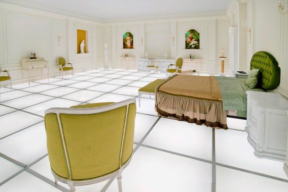
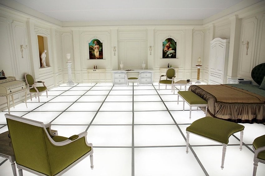
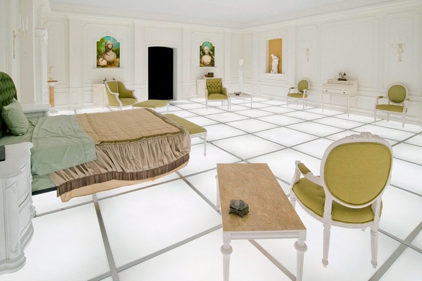
Artist Simon Birch and architect Paul Kember have recreated the famous bedroom from Stanley Kubrick’s 2001: A Space Odyssey as part of a larger art project called The 14th Factory in the Lincoln Heights neighborhood of Los Angeles. Weirdly, when Birch approached Kember about doing the project, Kember revealed that his uncles had worked on the actual set for Kubrick:
Birch showed the project’s architect, a guy named Paul Kember, a series of stills from the film hoping he’d be able to recreate it. Then Paul goes, and I’m paraphrasing here, “Oh, Si, didn’t I tell you? My uncle and great-uncle — you know, Tony and John? — were draughtsman on that movie, and they literally — literally! — worked on that exact room! Isn’t that bonkers?!”
From the Instagram evidence, it looks as though you can walk around the bedroom, sit on the furniture, lay on the bed, etc. This might almost be worth making a special trip to LA.
Update: This exhibition has moved on to the National Air and Space Museum in Washington DC. It will be on view from April 8 - May 28 2018. (via @kathrynyu)
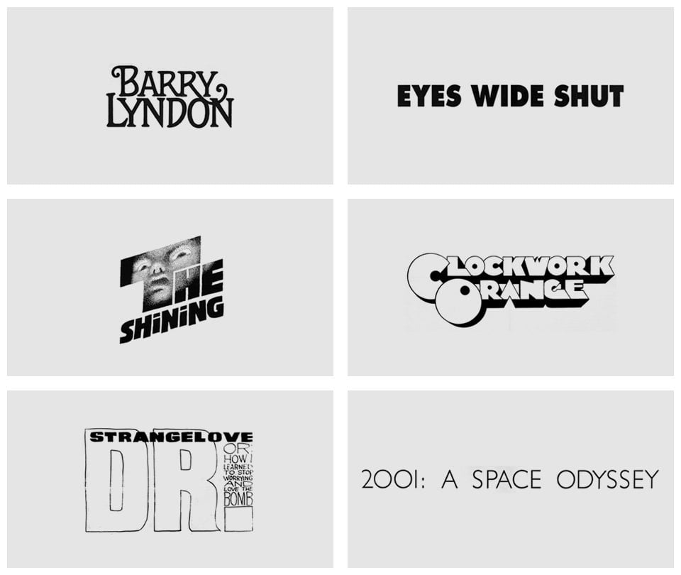
From designer Christian Annyas, an overview of the typography used in the titles and posters of Stanley Kubrick’s movies. Click on each graphic to see the poster or title sequence it was sourced from.
Stanley Kubrick’s Boxes is a documentary film by Jon Ronson about Kubrick’s personal archive of more than 1000 boxes filled with material (photos, news clippings, letters, research materials, etc.) related to his films. Ronson wrote about how he got access to the archive in a 2004 Guardian piece.
The journey to the Kubrick house starts normally. You drive through rural Hertfordshire, passing ordinary-sized postwar houses and opticians and vets. Then you turn right at an electric gate with a “Do Not Trespass” sign. Drive through that, and through some woods, and past a long, white fence with the paint peeling off, and then another electric gate, and then another electric gate, and then another electric gate, and you’re in the middle of an estate full of boxes.
There are boxes everywhere — shelves of boxes in the stable block, rooms full of boxes in the main house. In the fields, where racehorses once stood and grazed, are half a dozen portable cabins, each packed with boxes. These are the boxes that contain the legendary Kubrick archive.
Was the Times right? Would the stuff inside the boxes offer an understanding of his “tangled brain”? I notice that many of the boxes are sealed. Some have, in fact, remained unopened for decades.
Ronson did not upload his film to Vimeo, but he is “delighted” that it’s available online, so hopefully it won’t disappear soon.
The series of Marvel movies — X-Men, Avengers, Spider-Man, etc. — is the highest grossing film series of all time but the films’ music is largely forgettable and bland in a way that it isn’t in Star Wars, James Bond, or Harry Potter. In this video, the Every Frame a Painting gang explores why that is: partially a trend toward movie music not designed to be noticed and also the use by directors of temporary music that unduly influences the final score. All the Marvel movies run together for me (aside from Guardians of the Galaxy, which had distinctive music in it, I can’t recall a single scene from any one of the more recent films) and perhaps the music is one reason.
There’s a follow-up video to the one above composed of clips of movies played with their temp music followed by the same clips with the final music, which is nearly identical.
They’ve also started a Twitter account highlighting the influence of temp music on final scores.
These videos have me wondering…was Carter Burwell’s score for Carol influenced by temp music, specifically Philip Glass’ score for The Hours? This interview in Rolling Stone and the FAQ on his site suggest not:
It’s his ability to make music that compliments a scene rather than eclipse it that has made him an invaluable creative partner to filmmakers who work in such intense melodramatic registers, and Burwell is emphatic that his scores aren’t responsible for all of the emotional heavy-lifting. “As a listener, I do not like being instructed,” he says, emphatically. “It riles me when the music tells me something before I can figure it out for myself. In fact, I enjoy the discomfort of not being sure how to take something.” It’s the reason why he loathes listening to the temp music that directors often attach to rough cuts in order to point composers in the right direction.
But the similarities are there, so who knows?
Update: I forgot to mention that Stanley Kubrick ended up ditching the original score written for 2001 and sticking with the temp music, which were the classical compositions by Strauss et al. that we’re so familiar with today.
Update: In a video response, Dan Golding shows how temp music is not a recent Hollywood obsession…even the famous Star Wars theme was greatly influenced by temp music:
He questions that the pull of temp music by contemporary directors and composers is sufficient to explain why movie music is now so uninspiring:
Film music is an embrace of rampant unoriginality, and to think about how film music works, we need to think of new ways to talk about these questions, rather than just saying, “it’s a copy”.
Golding pins the blame primarily on technology but also on composers and filmmakers drawing from fewer and less diverse sources. Interestingly, this latter point was also made by Every Frame a Painting’s Tony Zhou in a recent chat with Anil Dash, albeit about originality in video essays. A lightly edited excerpt:
My advice to people has always been: copy old shit. For instance, the style of Every Frame a Painting is NOT original at all. I am blatantly ripping off two sources: the editing style of F for Fake, and the critical work of David Bordwell/Kristin Thompson, who wrote the introductory text on filmmaking called Film Art. I’ve run into quite a few video essays that are trying to be “like Every Frame a Painting” and I always tell people, please don’t do that because I’m ripping of someone else. You should go to the source. When any art form or medium becomes primarily about people imitating the dominant form, we get stifling art.
If you look at all of the great filmmakers, they’re all ripping someone off but it was someone 50 years ago. It rejuvenated the field to be reminded of the history of our medium. And I sincerely wish more video essayists would rip off the other great film essayists: Chris Marker, Godard, Agnès Varda, Thom Andersen. Or even rip off non-video essayists. I would kill to see someone make video essays the way Pauline Kael wrote criticism. That would be my jam!
ps. Also! Hans Zimmer — composer of film scores for Gladiator, Interstellar, Inception, The Dark Knight, etc. — was the keyboard player in the Buggles’ Video Killed the Radio Star music video. WHAT?!
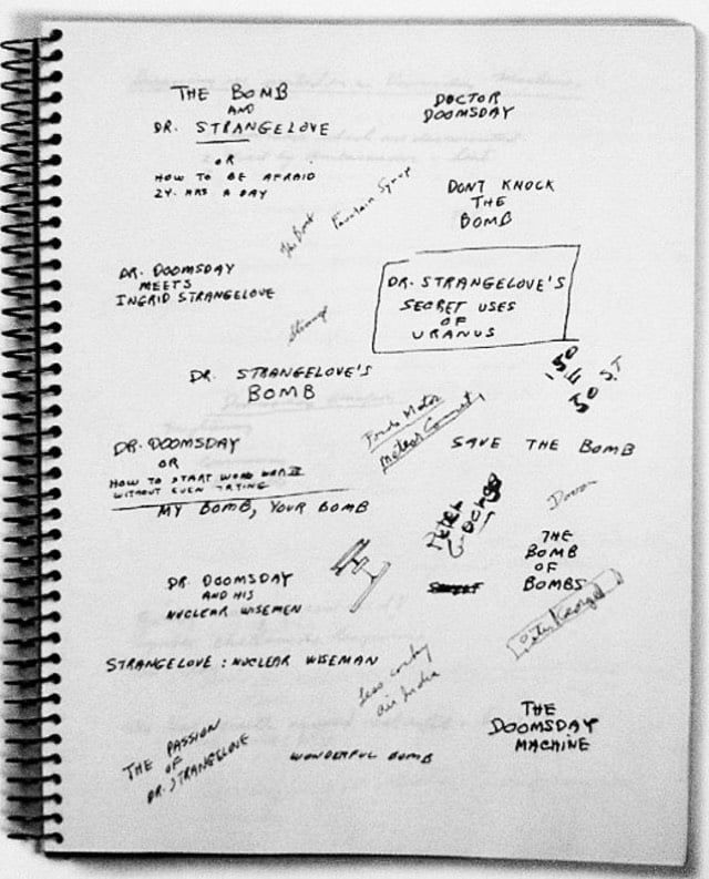
This is a page from one of Stanley Kubrick’s notebooks, on which he jotted down more than a dozen different titles for the movie that came to be called Dr. Strangelove, or: How I Learned to Stop Worrying and Love the Bomb. Among the rejected titles were:
Dr. Doomsday or: How to Start World War III Without Even Trying
Dr. Strangelove’s Secret Uses of Uranus
My Bomb, Your Bomb
Strangelove: Nuclear Wiseman
The Bomb and Dr. Strangelove or: How to be Afraid 24hrs a Day
The Passion of Dr. Strangelove
Fun titles, but they remind me of a chess quote I tweeted the other day: “When you see a good move look out for a better.” Glad Kubrick stuck with it.
The alternate titles made me curious to look at the script, which I’d never seen before. Even glancing at the first few pages are illuminating. I knew the main characters names were full of suggestive puns — General Buck Turgidson, President Merkin Muffley, General Jack D. Ripper — but that’s nothing compared to some of the names in the script, many of which do not appear in the film:
General “Buck” Schmuck
Admiral Percy Buldike
Ambassador de Sade (“Alexei de Sadeski” in the film)
Von Klutz
Frankenstein
Cadaverly
Didley
Crudley
Waffel
Funkel
Major Nonce
Lieutenant Quentin Quiffer
Lieutenant “Binky” Ballmuff
And under “General Notes”, Kubrick lays out how he wants the film to look and feel:
1. The story will be played for realistic comedy - which means the essentially truthful moods and attitudes will be portrayed accurately, with an occasional bizarre or super-realistic crescendo. The acting will never be so-called “comedy” acting.
2. The sets and technical details will be done realistically and carefully. We will strive for the maximum atmosphere and sense of visual reality from the sets and locations.
3. The Flying sequences will especially be presented in as vivid a manner as possible. Exciting backgrounds and special effects will be obtained.
Nailed it. (via @monstro)
The Stanley Kubrick Exhibition is currently showing at the Contemporary Jewish Museum in San Francisco and Adam Savage went to take a look and show us around. Super bummed I haven’t seen this in person yet. After SF, it heads off to Mexico City.
Bhautik Joshi took 2001: A Space Odyssey and ran it through a “deep neural networks based style transfer” with the paintings of Pablo Picasso.
See also Blade Runner in the style of van Gogh’s Starry Night and Alice in a Neural Networks Wonderland.
The films of Wes Anderson and Stanley Kubrick share some interesting visual similarities. Any influence was a one-way street, of course. With the exception of Bottle Rocket, which was cinematically spare compared to his later work, all of Anderson’s films were shot after Kubrick finished shooting Eyes Wide Shut.
There are tons of movie references in The Simpsons, but the show leans more heavily on referencing Stanley Kubrick’s films than perhaps any other director. As you can see in the video, there are dozens of references to 2001, Dr. Strangelove, The Shining, and even Eyes Wide Shut sprinkled throughout the series.
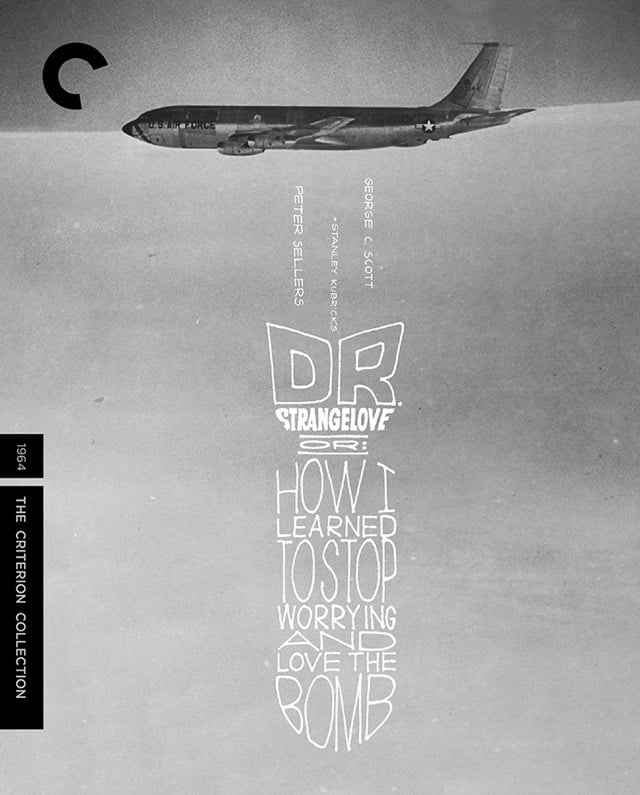
The Criterion Collection is coming out with a Blu-ray version of Stanley Kubrick’s Dr. Strangelove, Or: How I Learned to Stop Worrying and Love the Bomb. Features include a restored 4K digital transfer and a bunch of interviews and short documentaries about the film. Strangelove is one of my top two favorite films of all time. (via df)
From Celia Gomez, a supercut of some of the most notable movie references from The Simpsons. The Simpsons came out when I was 16 and while I loved it immediately, the show started making a whole lot more sense after I watched The Godfather, Taxi Driver, Citizen Kane, and Dr. Strangelove in my 20s. Lots of Kubrick in the Simpsons.
The Chickening is a surreal visual remix of Stanley Kubrick’s The Shining done by Nick DenBoer and Davy Force. It mostly defies description, so just watch the first minute or so (after which you won’t be able to resist the rest of it). The short film is playing at this year’s Sundance Film Festival.
But seriously, WTF was that?! (via @UnlikelyWorlds)
A video exploring Stanley Kubrick’s use of color in his films. See also Kubrick’s use of the color red. (via @john_overholt)
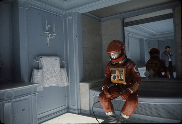
A behind-the-scenes photo from “2001: A Space Odyssey” from Coudal’s treasure trove of “Stuff About Stanley Kubrick.”
From 2007, a 30-minute documentary on the making of Stanley Kubrick’s The Shining. Includes interviews with Jack Nicholson, Steven Spielberg, and Sydney Pollack.
How many videos can we watch about the films of Stanley Kubrick? If you’re anything like me, the answer is never enough. This montage hinting at connections between his films is particularly well done.
Older posts




Socials & More