RIP, Pablo Ferro
Film & design legend Pablo Ferro died this weekend at the age of 83. Ferro was known for designing the iconic opening title sequences for Dr. Strangelove and Bullitt (among others).
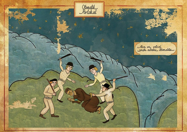
He also designed what is probably my favorite movie trailer, for A Clockwork Orange:
I wrote about Ferro’s work with Stanley Kubrick in this post 10 years ago. From a piece by Steven Heller that I linked to in the post:
Kubrick wanted to film it all using small airplane models (doubtless prefiguring his classic space ship ballet in 2001: A Space Odyssey). Ferro dissuaded him and located the official stock footage that they used instead. Ferro further conceived the idea to fill the entire screen with lettering (which incidentally had never been done before), requiring the setting of credits at different sizes and weights, which potentially ran counter to legal contractual obligations. But Kubrick supported it regardless. On the other hand, Ferro was prepared to have the titles refined by a lettering artist, but Kubrick correctly felt that the rough hewn quality of the hand-drawn comp was more effective. So he carefully lettered the entire thing himself with a thin pen.
The Art of the Title also interviewed Ferro about the Strangelove opening credits.
The titles for Strangelove were last-minute; I didn’t have much time to produce it. It came up because of a conversation between Stanley and I. Two weeks after I finished with everything, he and I were talking. He asked me what I thought about human beings. I said one thing about human beings is that everything that is mechanical, that is invented, is very sexual. We looked at each other and realized — the B-52, refueling in mid-air, of course, how much more sexual can you get?! He loved the idea. He wanted to shoot it with models we had, but I said let me take a look at the stock footage, I am sure that [the makers of those planes] are very proud of what they did and, sure enough, they had shot the plane from every possible angle.
Update: The Art of the Title also did a huge three-part interview with Ferro as a career retrospective. Great deep dive into a substantial career.


Socials & More