kottke.org posts about design
A British company called Faber & Faber is doing print on demand books with a wrinkle: each book has its own distinct cover that’s generated at print time.
Generating the borders was just one, if major, task of the final solution, though. The custom software written in Processing, straight Java and PHP works as an internal webservice at Faber which receives new batch orders and then generates complete, print ready PDF files with all copy, branding, spine, ISBN, barcode and optional high-res JPG preview using the book details supplied. Generating a single cover only takes about 1 second, but due to its iterative and semi-random nature can sometime require hundreds of attempts until a “valid” design is created which is judged to be “on brand” by software itself.
What a day it will be when software can determine whether all of us are “on brand” or not. (thx, david)
Slate has a nice short history of information visualizations, including work from Josh On, Jonathan Harris, and Martin Wattenberg. Many many more examples can be found on kottke.org’s infoviz page.
Christoph Niemann has used some unusual image sources to tile his bathrooms. For the shower, an appropriation of Warhol’s Brillo box. For the kids bathroom, a NYC subway map.
Daytum is a site for keeping track of your life, a “home for collecting and communicating your daily data”. For a glimpse of how Daytum might work, check out Daytum founder Nicholas Felton’s personal annual reports. Somewhat related: Trixie Tracker, the online baby tracking software. The first person I remember tracking their data in this way online was Erik Benson on his Morale-O-Meter.
Update: And Moodstats from K10K…I forgot about (the dearly departed) Moodstats! (thx, nick)
This is a fantastic set of photos of old business signs, many of them neon. As Ben says, “is it possible to favorite every photo in a set at once?”
Influenced by Modern design trends in Europe, Vanity Fair in 1929 got rid of all capital letters in their headlines. A few months later, the capital letters were reinstated and the design change was accompanied by a letter from the editor called “A Note on Typography”, reprinted in full on Design Observer.
The eye and the mind can adapt themselves to new forms with surprising ease. An innovation stands out at first like a sore thumb but before it has passed its infancy it has become invisible to the conscious eye. The unconscious eye, however, is another matter. It is vaguely dulled by the stale and hackneyed, it is antagonized by the tasteless and inept, and it is completely stopped by the involved and illegible. The unconscious eye is a remorseless critic of all art forms, it awards the final fame and final oblivion.
A large collection of old airline menus. The collection is poorly organized but worth poking through (check out Air France and Pan Am). Tracked this down after reading this short piece in the Times about a private menu collection, complete with a tiny image of some menus that’s barely worth the effort of clicking the link.
Objectified is an upcoming film about industrial design by Gary Hustwit, director of Helvetica.
Objectified is a documentary about industrial design; it’s about the manufactured objects we surround ourselves with, and the people who make them. On an average day, each of us uses hundreds of objects. (Don’t believe it? Start counting: alarm clock, light switch, faucet, shampoo bottle, toothbrush, razor…) Who makes all these things, and why do they look and feel the way they do? All of these objects are “designed,” but how can good design make them, and our lives, better?
The film is due out in early 2009. (via design observer)
What would happen if there were no stop signs and a large corporation attempted to design one?
“We’re targeting women, but we’re also targeting men, secondarily.”
The logo for A.G. Low Construction is the best one I’ve seen in awhile.

Nice work by design student Rebecca Low, who I’m assuming is related to the A.G. Low in question. (via monoscope)
Steven Heller asked a bunch of designers and illustrators to re-imagine the lapel pin for Barack Obama.
Since Mr. Obama promotes himself as the candidate of change, maybe he should start wearing a different kind of lapel pin that signals his patriotism as well as other values he wants to communicate.
One fellow suggests ripping his lapels off and thereby skirting the whole pin issue. (via design observer)
On the heels of Michael Bierut’s rave for Mad Men comes William Drenttel’s admission: I Was A Mad Man.
Then the CEO [of Krystal Restaurants] turns to me, ignoring everyone else, and asks me to take out my wallet. He asks me how much money I have. I count about $150, and tell him so. He smiles, looks me squarely in the eye, and asks: “Would you spend your last $150 on this shit?”
The rest of the story involves me telling him to take out his own wallet and me swearing I’d spend not only my money but all of his. And we did. We spent all of Krystal’s money, millions of dollars. We made second-rate advertising, and they had second-rate stores with really second-rate hamburgers. We deserved each other.
Time lapse video of a designer laying out an article for a magazine. I could watch stuff like this all day. It’s also the type of video I wish were on Vimeo…sometimes YouTube is like watching a UHF station from 200 miles away with the rabbit ears positioned just so. (via quips)
I love this clever New York magazine cover design from 1969…a photo of a too tall mayoral candidate is cropped just below the chin.
Entertainment Weekly recently compiled a list of well-designed book covers from the past 25 years. Not fantastic but a solid list worth browsing.
How big is England? Mapmakers can’t seem to agree.
So for the last two years I’ve been taking pictures of Britain on world maps. Not accurate maps, but drawings or illustrations of maps. The differences are amazing. You might assume that all maps were accurate, or at least accurate-ish. But no, designers play fast and loose with the truth making the host country bigger, more important or more central. Look at Britain in these photos. Look at the size of it compared to Europe. It’s the same, but different.
I love the averaged England near the bottom of the post. (via migurski)
Writing advice from Zadie Smith: write it then put it in a drawer.
When you finish your novel, if money is not a desperate priority, if you do not need to sell it at once or be published that very second — put it in a drawer. For as long as you can manage. A year of more is ideal — but even three months will do. Step away from the vehicle. The secret to editing your work is simple: you need to become its reader instead of its writer. I can’t tell you how many times I’ve sat backstage with a line of novelists at some festival, all of us with red pens in hand, frantically editing our published novels into fit form so that we might go on stage and read from them. It’s an unfortunate thing, but it turns out that the perfect state of mind to edit your novel is two years after it’s published, ten minutes before you go on stage at a literary festival. At that moment every redundant phrase, each show-off, pointless metaphor, all of the pieces of dead wood, stupidity, vanity, and tedium are distressingly obvious to you.
Top notch advice. I’m currently working on a (mostly visual) redesign for kottke.org. I pretty much finished the Photoshop part of it two months ago and haven’t looked at it since, hoping that the distance will give me some much needed perspective on whether the new design is any good or not. I’ve used this technique on the past couple of designs as well…if you have the luxury of the extra time, I’d highly recommend it.
An appreciation of Mad Men by designer Michael Bierut.
Jesus God in heaven! Not until I know I’m not wasting my time! From the minute Don launched his this-meeting-is-over bluff, I was on the edge of my seat, and my lovely wife Dorothy will tell you that I literally clapped my hands at that line. For me, this sequence is as close to pornography as I ever get to see on basic cable.
Alright, uncle, I give, I give. I will try and find some time in my schedule to watch this show.
The world’s first album cover was designed by Alex Steinweiss for Columbia Records in 1938. Before that, records were sold in generic sleeves. (via quipsologies)
CandyKaraoke, a bunch of album covers reimagined by Irish artists. (via ffffound)
Short interview with Mike Migurski and Tom Carden of Stamen about their projects and process.
We try to start from a position of great abundance and information, to show the vastness or the liveness. I think live, vast, and deep is some of the terminology that we’ve been using lately in a lot of our talks.
The history of the design and manufacture of the TiVo remote control.
Like any remote, the designers were adamant about keeping the remote’s button layout as simple as possible. But with the DVR’s numerous features, the designers needed to create lots of extra buttons. To keep things straight, each button needed to have a distinctive feel, giving the ability to control the remote without even looking at it, which Newby described as a “key Braille-ability” surprisingly helped by the “blank finger parking spots between keys” that were equally important.
(via waxy)
Raymond Loewy is well-known as an industrial designer but he was also responsible for some of the world’s most iconic logos. Pictured below are several sketches that Loewy did for the new Exxon logo:
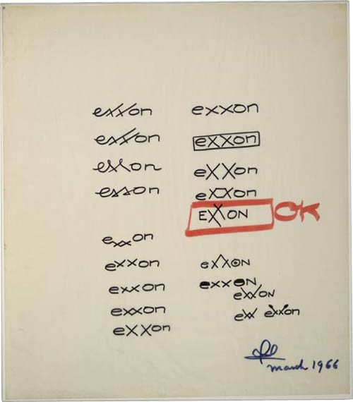
Big business moved more slowly back then; the sketches were done by Loewy in 1966 but the name change and new logo didn’t go into effect until 1972. Loewy was also responsible for several other logos: Shell, Hoover, BP, Nabisco, Canada Dry, and U.S. Mail.
This is a page from a book called Hypnerotomachia Poliphili.
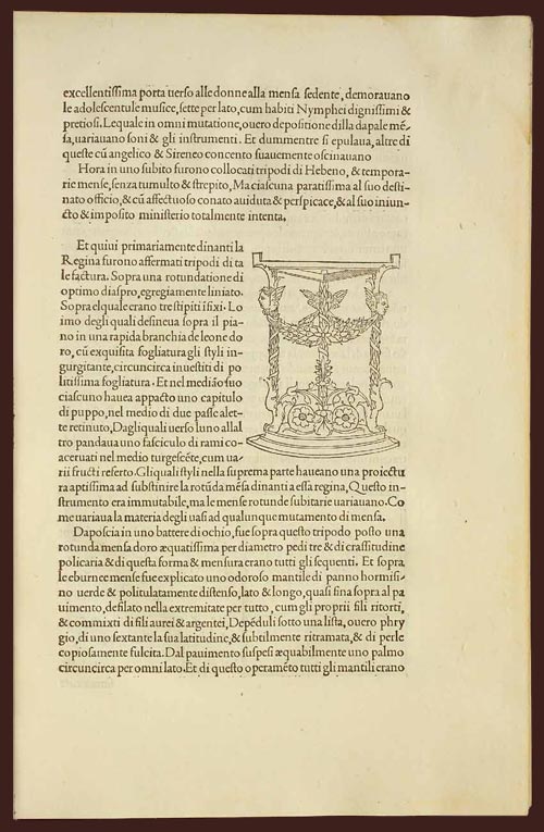
Any guesses as to when it was published? The title, Latin text, yellowed paper, and lack of page numbers might tip you off that it wasn’t exactly released yesterday. Turns out that Hypnerotomachia Poliphili was published in 1499, more than 500 years ago and only 44 years after Gutenberg published his famous Bible. It belongs to a group of books collectively referred to as incunabula, books printed with a printing press using movable type before 1501.
To contemporary eyes, the HP looks almost modern. The text is very readable. The typography, layout, and the way the text flows around the illustration; none of it looks out of the ordinary. When compared to other books of the time (e.g. take a look at a page from the Gutenberg Bible), its modernity is downright eerie. The most obvious difference is the absence of the blackletter typeface. Blackletter was a popular choice because it resembled closely the handwritten script that preceded the printing press, and I imagine its use smoothed the transition to books printed by press. HP dispensed with blackletter and instead used what came to be known as Bembo, a humanist typeface based on the handwriting of Renaissance-era Italian scholars. From a MIT Press e-book on the HP:
One of the features of the Hypnerotomachia that has attracted the attention of scholars has been its use of the famed Aldine “Roman” type font, invented by Nicholas Jenson but distilled into an abstract ideal by Francesco Biffi da Bologna, a jeweler who became Aldus’s celebrated cutter. This font — generally viewed as originating in the efforts of the humanist lovers of belles-lettres and renowned calligraphers such as Petrarch, Poggio Bracciolini, Niccolo Niccoli, Felice Feliciano, Leon Battista Alberti, and Luca Pacioli, to re-create the script of classical antiquity — appeared for the first time in Bembo’s De Aetna. Recut, it appeared in its second and perfected version in the Hypnerotomachia.
In that way, Hypnerotomachia Poliphili is both a throwback to Roman times and an indication of things to come.
The MIT Press site also notes a number of other significant aspects of the book. As seen above, illustrations are integrated into the main text, allowing “the eye to slip back and forth from textual description and corresponding visual representation with the greatest of ease”. In his 2006 book, Beautiful Evidence, Edward Tufte says:
Overall, the design of Hypnerotomachia tightly integrates the relevant text with the relevant image, a cognitive integration along with the celebrated optical integration.
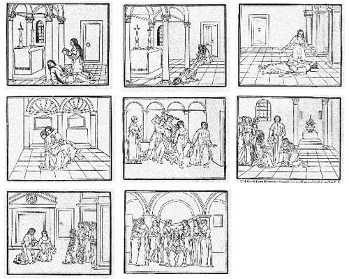
Several pages in the book make use of the text itself to illustrate the shapes of wine goblets. The HP also contained aspects of film, comics, and storyboarding…successive illustrations advanced action begun on previous pages:
All of which makes the following puzzling:
The Hypnerotomachia Poliphili is one of the most unreadable books ever published. The first inkling of difficulty occurs at the moment one picks up the book and tries to utter its tongue-twisting, practically unpronounceable title. The difficulty only heightens as one flips through the pages and tries to decipher the strange, baffling, inscrutable prose, replete with recondite references, teeming with tortuous terminology, choked with pulsating, prolix, plethoric passages. Now in Tuscan, now in Latin, now in Greek — elsewhere in Hebrew, Arabic, Chaldean and hieroglyphs — the author has created a pandemonium of unruly sentences that demand the unrelenting skills of a prodigiously endowed polyglot in order to be understood.
It’s fascinating that a book so readable, so beautifully printed, and so modern would also be so difficult to read. If you’d like to take a crack at it, scans of the entire book are available here and here. The English translation is available on Amazon.
Case study: a new interface for Wells Fargo’s ATMs.
The new UI still offers the Quick Cash feature, but in a much smarter way. Instead of one Quick Cash button, we introduced a whole column of shortcut buttons that behave somewhat like the History menu in a web browser. It is still possible to customize them through Set My ATM Preferences, but hardly necessary since they always reflect the most recent transactions.
(via magnetbox)
Newer posts
Older posts


Socials & More