Dark Knight poster
Nicely designed poster for The Dark Knight.
This site is made possible by member support. 💞
Big thanks to Arcustech for hosting the site and offering amazing tech support.
When you buy through links on kottke.org, I may earn an affiliate commission. Thanks for supporting the site!
kottke.org. home of fine hypertext products since 1998.
Beloved by 86.47% of the web.
CandyKaraoke, a bunch of album covers reimagined by Irish artists. (via ffffound)
The winners and shortlist of the 2008 Penguin Design Award, a student award in its second year. More info on Penguin’s blog. (via book design review)
Short interview with Mike Migurski and Tom Carden of Stamen about their projects and process.
We try to start from a position of great abundance and information, to show the vastness or the liveness. I think live, vast, and deep is some of the terminology that we’ve been using lately in a lot of our talks.
The history of the design and manufacture of the TiVo remote control.
Like any remote, the designers were adamant about keeping the remote’s button layout as simple as possible. But with the DVR’s numerous features, the designers needed to create lots of extra buttons. To keep things straight, each button needed to have a distinctive feel, giving the ability to control the remote without even looking at it, which Newby described as a “key Braille-ability” surprisingly helped by the “blank finger parking spots between keys” that were equally important.
(via waxy)
Raymond Loewy is well-known as an industrial designer but he was also responsible for some of the world’s most iconic logos. Pictured below are several sketches that Loewy did for the new Exxon logo:
![]()
Big business moved more slowly back then; the sketches were done by Loewy in 1966 but the name change and new logo didn’t go into effect until 1972. Loewy was also responsible for several other logos: Shell, Hoover, BP, Nabisco, Canada Dry, and U.S. Mail.
This is a page from a book called Hypnerotomachia Poliphili.
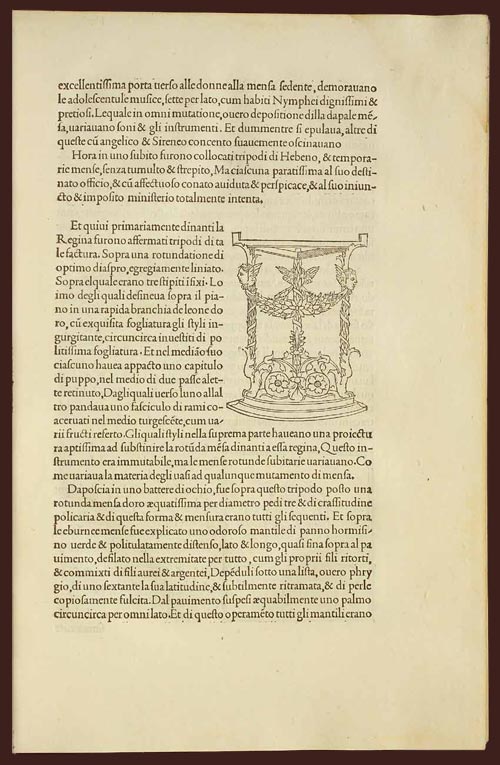
Any guesses as to when it was published? The title, Latin text, yellowed paper, and lack of page numbers might tip you off that it wasn’t exactly released yesterday. Turns out that Hypnerotomachia Poliphili was published in 1499, more than 500 years ago and only 44 years after Gutenberg published his famous Bible. It belongs to a group of books collectively referred to as incunabula, books printed with a printing press using movable type before 1501.
To contemporary eyes, the HP looks almost modern. The text is very readable. The typography, layout, and the way the text flows around the illustration; none of it looks out of the ordinary. When compared to other books of the time (e.g. take a look at a page from the Gutenberg Bible), its modernity is downright eerie. The most obvious difference is the absence of the blackletter typeface. Blackletter was a popular choice because it resembled closely the handwritten script that preceded the printing press, and I imagine its use smoothed the transition to books printed by press. HP dispensed with blackletter and instead used what came to be known as Bembo, a humanist typeface based on the handwriting of Renaissance-era Italian scholars. From a MIT Press e-book on the HP:
One of the features of the Hypnerotomachia that has attracted the attention of scholars has been its use of the famed Aldine “Roman” type font, invented by Nicholas Jenson but distilled into an abstract ideal by Francesco Biffi da Bologna, a jeweler who became Aldus’s celebrated cutter. This font — generally viewed as originating in the efforts of the humanist lovers of belles-lettres and renowned calligraphers such as Petrarch, Poggio Bracciolini, Niccolo Niccoli, Felice Feliciano, Leon Battista Alberti, and Luca Pacioli, to re-create the script of classical antiquity — appeared for the first time in Bembo’s De Aetna. Recut, it appeared in its second and perfected version in the Hypnerotomachia.
In that way, Hypnerotomachia Poliphili is both a throwback to Roman times and an indication of things to come.
The MIT Press site also notes a number of other significant aspects of the book. As seen above, illustrations are integrated into the main text, allowing “the eye to slip back and forth from textual description and corresponding visual representation with the greatest of ease”. In his 2006 book, Beautiful Evidence, Edward Tufte says:
Overall, the design of Hypnerotomachia tightly integrates the relevant text with the relevant image, a cognitive integration along with the celebrated optical integration.
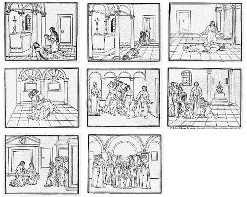
Several pages in the book make use of the text itself to illustrate the shapes of wine goblets. The HP also contained aspects of film, comics, and storyboarding…successive illustrations advanced action begun on previous pages:
All of which makes the following puzzling:
The Hypnerotomachia Poliphili is one of the most unreadable books ever published. The first inkling of difficulty occurs at the moment one picks up the book and tries to utter its tongue-twisting, practically unpronounceable title. The difficulty only heightens as one flips through the pages and tries to decipher the strange, baffling, inscrutable prose, replete with recondite references, teeming with tortuous terminology, choked with pulsating, prolix, plethoric passages. Now in Tuscan, now in Latin, now in Greek — elsewhere in Hebrew, Arabic, Chaldean and hieroglyphs — the author has created a pandemonium of unruly sentences that demand the unrelenting skills of a prodigiously endowed polyglot in order to be understood.
It’s fascinating that a book so readable, so beautifully printed, and so modern would also be so difficult to read. If you’d like to take a crack at it, scans of the entire book are available here and here. The English translation is available on Amazon.
Case study: a new interface for Wells Fargo’s ATMs.
The new UI still offers the Quick Cash feature, but in a much smarter way. Instead of one Quick Cash button, we introduced a whole column of shortcut buttons that behave somewhat like the History menu in a web browser. It is still possible to customize them through Set My ATM Preferences, but hardly necessary since they always reflect the most recent transactions.
(via magnetbox)
Print Magazine has an awesome roundup of book covers, advertisements, movies posters, etc. using the “cutoff-torso-spread-leg framing device”, what Steven Heller calls “the most frequently copied trope ever used”.
Video of designer John Gall, who shares his five rules for book cover design.
The other great source of inspiration is the deadline.
Michael Bierut celebrates the elegantly simple design of the Brannock Foot-Measuring Device.
Charles F. Brannock only invented one thing in his life, and this was it. The son of a Syracuse, New York, shoe magnate, Brannock became interested in improving the primitive wooden measuring sticks that he saw around his father’s store. He patented his first prototype in 1926, based on models he had made from Erector Set parts. As the Park-Brannock Shoe Store became legendary for fitting feet with absolute accuracy, the demand for the device grew, and in 1927 Brannock opened a factory to mass produce it. The Brannock Device Co., Inc., is still in business today. Refreshingly, it still only makes this one thing. They have sold over a million, a remarkable number when one considers that each of them lasts up to 15 years, when the numbers wear off.
Bierut also notes that Tibor Kalman was a big fan of the Brannock Device, once saying:
It showed incredible ingenuity and no one has ever been able to beat it. I doubt if anyone ever will, even if we ever get to the stars, or find out everything there is to find out about black holes.
The humble shoe horn is another well designed shoe-related device that may never be bettered.
The b3ta folk explore what happens just outside the border of some well-known album covers. The Simon and Garfunkel and Pink Floyd/Kool-Aid ones are pretty good.
A list of all the US presidential election logos from 1960-2008. That’s a whole lot of red and blue. I particularly liked 1988’s Dick “Chrysler” Gephardt and Paul Simon’s Top Gun homage. (via quips)
A slideshow featuring well-designed tables of contents. There’s an associated Flickr group if you fancy sharing your own. (via designnotes)
FontStruct is an awesomely simple online font creation tool. Just draw on a grid with simple Photoshop-like tools, save, and download a TrueType version of the fonts you’ve just created. If this had been around when I made Silkscreen, it would have taken so much less time.
Over at H&FJ, the H talks about the &.
As both its function and form suggest, the ampersand is a written contraction of “et,” the Latin word for “and.” Its shape has evolved continuously since its introduction, and while some ampersands are still manifestly e-t ligatures, others merely hint at this origin, sometimes in very oblique ways.
He goes on to describe several ampersands they’ve designed for their typefaces. When designing the ampersand for Silkscreen, I came up with a solution that many continue to dislike:

If you’re logged in to Flickr, you can see it action at a more appropriate size in the “prints & more” label above a photo. The symbol is basically a capital E with a vertical line through the middle…an e-t ligature that’s really more of an overstrike. I fashioned it after the way I hand-write my ampersand, which I got from my dad’s handwriting1. I don’t know where he got it from; it’s not a common way to represent that symbol, although I did find a few instances in the list of fonts installed on my computer.
I didn’t think about this way at the time, but the odd ampersand is one of the few distinguishing features of Silkscreen. There’s only so many ways you can draw letterforms in a 5x5 pixel space so a lot of the bitmap fonts like Silkscreen end up looking very similar. The ampersand gives it a bit of needed individuality. (The 4 is the other oddish character…it’s open at the top instead of diagonally closed.)
[1] Now that I think about it, I borrowed several aspects from my dad’s handwriting. I write my 7s with a bar (to distinguish them from 1s), my 8s as two separate circles rather than a figure-eight stroke, and my 4s with the open top. Oh, and a messy signature. ↩
Interview with Matthew Dent, the chap who designed the fantastic new UK coinage.
There were plenty of technical issues I had to come to terms with in conjunction with the distribution of metal across the coin and the high-speed striking process. At one point I considered suggesting that half the 20 pence’s border — where it met the shield — be removed. It would have still been a rounded heptagon, only its border wouldn’t completely surround the coin. There were potential issues with this; I learnt that the distribution of metal wouldn’t be balanced, thereby possibly affecting the striking of the coins and the acceptance of them by cash machines. Oh well… this competition was a learning curve. And as someone who was unfamiliar with the technical aspects of coin manufacture - you have to ask don’t you?
(via quipsologies)
The 92nd St Y has put the video of a talk called The Art of the Book up on their site. The talk was held in Dec 2006 and featured Milton Glaser, Chip Kidd, and Dave Eggers with Michael Bierut moderating. You may recall that Glaser got into a bit of hot water for some comments he made about the career paths of women in graphic design.
Here’s the trailer for Dr. Strangelove or: How I Learned to Stop Worrying and Love the Bomb.
It was done by a fellow named Pablo Ferro; it was his first movie trailer. Steven Heller writes:
After seeing Ferro’s commercials, Kubrick hired him to direct the advertising trailers and teasers for Dr. Strangelove and convinced him to resettle in London (Kubrick’s base of operations until he died there in March 1999). Ferro was inclined to be peripatetic anyway, and ever anxious to bypass already completed challenges he agreed to pull up stakes on the chance that he would get to direct a few British TV commercials, which he did. The black and white spot that Ferro designed for Dr. Strangelove employed his quick-cut technique — using as many as 125 separate images in a minute — to convey both the dark humor and the political immediacy of the film. At something akin to stroboscopic speed words and images flew across the screen to the accompaniment of loud sound effects and snippets of ironic dialog. At a time when the bomb loomed so large in the US public’s fears (remember Barry Goldwater ran for President promising to nuke China), and the polarization of left and right — east and west — was at its zenith, Ferro’s commercial was not only the boldest and most hypnotic graphic on TV, it was a sly subversive statement.
Ferro worked with Kubrick on the iconic and fantastic main titles for the film as well.
Kubrick wanted to film it all using small airplane models (doubtless prefiguring his classic space ship ballet in 2001: A Space Odyssey). Ferro dissuaded him and located the official stock footage that they used instead. Ferro further conceived the idea to fill the entire screen with lettering (which incidentally had never been done before), requiring the setting of credits at different sizes and weights, which potentially ran counter to legal contractual obligations. But Kubrick supported it regardless. On the other hand, Ferro was prepared to have the titles refined by a lettering artist, but Kubrick correctly felt that the rough hewn quality of the hand-drawn comp was more effective. So he carefully lettered the entire thing himself with a thin pen. Yet only after the film was released did he notice that one word was misspelled: “base on” instead of “based on”. Ooops!
If you want that hand-lettered look for yourself, Pablo Skinny is a font by Fargoboy that closely duplicates Ferro’s handwriting.
Ferro went on to make several well-known movie title sequences, including those for Bullitt and the original The Thomas Crown Affair but not Napoleon Dynamite. He collaborated with Kubrick once again on the trailer for A Clockwork Orange, another classic.
Update: According to this Wikipedia article, the work of Canadian avant-garde filmmaker Arthur Lipsett caught the eye of Stanley Kubrick after an Oscar nomination for his short film, Very Nice, Very Nice and, more importantly for our business here, that Kubrick directed the Strangelove trailer himself in Lipsett’s style after Lipsett refused to work with Kubrick on it:
Stanley Kubrick was one of Lipsett’s fans, and asked him to create a trailer for his upcoming movie Dr. Strangelove. Lipsett declined Kubrick’s offer. Kubrick went on to direct the trailer himself; however, Lipsett’s influence on Kubrick is clearly visible when watching the trailer.
The two are stylistically similar for sure, but Ferro is credited with having designed the main title sequence (according to the titles themselves). That passage doesn’t appear to have been derived from any particular source, so I looked for something more definitive. From a 1986 article by Lois Siegel
After his Academy Award nomination, he received a letter from British filmmaker Stanley Kubrick. The typewritten letter said, “I’m interested in having a trailer done for Dr. Strangelove.” Kubrick regarded Lipsett’s work as a landmark in cinema — a breakthrough. He was interested in involving Lipsett. This didn’t happen, but the actual trailer did reflect Lipsett’s style in Very Nice, Very Nice.
An endnote to a 2004 profile of Lipsett by Brett Kashmere describes what Kubrick wrote to Lipsett in the letter:
Kubrick described Very Nice, Very Nice (1961) as “one of the most imaginative and brilliant uses of the movie screen and soundtrack that I have ever seen.” Kubrick was so enthused with the film he invited Lipsett to create a trailer for Dr. Strangelove (Stanley Kubrick, 1965) an offer Lipsett refused. Stanley Kubrick, letter to Arthur Lipsett, Arthur Lipsett Collection, Cinematheque québécoise Archives, Montreal, May 31, 1962.
It’s not clear what the connection is between Lipsett’s work and the trailer that Ferro ended up producing for Strangelove, but several sources (including Heller) say that Ferro developed his quick-cut style directing commercials in the 1950s, work that would predate that of Lipsett.
Lipsett more clearly influenced the work of another prominent filmmaker, George Lucas. Lucas found inspiration in Lipsett’s 21-87 in making THX-1138 and borrowed the concept of “the Force” for the Star Wars movies. Lucas’ films are littered with references to Lipsett’s film; e.g. Princess Leia’s cell in Star Wars was in cell #2187. (thx, gordon)
Beautiful contemporary covers for Dante’s Divine Comedy. The individual covers can be seen here: Inferno, Purgatorio, and Paradiso.
Khoi Vinh, design director of NYTimes.com and Subtraction, will be answering questions from readers all this week. Look for Khoi’s initial responses later in the day and week.
The Droste effect is when a product’s packaging features the packaging itself.
At my grocery store I could only find three examples: Land O’Lakes Butter, Morton Salt and Cracker Jacks. These packages each include a picture of the package itself and are often cited by writers discussing such pop-math-arcana as recursion, strange loops, self-similarity, and fractals. This particular phenomenon, known as the “Droste effect,” is named after a 1904 package of Droste brand cocoa. The mathematical interest in these packaging illustrations is their implied infinity. If the resolution of the printing process — (and the determination and eyesight of the illustrator) — were not limiting factors, it would go on forever. A package with in a package within a package… Like Russian dolls.
(via andre)
Princeton Architectural Press is offering a most unusual publication called Materials Monthly. Each month or so, a small box arrives on your doorstep containing not just a printed magazine about architecturally interesting materials but samples of the materials themselves, including fabric swatches, tiles, wallpaper, glass, and steel. Dan Hill recently received his issue and has a nice review and unboxing.
Benoit Mandelbrot and Paola Antonelli talk about, among other things, fractals, self-similarity in architecture, algorithms that could specify the creation of entire cities, visual mathematics, and generalists.
This has been for me an extraordinary pleasure because it means a certain misuse of Euclid is dead. Now, of course, I think that Euclid is marvelous, he produced one of the masterpieces of the human mind. But it was not meant to be used as a textbook by millions of students century after century. It was meant for a very small community of mathematicians who were describing their works to one another. It’s a very complicated, very interesting book which I admire greatly. But to force beginners into a mathematics in this particular style was a decision taken by teachers and forced upon society. I don’t feel that Euclid is the way to start learning mathematics. Learning mathematics should begin by learning the geometry of mountains, of humans. In a certain sense, the geometry of…well, of Mother Nature, and also of buildings, of great architecture.
Even Erik Spiekermann agrees that Helvetica is sometimes an appropriate choice.
The Art of the Title Sequence, a blog highlighting good movie title sequences. (thx, ben)
None of what follows is rocket science, and it’s not the place to look for thoughts on 2.0/3.0, social software, or urban informatics. That would be in the accounts of different projects. But if you’re interested in the honest craft of website work, almost deliberately old-fashioned ‘classical’ web design — and how to ally this with innovation in magazine publishing — the following should provide a decent account of several of the key decisions in this particular project.
Dan’s thoughtful approach should be required reading for anyone building media web sites.
Interview with young designer Nikolay Saveliev, who is responsible for this gorgeousness:
I like the idea of a consolidated aesthetic totality; what you make looks like what you listen to, sounds like what you wear, and speaks like what you believe in. In simpler terms, my girlfriend might look like she’s in a band I’d listen to, my haircut looks like it belongs in the chair I’m sitting in, and the work I’m designing might be written about in a book that I would read. Even my cat has to figure in there somehow. It’s a meticulous thing to maintain, but probably comes from the fact that I’ve discovered mostly everything through music, whether it’s ideologies, writers, artists, designers, cultures, subcultures, or other music. So it’s easy to tie things back into your work, as long as you keep your eyes and ears open, and maintain a healthy dose of critical thought.
“My haircut looks like it belongs in the chair I’m sitting in”. Awesome. (via quips)
Andy redesigned waxy.org.
For the first time since I started blogging in 2002, I’ve redesigned Waxy.org. Over the last six years, I’ve grown pretty sick of the old design but never found the time to rework it. Mostly, the changes are cosmetic. Cleaner design, new logo, bigger type, headlines, better iPhone support, and more space devoted to Waxy Links.
Looks nice.
Socials & More