Final update to election maps
I added 16 new maps to the 2008 Election Maps page in what is probably the final update. Big thanks to everyone who sent in maps.
This site is made possible by member support. 💞
Big thanks to Arcustech for hosting the site and offering amazing tech support.
When you buy through links on kottke.org, I may earn an affiliate commission. Thanks for supporting the site!
kottke.org. home of fine hypertext products since 1998.
Beloved by 86.47% of the web.
I added 16 new maps to the 2008 Election Maps page in what is probably the final update. Big thanks to everyone who sent in maps.
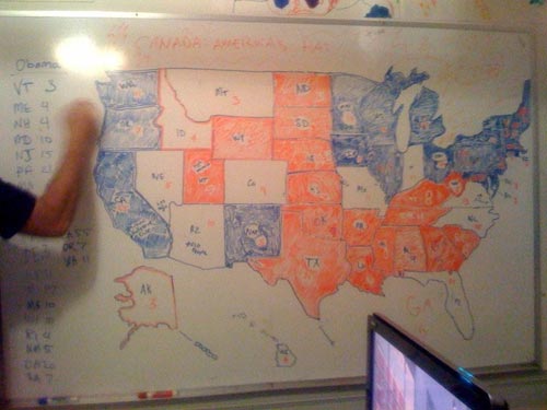
I added ten more maps to the 2008 Election Maps page, including one drawn on a dry erase board.
Both Michael Sippey and Kane Jamison collected screenshots of media sites as they declared Obama’s victory last night. Here are the front pages of all the newspapers today…I particularly enjoyed The Sun’s take on the historic night: One Giant Leap For Mankind. See also: the electoral maps.
Update: Electioneering ‘08 took screencaps of some of the big media sites throughout the evening. (thx, jason)
Update: Jim Ray also collected screencaps of media sites that night.
Update: Kristen Borchardt made an awesome video that takes a number of Nov 5th newspaper front pages and animates through them using each papers’ Obama photo as the focal point…very much like YTMND’s Paris Hilton doesn’t change facial expressions.
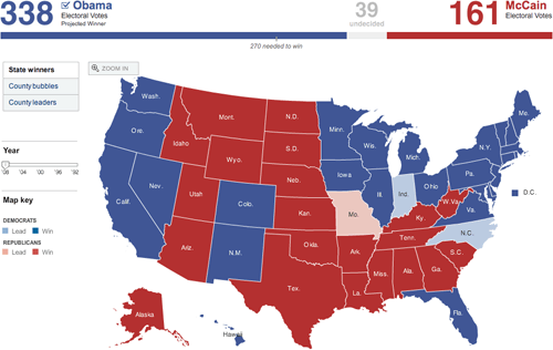
Last night as the election results were coming in online, I took screenshots of a bunch of the now-familiar red/blue electoral maps being used by the larger media sites to show election results and posted them all on this page. (There are currently 25 maps…I’m adding more in a few minutes.)
Hit me on my burner if you run across any others. A couple of quick notes:
1. No one strayed from the red and blue. The red/blue combo is overwhelmingly symbolic but there are plenty of other colors in the crayon box; I would like to have seen someone try something different.
2. In the 2000 and 2004 elections, the red/blue map was the focal point of the media coverage. People were fixated by it. This time around, it didn’t matter so much. The maps were interesting for 3-4 hours until the overwhelming nature of Obama’s victory became apparent and then, not so much. By this morning, the maps are already shrinking or disappearing from the home pages of the Times, CNN, and the like.
3. Nate Silver and the rest of the 538 guys nailed it. They got Indiana wrong and there are a couple more states that are still too close to call, but they got the rest of the map right. Their final projection had Obama getting 348.6 electoral votes and they currently have him at 349.
The Virgil O. Stamps Letterpress Laboratory prints business cards on all sorts of papers and surfaces, including children’s coloring book pages, duct tape, old National Geographic pages, antique book pages, and any sort of cardboard scraps. Pretty cool.
Nice look at the evolution of the front page of the LA Times from 1881 to 2003.
I selected a front page from every other decade, starting with the very first edition of the paper in 1881. Note the shifting hierarchy of images (yellow), advertising (orange) and editorial content (blue). The small black arrows are links to related content elsewhere within the paper.
They also look at the front pages of the web site from 1996 - 2006.
What do I think about the new Pepsi logo? Eh. Companies spend way too much time, effort, and money building up feelings about logos — like decades and billions of dollars — and then they just go and change it all. Of course the new logo and colors are similar to the old ones and it’s variations on a theme but the new designs feel like someone’s idea of what packaging is going to look like 10 years from now, an approach that never seems to work out well (see Back to the Future II). Coca-Cola had such success refreshing their brand with a simple take on their classic look and logo, why can’t Pepsi do the same with this classic look?
A collection of postage stamps designed by type designers. (via do)
BibliOdyssey has collected a number of charts which compare the heights of mountains and lengths of rivers by laying them all out next to each other. (Ok, kinda difficult to explain…just go take a look.) I had a chance to buy a copy of one of these maps a few years ago (not sure if it was an original print or what; it looked old) but passed it up because I didn’t have the money. Wish I would have bought it anyway. (via quips)
Someday I’m going to make my own book, from start to finish. It’s something that I’ve wanted to do for awhile, a physical parallel to building a web site from scratch. When I do, Ellen Lupton’s Indie Publishing will be my guide. At 170-some pages it’s not exhaustive, but the book does briefly touch all the bases: typography, cover design, binding types, and examples of several different types of books. There’s also a section on handmade books with hands-on directions for making your own book — folded books, stitched pamphlets, or stab bound — without having to visit the printer.
Truthful TV title cards. Heroes becomes No One Dies Ever, Mad Men is Drink Smoke Fuck, and Lost is Winging It.
Nice 25-minute documentary on the London Tube map, “the pinnacle of London Transport’s modernist design”.
Goodness blog asked a bunch of designers about books that they found helpful in their development as creative people, no graphic design books allowed.
The eyeballing game tests how good you are at lining things up. I got a 4.46 on my first try, but my hand slipped on one of them so I’m going to try again… Leave your best (or worst) score in the comments. (via core77)
Update: 4.34. I suck at parallelograms and triangle centers.
Apple announced new MacBooks and MacBooks Pro today and as Apple’s new releases always seem to do, the new models make the old ones look like a pile of puke. (My year-old MacBook Pro suddenly looks like an antique.) To show off their new lineup and manufacturing process, they’ve produced a little video. Jonathan Ive is one earnest dude.
Movie posters that list all the product placements in the films. (via quips)
The Muji Chronotebook combines the flexibility of a plain paper notebook with the utility of a daily planner.
For each function or feature you add, you lose a purpose. A blank sheet that could’ve been used in a million different ways can now only be used for a few. Artists aren’t going to buy a calendar if they’re looking for something to sketch on. Writers aren’t going to pick up to-do lists to use as a journal. This isn’t a bad thing per se — by narrowing down on a purpose, a blank sheet of paper can become more useful and relevant to certain people.
Each page of the Chronotebook has a analog clock in the middle, around which you can freely form appointments (just draw a line to the time for the meeting), sketch, make lists, or anything else the mostly blank page beckons you to do. Fantastic idea.
Update: Here’s the same idea in whiteboard form. (thx, michael)
The Atlantic is getting a redesign. Changes are already afoot over at the web site and Pentagram’s blog has an extensive look at the magazine’s new look, designed by Michael Bierut, Luke Hayman, and their team. I love the proposed Helvetica cover. The inspiration for the throw-back logo came in part from an appearance of an old issue of the magazine on Mad Men (Bierut is a fan).
BTW, the new cover tells of an article on blogs — Will Blogs Kill Writing? — that you will likely be hearing about from all corners of the web when the issue is released next week.
Mark Simonson takes an extensive look at the typography of Mad Men and concludes that a surprising amount of the type is set in fonts that either weren’t around in the early 60s or weren’t yet popular in the US.
Then there is the Gill Sans (c. 1930) problem. Gill is used quite a lot in the series, mainly for Sterling Cooper Advertising’s logo and signage. Technically, this is not anachronistic. And the way the type is used — metal dimensional letters, generously spaced — looks right. The problem is that Gill was a British typeface not widely available or popular in the U.S. until the 1970s. It’s a decade ahead of its time in American type fashions.
There’s also the Arial problem in the ending credits.
The AIGA has posted their 50 Books/50 Covers selections from 2007. It’s worth fighting through the stupid Flash interface to check out these covers (click “View the 365:AIGA Year in…” and then on “Book design”). The covers are on display in NYC until 11/26/2008. (via book design review)
Illustrator Bob Staake explains the process behind his cover on this week’s politically themed New Yorker, including rejected alternatives and a video progression of the finished design. Staake still uses a copy of Photoshop 3.0 on MacOS 7 to do his illustrations. That was a great version of Photoshop…I remember not wanting to switch myself. (via df)
Update: Staake uses OS X with MacOS 9 running in the background:
Let me clear up today’s rumor: I do NOT work in OS 7. I use OSX and run classic (9.0) in the background. Photoshop 3.0? Yes, STILL use that.
We’ve seen personal annual reports, but now Christopher Doyle has devised a set of personal identity guidelines for himself.
The image above is from a spread marked Full Colour Vertical_Private. The following ‘key identity formats’ are, of course, Full Color_Vertical, Full Colour Seated_Casual and Full Colour Seated _Formal.
The incorrect uses are hilarious.
Finalists for the 2008 magazine cover of the year competition. That Spitzer one always makes me laugh.
Some nice work amongst the finalists of a contest to design the book cover for a novel called The Island at the End of the World. (via book design review)
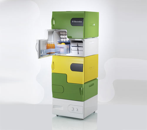
For creator Stefan Buchberger, a design student at the University of Applied Arts in Vienna, the idea grew out of a semester-long theme about keeping personal space clean and tidy. “I decided to create Flatshare fridge because there is nothing more disgusting than a dirty fridge in a shared flat,” he says. “At the time, I was living in such a flat!”
The fridge consists of a base station and up to four stackable modules. The modules allow each individual user to have his or her own refrigerator space and can be customized with various colorful skins as well as with add-ons like a bottle opener or a whiteboard.
The Flatshare refrigerator has the perhaps unfortunate side effect of reinforcing which household members hold lower positions on the metaphorical totem pole and therefore always need to bend down to access their unit while higher-status members can easily get at their fruit and veg without genuflection. (via cribcandy)
Dorothy Gambrell applies every Photoshop filter to an image in order and posted the results, including all the tweens. (via waxy)
I don’t know if I’m interested in watching the show or not, but we might have a new leader in the best TV show main title sequence: True Blood. By the same folks who did the Six Feet Under titles. Perhaps NSFW. (via quips)
Update: Maybe Digital Kitchen was influenced by a documentary called Searching for the Wrong Eyed Jesus in making the True Blood titles?
William Drenttel opines on the all-white-male jury of an Adbusters design competition:
Nearly a decade into a new century, I believe it is unacceptable for a design organization, foundation, board of directors, magazine or other enterprise, to mount an initiative with an all male panel of judges — or, put another way, “white, native English-speaking men from the U.S., British Isles or Australia.” Such behavior is no longer acceptable and should not be tolerated by a community of designers (or any other community). Designers around the world should just say no.
COLOURlovers, the site that takes inspiration from colors in the real world to make design palettes, today has a collection of palettes inspired by some wickedly vibrant bruises.
Socials & More