kottke.org posts about Milton Glaser
Bloomberg Businessweek asked eight designers to design a logo for Trump’s proposed new branch of the military, Space Force. 89-year-old Milton Glaser, designer of the iconic I ❤ NY logo, can still bring the heat:

I really really *really* want this on a hat. (via df)
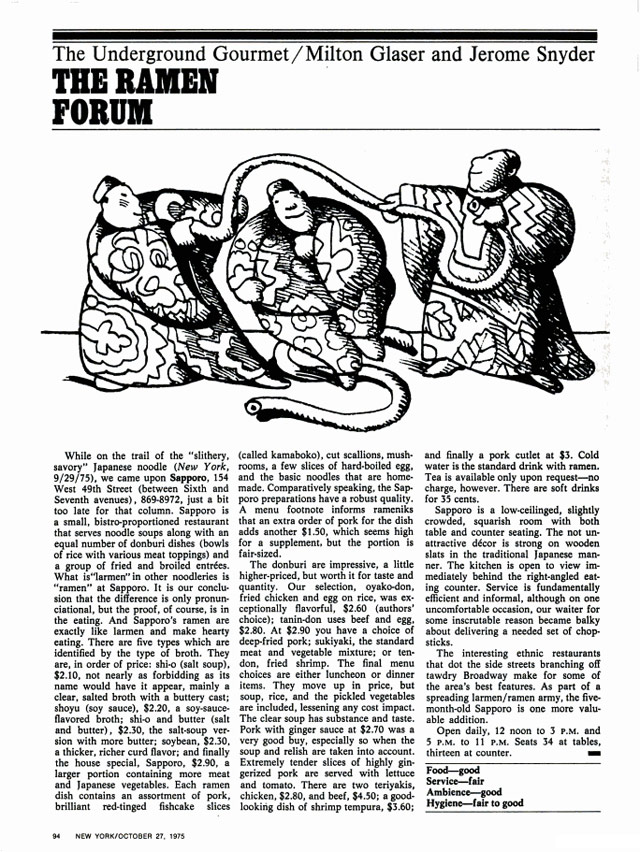
Today I learned that iconic designer Milton Glaser co-wrote a column for New York magazine (which he co-founded) about where to find cheap-but-good food in NYC. It was called The Underground Gourmet. Here’s a typical column from the October 27, 1975 issue, reviewing a ramen joint in Midtown called Sapporo that is miraculously still around:
Glaser and his co-authior Jerome Snyder eventually packaged the column into a series of books, some of which you can find on Amazon…I bought a copy this morning.
I found out about Glaser’s food enthusiasm from this interview in Eye magazine about The Underground Gourmet and his long collaboration with restaurateur Joe Baum of the Rainbow Room and Windows on the World.
We just walked the streets … When friends of ours knew we were doing it we got recommendations.
There were parts of the city where we knew we could find good places … particularly in the ethnic parts. We knew if we went to Chinatown we would find something if we looked long enough, or Korea Town, or sections of Little Italy.
More then than now, the city was more locally ethnic before the millionaires came in and bought up every inch of space. So you could find local ethnic places all over the city. And people were dying to discover that. And it was terrific to be able to find a place where you could have lunch for four dollars.
In 2010, Josh Perilo wrote an appreciation of The Underground Gourmet in which he noted only six of the restaurants reviewed in the 1967 edition had survived:
Being obsessed with the food and history of New York (particularly Manhattan), this was like finding a culinary time capsule. I immediately dove in. What I found was shocking, both in the similarities between then and now, and in the differences.
The most obvious change was the immense amount of restaurants that no longer existed. These were not landmarked establishments, by and large. Most of them were hole-in-the wall luncheonettes, inexpensive Chinese restaurants and greasy spoons. But the sheer number of losses was stunning. Of the 101 restaurants profiled, only six survive today: Katz’s Delicatessen, Manganaro’s, Yonah Schimmel’s Knishes Bakery, The Puglia and La Taza de Oro. About half of the establishments were housed in buildings that no longer exist, especially in the Midtown area. The proliferation of “lunch counters” also illustrated the evolution of this city’s eating habits. For every kosher “dairy lunch” joint that went down, it seems as though a Jamba Juice or Pink Berry has taken its place.
Man, it’s hard not get sucked into reading about all these old places…looking forward to getting my copy of the book in a week or two.
Update: Glaser’s co-author Jerome Snyder was also a designer…and no slouch either.
Bryce Roberts riffs on an idea presented by Zappos founder Tony Hsieh: collision hours.
The idea is called “collision hours” and Tony posits that the success of the [Las Vegas] downtown project hangs on creating spaces to maximize “collisionable” hours.
What is a collision you may be asking? It’s simply colliding with new people and ideas. Sharing your own and being open to others. It’s unfiltered serendipity. Stepping onto the street, or into the cafe, or into the conference and making an effort to collide with as many people and ideas in a designated timeframe. And being open to the possibilities and changes of course that collisions often enact.
It strikes me that maximizing collision hours is not what you want. Per Milton Glaser, just enough is more. One of the secrets in achieving Brian Eno’s concept of scenius might be to find just the right amount of collisions for a given space.
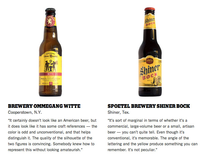
Legendary designer Milton Glaser (of I❤NY fame) critiques craft beer labels.
(via @bn2b)
A short video in which Milton Glaser extols the virtues of drawing while drawing.
It is only through drawing that I look at things carefully.
There’s very little information about this online, but here’s what I’ve scraped together. Milton Glaser: To Inform and Delight is a documentary on the legendary designer and it will be released in theaters sometime near the end of May. You know, one of those huge summer blockbusters.
I posted about Glaser’s Ten Things I Have Learned several years ago, mostly for point #5’s rejoinder to “less is more”: “Just enough is more”. Rereading it now, I’m much more interested in some of the other points, particularly 1-3.
And the important thing that I can tell you is that there is a test to determine whether someone is toxic or nourishing in your relationship with them. Here is the test: You have spent some time with this person, either you have a drink or go for dinner or you go to a ball game. It doesn’t matter very much but at the end of that time you observe whether you are more energised or less energised. Whether you are tired or whether you are exhilarated. If you are more tired then you have been poisoned. If you have more energy you have been nourished. The test is almost infallible and I suggest that you use it for the rest of your life.
Wait, wait, wait. Bob Dylan has a radio show? Yes, he does…on XM. From the May 2008 issue of Vanity Fair, a list of the topics, movies, recipes, music, etc. that Dylan discusses on the show.
Let me give you my recipe for a rum and Coca-Cola. Take a tall glass, put some ice in it, two fingers of Bombay rum, and a bottle of Coca-Cola. Shake it up well and go drink it in the sunshine!
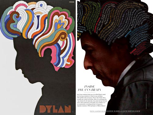
In the magazine, an illustration tells the tale with a clever wink to a Dylan poster by Milton Glaser.
Glaser on the left, yo. (via hysterical paroxysm)
The 92nd St Y has put the video of a talk called The Art of the Book up on their site. The talk was held in Dec 2006 and featured Milton Glaser, Chip Kidd, and Dave Eggers with Michael Bierut moderating. You may recall that Glaser got into a bit of hot water for some comments he made about the career paths of women in graphic design.
At The Art of the Book event last week, the panel was asked why there were so few female superstar designers. Milton Glaser took a shot at answering the question (many women choose family over work during the crucial superstar career development years) but judging by the reaction afterwards online, his comments were not appreciated by some. To be fair, Glaser’s comments were taken out of context, I think, and what he said is a part of the overall answer to the question. On Design Observer, Michael Beirut, who was the moderator for that evening’s event, takes a closer look at the issue. “The real question was the unspoken one: ‘Why is it that you guys up there are always…guys?’” Oh, and here’s a list of women speakers for your conference.
Took in The Art of the Book lecture at the 92nd Street Y last night. Milton Glaser, Chip Kidd (“a modern day Truman Capote” I heard him described as afterward), Dave Eggers, with Michael Beirut moderating. One of the most interesting comments came late in the proceedings from Dave Eggers, who described one of the main goals of the McSweeney’s design staff as attempting to design the books as well and as beautifully as they could as objects so that people would be compelled to save them. That way, even if people didn’t have time to read them soon after purchase, they couldn’t bear to throw/give the book away and would instead put it on their shelf in the hopes — McSweeney’s hopes, that is — that the buyer would at some point pull it down off the shelf and give it another try.
This design goal runs counter to the design process behind most contemporary book jackets, which are engineered almost entirely for the purpose of eliciting in the potential buyer a “buy me” reaction within two seconds of spotting them. McSweeney’s, as a champion of authors, wants the writing to be read while most major publishing companies, as champions of their shareholders, want books to be purchased. People buying books is important to the goal of getting the writing within them read, but McSweeney’s emphasis on designing books to last in people’s homes is a clever way to pursue that goal after the sale.
Forbes has quite a large feature on the subject of communicating, with thoughts from Arthur C. Clarke, Carl Zimmer, Milton Glaser, Jane Goodall, etc. I haven’t read any of this yet; it looks sufficiently interesting to get it in magazine form for easier reading.
Wonderful interview of Milton Glaser by Chip Kidd from a couple of years ago. Touches on his iconic I [heart] NY logo, the updated version (which the NY Commerce Dept. tried to sue him for), and the economics of design. (via df)
The AIGA has podcasts and presentation materials up for some of the speakers from the Design Conference (my full coverage here). Several of the main stage speeches are up, as well as backstage interviews with some of the participants. In particular, I would recommend:
- Audio of the main stage presentation and interview with Juan Enriquez.
- Audio of the main stage presentation by Bill Strickland on The Design of Leadership.
- Audio of the main stage presentation by Milton Glaser and Nicholas Negroponte.
- Audio of the main stage presentation by Murray Moss, although I’m not sure how well this one would work if you listened to it without the slides.
- The PDF of Stefan Sagmeister’s presentation doesn’t make too much sense without the audio, but the last 50 or so slides are worth checking out for the design candy.
These aren’t just for designers; they’re perfectly fine for non-designers as well. Here’s the RSS file with all the resources…it should work well with your favorite podcasting software or newsreader. It’s great that the AIGA is making these presentations freely available…you’re getting a lot of the conference for free here. If I remember correctly, not even O’Reilly offers the presentations or podcasts for download after their events like Etech.
Update: Wrong again! IT Conversations has several podcasts from the last Etech conference. (thx tim)
Here’s a sampling of the rest of the AIGA Design Conference, stuff that I haven’t covered yet and didn’t belong in a post of it’s own:
- Juan Enriquez gave what was probably my favorite talk about what’s going on in the world of genetics right now. I’ve heard him give a variation of this talk before (at PopTech, I think). He started off talking about coding systems and how when they get more efficient (in the way that the Romance languages are more efficient than Chinese languages), the more powerful they become in human hands. Binary is very powerful because you can encode text, images, video, etc. using just two symbols, 1 and 0. Segue to DNA, a four symbol language to make living organisms…obviously quite powerful in human hands.
- Enriquez: All life is imperfectly transmitted code. That’s what evolution is, and without the imperfections, there would be no life. The little differences over long periods of time are what’s important.
- Enriquez again: The mosquito is a flying hypodermic needle. That’s how it delivers malaria to humans. We could use that same capability for vaccinating cows against disease.
- Along with his list of 20 courses he didn’t take in design school, Michael Bierut offered some advice to young designers:
1. Design is the easy part.
2. Learn from your clients, bosses, collaborators, and colleagues.
3. Content is king.
4. Read. Read. Read.
5. Think first, then design.
6. Never forget how lucky you are. Enjoy yourself.
- Nicholas Negroponte: If programmers got paid to remove code from sofware instead of writing new code, software would be a whole lot better.
- Negroponte also shared a story about outfitting the kids in a school in Cambodia with laptops; the kids’ first English word was “Google”, and from what Negroponte said, that was followed closely by “Skype”. He also said the children’s parents loved the laptops because at night, it was the brightest light in the house.
- Christi recorded Milton Glaser’s mother’s spaghetti recipe. “Cook until basically all of the water is evaporated. Mix in bottle of ketchup; HEINZ ketchup.”
- Ben Karlin and Paula Scher on the challenges of making America, The Book: Books are more daunting than doing TV because print allows for a much greater density of jokes. In trying to shoot the cover image, they found that bald eagles cannot be used live for marketing or advertising purposes. The solution? A golden eagle and Photoshop. And for a spread depicting all the Supreme Court Justices in the buff, they struggled — even with the Web — to find nude photos of older people until they found a Vermont nudist colony willing to send them photos because they were big fans of The Daily Show.
- Bill Strickland blew the doors off the conference with his account of the work he’s doing in “curing cancer” — his term for revitalizing violent and crime-ridden neighborhoods — in Pittsburgh. I can’t do justice to his talk, so two short anecdotes. Strickland said he realized that “poor people never have a nice day” so when he built his buildings in these poor black neighbohoods, he put nice fountains out front so that people coming into the building know that they’re entering a space where it’s possible to have a good day. Another time, a bigwig of some sort was visiting the center and asked Strickland about the flowers he saw everywhere. Flowers in the hood? How’d these get here? Strickland told him “you don’t need a task force or study group to buy flowers” and that he’d just got in his car, bought some flowers, brought them back, and set them around the place. His point in all this was creating a place where people feel less dissimilar to each other…black, white, rich, poor, everybody has a right to flowers and an education and to be treated with respect and to have a nice day. You start treating people like that, and surprise!, they thrive. Strickland’s inner city programs have produced Fulbright Scholars, Pulitzer Prize winners, and tons of college graduates.
- I caught 30 minutes of David Peters’ presentation of Typecast: The Art of the Typographic Film Title and realized I should have gotten there in time to see the whole thing. I could sit and watch cool movie titles all day long. Among the titles he showed were Bullit, Panic Room, Dr. Strangelove, Barbarella, The Island of Dr. Moreau, and Superman. The title sequence for Napoleon Dynamite (which was discussed on Design Observer last year) was shown later in the main hall.
- At the closing party at the Museum of Science, we checked out the cool Mathematica exhibit that was designed by Charles and Ray Eames, two designers who were also pretty big science/math nerds.
- And some final thoughts from others at the conference. Peter Merholz says that “form-makers”, which make up the vast majority of the AIGA audience, “are being passed by those who are attempting to use design to serve more strategic ends”. (That’s an interesting thought…) A pair of reviews from Speak Up: Bryony was a bit disappointed with the opening Design Gala but left, like everyone else, in love with emcee John Hockenberry while Armin noted that the preservation of digital files is a big concern for museums in building a collection of graphic design pieces…in 35 years, how are you going load that Quark file or run that Flash movie?
For more of what people are saying about the conference, check out IceRocket. There’s a bunch of photos on Flickr as well.
Designboom interview with designer/citizen Milton Glaser. Glaser is responsible for one of my favorite sayings: just enough is more.
This is what Milton Glaser has learned about design:
Less is not necessarily more. Being a child of modernism I have heard this mantra all my life. Less is more. One morning upon awakening I realised that it was total nonsense, it is an absurd proposition and also fairly meaningless. But it sounds great because it contains within it a paradox that is resistant to understanding. But it simply does not obtain when you think about the visual of the history of the world. If you look at a Persian rug, you cannot say that less is more because you realise that every part of that rug, every change of colour, every shift in form is absolutely essential for its aesthetic success. You cannot prove to me that a solid blue rug is in any way superior. That also goes for the work of Gaudi, Persian miniatures, art nouveau and everything else. However, I have an alternative to the proposition that I believe is more appropriate. “Just enough is more.”
I *love* that. Just enough is more. (via bbj)
Socials & More