Mermaids of North America
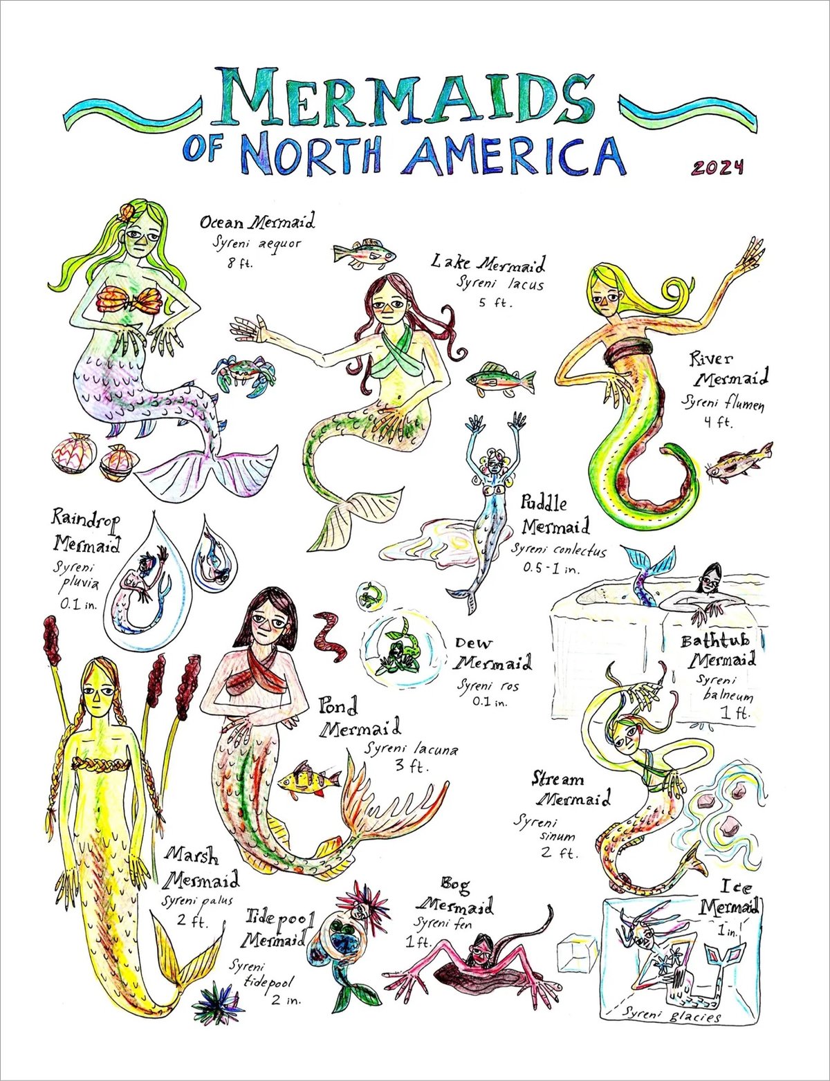
Edith Zimmerman has put some new stuff in her Etsy shop, including original watercolors and this print of Mermaids of North America (which I love).


This site is made possible by member support. 💞
Big thanks to Arcustech for hosting the site and offering amazing tech support.
When you buy through links on kottke.org, I may earn an affiliate commission. Thanks for supporting the site!
kottke.org. home of fine hypertext products since 1998.
Beloved by 86.47% of the web.

Edith Zimmerman has put some new stuff in her Etsy shop, including original watercolors and this print of Mermaids of North America (which I love).
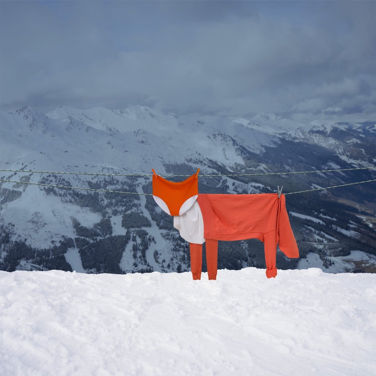
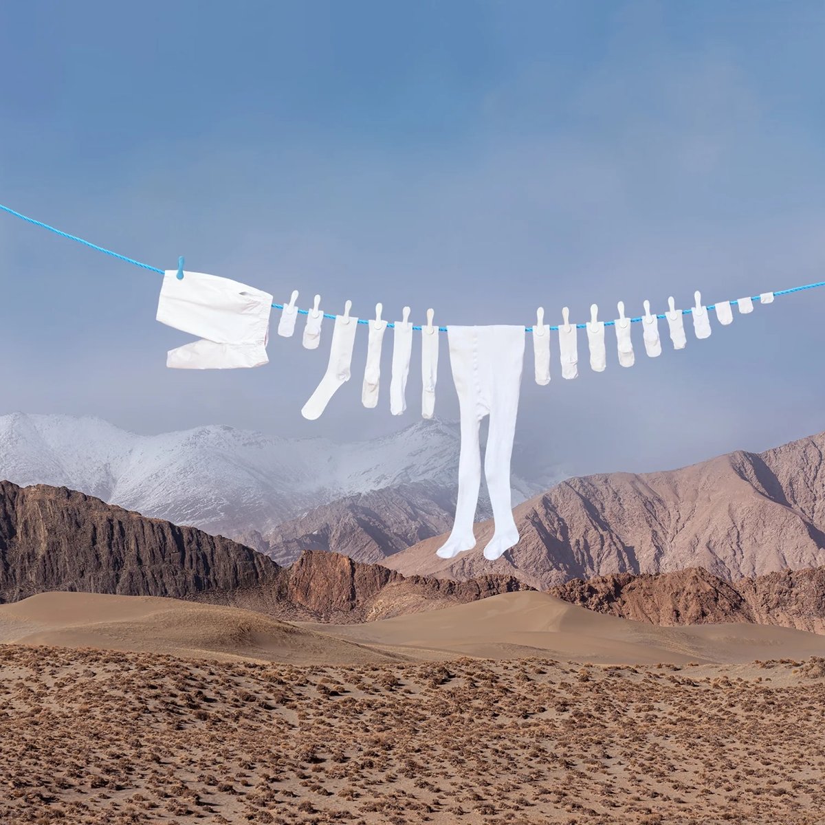
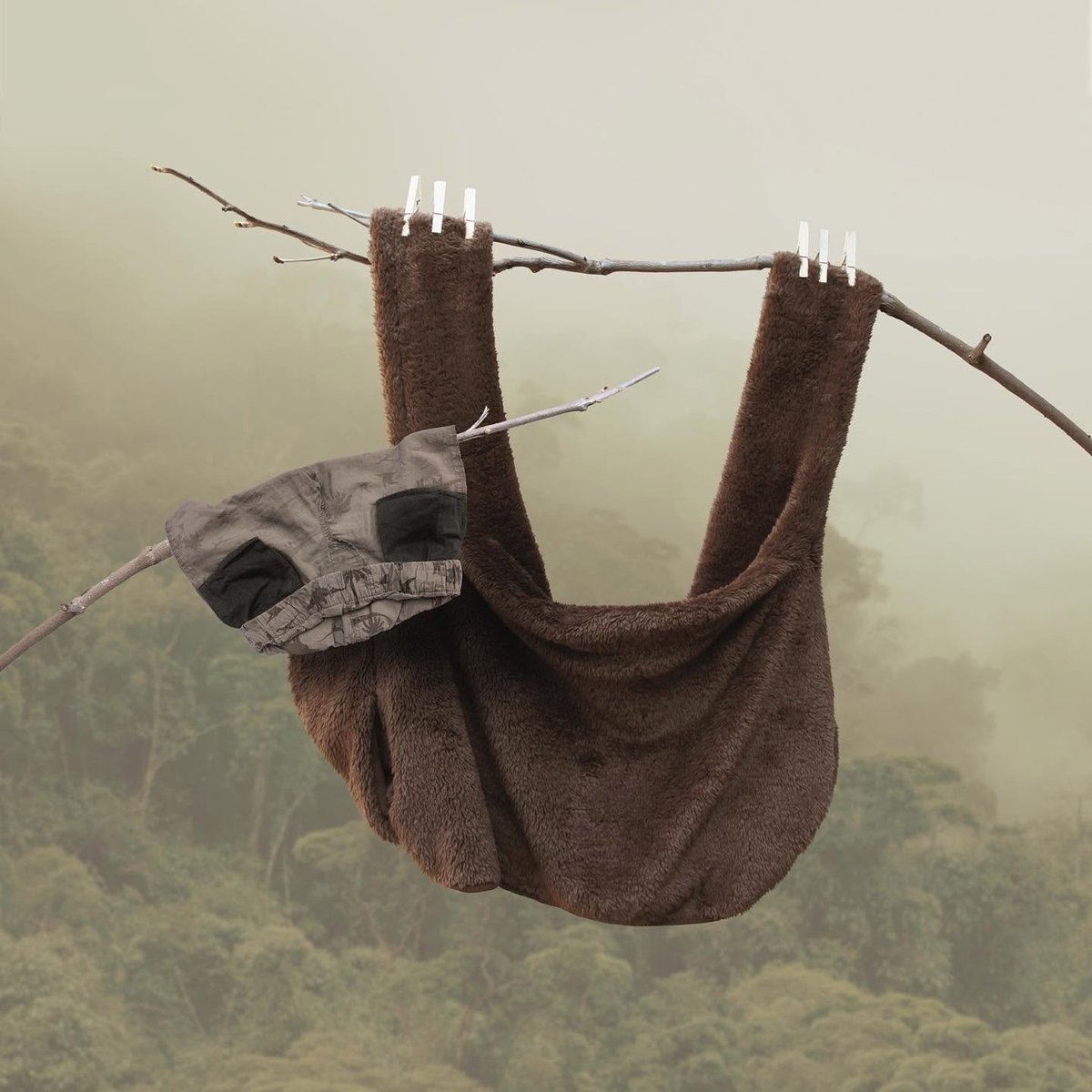
Multidisciplinary artist Helga Stentzel cleverly hangs laundry items on clotheslines to make abstract animal shapes. You can find more of her household surrealism on Instagram. (via colossal)
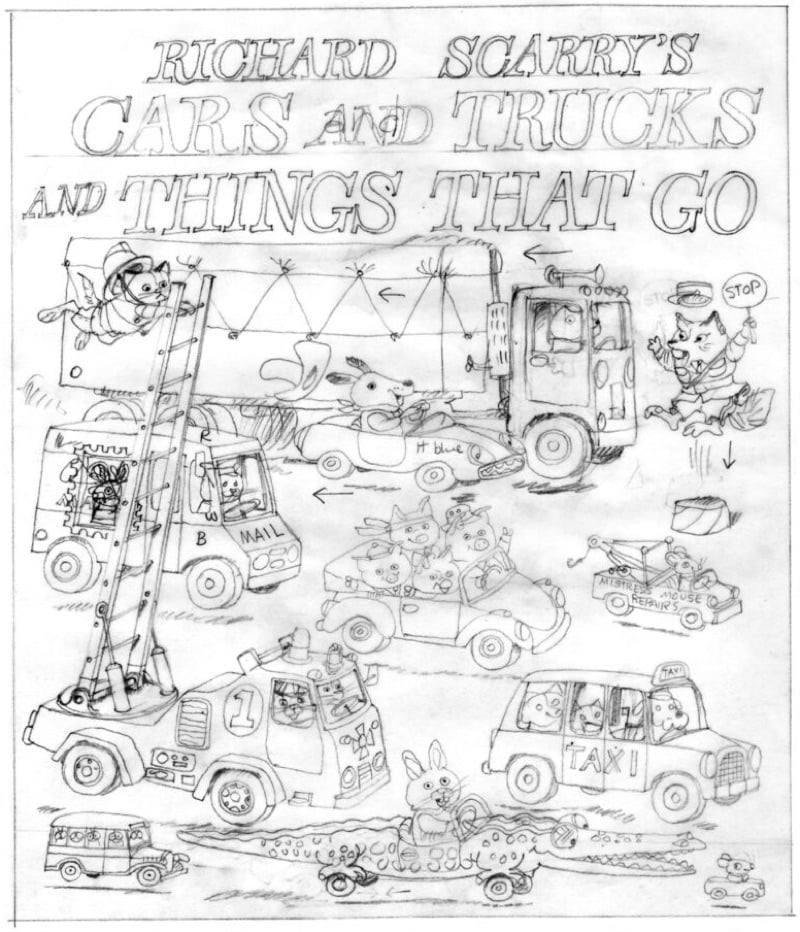
Well! In the Yale Review, Chris Ware (one of my favorite cartoonists) writes about Richard Scarry (one of my favorite children’s book authors) and Cars and Trucks and Things That Go (one of my favorite books).
This year is the 50th anniversary of Scarry’s 1974 Cars and Trucks and Things That Go, which strikes me as a commemoration worthy of ballyhoo, especially now that, as a dad myself, I’ve spent so much time ferrying my own daughter to and from school and birthday parties in various cars that-well, mostly goed. (I’ve owned five automobiles in my life, all of them cheap, one of which smoked and required the driver’s side door to be kept shut with a bungee cord hooked to the opposite armrest, stretched across both driver and passenger. What can I say? I was a young cartoonist on a cartoonist’s budget.)
Unlike those budget vehicles, however, the new deluxe Penguin Random House anniversary edition of Cars and Trucks and Things That Go is lavishly well-made, attentively reprinted with sharp black lines and warm, rich, watercolors. It includes an especially lively afterword by Scarry’s son Huck, in which he explains, using language even a kid can understand, how his dad wrote and drew the book, as well as hinting at what it was like to grow up as the son of arguably the world’s most popular and successful children’s book author.
Reader, I have never clicked “buy” faster than I did when ordering the 50th anniversary version of Cars and Trucks and Things That Go — I’m very much looking forward to peeking behind the scenes. But also, do read Ware’s whole piece…it’s an inspiring review of Scarry’s career & impact and contains all manner of little observations like these:
(Lowly was perhaps the first children’s book animal character with a real nod to the ADA and the myth of “dis”-ability, and cheerfully makes his linear form work in all sorts of inspiring and disarmingly moving ways.)
And:
But the more one looks at his work, the more one sees how the European daily grocery trip, the walk to a nearby shop or tradesman’s guild, the tiny apple car fit for a worm are not part of the blowout-all-in-for-oneself-oil-fueled-free-for-all toward which America was barreling in the late 1960s.
From Danielle Coffyn, a poem called If Adam Picked the Apple. Here’s the first bit of it:
If Adam Picked the Apple
There would be a parade,
a celebration,
a holiday to commemorate
the day he sought enlightenment.
We would not speak of
temptation by the devil, rather,
we would laud Adam’s curiosity,
his desire for adventure
and knowing.
You can read the rest of the poem here and preorder her poetry collection of the same name.
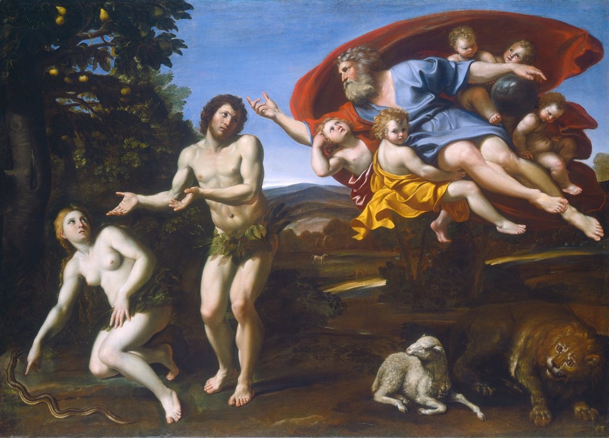
BTW, the hilarious painting is The Rebuke of Adam and Eve (1626) by Domenichino. That Adam, what a wanker.
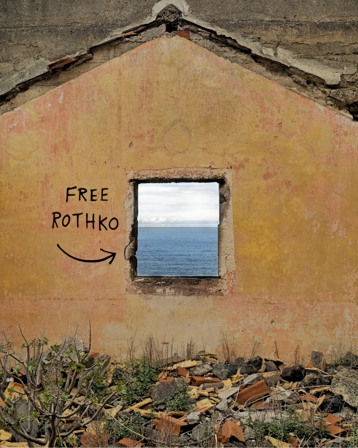
From French street artist OakOak, a reminder that art is everywhere and that art comes from everywhere. From their website and Instagram, here are a few more pieces that caught my eye:
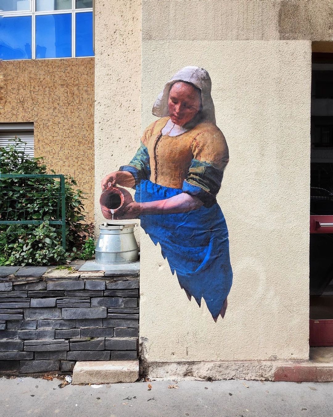
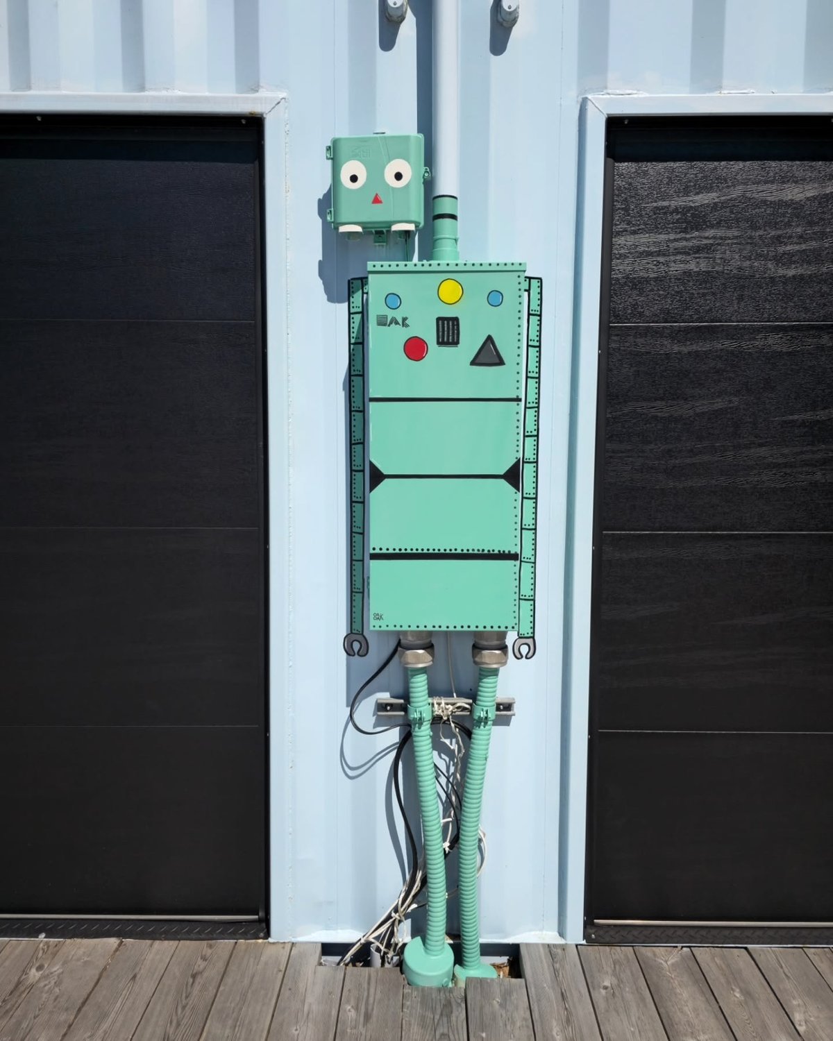
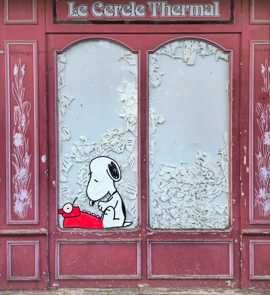
And ha, I just noticed this one, a riff on Hokusai’s The Great Wave.
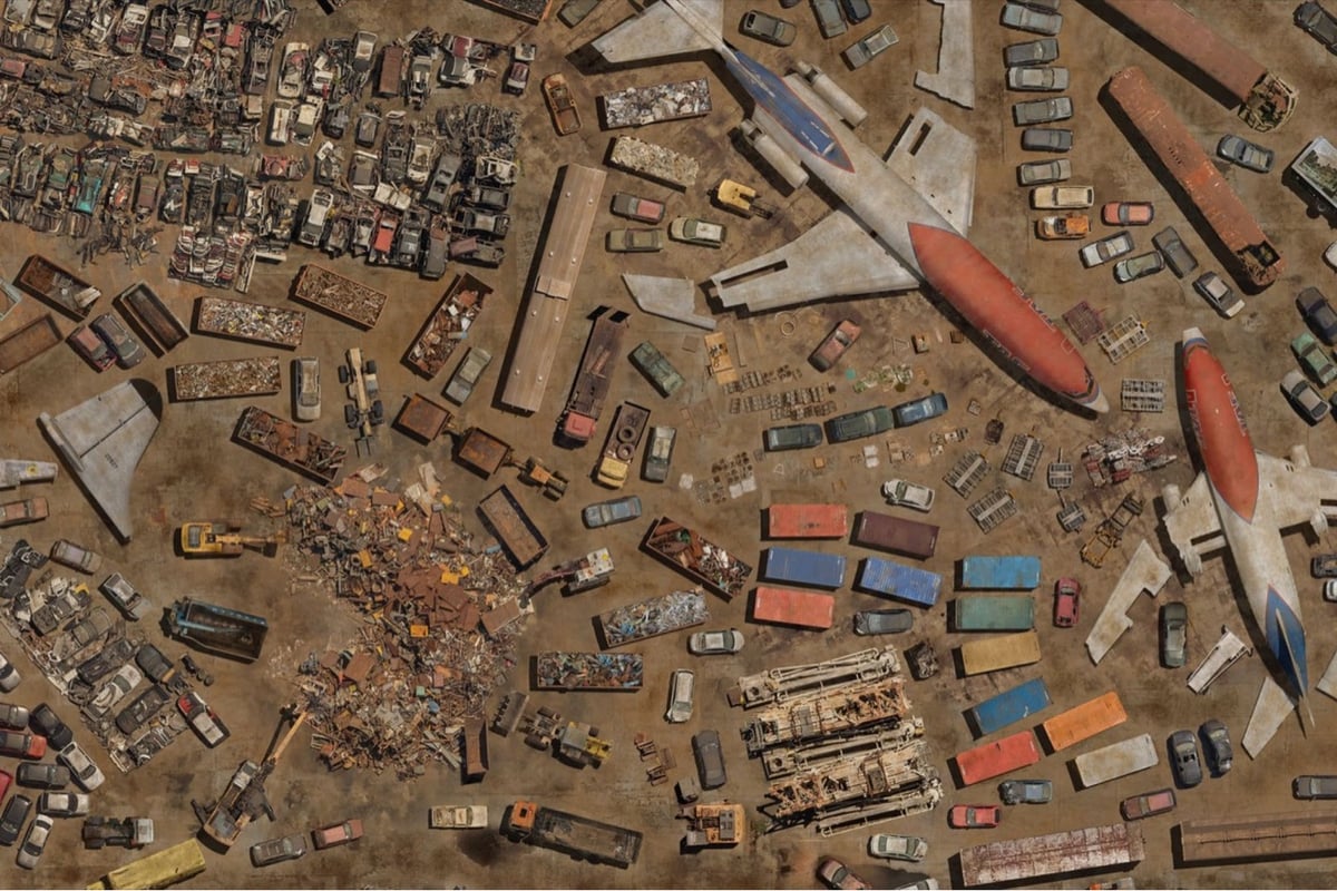
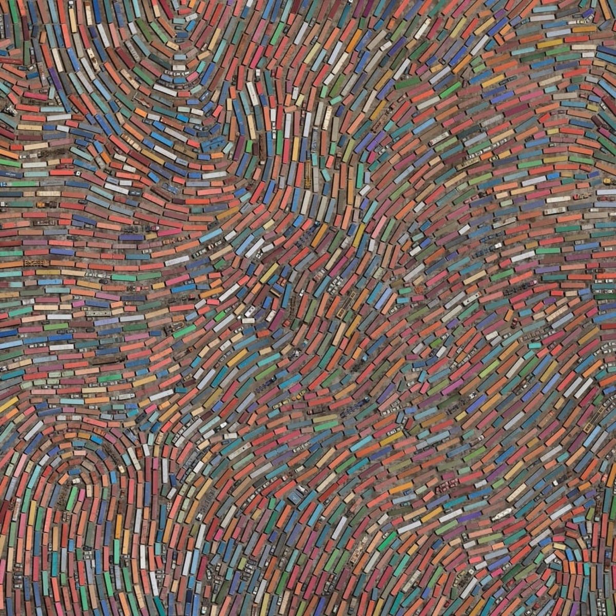
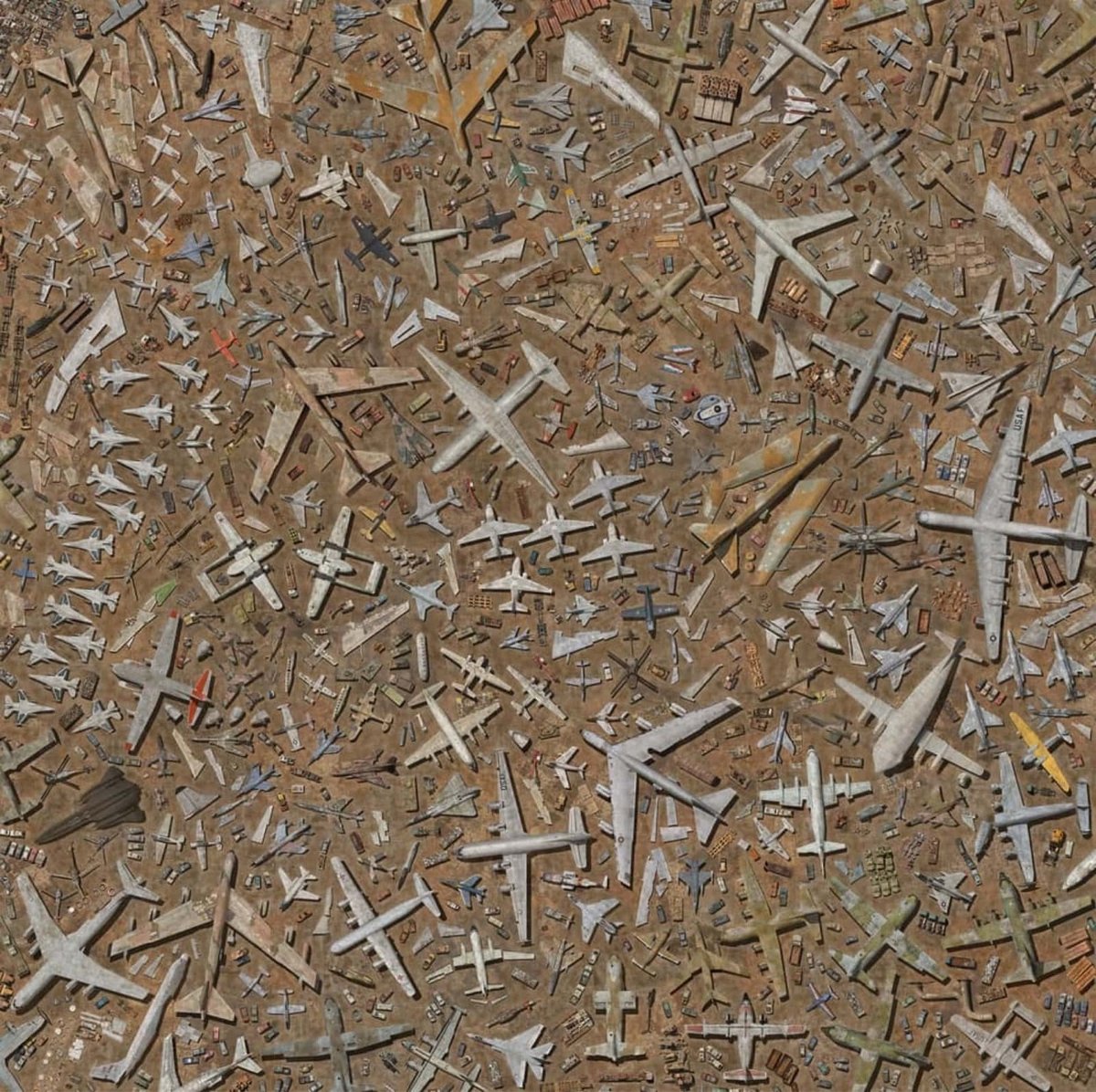
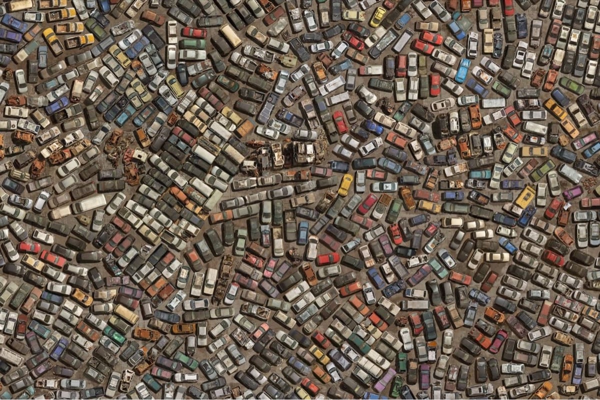
In a continuation and tweak of his Coletivos project (which I posted about previously), Cássio Vasconcellos took aerial photos of scrapyards and arranged the junked cars, planes, trains, and other objects into dense photographic collages.
OVER presents a scenario that seems to point to a dystopian future, but which, in fact, brings together fragments of the present. The exaggerated agglomeration denounces the misleading idea of “disposal”, given that objects do not cease to exist in the world when we throw them away. Rather, they inhabit other places.
This video shows the artist’s process, from hanging out the side of a helicopter to arranging all the items in Photoshop.
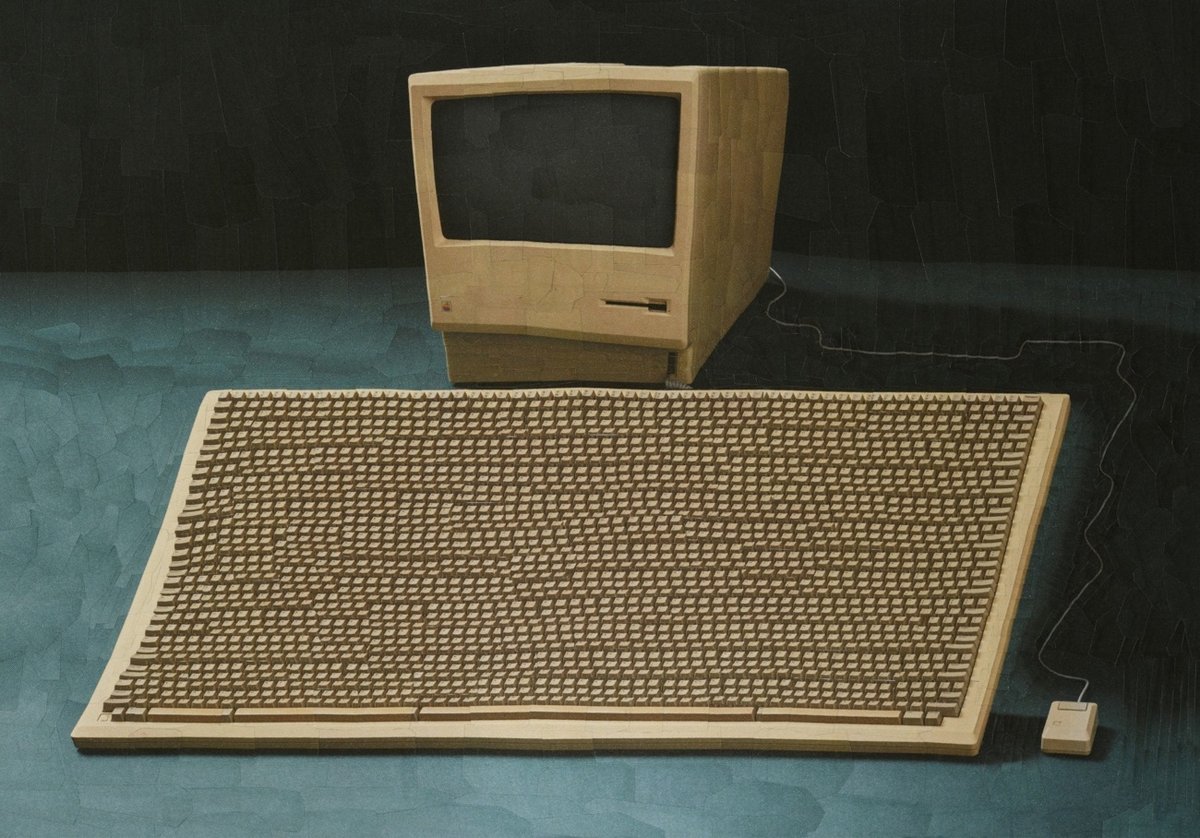
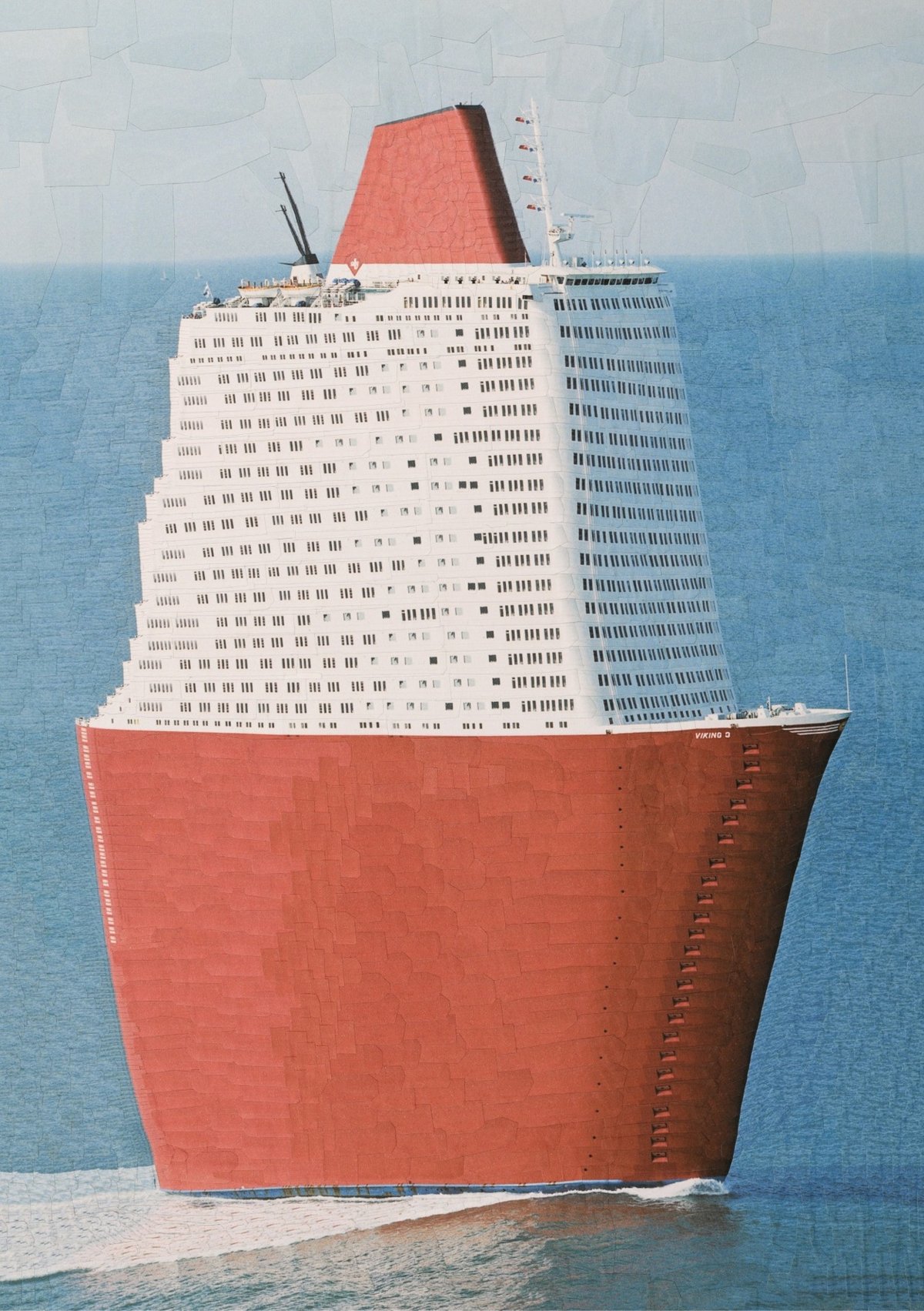
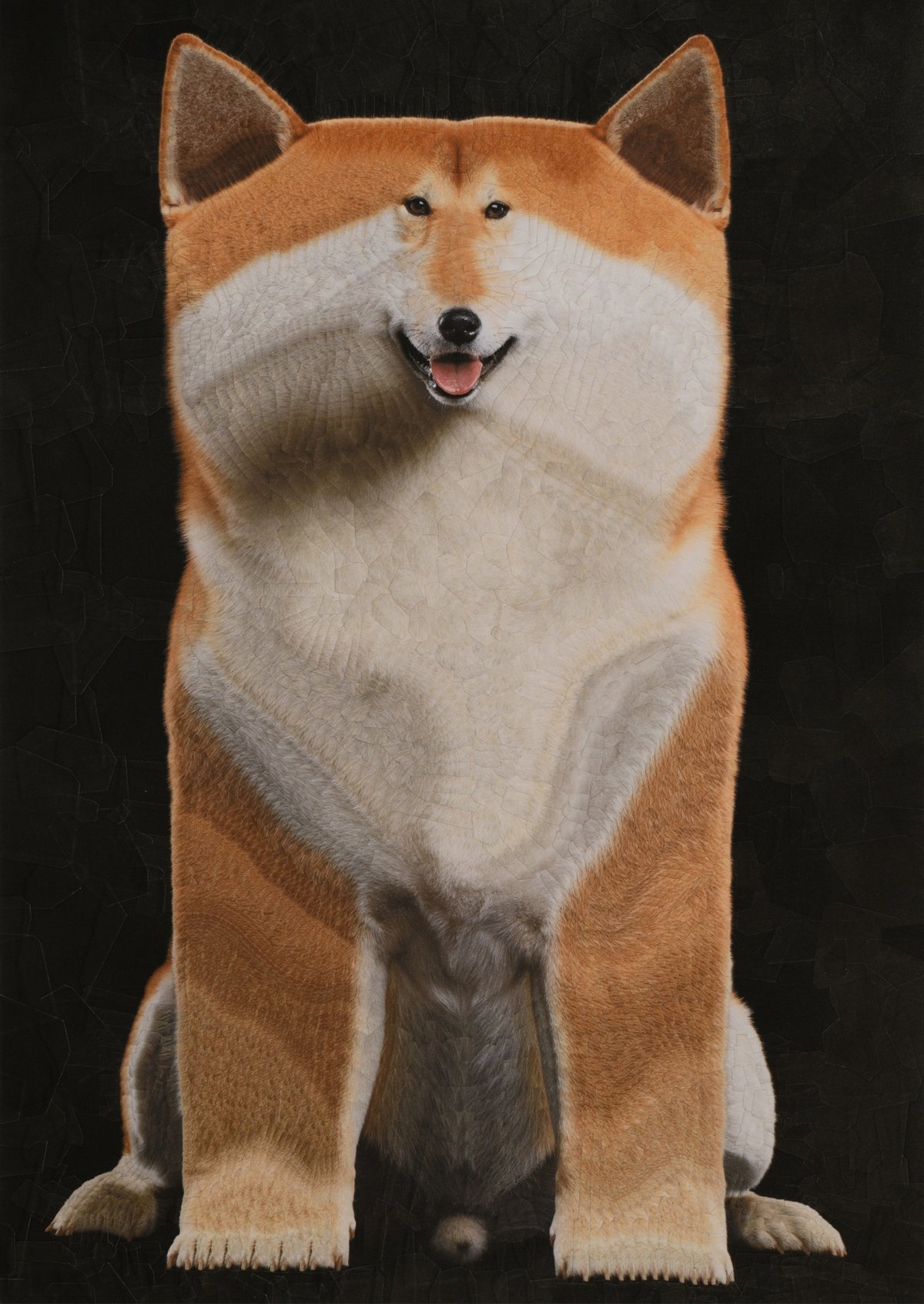

Collage artist Lola Dupré makes these wonderfully weird images of exaggerated objects, animals, and people. You find more of Dupré’s work on her website and on Instagram. (via colossal)
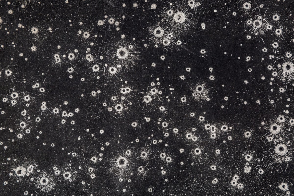
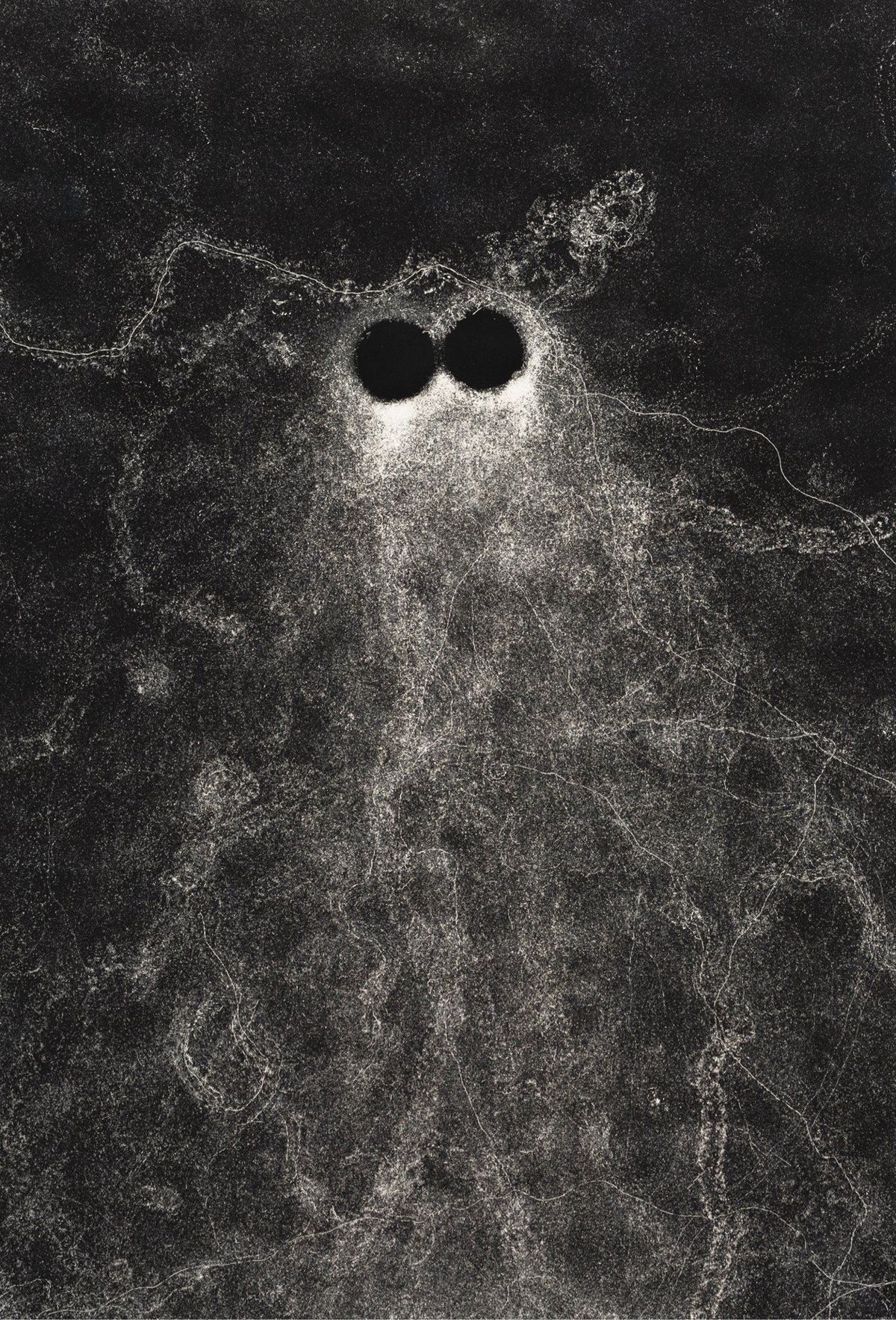
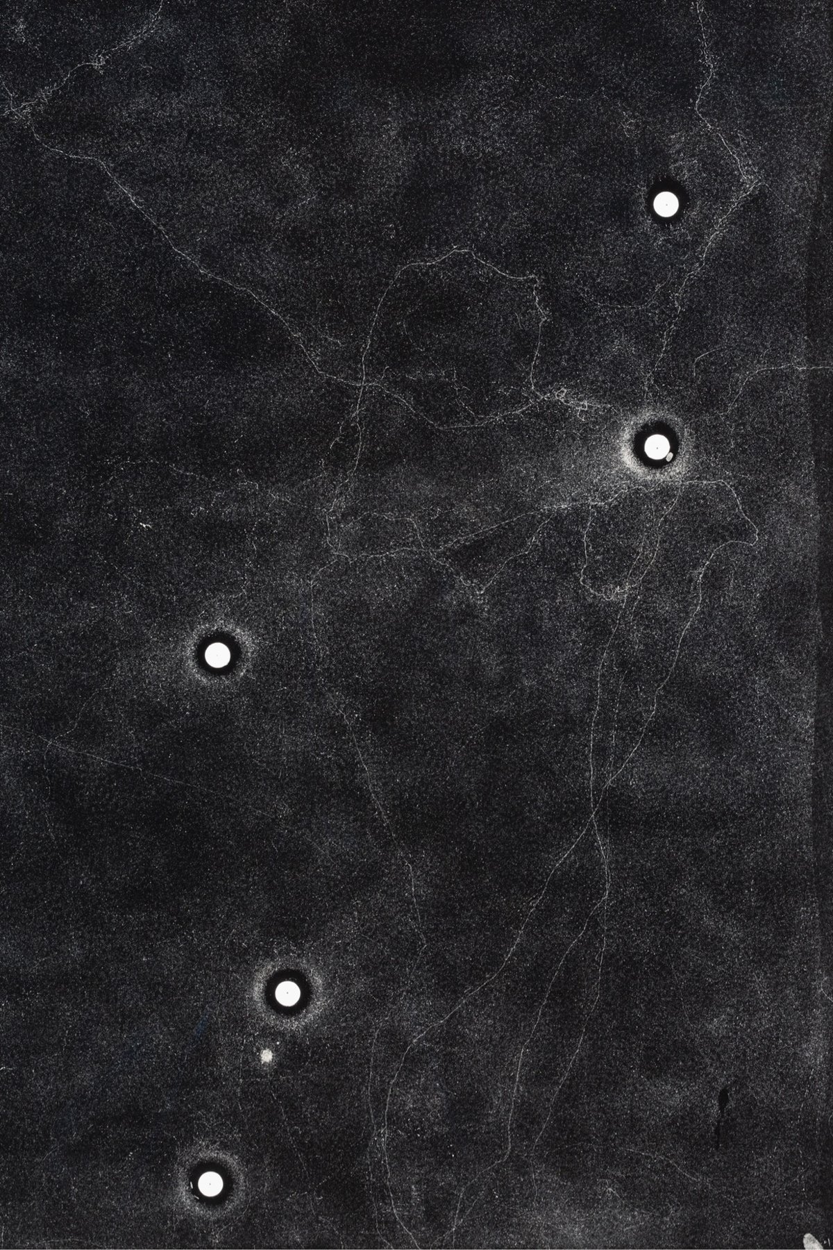
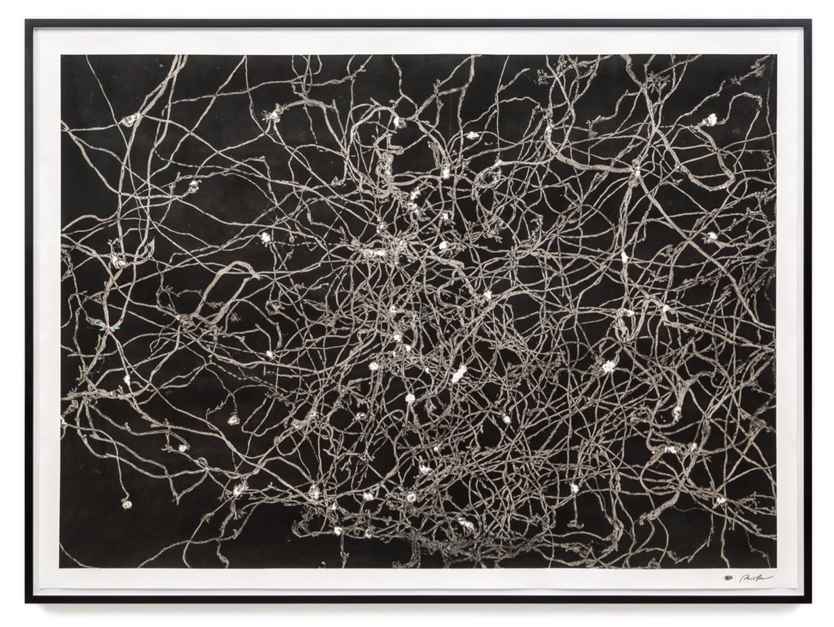
Maximilian Prüfer makes art in collaboration with nature and animals like ants & snails. Using paper with a very sensitive coating on it, he’s able to record the slightest moments of activity, like a raindrop or an ant’s footstep. Here’s a video of some ants leaving their marks:
And some rain drops:
You can find more of Prüfer’s work on his website and on Instagram.
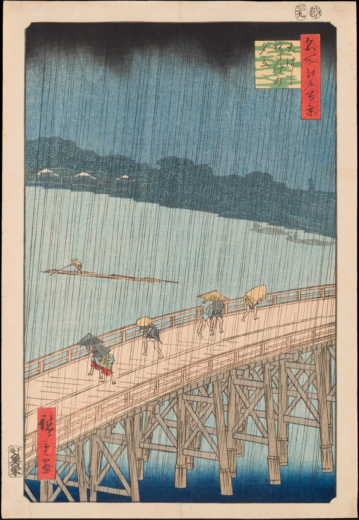
The NY Times has been doing these challenges every Friday where you sit and look at one piece of art for 10 minutes. Last week featured a woodblock print by Utagawa Hiroshige called Great Bridge: Sudden Rain at Atake, a piece that Vincent van Gogh had in his personal collection and painted a version of himself.
I didn’t expect to last the entire 10 minutes — a slow start to the day (dentist, errands) had me feeling rushed and a computer with an infinite number of apps & websites just a tab or click away is not the ideal medium for this exercise — but once I got going (or, rather, once I slowed down), it was pretty easy. (via laura olin)
It’s been awhile since I’d checked in on one of my favorite YouTube channels, Great Art Explained. In the past year, curator James Payne has done videos on Duchamp, Manet, Magritte, and that one painting by Caspar David Friedrich (you know the one). But this one, on Vincent van Gogh’s final painting, particularly caught my attention:
The mystery of what [his final painting] was and where it was painted would take over a century to solve, and that was only thanks to a worldwide epidemic. What it means is that we now have a deeper insight into what van Gogh’s final last hours were like — before his tragic death.
“Barbaric.” A “nightmare of vulgarity.” “Monstrous.” “A violent mess.” “The work of a madman.” Those are just some of the reactions that Henri Matisse’s Dance received after its public debut in 1910. In this video, Evan Puschak shares How Matisse Revolutionized Color In Art with this painting and other Fauvist work.
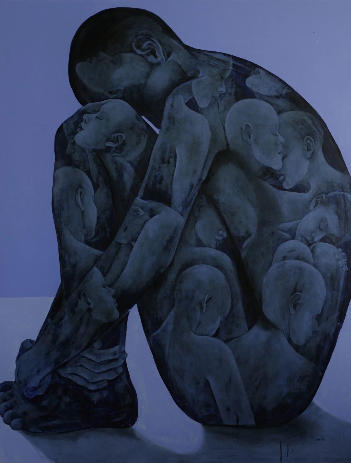
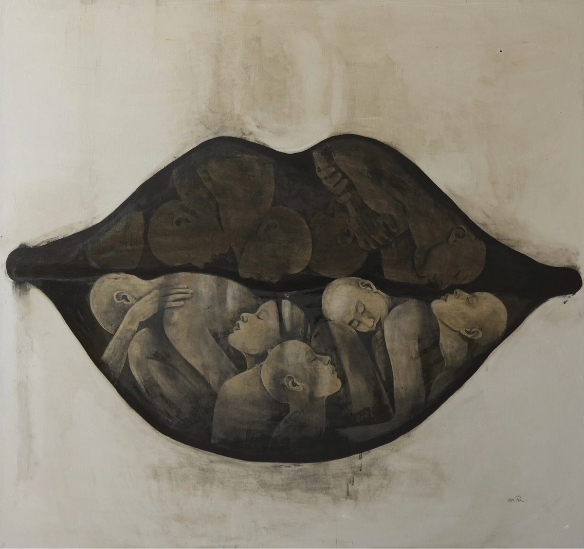
I quite like these layered oil paintings by Moldovan artist Pon Arsher. You can find her latest work, as well as several behind-the-scenes videos, on Instagram.
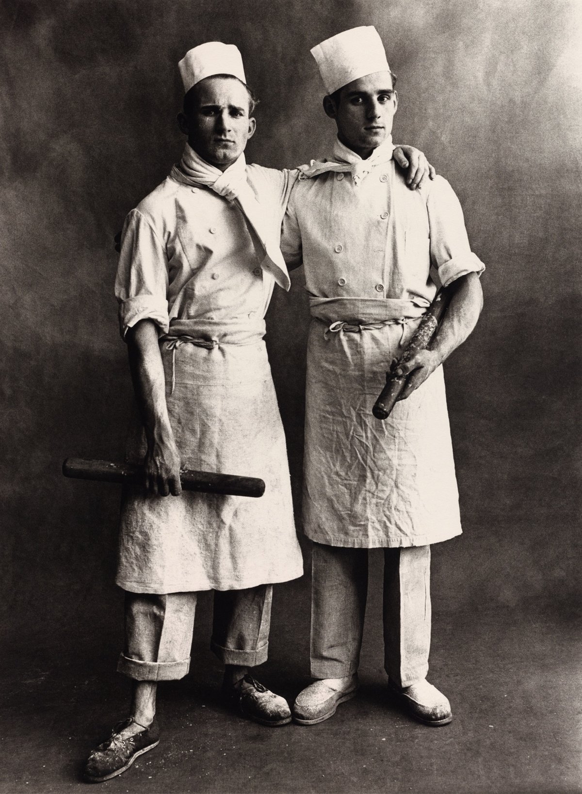
In 1950, master photographer Irving Penn set up a simple studio in Paris and started to photograph people of all kinds of professions, each wearing their work clothes and carrying the tools of their trade.
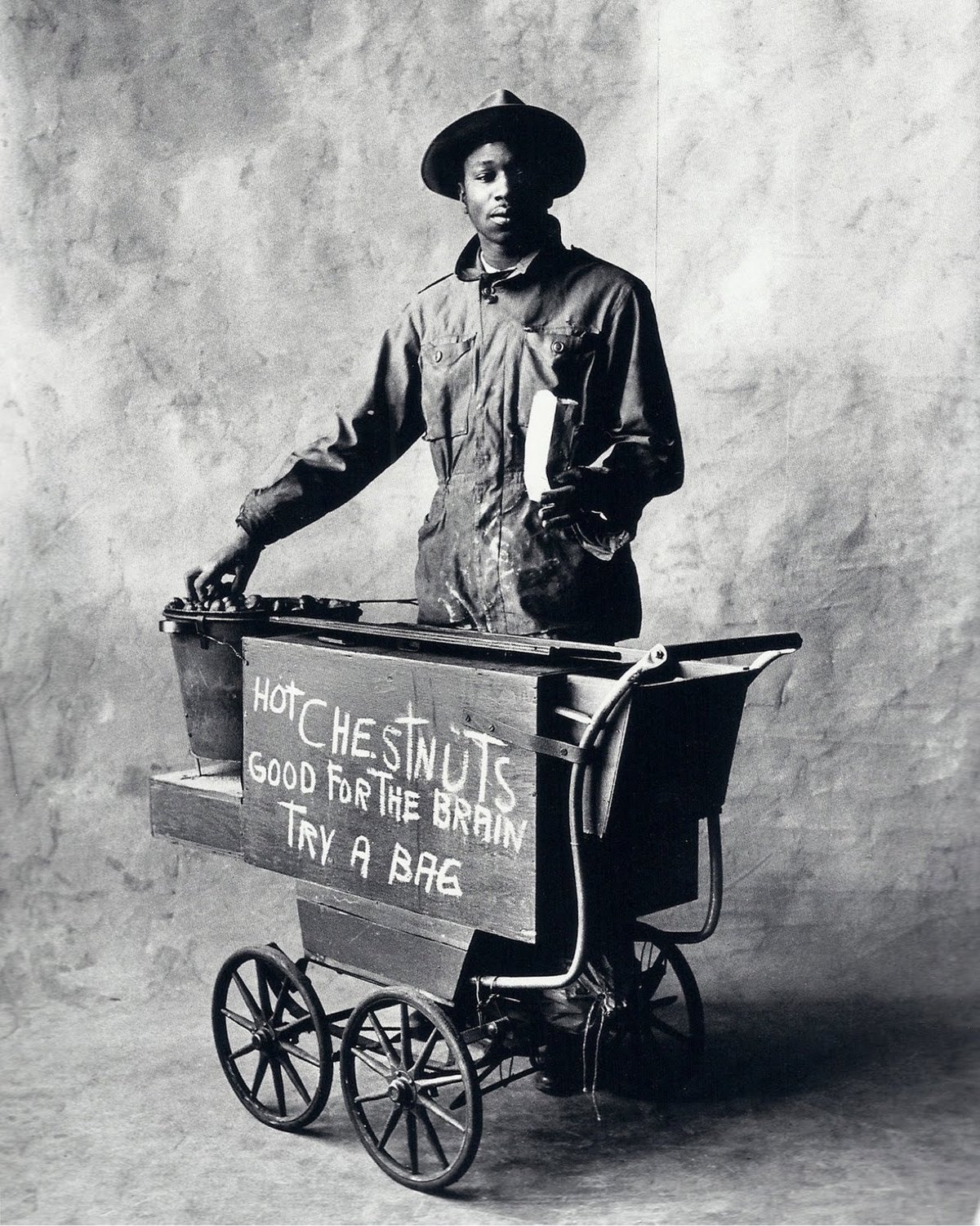
Working in the tradition of representing the petits métiers, Penn photographed fishmongers, firefighters, butchers, bakers, divers, baseball umpires, chefs, bike messengers, and sellers of goods of all kinds.
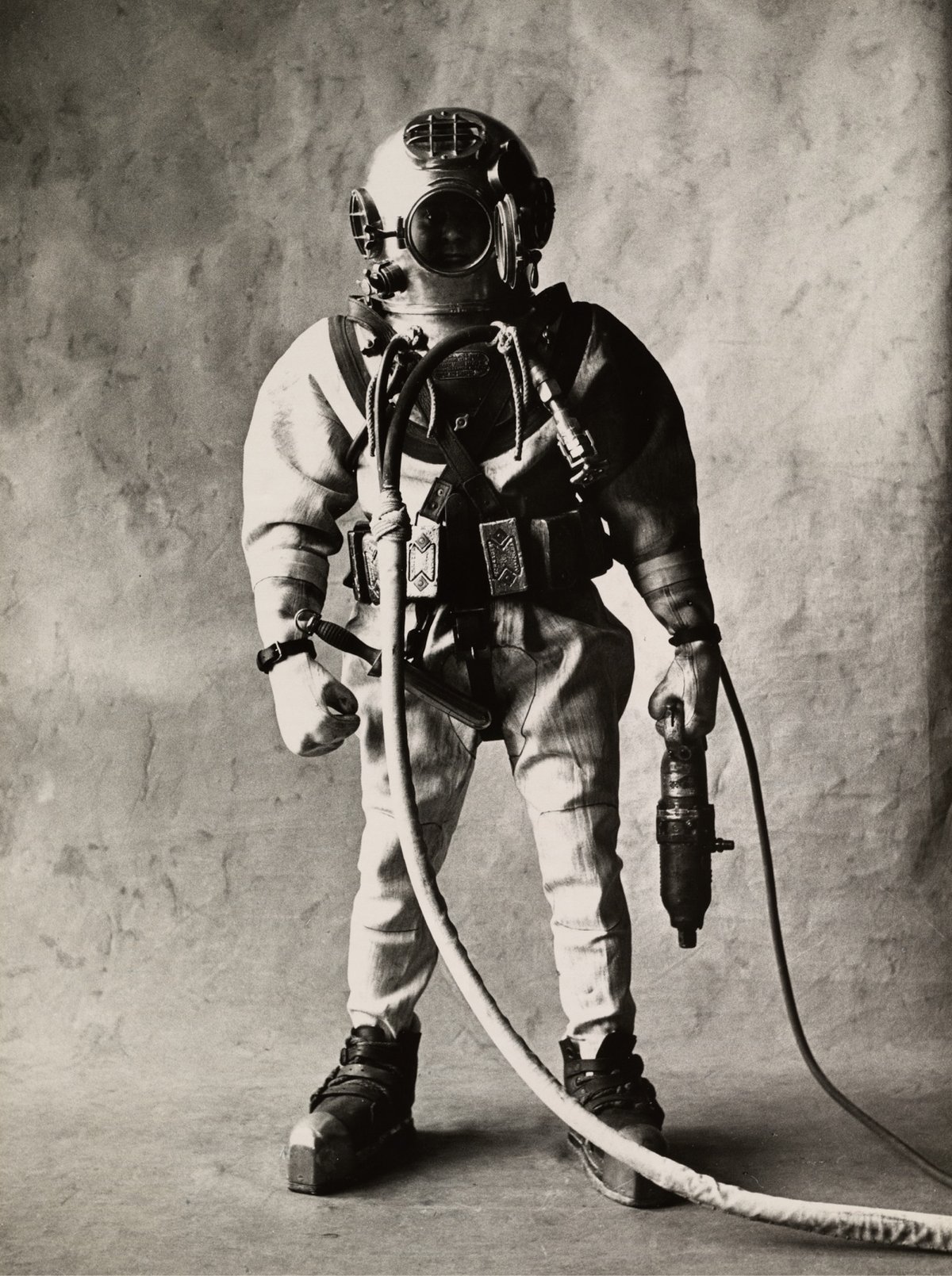
Penn continued photographing workers in New York and London, collecting the photos into a project called Small Trades.
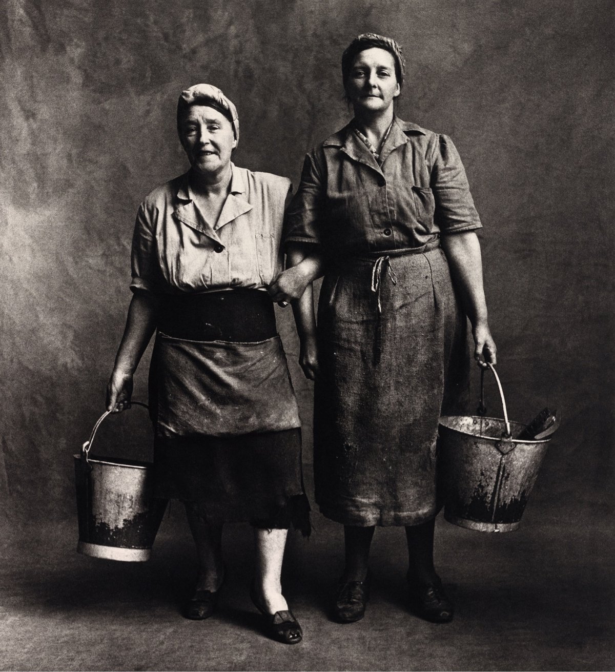
Penn said of the project:
Like everyone else who has recorded the look of tradesmen and workers, the author of this book was motivated by the fact that individuality and occupational pride seem on the wane. To a degree everyone has proved right, and since these photographs were made, London chimney sweeps have all but disappeared and in New York horseshoers — hard to find in 1950 — now scarcely exist.
A possible companion to Penn’s photographs: Studs Terkel’s Working: People Talk About What They Do All Day and How They Feel About What They Do. (Fun fact: Terkel and his editor got the idea for Working from Richard Scarry’s children’s book, What Do People Do All Day?)
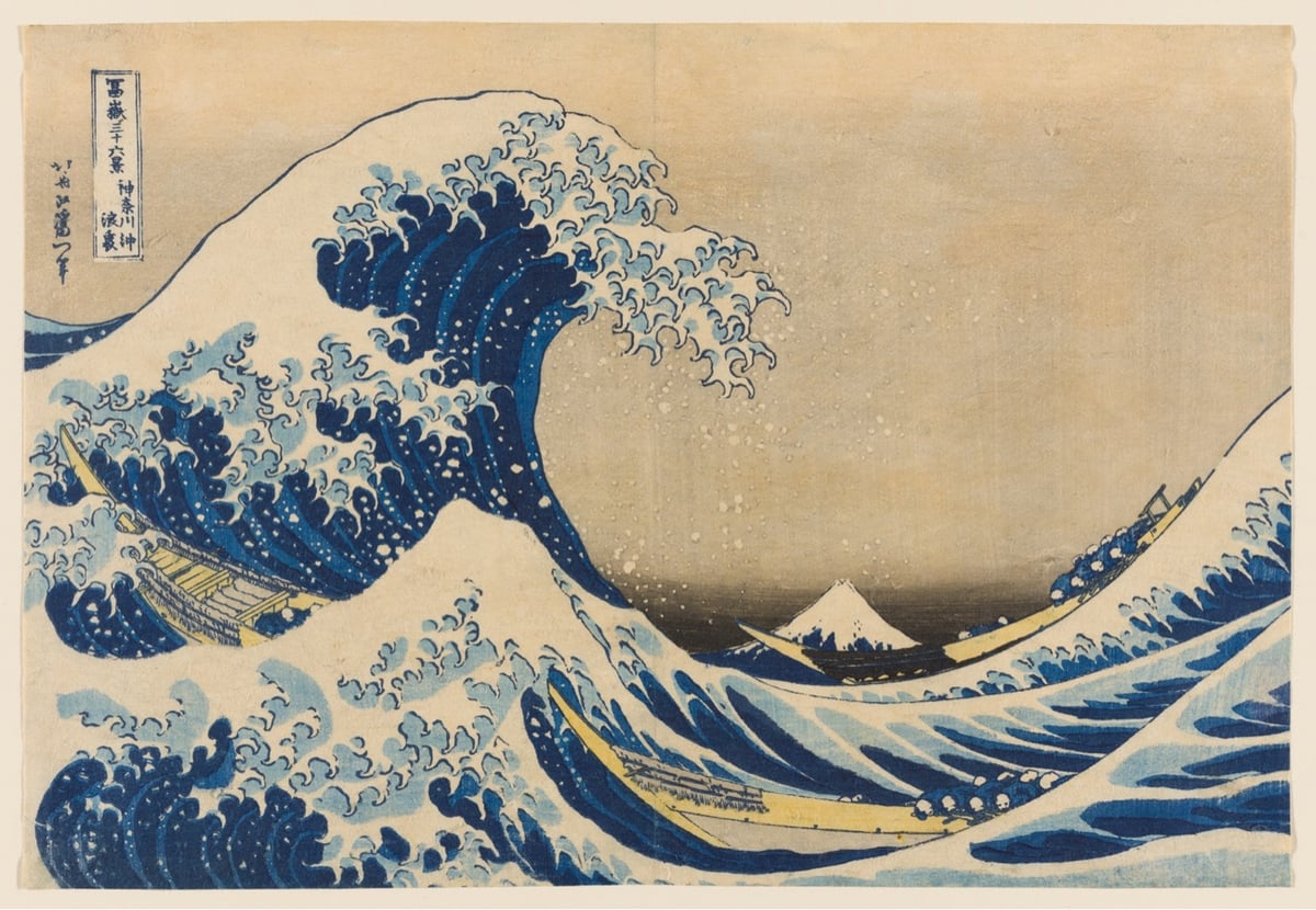
The Art Institute of Chicago has three copies of Katsushika Hokusai’s iconic work The Great Wave Off Kanagawa in its collection and one of them has been removed from storage and is back on display in the museum until Jan 6, 2025.
The Great Wave has not been on view in the Art Institute galleries for five years because, like all prints, it is susceptible to light damage and must rest a minimum of five years between showings to preserve its colors and vibrance.
Here’s a video of the print being removed from storage as well as a brief comparison of their three prints:
For other places you can see The Great Wave on display, check out Great Wave Today.
For his 2012-13 piece The Obstruction of Action by the Existence of Form, artist R. Eric McMaster built a hockey rink less than 1/10th the size of a regulation rink and had two full hockey teams play what has to be the most frustrating game of hockey ever. This is definitely a metaphor for something but I don’t quite know what.

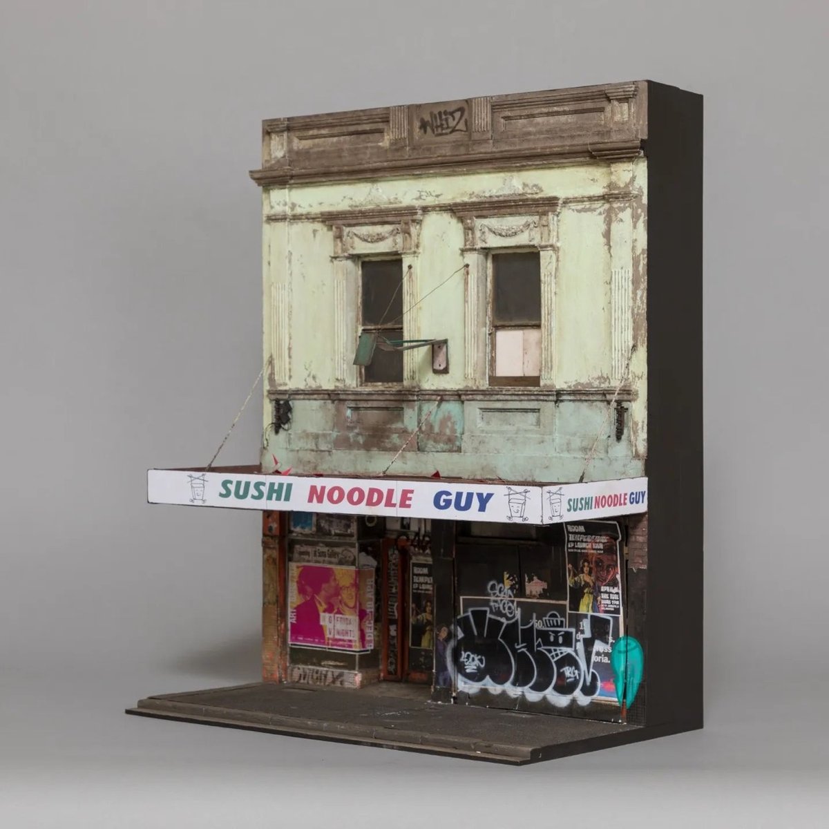
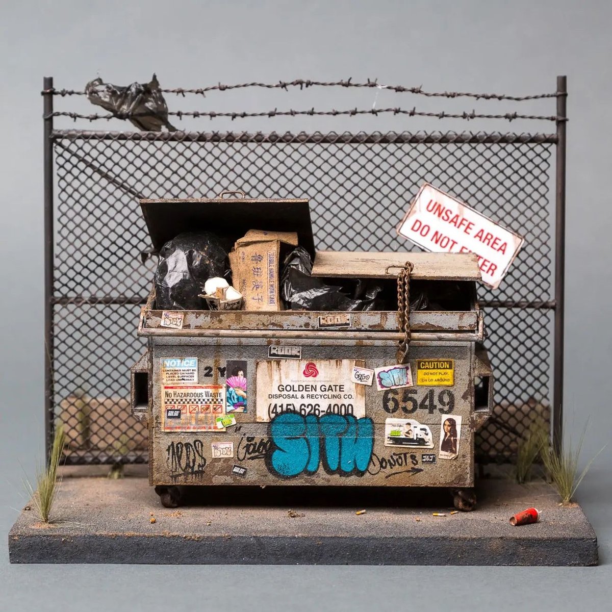
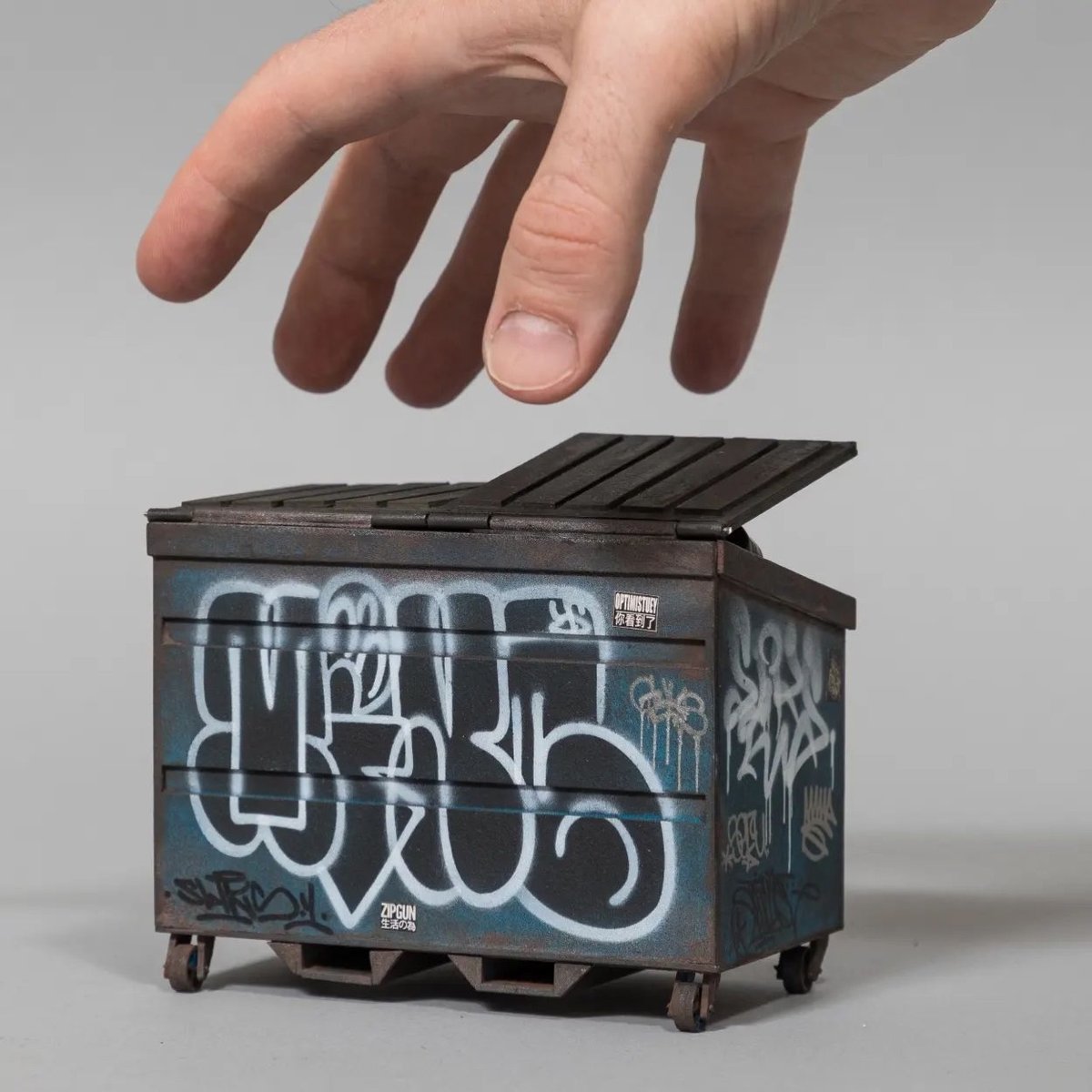
Australian artist Joshua Smith makes extremely detailed and realistic miniatures of grimy, graffitied buildings — he calls them “sculptures of Urban Decay”.
See also Gritty Miniatures of Classic NYC Street Objects.
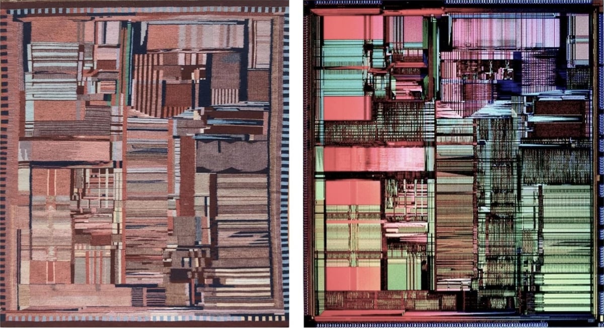
In 1994, a Navajo/Diné weaver named Marilou Schultz made a weaving of the microscopic pattern of an Intel Pentium processor. (In the image above, the weaving is on the left and the chip is on the right.)
The Pentium die photo below shows the patterns and structures on the surface of the fingernail-sized silicon die, over three million tiny transistors. The weaving is a remarkably accurate representation of the die, reproducing the processor’s complex designs. However, I noticed that the weaving was a mirror image of the physical Pentium die; I had to flip the rug image below to make them match. I asked Ms. Schultz if this was an artistic decision and she explained that she wove the rug to match the photograph. There is no specific front or back to a Navajo weaving because the design is similar on both sides,3 so the gallery picked an arbitrary side to display. Unfortunately, they picked the wrong side, resulting in a backward die image.
Schultz is working on a weaving of another chip, the Fairchild 9040, which was “built by Navajo workers at a plant on Navajo land”.
In December 1972, National Geographic highlighted the Shiprock plant as “weaving for the Space Age”, stating that the Fairchild plant was the tribe’s most successful economic project with Shiprock booming due to the 4.5-million-dollar annual payroll. The article states: “Though the plant runs happily today, it was at first a battleground of warring cultures.” A new manager, Paul Driscoll, realized that strict “white man’s rules” were counterproductive. For instance, many employees couldn’t phone in if they would be absent, as they didn’t have telephones. Another issue was the language barrier since many workers spoke only Navajo, not English. So when technical words didn’t exist in Navajo, substitutes were found: “aluminum” became “shiny metal”. Driscoll also realized that Fairchild needed to adapt to traditional nine-day religious ceremonies. Soon the monthly turnover rate dropped from 12% to under 1%, better than Fairchild’s other plants.
The whole piece is really interesting and demonstrates the deep rabbit hole awaiting the curious art viewer. (via waxy)
Ted Chiang with a thought-provoking essay on Why A.I. Isn’t Going to Make Art:
It is very easy to get ChatGPT to emit a series of words such as “I am happy to see you.” There are many things we don’t understand about how large language models work, but one thing we can be sure of is that ChatGPT is not happy to see you. A dog can communicate that it is happy to see you, and so can a prelinguistic child, even though both lack the capability to use words. ChatGPT feels nothing and desires nothing, and this lack of intention is why ChatGPT is not actually using language. What makes the words “I’m happy to see you” a linguistic utterance is not that the sequence of text tokens that it is made up of are well formed; what makes it a linguistic utterance is the intention to communicate something.
In the past few years, Chiang has written often about the limitations of LLMs — you can read more about his AI views on kottke.org.
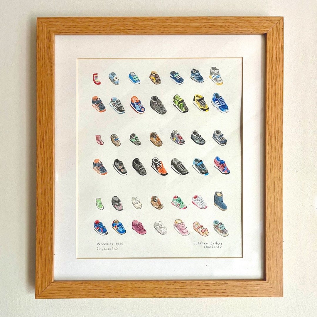
This is lovely: illustrator & cartoonist Stephen Collins drew the progression of shoes worn by each of his three kids.
Back in 2020 we had to chuck the kids’ baby shoes out 😱, so I decided to keep the first ones and draw the rest, in order, starting with pre-walking socks.
When I look at photos of my kids from when they were younger, my eye is always drawn to their shoes and clothes — some of them are so iconic in my mind they almost function as logos for my kids at different stages.
I haven’t watched too much of the Olympics this summer so maybe the announcers explain this every single time they show a medals ceremony, but in case you didn’t know, the long, thin boxes given to the medalists along with their medals contain the official poster of the Games (and a plushie).
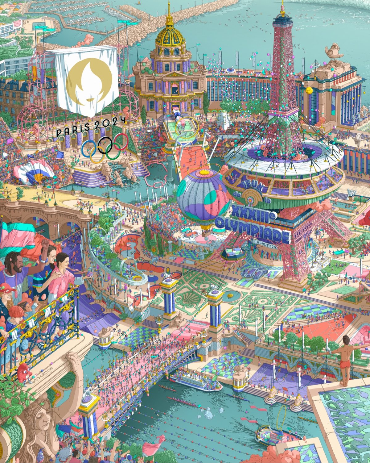
The poster was created by illustrator Ugo Gattoni and is a sort of Where’s Waldo / Busy Busy Town representation of the Games and its venues.
The designer had total creative freedom. While working to a brief and respecting the look of the Games, he still managed to maintain his own playful and joyful style.
This is why eight mascots are hidden within the posters. In fact, whatever age you are, there is something within the artwork that you will be able to enjoy.
The biggest images of the poster I can find are here if you want to zoom in to see the details. There are also zoomed-in images and videos on Gattoni’s Instagram.
The Olympic poster is the twin of the poster for the Paralympic Games, also created by Gattoni:
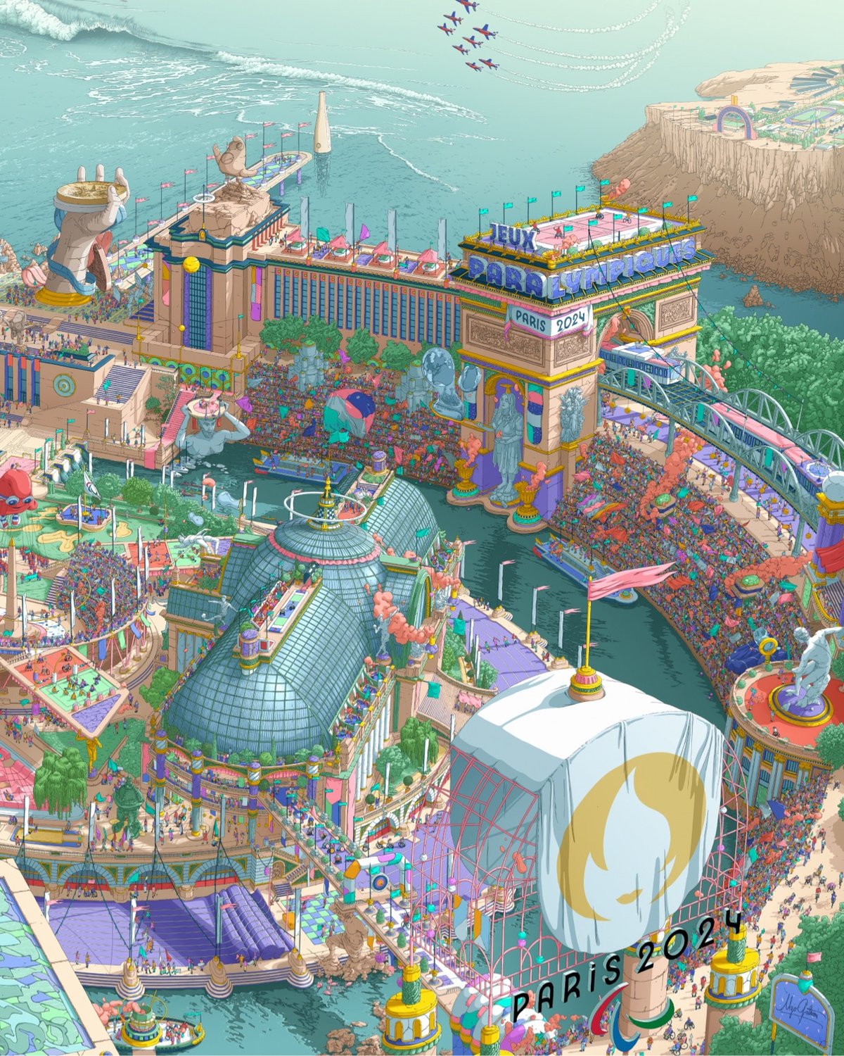
Together, they create one unified view of the 2024 Summer Games.
If you’d like to buy your own version of the poster, check out the official Olympics store.
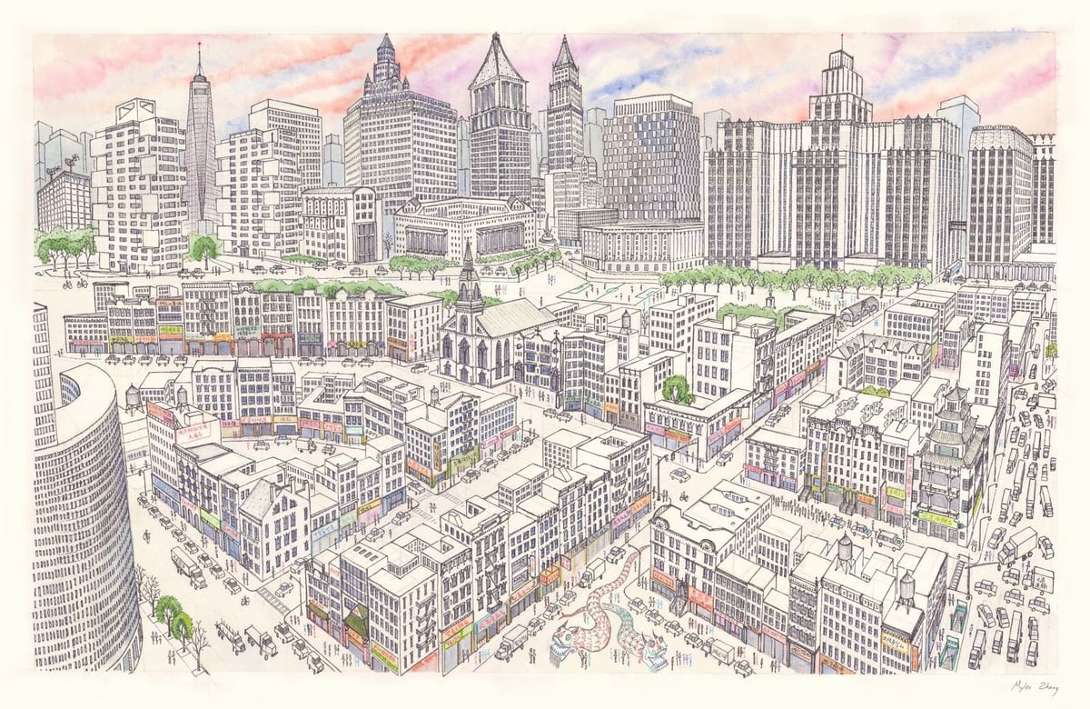
Myles Zhang, a PhD candidate in architectural history, created this drawing of Manhattan’s Chinatown several years ago.
Chinatown’s tenements are in the foreground, while the skyscraper canyons of Lower Manhattan rise above. This shows the area of Chinatown bordered by Bowery, Canal Street, and Columbus Park.
It took him around 60 hours to complete; he made a time lapse video of its creation:
There’s a very large scan of the image that’s worth looking at.
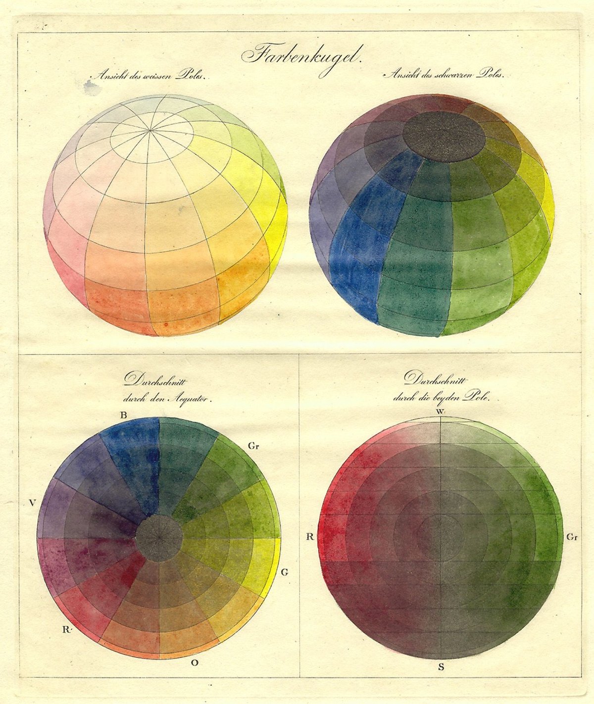
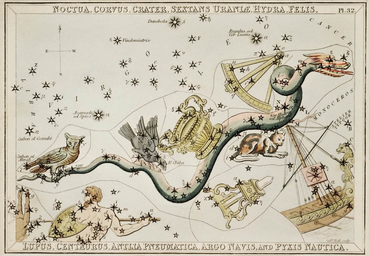
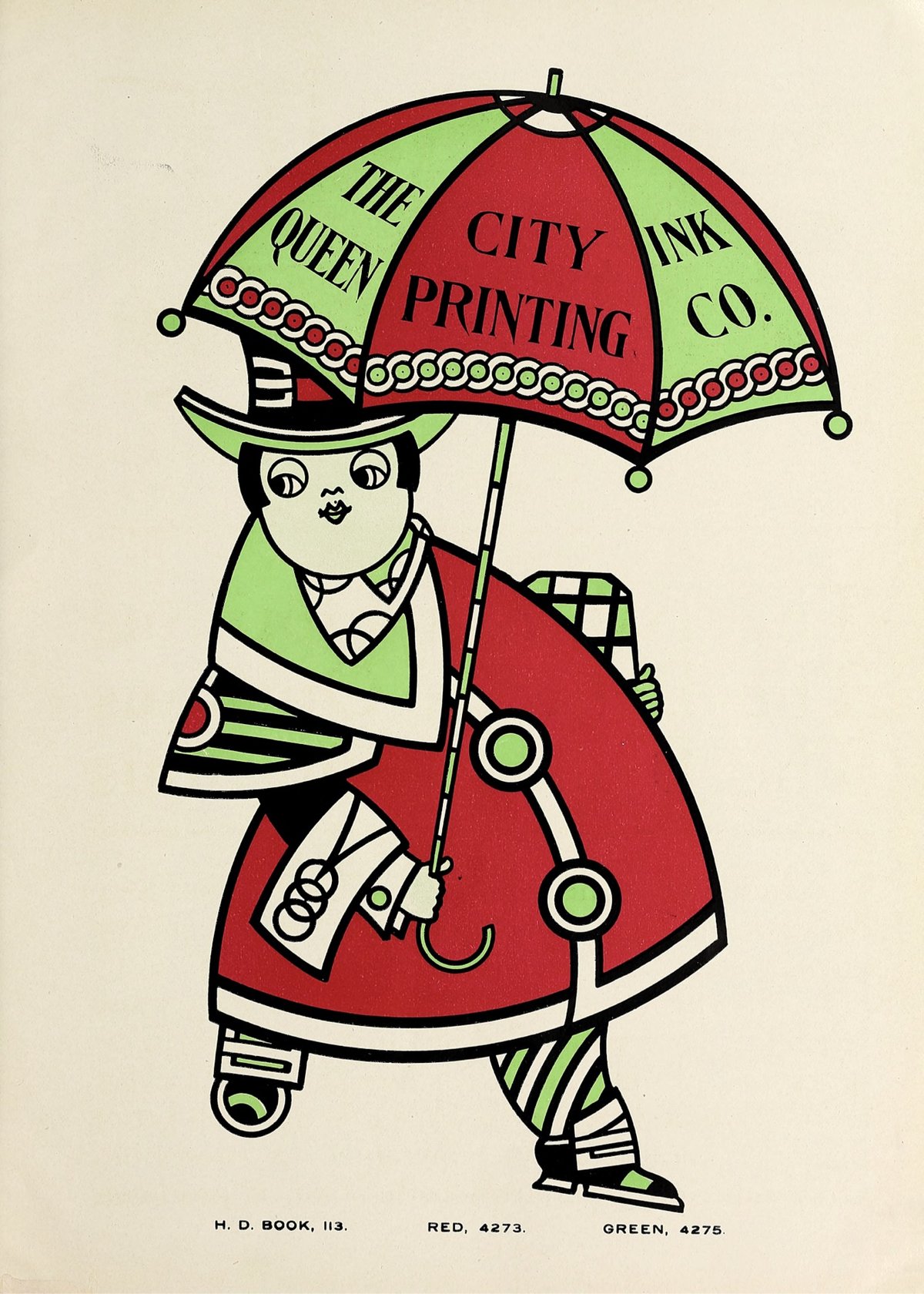
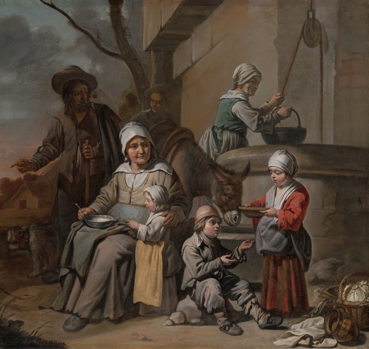
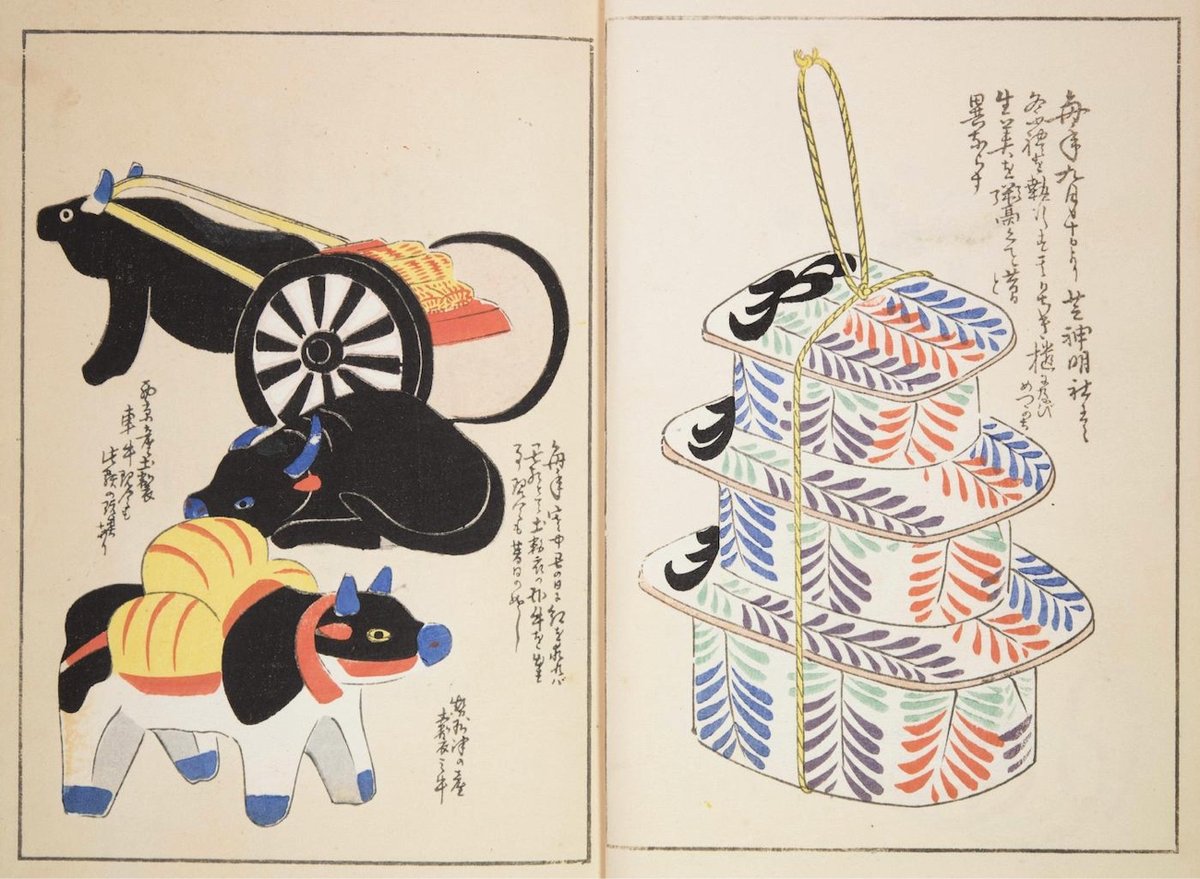
Public Work is an image search engine that boasts 100,000 “copyright-free” images from institutions like the NYPL, the Met, etc. It’s fast with a relatively simple interface and uses AI to auto-categorize and suggest possibly related images (both visually and content-wise). And it’s fun to just visually click around on related images. On the downside, their sourcing and attribution isn’t great — especially when compared to something like Flickr Commons.
I’d love it if an interface this quick and visual-first were adopted by museums though — let’s face it: the image search on museum, library, and institution websites is often terrible and slow. (via @jaygogh)
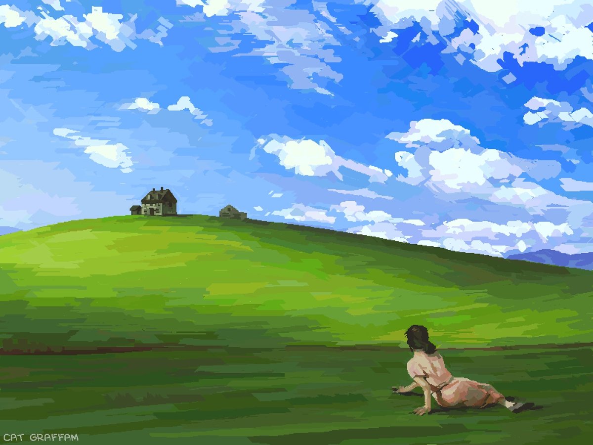
Cat Graffam combined their love of art and old technology to create a mashup of Andrew Wyeth’s Christina’s World and the Windows XP wallpaper, using MS Paint and a mouse. You can watch how they did it in this video:
Prints of the finished product are available. (via waxy)
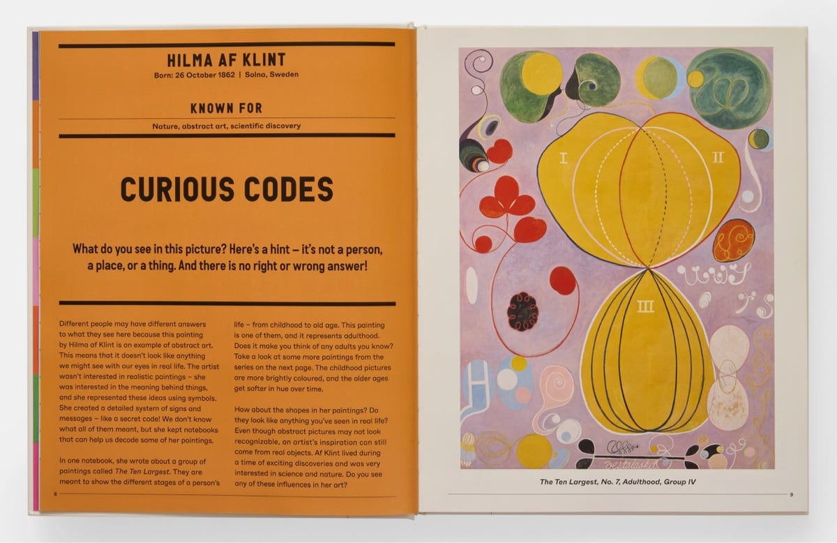
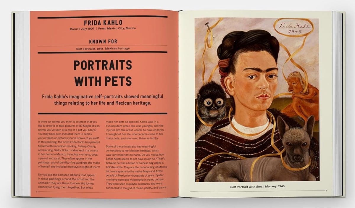
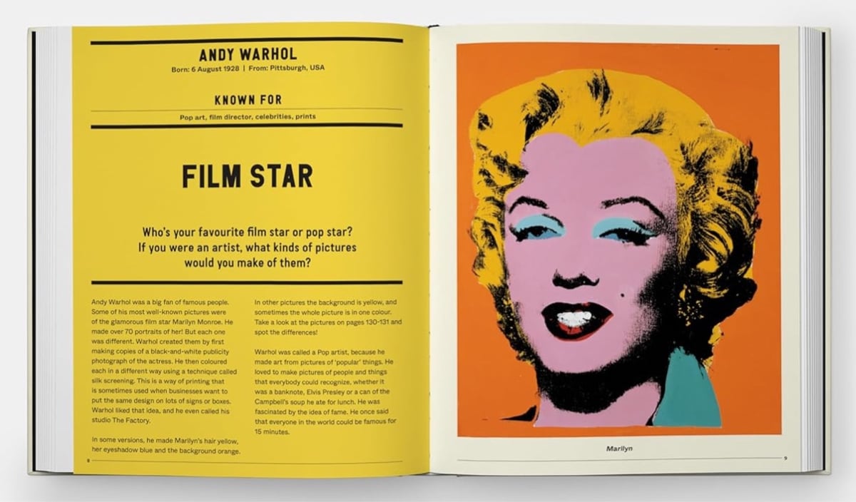
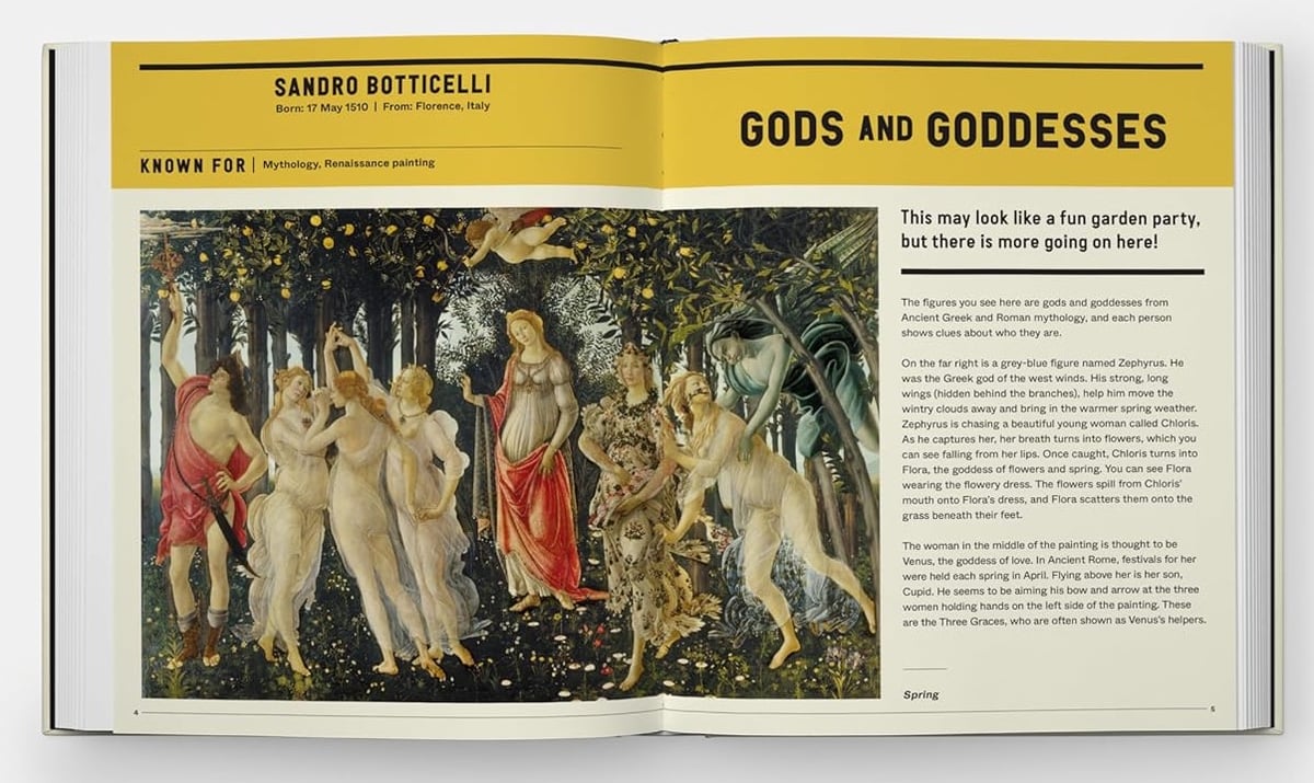
Phaidon has released a new version of their classic The Art Book for Children. Aimed at kids aged 7-12, the new version includes a selection of contemporary artists alongside familiar favorites.
This single volume features 60 artists through a wide range of large-scale, full-page reproductions of their artworks, including paintings, photographs, sculptures, video, prints, and installations from across time and space. Each page showcases defining artworks by the artists, combined with an interactive and informative conversation, giving relatable and memorable contexts for children, and inspiring a curiosity and appreciation for the Visual Arts that will continue into adulthood.
I’ve grown to love art as an adult but I don’t remember ever noticing or caring about any art when I was a kid. If this book had dropped into the lap of a young Jason, I wonder if it would have sparked anything?
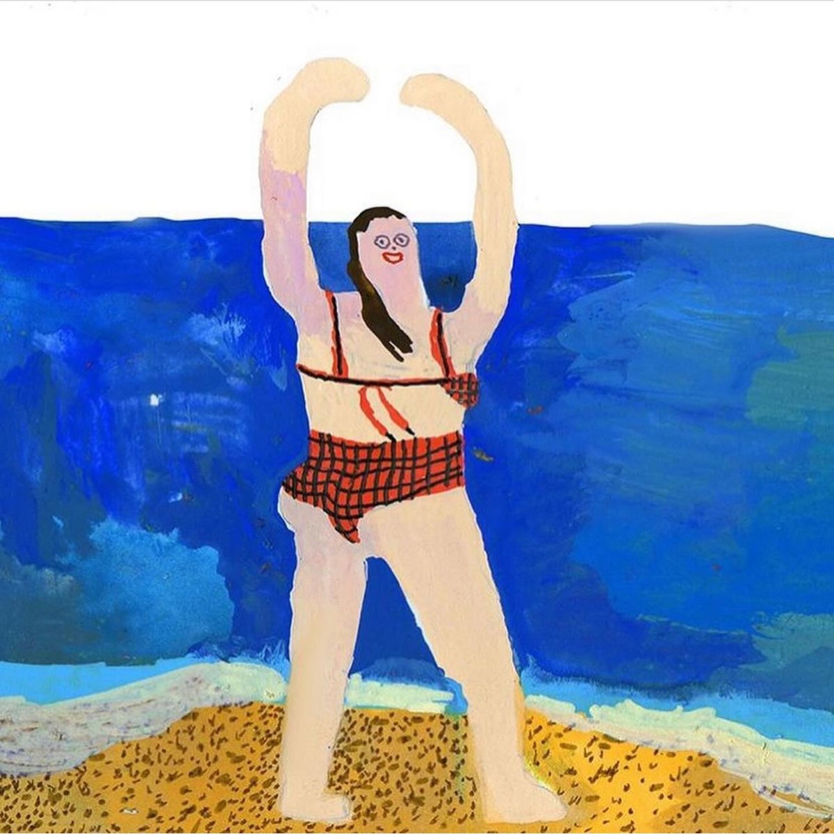
“who else is ready to get beat tf up by the ocean?” asks artist Tara Booth on Instagram. (If you click through, it’s a whole mini-story.)
More of Booth’s awesome work can also be found on her website. Is this the day I buy her art on a tote bag? Or a hoodie? Or a pillowcase?
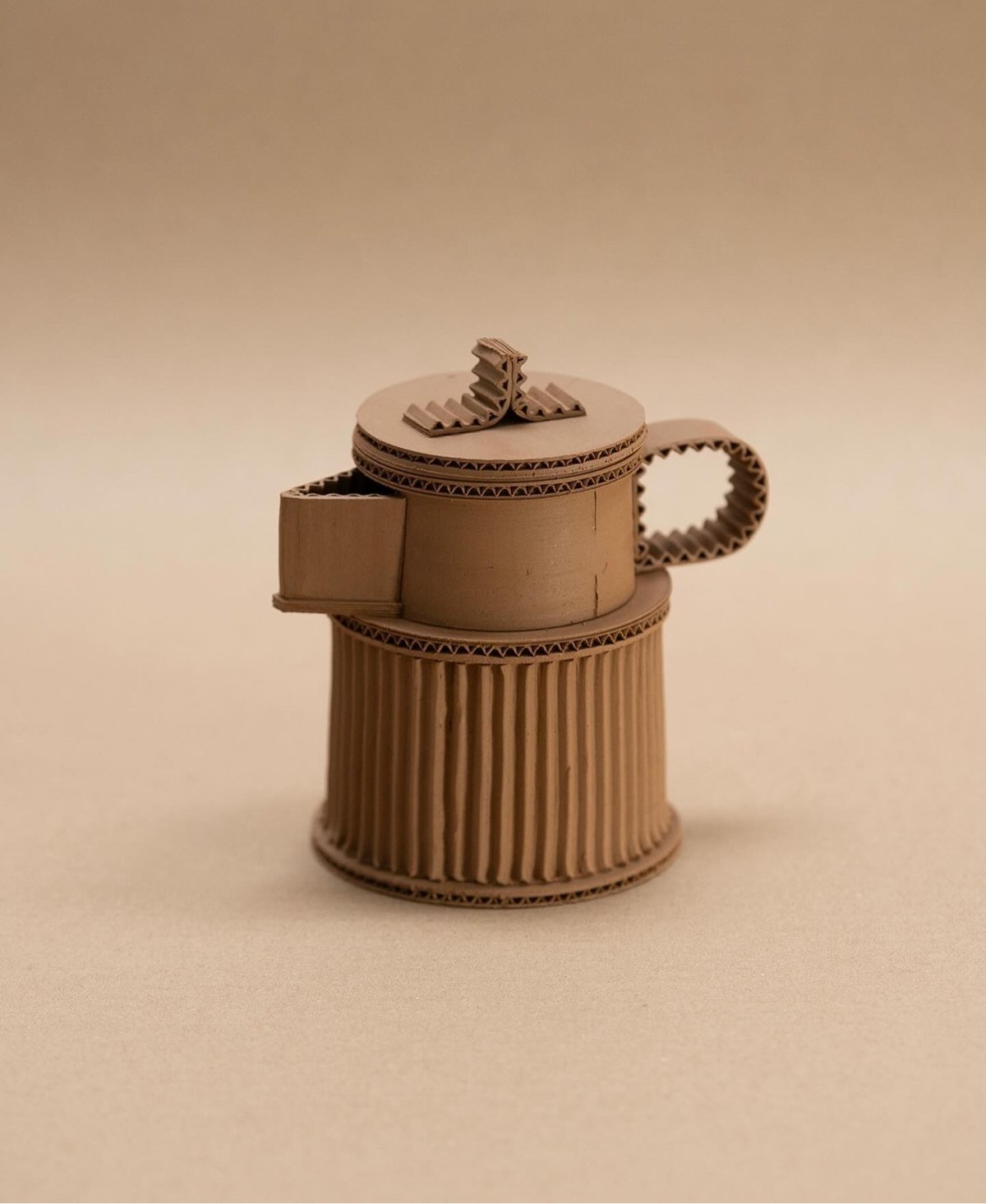
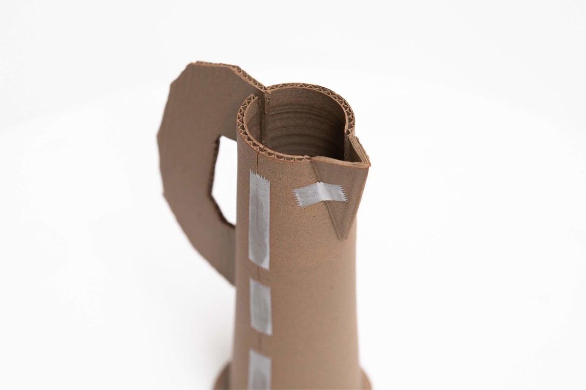
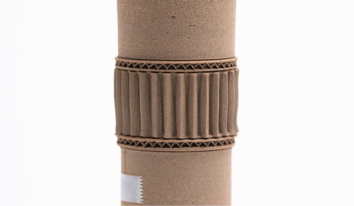
French potter Jacques Monneraud makes ceramic pots that look like teapots, vases, and pitchers made from cardboard and scotch tape. He offers these pots for sale, but they’re unsurprisingly sold out right now. More about Monneraud & his work on his website and Instagram. (via @presentandcorrect)
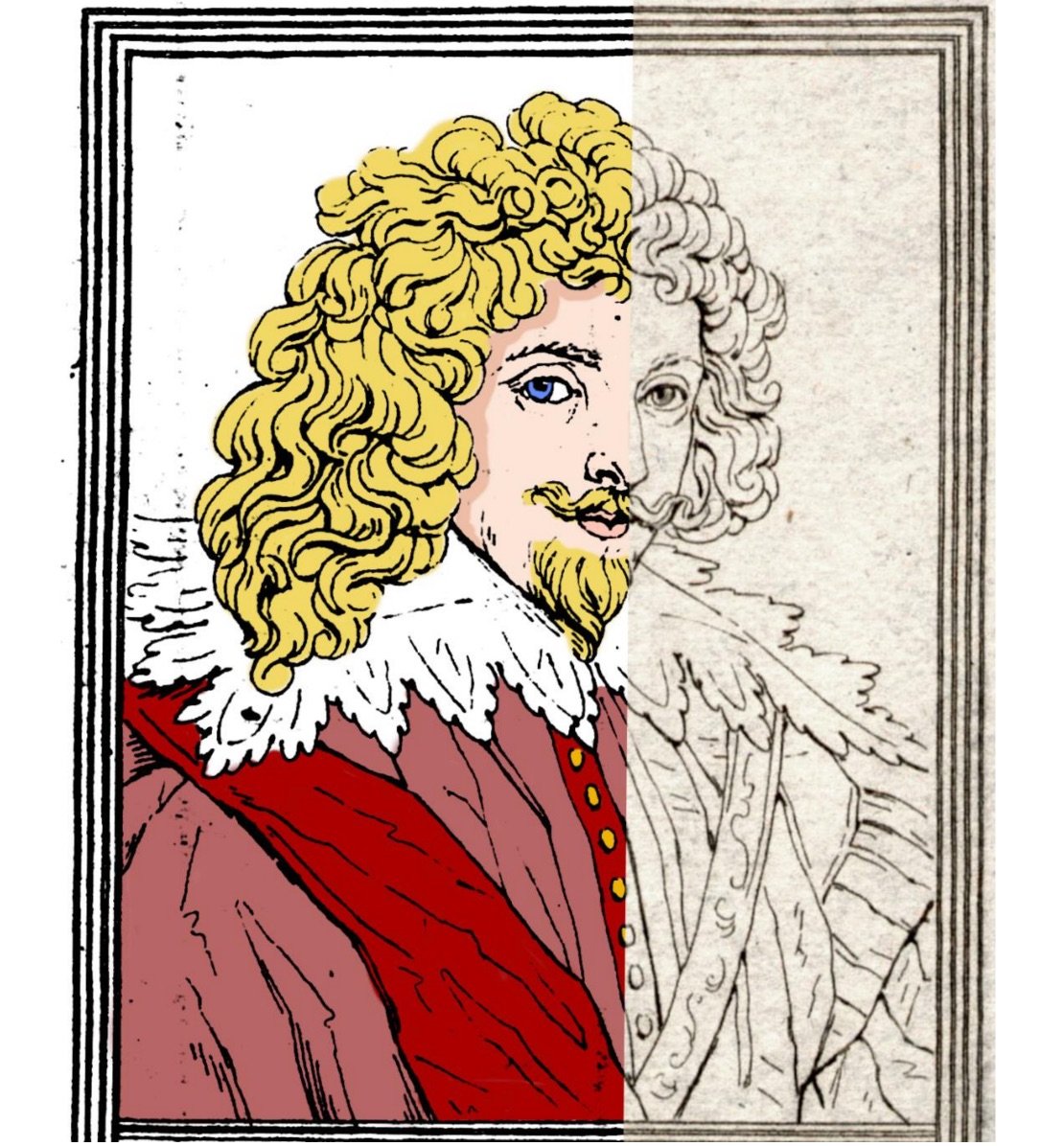

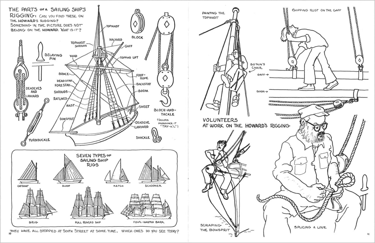
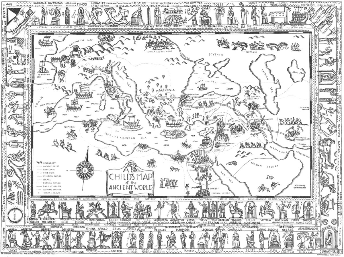
Hosted by the New York Academy of Medicine, #ColorOurCollections is a yearly assemblage of coloring books sourced from the collections of museums and libraries. You can download this year’s coloring books (as well as those from past years) for free from the website. (via open culture)
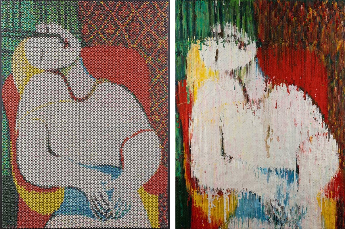
Bradley Hart creates pointillist paintings by painstakingly injecting acrylic paint into the individual bubbles in bubble wrap. The paint leaks out of the bubbles and onto a canvas backing, which also becomes part of the creative output (which he calls the “impression”). Here’s Hart’s version of Picasso’s Le Rêve, bubble wrap and impression:
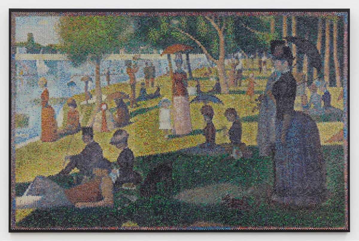
And here’s Georges Seurat’s A Sunday on La Grande Jatte:
And the impression:
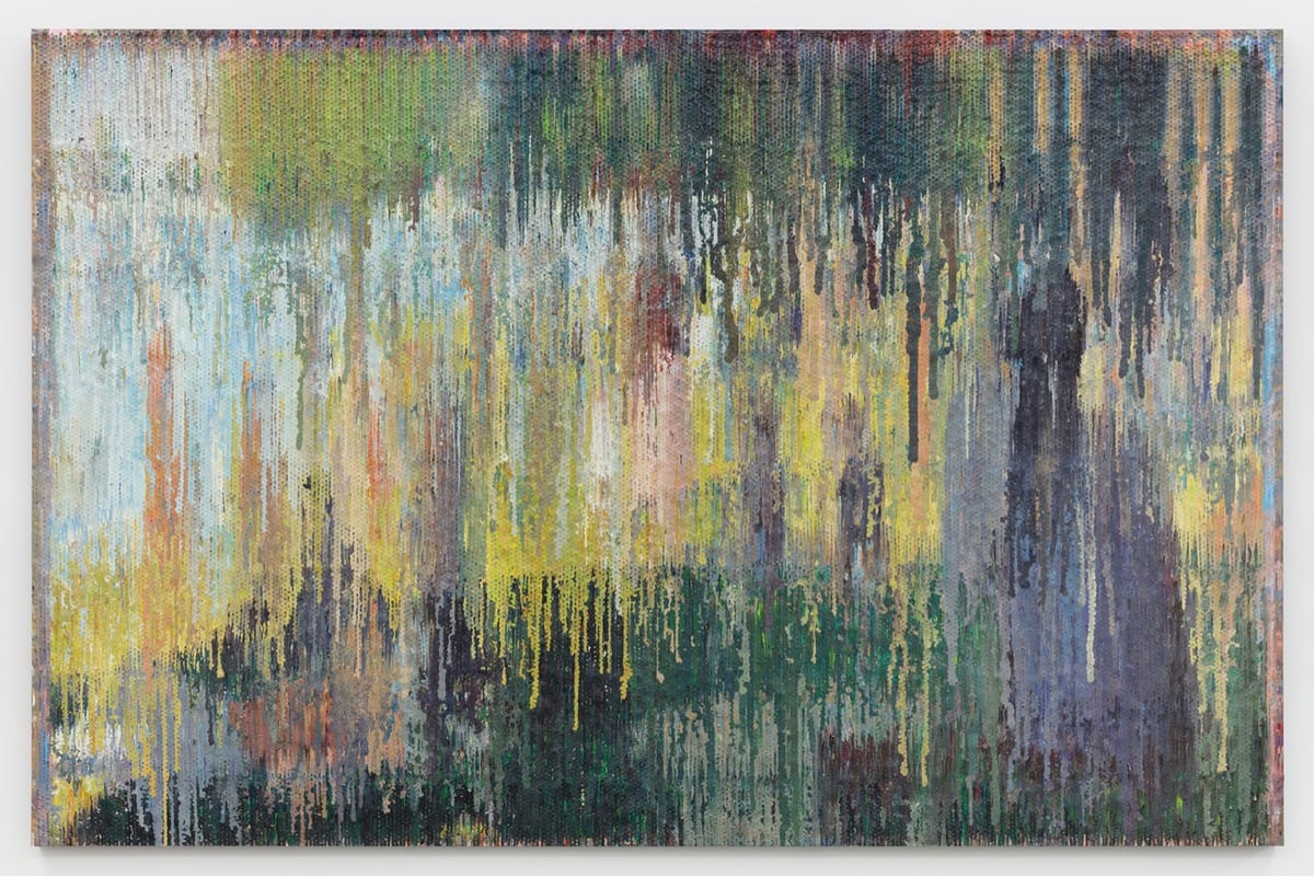
From Hart’s artist’s statement:
The bare bubbles in the bubble wrap reference dots or pixels, echoing various movements in art history and other media, including pointillism, screen-printing, TVs and LCD monitors. In today’s world people do not print their pictures for an album. Their albums are on Facebook, Flickr and Instagram, all exotic rote, yet combinations of 1’s and 0’s. The process of injecting paint into bubble wrap directly references pixilation (and those 1’s and 0’s) and at the same time harkens back to the time of family portrait painting, when a family’s personal “photo” album consisted of paintings hanging on its walls.
It’s such a genius idea to use the backing canvas as a separate artwork — I love that. (via clive thompson)
Ok, this is super freaky: this is a regular analog piano being played by a computer-controlled mechanical machine and it sounds like a person speaking. If you hadn’t seen this before, (it’s from 2009) take a listen:
Deus Cantando is the work of artist Peter Ablinger. He recorded a German school student reciting some text and then composed a tune for the mechanical player to sound like the recitation. I cannot improve upon Jason Noble’s description of the work:
This is not digital manipulation, nor a digitally programmed piano like a Disklavier. This is a normal, acoustic piano, any old piano. The mechanism performing it consists of 88 electronically controlled, mechanical “fingers,” synchronized with superhuman speed and accuracy to replicate the spectral content of a child’s voice. Watching the above-linked video, it may seem that the speech is completely intelligible, but this is partially an illusion. The visual prompt of the words on the screen are an essential cue: take them away, and it becomes much harder to understand the words. But it is still remarkable that the auditory system is able to group discrete notes from a piano into such a close approximation of a continuous human voice, and that Ablinger was able to do this so convincingly using a conventional instrument (albeit, played robotically).
This is so cool, I can’t believe I’d never seen it before. (via @roberthodgin)
Socials & More