The Great Wave has not been on view in the Art Institute galleries for five years because, like all prints, it is susceptible to light damage and must rest a minimum of five years between showings to preserve its colors and vibrance.
Here’s a video of the print being removed from storage as well as a brief comparison of their three prints:
For other places you can see The Great Wave on display, check out Great Wave Today.
For his 2012-13 piece The Obstruction of Action by the Existence of Form, artist R. Eric McMaster built a hockey rink less than 1/10th the size of a regulation rink and had two full hockey teams play what has to be the most frustrating game of hockey ever. This is definitely a metaphor for something but I don’t quite know what.
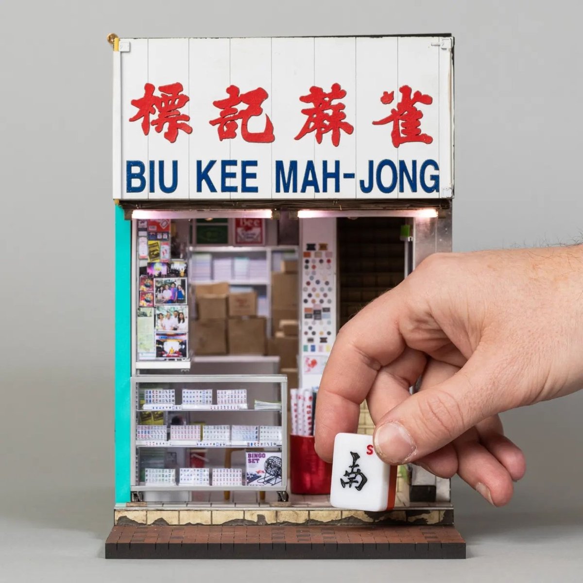
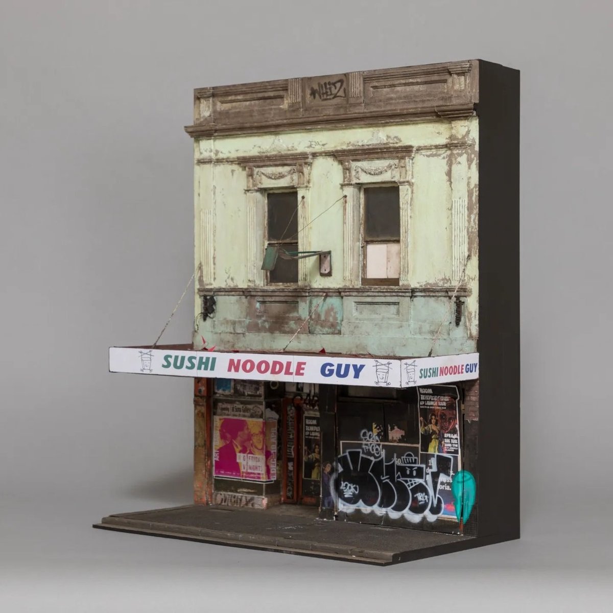
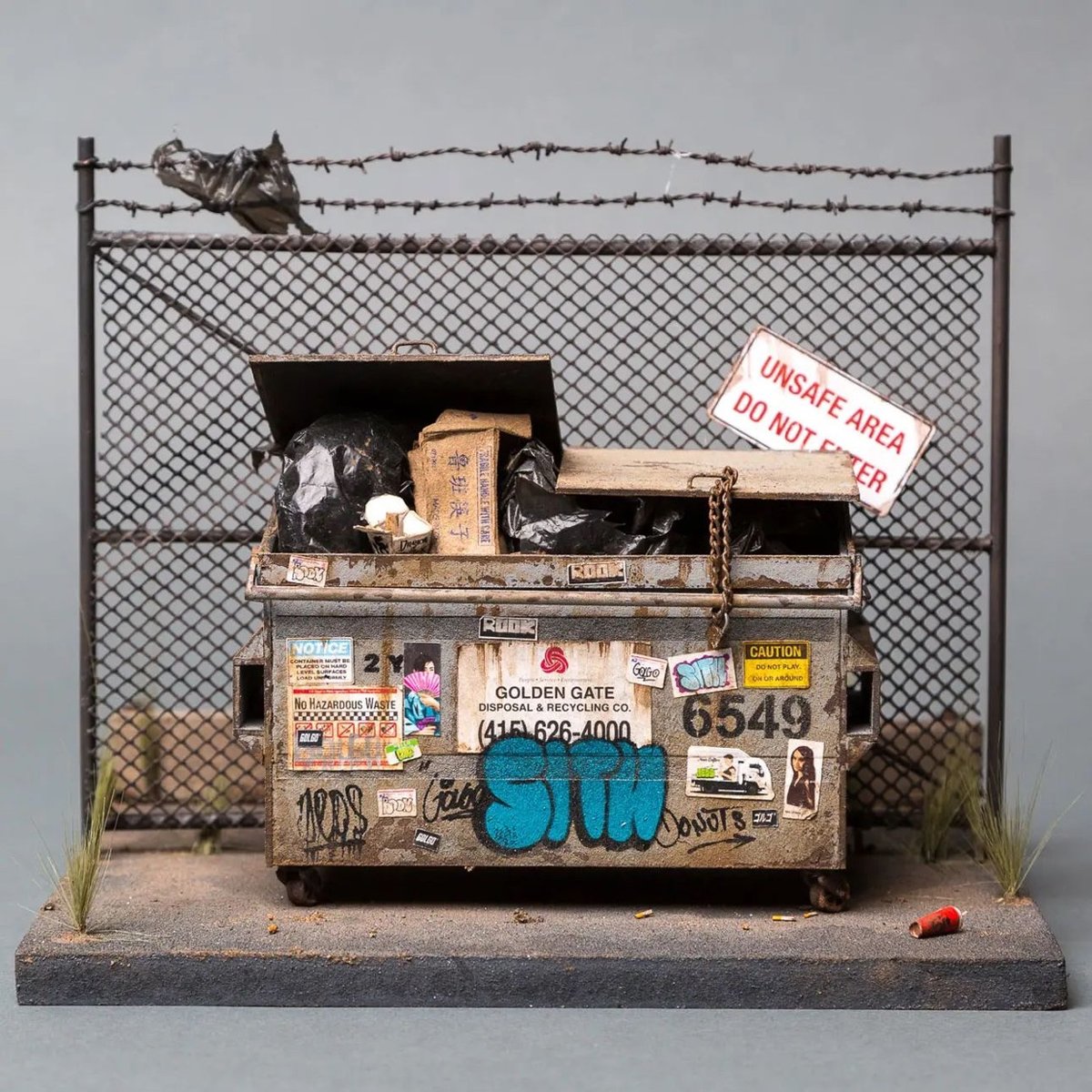
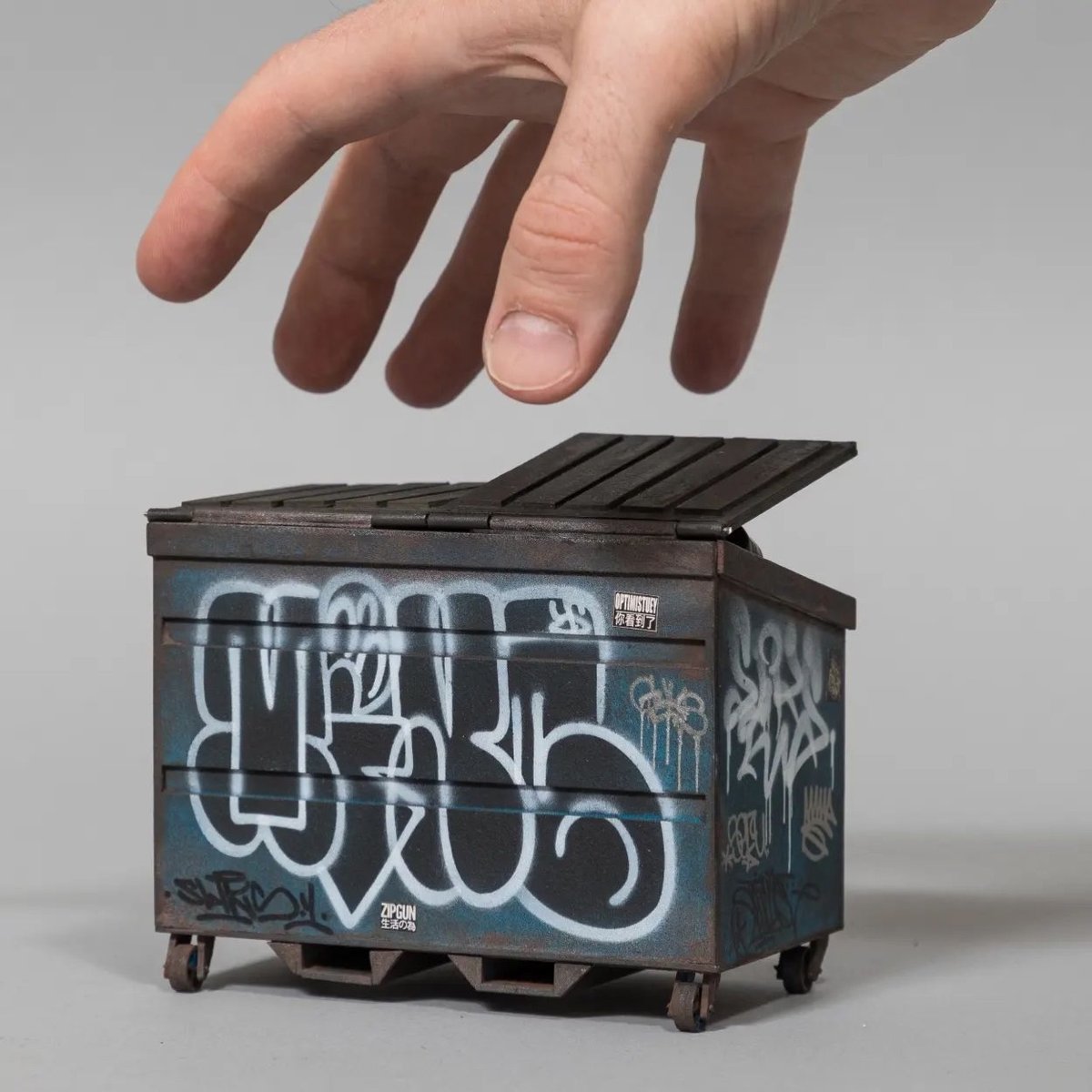
Australian artist Joshua Smith makes extremely detailed and realistic miniatures of grimy, graffitied buildings — he calls them “sculptures of Urban Decay”.
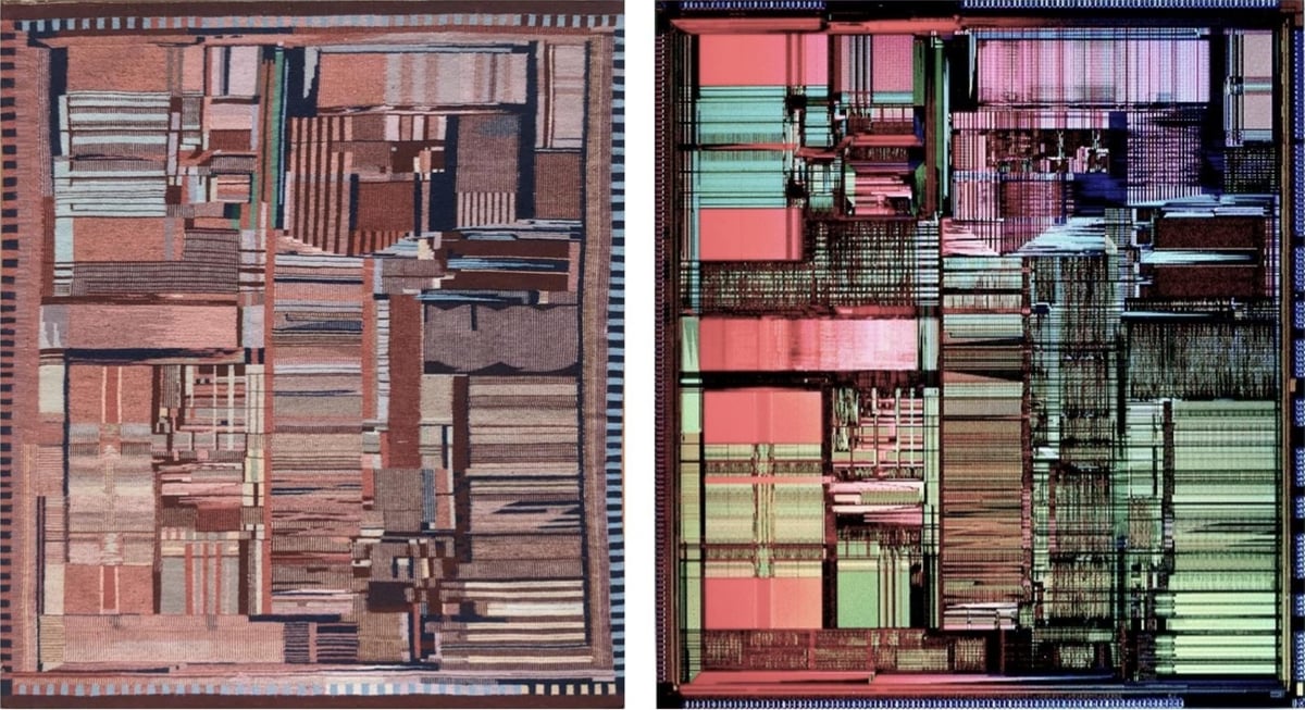
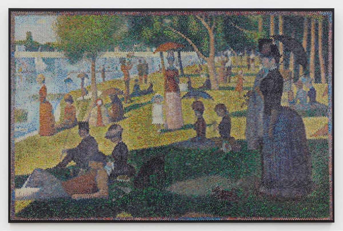
The Pentium die photo below shows the patterns and structures on the surface of the fingernail-sized silicon die, over three million tiny transistors. The weaving is a remarkably accurate representation of the die, reproducing the processor’s complex designs. However, I noticed that the weaving was a mirror image of the physical Pentium die; I had to flip the rug image below to make them match. I asked Ms. Schultz if this was an artistic decision and she explained that she wove the rug to match the photograph. There is no specific front or back to a Navajo weaving because the design is similar on both sides,3 so the gallery picked an arbitrary side to display. Unfortunately, they picked the wrong side, resulting in a backward die image.
Schultz is working on a weaving of another chip, the Fairchild 9040, which was “built by Navajo workers at a plant on Navajo land”.
In December 1972, National Geographic highlighted the Shiprock plant as “weaving for the Space Age”, stating that the Fairchild plant was the tribe’s most successful economic project with Shiprock booming due to the 4.5-million-dollar annual payroll. The article states: “Though the plant runs happily today, it was at first a battleground of warring cultures.” A new manager, Paul Driscoll, realized that strict “white man’s rules” were counterproductive. For instance, many employees couldn’t phone in if they would be absent, as they didn’t have telephones. Another issue was the language barrier since many workers spoke only Navajo, not English. So when technical words didn’t exist in Navajo, substitutes were found: “aluminum” became “shiny metal”. Driscoll also realized that Fairchild needed to adapt to traditional nine-day religious ceremonies. Soon the monthly turnover rate dropped from 12% to under 1%, better than Fairchild’s other plants.
The whole piece is really interesting and demonstrates the deep rabbit hole awaiting the curious art viewer. (via waxy)
It is very easy to get ChatGPT to emit a series of words such as “I am happy to see you.” There are many things we don’t understand about how large language models work, but one thing we can be sure of is that ChatGPT is not happy to see you. A dog can communicate that it is happy to see you, and so can a prelinguistic child, even though both lack the capability to use words. ChatGPT feels nothing and desires nothing, and this lack of intention is why ChatGPT is not actually using language. What makes the words “I’m happy to see you” a linguistic utterance is not that the sequence of text tokens that it is made up of are well formed; what makes it a linguistic utterance is the intention to communicate something.
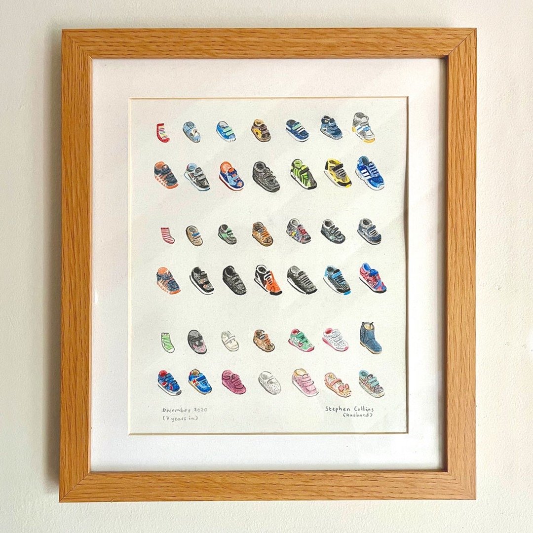
Back in 2020 we had to chuck the kids’ baby shoes out 😱, so I decided to keep the first ones and draw the rest, in order, starting with pre-walking socks.
When I look at photos of my kids from when they were younger, my eye is always drawn to their shoes and clothes — some of them are so iconic in my mind they almost function as logos for my kids at different stages.
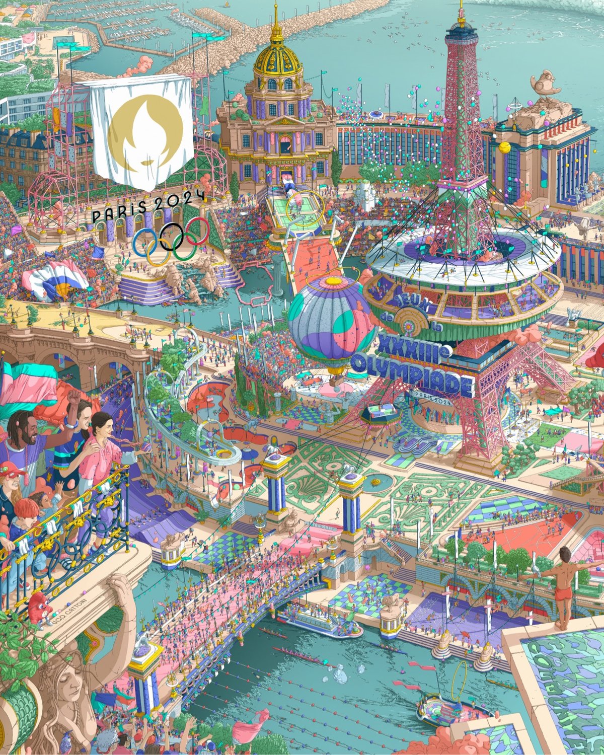
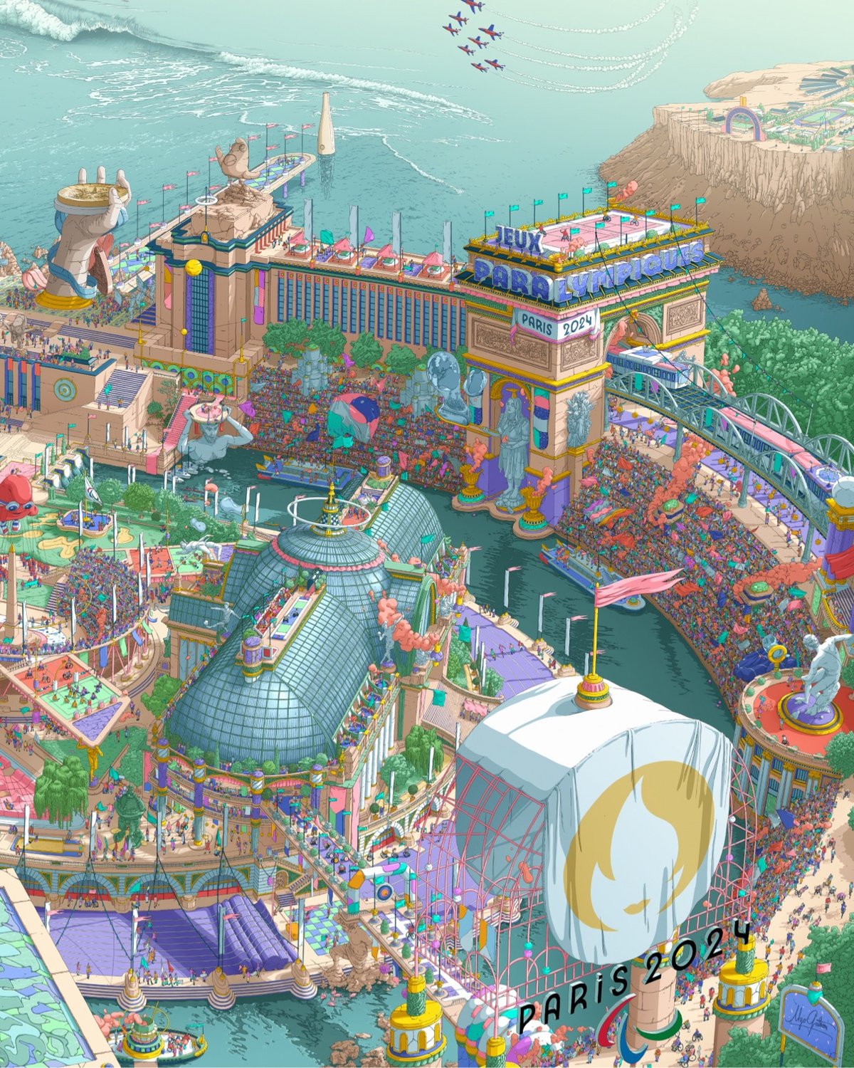
I haven’t watched too much of the Olympics this summer so maybe the announcers explain this every single time they show a medals ceremony, but in case you didn’t know, the long, thin boxes given to the medalists along with their medals contain the official poster of the Games (and a plushie).
The poster was created by illustrator Ugo Gattoni and is a sort of Where’s Waldo / Busy Busy Town representation of the Games and its venues.
The designer had total creative freedom. While working to a brief and respecting the look of the Games, he still managed to maintain his own playful and joyful style.
This is why eight mascots are hidden within the posters. In fact, whatever age you are, there is something within the artwork that you will be able to enjoy.
The biggest images of the poster I can find are here if you want to zoom in to see the details. There are also zoomed-in images and videos on Gattoni’s Instagram.
The Olympic poster is the twin of the poster for the Paralympic Games, also created by Gattoni:
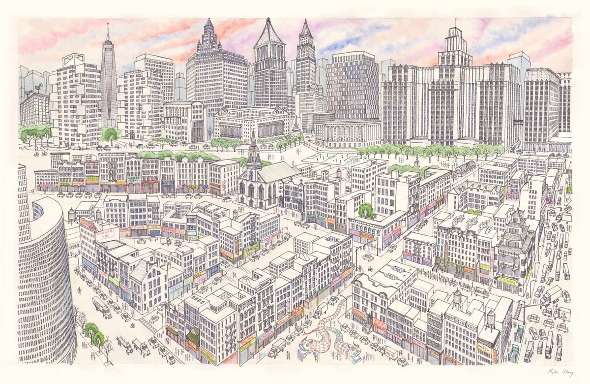
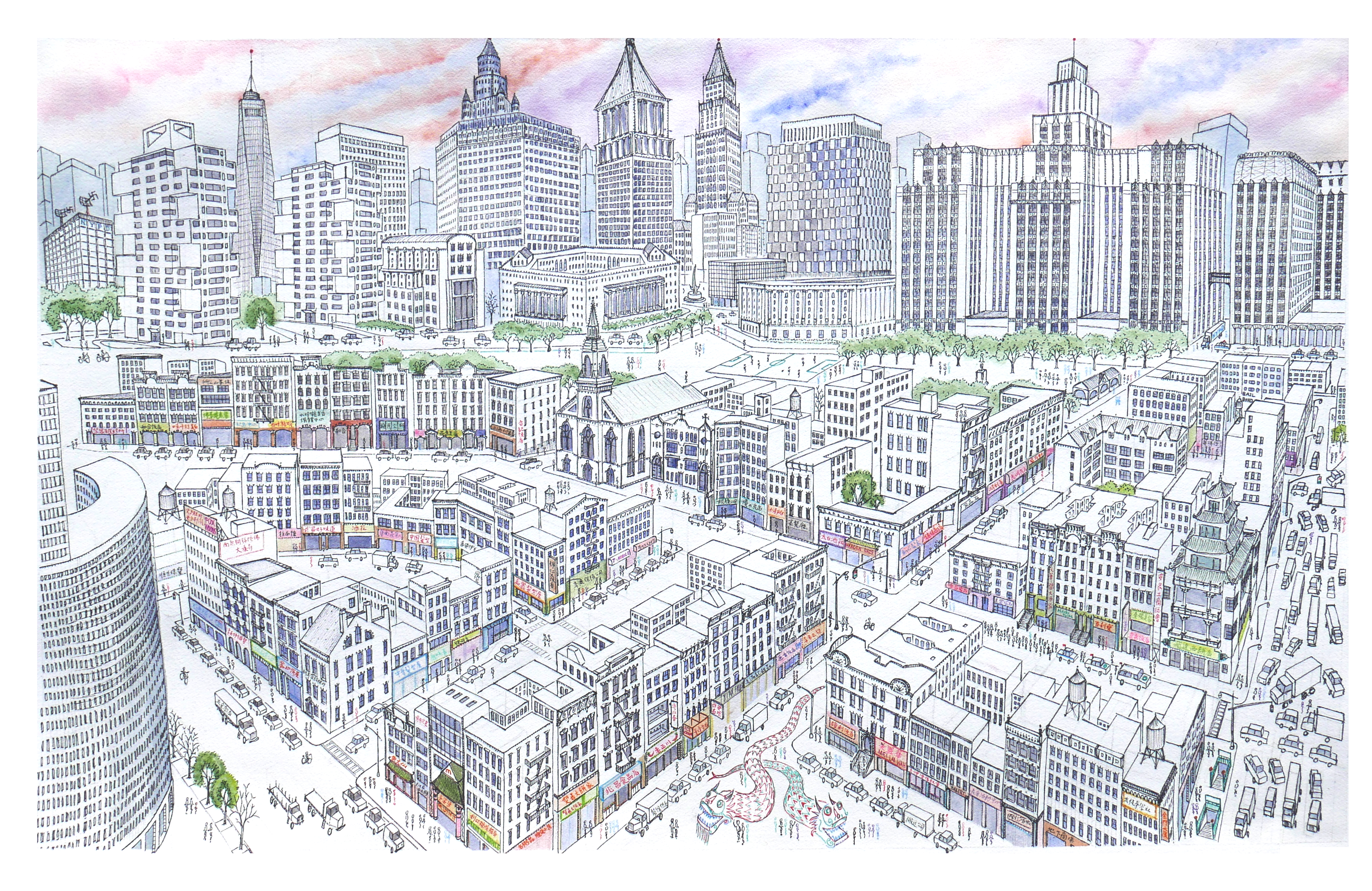
Chinatown’s tenements are in the foreground, while the skyscraper canyons of Lower Manhattan rise above. This shows the area of Chinatown bordered by Bowery, Canal Street, and Columbus Park.
It took him around 60 hours to complete; he made a time lapse video of its creation:
Public Work is an image search engine that boasts 100,000 “copyright-free” images from institutions like the NYPL, the Met, etc. It’s fast with a relatively simple interface and uses AI to auto-categorize and suggest possibly related images (both visually and content-wise). And it’s fun to just visually click around on related images. On the downside, their sourcing and attribution isn’t great — especially when compared to something like Flickr Commons.
I’d love it if an interface this quick and visual-first were adopted by museums though — let’s face it: the image search on museum, library, and institution websites is often terrible and slow. (via @jaygogh)
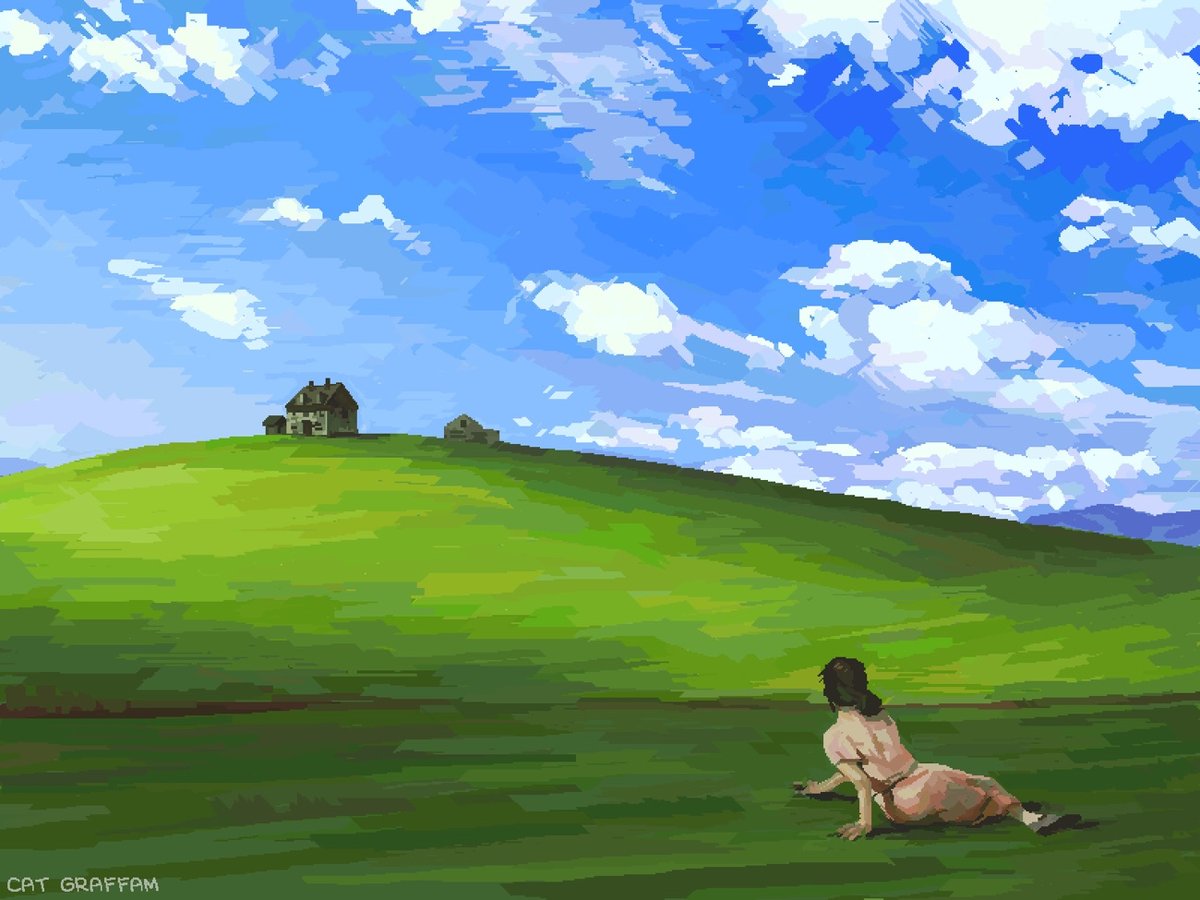
Cat Graffam combined their love of art and old technology to create a mashup of Andrew Wyeth’s Christina’s World and the Windows XP wallpaper, using MS Paint and a mouse. You can watch how they did it in this video:
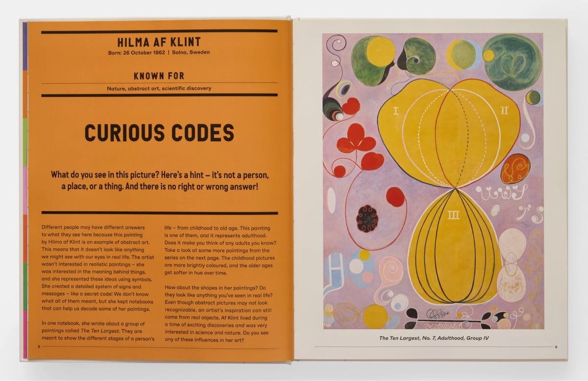
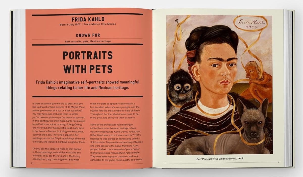
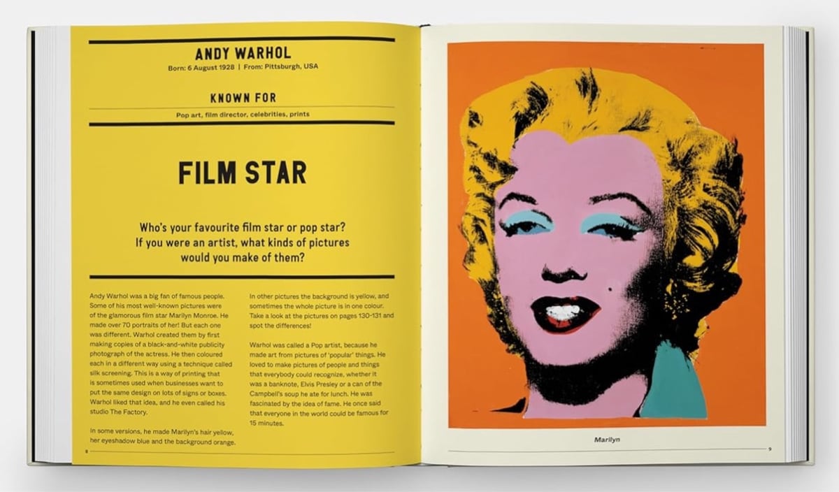
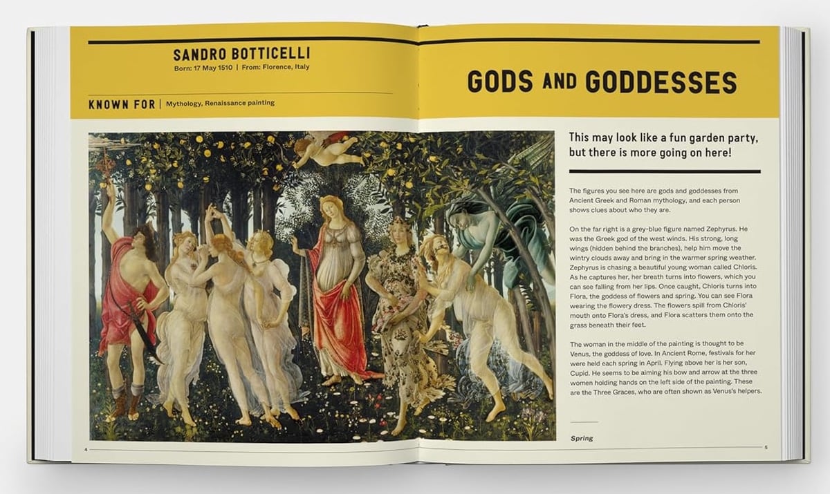
Phaidon has released a new version of their classic The Art Book for Children. Aimed at kids aged 7-12, the new version includes a selection of contemporary artists alongside familiar favorites.
This single volume features 60 artists through a wide range of large-scale, full-page reproductions of their artworks, including paintings, photographs, sculptures, video, prints, and installations from across time and space. Each page showcases defining artworks by the artists, combined with an interactive and informative conversation, giving relatable and memorable contexts for children, and inspiring a curiosity and appreciation for the Visual Arts that will continue into adulthood.
I’ve grown to love art as an adult but I don’t remember ever noticing or caring about any art when I was a kid. If this book had dropped into the lap of a young Jason, I wonder if it would have sparked anything?
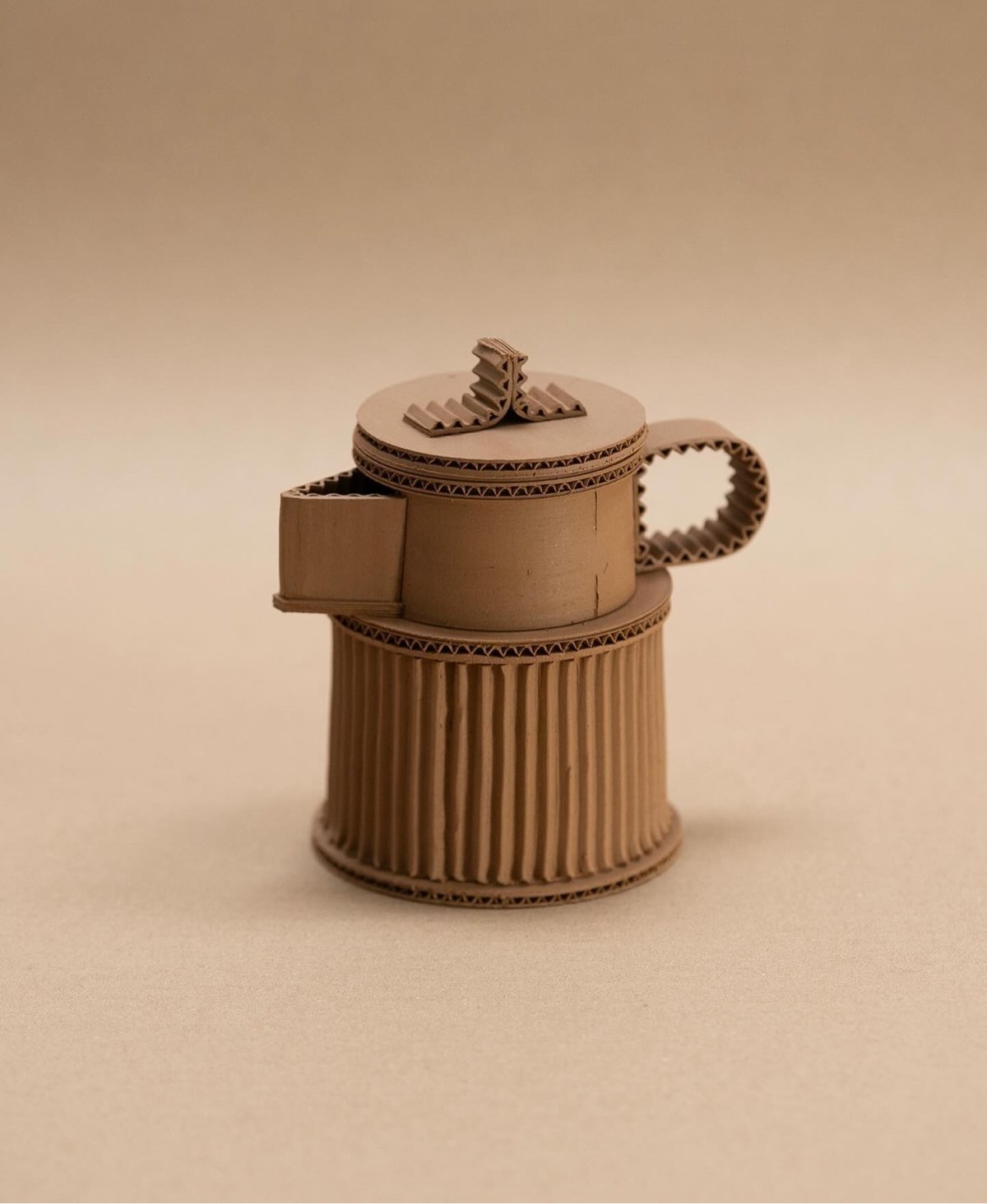
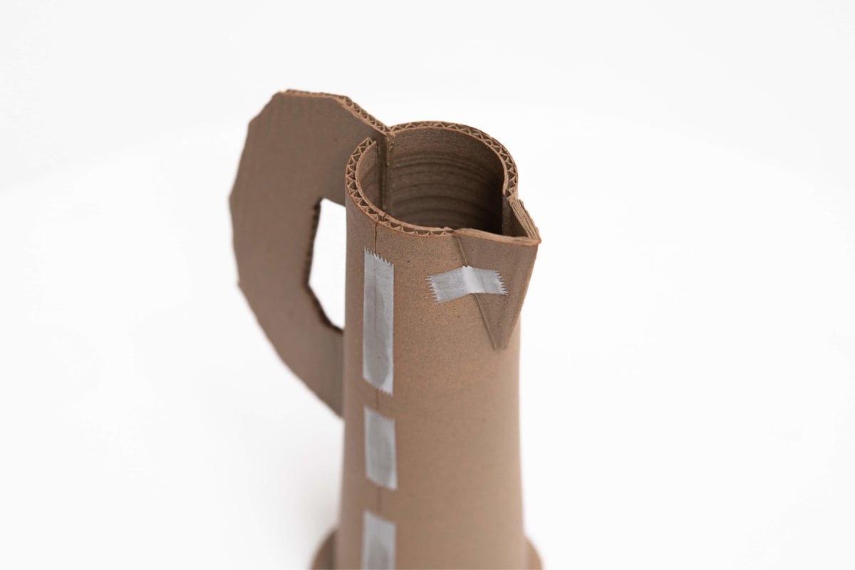
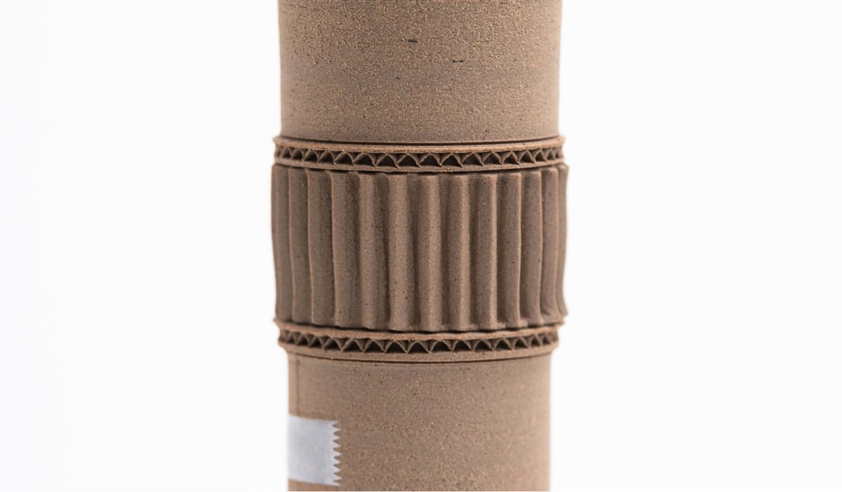
French potter Jacques Monneraud makes ceramic pots that look like teapots, vases, and pitchers made from cardboard and scotch tape. He offers these pots for sale, but they’re unsurprisingly sold out right now. More about Monneraud & his work on his website and Instagram. (via @presentandcorrect)
Hosted by the New York Academy of Medicine, #ColorOurCollections is a yearly assemblage of coloring books sourced from the collections of museums and libraries. You can download this year’s coloring books (as well as those from past years) for free from the website. (via open culture)
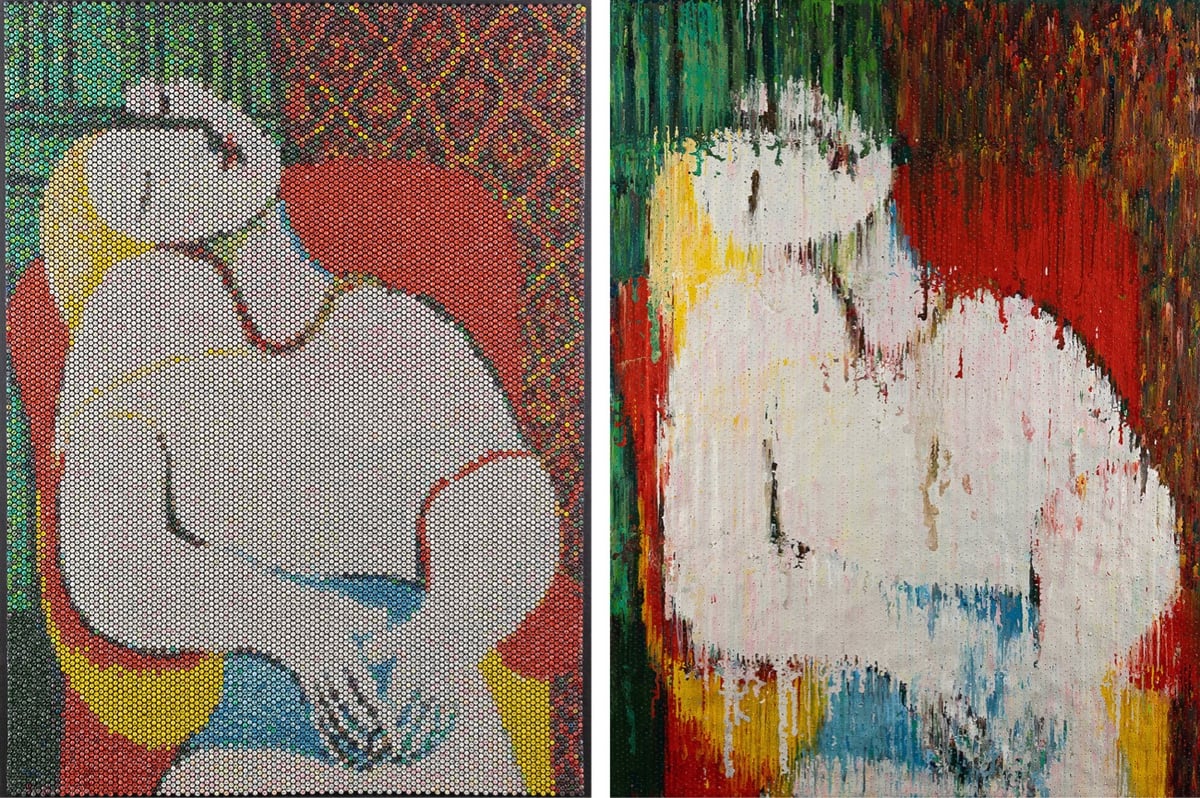
Bradley Hart creates pointillist paintings by painstakingly injecting acrylic paint into the individual bubbles in bubble wrap. The paint leaks out of the bubbles and onto a canvas backing, which also becomes part of the creative output (which he calls the “impression”). Here’s Hart’s version of Picasso’s Le Rêve, bubble wrap and impression:
The bare bubbles in the bubble wrap reference dots or pixels, echoing various movements in art history and other media, including pointillism, screen-printing, TVs and LCD monitors. In today’s world people do not print their pictures for an album. Their albums are on Facebook, Flickr and Instagram, all exotic rote, yet combinations of 1’s and 0’s. The process of injecting paint into bubble wrap directly references pixilation (and those 1’s and 0’s) and at the same time harkens back to the time of family portrait painting, when a family’s personal “photo” album consisted of paintings hanging on its walls.
It’s such a genius idea to use the backing canvas as a separate artwork — I love that. (via clive thompson)
Ok, this is super freaky: this is a regular analog piano being played by a computer-controlled mechanical machine and it sounds like a person speaking. If you hadn’t seen this before, (it’s from 2009) take a listen:
Deus Cantando is the work of artist Peter Ablinger. He recorded a German school student reciting some text and then composed a tune for the mechanical player to sound like the recitation. I cannot improve upon Jason Noble’s description of the work:
This is not digital manipulation, nor a digitally programmed piano like a Disklavier. This is a normal, acoustic piano, any old piano. The mechanism performing it consists of 88 electronically controlled, mechanical “fingers,” synchronized with superhuman speed and accuracy to replicate the spectral content of a child’s voice. Watching the above-linked video, it may seem that the speech is completely intelligible, but this is partially an illusion. The visual prompt of the words on the screen are an essential cue: take them away, and it becomes much harder to understand the words. But it is still remarkable that the auditory system is able to group discrete notes from a piano into such a close approximation of a continuous human voice, and that Ablinger was able to do this so convincingly using a conventional instrument (albeit, played robotically).
This is so cool, I can’t believe I’d never seen it before. (via @roberthodgin)
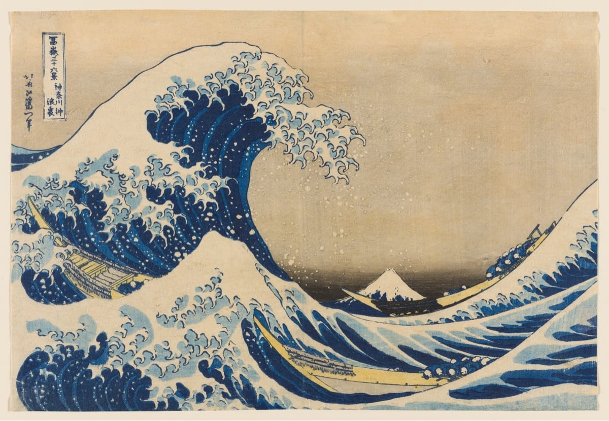
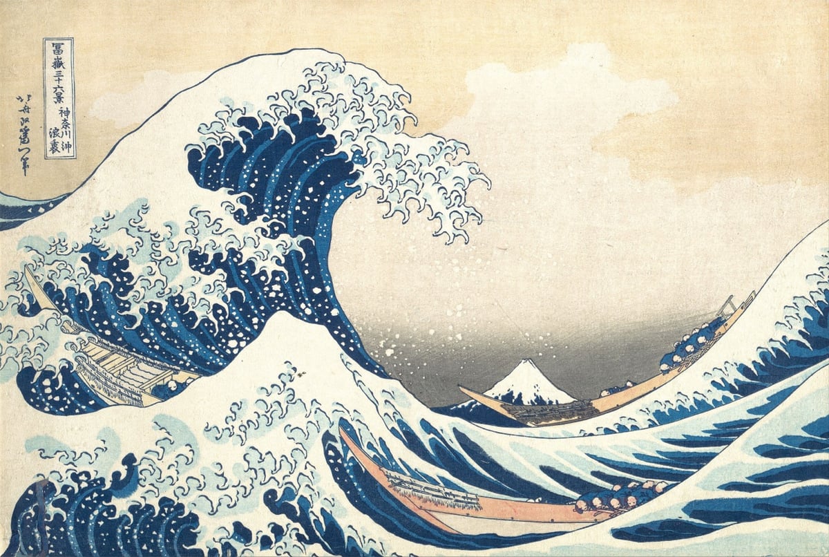
The Great Wave off Kanagawa by Katsushika Hokusai is one of the world’s most iconic pieces of art. Hokusai created the woodblock print in 1831 at the age of 71 as part of his series Thirty-six Views of Mount Fuji. But in some sense, he’d been working on it all of his life.
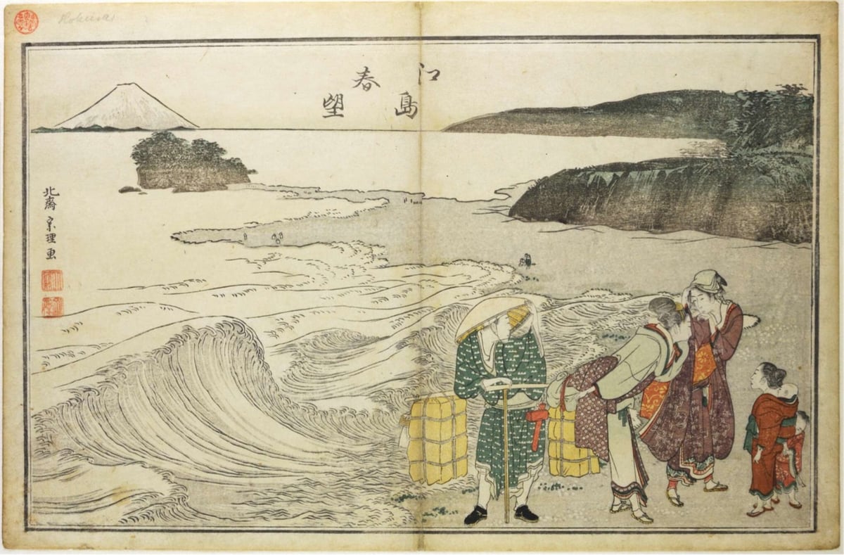
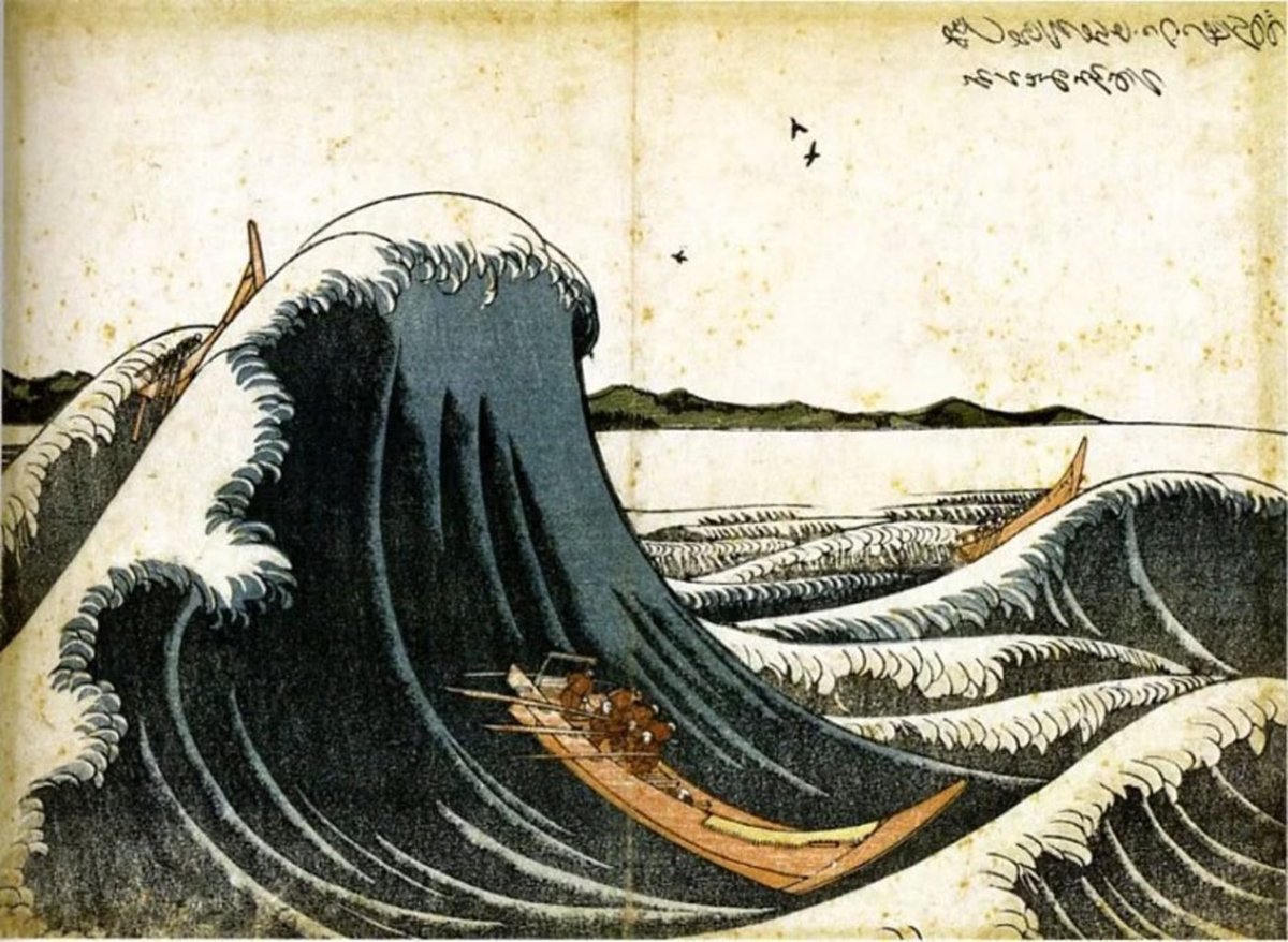
In 1797, at the age of 37, Hokusai made what could be interpreted as his first wave print, Spring at Enoshima (Enoshima shunbô):
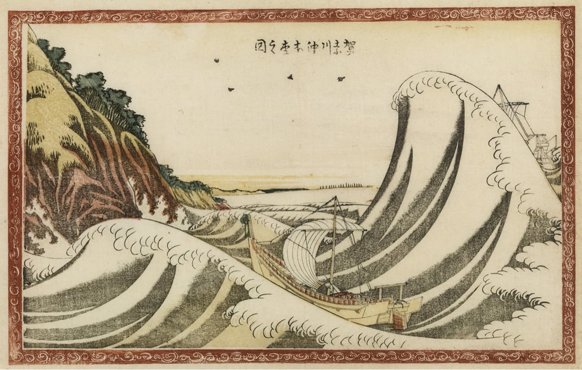
In 1831 at the age of 71, Hokusai returned to waves with The Great Wave off Kanagawa (Kanagawa-oki Nami Ura):
As others have noted, this version is fantastically impressionistic — it evokes a feeling just as much as it depicts a scene. The others are nice works of art, but this is the work of a master at the peak of his expressive powers.1
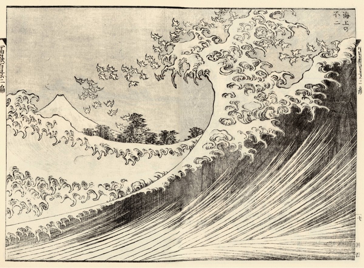
But that wasn’t the end of the story. Here’s Fuji at Sea (Kaijo no Fuji) from circa 1834, made at age 74 — it looks great in color:
Right around the same period, Hokusai made Kajikazawa in Kai Province (Kōshū Kajikazawa) and Fishing Boats at Choshi in Shimosa (Soshu Choshi). Later on, Hokusai allegedly made a pair of paintings referred to as Feminine Wave and Masculine Wave, but I can’t find any information about them online outside of sites selling prints. [Edit: the Feminine & Masculine Waves are featured in Hokusai: Beyond the Great Wave, based on an exhibition in the British Museum. (thx, jody)]
What did Hokusai make of this progression over his career? In a colophon to his series One Hundred Views of Mount Fuji (Fugaku hyakkei), he wrote:
From the age of six I had a penchant for copying the form of things, and from about fifty, my pictures were frequently published; but until the age of seventy, nothing that I drew was worthy of notice. At seventy-three years, I was somewhat able to fathom the growth of plants and trees, and the structure of birds, animals, insects, and fish. Thus, when I reach eighty years, I hope to have made increasing progress, and at ninety to see further into the underlying principles of things, so that at one hundred years I will have achieved a divine state in my art, and at one hundred and ten, every dot and every stroke will be as though alive. Those of you who live long enough, bear witness that these words of mine prove not false.
Note: Screenshots of a viral tweet from 2018 about this series of prints are goingaround again. I’m sure it will shock you to learn that some of the math and dates haven’t been fact-checked as well as they could have been. I’ve documented the names of the artworks shown here and relied on primary sources for their dates where possible. I’ve used 1760 as the year of Hokusai’s birth and the dates of works are when they were made, not when they were first published. Please let me know if I’ve made any errors…I’d love for this post to be as correct as possible.
From Business Insider’s series Still Standing, a look at La Maison du Pastel, a 300-year-old French company that makes pastels for artists by hand. Back in its golden age, the company supplied the likes of Monet & Degas but fell into neglect near the end of the 20th century. The newest generation of ownership has restored the company and they now offer over 1,900 different pastel colors.
Seriously, take a look at their online shop…there’s all sorts of amazing stuff in there. Like this antique watercolors set — get a load of these color names: Violet Lake, Burnt Lake, Carmine, Venice Red, Vermilion, Orange Chrome, Gamboge, Zinc White, Yellow Ochre, Burnt Umber, Van Dyck Brown, Lamp Black, Payne’s Gray, Indigo, Celestial Blue, Blue Ash, Prussian. You can even order a full set of their pastels for only €29,450.00 (the set comes with a custom-made chest of drawers).
I am not at all an artist but these colors all look so amazing that I’m eyeing one of the smaller sets for myself… (thx, caroline)
Queendom is a documentary film by Agniia Galdanova about queer Russian activist and performance artist Jenna Marvin and her unusual form of protest against the war in Ukraine and Russia’s treatment of LGBTQ+ people. From a short review in the Guardian:
When Russia invaded Ukraine in February last year, some brave souls took to the streets of Moscow to voice their horror at the war, and were met with batons and police brutality. Radical queer performance artist Gena Marvin took a different approach. Wearing platform boots, body paint and wrapped in barbed wire, she walked the streets of Moscow in a stark, silent statement against the war. To call Gena a drag artist fails to capture just how subversive and courageous are her public “performances”. Her otherworldly costumes, created from junk and tape, show the influence of Leigh Bowery; her fearlessness evokes the punk provocation of Pussy Riot.
Marvin’s performances can be intense — check out this video from Paris in 2022. France had just advanced into the semifinals of the World Cup and she went out on the streets dressed in an all-black costume straight out of Alien or Pan’s Labyrinth:
Queendom opens in theaters and will available on streaming on June 14.
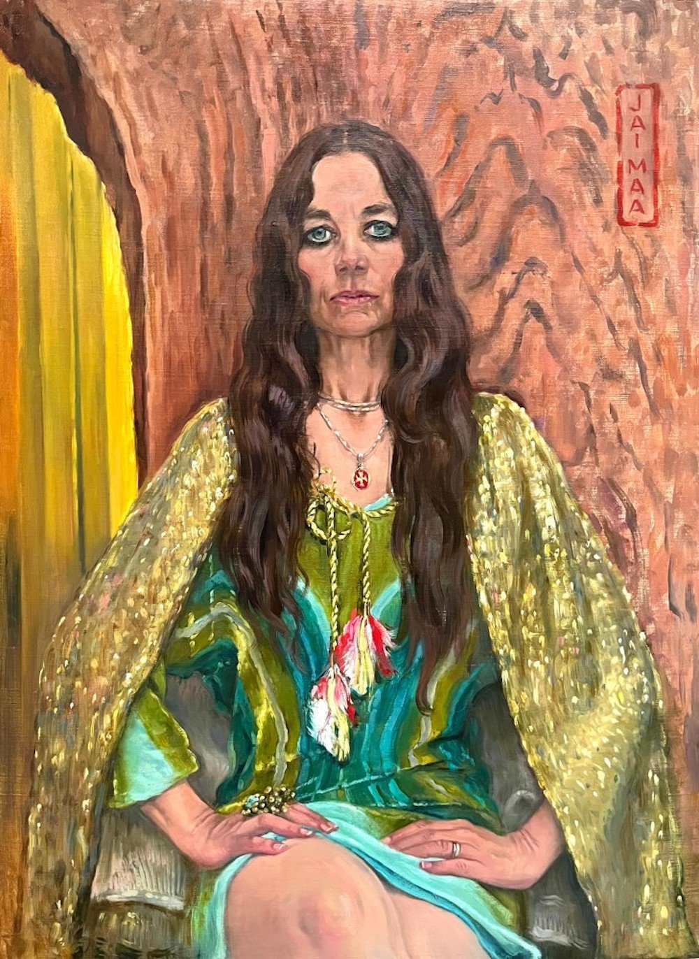
Thanks to the Instagram account New American Paintings, I recently came across the work of Los Angeles-based artist Delia Brown, including the above portrait, “Jai Maa! (Justine II),” which I love. A feature on Brown in Independent Art Fair magazine also includes an awesome painting of hers from 2000 called “What, Are You Jealous?” (probably NSFW).
Someday — someday! — I want to turn down an invitation to something because “I can’t, I’m sitting for my portrait at that time.”
Elsewhere in portraits: King Charles’s, by Jonathan Yeo. “In his interview with the BBC,” the NYT’s Vanessa Friedman writes, “Mr. Yeo noted that when the king first saw the painting, he was ‘initially mildly surprised by the strong color,’ which may be an understatement.”
Many more of Brown’s paintings can be found on her website and Instagram.
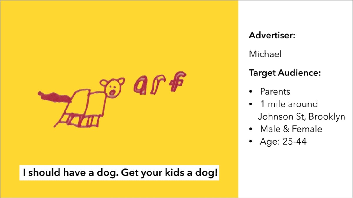
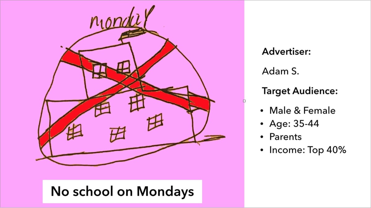
In 2019, artist and engineer Tega Brain gave some kids the opportunity to create targeted advertising relevant to their particular interests: Bushwick Analytica.
Politicians and marketers now use data and targeted advertising to try to change our behaviors and influence our worldviews. But why should these tools only be available to people in places like Washington DC, Manhattan and London?
Some of the kids’ ads targeted their parents:
While others were aimed at people who could help with causes the kids were interested in:
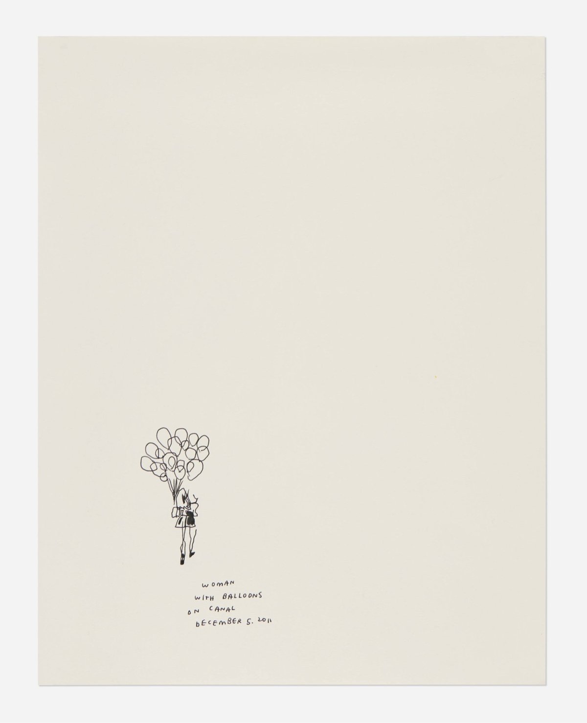
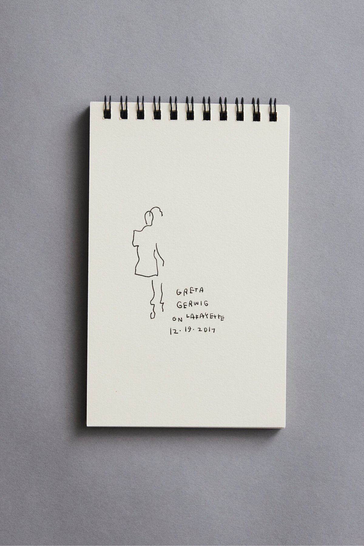
Jen Bekman, the founder of the online gallery 20x200, reflected on Mr. Polan’s legacy while she sat beside his sketches.
“These are not doodles,” Ms. Bekman said. “That word is diminishing. People remember him as an illustrator, but Jason was a great artist, and his practice was his life.”
It’s great to see Polan’s legacy being preserved and his art being spread around the world. And to be reminded of that time he went to a fashion show.
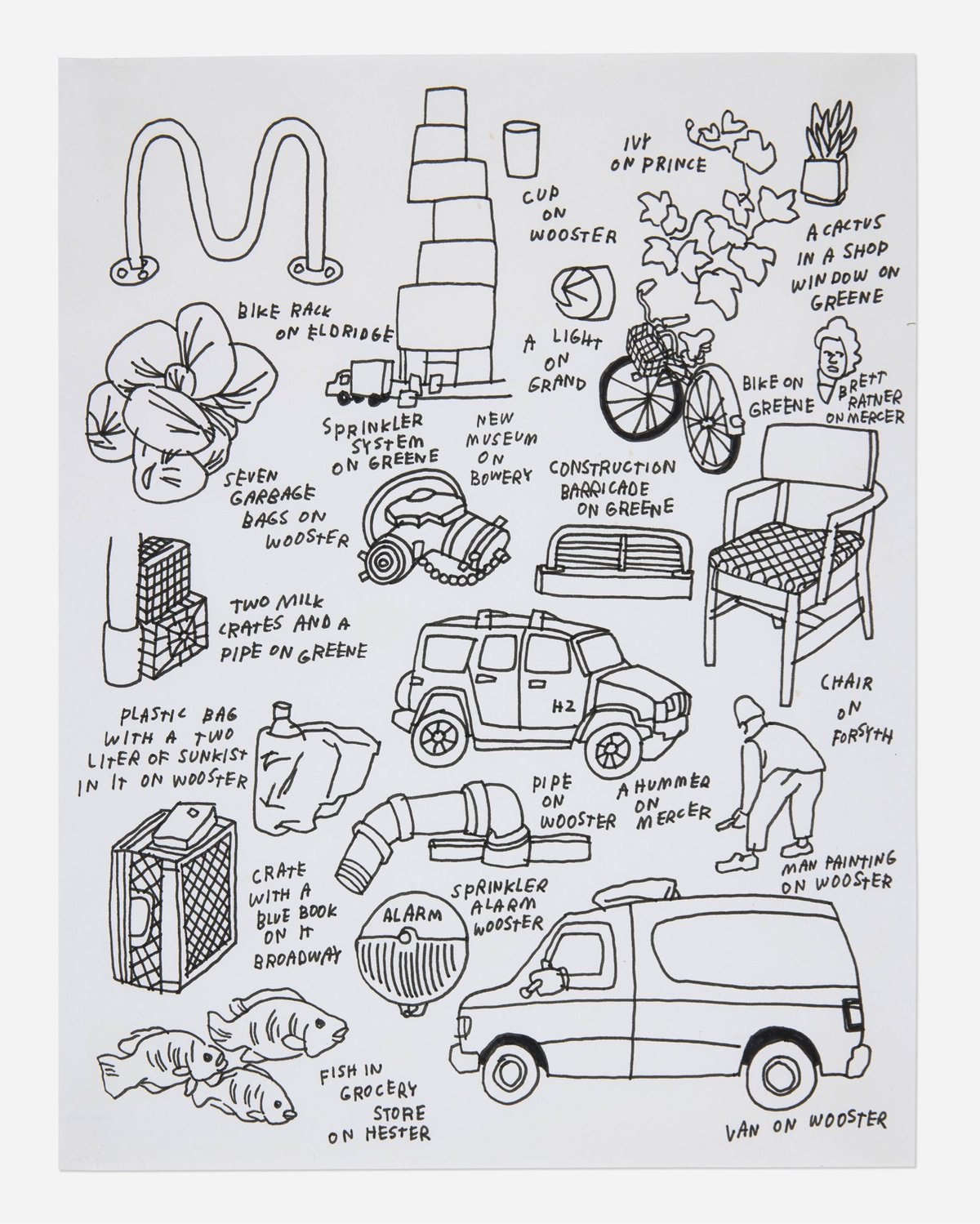
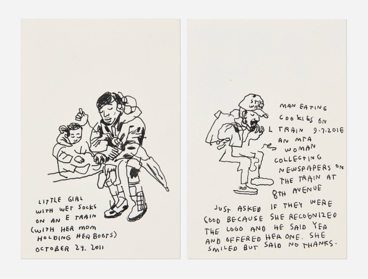
I sort of stood still because I was a little confused as to what just happened. Kim walked right by me. Puff Daddy took a picture with someone right in front of me. I then saw Beyoncé walking toward me and I said, “Hi Beyoncé,” and she said, “Heeey,” and smiled and it was kind of like having a Bar Mitzvah. Then Jay Z walked by and I said, “Hi Jay,” and in the second I said that I thought, am I supposed to add a Z? but didn’t and he said hey but not as beautifully as Beyoncé. I love her so much. I drew a couple more people and then went outside and forgot where I was and then walked to the train and went home.
The Water Lilies paintings that French impressionist Claude Monet is most known for were all painted in the garden of his house in Giverny. Pay a relaxing visit to the set of the MBU (Monet Botanical Universe) with this leisurely video. Here’s another tour of the gardens with music.
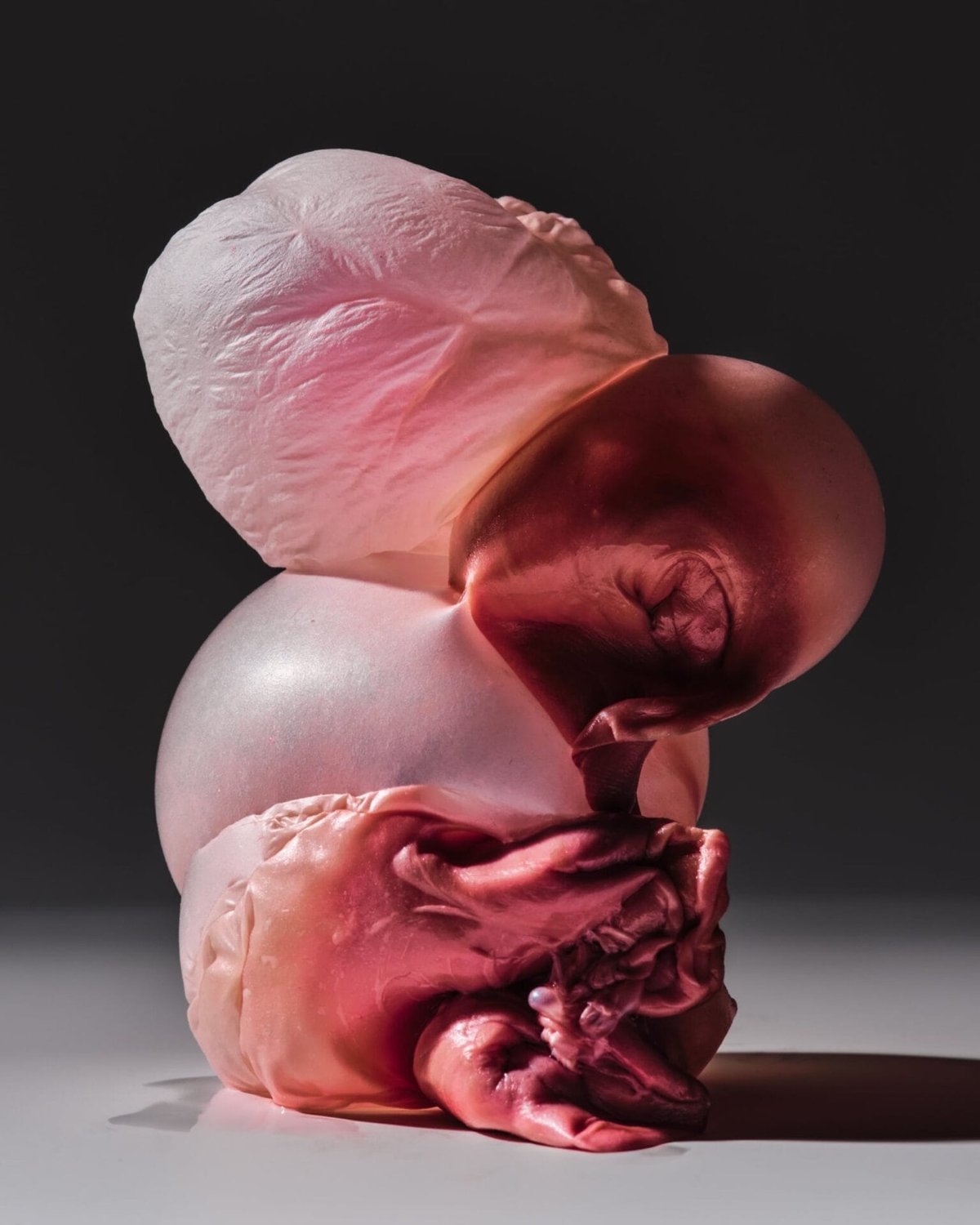
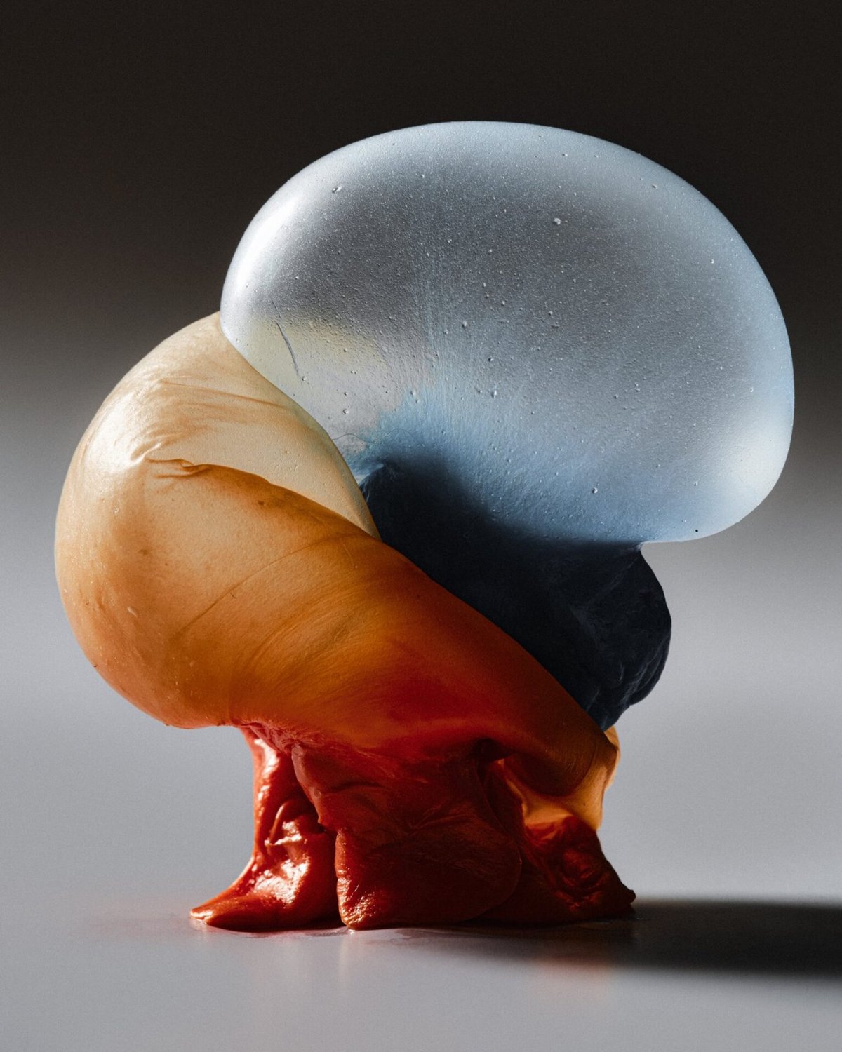
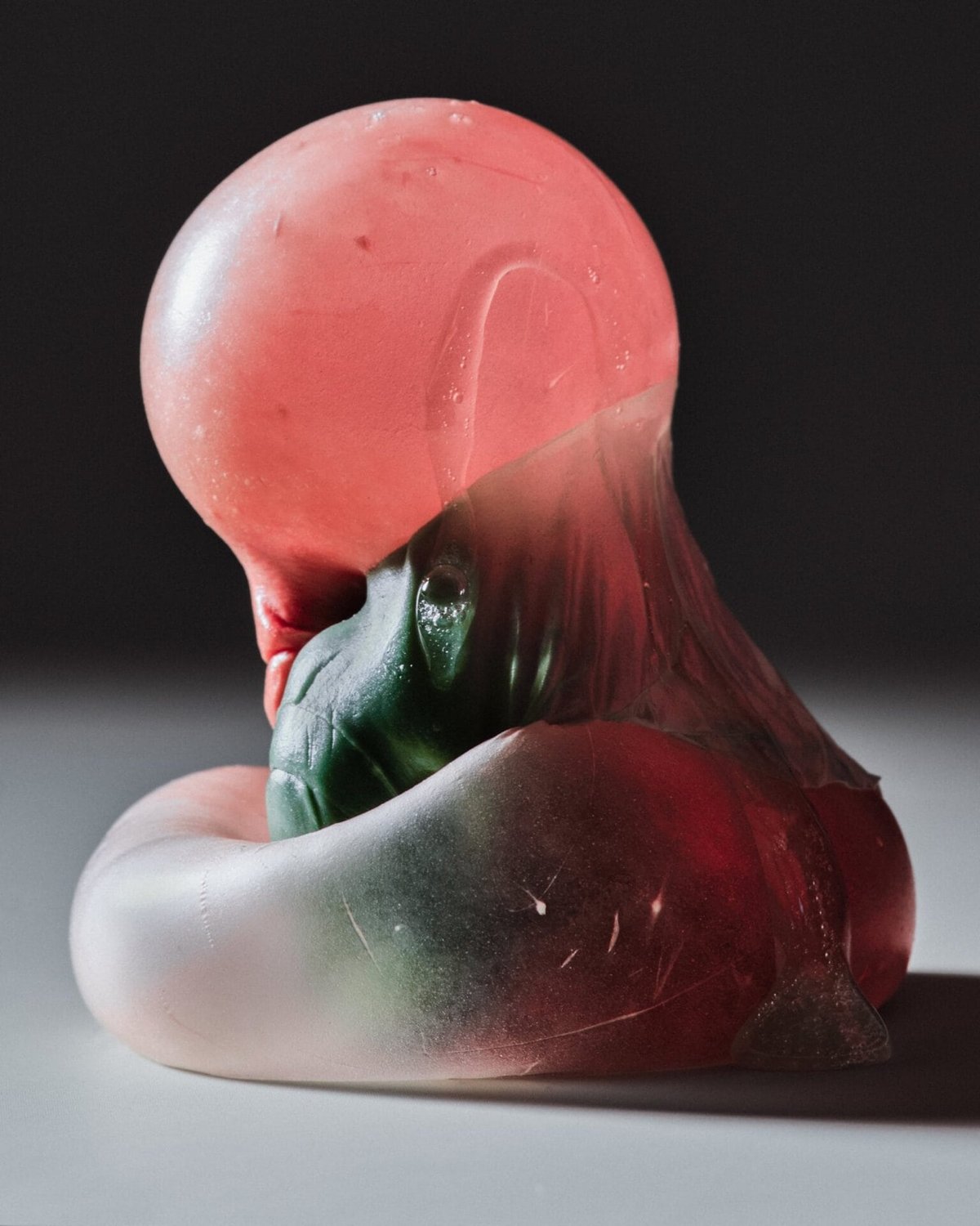
Conjuring memories of childhood competitions and absent-minded chomping, the photos zoom in on chewed wads of pink, blue, and green that appear almost corporeal, their pudgy folds and pockets evoking the beauty and repulsion of the human body.
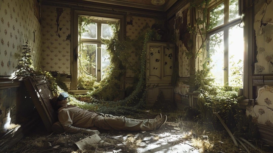
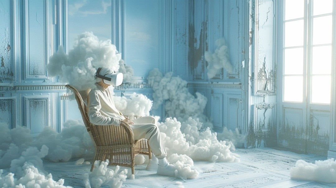
Data artist Robert Hodgin recently created a feedback loop between Midjourney and ChatGPT-4 — he prompted MJ to create an image of an old man in a messy room wearing a VR headset, asked ChatGPT to describe the image, then fed that description back into MJ to generate another image, and did that 10 times. Here was the first image:
It retains much of the information on the Web, in the same way that a jpeg retains much of the information of a higher-resolution image, but, if you’re looking for an exact sequence of bits, you won’t find it; all you will ever get is an approximation. But, because the approximation is presented in the form of grammatical text, which ChatGPT excels at creating, it’s usually acceptable. You’re still looking at a blurry jpeg, but the blurriness occurs in a way that doesn’t make the picture as a whole look less sharp.
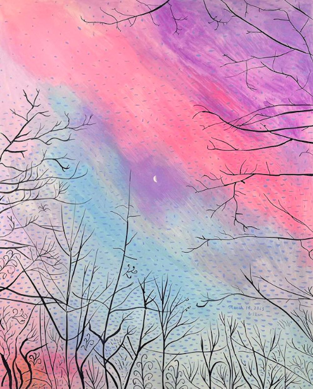
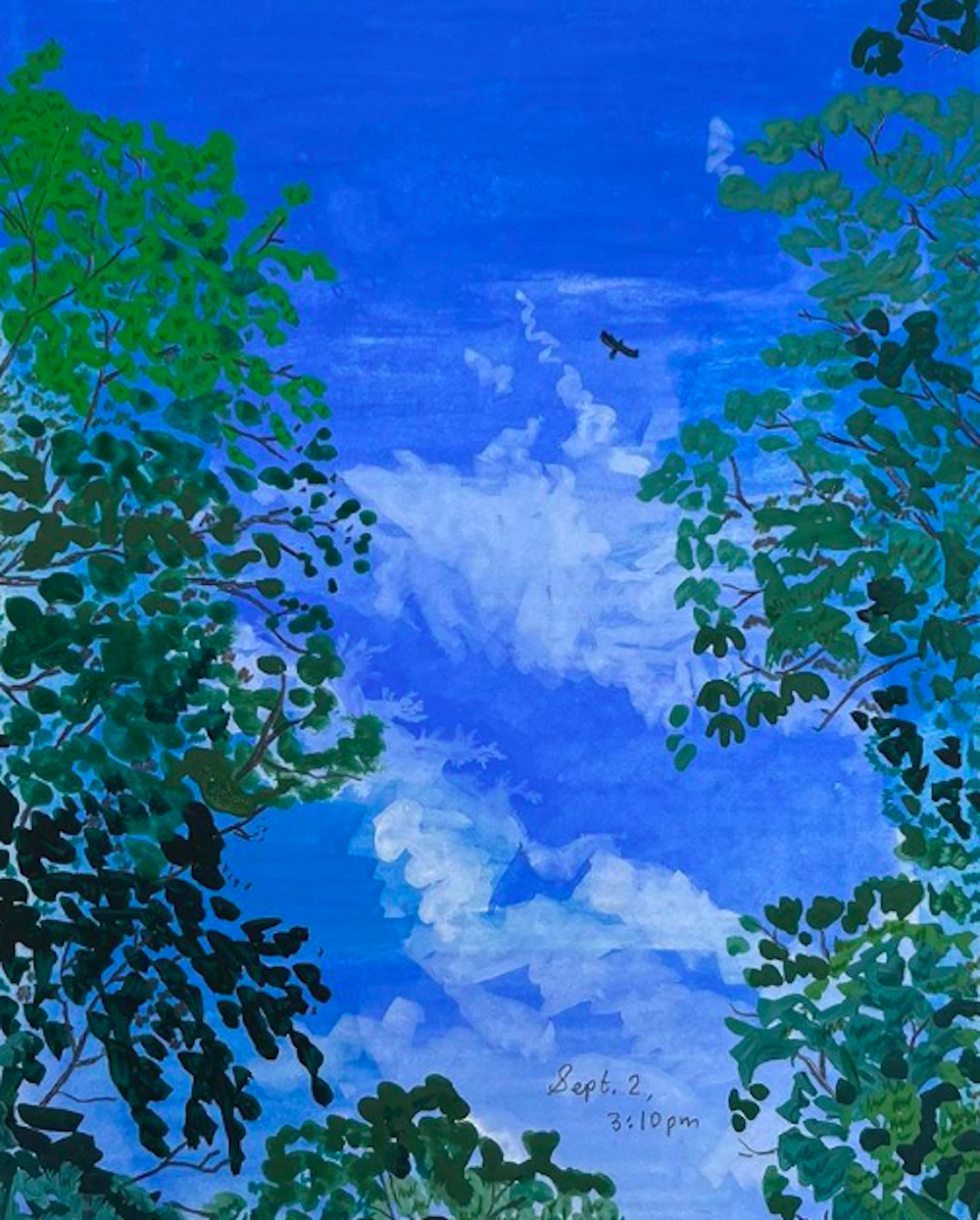
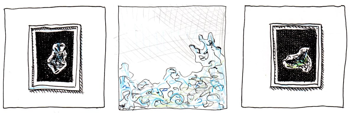
Edith here. For the latest installment of my newish illustrated column, I interviewed my friend and neighbor, the artist and climate activist Zaria Forman. Zaria makes pastel drawings of ice, among other things, and her solo show “Fellsfjara, Iceland” is currently on exhibition at Winston Wächter gallery in New York until May 4. (I’ve rendered a miniature version of some of it right below these words, but definitely click here for the actual images.) Zaria is also on Instagram.
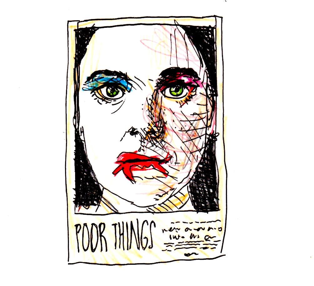
Zaria, have you read, watched, listened to, or otherwise experienced anything good recently? Poor Things. It was so visually stimulating and imaginative — more than anything I’ve seen in a while.
Possibly more interesting: the ice storm a few weekends ago! I’d never seen an ice storm before moving to upstate New York, and although the storms are destructive, they’re so beautiful. It was the most spectacular one I’ve ever experienced.
Seen anything bad? Mr. and Mrs. Smith, the new version. I thought it was poorly cast and just plain dumb. OR: All the mud, now that the ice has melted ;)
What’s something you’ve read or seen that changed your life?
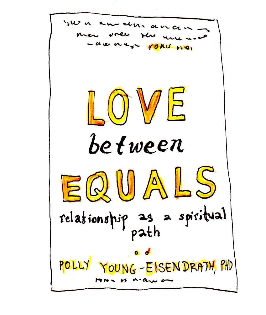
Seeing glaciers and icebergs for the first time absolutely changed my life. But if we’re sticking to books, etc., one that changed my way of thinking was Love Between Equals: Relationship as a Spiritual Path, by Polly Young-Eisendrath.
She’s a psychologist and couples therapist, and the book just kind of reframed the idea of relationships in my mind — of how you relate to someone you’re in a long-term relationship with, and how you can grow with them. And how, like, love is.
She talks about radical acceptance, fully accepting someone for who they are, learning how to do the same for yourself, and then figuring out how all of that can work together.
Does anything make you laugh online?
Memes on Instagram!
What’s a recent one?
I just forwarded you the last one I sent to [my husband] this morning.
Are there any cultural moments you currently think about unusually often? Like are you haunted by a moment from a TV show, or anything like that?
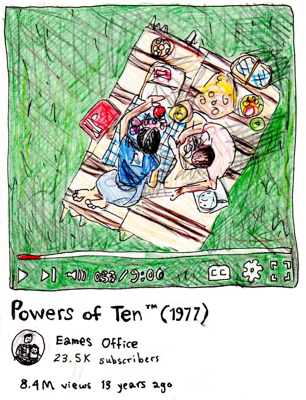
More “inspired” than “haunted,” but the artists Ray and Charles Eames made a 10-minute documentary in 1977 called “Powers of 10” that made a big impact on me. The Tang Teaching Museum in Saratoga Springs exhibited the film in a show during my years at Skidmore College, and it’s probably the one film I think about more than any other.
What’s it about?
It starts with a couple on a blanket having a picnic by a lake in Chicago. And then from one of their hands, the camera zooms back 10 meters. And then it continues zooming back by powers of ten. And so you see these squares get smaller and smaller, and it keeps going into the atmosphere, and the solar system, and it’s just mind-boggling how it keeps going.
And then it then zooms back down to the picnic and goes into their skin and all the way down to, like, a molecule inside the body. And it’s crazy to see the similarities between the two.
It’s on YouTube, if you want to watch — I highly recommend!
What were you really into when you were 12?
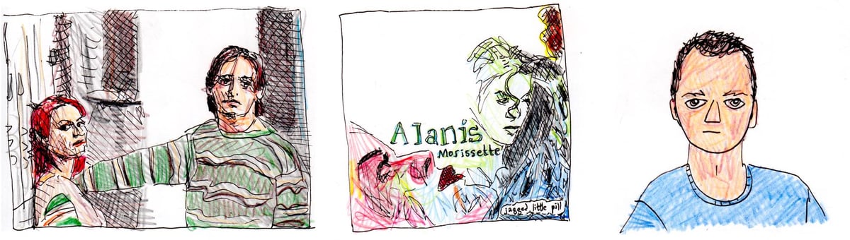
My So-Called Life, singing along to Alanis Morissette, and a boy named Ben.
Is there a book/movie/whatever you’d like to experience again for the first time?
Burning Man. There’s just no way to really know what it’s like until you’re there, in the middle of it. And when you know what to expect, it’s not as thrilling. But as a climate activist, it doesn’t feel right to continue attending over and over.
What’s a funny or weird way people have described your art?
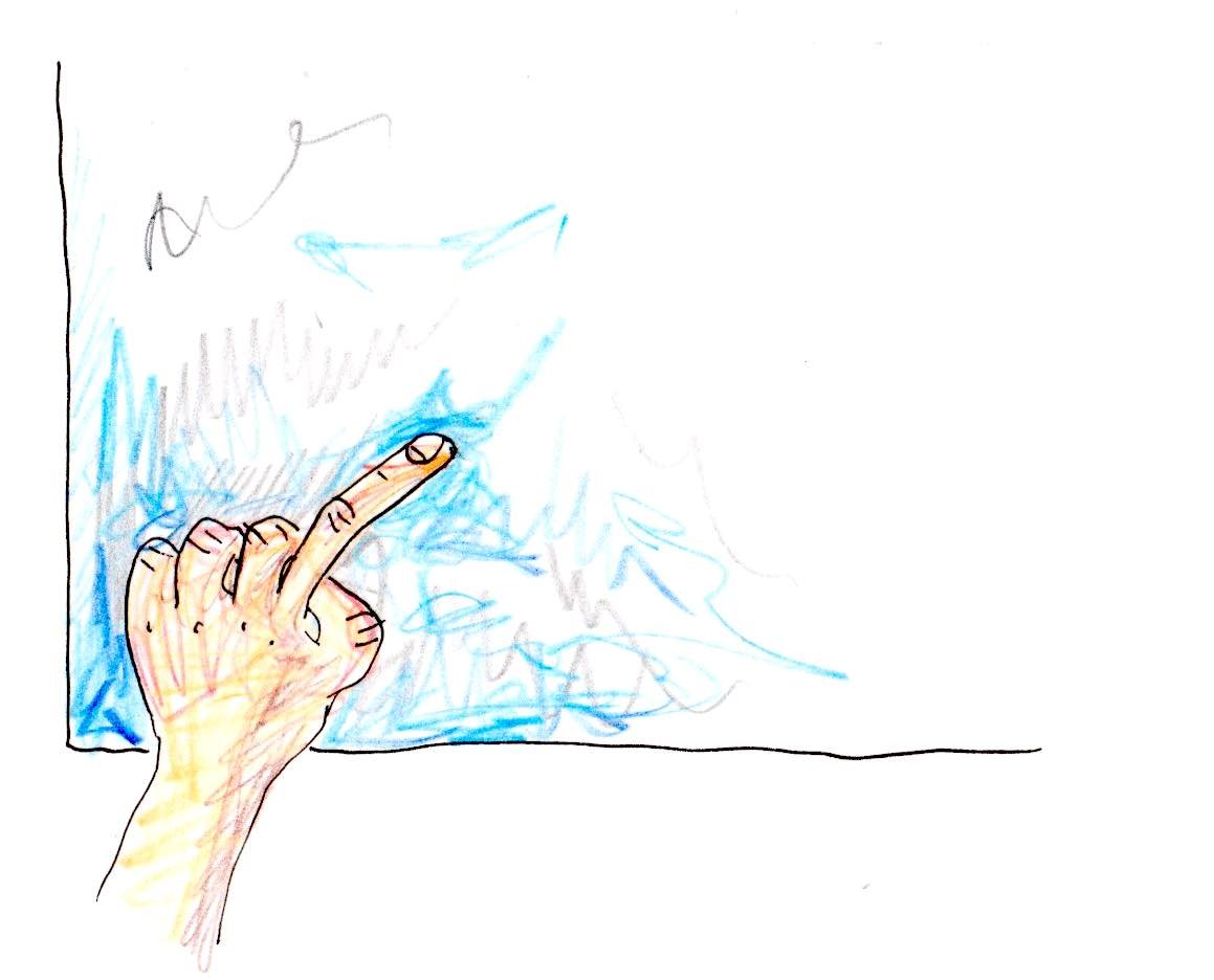
As “finger painting.” It was a term used first (I think) in the Daily Mail, and then almost every writer used it to describe my work for several years. I wince at a line I say in my TedTalk: “I cringe when people call me a finger painter,” or something like that — my tone just sounds so snobby, I hate it — but I was attempting to detach my work from the term, and it did finally work. It pops up every now and then, but rarely.
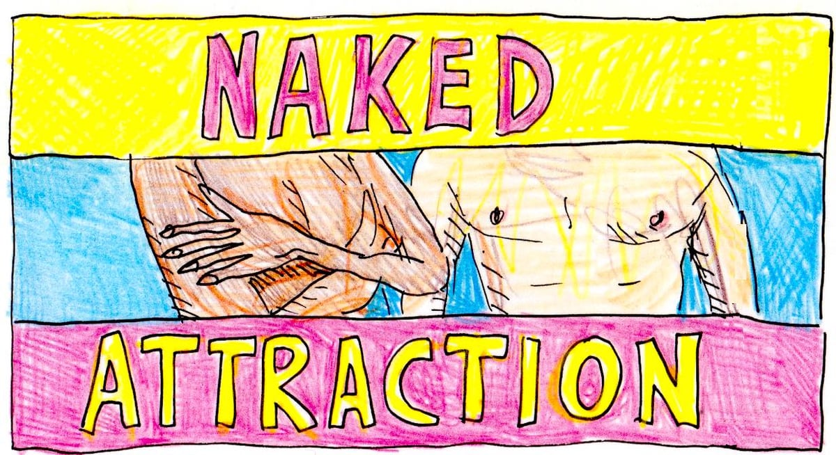
Please tell me something silly that you love. Naked Attraction, the dating show where people are naked.
Thanks, Zaria!
Zaria’s work can be found here. And past installments of Drawing Media can be found here.


Stay Connected