Lady Gaga + typeface = awesome
Jesus, this is nerdy (and hilarious): a Lady Gaga parody about a typeface.
(via @caterina)
This site is made possible by member support. 💞
Big thanks to Arcustech for hosting the site and offering amazing tech support.
When you buy through links on kottke.org, I may earn an affiliate commission. Thanks for supporting the site!
kottke.org. home of fine hypertext products since 1998.
Beloved by 86.47% of the web.
Jesus, this is nerdy (and hilarious): a Lady Gaga parody about a typeface.
(via @caterina)
Typekit launched today (details here).
This will change the way you design websites. Add a line of code to your pages and choose from hundreds of fonts. Simple, bulletproof, standards compliant, accessible, and totally legal.
I haven’t had a chance to play around with this yet, but hope to soon. And hey, you can use Silkscreen with Typekit.
Emigre has released a sans serif companion for Mrs Eaves, Mr Eaves.
Mr Eaves was based on the proportions of Mrs Eaves, but Licko took some liberty with its design. One of the main concerns was to avoid creating a typeface that looked like it simply had its serifs cut off. And while it matches Mrs Eaves in weight, color, and armature, Mr Eaves stands as its own typeface with many unique characteristics.
Very handsome. I’ve always liked the attitude and flourishes of Emigre’s typefaces. (via quips)
Jeff Veen has a look at how Typekit protects fonts served through the service.
To that end, our Javascript is minified and the fonts themselves are represented as Base64 encoded strings. You may see right through this, but the vast majority of web users wouldn’t know what to make of it.
Those Base64 encoded strings are then placed right into the CSS file. And even better than that, the fonts are split up into multiple files and recombined using the CSS font stack. Pretty clever stuff.
The intentional misspelling in the headline caught my eye: Edward Rondthaler, Foenetic Speler, Dies at 104. Turns out that Mr. Rondthaler was quite a fellow. He was a pioneer in the field of phototypesetting, cofounded the International Typeface Corporation & the Type Directors Club, and was a advocate of a phonetic spelling system called SoundSpel. Rondthaler’s fascination with letters began at an early age:
At 5, Edward received a toy printing press as a gift and began publishing his own newspaper. (It was a very small newspaper, about the size of a postcard, his son said.) Only a few years later, he and a friend opened a print shop in a nearby basement, doing jobs for paying customers; they ran the business through high school and for a year afterward, to earn college money.
Rest easy, Mr. Rondthaler.
Update: A few years back, Rondthaler did a charming video on the pronunciation complexities of seemingly simple words for House Industries, a type company that owns the physical assets of Rondthaler’s company, Photo-Lettering, Inc.
(thx, all)
The Typography Manual looks like a nice little iPhone app for designers.
The Typography Manual has several useful features and resources for designers, including a visual type anatomy glossary, a font size ruler, an em calculator, and a enough content to fill a 60 page book. It has the all the essentials of a desk reference in a regularly updated pocket resource.
(via quips)
From Neville Brody and Jeff Knowles:
Throughout the nation men and women, forgotten in the typographical philosophy of the Foundries, look to us here for guidance and for more equitable opportunity to share in the distribution of typefaces… I pledge myself to a New Deal for the American people. This is more than a font. It is a call to arms.
(via my design observer comrades)
Typekit is an upcoming typeface hosting service which will provide vetted fonts that you can include in your site’s stylesheet using the @font-face mechanism.
That’s where Typekit comes in. We’ve been working with foundries to develop a consistent web-only font linking license. We’ve built a technology platform that lets us to host both free and commercial fonts in a way that is incredibly fast, smoothes out differences in how browsers handle type, and offers the level of protection that type designers need without resorting to annoying and ineffective DRM.
What a great idea. And web entrepreneurs pay attention, this is how to make a compelling online property: take an idea that everyone loves in theory but doesn’t use in practice because it’s a pain in the ass (in this case, embedding type on the web) and offer a hosting service to solve that problem. YouTube did this with videos, Blogger/Blogspot, TypePad, & Wordpress did this with blogs, Flickr did it with photos, etc. etc.
Both houses of Congress have recently passed credit card legislation which will cut down on credit card companies abusing their customers. The NY Times has a guide to what the new legislation could mean for consumers. The bill that passed the House contains some interesting provisions on how card companies can use type.
The House throws in what ought to be called “The Fine Print Rule.” Card companies must print their account applications and disclosures in 12-point type or greater. A supervisory board will also probably declare certain hard-on-the-eyes fonts off limits. The Senate is silent on typeface but imposes many other communication requirements.
SEC. 14. Readability requirement.
Section 122 of the Truth in Lending Act (U.S.C. 1632) is amended by adding at the end the following new subsection:
“(d) Minimum type-size and font requirement for credit card applications and disclosures. -All written information, provisions, and terms in or on any application, solicitation, contract, or agreement for any credit card account under an open end consumer credit plan, and all written information included in or on any disclosure required under this chapter with respect to any such account, shall appear-
“(1) in not less than 12-point type; and
“(2) in any font other than a font which the Board has designated, in regulations under this section, as a font that inhibits readability.”.
I haven’t seen a credit card application or bill in years (we’re paperless)…what unreadable fonts are these companies using? Do they set their terms and conditions sections in 6-pt Zapf Dingbats a la David Carson?
After a thorough review, Typographica has chosen their favorite typefaces of 2008.
Sensationalism aside, it’s significant that the ever-increasing quality in type design these days — dubbed by some as the new “golden age” of type — has caused this year’s list to supersede previous lists in many ways.
Responding to a query from an NPR science correspondant about prime numbers, Hoefler & Frere-Jones researched the lengths involved when typesetting the largest known prime number, which has almost 13 million digits.
Joe liked the idea of measuring how long this number would be if it were set in type, which immediately called into question the choice of font. The number’s length would depend chiefly on the width of the font selected, and even listener-friendly choices like Times Roman and Helvetica would produce dramatically different outcomes. Small eccentricities in the design of a particular number, such as Times Roman’s inexplicably scrawny figure one, would have huge consequences when multiplied out to this length. But even this isn’t the hairy part. Where things get difficult, as always, is in the kerning.
In some cases, properly kerning the number resulted in a difference of more than 1000 feet for 12 pt. text.
Jeremy Mickel shares the story of making his first font, which took him about a year and a half.
But then a funny thing happened. I kept correcting and correcting, and all of a sudden I had sanitized the font and there was almost no personality left in it. What I was left with might as well have been VAG Rounded. In a very early draft, I had played with the idea of exaggerating the swellings in the strokes from the original sign. Now I resurrected that, and found the true character of the font.
The result was Router. I also liked this bit:
It’s been said that type design is the art of making unequal things appear equal. Noordzij’s theory of the Stroke of the Pen is apparent even in monoweight sans-serifs. Flip Helvetica’s A, V, or W sideways, and you’ll see that the diagonal strokes are slightly unequal. Rotate the O in Futura, which I was always told was a perfect circle, and you’ll see why that’s not true.
(via shaun inman)
The (Mostly) True Story of Helvetica and the New York City Subway details the use of type in signage, maps, and manuals for the NYC subway. A must-read for type and subway fans.
As if this plethora of signs were not enough, the subway system also had a bewildering variety of other porcelain enamel and hand-painted signs. The porcelain enamel signs, either hung from the ceiling or posted on the walls, were directional as well as informational. The directional signs included those on the outside of the station entrances as well as those intended for the corridors and platforms underground. Many of the informational signs warned against criminal, dangerous or unhealthy behavior: no peddling wares, no leaning over the tracks, no crossing the tracks, no smoking, no spitting. The directional and informational ones were made by Nelke Veribrite Signs and the Baltimore Enamel Company, while the behavioral ones were the product of the Manhattan Dial Company. Most were lettered in some form of sans serif capitals-regular, condensed, square-countered, chamfered, outlined-though some were in bracketed or slab serif roman capitals. They were usually white letters on a colored background (often dark green for the IND and dark blue for the IRT and BMT), yet many were also black on a white background. There was no house style.
What is to modern eyes a beautiful disorder of tiled text and hand-painted enamel became an embarrassing shambles in the 70s and 80s. It was only in late 1989 that Helvetica became the official typeface for New York City subway system signage…about 20 years too late to prevent the current signage from looking dated.
The pixel font circa 1567 is cool, but more interesting is Jonathan Hoefler’s assertion that the pixel is nearly dead — except as a design cliche.
The pixel will never go away entirely, but its finite universe of digital watches and winking highway signs is contracting fast. It’s likely that the pixel’s final and most enduring role will be a shabby one, serving as an out-of-touch visual cliche to connote “the digital age.”
Goldenfiddle has screenshots of the type done for each of the locations in Quantum of Solace, hand-crafted by Tomato.
Inspired by Emmett Williams, a practitioner of concrete poetry, Rob Giampietro has written three poems: Wastebasket, Snowflakes, and Spraypaint.
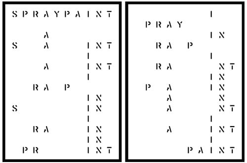
Giampietro has put out a call for someone to develop a Williams Word Generator. Drop him a line if you can help out…shouldn’t be too much different than the many “words within words” generators scattered around the web.
Rives shares a typographic fairy tale in three minutes. It’s a O}-< meets Q<= story.
Garamond Powerline, a typeface made out of photos of powerlines. The “quick brown fox…” sample at the bottom is kind of awesome. (via waxy)
A collection of postage stamps designed by type designers. (via do)
Mark Simonson takes an extensive look at the typography of Mad Men and concludes that a surprising amount of the type is set in fonts that either weren’t around in the early 60s or weren’t yet popular in the US.
Then there is the Gill Sans (c. 1930) problem. Gill is used quite a lot in the series, mainly for Sterling Cooper Advertising’s logo and signage. Technically, this is not anachronistic. And the way the type is used — metal dimensional letters, generously spaced — looks right. The problem is that Gill was a British typeface not widely available or popular in the U.S. until the 1970s. It’s a decade ahead of its time in American type fashions.
There’s also the Arial problem in the ending credits.
In addition to being well-suited to web graphics, Silkscreen works equally well in cross-stitch.
Mad Men gets a C- for using Arial in the closing credits instead of original-and-still-champion Helvetica. Time for Sterling to have a chat with the art department.
A weblog about ampersands, “often the most attractive punctuation mark of them all”. (via le gruber)
Fonts personified at a font conference.
Pencil, telephone, hourglass, diamonds, candle, candle, flag. Mouse, scissors, ball, mailbox, mailbox, mailbox!
That’s Wingdings talking.
Fontsmith designed the Mencap typeface to be highly readable and legible for those with learning disabilities. See also the Clearview typeface used on the new highway signs in the US. (via ministry of type)
A comparison of typographers’ fonts with their handwriting…among them Erik Spiekermann, Mark Simonson, and Marian Bantjes. (via le waxy)
Serious Sans is a more professional take on Microsoft’s much-maligned Comic Sans typeface. The typeface is a project by four students at the Royal College of Art in London. From The Moment blog:
Struggling to understand what could possibly be good about Comic Sans, Valerio — together with partners Hugo Timm, Filip Tydén and Erwan Lhussier — found that the doggedly goofy font’s irregular forms made it one of the easiest typefaces for dyslexics to read. The designers also liked how it undermined the authority — and changed the meaning — of texts set in it.
Mark Simonson notes that the period typography in the Indiana Jones movies is pretty good, except for that used on Indy’s travel maps.
In Raiders of the Lost Ark (1981) which is set in 1936, we see ITC Serif Gothic (designed in 1972). The wide spacing feels right, and it does have an art deco feel, but it’s 1970s art deco.
Socials & More