kottke.org posts about renaissance
Several years ago, I heard a performance from the group above while driving. I made a note of their name on my phone — Stile Antico — and later bought tickets to a concert they were having near where I lived at the time. I invited my boyfriend (also at the time), who made a point of letting me know in not so many words that he wasn’t into the music and didn’t really want to go. I think we were also fighting about something else, to be fair. Anyway, we went to the concert. But it didn’t have the magic that had captivated me on the radio, and I was too aware that my companion wasn’t enjoying himself, so we left at intermission. The group dropped off my radar until recently, but this performance of music by William Byrd, written more than 400 years ago, just blows me away (full album streaming here). I wish I had stayed for the second half of that show. I should have just been like, “You go home and let me enjoy my Renaissance music in peace!”
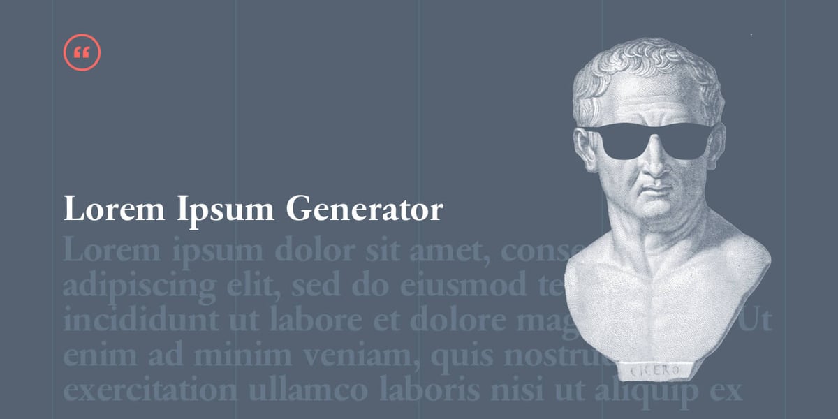
“Lorem ipsum” is a shorthand for placeholder text, usually beginning with this not-quite-meaningful-Latin phrase. Many folk genealogies date the practice to the Latin-loving Renaissance humanists, and who knows? Maybe Aldus Manutius did have some dummy Latin that he liked to use to test a page design. But it probably wasn’t the same text we use today, and Aldus himself only enters the story in a marginal way.
Jack Shepherd argues persuasively for a much more recent lorem ipsum origin story.
The source text is definitely Cicero, although it’s two mishmashed quotes from De Finibus Bonorum et Malorum (About the Ends of Good and Evil) with words cut in half:
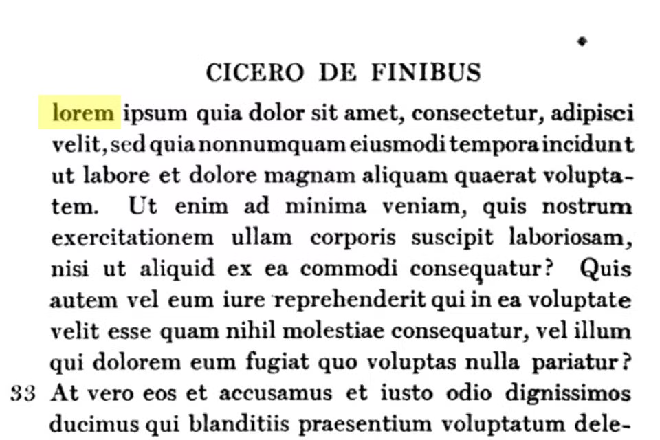
You’ll notice that this image, from the Loeb Classical Library 1914 opposing-face translation of Cicero’s work, doesn’t cut off “delorem ipsum,” or rather it does: this page is the second half of the cut. And that’s one clue that we have that this particular truncation of the text is a twentieth century practice, not a fifteenth century one.
The earliest example that anyone seems to have been able to find of Random Selections of the 1914 Loeb Facing Translation of Sections 1.10.32 and 1.10.33 of Cicero’s De Finibus Used as Dummy Text (aka, mercifully, Lorem Ipsum) is from the 1960s. At the time, if you wanted to mock up an ad or a flier for a punk show and you didn’t have a bunch of bespoke font settings on your Imperial Model 70 typewriter, your best bet was a British company called Letraset, which sold adhesive transfer sheets with different typefaces.
Letraset used Lorem Ipsum in their advertisements, and the layout-design software company Aldus (maker of the popular PageMaker layout tool) duplicated the practice in the ’80s, which is presumably the origin point of ChatGPT’s tall tale about Aldus Manutius using Lorem Ipsum in the 16th Century.

You might feel a little deflated by this revelation. You mean, that’s it? It’s been software all along? We don’t stand in a noble tradition of humanist lettersetters?
Ah, but the thing is we do! Nothing screams “Renaissance humanism” more than inventing a practice and then assigning it a venerable pseudo-archaic origin. Imitation here is genuinely the sincerest form of flattery. This is perfect.

There’s growing visibility and demand for the work of female artists of the Renaissance and Baroque periods, from The Museo Nacional del Prado showcasing the work of Sofonisba Anguissola and Lavinia Fontana as part of its 200th anniversary programming, to Sotheby’s achieving record-breaking prices for female Old Masters, to D.C.’s National Museum of Women in the Arts current “Women Artists of the Dutch Golden Age.”
Anguissola was a celebrated portraitist in the late 16th and early 17th centuries whose fame earned her a place as a lady-in-waiting to Isabel de Valois at the court of King Philip II of Spain. Fontana worked around the same time in Rome and Bologna, disregarding the limits of genres imposed on her sex, even painting from the nude—a practice from which women were generally excluded at the time.
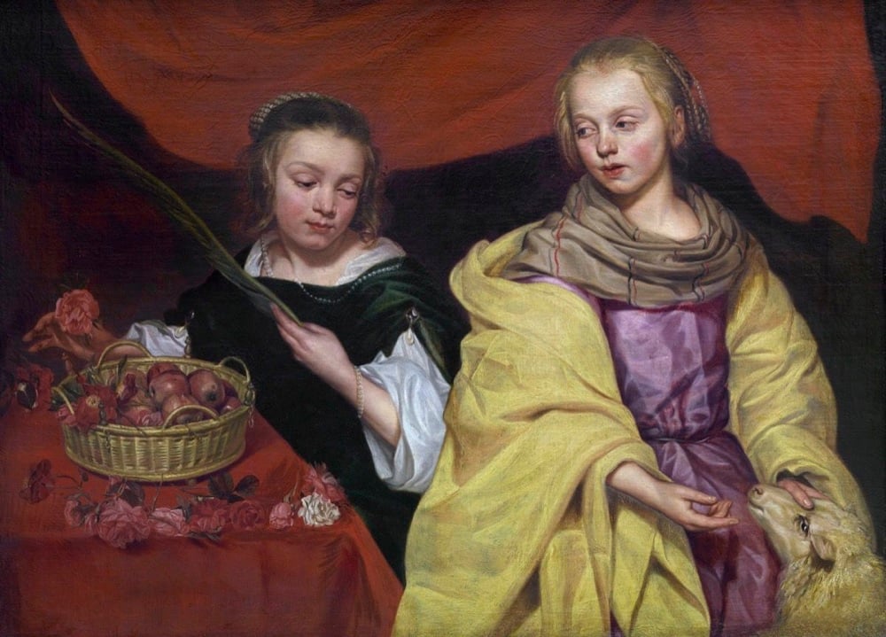
As often happens when trying to right some imbalances, it starts with breaking the loop of being too unknown to be featured but needing to be exhibited to become known.
Art historian Katlijne Van der Stighelen first rediscovered the Baroque painter Michaelina Wautier in the 1990s, but found it impossible to get support for an exhibition as museums would not risk gambling on an unknown artist. It was not until the Flanders tourism department decided to invest heavily in a three-year exhibition program, beginning in 2018 with Peter Paul Rubens and Baroque painting, that she finally got her chance.
Until of course someone finally “takes a chance” only to find out that yes, there is a thirst for more diversity of voices in all domains.
The response exceeded anything Van der Stighelen or MAS could have hoped for. Both the national and international press were attracted by the “surprise element” of an artist so technically accomplished, yet completely unknown. By the time the show came down in September 2018, some 40,000 visitors had seen it—about four times the usual number for a summer show at MAS, according to Van der Stighelen.
I’m always up for a good polymath bio but I didn’t know about Athanasius Kircher. The Public Domain Review takes us through John Glassie’s book about one of Kircher’s great masterworks Mundus Subterraneus. A two-volume tome of atlas-like dimensions, intended to lay out “before the eyes of the curious reader all that is rare, exotic, and portentous contained in the fecund womb of Nature.”

The “prodigious volcanoes and fire-vomiting mountains visible in the external surface of the earth do sufficiently demonstrate it to be full of invisible and underground fires,” he wrote. “For wherever there is a volcano, there also is a conservatory or storehouse of fire under it…. And these fires argue for deeper treasuries and storehouses of fire, in the very heart and inward bowels of the Earth.”

More than once, Kircher compares the movement of the earth’s water to the circulation of the blood in the body as described by William Harvey. The water of the oceans follows its “secret motions” up and around the globe toward the North Pole.
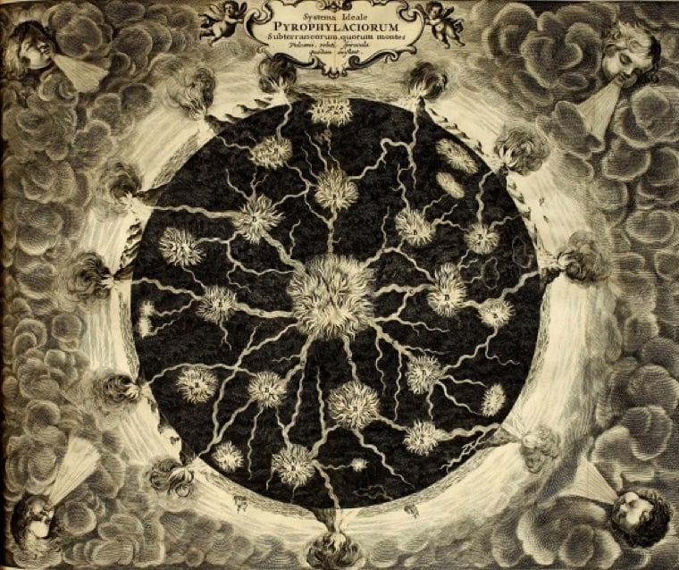
His fascination with volcanoes and the underworld took him to Malta, Sicily, Calabria, and the Vesuvius.
“After having diligently searched out the incredible power of Nature working in subterraneous burrows and passages,” he wrote, “I had a great desire to know whether Vesuvius also had not some secret commerce and correspondence with Stromboli and Aetna.”

For August, the writers at HiLobrow will have a month of appreciations of fonts and typefaces, lovingly titled “Kern Your Enthusiasm.” Matthew Battles kicks things off with the legendary Aldine Italic developed for Venetian publisher Aldus Manutius, a new set of metal letters that helped jumpstart a little thing we call the Renaissance.
When Aldus put the first version of a typeface we call italic to use in 1501, the printing press had been proliferating in Europe for half a century. In other words, it was about as old as the computer is now. It was a time of immense invention and swiftly spun variety in the printed book, and a time of new mobility and independence of thought and activity among certain classes of people as well — and the combination of new ways and new tools meant new kinds of books. Crucially, the book was getting smaller, small enough to act not only as a desktop, but as a mobile device.
Previous HiLobrow series include “Kirb Your Enthusiasm” (on Jack Kirby), “Kirk Your Enthusiasm” (on Star Trek’s Captain Kirk) and “Herc Your Enthusiasm” (on old school hip-hop, where I contributed a short thing on Afrika Bambaataa.)
This is a page from a book called Hypnerotomachia Poliphili.
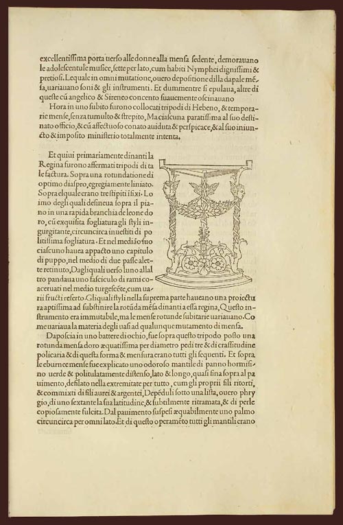
Any guesses as to when it was published? The title, Latin text, yellowed paper, and lack of page numbers might tip you off that it wasn’t exactly released yesterday. Turns out that Hypnerotomachia Poliphili was published in 1499, more than 500 years ago and only 44 years after Gutenberg published his famous Bible. It belongs to a group of books collectively referred to as incunabula, books printed with a printing press using movable type before 1501.
To contemporary eyes, the HP looks almost modern. The text is very readable. The typography, layout, and the way the text flows around the illustration; none of it looks out of the ordinary. When compared to other books of the time (e.g. take a look at a page from the Gutenberg Bible), its modernity is downright eerie. The most obvious difference is the absence of the blackletter typeface. Blackletter was a popular choice because it resembled closely the handwritten script that preceded the printing press, and I imagine its use smoothed the transition to books printed by press. HP dispensed with blackletter and instead used what came to be known as Bembo, a humanist typeface based on the handwriting of Renaissance-era Italian scholars. From a MIT Press e-book on the HP:
One of the features of the Hypnerotomachia that has attracted the attention of scholars has been its use of the famed Aldine “Roman” type font, invented by Nicholas Jenson but distilled into an abstract ideal by Francesco Biffi da Bologna, a jeweler who became Aldus’s celebrated cutter. This font — generally viewed as originating in the efforts of the humanist lovers of belles-lettres and renowned calligraphers such as Petrarch, Poggio Bracciolini, Niccolo Niccoli, Felice Feliciano, Leon Battista Alberti, and Luca Pacioli, to re-create the script of classical antiquity — appeared for the first time in Bembo’s De Aetna. Recut, it appeared in its second and perfected version in the Hypnerotomachia.
In that way, Hypnerotomachia Poliphili is both a throwback to Roman times and an indication of things to come.
The MIT Press site also notes a number of other significant aspects of the book. As seen above, illustrations are integrated into the main text, allowing “the eye to slip back and forth from textual description and corresponding visual representation with the greatest of ease”. In his 2006 book, Beautiful Evidence, Edward Tufte says:
Overall, the design of Hypnerotomachia tightly integrates the relevant text with the relevant image, a cognitive integration along with the celebrated optical integration.
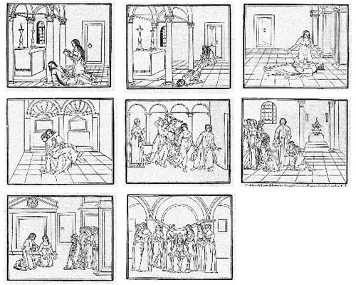
Several pages in the book make use of the text itself to illustrate the shapes of wine goblets. The HP also contained aspects of film, comics, and storyboarding…successive illustrations advanced action begun on previous pages:
All of which makes the following puzzling:
The Hypnerotomachia Poliphili is one of the most unreadable books ever published. The first inkling of difficulty occurs at the moment one picks up the book and tries to utter its tongue-twisting, practically unpronounceable title. The difficulty only heightens as one flips through the pages and tries to decipher the strange, baffling, inscrutable prose, replete with recondite references, teeming with tortuous terminology, choked with pulsating, prolix, plethoric passages. Now in Tuscan, now in Latin, now in Greek — elsewhere in Hebrew, Arabic, Chaldean and hieroglyphs — the author has created a pandemonium of unruly sentences that demand the unrelenting skills of a prodigiously endowed polyglot in order to be understood.
It’s fascinating that a book so readable, so beautifully printed, and so modern would also be so difficult to read. If you’d like to take a crack at it, scans of the entire book are available here and here. The English translation is available on Amazon.
 The Metropolitan Museum of Art recently purchased a painting called Madonna and Child by Duccio di Buoninsegna. The Met paid $50 million for the early Renaissance piece, more than they’ve paid for any single acquisition to date. The New Yorker has the story of how they came to own the last Duccio in private hands. In the article, Calvin Tomkins explains the reason for the painting’s importance:
Small as it is, the painting has a powerful presence. It captures the eye from a distance, and commands, up close, something like complete attention. Holding the Christ child in her left arm, the Virgin looks beyond him with melancholy tenderness, while the child reaches out a tiny hand to brush aside her veil. Centuries of Byzantine rigidity and impersonal, hieratic forms are also brushed aside in this intimate gesture. We are at the beginning of what we think of as Western art; elements of the Byzantine style still linger—in the gold background, the Virgin’s boneless and elongated fingers, and the child’s unchildlike features—but the colors of their clothing are so miraculously preserved, and the sense of human interaction is so convincing, that the two figures seem to exist in a real space, and in real time. Candle burn marks on the frame, which is original, testify to the picture’s use as a private devotional image. It is dated circa 1300.
I had the good fortune to stumble across the Duccio at the Met a few weeks ago (I was there for the Diane Arbus exhibition and passed it by accident on the way to another part of the musuem). What struck me at the time was a certain oddity of the piece…almost like it wasn’t what they’d said it was but magical all the same. I know Jack about art[1], but after reading more about Madonna and Child, it probably seemed odd to me because it’s a transitional piece, not quite Renaissance but not quite Byzantine either. The piece is a thin slice of a phase transition that had barely begun, a moment frozen from when the artists of the day were collectively working out how a Renaissance painting would eventually differ from earlier European styles and represent the wider cultural changes then occurring. Marco Grassi writes in The New Criteron:
More importantly, the artist places the Virgin at a slight angle to the viewer, behind a fictive parapet. She gazes away from the Child into the distance while He playfully grasps at Her veil. One must realize that every aspect of this composition represents a departure from pre-existing convention. With these subtle changes, Duccio consciously developed an image of sublime tenderness and poignant humanity, almost a visual echo of the spiritual renewal that St. Francis of Assisi had wrought only a few decades earlier.
More more on Duccio, check out his biography on Wikipedia and some collections of his work (1, 2, 3), including other Duccio representations of the Virgin and Child),
[1] I wish I’d taken an art history class in college, but my 18-yo self wasn’t that interested.


 The Metropolitan Museum of Art recently purchased a painting called
Socials & More