kottke.org posts about WWW
things magazine on living in simulation: “There’s a lack of depth on the internet, a world with an atmosphere just one pixel thick that has reached out across all forms of media and turned everything into a vast, shallow pool that stretches as far as the eye can see. All visual culture is instantly at our fingertips, with the thrill of discovery superseded by a high fructose corn syrup buzz that comes from near-constant, 30fps stimulation.”
So, whoa. The commonly accepted wisdom is that Vannevar Bush’s seminal As We May Think, published in the Atlantic Monthly in 1945, was the first time anyone had described something like the modern desktop computer and the World Wide Web. Not so, says Alex Wright in Glut: Mastering Information Through the Ages (@ Amazon). A Belgian chap named Paul Otlet described something called the “radiated library” — or the “televised book” — in 1934:
Here, the workspace is no longer cluttered with any books. In their place, a screen and a telephone within reach. Over there, in an immense edifice, are all the books and information. From there, the page to be read, in order to know the answer to the question asked by telephone, is made to appear on the screen. The screen could be divided in half, by four, or even ten if multiple texts and documents had to be consulted simultaneously. There would be a loudspeaker if the image had to be complemented by oral data and this improvement could continue to the automating the call for onscreen data. Cinema, phonographs, radio, television: these instruments, taken as substitutes for the book, will in fact become the new book, the most powerful works for the diffusion of human thought. This will be the radiated library and the televised book.
Sweet fancy Macintosh, if that’s not what we’re all doing right here on the web all day.
Much of the section in the book on Otlet was first published by Wright in a Boxes and Arrows essay called Forgotten Father: Paul Otlet. Wright’s extensive online bibliography for Glut should keep you busy for a few hours when you’re done with that. (I wish all the books I read were accompanied by such bibliographies.) I’ll also recommend a related read and one of my favorite technology books, The Victorian Internet by Tom Standage (@ Amazon):
It points out the features common to the telegraph networks of the nineteenth century and the internet of today: hype, skepticism, hackers, on-line romances and weddings, chat-rooms, flame wars, information overload, predictions of imminent world peace, and so on. In the process, I get to make fun of the internet, by showing that even such a quintessentially modern technology actually has roots going back a long way (in this case, to a bunch of electrified monks in 1746).
Now, if you’ll excuse me, I need to get back to my televised book.
I wanted to clarify my comments about Facebook’s similarities to AOL. I don’t think Facebook is a bad company or that they won’t be successful; they seem like smart passionate people who genuinely care about making a great space for their users.1 It’s just that I, unlike many other people, don’t think that Facebook and Facebook Platform are the future of the web. The platform is great for Facebook, but it’s a step sideways or even backwards (towards an AOL-style service) for the web.
Think of it this way. Facebook is an intranet for you and your friends that just happens to be accessible without a VPN. If you’re not a Facebook user, you can’t do anything with the site…nearly everything published by their users is private. Google doesn’t index any user-created information on Facebook.2 AFAIK, user data is available through the platform but that hardly makes it open…all of the significant information and, more importantly, interaction still happens in private. Compare this with MySpace or Flickr or YouTube. Much of the information generated on these sites is publicly available. The pages are indexed by search engines. You don’t have to be a user to participate (in the broadest sense…reading, viewing, and lurking are participating).
Faced with competition from this open web, AOL lost…running a closed service with custom content and interfaces was no match for the wild frontier of the web. Maybe if they’d done some things differently, they would have fared better, but they still would have lost. In competitive markets, open and messy trumps closed and controlled in the long run. Everything you can do on Facebook with ease is possible using a loose coalition of blogging software, IM clients, email, Twitter, Flickr, Google Reader, etc. Sure, it’s not as automatic or easy, but anyone can participate and the number of things to see and do on the web outnumbers the number of things you can see and do on Facebook by several orders of magnitude (and always will).
At some point in the future, Facebook may well open up, rendering much of this criticism irrelevant. Their privacy controls are legendarily flexible and precise…it should be easy for them to let people expose parts of the information to anyone if they wanted to. And as Matt Webb pointed out to me in an email, there’s the possibility that Facebook turn itself inside out and be the social network bit for everyone else’s web apps. In the meantime, maybe we shouldn’t be so excited about the web’s future moving onto an intranet.
[1] And I’m definitely not, as more than one person has suggested, “bitter” about Facebook’s success. Please. Just because you disagree with something doesn’t mean you’re angry. The only reason I even wrote that post is that I got tired of seeing the same people who think AOL sucked, that Times Select is a bad business decision for the NY Times, that are frustrated by IM interop, and that open participation on the web is changing business, media, and human culture for the better trumpeting that this new closed platform is the way forward. ↩
[2] Aside from extremely limited profile pages, which are little more than “hi, this person is on Facebook and you should be too” advertisements. Examples here.↩
Stuff from Steve Jobs’ WWDC keynote this morning: new version of Safari for Mac *and* Windows (downloadable beta), developing for iPhone can be done with HTML & JavaScript…just like Dashboard widgets, new Finder and Desktop, and Apple’s web site is completely redesigned.
Update: From the reaction I’m hearing so far, it’s difficult to tell what was more disappointing to people: Jobs’ keynote or The Sopronos finale. Also, a Keynote bingo was possible (diagonally, bottom left to top right)…no report yet as to whether anyone yelled out during the show.
Update: TUAW is reporting that someone in the crowd yelled “bingo” 35 minutes into the keynote, but if you look at the card, a bingo was only possible when the iPhone widgets were announced towards the end. Disqualified for early non-bingo! (thx, alex)
Regarding my earlier post on how Heather Champ’s jezebel.com came to be in Gakwer’s hands, she sold it to them directly: “When the good folks at Gawker contacted me a couple of months ago, I realized that she would find a good home amongst their properties.” (thx, meg)
Jezebel is a new Gawker Media blog about…well, that’s not important. Anyway, the site is hosted at jezebel.com, which was the former personal domain of Heather Champ and the original home of The Mirror Project (timeline). Heather put the domain up for sale in January 2004…I guess Nick bought it?
Update: Never fear, vintage Jezebel merchandise is still available.
There are almost no words for this video. “When that stool pops out an ottoman 9 months from now, there is no way in hell y’all are gonna be able to tell who the baby daddy is….” Potentially NSFW. (via todd at bingbong.com, who says that he “would be totally happy if this video was the World Wide Web’s grand finale, and then the Internet just went dark and we all went back to making candles and reading the bible and stuff.”)
Update: The video was made for a contest held by Pretty Ricky, a hip-hop group. Here’s the contest announcement. That still doesn’t explain why those young men were having outercourse with that ottoman. (thx, travis)
Update: This one’s good too. Furniture sex + rubber gloves and surgical masks.
Update: One last word on this…the video is not an entry in Push It contest, it’s just set to a Pretty Ricky song. (thx, todd)
Regarding the Twitter vs. Blogger thing from earlier in the week, I took another stab at the faulty Twitter data. Using some educated guesses and fitting some curves, I’m 80-90% sure that this is what the Twitter message growth looks like:
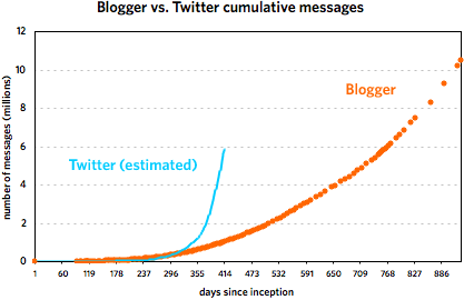
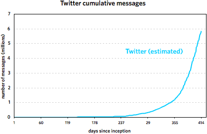
These graphs cover the following time periods: 8/23/1999 - 3/7/2002 for Blogger and 3/21/2006 - 5/7/2007 for Twitter. It’s important to note that the Twitter trend is not comprised of actual data points but is rather a best-guess line, an estimate based on the data. Take it as fact at your own risk. (More specifically, I’m more sure of the general shape of the curve than with the steepness. My gut tells me that the curve is probably a little flatter than depicted rather than steeper.)
That said, most of what I wrote in the original post still holds, as do the comments in subsequent thread. Twitter did not grow as fast as the faulty data indicated, but it did get to ~6,000,000 messages in about half the time of Blogger. Here are the reasons I offered for the difference in growth:
1. Twitter is easier to use than Blogger was and had a lower barrier to entry.
2. Twitter has more ways to update (web, phone, IM, Twitterific) than did Blogger.
3. Blogger’s growth was limited by a lack of funding.
4. Twitter had a larger pool of potential users to draw on.
5. Twitter has a built-in social aspect that Blogger did not.
And commenters in the thread noted that:
6. Twitter’s 140-character limit encourages more messages.
7. More people are using Twitter for conversations than was the case with Blogger.
What’s interesting is that these seeming advantages (in terms of message growth potential) for Twitter didn’t result in higher message growth than Blogger over the first 9-10 months. But then the social and network effects (#5 and #7 above) kicked in and Twitter took off.
Important update: I’ve re-evaluated the Twitter data and came up with what I think is a much more accurate representation of what’s going on.
Further update: The Twitter data is bad, bad, bad, rendering Andy’s post and most of this here post useless. Both jumps in Twitter activity in Nov 2006 and March 2007 are artificial in nature. See here for an update.
Update: A commenter noted that sometime in mid-March, Twitter stopped using sequential IDs. So that big upswing that the below graphs currently show is partially artificial. I’m attempting to correct now. This is the danger of doing this type of analysis with “data” instead of data.
—
In mid-March, Andy Baio noted that Twitter uses publicly available sequential message IDs and employed Twitter co-founder Evan Williams’ messages to graph the growth of the service over the first year of its existence. Williams co-founded Blogger back in 1999, a service that, as it happens, also exposed its sequential post IDs to the public. Itching to compare the growth of the two services from their inception, I emailed Matt Webb about a script he’d written a few years ago that tracked the daily growth of Blogger. His stats didn’t go back far enough so I borrowed Andy’s idea and used Williams’ own blog to get his Blogger post IDs and corresponding dates. Here are the resulting graphs of that data.1
The first one covers the first 253 days of each service. The second graph shows the Twitter data through May 7, 2007 and the Blogger data through March 7, 2002. [Some notes about the data are contained in this footnote.]
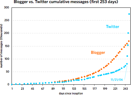
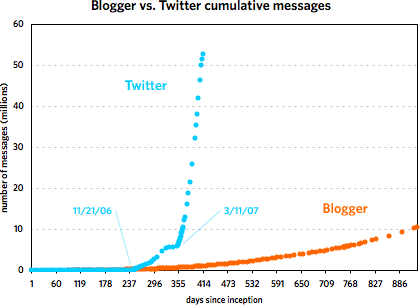
As you can see, the two services grew at a similar pace until around 240 days in, with Blogger posts increasing faster than Twitter messages. Then around November 21, 2006, Twitter took off and never looked back. At last count, Twitter has amassed five times the number of messages than Blogger did in just under half the time period. But Blogger was not the slouch that the graph makes it out to be. Plotting the service by itself reveals a healthy growth curve:
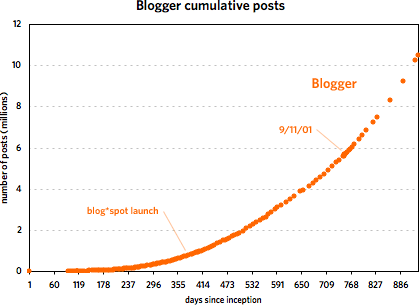
From late 2001 to early 2002, Blogger doubled the number of messages in its database from 5M to 10M in under 200 days. Of course, it took Twitter just over 40 days to do the same and under 20 days to double again to 20M. The curious thing about Blogger’s message growth is that large events like 9/11, SXSW 2000 & 2001, new versions of Blogger, and the launch of blog*spot didn’t affect the growth at all. I expected to see a huge message spike on 9/11/01 but there was barely a blip.
The second graph also shows that Twitter’s post-SXSW 2007 growth is real and not just a temporary bump…a bunch of people came to check it out, stayed on, and everyone messaged like crazy. However, it does look like growth is slowing just a bit if you look at the data on a logarithmic scale:
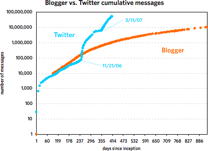
Actually, as the graph shows, the biggest rate of growth for Twitter didn’t occur following SXSW 2007 but after November 21.
As for why Twitter took off so much faster than Blogger, I came up with five possible reasons (there are likely more):
1. Twitter is easier to use than Blogger was. All you need is a web browser or mobile phone. Before blog*spot came along in August 2000, you needed web space with FTP access to set up a Blogger blog, not something that everyone had.
2. Twitter has more ways to create a new message than Blogger did at that point. With Blogger, you needed to use the form on the web site to create a post. To post to Twitter, you can use the web, your phone, an IM client, Twitterrific, etc. It’s also far easier to send data to Twitter programatically…the NY Times account alone sends a couple dozen new messages into the Twitter database every day without anyone having to sit there and type them in.
3. Blogger was more strapped for cash and resources than Twitter is. The company that built Blogger ran out of money in early 2001 and nearly out of employees shortly after that. Hard to say how Blogger might have grown if the dot com crash and other factors hadn’t led to the severe limitation of its resources for several key months.
4. Twitter has a much larger pool of available users than Blogger did. Blogger launched in August 1999 and Twitter almost 7 years later in March 2006. In the intervening time, hundreds of millions of people, the media, and technology & media companies have become familiar and comfortable with services like YouTube, Friendster, MySpace, Typepad, Blogger, Facebook, and GMail. Hundreds of millions more now have internet access and mobile phones. The potential user base for the two probably differed by an order of magnitude or two, if not more.
5. But the biggest factor is that the social aspect of Twitter is built in and that’s where the super-fast growth comes from. With Blogger, reading, writing, and creating social ties were decoupled from each other but they’re all integrated into Twitter. Essentially, the top graph shows the difference between a site with social networking and one largely without. Those steep parts of the Twitter trend on Nov 21 and mid-March? That’s crazy insane viral growth2, very contagious, users attracting more users, messages resulting in more messages, multiplying rapidly. With the way Blogger worked, it just didn’t have the capability for that kind of growth.
A few miscellaneous thoughts:
It’s important to keep in mind that these graphs depict the growth in messages, not users or web traffic. It would be great to have user growth data, but that’s not publicly available in either case (I don’t think). It’s tempting to look at the growth and think of it in terms of new users because the two are obviously related. More users = more messages. But that’s not a static relationship…perhaps Twitter’s userbase is not increasing all that much and the message growth is due to the existing users increasing their messaging output. So, grain of salt and all that.
What impact does Twitter’s API have on its message growth? As I said above, the NY Times is pumping dozens of messages into Twitter daily and hundreds of other sites do the same. This is where it would be nice to have data for the number of active users and/or readers. The usual caveats apply, but if you look at the Alexa trends for Twitter, pageviews and traffic seem to leveling out. Compete, which only offers data as recently as March 2007, still shows traffic growing quickly for Twitter.
Just for comparison, here’s a graph showing the adoption of various technologies ranging from the automobile to the internet. Here’s another graph showing the adoption of four internet-based applications: Skype, Hotmail, ICQ, and Kazaa (source: a Tim Draper presentation from April 2006).
[Thanks to Andy, Matt, Anil, Meg, and Jonah for their data and thoughts.]
[1] Some notes and caveats about the data. The Blogger post IDs were taken from archived versions of Evhead and Anil Dash’s site stored at the Internet Archive and from a short-lived early collaborative blog called Mezzazine. For posts prior to the introduction of the permalink in March 2000, most pages output by Blogger didn’t publish the post IDs. Luckily, both Ev and Anil republished their old archives with permalinks at a later time, which allowed me to record the IDs.
The earliest Blogger post ID I could find was 9871 on November 23, 1999. Posts from before that date had higher post IDs because they were re-imported into the database at a later time so an accurate trend from before 11/23/99 is impossible. According to an archived version of the Blogger site, Blogger was released to the public on August 23, 1999, so for the purposes of the graph, I assumed that post #1 happened on that day. (As you can see, Anil was one of the first 2-3 users of Blogger who didn’t work at Pyra. That’s some old school flavor right there.)
Regarding the re-importing of the early posts, that happened right around mid-December 1999…the post ID numbers jumped from ~13,000 to ~25,000 in one day. In addition to the early posts, I imagine some other posts were imported from various Pyra weblogs that weren’t published with Blogger at the time. I adjusted the numbers subsequent to this discontinuity and the resulting numbers are not precise but are within 100-200 of the actual values, an error of less than 1% at that point and becoming significantly smaller as the number of posts grows large. The last usable Blogger post ID is from March 7, 2002. After that, the database numbering scheme changed and I was unable to correct for it. A few months later, Blogger switched to a post numbering system that wasn’t strictly sequential.
The data for Twitter from March 21, 2006 to March 15, 2007 is from Andy Baio. Twitter data subsequent to 3/15/07 was collected by me. ↩
[2] “Crazy insane viral growth” is a very technical epidemiological term. I don’t expect you to understand its precise meaning. ↩
A map of online communities. Notable features include the Blogipeligo, the Bay of Trolls, the Sea of Memes, and the Viral Straits. (thx, kayhan)
Panic has released Coda, a new web development app for OS X. Panic co-founder Cabel Sasser describes it thusly:
We build websites by hand, with code, and we’ve long since dreamed of streamlining the experience, bringing together all of the tools that we needed into a single, elegant window. While you can certainly pair up your favorite text editor with Transmit today, and then maybe have Safari open for previews, and maybe use Terminal for running queries directly or a CSS editor for editing your style sheets, we dreamed of a place where all of that can happen in one place.
Ever since I switched to a Mac, I’ve been seeking a suitable replacement/upgrade for Homesite. I limped along unsatisfied with BBEdit and am finally getting into the groove with TextMate, but the inter-app switching — especially between the editor, FTP client, and the terminal — was really getting me down. John Gruber has a nice preview/review of Coda:
Each of Coda’s components offers decidedly fewer features than the leading standalone apps dedicated to those tasks. (With the possible exception of the terminal - I mean, come on, it’s a terminal.) This isn’t a dirty secret, or the unfortunate downside of Coda only being a 1.0. Surely Coda will sprout many new features in the future, but it’s never going to pursue any of these individual apps in terms of feature parity.
The appeal of Coda cannot be expressed solely by any comparison of features. The point is not what it does, but it how it feels to use it. The essential aspects of Coda aren’t features in its components, but rather the connections between components.
Panic’s implicit argument with Coda is that there are limits to the experience of using a collection of separate apps; that they can offer a better experience - at least in certain regards - by writing a meta app comprising separate components than they could even by writing their own entire suite of standalone web apps. Ignore, for the moment, the time and resource limitations of a small company such as Panic, and imagine a Panic text editor app, a Panic CSS editor app, a Panic web browser, a Panic file transfer/file browser app - add them all together and you’d wind up with more features, but you’d miss the entire point.
Panic co-founders Steven Frank and Cabel Sasser both weigh in on the launch. Has anyone given Coda a shot yet? How do you find it? I’m hoping to find some time later today to check it out and will attempt to report back.
The Game Neverending Museum contains several screenshots and a paper transformation matrix. I got a little nostalgic for Web 1.0 looking at this.
The New Yorker redesign just went live. Not sure if I like it yet, but I don’t not like it. Some quick notes after 15 minutes of kicking the tires, starting with the ugly and proceeding from there:
- Only some of the old article URLs seem to work, which majorly sucks. This one from 2002 doesn’t work and neither does this one from late 2005. This David Sedaris piece from 9/2006 does. kottke.org has links to the New Yorker going back to mid-2001…I’d be more than happy to supply them so some proper rewrite rules can be constructed. I’d say that more than 70% of the 200+ links from kottke.org to the New Yorker site are dead…to say nothing of all the links in Google, Yahoo, and 5 million other blogs. Not good.
- The full text of at least one article (Stacy Schiff’s article on Wikipedia) has been pulled from the site and has been replaced by an abstract of the article and the following notice:
The New Yorker’s archives are not yet fully available online. The full text of all articles published before May, 2006, can be found in “The Complete New Yorker,” which is available for purchase on DVD and hard drive.
Not sure if this is the only case or if the all longer articles from before a certain date have been pulled offline. This also is not good.
- They still default to splitting up their article into multiple pages, but luckily you can hack the URL by appending “?currentPage=all” to get the whole article on one page, like so. Would be nice if that functionality was exposed.
- The first thing I looked for was the table of contents for the most recent issue because that’s, by far, the page I most use on the site (it’s the defacto “what’s new” page). Took me about a minute to find the link…it’s hidden in small text on the right-hand side of the site.
- There are several RSS options, but there’s no RSS autodiscovery going on. That’s an easy fix. The main feed validates but with a few warnings. The bigger problem is that the feed only shows the last 10 items, which isn’t even enough to cover an entire new issue’s worth of stories and online-only extras.
- A New Yorker timeline. Is this new?
- Listing of blogs by New Yorker contributors, including Gladwell, SFJ, and Alex Ross.
- Some odd spacing issues and other tiny bugs here and there. The default font size and line spacing make the articles a little hard to read…just a bit more line spacing would be great. And maybe default to the medium size font instead of the small. A little rough around the edges is all.
- The front page doesn’t validate as XHTML 1.0 Transitional. But the errors are pretty minor…
instead of
, not using the proper entity for the ampersand, uppercase anchor tags and the like.
- All articles include the stardard suite of article tools: change the font size, print, email to a friend, and links to Digg, del.icio.us, & Reddit. Each article is also accompanied by a list of keywords which function more or less like tags.
- Overall, the look of the site is nice and clean with ample white space where you need it. The site seems well thought out, all in all. A definite improvement over the old site.
Thanks to Neil for the heads up on the new site.
1993 New Yorker piece on Barry Diller’s search for his future and that of television, cable, and technology. This article is a time capsule of the optimism surrounding technology in the early 90s. Note that no one saw the internet coming then…the word doesn’t even appear in the article even though most of the things hoped for by the media barons came to pass on the web without their involvement. This interesting exchange between Diller and Steve Jobs happens about halfway through: “After studying NeXT’s brilliant software and graphics — ‘It’s the most magical computer,’ Diller says — he recalls telling Jobs, ‘You’ve made this thing too hard. It shouldn’t be this hard.’ ‘No,’ Jobs answered. ‘It’s like learning to drive. It takes two months.’ ‘No, it takes very little time to drive,’ Diller said. ‘A computer is not that — it’s hard. Why make it harder?’”
1994 best/worst-of the internet lists with predicitons for 1995. “Pick any tragic event and you can probably recall seeing a newsgroup that taunted its seriousness. There was alt.tonya-harding.whack.whack.whack. Then we had alt.lorena.bobitt.chop.chop.chop. And no, I haven’t forgotten alt.oj-simpson.drive.faster.”
Here’s what kottke.org looks like using the browser on the Wii. The browser is from Opera and is available for free by going to the Wii Shop Channel, then Wii Ware, and then click “Download”.
Dori Smith had her personalized license plate (“WEB GEEK”) stolen and she wants it back, no questions asked. “I know a lot of people in the San Francisco/Silicon Valley area. I know a lot of Web geeks. The chances are good that whoever ends up with my plate knows someone who knows someone who knows me.”
The Observer lists 15 web sites that changed the world, including Google, Wikipedia, Blogger, and Amazon. (thx, dylan)
Today is the WWW’s 15th birthday. “Links to the fledgling computer code for the www were put on the alt.hypertext discussion group so others could download it and play with it. On that day the web went world wide.” Here’s the alt.hypertext posting where Tim Berners-Lee releases the WWW to the world.
Gopher, developed in 1991 at the University of Minnesota, is a text-only, hierarchical document search and retrieval protocol that was supplanted by the more flexible WWW in the mid-1990s. Some servers running this old protocol are still alive, however. The WELL, an online discussion board and community that started back in 1985, is still running a Gopher server. If you’ve got a recent version of Firefox, you can check it out in its original Gopher-y state at gopher://gopher.well.com/ or with any web browser at http://gopher.well.com:70/.
It seems to have been frozen in early 1996 or so and houses several historical documents from the early 1990s. Many of the links are dead and some documents cannot be found, but poking around for 20 minutes or so, I found:
One of the articles by Sterling, his remarks from a privacy conference in 1994, touches on a topic that’s still hotly debated today:
I’ve been asked to explain why I don’t worry much about the topics of privacy threat raised by this panel. And I don’t. One reason is that these scenarios seem to assume that there will be large, monolithic bureaucracies (of whatever character, political or economic) that are capable of harnessing computers for one-way surveillance of an unsuspecting populace. I’ve come to feel that computation just doesn’t work that way. Being afraid of monolithic organizations especially when they have computers, is like being afraid of really big gorillas especially when they are on fire.
I don’t follow Sterling’s writing that closely, but I wonder if he’s changed his mind on this issue?
Matisse Enzer helped set up The WELL’s Gopher server and tells how it came to be on his blog. And here are a few other Gopher servers that are still running:
gopher://aerv.nl/1
gopher://hal3000.cx/1
gopher://quux.org/1
gopher://sdf.lonestar.org/11/users
http://gopherproject.org/Software/Gopher
Update: It occurs to me that this might be up the alley of Digg’s users. If you’ve got an account there, you may wish to Digg this story.
Update: Here’s a write-up of GopherCon ‘92, “a small working session of Gopher developers and users”. I liked this bit:
Ed Vielmetti of CICnet gave a talk on “what we would be gathering to discuss if UMinn had never developed Gopher”, meaning primarily World-Wide Web (WWW). WWW was developed for the high-energy physics community and serves as a model of what Gopher could do if a discipline-oriented virtual community invested in it heavily.
Thanks for sending that along, Ed.
Update: The archives of the infamous spies.com Gopher server appear to be here. I don’t know how complete they are or when they’re from. (via digg)
Back in 9/2000, over a hundred bloggers recorded their day in photos and text…alas, most of those galleries are gone; only the listings remain. It’s funny, bloggers are their own paparazzi and archivists, but they’re not doing a very good job of it; there’s little material publicly available from those early days.
List of easily mispronouncable domain names. I’ve always beeen partial to WhoRepresents.com (or whorepresents.com).
Newer posts
Older posts


Stay Connected