kottke.org posts about Gawker
Design historian Steven Heller collects vintage letterheads and shares some examples at Design Observer.
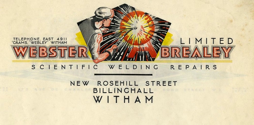
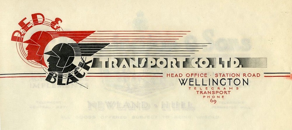
The design of blogs owes much to the letterhead (and, perhaps more obviously, to the newspaper masthead). Blog posts are, after all, public letters “to whom it may concern”. The first design I did for Gawker was quite letterheady and I loved & envied my pal Dean Allen’s letterhead-inspired design for Cardigan Industries.
Update: Loooots more great letterhead examples at Letterheady. (thx, jenni)
Gawker has rebranded their new commenting system…it’s now called Kinja. The name is recycled from a project that Nick Denton worked on with Meg Hourihan starting in 2003. Kinja 1 was an attempt to build a blog aggregator without relying solely on RSS, which was not then ubiquitous. Here’s a mockup of the site I did for them in late 2003:

Luckily they got some real designers to finish the job…here’s a version that 37signals did that was closer to how it looked at launch.
Where is the team that worked on that Kinja? Nick’s still hammering away at Gawker, Meg is raising two great children (a more difficult and rewarding task than building software), programmer Mark Wilkie is director of technology at Buzzfeed, programmer Matt Hamer still works for Gawker (I think?), intern Gina Trapani is running her own publishing/development empire & is cofounder of ThinkUp, and 37signals (they worked on the design of the site) is flying high.
With all the buzz around the new Gawker design, I figured I’d dig out the first design I ever showed Nick for the site back in October of 2002:
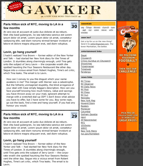
Nick didn’t like it too much. Background too dark, masthead text not logo-y enough. Two weeks later, I sent him this, with a half-assed technicolor logo that I’d dashed off in Photoshop in like 30 minutes:
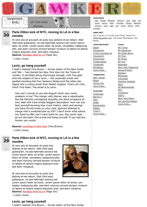
To my shock, he loved it — so much so that they’re still using the damn thing! — and that design was very close to how the site looked when it launched.
When I go back and read journalism from the ’70s and ’80s, I can see that there has been little, if any, innovation in the form since. But! While they may not be drastically “new,” there are at least two bits of excitement in internet journalism today that seem somewhat radical. First, Brian Lam at Gizmodo talks overtly about the twisted relationship between tech companies and journalists. (“As one reporter put it while chiding me, ‘Journalists are guests in the houses of these companies.’ Not first and foremost! We are the auditors of companies and their gadgets on behalf of the readers.”) And over on another Gawker Media blog (my former employer, and one that I have deeply conflicted feelings about), Jezebel’s Tracie Egan writes an astounding and reallly not for the faint-of-heart (or crotch) account of schtupping this guy she met in Vegas. It’s BANANAS. And probably NSFW. And a great read.
For a long time, I wanted to write a profile of the designer Tom Ford—and I realized the only way to do so properly would be to have sex with him and write about it. I sent an emissary to him; he declined the opportunity. I was relieved.
For his last Gawker post, Choire Sicha pens a recent history of New York City, 2000-2007.
Over the last month, I have read the Metro section from each issue of the New York Times — starting in mid-2000 and ending with today’s paper. Here’s what I learned.
Digg policies from Lifehacker and Gizmodo, which state that the only Digg-worthy posts of theirs are those with “original content, new reporting, treatment, or photos” because “it’s not fair when we get the Digg for someone else’s work.” This seems inconsistent on the part of Gawker Media. One of their main innovations (if you’d like to call it that) regarding the blog format was the idea of linking to things in such a way that readers don’t need to actually leave the site to get the full (or nearly full) story. Why let all those readers (and the associated ad revenue) go to some other site to read the story…they might never return. Due in part to Gawker’s influence as first mover in the pro blog space, this practice is unfortunately standard procedure for most similar blogs.
Regarding my earlier post on how Heather Champ’s jezebel.com came to be in Gakwer’s hands, she sold it to them directly: “When the good folks at Gawker contacted me a couple of months ago, I realized that she would find a good home amongst their properties.” (thx, meg)
Jezebel is a new Gawker Media blog about…well, that’s not important. Anyway, the site is hosted at jezebel.com, which was the former personal domain of Heather Champ and the original home of The Mirror Project (timeline). Heather put the domain up for sale in January 2004…I guess Nick bought it?
Update: Never fear, vintage Jezebel merchandise is still available.
David Remnick may be the current editor of the New Yorker, but it’s much-maligned former editor Tina Brown’s team that’s running the place. Love the comments at the end…the Gawker audience is almost shocked at something that’s actually researched, longer than three sentences, and doesn’t contain any overt drug references. Choire, you keep this up, I might have to start reading the site again.
Gawker has a list of blog-media cliches. I’m especially tired of “Best. Thing. Evar!” and “teh”. They also forgot “Internets” and “the Google”. Then again, I’m partial to “wait for it” so whatever.
This comment from Nick Denton (and much of the rest of the thread) demonstrates why Gawker is still worth reading on occasion. It’s disappointing Nick isn’t more involved in the day-to-day of the Gawker sites…his writing is always more entertaining than his blog empire.


Socials & More