kottke.org posts about typography
Join designer James Victore for an opinionated tour of the typography of Brooklyn and Queens.
We’re going to do a typographical tour of Brooklyn and Queens, We’re going to look at type on the street and signage on the street and try to figure out what the hell it’s for.
Favorite quote: [Pointing at a logo for a waxing salon] “There’s been a designer here. Which is not always a good thing.” (via gothamist)
While the story covers both sides of the dispute with detail and pathos, the most affecting bits treat how H & FJ worked together and the tiny details of the letters they made and loved:
At his computer, he drew an uppercase H, O, and D, because they contained flat and round elements that would determine how other letters looked. When he moved on to the G, the R, and the S, he started to deviate from the mathematical grid, hoping to give the font a subliminal playfulness. As he filled out the alphabet, the letters revealed a promising flexibility; if Frere-Jones set text in caps and spread the spacing out, the words felt authoritarian, imposing, and if he set them in lowercase and pulled the spacing in, they felt fresh and young. He tried to think of a name for the font that would showcase some of the more distinctive letters: the stark, powerful G; the circular o; the strange-tasting a. For a name, he thought about Goats, and Gomorrah. He finally settled on Gotham.
If the deep dive into the beauty and business of lettermaking doesn’t grab you, the essay’s packed with other-cultural analogies. My favorite is probably this: “According to a designer who used to work with Frere-Jones, his eye is so sharp that he can look at a printout of a letterform and tell if it’s one pixel off, the same way Ted Williams was said to be able to hold a baseball bat and tell if it was a half-ounce too heavy.”
Disclosure: Jason Fagone is my friend. Kottke.org uses Whitney Screensmart, a version of one of the fonts discussed in the article. Also one time Jonathan Hoefler got really mad at me because of a story I wrote about iPad magazines. The font people don’t play.
Update: If you want to know just how much the font people don’t play, I immediately was contacted by a friend to change “typographer” to “type designer.” I’ve spent years writing about this, and if I ever manage to get all of the terms right, the universe will collapse on itself.
For the first post on his new blog, Tobias Frere-Jones discovers that most of the type foundries in New York in the 1800s and 1900s were all located within a few blocks of each other in lower Manhattan. Why there? Newspapers and City Hall.
I was able to plot out the locations for every foundry that had been active in New York between 1828 (the earliest records I could find with addresses) to 1909 (see below). All of the buildings have been demolished, and in some cases the entire street has since been erased. But a startling picture still emerged: New York once had a neighborhood for typography.
Gruber beat me to the punch in noting that Frere-Jones’ site doesn’t use any of the fonts from the company he was recently ousted from but instead a pair of faces (Benton Modern and Interstate) he designed before he formed his partnership with Jonathan Hoefler. Before I discovered Whitney (another Frere-Jones creation), Interstate was my go-to font for graphics for the site. Big TFJ fan, is what I’m saying.
I don’t know exactly what my expectations were of how lettering is painted on city streets, but this was not it. The level of precision and artistry is surprising.
Reminds me of this video of a hand-lettering master at work.
Update: Sure, he’s using a vehicle, but this guy is pretty good at line painting as well.
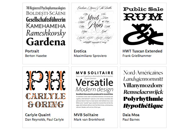
From Typographica, a list of their favorite typefaces from 2013. As you’ll see, good type design is happening all over the globe.
As evidence of that diversity, the 53 typefaces selected from 2013 were created by designers from at least 20 countries. […] This new phase of globalization and democratization of the font market began in earnest about a decade ago, propelled by newly accessible digital tools, online commerce, and post-graduate education in type design. It is a sea change. For centuries, places like Argentina, Brazil, Croatia, Lebanon, and New Zealand were vastly underrepresented in a type design community that was dominated by western Europe and North America. (And this only goes for Latin-based type. The burgeoning production of fonts in other scripts tells another fascinating story.) We will have much more detail about these changes in an upcoming report by Ruxandra Duru on the current state of typefounding around the world.
One that caught my eye is Clear Sans.
From a new blog, Typeset in the Future, an examination of the typography in Kubrick’s 2001: A Space Odyssey.
It’s Futura again, with an M borrowed from Gill Sans, and a W that I don’t recognize from anywhere.
Finally! A Japanese company called Type is selling eyeglasses that evoke the Helvetica and Garamond typefaces. It’s like webfonts for your face.
I joke, but those Helvetica Black Regulars look pretty nice. I wonder what some of the older Raygun-inspired GarageFonts typefaces would look like as glasses? (via the verge)
Oh, wow. Tobias Frere-Jones is suing his business partner Jonathan Hoefler over ownership of world-reknowned type foundry Hoefler & Frere-Jones.
Type designer Tobias Frere-Jones claims he has been cheated out of his half of the company by his business partner, Jonathan Hoefler. In a blistering lawsuit filed today in New York City, Frere-Jones says he was duped into transferring ownership of several fonts, including the world-famous Whitney, to Hoefler & Frere-Jones (HFJ) on the understanding that he would own 50% of the company.
“In the most profound treachery and sustained exploitation of friendship, trust and confidence, Hoefler accepted all of the benefits provided by Frere-Jones while repeatedly promising Frere-Jones that he would give him the agreed equity, only to refuse to do so when finally demanded,” the suit claims.
The full complaint is here. A descendant of Whitney (Whitney ScreenSmart) is what you’re reading right now and I was an early beta tester of H&FJ’s webfont service. This is gobsmacking news…I have no idea what to think about it. What a sad and strange situation. (via @khoi)
Update: H&FJ has released a statement from their general counsel:
Last week, designer Tobias Frere-Jones, a longtime employee of The Hoefler Type Foundry, Inc. (d/b/a “Hoefler & Frere-Jones”), decided to leave the company. With Tobias’s departure, the company founded by Jonathan Hoefler in 1989 will become known as Hoefler & Co.
Update: According to a document filed with the New York County Clerk, the matter between Hoefler and Frere-Jones “has been settled”. No other details are available at this time.
Your font: Helvetica. Your smell: Helvetica The Perfume.
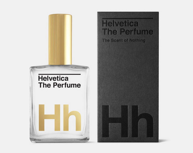
Helvetica has gone on to become arguably the most ubiquitous and widely used typeface in history.
It is in this spirit that we have created the ultimate Modernist perfume — a scent distilled down to only the purest and most essential elements to allow you, the content, to convey your message with the utmost clarity.
Air. Water. You.
2 oz. of distilled water. Precious bodily fluids, Mandrake.
Glen Weisgerber is a wizard at the art of hand-lettering. Make sure you watch all the way through for the big flourish-y finish.
(via colossal)
More than 80 photos of marvelous wood type alphabets in this Flickr set.
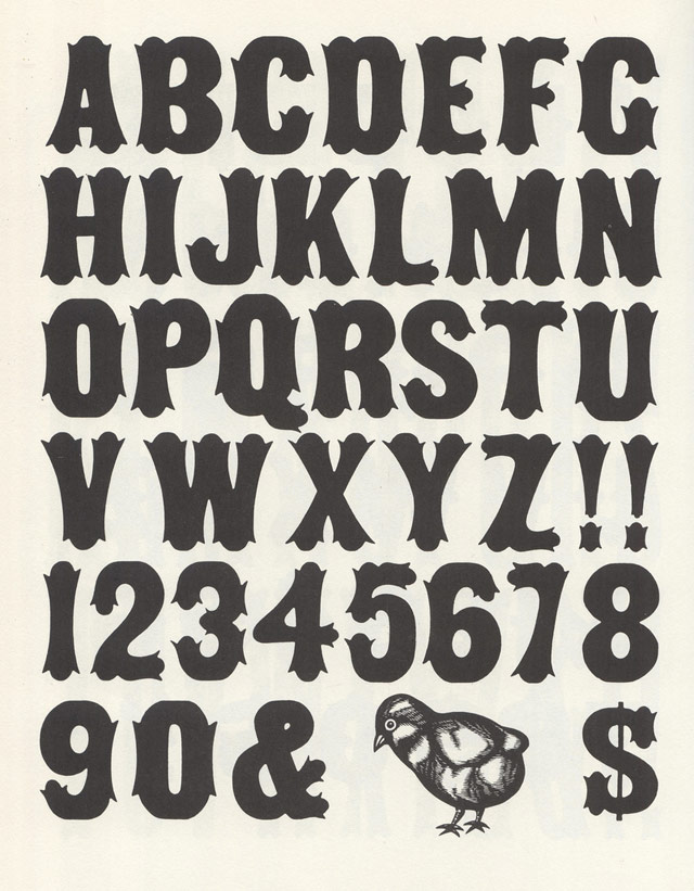
The scans are from Rob Roy Kelly’s 100 Wood Type Alphabets. (via @H_FJ)
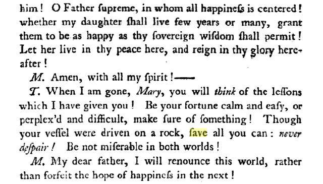
While researching the etymology of the word “fave”, a noun that’s in the process of being verbed,1 I noticed that, according to Google’s ngram viewer, the word was much more popular in the 1600-1700s than it is now.
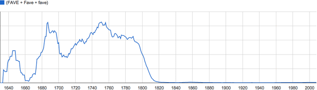
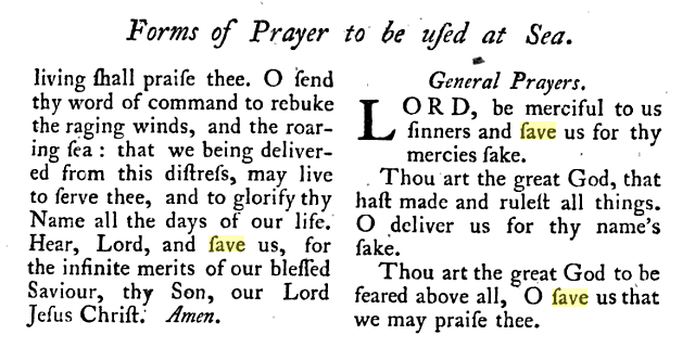
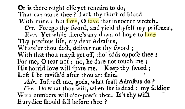
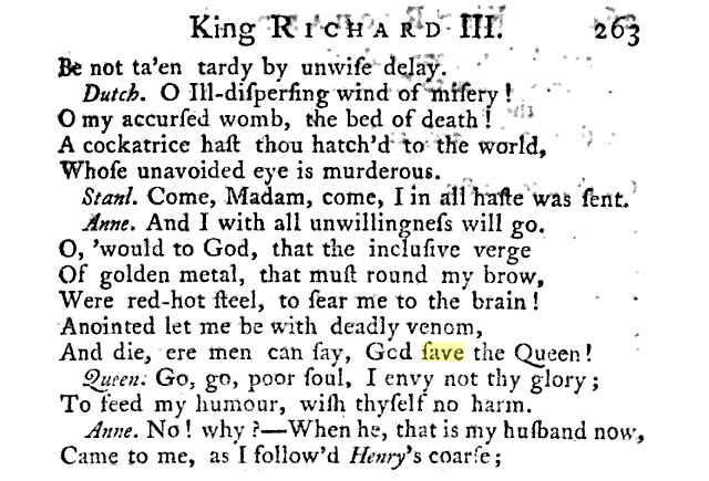
A bit of investigation reveals that Google’s book-scanning software is at fault; it can’t recognize the long s commonly used in books prior to the 1800s. So each time it encounters “save” with a long s, it sees “fave”:
The Art of the Title chats with the excellent Jessica Hische about the lettering and type design she did for Wes Anderson’s Moonrise Kingdom.
To me, that was really fun because if you think about New England in the ’60s… it’s not like most places would be staying on top of the most current trends in type, using typefaces that were released that very year. So, using something from the ’40s made sense to me. If you think about a small, conservative New England town, lord knows all the printers and designers in town are probably still using type from years ago. I think when people think about historical type references, they often don’t think about that. You should be reaching from that time period to 15 - 20 years earlier and then you’ll be getting stuff that’s quote-unquote “current.”
And she’s releasing the typeface commercially so everyone can use it! Yay!
Type Hunting. Prepare to lose yourself in this for awhile. Wow. (via df)
From the AIGA, a lovely short film on type designers Jonathan Hoefler and Tobias Frere-Jones. I love the bit about starting a typeface design with the O, H, and D. Elsewhere, Hoefler recommended other potential starting points:
Work out the B, the ampersand, and the bullet before you get too far: you’ll have to confront decisions about thinning strokes, intersections, and shapes without any counters, which might inform what you do on the other letters.
(via daring fireball)
Before personal brands were something to be seared into the minds of a rabid fanbase, brands were symbols that were literally burned into the flesh of livestock to keep track of ownership. The Texas and Southwestern Cattle Raisers Association has a guide to designing your own cattle brand.
Smithsonian Magazine’s Jimmy Stamp has more info on what cattle brands are all about. For more info on what personal brands are all about, spend more than 30 seconds on Twitter.
Stephen Coles of Typographica says that 2012 was “a strong year” for new typefaces. He asked dozens of designers and font makers to nominate their favorite 2012 typefaces and here’s what they had to say.
The independent foundry has also cemented its place as the new foundation of the industry. Most of this year’s selections are from very small shops, several of which are entirely new to the market. It’s also significant that, in addition to offering their fonts through retailers like FontShop, MyFonts, and the newly revived Fonts.com, most of these indie foundries now sell directly to customers through their own sites. In some cases they have eschewed outside distribution altogether. The “majors” have not simply laid down, however. Monotype, Linotype, Font Bureau, FontFont, and H&FJ are all represented in this year’s list, each with releases that are remarkably characteristic of their respective brands.
(via df)
Marco Arment has added a typeface optimized for dyslexics to Instapaper.
I’m happy to report that in this update, I added the Open-Dyslexic font by Abelardo Gonzalez. Its bottom-weighted characters are designed to reduce letter-swapping and increase differentiation between similar-looking letters, which improves readability for people with dyslexia. It’s now the bottom-most option in the font list in Instapaper’s text-controls (“aA”) panel.
Nicely done.
Flavorwire has a quick look at some noted directors (Kubrick, Wes Anderson, Fincher) and the typefaces that they often used. (via @curiousoctopus)
You may remember a short piece by Errol Morris in the Times a few weeks ago that was more of a quiz than a essay. Well, the quiz turned out to be a smokescreen for how people’s opinions change when the text is set in different typefaces.
Each Times participant read the passage in one of six randomly assigned fonts - Baskerville, Computer Modern, Georgia, Helvetica, Comic Sans and Trebuchet. The questions, ostensibly about optimism or pessimism, provided data about the influence of fonts on our beliefs.
The test consisted of comparing the responses and determining whether font choice influenced our perception of the truth of the passage.
The results pointed to a small but noticeable effect in the authority of each font.
DAVID DUNNING: Baskerville seems to be the king of fonts. What I did is I pushed and pulled at the data and threw nasty criteria at it. But it is clear in the data that Baskerville is different from the other fonts in terms of the response it is soliciting. Now, it may seem small but it is impressive.
ERROL MORRIS: I am completely surprised by this. If you asked me in advance, I would have guessed Georgia or Computer Modern, something that has the imprimatur of, I don’t know, truth - truthiness.
DAVID DUNNING: The word that comes to my mind is gravitas. There are some fonts that are informal - Comic Sans, obviously - and other fonts that are a little bit more tuxedo. It seems to me that Georgia is slightly tuxedo. Computer Modern is a little bit more tuxedo and Baskerville has just a tad more starchiness. I would have expected that if you are going to have a winner in Baskerville, you are also going to have a winner in Computer Modern. But we did not. And there can be a number of explanations for that. Maybe there is a slight difference in how they are rendered in PCs or laptops that causes the starch in Computer Modern to be a little softer than the starch in Baskerville.
ERROL MORRIS: Starchiness?
DAVID DUNNING: Fonts have different personalities. It seems to me that one thing you can say about Baskerville is that it feels more formal or looks more formal. So that may give it a push in terms of its level of authority. This is, of course, speculation. I don’t really know. What one would do with, when you get surprising results is you now have to think about, O.K., what do we do to take that back-ended speculation and support it with data?
Update: Pentagram’s Michael Bierut weighs in on Morris’ article.
Whether or not a typeface can do any or all of those things, I do agree the landscape has changed. Once upon a time, regular people didn’t even know the names of typefaces. Then, with the invention of the personal computer, people started learning. They had their opinions and they had their favorites. But until now, type was a still matter of taste. Going forward, if someone wants to tell the truth, he or she will know exactly what typeface to use. Of course, the truth is the truth no matter what typeface it’s in. How long before people realize that Baskerville is even more useful if you want to lie?
Lovely type and illustration on these architectural stationery vignettes collected by BibliOdyssey.
The images in this post all come from Columbia University’s very large assortment of commercial stationery (featuring architectural illustrations): the Biggert Collection.
The vast majority of the images below have been cropped, cleaned and variously doctored for display purposes, with an intent towards highlighting the range of letterform/font and design layouts. The underlying documents are invoices (most), letters, postcards, shipping records and related business and advertising letterhead ephemera from the mid-1800s to the 1930s.
See also the Sanborn fire insurance maps.
Typographica shares their favorite typefaces of 2011.
The idea is simple: I invite a group of writers, educators, type makers and type users to look back at 2011 and pick the release that excited them most.
(via ★essl)
Type designer Matthew Butterick sent a letter to director Brad Bird about the use of Verdana in captions and subtitles in the latest Mission Impossible movie.
Second, it’s not stylistically suitable. Verdana is a built-in font on nearly every Windows and Mac computer. It’s used on zillions of web pages. It’s ubiquitous. Therefore, the person who uses Verdana suggests to readers “I couldn’t be bothered to pick anything better.” It’s also well-known as the corporate font of IKEA — probably not the association you’re going for.
(via ★aaronsw)
The Internet Archive is hosting a copy of the American Specimen Book of Type Styles put out by the American Type Founders Company in 1912. It’s a 1300-page book listing hundreds of typefaces and their possible use cases.
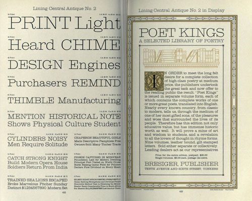
There’s also a 1910 copy of what is basically the German version of the ATF book. Look at these swirls! (via @h_fj)
Old-school font foundry Emigre is doing most (all?) of their typefaces as web fonts. I’m going to redo my goth blog in Exocet.
An excellent 26-minute talk by Jonathan Hoefler of the Hoefler & Frere-Jones about how they think about designing typefaces and webfonts in particular.
Today, as webfonts are buoyed by a wave of early-adopter enthusiasm, they’re marred by a similar unevenness in quality, and it’s not just a matter of browsers and rasterizers, or the eternal shortage of good fonts and preponderance of bad ones. There are compelling questions about what it means to be fitted to the technology, how foundries can offer designers an expressive medium (and readers a rich one), and what it means for typography to be visually, mechanically, and culturally appropriate to the web. This is an exploration of this side of web fonts, and a discussion of where the needs of designers meet the needs of readers.
I love Typekit, but I am very much looking forward to switching Stellar over to Whitney or somesuch when H&FJ’s webfonts are released (if the price and performance are right).
Remember the kerning game? The same folks have built a letter shaping game where you can play at being a type designer. I found this to be a bit more difficult than kerning.
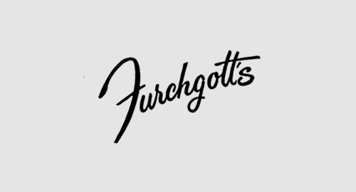
A lovely collection of hand-lettered American department store logos from the late 19th and early 20th century.
You’re given a name and you have to guess if it’s a cheese or a font. This might be the most difficult game I’ve ever played. (thx, @ziggy444)
Newer posts
Older posts
Socials & More