kottke.org posts about remix
In 2012, actor and budding film editor Topher Grace took all three Star Wars prequels and condensed them into an 85-minute movie called Star Wars: Episode III.5: The Editor Strikes Back.
Earlier today, Grace and trailer editor Jeff Yorkes uploaded a trailer they created for all 10 movies in the Star Wars franchise: the originals, the prequels, the two new ones, and the Star Wars Stories (Solo and Rogue One). As a trailer, it leaves a lot out, but the pair still make a few connections explicit that the casual fan may have overlooked in the midst of all the light saber & fighter duels.
A site called The Colors of Motion makes single image timelines of the use of colors in movies. They sample frames at regular intervals, choose the average color of each frame, and stack them up. Here’s their representation of Blade Runner 2049:

If you click through on specific films, you can see the actual screencaps used for sampling and buy prints.
The Moviebarcode Tumblr pre-dates The Colors of Motion, although they appear to use a slightly different technique: each scene is smooshed into a single vertical line. Here’s Mad Max: Fury Road:
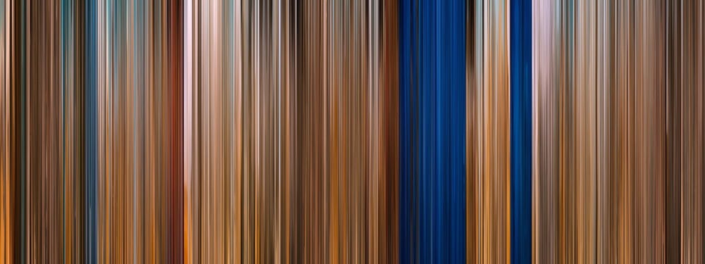
Prints are available from Moviebarcode as well.
See also Brendan Dawes’ Cinema Redux and Wes Anderson Palettes.
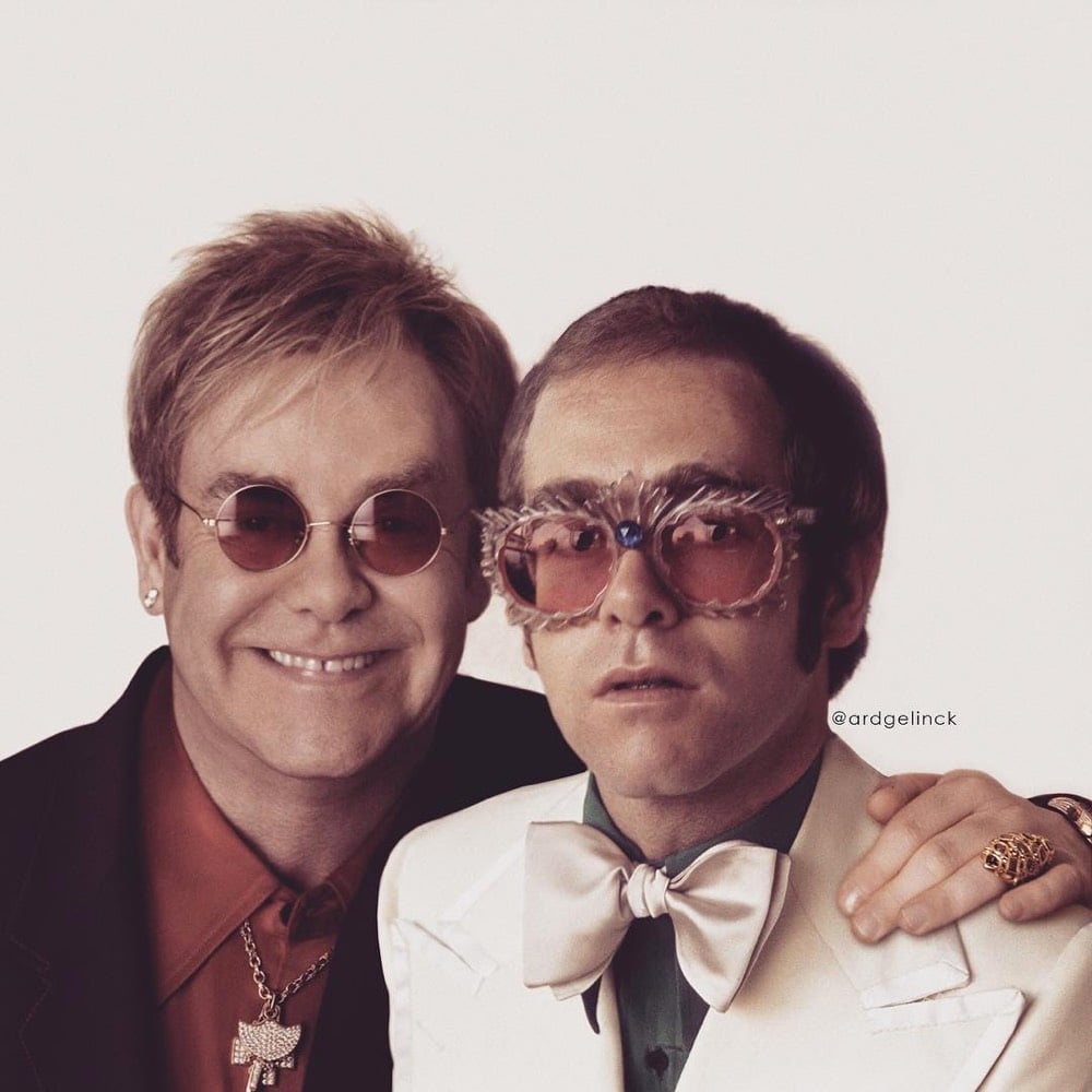
Ard Gelinck photoshops celebrities posing with their younger selves and posts the results on Instagram.



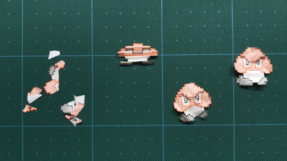
I love the aesthetic of Paper Mario Bros, a hand-drawn stop motion animation of World 1-1 of Super Mario Bros. The artist, @KisaragiHutae6, drew the world in their notebook and shared some behind-the-scenes techniques on Twitter…how they crumpled the paper for stomped-on Goombas, etc.
(via digg)
Cignature Films is showing the first episode of Mad Men in its entirety but with all of the cigarettes replaced with kazoos. Here’s a short clip (watch the whole thing here):
Though smoking in movies was a staple element of old Hollywood, the Center for Disease Control and Prevention found that tobacco has had a resurgence in recent years on the big screen. It has been reported that 44% of adolescents who start smoking do so because of smoking images they have seen in the movies. Cignature Films wants to change this statistic for the better.
They also have plans to do the same with Fight Club, The Godfather, and Stranger Things. I’m wondering how long this is gonna stay up though…a clip or two is perhaps covered under fair use but I can’t see studios allowing entire movies and episodes to be shown without some kind of legal action. (via rob walker)
For this video, freelance animator Nick Murray Willis took the audio from football commentators and made these little animated vignettes to go along with each line. Here’s a sample:
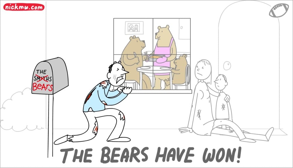
My only complaint about this video is that it was over too quickly. Luckily Willis has done the same thing in videos for NBA, soccer, movie lines, etc.
For more than a year now, Jon Lefkovitz has been making short videos of iconic scenes from films backed by the same musical score, a short clip of “Canis Lupus” from Alexandre Desplat’s Fantastic Mr. Fox score. Here’s Groundhog Day, 2001: A Space Odyssey, Jurassic Park (featuring a great example of the Spielberg Face), and the beautiful 2-minute shot from Big Night:
Each clip is between 30 seconds and 2 minutes 30 seconds long. Here’s the whole playlist.

What would the Grand Canyon look like as a Grand Mountain, i.e. if its depth became its height? Not quite as Grand perhaps, but still pretty cool.
Some of my earliest memories of the place had to do with the trippy feeling of my eyes and mind trying to make sense of the scale. I had seen many mountain ranges and vistas, including some on the way, but the vast negative space played havoc with my perception of magnitude. I’ve felt it a few times since, but never like that first Grand Canyon overlook.
I wondered, then, if flipping the Grand Canyon into a Grand Mountain might in some way help me make sense of its scale. I’m much more accustomed to seeing the mass of something rather than the massive void of something. So, here’s what that looks like.
For reference, the depth at the deepest part of the canyon is ~6000 feet and the top of the canyon is between 6000 and 8000 feet above sea level, so the highest point of the Grand Mountains would be somewhere between 12,000 and 14,000 feet, in the ballpark of the Rocky Mountains. It would be fun to see what an inverted Kola Superdeep Borehole would look like: a 9-inch spire rising 40,000 feet into the air from a starting point very close to sea level, more that 10,000 feet higher than Everest.
If you want to dig into the details of how this visualization was made, check out this post on the ArcGIS blog. (thx, john)
The tradition of fans recutting trailers and clips of movies and TV shows into different genres — like Toy Story as a horror film and The Shining as a romantic comedy — has been around almost as long as YouTube itself. But I think this trailer by 20th Century Fox is the first official effort I’ve seen. Die Hard has become an unlikely holiday favorite so I guess they figured, hey, let’s put out a trailer that explicitly recasts the it as a Christmas film. Merry Christmas Hans!
Sleepy Skunk took audio and footage from dozens of trailers of movies that came out in 2018 and mashed them together into one mega movie trailer. And it’s actually coherent! Or at least as coherent as trailers for blockbuster movies typically are. I dunno, I’d watch this movie.
From Neil Cicierega, who you may remember from this hilarious recap of J.R.P.G. Torkelson’s Lorne of the Rings trilogy, comes this short guide to the film career of Tom Hanks, including his best-known works like Tuber & Hoonis, Sadness in the Saddle, and You’ll Get Soil. I woke up feeling a little blah this morning, but this cheered me right the hell up.
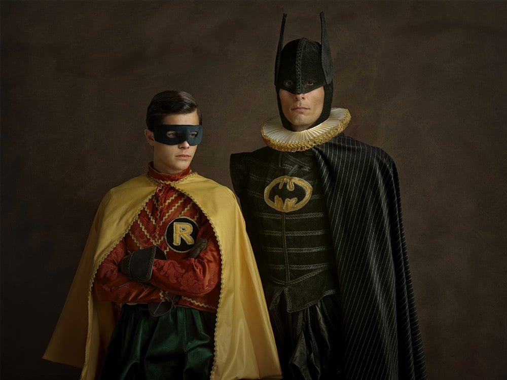
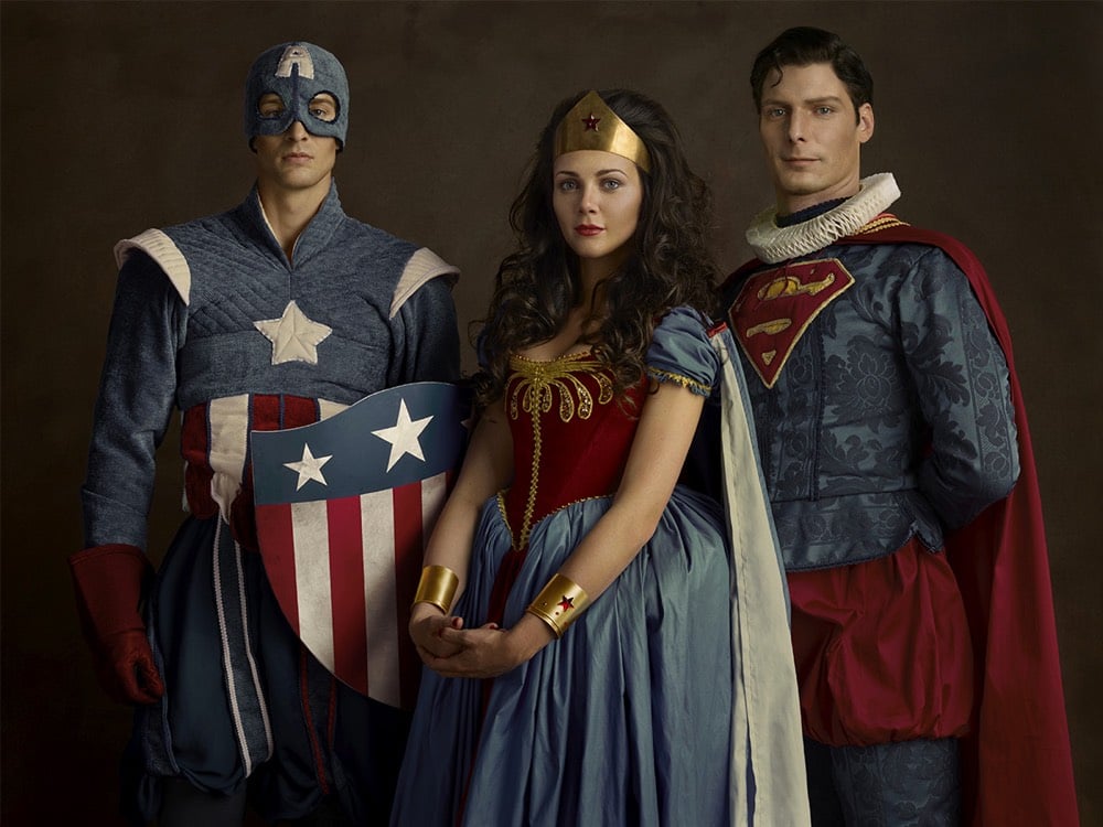
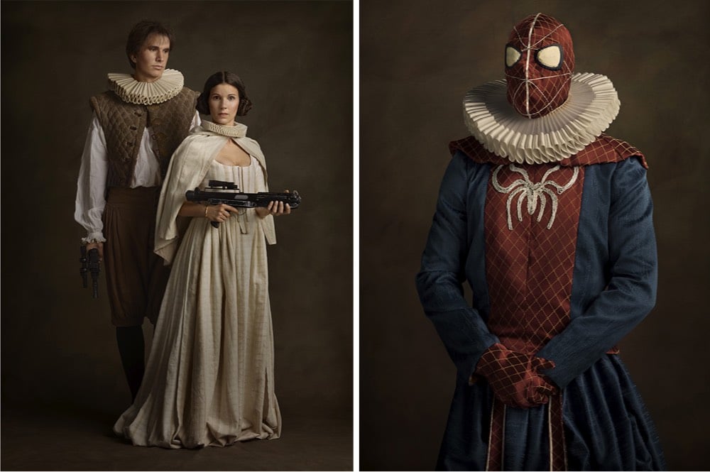
Sacha Goldberger made a series of portraits of characters from Star Wars and superhero comics as if they were the subjects of 16th-century Flemish paintings, ruffs and all. (thx, anna)
Using 3D rendering software, Yeti Dynamics made this video that shows what our sky would look like if several of our solar system’s planets orbited the Earth in place of the Moon. If you look closely when Saturn and Jupiter are in the sky, you can see their moons as well.
the moon that flies in front of Saturn is Tethys. It is Tiny. but *very* close. Dione would be on a collision course, it’s orbital distance from Saturn is Nearly identical to our Moon’s orbit around Earth
See also their video of what the Moon would look like if it orbited the Earth at the same distance as the International Space Station.
Update: And here’s what it would look like if the Earth had Saturn’s rings. (via @FormingWorship)
Taking advantage of the fact that puzzle manufacturers typically use the same cut patterns to make many different puzzles, Tim Klein uses the interchangeable pieces to create surrealist mashups of puzzles.



Artist Alma Haser used this technique for her Within 15 Minutes project in which she melded identically cut puzzles of portraits of identical twins.

(via @john_overholt)



I seemingly cannot get enough of contemporizing old paintings and works of art. Here, from Rodrigo Pinheiro, are some familiar young people hanging out with modern beverages.
See also Girl with a Pearl Earring and Point-and-Shoot Camera and Art History Comes to Life.
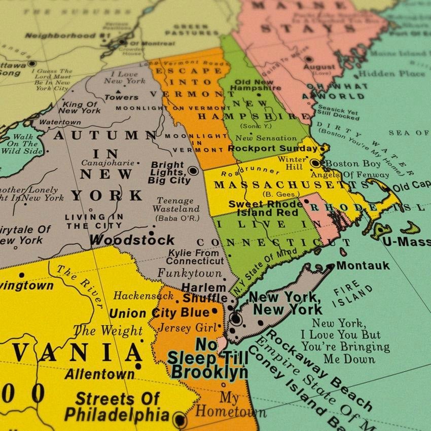
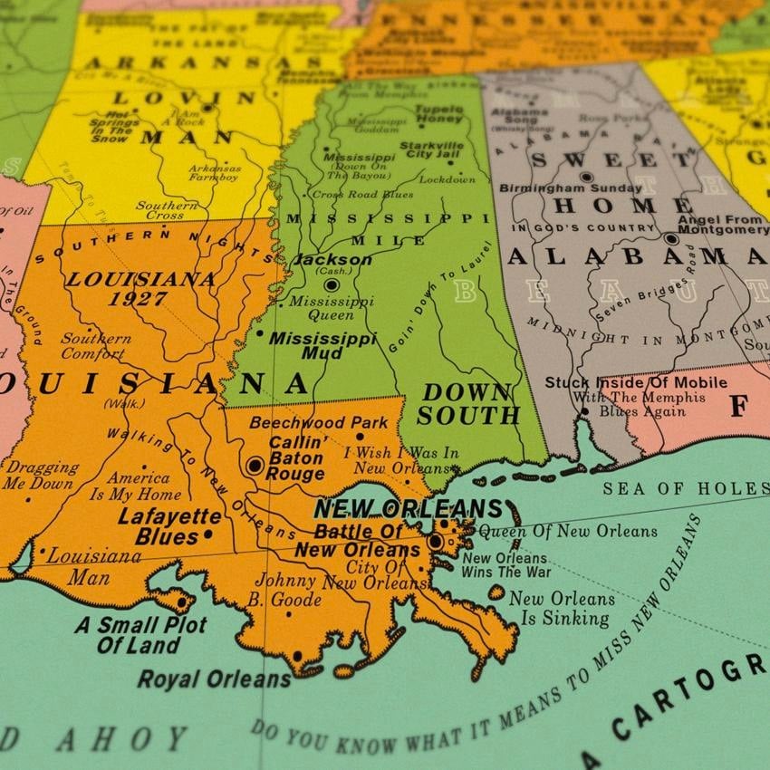
Design studio Dorothy has produced a poster of a map of the United States where all the place names are song titles.
Some of our favourite song choices are the ones which require you to think a little harder about connections, such as Space Oddity (David Bowie) which signposts Cape Canaveral, After the Gold Rush (Neil Young) which references Sutter’s Mill, and Homecoming (Kanye West) which is placed near the rapper’s home town of Chicago.
The map is accompanied by a Spotify playlist of most of the songs used…over 61 hours of music in total.
Koyaanisqatsi is a 1982 experimental film by Godfrey Reggio with a soundtrack from Philip Glass. The movie has no dialogue or narrative and mainly features slow motion and time lapse footage of nature, technology, and cities.
Rico Monkeon has built a tool called Gifaanisqatsi that constructs the trailer for Koyaanisqatsi using a random assortment of slow motion and time lapse animated GIFs from Giphy. The trailer you get is different each time. You can compare it to the actual trailer.
I wondered how easy it would be to make an internet version using random Giphy ‘gifs’ which have been tagged as slow motion or time-lapse, playing them along with the Philip Glass soundtrack.
I *love* this and have watched at least 5 or 6 different trailers now…the slow motion cats and dogs are best. I recorded one of the trailers it generated for me:
I miiiiight just want to watch a feature-length version of this accompanied by the full soundtrack.
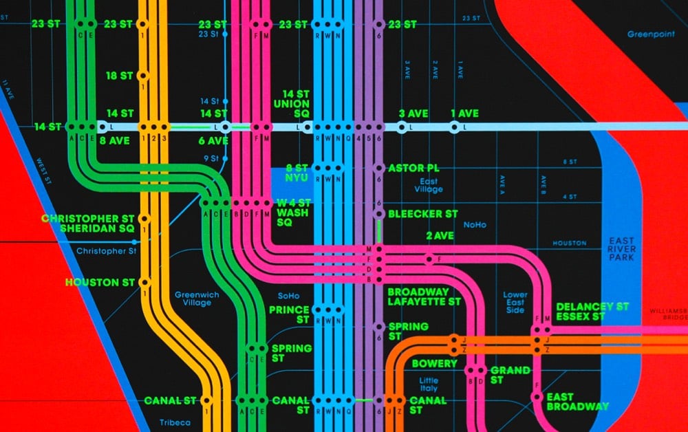
From the orange 123 line to the green ACE to the purple 456, the color designations on the NYC subway lines on the Wrong Color Subway Map will mess with your head. Get the print here. From the folks who brought us the One-Color Subway Map. (via @khoi)
Even though you knew going into Jurassic Park that they had somehow brought dinosaurs back to life, you don’t actually see any of the prehistoric creatures until the “Welcome to Jurassic Park” reveal more than 20 minutes into the film. The scene features a Brachiosaurus eating from a tall tree and many dinosaurs flocked around a watering hole. William Hirsch edited that scene, digitally removing the dinosaurs so that Dr. Sattler, Dr. Malcolm, and the others are gawking in wonder at empty forests and a lonely lake.
Trees and lakes are pretty amazing though…we just don’t notice that often. I imagine if you took someone who grew up in the Arctic or in a desert without access to any media or photography and plopped them without explanation on a tropical island, they would flip out.
See also Jurassic Park but with the dinosaurs from the 90s TV show Dinosaurs. (via open culture)
Illustrator Tom Stults imagines what the posters of popular movies would look like in an alternate universe…if they’d been made earlier or later or in a different setting. He’s done dozens of these…the latest “What If…” set is here with links you can follow to his past sets. I could caption these but they’re pretty self-explanatory.
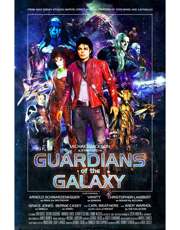
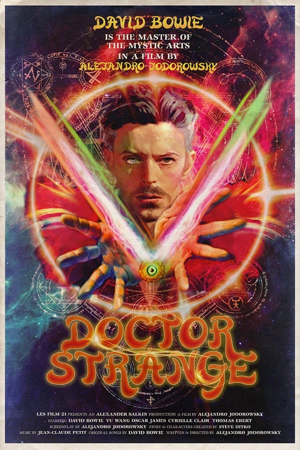
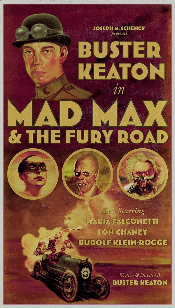
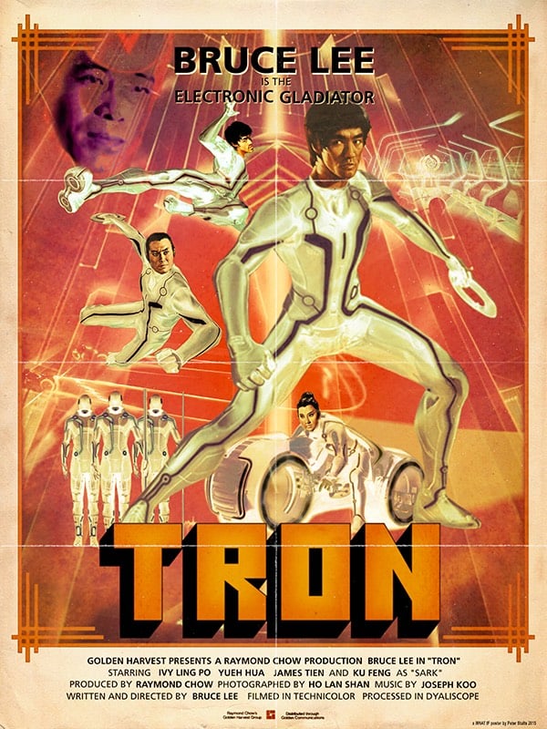
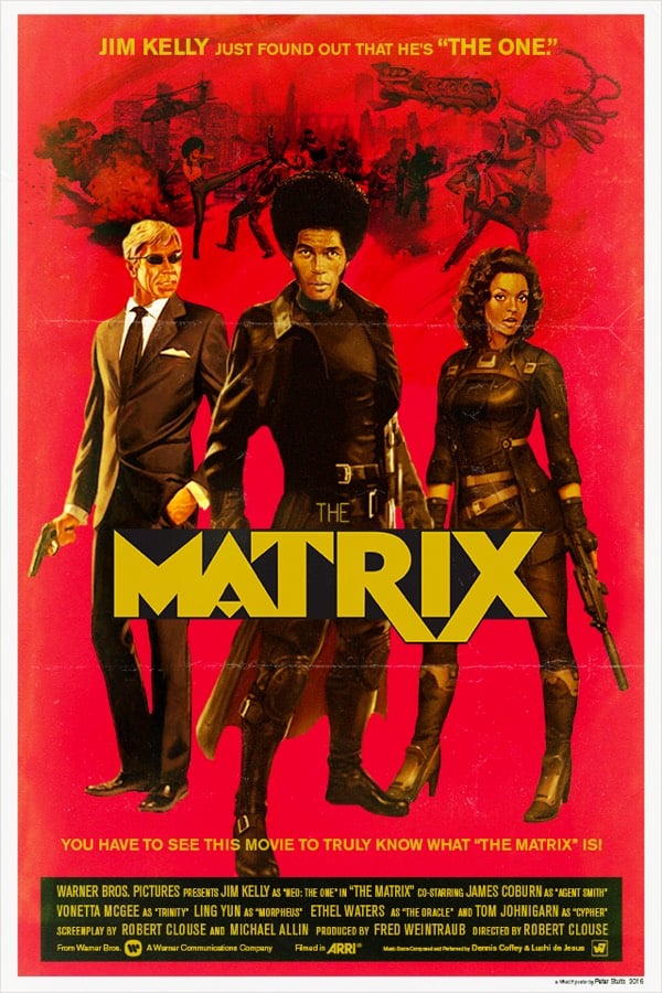
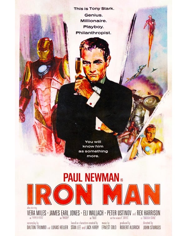
Some of these are ridiculously spot-on, revealing Hollywood’s casting tropes and near-impressions some actors make of older actors’ careers (intentional or not). And that Mad Max / Buster Keaton thing works really really well actually.
I featured Stults’ first series of these several years ago…I’m glad he’s continued making them.

In Incomplete Open Cubes Revisited, Rob Weychert extends a 1974 project by Sol LeWitt called Variations on Incomplete Open Cubes that displayed 122 different ways that cubes with one or more edges missing could be depicted. Weychert’s project expands the number of incomplete cube possibilities to 4,094 by challenging LeWitt on three aspects of the original: dimensionality, contiguity, and rotation. See the about page for the explanation.
All of LeWitt’s cubes are contiguous; each part is connected to at least one other part. Since the cubes were intended to be physically fabricated, this appears to be a logistical concern: In the physical world, a detached part floating in space would be impossible. (It’s not clear, however, why detached, grounded parts were not permitted.)
Here’s how Weychert did it, complete with downloadable source code.
Dmitry Grozov is a Russian comic artist who has made a trailer for an anime version of Star Wars: A New Hope. This treatment of Star Wars is fitting given the Asian, and particularly Japanese, influence on the film.
I would watch the hell out of a full-length version of this.


I love these fun visual mashups created by French creative agency Les Créatonautes. (via colossal)
Frustrated that the US Treasury Department is walking back plans to replace Andrew Jackson on the front of the $20 bill with Harriet Tubman, Dano Wall created a 3D-printed stamp that can be used to transform Jacksons into Tubmans on the twenties in your pocketbook.
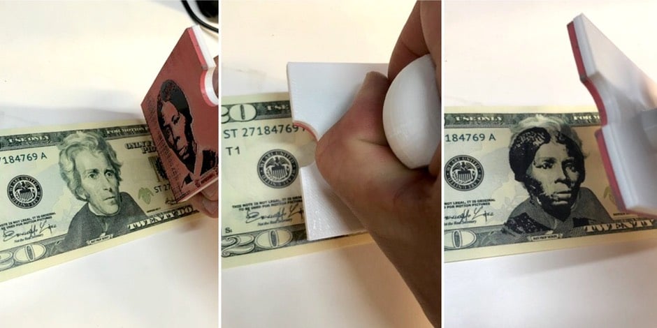
Here’s a video of the stamp in action. Wall told The Awesome Foundation a little bit about the genesis of the project:
I was inspired by the news that Harriet Tubman would replace Andrew Jackson on the $20 bill, and subsequently saddened by the news that the Trump administration was walking back that plan. So I created a stamp to convert Jacksons into Tubmans myself. I have been stamping $20 bills and entering them into circulation for the last year, and gifting stamps to friends to do the same.
If you have access to a 3D printer (perhaps at your local library or you can also use a online 3D printing service), you can download the print files at Thingiverse and make your own stamp for use at home.
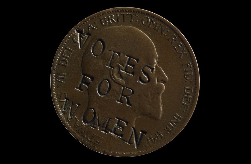
Wall also posted a link to some neat prior art: suffragettes in Britain modifying coins with a “VOTES FOR WOMEN” slogan in the early 20th century.
Update: Several men on Twitter are helpfully pointing out that, in their inexpert legal opinion, defacing bills in this way is illegal. Here’s what the law says (emphasis mine):
Defacement of currency is a violation of Title 18, Section 333 of the United States Code. Under this provision, currency defacement is generally defined as follows: Whoever mutilates, cuts, disfigures, perforates, unites or cements together, or does any other thing to any bank bill, draft, note, or other evidence of debt issued by any national banking association, Federal Reserve Bank, or Federal Reserve System, with intent to render such item(s) unfit to be reissued, shall be fined under this title or imprisoned not more than six months, or both.
The “with intent” bit is important, I think. The FAQ for a similar project has a good summary of the issues involved.
But we are putting political messages on the bills, not commercial advertisements. Because we all want these bills to stay in circulation and we’re stamping to send a message about an issue that’s important to us, it’s legal!
I’m not a lawyer, but as long as your intent isn’t to render these bills “unfit to be reissued”, you’re in the clear. Besides, if civil disobedience doesn’t stray into the gray areas of the law, is it really disobedience? (via @patrick_reames)
Update: Adafruit did an extensive investigation into the legality of this project. Their conclusion? “The production of the instructional video and the stamping of currency are both well within the law.”
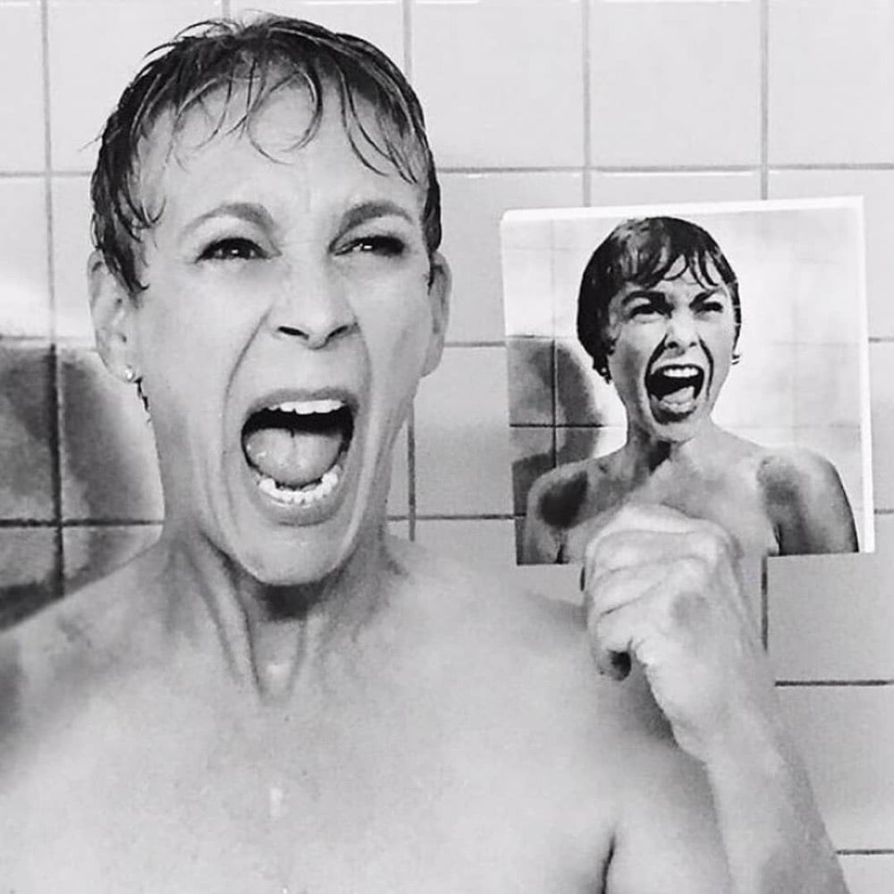
For an episode of a TV show called Scream Queens, Jamie Lee Curtis recreated the shower scene from Psycho performed by her mother, Janet Leigh, with a shot-for-shot homage. Even though they had limited time to shoot, Curtis and the crew took the recreation very seriously.
Falchuk began contemplating having Munsch in the shower as an homage to Curtis’ mother. “I thought, ‘Can I do this? Do I need to ask her?’ I didn’t want to offend her but at the same time this would be so awesome,” remembers Falchuk. “So then I wrote it and then got a text from her very quickly after she read the script. Her text was, ‘We need to do this shot-for-shot.’ Then, typical Jamie Lee, she started sending me all the websites and Tumblrs that have each shot laid out and storyboarded.”
What a photo! Curtis’ scene is not quite shot-for-shot, but you can see a screencapped video of it on YouTube and compare to the original.
Since 2011, brothers Morgan and Mason McGrew have been working on a shot-by-shot recreation of Toy Story 3. They’ve built sets, borrowed garbage trucks for scenes, and spent hundreds and hundreds of hours shooting stop motion animation of their army of Toy Story dolls & action figures. They’ve made enough progress on the film to release a trailer and it looks great!
For way too many years now, my brother and I (with the support of our awesome family and friends) have been working on a shot-for-shot recreation of Toy Story 3. This project has been an incredible undertaking, and we’ve made the decision to have this complete by 2019. At this time, I’m not quite sure what a release will look like, but I do know that this has to be done by next year. We’re both pursuing college and full-time careers right now, and it’s time to wrap this side-project up.
It looks like the brothers were around 11 and 14 when they began filming. You can check out the project’s Facebook page for information and updates.
See also Raiders of the Lost Ark: The Adaptation.
In 2014, Ruben Bolling created an updated version of Richard Scarry’s Busytown (as seen in What Do People Do All Day? and Busy, Busy Town) populated with workers with job descriptions like climate change denier, content aggregator, and rage pundit. At Topic, Bolling has updated the activities of Busytown residents for 2018.
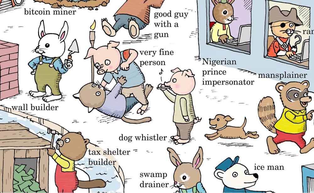
Busytown 2018 residents include gig economy worker, fake news troll, good guy with a gun, and swamp drainer. Still no Goldbug though…I thought he showed up just about everywhere? (via david jacobs)
This is a pitch-perfect mashup by Funny Or Die of Amazon’s new series Tom Clancy’s Jack Ryan (starring John Krasinski) and The Office (also starring John Krasinski).
P.S. I know Funny Or Die called this “Tom Clancy’s Jim Ryan”, but they should have called it “Tom Clancy’s Jim Halpert”. Hardass name + goofy creampuff name = Comedy 101, folks. (via anil dash)


Festivals dedicated to the celebration and modification of Vespa scooters are held in various places around Indonesia. Photographer Darren Whiteside traveled to these festivals to capture the “extreme Vespa” scene going on there. I love the creativity and ingenuity on display here. For more, here’s a video tour of the 2018 festival in Kediri.
(via robin sloan)
Over the past few months, a team at Lego has been building a full-scale model of a Bugatti Chiron supercar using only Lego Technics pieces — aside from the wheels, tires, and a few other key components. They got the look of the car down, but the truly impressive thing is that the car actually drives, powered by an electric engine made up of over 2300 Power Function motors. The Lego press release has the details.

The model is the first large scale movable construction developed using over 1,000,000 LEGO Technic elements and powered exclusively using motors from the LEGO Power Function platform. Packed with 2,304 motors and 4,032 LEGO Technic gear wheels, the engine of this 1.5 tonnes car is generating 5.3 horse power and an estimated torque of 92 Nm.
The doors open and close, the spoiler moves up and down, the headlights work, and the all-Lego speedometer works — what a goofy and amazing accomplishment. cc: my Lego- and supercar-loving son
Newer posts
Older posts


Socials & More