Advertise here with Carbon Ads

This site is made possible by member support. ๐Ÿ’ž

Big thanks to Arcustech for hosting the site and offering amazing tech support.

When you buy through links on kottke.org, I may earn an affiliate commission. Thanks for supporting the site!

kottke.org. home of fine hypertext products since 1998.

Beloved by 86.47% of the web.

๐Ÿ”  ๐Ÿ’€  ๐Ÿ“ธ  ๐Ÿ˜ญ  ๐Ÿ•ณ๏ธ  ๐Ÿค   ๐ŸŽฌ  ๐Ÿฅ”

kottke.org posts about infoviz

Cartographies of Time

The NY Times’ Paper Cuts blog calls Cartographies of Time “the most beautiful book of the year”. I cannot disagree. In attempting to answer the question “how do you draw time?”, the authors present page after page of beautiful and clever visual timelines.

Cartographies of Time is the first comprehensive history of graphic representations of time in Europe and the United States from 1450 to the present. Authors Daniel Rosenberg and Anthony Grafton have crafted a lively history featuring fanciful characters and unexpected twists and turns. From medieval manuscripts to websites, Cartographies of Time features a wide variety of timelines that in their own unique ways-curving, crossing, branching-defy conventional thinking about the form. A fifty-four-foot-long timeline from 1753 is mounted on a scroll and encased in a protective box. Another timeline uses the different parts of the human body to show the genealogies of Jesus Christ and the rulers of Saxony. Ladders created by missionaries in eighteenth-century Oregon illustrate Bible stories in a vertical format to convert Native Americans. Also included is the April 1912 Marconi North Atlantic Communication chart, which tracked ships, including the Titanic, at points in time rather than by their geographic location, alongside little-known works by famous figures, including a historical chronology by the mapmaker Gerardus Mercator and a chronological board game patented by Mark Twain. Presented in a lavishly illustrated edition, Cartographies of Time is a revelation to anyone interested in the role visual forms have played in our evolving conception of history.

The book is also available at Amazon.


On infographics

Phil Gyford’s spot-on critique of the number and quality of infographics currently choking the web. As Phil notes, far too many infographics decorate and don’t communicate.


NYC taxi flow infoviz

Nice timelapse map view of taxi traffic across Manhattan.

Taxi flow NYC

I’ve often wondered what an NYC version of Stamen’s Cabspotting project would look like.


This American Infographic

The goal of This American Infographic is to make a companion infographic for every episode of This American Life.

This American Infographic


How people use Firefox

From a study on how people use Firefox, a heat map that highlights the most- and least-popular menu items. Bookmarks got the most use by far, followed by copy and paste. Copy was used about twice as much as paste, which suggests that about 50% of the time, people are copying things to be pasted into another program. Oh and not a single person used “Redo”. (via ben fry)


Mountain ranges as stock market infographics

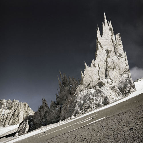
Photographer Michael Najjar took some of his photos from the Andes and turned them into stock market infographics. Here’s Lehman Brothers stock price from 1980 to 2008.

Lehman Mountain

Boy, their stock price really fell off a cliff there, didn’t it? The rest of the series is worth a look as well, although Najjar’s site features the worst use of Flash I’ve seen in many months…it automatically fullscreens and generally wastes a bunch of time with transitions. To find the rest of the photos, wait until the map starts loading and put your mouse at the bottom of the screen. A menu will s.l.o.w.l.y. slide up…High Altitude is what you’re looking for. (via info aesthetics)


Flickr seasons

This visualization represents a year in color (summer is at the top, winter at the bottom).

Flickr seasons

The images were taken of the Boston Common, courtesy of Flickr.


Famous movie quotes, graphed

Information visualization of some well-known movie quotes. A picture is, how you say, worth a thousand words:

Movie quotes graphed


How genetics works

Genetic Shirts

As information visualizations go, you can’t get much better than this.


The bottomless ocean

A representation of how deep the Mariana Trench is. Turns out it’s really, really, really, really, really, really, really, really, really, really, really, really, really deep. (via df)


Twitter code visualization

Watch Twitter’s engineering team and code base grow as the site gets more and more popular. It gets nuts at the end.

(thx, chris)


Timeline paintings

Ward Shelley paints these wonderfully intricate timelines of different things…his life, Frank Zappa’s career, and the history of the avant garde.

Ward Shelley


Found functions

Photographs of curves found in nature and the graphs and functions that go with them.

Found Functions

(via snarkmarket)


Measuring type

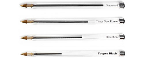
Clever idea: you can measure the amount of ink required to print different typefaces simply by writing them out with ballpoint pens. The pens themselves become the usage graph:

Ink pen graph

Update: You can also use this technique to represent which colors you draw with most often.


Beatles infographics

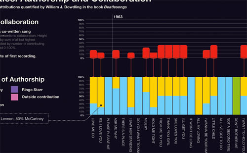
The most interesting of several infographics related to The Beatles is the first one depicting the declining rate of collaboration within the band gleaned from songwriting credit data.

Beatles Collab Infoviz

(thx, bryan)


Victorian infographics

This one is my favorite of the bunch.


Cost of healthcare

This clever graph by National Geographic shows the cost of healthcare compared to life expectancy in a number of countries. The way that the US healthcare expenditure is pictured entirely outside the confines of the graph’s scale and legend is a particularly effective design decision. (thx, jim)


The gravity of the solar system

Today on xkcd, an illustration showing the gravity wells of our solar system’s planets and some of their moons.

Gravity wells

Two of Mars’ tiny moons barely have any gravity at all:

You could escape Deimos with a bike and a ramp. A thrown baseball could escape Phobos.

That’s great, but you forgot Pluto!


Lovely chocolate

Mary And Matt

One of many from Mary and Matt. It’s a stacked bar chart *and* candy. (via youngna)


Big cities, little states

New-ish thing from fake is the new real: outlines of the 100 most populous areas in the US. Some are cities and some are states.

The fifty largest metro areas (in blue), disaggregated from their states (in orange). Each has been scaled and sorted according to population.

By themselves, the New York, Los Angeles, and Chicago metros are the three most populous areas in the US. (via snarkmarket)


The fall of empires

A visualization of the decline of the world’s four maritime empires (British, Portuguese, French, Spanish) from 1800 to 2009.

France pretty much just explodes around 1960.


There and back again

A wonderful character interaction map of the Lord of the Rings trilogy drawn by Randall Munroe. Here’s just a little part of it:

xkcd LOTR


Human space exploration map

Beautiful map by National Geographic of human exploration of the solar system.

Human exploration of the solar system

See also Race to the Moon at HistoryShots and Bryan Christie’s Mission(s) to Mars. (thx, byrne)


A three-year-old’s view of the NYC subway

Simple NYC subway map

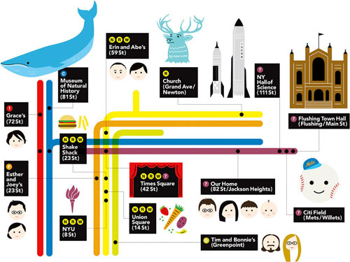
This was my present to my nephew for his 3rd birthday. He loves, loves, loves the subway so my sister asked me if I could make a custom map with all the places that mean something to him on the poster.

Best viewed a bit large.

Update: There’s been a bit of confusion…this is not something that I made. I don’t even have a nephew.

Update: The subway map was made by Erin Jang.


Photographer’s venn

A diagram that shows the overlap of street photography, fine art photography, and photojournalism.


Venn diagram of mythical creatures

Mythical Venn

My favorite is dog + dog + dog = Cerberus. (thx, ben)


How people spend their time

Great interactive graphic from the Times depicting how people spend their time.


How to get The Sartorialist to shoot you

A handy flowchart: how to get your photo taken by The Sartorialist. If you’re a man and you have pants: “cuff ‘em, roll ‘em, make ‘em too short”.


Salary vs performance in baseball

Ben Fry just updated his interactive salary vs performance graph that compares the payrolls of major league teams to their records. Look at those overachieving Rays and Marlins! And those underachieving Indians, Mets, and Cubs!


Flip Flop Fly Ball

Flip Flop Fly Ball is a marriage of baseball fandom and an enthusiasm for infographics. While not strictly baseball, this comparison of the sizes and shapes of sports balls is a favorite.