This shows mostly Spanish, Dutch, and English routes — they are surprisingly constant over the period (although some empires drop in and out of the record), but the individual voyages are fun. And there are some macro patterns — the move of British trade towards India, the effect of the American Revolution and the Napoleonic Wars, and so on.
There are times in the video when a single nation dominates all of the shipping traffic…the British in the early 1800s and the Dutch from the mid 1830s on.
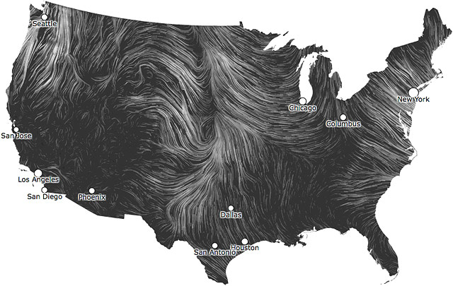
A pair of recent info visualizations look as though they were painted by Vincent van Gogh. Wind Map shows the realtime flow of wind over the United States.
Perpetual Ocean is a NASA animation of ocean currents around the world.
I want to share with you something I’ve learned. I’ll draw it on the blackboard behind me so you can follow more easily [draws a vertical line on the blackboard]. This is the G-I axis: good fortune-ill fortune. Death and terrible poverty, sickness down here-great prosperity, wonderful health up there. Your average state of affairs here in the middle [points to bottom, top, and middle of line respectively].
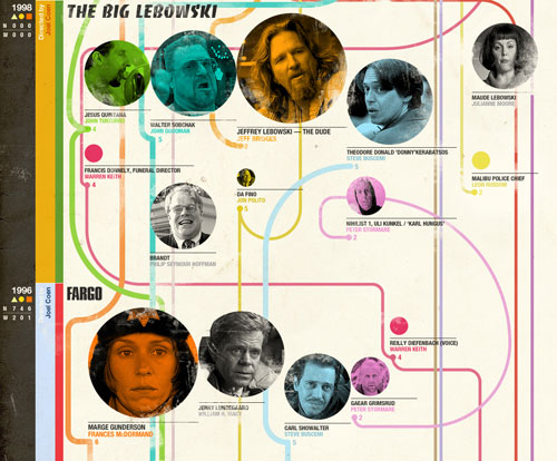
This chart shows former and future superheroes by movie. That is, George Clooney played Batman, so Out of Sight gets a Batman, along with another Batman for Micheal Keaton, and a Nick Fury for Sam Jackson. Lots of movies have 4 superheroes, though none on this chart have 5. Click through, you’ll understand. If you want to see how they all fit together, he’s made that chart, too. Raynor, you may raymember, also made the Harry Potter wizards in other movies chart.
HBO recently released a documentary about real-life superheroes. The trailer is below. It reminded me of the fascinating Rolling Stone article about Master Legend, but I can’t find it on their site because Rolling Stone doesn’t believe the internet needs to see old articles.
Incidentally, I found not 1, but 3 networks for real-life superheroes. 1, 23. But also, hipster superheroes. Hulk is only smashing ironically. And here’s a list of all the superheroes. All of them.
Lastly, I’d be remiss not to mention Petsaresuperhero.es, a project I put together with a friend. You know your pet’s a superhero, now you can show the world.
This infographic over at Information is Beautiful does a great job explaining the difference UV protections offered by sunscreens, what SPF is, when/how much to apply, etc. I had no idea about the stars or the difference between UVA and UVB.
Charlie Park takes a look at a type of chart that Edward Tufte developed for his 1983 book, The Visual Display of Quantitative Information. Unlike sparklines, another Tufte invention/coinage, slopegraphs didn’t really take off.
It’s curious that it hasn’t become more popular, as the chart type is quite elegant and aligns with all of Tufte’s best practices for data visualization, and was created by the master of information design. Why haven’t these charts (christened “slopegraphs” by Tufte about a month ago) taken off the way sparklines did? In this post, we’re going to look at slopegraphs — what they are, how they’re made, why they haven’t seen a massive uptake so far, and why I think they’re about to become much more popular in the near future.
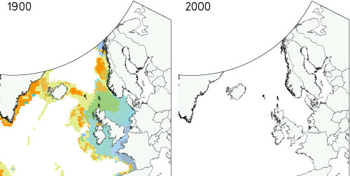
David McCandless made a data visualization comparing the Atlantic Ocean fishing stocks in 1900 and in 2000. It’s a literal jawdropper…here’s just a little bit of it:
That’s not just depleted…the fish are just gone. Click through for the full craziness. (via @daveg)
After the publication of Envisioning Information, Tufte decided, he told me, “to be indifferent to culture or history or time.” He became increasingly consumed with what he calls “forever knowledge,” or the idea that design is meant to guide fundamental cognitive tasks and therefore is rooted in principles that apply regardless of the material being displayed and the technology used to produce it. As Tufte explains it, basic human cognitive questions are universal, which means that design questions should be universal too. “I purposely don’t write books with names like How to Design a Web Site or How to Make a Presentation,” he told me.
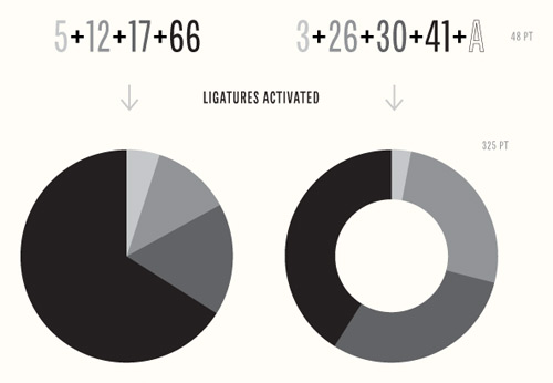
Chartwell is a type family you can use to build all kinds of graphs and charts. Stringing letters and numbers together into ligatures, you can make things like this:
Here’s an infographic that shows feature films with four or more Harry Potter wizards in them.
i was watching sense & sensibility in the back of my neighbour’s minivan while on a stakeout the other night and realized that professors snape, trelawney, and umbridge had each somehow apparated into the cast. my neighbour (who is a former hogwarts alumna) pointed out that cornelius fudge and madam pomfrey were also in it. was this a record for the most harry potter wizards in a non-harry potter film?
Close but nine Potter wizards is the record…can you guess which movie before clicking through?
With the assistance of a nuclear reactor operator, Randall Munroe came up with this handy radiation dose infographic. Doses recorded near the Fukushima plant compare to those from a single mammogram or dental x-ray. A note on how to use this chart:
If you’re basing radiation safety procedures on an internet PNG image and things go wrong, you have no one to blame but yourself.
Weatherspark is an impressive collection of weather data, graphs, and tools.
WeatherSpark is a new type of weather website, with interactive weather graphs that allow you to pan and zoom through the entire history of any weather station on earth.
Get multiple forecasts for the current location, overlaid on records and averages to put it all in context.
This interactive chart from the Washington Post shows how the average body mass index has risen in most countries since 1980. The European men getting comparatively heavier than European women (against the general trend of the rest of the world) is interesting.
As you can see in this visualization created by Information is Beautiful, the most commonly used words in horoscopes are amazingly consistent across the twelve different signs. As part of the analysis, they also created a meta-horoscope reading for use anytime during the year:
Ready? Sure? Whatever the situation or secret moment, enjoy everything a lot. Feel able to absolutely care. Expect nothing else. Keep making love. Family and friends matter. The world is life, fun, and energy. Maybe hard. Or easy. Taking exactly enough is best. Help and talk to others. Change your mind and a better mood comes along…
An hour-long documentary on statistics and infoviz produced by the BBC.
Documentary which takes viewers on a rollercoaster ride through the wonderful world of statistics to explore the remarkable power thay have to change our understanding of the world, presented by superstar boffin Professor Hans Rosling, whose eye-opening, mind-expanding and funny online lectures have made him an international internet legend.
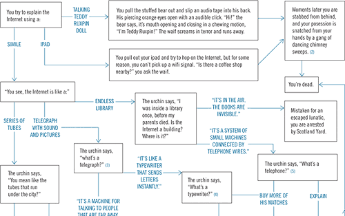
If you ever find yourself time travelling back to Victorian England, here’s a handy flowchart that will help you explain the internet to the youth of the era.
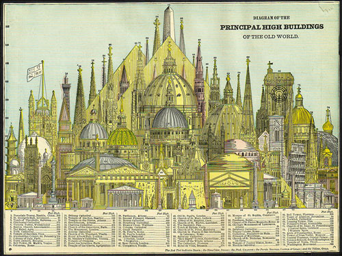
That’s right, the Washington Monument was the tallest building in the world for about five years before the Eiffel Tower, at almost double the height of the Washington Monument, took over the top spot for more than 40 years. (via modcult)
Pseudovariety — “the illusion of diversity, concealing a lack of real choice” — is when you go to the store and see an entire aisle filled with hundreds of different kinds of soda but most of those soda varieties are owned by three companies. Click through to see a neat visualization of soft drink brands and their market shares and owners.
Here’s what the communication between a web browser and YouTube looks like when the browser requests a video, slowed down 12X so you can actually see what happens.
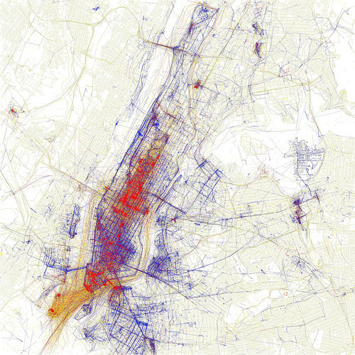
Locals and Tourists is a set of maps showing where people take photos in various cities around the world. The results are broken down into tourist photos and photos taken by locals. Here’s NYC:
Blue points on the map are pictures taken by locals (people who have taken pictures in this city dated over a range of a month or more). Red points are pictures taken by tourists (people who seem to be a local of a different city and who took pictures in this city for less than a month).
Note: If you are a member and tried to log in, it didn't work, and now you're stuck in a neverending login loop of death, try disabling any ad blockers or extensions. Or try logging out and then back in. Still having trouble? Email me!


Socials & More