Twitter sparklines
I’ve been seeing a few mini bar charts (aka sparklines) pop up on Twitter in the past few days. Like this one:
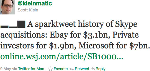
Last year Alex Kerin built an Excel-to-Twitter sparkline generator that uses Unicode block elements for the tiny charts and now media outlets like the WSJ are using it to publish data to Twitter:
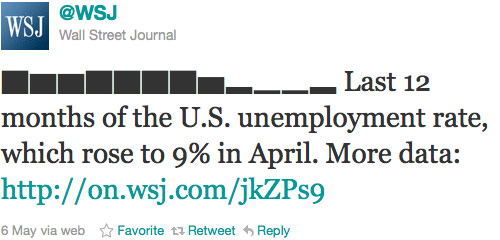
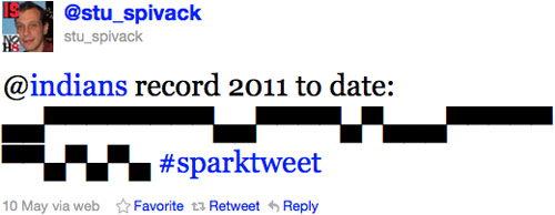
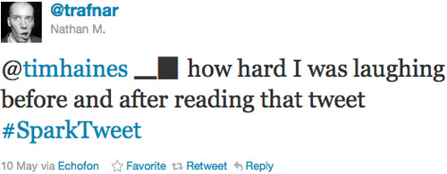
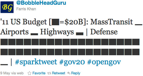
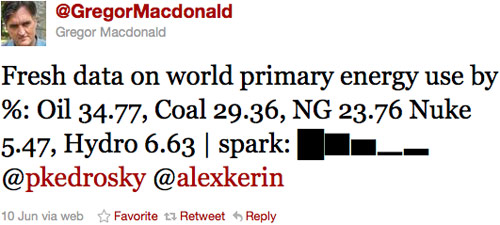
Anil Dash has a nice post on how the WSJ came to use Kerin’s idea. Here are a few more favorites “sparktweets” (1, 2, 3, 4, 5):






Socials & More