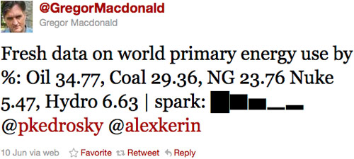
I've been seeing a few mini bar charts (aka sparklines) pop up on Twitter in the past few days. Like this one:

Last year Alex Kerin built an Excel-to-Twitter sparkline generator that uses Unicode block elements for the tiny charts and now media outlets like the WSJ are using it to publish data to Twitter:

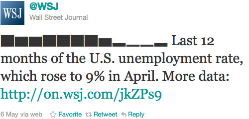
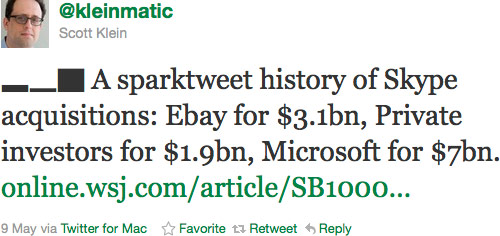
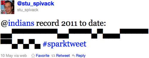
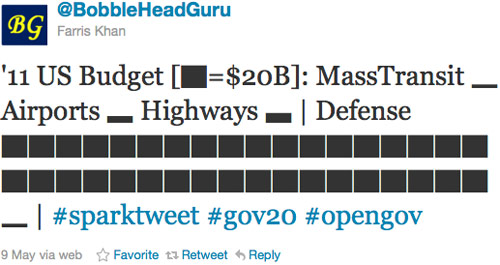
Anil Dash has a nice post on how the WSJ came to use Kerin's idea. Here are a few more favorites "sparktweets" (1, 2, 3, 4, 5):


More about...
Microsoft has filed a patent application for sparklines and Edward Tufte, who came up with the idea for sparklines, is wondering what to do about it. (via waxy)
More about...
Jeff Veen: "Today, a completely redesigned version of Google Analytics is launching, bringing a lot of the simplicity and data visualization techniques we learned building Measure Map to a whole new scale." They aren't switching everyone right away (no love for me yet) but you can read this post and get an idea of what to expect. Also: sparklines!
More about...
I love the little sparkline graphs on information aesthetics (right sidebar). That's some information richness. Must check out the Sparkline PHP Graphing Library at some point.
More about...
A craigslist missed connection for any of the hot women who were in the audience for Edward Tufte's lecture. Not too picky, this guy, he'll take any beautiful woman who was there. Quick, someone snap him up before he makes another sparklines pun.
More about...
Sparklines of landscapes of a few American states. The one for Missouri has a little arch while the Iowa sparkline is almost flat.
More about...
Tufte has revised his chapter on sparklines. Sparklines are "intense, simple, word-sized graphics".
More about...
Sparklines are "intense word-sized graphics". From Tufte's upcoming book, Beautiful Evidence
More about...