kottke.org posts about design
Here’s part of a fun pixel illustration of Communication City by eboy:
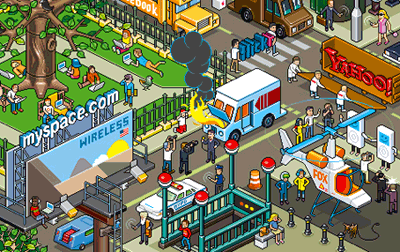
Click through to see the whole image. eboy did the illustration for a Fortune magazine article on the resurgence of internet companies. The company also does amazingly intricate futuristic posters of cities. Oh, and this T-Mobile HotSpot map of London…I could go on and on.
Among the many things New York is famous for is the tiny apartments of its inhabitants. Our first apartment here was about 400 square feet and somehow the people who lived downstairs from us in an apartment with the same footprint fit two people and two pitbull-type dogs into that space. In a recently released book, Apartment Therapy’s Maxwell Gillingham-Ryan reveals that he and his wife live in a 250 square foot apartment in the West Village.
Having such small apartments, city residents want to make the most of the space that they have. In designing a loft apartment for his son, architect Kyu Sung Woo came up with an interesting solution to the space problem…he fit two stories into a one-story apartment. The result is The Interlocking Puzzle Loft, a surprisingly spacious two-bedroom palace crammed into 700 square feet.
As shown and described in this article from Dwell, the key element in the loft is the half-height bedroom above the kitchen and the bedroom’s walkway positioned above the short downstairs hall closet and back kitchen counter, which allows the apartment’s inhabitants to stand up in the bedroom. Pretty genius idea.
Winterhouse (along with the AIGA) is sponsoring an award for design writing and criticism. There’s a main award ($5000) and a student award ($1000). Be nice to see some Web design writing in there.
Mark Simonson notes the decline in license plate design. They’ve become increasingly bad at their primary use…quick and easy identification of the car.
The evolution of the design of the Netflix envelope. We started using Netflix pretty early on, but I don’t remember the first 3 or 4 designs.
Luke Wroblewski wrote an article for Boxes and Arrows about using colors found in nature as inspiration for color palettes used in designing web sites. Unfortunately, the photos showing Luke’s examples don’t appear to be working on the site (the images have been fixed…thx, Lars), but Dave Shea published an image that illustrates Luke’s technique.
When you’re on the beach in the Caribbean as I was recently, it’s difficult for the color palette to escape your notice. I whipped up this collection of colors from some of my photos (coming soon) from Mexico:

From left to right, you’ve got the pale blue of the ocean close to shore, the light brown of the sand, the green of the lush vegetation, and the deep clear blue of the sky.
Update: A couple people asked, so here are the hex values for the above colors: 3DB8AE, FFEDD8, 396600, and 0050A2, respectively.
Slideshow of graphics submitted for New York magazine’s High Priority feature, the production of which Michael Bierut says “is as close as the graphic design world gets to an Olympic event”.
Interview with Amy Franceschini, founder of Futurefarmers. Franceschini also had a hand in Atlas Magazine (blast from the past!), which was one of my favorite sites back in the day.
Bruce Sterling: “if you can explain what you are doing with any conventional terminology, you’ve already been outsourced to India”.
Michael Bierut: “the great thing about graphic design is that it is almost always about something else”.
Rediscovered this while looking for something else last night: a list of questions from a panel Jeff Veen, Jason Fried, and I did on Design for Web 2.0 in Octobr 2004. Have we made any progress?
Amanda Spielman created a brochure for Ephemeral City which she handed out on the F Train. “The brochure — an aesthetic cross between McSweeney’s and Edward Tufte — evokes a fantasy culture where poetry and bicycle riding are exalted pastimes, and geographic features have names like Sea of Enumeration and Untold Islands.”
Wired Magazine profiles Josh Davis. Davis typically gets too much credit for being controversial and too little for his work. His speeches/appearances are well worth seeking out; they’re entertaining, informative, and inspiring.
TechCrunch reports on FlySpy, a site that will help people buy the lowest priced airplane ticket for a given destination:
The way it works is that I give it a departure city and a destination city and optionally a departure date and length of stay. The search result, which returns very quickly, will present me with a graph of flight prices over the next 30 days so that I can quickly look at which days are the cheapest to fly. To book a flight I just click on the point in the graph. Simple.
That’s a pretty useful UI innovation (especially if you’re able to drill down into individual days to find the lowest fare on that day), but it doesn’t help you much if your travel dates are inflexible. The killer airline reservation app that I’ve been wanting for several years would tell you when to buy your ticket for a particular flight. Airlines update their fares several times a day and hundreds of times over the course of a month. Depending on when you buy, it might cost you $250 or $620 for the same exact ticket.
What this hypothetical app would do is track fare histories and then release forecasts based on those histories. If you want a RT to SFO from JFK on 4/12/06 returning 4/17/06, the site would tell you to buy your ticket three weeks out or when the price hits $298, whichever comes first, but to never wait until the week before, when similar flights begin to sell out.
A thornier problem than the one FlySpy addresses, but it could save people a lot of money. (This would work for hotels and rental cars as well probably, although I don’t think their prices fluctuate as much.)
George W. Bush makes a guest post on Design Observer: “I don’t know much about designing rugs. So I […] delegated. That’s one of the things you do in decision-making.”
Check out all of the chrome in the new version of Outlook. Good grief. Even the veracity of the emailer’s claim is questionable.
CNN International redesigned their on-screen graphics. You can see the definite influence of lo-fi web design here…those screens look like a web site. I’d love to see these in action.
Update: A UK firm called Kemistry did the work.
This article on how Google and eBay are poorly designed seems really wrongheaded to me, although it may just be that essays that use the word “suckass” and mistake style for design will fail to convince me of anything.
A grid of logos of Web 2.0 companies. These names sound like a bunch of companies that make children’s toys (which when you think about it, isn’t too far from the truth).
Update: Original here.
Newer posts
Older posts
Socials & More