



Want to draw you some diagrams, charts,
Want to draw you some diagrams, charts, or flowcharts? Try these nifty tools.

This site is made possible by member support. 💞
Big thanks to Arcustech for hosting the site and offering amazing tech support.
When you buy through links on kottke.org, I may earn an affiliate commission. Thanks for supporting the site!
kottke.org. home of fine hypertext products since 1998.
Beloved by 86.47% of the web.
Want to draw you some diagrams, charts, or flowcharts? Try these nifty tools.
Design Observer has a suggested alert system for the avian flu.
Last week, Vanity Fair published an article about the U.S. Air Force’s response to 9/11. In writing the article, Michael Bronner makes extensive use of audio tapes from the control room of NORAD’s Northeast headquarters and in the online version, you can listen to audio clips of those tapes. As you can see in the screenshot below, not only are the transcripts of the audio part of the main narrative (and not collected elsewhere or put into a separate footnote or sidebar), but the controls for playing the audio clips (PLAY | STOP) are presented inline as well:
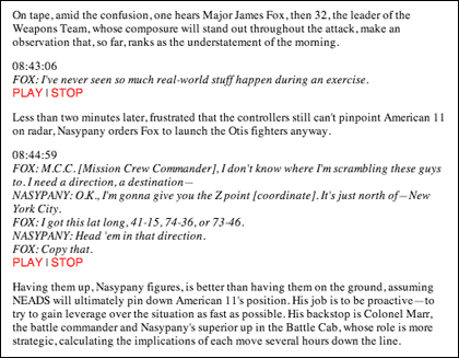
That’s a nice bit of design. No need for a clunky player or to download the clips at the end of the article when two simple text-only inline commands will do. In Beautiful Evidence, Edward Tufte argues for the placement of information in the location where it will do the most good for those attempting to understand the matter at hand, regardless of form:
Evidence is evidence, whether words numbers, images, diagrams, still or moving. It is all information after all. For readers and viewers, the intellectual task remains constant regardless of the particular mode of evidence: to understand and to reason about the materials at hand, and to appraise their quality, relevance, and integrity.
The examples that Tufte cites in the book are all visual and published on paper. This is an instance where web publishing provides for a better way to design for the information at hand than print. (thx to david for kickstarting this post)
Part two of a conversation between Jesse James Garrett and Steven Johnson. Here’s part one. (thx, kevin)
Part two of an interview with Paul Buckley, a creative director for Penguin, on the topic of book cover design. Part one is here.
Lionel Shriver: bad book covers happen because people use computers to design them and don’t know how to draw. What, you can’t draw with a computer? Not sure I see the cause and effect that Shriver is talking about here.
A collection of posters and promotional art from the films of Stanley Kubrick. This Clockwork Orange poster is one of my favorites; I have a copy hanging in my apartment.
Web 2.0 style redesigns of famous logos. The BoeingBoeing one is pretty clever. (thx, mark)
The Independent has a great infographic on its cover today depicting which countries support the immediate ceasefire in the Middle East demanded by the UN and which do not:
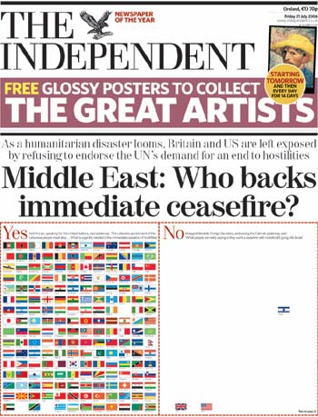
That message would take up less space as words, but somehow the impact wouldn’t be quite the same. (thx, g)
New York Times to redesign in 2008, each page will be 1.5 inches narrower.
Regarding the doublestrike on the Guggenheim, Design Observer has a little more information about it. “I don’t think [Frank Lloyd Wright] ever floated text.”
Jeff Veen is posting some old screencaps of hotwired.com on Flickr; this one’s from 1994. Early 1995. Late 1995. 1996. 1997 (Packet!). 1998. 1999. 2006.
Update: Jeff has some further thoughts on the Hotwired design.
A group of designers (National Design Award finalists and winners) recently declined to be honored at a White House breakfast. “It is our belief that the current administration of George W. Bush has used the mass communication of words and images in ways that have seriously harmed the political discourse in America. We therefore feel it would be inconsistent with those values previously stated to accept an award celebrating language and communication, from a representative of an administration that has engaged in a prolonged assault on meaning.”
Great detailed post about how the inside of a book is designed. Page counts are determined for business reasons so the designer has little choice but to find the proper font to make the given text fit in the given space…readability is a secondary consideration. (thx, susan)
Photos of the IKEA Everyday Fabulous! Exhibit, featuring IKEA products improving daily life on the streets of Manhattan, including comfy couches at bus stops, picture frames for lost cat photos, stools near payphones, and blankets for every seat at the movies.
Awesome Polish movie posters, “some of the most brilliantly surreal and amazing pieces of movie artwork ever created”. (via avc)
Reviews of some recent logo redesigns. That new MasterCard logo is…yikes.
Second part of a two-part interview with designer Michael Bierut. “I’ve found that any reluctance I’ve had to doing more of this ‘political design’ has to do with my own fear that things like T-shirts and posters are usually feeble tools to address the enormous problems we face as a society today.” Read part one.
Slate has redesigned and it’s looking a little rough around the edges.
You’ve probably seen this by now, but if you haven’t, you should. BumpTop is a prototype of a new desktop metaphor for computing, and a pretty damn intriging one at that.
Update: Peterme isn’t impressed. I don’t think BumpTop is going to replace WIMP either, but there are certainly some applications where some of the BT ideas could be useful.
Big 10th anniversary package from Slate. It’s interesting to see how it has evolved. Here’s a slideshow of the design through the years…the stuff about their failed subscription business model and how they lost marketshare because of it is relevent in the ongoing TimesSelect debate.
Classic Royksopp music video featuring dozens of wonderful infographics.
Interview with designer Michael Bierut. “The best thing design can do for a company is to express that company’s personality accurately and compellingly, and in so doing permit that organizations inherent strengths to prevail.”
Design Observer redesigns…looks a bit smarter than before. They joined The Deck too.
Six Apart recently launched a preview version of their new Vox blogging service. When you log in to Vox, one of the first things you notice on the front page is the Question of the Day followed by a quick posting box. Answer the question, press “continue”, and you’ve got yourself a blog post. I asked Six Apart president Mena Trott how the feature came about.
Jason: Everyone loves the Question of the Day feature on Vox. The QotD cleverly formalizes the memes that travel through LiveJournal and the blogosphere at large, making it OK for the kind of people who hate email joke forwards to participate collectively in something on a regular basis. Who is responsible for generating these questions? Are they recycled memes from LJ or do you have some meme genius working for 6A?
Mena: Question of the Day actually started in a design comp I did — meaning it hadn’t been specified in any product requirements docs. I was creating the Vox dashboard and realized that the one thing really missing from the page was a call to action. So, I tried to think what would be the one thing that would make me want to post and the Question of the Day made total sense.
You’re exactly correct in saying that we’re wanting to legitimize the behavior we’ve seen in email (forwards). It’s all about trying to figure out the behavior that would make my mom feel comfortable posting or make someone not feel overwhelmed by a big white posting box.
If you remember the Four Things meme that floated around a couple months ago, you’ll recall that this simple meme got people (like me) to post on their blogs after significant absences. We wanted to capture that sort of motivator.
And of course, LiveJournal is the inspiration for all of this.
As far as who creates the questions, we have a scratchpad that is generated by various members of the staff as well as suggestions that come in from our feedback forms. We’re still in such an early stage of Vox that these questions are evolving daily. One thing we’ve seen, however, is that the two topics that people most like to answer questions about are nostalgia (favorite childhood candy, childhood fears, etc…) and media-based (favorite movie, song that makes you happy, anything television).
Some questions, surprisingly bomb in an unexpected way. In April, I posed the question “If you had a time machine and could travel anywhere in time, where would you go and why?” It’s a difficult question for those who don’t obsess about time travel as much as I do. And, I have to admit, I made it question of the day since *I* had my own answer. Still, I’d love to try this one again now that more people are in Vox.
—
Thanks, Mena. Sometimes it’s these little things, tiny addictive hooks, that make the difference between a product taking off, and Vox’s QotD is a nice hook indeed. (Also, I’m totally with you on the time travel question.)
Update: Mena posted some more info about the QotD on Vox.
Nice interview with 37signals’ Jason Fried by Khoi Vinh.
Art and genocide…why doesn’t Soviet and Communist Chinese propaganda imagery offend us like Nazi propaganda does? The Stalinist and Maoist regimes were responsible for more deaths than the Nazis.
Business Week holds a competition to design their new design magazine and Michael Bierut says to hell with this kind of spec work. I love Andy Rutledge’s analogy.
Quick profile of Milton Glaser in BusinessWeek. (via do)
Yale’s MFA Graphic Design show is this weekend in New Haven from May 17 to May 24, opening on May 20th. (thx, rebecca)
Socials & More