kottke.org posts about Web 2.0

Matt Haughey comes not to bury Flickr, but to praise it.
Flickr represents one of the very best of things in the history of the internet. It was the first popular way to share photos in a social way instead of photos lingering in private accounts online and in the real world in shoeboxes under beds. It brought millions together and helped kick off first the digital SLR revolution, then it was eclipsed by the mobile photography revolution. Flickr—despite being a big corporate entity—embraced open licensing and took on the ambitious goal of being a mirror and gallery for oodles of museums around the globe.
Those values that drove Flickr during its influential peak can be seen in its Explore page, which still knocks your socks off. Matt calls it “an entire year’s worth of epic shots from National Geographic, generated each day, automatically by algorithms.”
Lots of wondrous shots from places I’ve never heard of. Lots of “how’d they even get that shot?!” photos of animals… Instagram has an explore tab but it’s popular music and tv stars and their dogs or it’s brand advertising-driven shots cooked up to sell something. There’s something so completely boring about Instagram’s explore page that makes me ignore it and go back to my friend feeds, whereas Flickr is the opposite: my friend feed is largely silent, but the best of the best page is truly awe-inspiring and at least one photo each day is going to take my breath away.
It is bizarre to think now that Flickr was only active for about a year before it was acquired by Yahoo. For those of us who were on the site then, that year felt like everything.
Jason’s first post that mentions Flickr is from March 2004. He wonders whether Flickr could be used as a universal login (much like Facebook, Twitter, and Google accounts are today). Annotation quickly followed. Then calendar view. RSS feed splicing. Organizr. A public API. The interestingness algorithm. Prints. It was step-by-step, bit-by-bit, but every new feature was a milestone. It excited people, and got them thinking and working on what was next.
Jason even has a remarkable post from August 2004 where he imagines an entire web-based operating system linking different services together:
To put this another way, a distributed data storage system would take the place of a local storage system. And not just data storage, but data processing/filtering/formatting. Taking the weblog example to the extreme, you could use TypePad to write a weblog entry; Flickr to store your photos; store some mp3s (for an mp3 blog) on your ISP-hosted shell account; your events calendar on Upcoming; use iCal to update your personal calendar (which is then stored on your .Mac account); use GMail for email; use TypeKey or Flickr’s authentication system to handle identity; outsource your storage/backups to Google or Akamai; you let Feedburner “listen” for new content from all those sources, transform/aggregate/filter it all, and publish it to your Web space; and you manage all this on the Web at each individual Web site or with a Watson-ish desktop client.
Think of it like Unix…small pieces loosely joined.
That last part didn’t come true; the pieces didn’t join so much as fuse together into something new. The companies listed either took over the world, faded into relative obscurity, or stopped existing (at least for a little while). And then there’s Flickr — which didn’t do any of those things, but changed how we use the web forever.
I usually say that platforms stop being vital, even if they continue to have lots of users, when the platforms stop getting better. It’s a tricky thing: sometimes a ham-handed “improvement” can actually ruin a lot of what made a platform special. Flickr was extraordinarily vital, for years. It still has so much to offer. Sometimes there’s something reassuring about a tool that’s still much the same.
Photo by Tom Hall, via Flickr. Used under a CC-BY license.
I’ve said it before, anyone using the term Web 3.0 gets poked in the eye. My dance card is filling up.
Quick! Which photo sharing site community thingie is more popular: Fotolog or Flickr? You might be surprised at the answer…but first some history.
Fotolog launched in May 2002 and grew quite quickly at first. They’d clearly hit upon a good idea: sharing photos among groups of friends. As Fotolog grew, they ran into scaling problems…the site got slow and that siphoned off resources that could have been used to add new features to the site, etc. Problems securing funding for online businesses during the 3-4 years after the dot com bust didn’t help matters either.
Flickr launched in early 2004. By the end of their first year of operation, they had a cleaner design than Fotolog, more features for finding and organizing photos, and most of the people I knew on Fotolog had switched to Flickr more or less exclusively. They also had trouble with scaling issues and downtime. Flickr got the scaling issues under control and the site became one of the handful of companies to exemplify the so-called Web 2.0 revitalization of the web. The founders landed on tech magazine covers, news magazine covers, and best-of lists, the folks who built the site gave talks at technology conferences, and the company eventually sold to Yahoo! for a reported $30 million.
Fotolog eventually got their scaling and funding issues under control as well, but relative to Flickr, the site has changed little in the past couple of years. Fotolog has groups and message boards, but they’re not done as well as Flickr’s and there’s no tags, no APIs, no JavaScript widgets, no “embed this photo on your blog/MySpace”, and no helpful Ajax design elements, all supposedly required elements for a successful site in the Web 2.0 era. Even now, Fotolog’s feature set and design remains planted firmly in Web 1.0 territory.
So. Then. Here’s where it gets puzzling. According to Alexa1, Fotolog is now the 26th most popular site on the web and recently became more popular than Flickr (currently #39). Here’s the comparison between the two over the last 3 years:
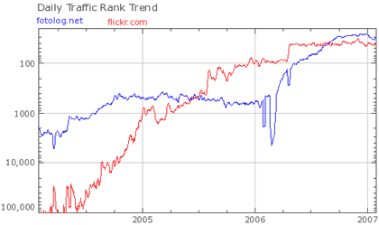
This is a somewhat stunning result because by all of the metrics held in high esteem by the technology media, Web 2.0 pundits, and those selling technology and design products & services, Flickr should be kicking Fotolog’s ass. Flickr has more features, a better design, better implementation of most of Fotolog’s features, more free features, critical praise, a passionate community, and access to the formidable resources & marketing power of Yahoo! And yet, Fotolog is right there with them. Perhaps this is a sign that those folks trapped in the Web 2.0 bubble are not being critical enough about what is responsible for success on the Web circa-2007. (As an aside, MySpace didn’t really fit the Web 2.0 mold either, nobody really talked about it until after it got huge, and yet here it is. And then there’s Craigslist, which is more Web 0.5 than 2.0, and is one of the most popular sites on the web. Google too.)
What’s going on here then? I can think of three possibilities (there are probably more):
1. Fotolog is very popular with Portugese and Spanish speakers, especially in Brazil. According to Wikipedia, almost 1/3rd of all Fotolog users are from Brazil and Chile. In comparing the two sites, what could account for this difference? Fotolog has a Spanish language option while Flickr does not (although I’m not sure when the Spanish version of Fotolog launched). Flickr is more verbose and text-intensive than Fotolog and much of Flickr’s personality & utility comes from the text while Fotolog is almost text-free; as a non-Spanish speaker, I could navigate the Spanish-language version quite easily. Gene Smith noted that a presentation made by a Brazilian internet company said that “Flickr is unappealing to Brazilians because they want to the customize the interface to express their individual identities”.
Cameron Marlow noticed that Orkut is set to pass MySpace as the world’s most popular social networking site (Orkut is also very popular in Brazil), saying that “Orkut’s growth reinforces the fact that the value of social networking services, and social software in general, comes from the base of active users, not the set of features they offer”. Marlow also notes that Alexa’s non-US reporting has improved over the past year, which might be the reason for Fotolog’s big jump in early 2006. If Alexa’s global reporting had been robust from the beginning, Fotolog may have been neck and neck with Flickr the whole time.
2. Flickr is more editorially controlled than Fotolog. The folks who run Flickr subtly and indirectly discourage poor quality photo contributions. Yes, upload your photos, but make them good. And the community reinforces that constraint to the point where it might seem restricting to some. Fotolog doesn’t celebrate excellence like that…it’s more about the social aspect than the photos.
3. Maybe tags, APIs, and Ajax aren’t the silver bullets we’ve been led to believe they are. Fotolog, MySpace, Orkut, YouTube, and Digg have all proven that you can build compelling experiences and huge audiences without heavy reliance on so-called Web 2.0 technologies. Whatever Web 2.0 is, I don’t think its success hinges on Ajax, tags, or APIs.
Update: You can see how much Fotolog depends on international usage for its traffic from this graph from Compete. They only use US statistics to compile their data. I don’t have access to the Comscore ratings, but they only count US usage and, like Alexa, undercount Firefox and Safari users. (thx, walter)
[1] Usual disclaimers about Alexa’s correctness apply. The point is that among some large amount of users, Fotolog is as popular (or even more) than Flickr. Whether those users are representative of the web as a whole, I dunno. ↩
A pair of trend maps for 2007, both based on subway maps. The top one depicts the top online companies/brands & how they’re connected while the bottom one deals with ideas (with the River of Consciousness standing in for the Thames).
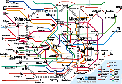
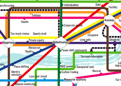
Both maps were found in this article about internet predictions in 2007. I don’t know about you, but I find these types of maps fun to look at, but completely inscrutable informationally speaking. Surely there’s a more enlightening way to present this information than in Tube map form.
It’s sad that the Silicon Valley tech scene and press is so fixated on building companies to flip that people need to write about sustainable companies as “a new and better model for Internet startups”. Good luck, Ev and company, in finding success on your own terms.
Surprisingly good list of the top 10 Web 2.0 losers. It’s too early to pass judgement on Netscape (the site has shot to the top of Google search results for current events keywords because of the site’s high PageRank) and SixApart’s inclusion is wrong. The top four spots are right on; the Odeo situation is sad (I thought they were really onto something), but Flock, Edgeio, and Squidoo seemed not quite equal to the hype right from the beginning.
37signals recently polled the customers of their online project management application and one of the questions asked what Web 2.0 meant to them. They’ve posted 500 answers to that question on their site; it’s an interesting read. I decided to do a quick and dirty analysis of the most frequently used words by the respondents, hoping that the result would provide a collective definition of sorts for the term Web 2.0. By the time I’d finished (with several timeouts and distractive blog-related detours), I went back to the thread and saw that Jacob Kaplan-Moss had already completed an analysis. Here are his top 15 words:
web - 348
ajax - 107
applications - 93
new - 78
user - 71
apps - 44
desktop - 40
sites - 37
people - 36
internet - 36
content - 34
think - 33
software - 31
services - 30
technologies - 29
Just for kicks, here’s my top 30:
web: 347
ajax: 105
more: 99
applications: 92
new: 77
user: 69
use: 47
apps: 43
desktop: 39
sites: 38
internet: 35
people: 35
content: 33
think: 32
software: 30
using: 30
etc: 29
services: 29
next: 28
technologies: 28
interactive: 28
generation: 27
application: 25
marketing: 25
websites: 23
better: 23
social: 23
users: 22
hype: 22
buzzword: 21
interfaces: 20
For some reason (my shoddy programming skills are a likely culprit), my word counts are slightly different than Jacob’s, but they’re close. I also left in a few words that he removed but that I thought were relevant, like “more”, “use”, “using”, and “etc”. Here are a few more interesting words and their frequency counts:
community: 17
collaboration: 13
companies: 13
bubble: 10
ruby: 9
rounded: 9
gradients: 8
rails: 7
37signals: 6
tagging: 6
flickr: 5
wikis: 5
overused: 5
o’reilly: 5
hyped: 5
overhyped: 5
Not sure this provides much of a definition, but it’s fun to play around with.
Big ol’ obvious caveat: I performed a straight-up word frequency analysis which did not take into account the context of particular words (e.g. no distinction between different uses of words like “think”: “I think Web 2.0 sucks” and “Web 2.0 products make users think”), phrase frequency (“web 2.0”, “next generation”, “rounded corners”), or anything like that. This obviously limits the utility of the analysis; hence “quick and dirty”.
Update: Perhaps a better “definition” of Web 2.0 comes from the related tags at del.icio.us:
ajax
tools
web
blog
webdesign
software
design
social
programming
javascript
business
Not bad.
Update: del.icio.us did this analysis back in November 2005. (thx, maciej)
I’m so glad I’m friends with you
I can see your Flickr pix
and your Vox posts too
Web 2.0 style redesigns of famous logos. The BoeingBoeing one is pretty clever. (thx, mark)
I could give two craps about Sphere, but I loved these two lines: “it’s eyecandy for Web2.0 retards” and “Designing for the TechCrunch crowd is a mook’s game. Designing for users means making things straightforward, lightweight, and uncluttered.” (via bbj)
Zlopp, Bangeth, Kapow, Klonk, Thwack, Kersploosh. Batman fight sounds or Web 2.0 company names? (via waxy)
Rebutting Caterina, David says it’s a great time to start a business. Good points by both, but they’re ultimately arguing different things. ps. Staying small isn’t the answer to everything, guys.
“It’s a bad time to start a company”. Amen. It’s kinda what I was getting at in this post…”if you’re buying low and selling high, the time to buy optimism was two to four years ago, not now”.
Quiz: Web 2.0 company or Star Wars character? Web 2.0 increasingly reminds me of the web circa 1999. I hope it hurts less this time.
Rediscovered this while looking for something else last night: a list of questions from a panel Jeff Veen, Jason Fried, and I did on Design for Web 2.0 in Octobr 2004. Have we made any progress?
Exciting new Web 2.0 product: JusFlam is “the social network for people who enjoy Jesus, and flames, and rotating stuff”. The beta seems to be down at the moment…it’s throwing a “due to overwhelming server load, that is due to underwhelming development methodologies and system architecture, due to limited resources, due to limited business direction, due to giving away a complex web service for free with no feasible plan for revenue generation besides ‘getting bought by google or maybe yahoo’, we are unable to process your request at this time” error.
…Jotspot, Frappr, Yedda, Writeboard, Kanoodle, Memeorandum, SuprGlu, 43 Things, Findory, Clipmarks, Wayfaring, AllPeers, Zoozio, Ziggs, Wink, Reddit, Digg, Gumshoo, Ta-da List, Wikipedia, Pubsub, Ookles, YubNub, Bloop, FeedBurner, Bloglines, Gabbr, Gcast, Blinkx, Openomy, Riffs, Myspace, Pandora, LookLater, 30 Boxes, Rollyo, Squishr, Plazes, Noodly, Wondir, Protopage, Blummy, Jots, Vizu, Del.icio.us, Tagyu, Writely, Simpy, Gtalkr, Truveo, EgoSurf, Mozy, Quimble, Basecamp, Squidoo, NewsVine, Clipfire, Lookster, Netvibes, Facebook, Goowy, Yelp, Magnolia, Technorati, Gmail, Feedmarker, Mercora, StumbleUpon, and SpinSpy all have in common?
They’re all web sites. The truth was staring us right in the face all this time.
ps. Damn Movable Type and its restriction on the number of characters I can put in the title of a post. varchar(255) my ass.
A grid of logos of Web 2.0 companies. These names sound like a bunch of companies that make children’s toys (which when you think about it, isn’t too far from the truth).
Update: Original here.
Once again, the pornographers are on the cutting edge of technology. Feast your eyes on the Web 2.0ness of mydirtyipod, which offers naughty iPod-ready videos and podcasts. I’m gonna spell this one out for you: NOT SAFE FOR WORK.
Scott Rosenberg on the Web 2.0 conference and the new bubble: “it seems likely that a certain number of people will get rich, a certain amount of money will be wasted, several important new companies and technologies will emerge and some indeterminate number of investors will be fleeced”.
Morfik seems to be working towards a WebOS like I wrote about in August…web apps that run on the desktop: “[Morfik’s] technology combined with its tight integration of the browser, a database and web server, uniquely offers developers the opportunity to create web applications that run on the desktop after being unplugged from the web.” They have a Gmail clone that works offline…keen to see how that works, exactly. (thx mike)
Older posts


Stay Connected