kottke.org posts about design
Dieter Rams, the legendary designer, came up with a now-famous list of Ten Principles for Good Design. Among them:
Good design makes a product understandable. It clarifies the product’s structure. Better still, it can make the product talk. At best, it is self-explanatory.
Recently, designer Tobias Van Schneider posted a tongue-in-cheek update of Rams’ list, the 2017 Tech Industry edition.
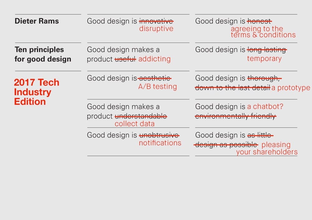
1. Good design is disruptive.
2. Good design makes a product addicting.
3. Good design is A/B testing.
4. Good design makes a product collect data.
5. Good design is notifications.
6. Good design is agreeing to the terms & conditions.
7. Good design is temporary.
8. Good design is a prototype.
9. Good design is a chatbot?
10. Good design is pleasing your shareholders.
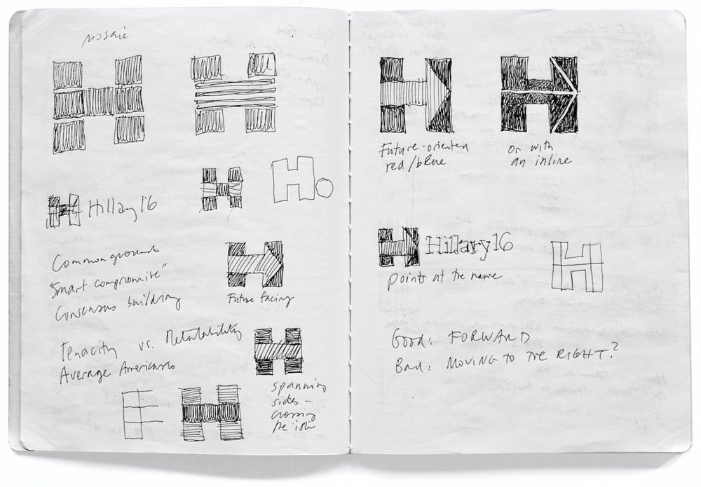
Pentagram’s Michael Bierut and his team designed the identity for Hillary Clinton’s 2016 Presidential campaign (of which I was not initially a fan but came around later). Here’s how it happened.
I put together a three-person team: me, designer Jesse Reed, and project manager Julia Lemle. We would work in secret for the next two months. Our first meeting with the Clinton team began with a simple statement: “Our candidate has 100 percent name recognition.” There is a well-known marketing principle that is often credited to midcentury design legend Raymond Loewy. He felt that people were governed by two competing impulses: an attraction to the excitement of new things and a yearning for the comfort provided by what we already know. In response, Loewy had developed a reliable formula. If something was familiar, make it surprising. If something was surprising, make it familiar.
That same principle applies to political campaigns. In 2008 Sol Sender, Amanda Gentry and Andy Keene were faced with the challenge of branding a candidate who had anything but name recognition. Barack Obama’s design team responded with a quintessentially professional identity program, introducing — for the first time — the language of corporate branding to political marketing. Obama’s persona — unfamiliar, untested, and potentially alarming to much of the voting public — was given a polished logo and a perfectly executed, utterly consistent typographic system. In short, they made a surprising candidate seem familiar.
We faced the opposite problem. Our candidate was universally known. How could we make her image seem fresh and compelling?
This is a great look at how a designer at the top of his game approaches a problem…and reckons with failure. Even this little bit:
It wasn’t clever or artful. I didn’t care about that. I wanted something that you didn’t need a software tutorial to create, something as simple as a peace sign or a smiley face. I wanted a logo that a five-year-old could make with construction paper and kindergarten scissors.
Leading up to the election, how many photos did you see of Hillary logos hand-drawn by kids on signs and t-shirts? Lots and lots…my kids even got into the act.
Anyway, a huge contrast to the process and impact of the Trump campaign’s identity.
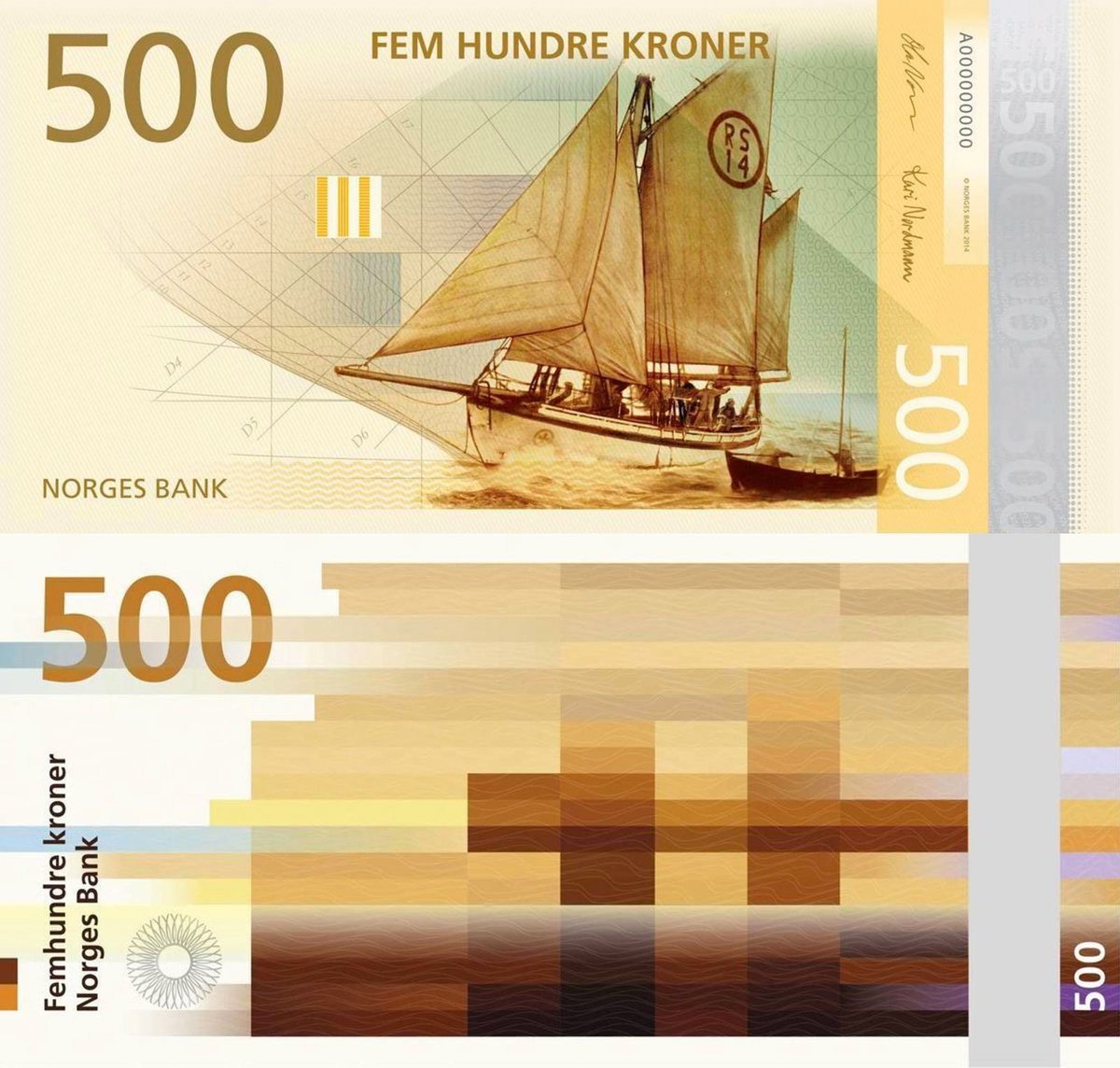
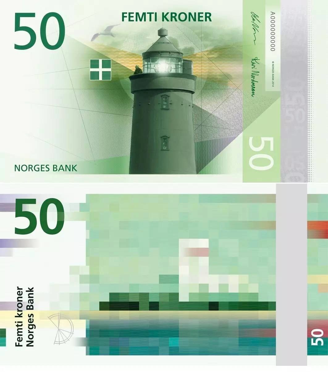
Back in 2014, I posted that Norway would start using new banknotes in 2017 featuring an abstract pixelated design on the reverse of each note. Time did the only thing it knows how to do so here we are in 2017 and the bills will begin circulating later this year. The overall theme for the notes is “The Sea”:
Norway’s long, gnarled coastline has shaped the identity of Norwegians individually and as a nation. The use of marine resources, combined with the use of the sea as a transport artery, has been crucial to the development of Norwegian society.
And each particular note has its own subtheme:
The 50-krone banknote: The sea that binds us together
The 100-krone banknote: The sea that takes us out into the world
The 200-krone banknote: The sea that feeds us
The 500-krone banknote: The sea that gives us prosperity
The 1000-krone banknote: The sea that carries us forward
The final design concept by Terje Tønnessen was chosen from among several finalists. I love the final design but also really like the concept by Aslak Gurholt with a children’s drawing on the back of each note echoing the illustration on the front.
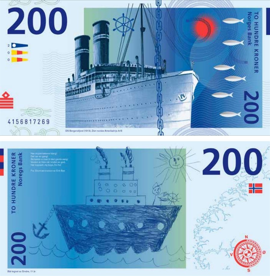
Also of note (ha!): Norges Bank crowdsourced several aspects of the design process but managed to do it in such a way as to avoid the Boaty McBoatface problem.
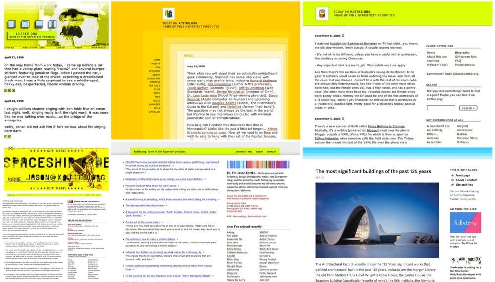
As of today, I’ve been posting and linking to stuff on kottke.org for 19 years. When I started, I was 24 years old, working as a web designer for a small web development shop in Minneapolis. The site started as a offshoot of another site I had at the time, which I worked on in my spare time at home on my Pentium Pro 200 with a 56K modem. I worked at a desk that was really a 70s-style kitchen table I’d bought for $25. I’m sitting at that same table writing this right now. Earlier I was struggling to think of something else that’s been in my life for as long as kottke.org has…I guess this table is it.
Whether you’re a relatively recent reader or you’ve been along for the entire ride, I’d like to thank you for reading the site and for your feedback, gentle typo corrections, encouragement, push-back, and membership support. I’m really glad to be hurtling through space and time with you good people.
See also a retrospective of kottke.org designs I did nine years ago when the site turned 10.

Eleanor Lutz made these nifty models of California plants that can withstand fire damage out of Elmer’s Glue and watercolor paper. She then photographed them burning for this infographic on how some species have adapted to California’s wildfires. Be sure to click through to see the animated version.
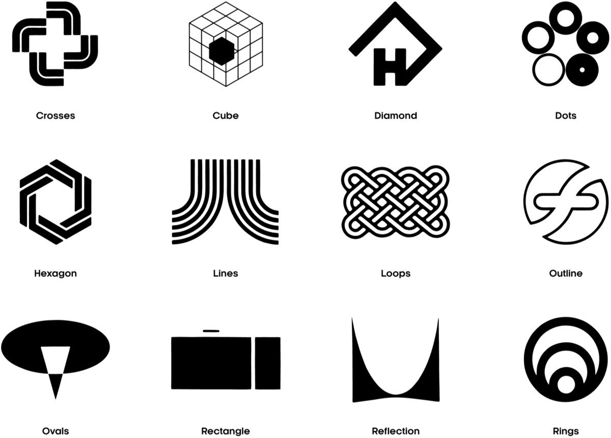
Logobook is a growing catalog of “the finest logos, symbols & trademarks” in the world. The 5000+ logos are divided into groups like letters & numbers, shapes, animals, objects, and nature and are extensively categorized by industry, designer, and country of origin. Great resource.
They’re backed up with new submissions right now, but you can still send them your logos and they’ll get back to you when submissions are open again. (via @buzz)
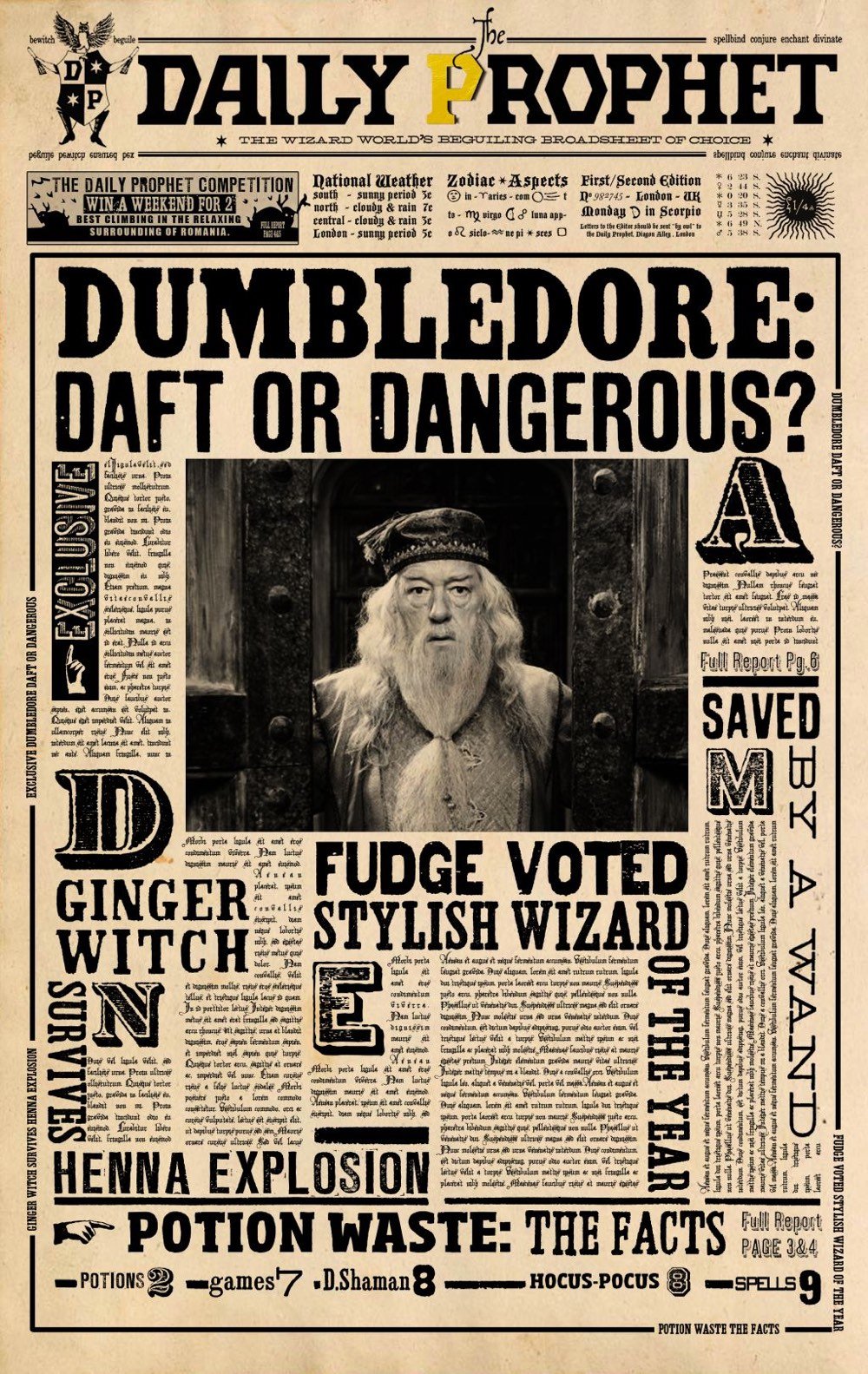

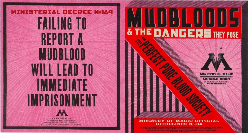
MinaLima (aka Miraphora Mina and Eduardo Lima) is the design studio that designs all of the graphics, signs, newspapers, decrees, posters, labels, maps, book covers, and packaging that you see in the Harry Potter movies.
The range of design styles on display is impressive and captures the films’ combination of humour, horror and fantasy.
On one wall, packaging and adverts for products in a shop owned by the Weasley family combine early 20th century print advertising with humorous taglines and garish colours, while posters promoting the fictional game of Quidditch (below) reference 1950s Olympics adverts.
Official notices and letters use hand written fonts, and pamphlets demonising ‘mudbloods’ — a wizard born to non-wizard parents — are inspired by Soviet progaganda (top).
“One of the best things about working on the Harry Potter films was being able to try out so many different styles, from Victorian letterpress to modern design,” says Lima.
“The Daily Prophet was designed to look very Gothic, as did the architecture of Hogwarts [the boarding school for wizards where the film is set]. When an organisation called the Ministry of Magic takes control in later films, the school becomes a kind of totalitarian state, so we started looking to Russian constructivist design to reflect that,” says Mina.
They also worked on the Fantastic Beasts movie. You can follow their work on Instagram and a bunch of the best stuff is available for purchase on their site.

Yay! It’s Fractal Friday! (It’s not, I just made that up.) But anyway, courtesy of Christopher Night, you can play around with this Julia set fractal. It works in a desktop browser (by moving the mouse) or on your phone (by dragging your finger).
The Julia set, if you don’t remember, goes thusly: Let f(z) be a complex rational function from the plane into itself, that is, f(z)=p(z)/q(z) f(z)=p(z)/q(z), where p(z) and q(z) are complex polynomials. Then there is a finite number of open sets F1, …, Fr, that are left invariant by f(z) which, uh, is um… yay! Fractal Friday! The colors are so pretty!
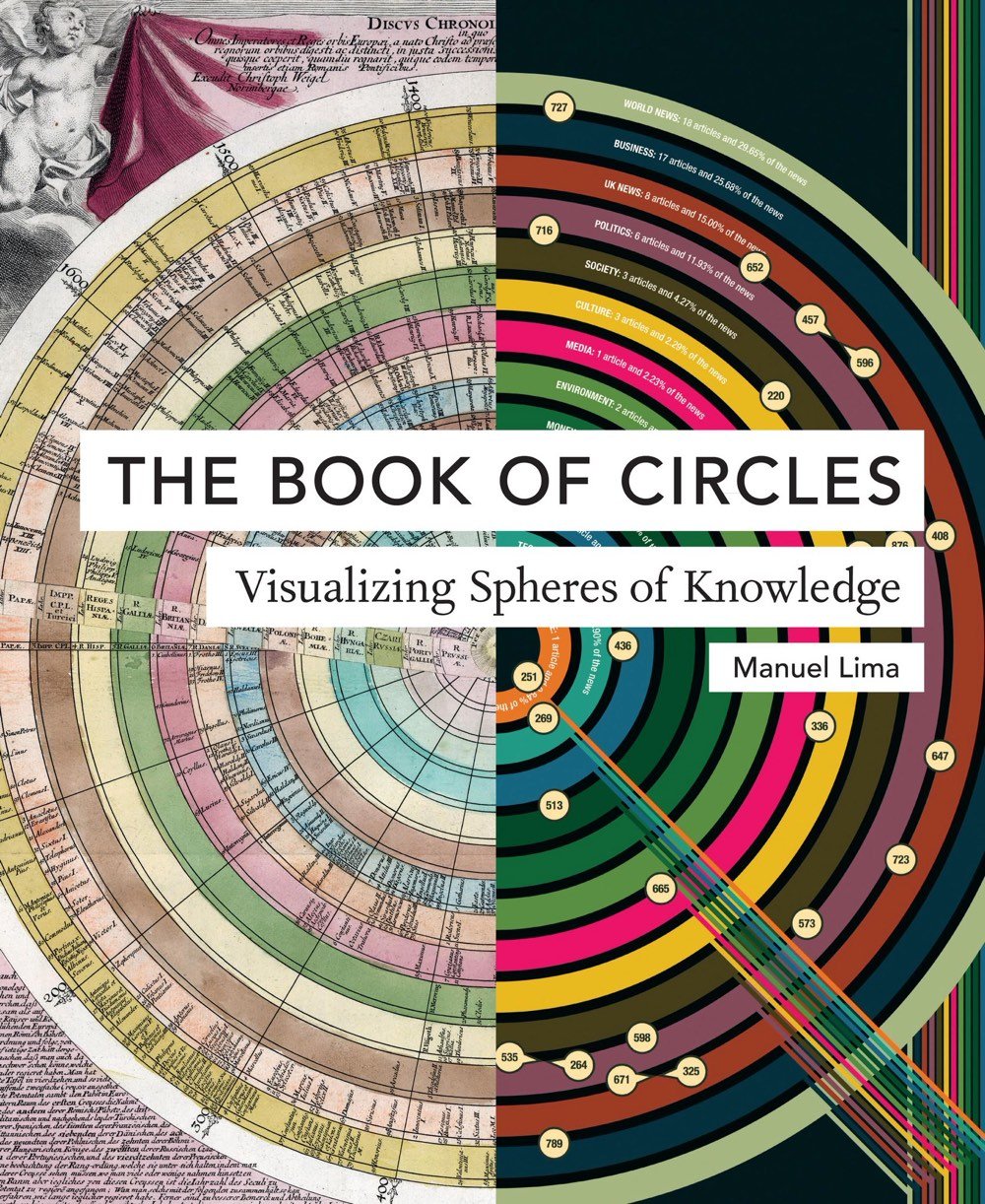
The Book of Circles is an upcoming book by Manuel Lima about the use of circles in information design.
In this follow-up to his hugely popular The Book of Trees and Visual Complexity, Manuel Lima takes us on a lively tour through millennia of circular information design. Three hundred detailed and colorful illustrations from around the world cover an encyclopedic array of subjects-architecture, urban planning, fine art, design, fashion, technology, religion, cartography, biology, astronomy, and physics, all based on the circle, the universal symbol of unity, wholeness, infinity, enlightenment, and perfection. Clay tokens used by ancient Sumerians as a system of recording trade are juxtaposed with logos of modern retailers like Target; Venn diagrams are discussed alongside the trefoil biohazard symbol, symbols of the Christian trinity, and the Olympic rings; and a diagram revealing the characteristics of ten thousand porn stars displays structural similarities to early celestial charts placing the earth at the center of the universe.
I have both of Lima’s previous books, The Book of Trees and Visual Complexity.
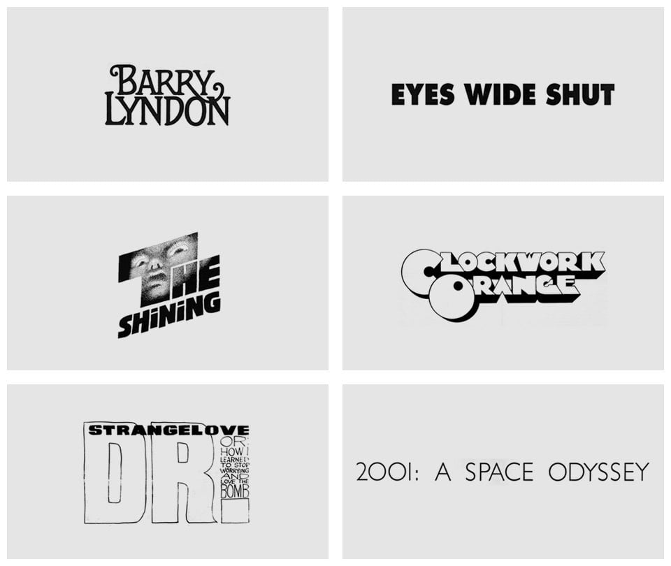
From designer Christian Annyas, an overview of the typography used in the titles and posters of Stanley Kubrick’s movies. Click on each graphic to see the poster or title sequence it was sourced from.
In the Atlantic, Ian Bogost takes on the accepted view that Apple has great design, calling it “the biggest myth in technology today”.
At base, such a claim seems preposterous. In 1977, the Apple II made the microcomputer useful and affordable. In 1984, the Macintosh made the computer more usable by the everyperson thanks to the graphical user interface. In 2001, the iPod fit a music library in a pocket. In 2007, the iPhone made computing portable (and obsessive).
But if Apple designs at its best when attending closely to details like those revealed in the construction of its spaceship headquarters, then presumably the details of its products would stand out as worthy precedents. Yet, when this premise is tested, it comes up wanting. In truth, Apple’s products hide a shambles of bad design under the perfection of sleek exteriors.
While I find this piece to be hyperbolic, it hints at where Apple’s design is weakest. Apple is great at designing products but less good at designing the connections between these products and the rest of the world.1 iPhones, iPods, and iPads are great, but you have to go through iTunes to manage their contents. As Bogost notes, the power cords and chargers for their products are often bulky and awkward…you can’t even charge the newest iPhone using the newest Macbook Pro without a separate adapter. Who makes all the apps that people want to use on their iPhones to chat/connect/flirt/collaborate with their loved ones? Facebook, Snap, Google, Slack…not Apple, who initially wasn’t even going to provide a way for 3rd parties to build apps for the iPhone. Almost every attempt by Apple to build services to connect people — remember Ping?! — has failed. Even iCloud, which promised to unite all Apple devices into one fluid ecosystem, was plagued for years with reliability problems and still isn’t as good as Dropbox. How devices, apps, and people interconnect are far more important now than in 1977, 1984, and even 2007, when the iPhone was introduced, and Apple could stand to focus more of their design energy on that experience.
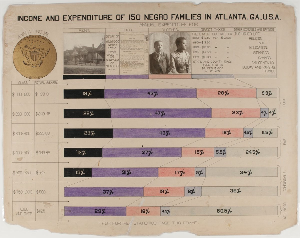
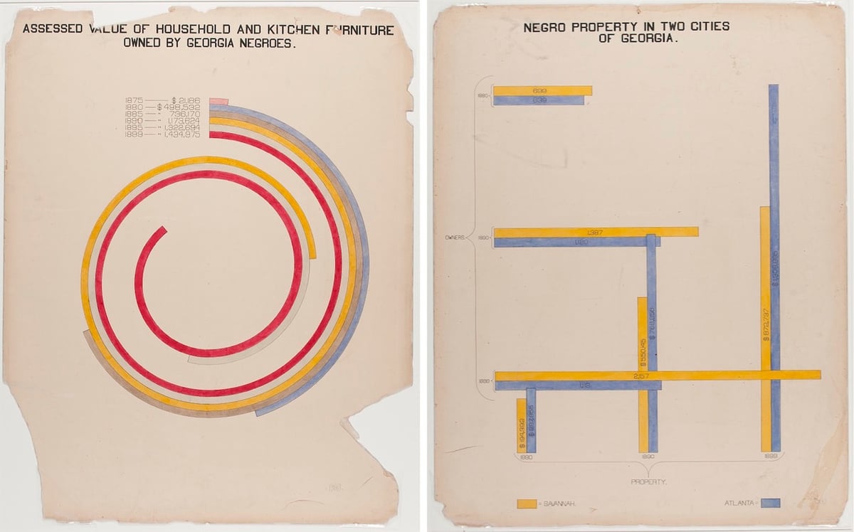
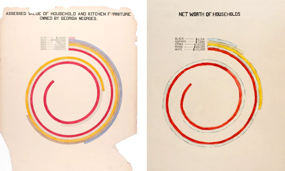
W.E.B. Du Bois was an American author, sociologist, historian, and activist. Apparently Du Bois was also a designer and design director of some talent as these hand-drawn infographics show.
In addition to an extensive collection of photographs, four volumes containing 400 official patents by African Americans, more than 200 books penned by African-American authors, various maps, and a statuette of Frederick Douglass, the exhibition featured a total of fifty-eight stunning hand-drawn charts (a selection of which we present below). Created by Du Bois and his students at Atlanta, the charts, many of which focus on economic life in Georgia, managed to condense an enormous amount of data into a set of aesthetically daring and easily digestible visualisations. As Alison Meier notes in Hyperallergic, “they’re strikingly vibrant and modern, almost anticipating the crossing lines of Piet Mondrian or the intersecting shapes of Wassily Kandinsky”.
Update: Oh, this is great: Mona Chalabi has updated Du Bois’ charts with current data.
Wealth. If I had stayed close to the original chart, the updated version would have shown that in 2015, African American households in Georgia had a median income of about $36,655, which would fail to capture the story of inflation (net asset numbers aren’t published as cumulative for one race). Instead, I wanted to see how wealth varies by race in America today.
The story is bleak. I hesitated to use the word “worth”, but it’s the language used by the Census Bureau when they’re collecting this data and, since money determines so much of an individual’s life, the word seems relevant. For every dollar a black household in America has in net assets, a white household has 16.5 more.
Josh Marshall from Talking Points Memo urges us that when it comes to figuring out what Donald Trump’s up to, we should keep it simple. The media has covered Trump for more than 30 years, he appeared weekly on television for several years, and the coverage of his campaign over the past two years was unprecedented. That, says Marshall, means that we know Trump and his motivations quite well at this point and offers a list of five things we should keep in mind:
1. Trump is a Damaged Personality
2. Trump is a Great Communicator
3. Trump’s Hold on His Base Is Grievance
4. Trump is Possible Because of Partisan Polarization
5. Trump is Surrounded By Extremists and Desperados
Trump is an impulsive narcissist who is easily bored and driven mainly by the desire to chalk up ‘wins’ which drive the affirmation and praise which are his chief need and drive. He needs to dominate everyone around him and is profoundly susceptible to ego injuries tied to not ‘winning’, not being the best, not being sufficiently praised and acclaimed, etc. All of this drives a confrontational style and high levels of organizational chaos and drama. This need for praise and affirmation and a lack of patience for understanding the basic details of governing are a volatile and dangerous mix. They catalyze and intensify each other. Perhaps most importantly, the drive to be the best and right drives promises, claims and policy pronouncements which may contradict his already existing positions or be impossible to fulfill.
Marshall also calls out something I’ve been thinking about recently, the Make America Great Again branding:
‘Make America Great Again’ may be awful and retrograde in all its various meanings. But it captured in myriad ways almost every demand, fear and grievance that motivated the Americans who eventually became the Trump base. It is almost certainly the case that MAGA is entirely Trump’s invention, not the work of any consultant or media specialist but from Trump himself. The Trump Trucker baseball cap, a physical manifestation of Trumpite branding, is similarly ingenious.
As much as I came to admire Pentagram’s work on Hillary Clinton’s campaign branding and loved the Obama campaign’s branding (complete with beautiful typefaces from Hoefler and Frere-Jones), I think the MAGA design easily beats them both. Marshall nailed it…it was exactly right for who it was designed to appeal to. It’s perhaps unlikely to happen, but the Make America Great Again hat should be added to the permanent collections of design museums as an exemplary example of branding, right alongside Got Milk?, Think Different, and Just Do It. (Also, you know who else came up with an extraordinarily effective design for his fascist authoritarian movement?)
Abstract is an upcoming documentary series from Netflix that explores the art of design. Each of the eight episodes profiles a designer at the top of their discipline: photographer Platon, graphic designer Paula Scher, stage designer Es Devlin, illustrator Christoph Niemann, architect Bjarke Ingels, shoe designer Tinker Hatfield, interior designer Ilse Crawford, and automotive designer Ralph Gilles.
Step inside the minds of the most innovative designers in a variety of disciplines and learn how design impacts every aspect of life.
Looks like a Chef’s Table for design. All episodes will be available February 10.
Shigeru Miyamoto has designed dozens of the most popular video games in the world: Donkey Kong, Super Mario Bros, and the Legend of Zelda among them. In this video by Vox, Miyamoto shares how he thinks about game design.
This is one of the first times that a video game’s plot and characters were designed before the programming. [Miyamoto:] “Well, early on, the people who made video games, they were technologists, they were programmers, they were hardware designers. But I wasn’t. I was a designer, I studied industrial design, I was an artist, I drew pictures. And so I think that it was in my generation that people who made video games really became designers rather than technologists.”
Also worth watching is this video by Game Maker’s Toolkit about how Nintendo builds everything in their games around a fun and unique play mechanic.
It seems to me that these two videos slightly contradict each other, although maybe you’ll disagree.
French drone company Parrot recently announced significant layoffs and will shift focus away from their recreational drone business.
French company Parrot has had a rough year and missed its sales expectations. That’s why the company will lay off 290 employees who were working on drones. In total, Parrot currently has 840 employees on the drone team and more than a thousand employees in total.
While the company isn’t just selling drones, it represents a good chunk of the business. But it looks like other companies, such as DJI, are doing better in this market. Parrot expected to report $105.9 million in sales for 2016. It reported $90 million instead (€85 million vs. €100 million expected).
Even though the company is still selling quite a few drones, Parrot says that it doesn’t generate healthy margins. So here’s the new plan: focusing on commercial drones.
Well, this explains my holiday shopping difficulties with Parrot. Ollie asked for a drone for Christmas and after doing some research, I decided on the Parrot Swing. Amazon was out of stock, so I decided to buy directly from Parrot. They had stock and the site said they’d ship in plenty of time for Xmas. So I ordered one. The next day, I get a call from Parrot saying I need to “verify my order”. So, I call them back, give them some info about my order and where it’s being shipped and the very nice woman on the phone tells me that I’m all set and they’re shipping it out.
Two days go by, no shipping confirmation email in sight. I get another voicemail: you need to call us to verify your order. I call back, give them the same info and tell them, oh by the way I’ve already done this once. Profuse apologies were offered, that was a mistake, and the very nice woman on the phone tells me she’s going to tell the shipping people to send out my order “right away”. It will still arrive in time for Xmas. The next day I get an email from Parrot:
Hello! We have refunded your order No. XXXXX-XXXXX placed 12/15/2016. We are sorry that your order did not meet your expectations and hope that you will visit us again.
Obviously, I am done with them at this point but still need that drone. Amazon is still out of stock, but Walmart has them. I order one, it arrives two days later (with free shipping), and on Christmas morning, after some reflection, Ollie says it was the best present Santa has ever gotten him.
I did quite a bit of holiday shopping this year…went a bit nuts making up for some not-so-great efforts the past two years. The kids and I shopped for Toys for Tots (twice), I bought gifts for them from me and from Santa, I bought non-holiday stuff like clothes for myself,1 and I shopped virtually for the gift guide. I shopped every which way: small, locally, at big box stores, and online at 4-5 different retailers. My main takeaway from that experience? Amazon is miles and miles and miles ahead of everyone else. It is not even close.
Sure, Walmart had the drone in stock, but when I’d tried shopping with them earlier in the month, the product page threw a 404 error. I switched to Safari and was able to put the item into my cart, but then a form in the ordering flow wouldn’t work, so I had to get that item elsewhere. (When I did finally create an account while ordering the drone, Walmart thought my name was “Ashley”?!)
Target’s site was so slow that it was nearly unusable (like 30-40 seconds for a product page to start loading). But I persevered because they had an item I really wanted that no one else had in stock. I got an email two days before Xmas saying they were out of stock and couldn’t ship until Jan 4 at the earliest, but that if I still wanted the item, I would have to log in to my account to verify the new shipping date. I didn’t want the item later, so I did nothing. Guess what arrived on my doorstep last week?
My troubles with Parrot I shared above. The local toy stores are expensive (Lego sets are $5-10 more than if you buy online) and ran out of popular items 2-3 weeks before Xmas. Very few online stores outside Amazon, Walmart, etc. had clear holiday shipping policies, so relying on them more than a week or two out was risky. Zappos was great (Amazon owns them) and Patagonia was pretty good, although their shipping estimates aren’t that great and returns aren’t free.
And Amazon? The site is always fast, I have never seen a 404’d product page, the URLs for their products haven’t changed in almost 20 years,1 each product page was clearly marked with holiday shipping information, they showed the number of items in stock if they were running low, shipping was free (b/c I’m a Prime member), returns are often free, and the items arrived on time as promised. More than 20 years after the invention of online retailing, how is it that Amazon seems to be the only one that’s figured all this out? How come massive companies like Walmart and Target, whose very businesses are under immense pressure from Amazon, can’t get this stuff right despite having spent hundreds of millions on it? I’m not a financial analyst, but unless something changes drastically, Amazon is just going to continue to eat more and more of the US retail pie and at this point, with all these advantages they’ve accrued and their razor-sharp focus on low pricing, it’s difficult to see how anyone is going to compete.1
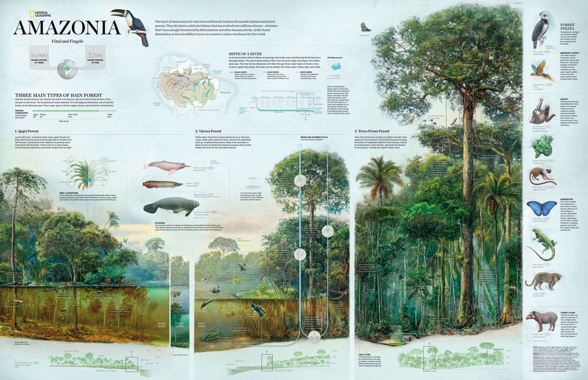
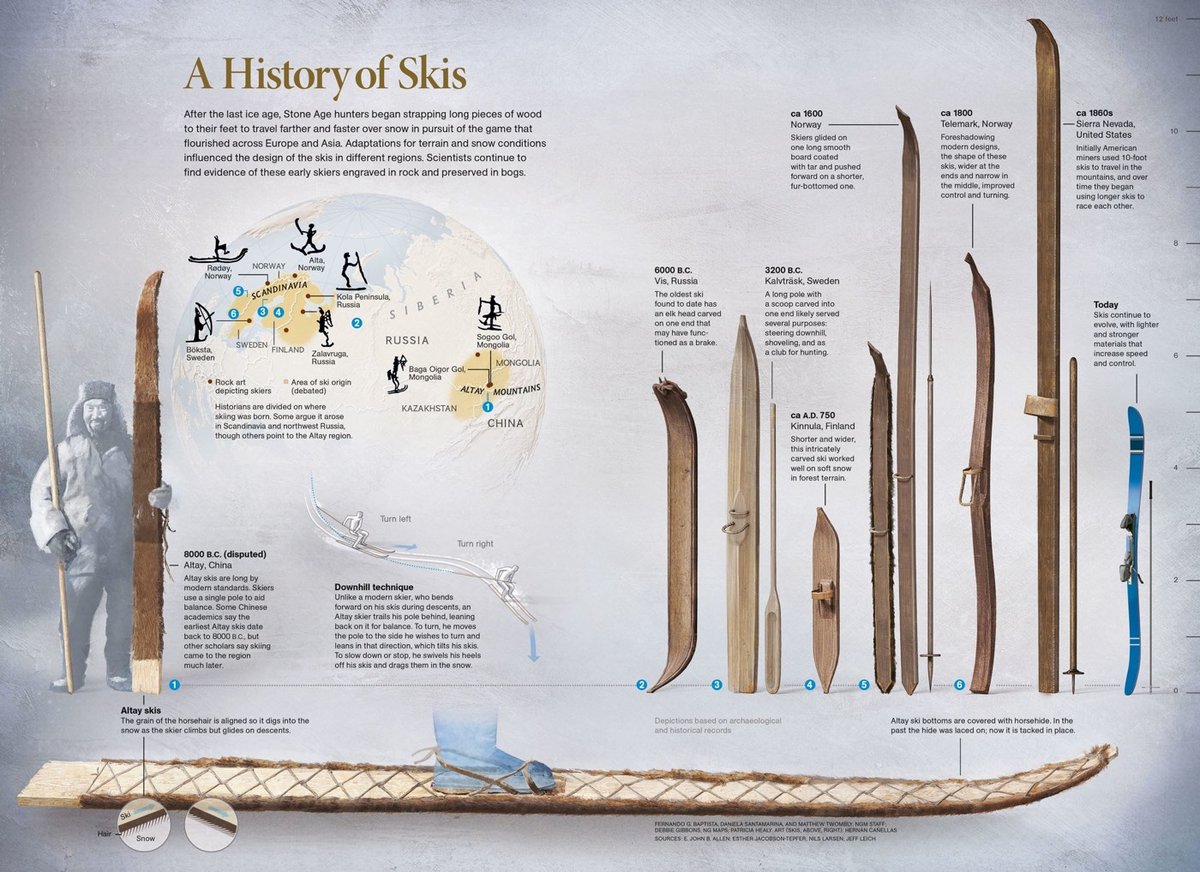
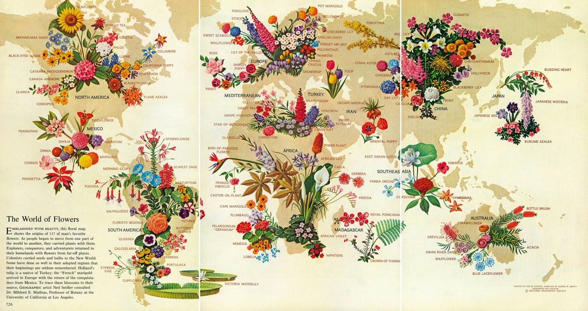
National Geographic Infographics is an anthology published by Taschen of some of the best infographics featured by National Geographic in the past 128 years.
Through seven sections — History, The Planet, Being Human, Animal World, World of Plants, Science and Technology, and Space — we encounter the rise and fall of the Roman Empire, the mysterious origins of the Easter Island statues, Cleopatra’s Alexandria and a history of Hawaiian surfboarding, all distilled in expert, accessible graphic form. We discover how our genetic patterns have been pieced together over the years or how hip-hop emerged as a cultural heavyweight; we get to grips with global warming, and explore our ever-expanding study of an ever-expanding universe.
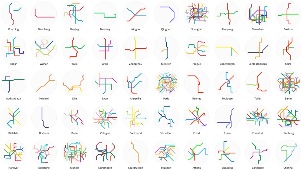
Mini Metros features small and simplified maps of over 200 metro and light rail systems from around the world. Many of the systems are small and simple themselves, just a single line or two, like in Edmonton, Mumbai, Seville, and Qingdao. Others, like in Munich, Shanghai, Tokyo, London, Seoul, and New York, are densely interconnected.
Prints and mugs are available.
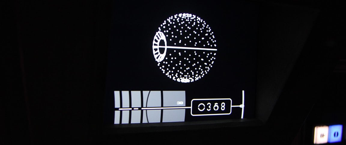

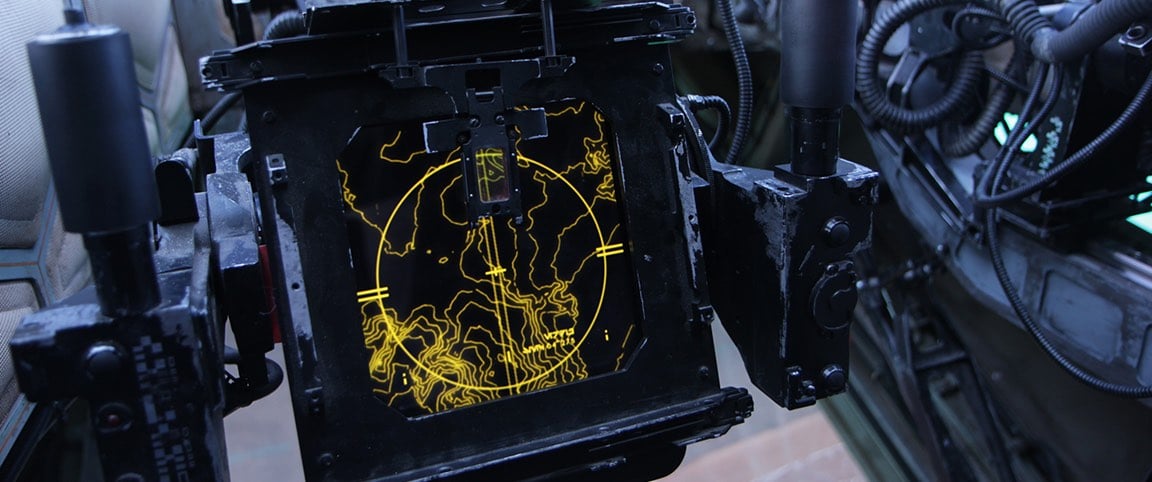
From design firm Blind Ltd, the user interface graphics they did for Rogue One. They had some graphics from the original Star Wars to play off of, but this is still really nice work. Blind also did onscreen interfaces for The Force Awakens, the Batman films, and some recent Bond films. (via @pieratt)
Art director Antonio Alcalá, one of four art directors employed by the USPS, talks a little bit about the history behind US postage stamps and how they are designed and produced.
In the US, cars went from curvy in the 30s & 40s to boxy in the 60s and then back to curvy in the 90s. The price of oil, design imported from Europe, and fuel economy regulations all played a factor in the changes.
Update: A strong rebuttal from Jalopnik:
This Vox Video About The Evolution Of Cars Is A Complete Mess. (via @nick__vance)

The North American Cartographic Information Society has published the third volume of The Atlas of Design, a book consisting of “beautiful and inspiring maps from around the world”.
National Geographic took a look at some of the maps included in the book.
The striking panorama above of Denali and the Alaska Range was created by draping satellite imagery over a three-dimensional model of the terrain. Brooke Marston, a cartographer at the U.S. State Department’s Bureau of Intelligence and Research, was inspired by the Austrian artist Heinrich Berann, who is famed for his beautiful panoramas of mountain ranges.
While Berann took some artistic license with the precise location and positioning of mountains in his panoramas, Marston’s map is true to the geography. The oblique, bird’s-eye view emphasizes the sheer size of the mountains while maintaining a closeness with the viewer. “Good oblique mapping can transport the viewer straight into the landscape,” Elmer says. “This map makes me feel lost among the jagged, cold, majestic mountains just looking at it.”
Andy Baio has redesigned his long-running blog Waxy.
After 14 years of blogging, I switched from MovableType to WordPress. The design is finally responsive, though pretty minimalist for now with lots of rough edges. It took some effort, but I preserved the links to everything I’ve ever written — 472 posts and 15,891 links.
In his post about the redesign, he notes why he still continues to publish on his own site:
Ultimately, it comes down to two things: ownership and control.
Last week, Twitter announced they’re shutting down Vine. Twitter, itself, may be acquired and changed in some terrible way. It’s not hard to imagine a post-Verizon Yahoo selling off Tumblr. Medium keeps pivoting, trying to find a successful revenue model. There’s no guarantee any of these platforms will be around in their current state in a year, let alone ten years from now.
Here, I control my words. Nobody can shut this site down, run annoying ads on it, or sell it to a phone company. Nobody can tell me what I can or can’t say, and I have complete control over the way it’s displayed. Nobody except me can change the URL structure, breaking 14 years of links to content on the web.
I might have said “freedom” instead of “control” but there’s some hard nodding from me right here. I’d also add something about the freedom to pursue revenue in whatever way you want. Publishing on YouTube or Facebook or Medium or Instagram or Twitter limits how you can do that.
But given the state of the open web these days, Andy rightly notes that going it alone is much more difficult now than it used to be:
But the ecosystem for independent publications is fundamentally broken. Getting discovered, building a readership, and profiting from your work as an independent writer are all much, much harder than they used to be.
I also have lots of thoughts about this, and I’m glad Andy has decided to join me in sticking it out and remaining independent. Waxy is one of my favorite sites in the world and I’m happy to see it looking so smart this morning.
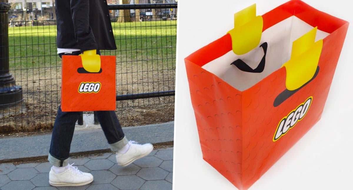
These Lego shopping bags are cleverly designed to make people carrying them look like they have Lego minifig arms. Fantastic design. (via @andrewbloch)
This folding measuring spoon on Kickstarter is clever as hell. Polygons lays flat in a drawer and, depending on how you pick it up, folds into four different volumes.
Premarked areas on both spoon sizes (tablespoon and teaspoon) let you know where to pick up from to measure the volume required for your recipe. Practicality and simplicity at its finest.
The spoons come in two sizes (the smaller measures teaspoons and the larger one tablespoons), they’re marked with US and metric measurements, you can flatten it to easily scrape every last bit of stuff into the bowl, and it doubles as a knife when flat as well. (via colossal)
Update: Hmm, it looks like Polygons needs a little more work to be a fully functional product. (thx, mac)

This is a lovely infographic from Eleanor Lutz of a bunch of different heartbeat EKG waves, from a normal heartbeat to a flatline to ventricular fibrillation (“must be treated immediately with CPR and defibrillation”.) Prints are available.
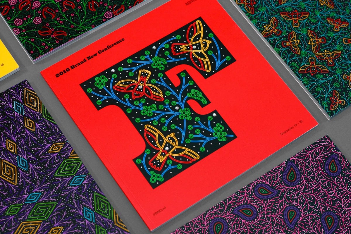
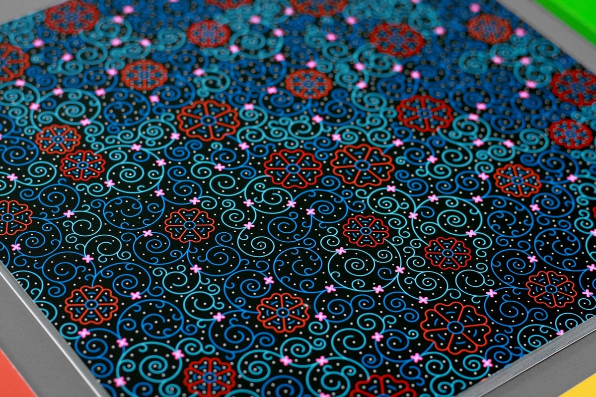
I love this design work from UnderConsideration for their recent conference in Nashville. It’s got a Western rhinestone + woodtype vibe but it also feels digital — the first thing that popped into my head when I saw that gorgeous F was a circuit board. Wonderful. (via @Colossal)
Designing Your Life is one of the most popular courses at Stanford. Taught by Bill Burnett and Dave Evans, the class teaches how you can use design thinking and techniques to shape your life and career. Burnett and Evans just came out with a book based on the class, Designing Your Life: How to Build a Well-Lived, Joyful Life.
In this book, Bill Burnett and Dave Evans show us how design thinking can help us create a life that is both meaningful and fulfilling, regardless of who or where we are, what we do or have done for a living, or how young or old we are. The same design thinking responsible for amazing technology, products, and spaces can be used to design and build your career and your life, a life of fulfillment and joy, constantly creative and productive, one that always holds the possibility of surprise.
The course itself isn’t available online, but there are a couple of lectures from the class available on YouTube: Reframe Your Passion and Prototypes for Personal Success.
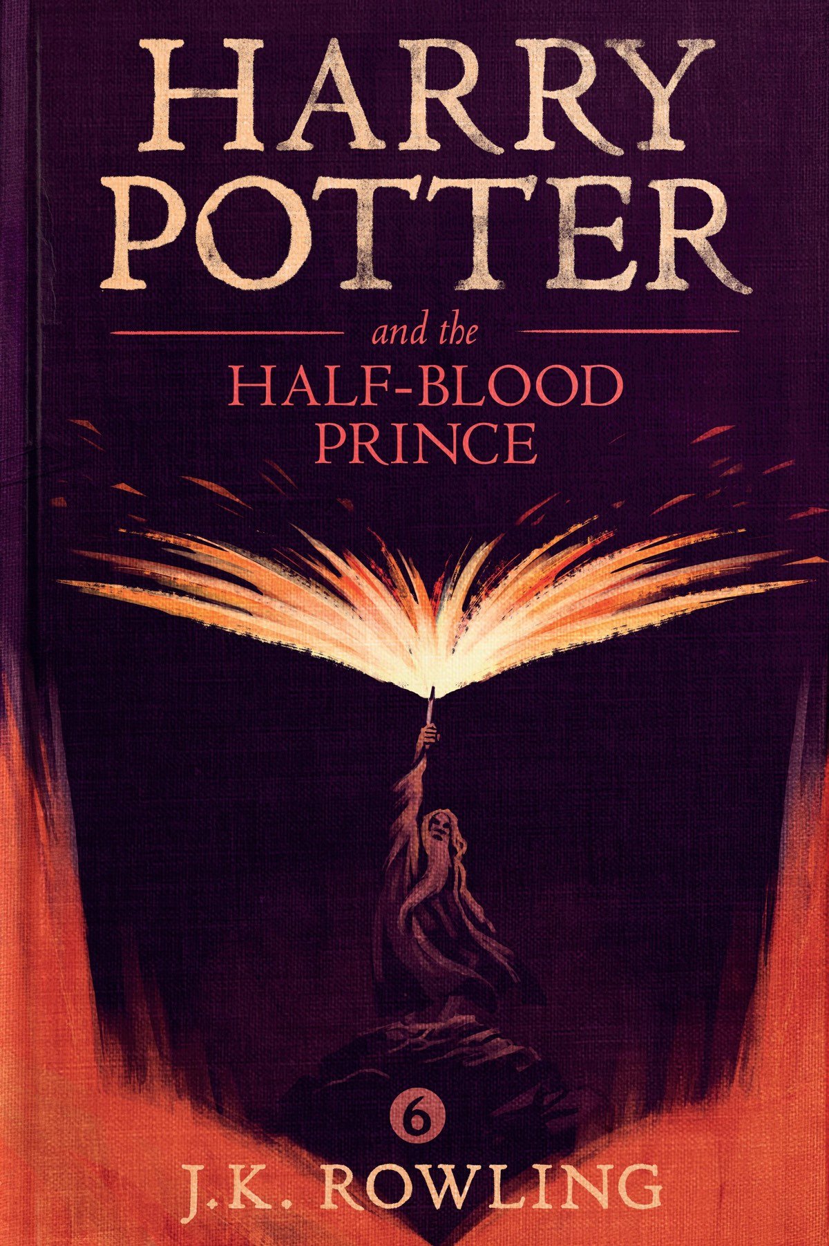
I first ran across the work of designer Olly Moss several years ago, when he designed some super-simple alternate posters for iconic movies. He’s since worked on a whole bunch of great stuff, like Firewatch and posters for Studio Ghibli. Just the other day, while the kids and I were finding out what our Patronuses are,1 I discovered that Moss not only designed the cover of the forthcoming ebook of Fantastic Beasts and Where to Find Them but also did the covers for all seven of the Harry Potter ebooks.
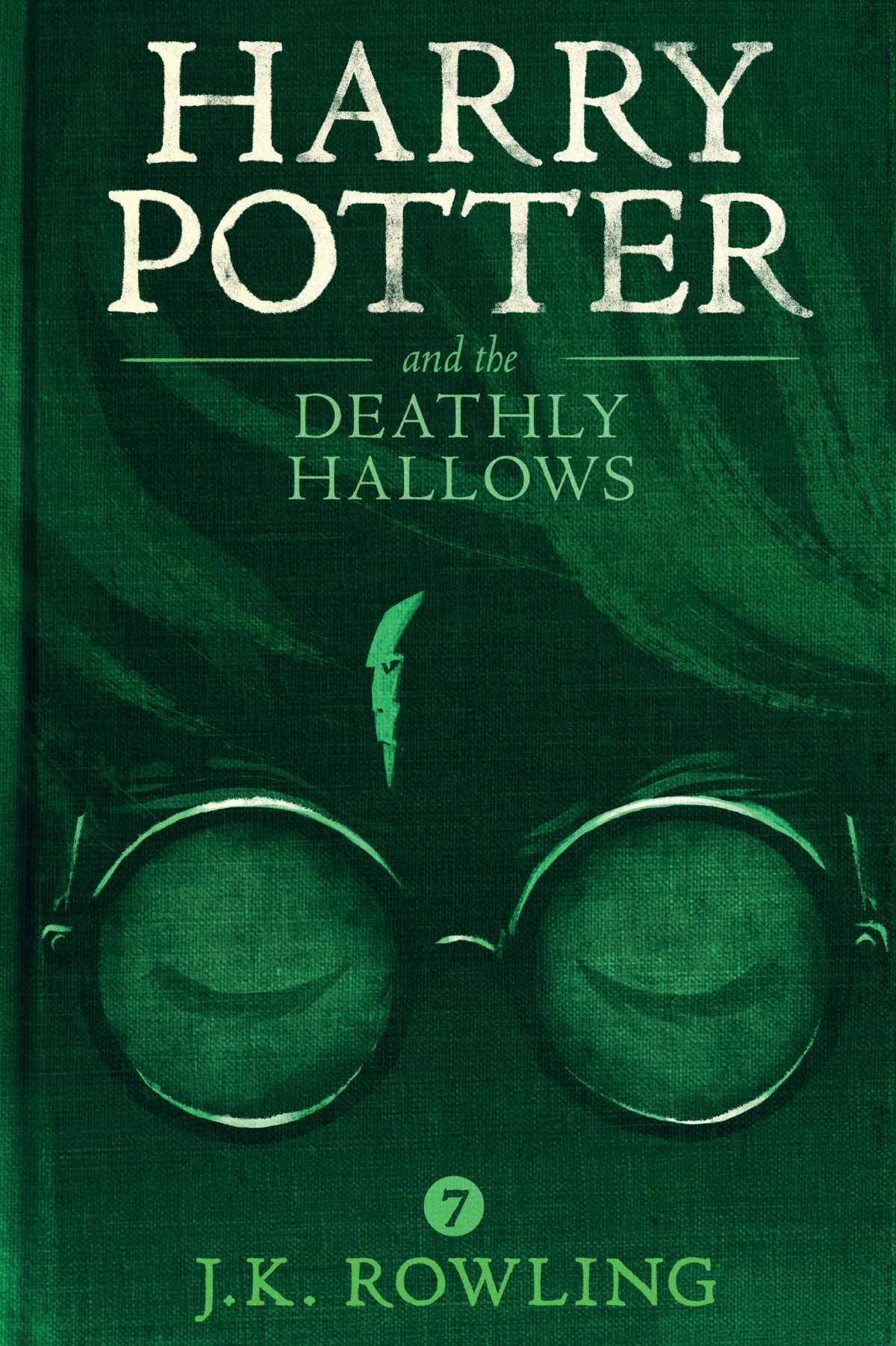
Moss’ main technique, of combining two or more aspects of the story into a single image, is on full display in the Potter covers — the prison on a rock shaped like a dog for Azkaban, Voldemort as Harry’s scar for Hallows, and Dumbledore’s spell casting forming the pages of a textbook for Half-Blood Prince.
Newer posts
Older posts




Socials & More