The surprising history of the infographic

From Clive Thompson, a history of the infographic, which was developed in part to help solve problems with an abundance of data available in the 19th century.
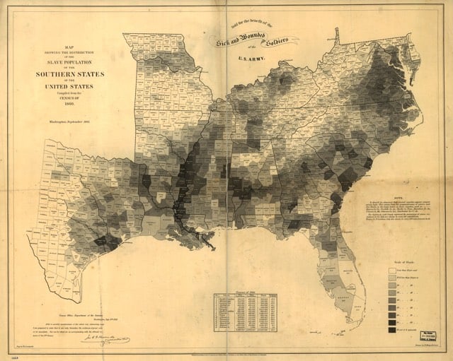
The idea of visualizing data is old: After all, that’s what a map is — a representation of geographic information — and we’ve had maps for about 8,000 years. But it was rare to graph anything other than geography. Only a few examples exist: Around the 11th century, a now-anonymous scribe created a chart of how the planets moved through the sky. By the 18th century, scientists were warming to the idea of arranging knowledge visually. The British polymath Joseph Priestley produced a “Chart of Biography,” plotting the lives of about 2,000 historical figures on a timeline. A picture, he argued, conveyed the information “with more exactness, and in much less time, than it [would take] by reading.”
Still, data visualization was rare because data was rare. That began to change rapidly in the early 19th century, because countries began to collect-and publish-reams of information about their weather, economic activity and population. “For the first time, you could deal with important social issues with hard facts, if you could find a way to analyze it,” says Michael Friendly, a professor of psychology at York University who studies the history of data visualization. “The age of data really began.”


Socials & More