kottke.org posts about art
Man, I really like these paintings from Jeremy Mann’s Cityscape series. Particularly the NYC street scenes, like this one in Hell’s Kitchen:
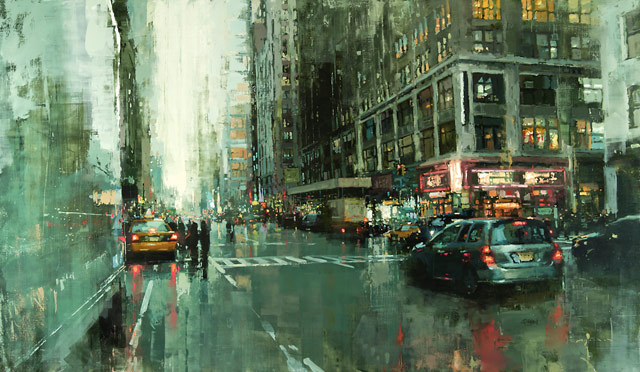
Mann’s paintings seem to hold a lot of detail, even up close, but there are also broader strokes visible only from afar. Not sure if that’s novel (unlikely) but I haven’t seen it elsewhere. (via colossal)
Swiss artist Zimoun used a bunch of fans and packing peanuts to make it look like an angry foaming ocean inside this building:
Zimoun’s piece is on display through July 11 at la Limonaia di Villa Saroli in Lugano, Switzerland. (via coudal)
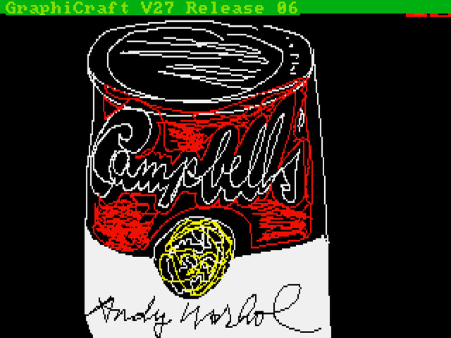
In the 1980s, when personal computers with graphics capabilities were first introduced, Andy Warhol was an enthusiastic early adopter. In 1985, Commodore commissioned the artist to produce some art on their Amiga computer, but the work was never widely shown and was assumed lost. Then artist and retro computer nerd Cory Arcangel learned of Warhol’s Amiga experiments from this video (and perhaps this article from a 1986 issue of Amigaworld) and set in motion the process of finding out if any of the computers or storage devices in The Andy Warhol Museum contained his Amiga art.
CMU Computer Club members determined that even reading the data from the diskettes entailed significant risk to the contents, and would require unusual tools and methodologies. By February 2013, in collaboration with collections manager Amber Morgan and other AWM personnel, the Club had completed a plan for handling the delicate disk media, and gathered at The Andy Warhol Museum to see if any data could be extracted. The Computer Club set up a cart of exotic gear, while a video crew from the Hillman Photography Initiative, under the direction of Kukielski, followed their progress.
It was not known in advance whether any of Warhol’s imagery existed on the floppy disks-nearly all of which were system and application diskettes onto which, the team later discovered, Warhol had saved his own data. Reviewing the disks’ directory listings, the team’s initial excitement on seeing promising filenames like “campbells.pic” and “marilyn1.pic” quickly turned to dismay, when it emerged that the files were stored in a completely unknown file format, unrecognized by any utility. Soon afterwards, however, the Club’s forensics experts had reverse-engineered the unfamiliar format, unveiling 28 never-before-seen digital images that were judged to be in Warhol’s style by the AWM’s experts. At least eleven of these images featured Warhol’s signature.
Incredible.
It’s been suggested that perhaps Johannes Vermeer painted his exacting masterpieces with the help of mirrors and lenses. Tim Jenison learned of these suggestions and started to study the problem.
He was in no rush. His R&D period lasted five years. He went to the Rijksmuseum in Amsterdam. “Looking at their Vermeers,” he says, “I had an epiphany” — the first of several. “The photographic tone is what jumped out at me. Why was Vermeer so realistic? Because he got the values right,” meaning the color values. “Vermeer got it right in ways that the eye couldn’t see. It looked to me like Vermeer was painting in a way that was impossible. I jumped into studying art.”
A recent documentary called Tim’s Vermeer (directed by Penn & Teller’s Teller) follows Jenison’s quest to construct a contraption that allows someone to paint as Vermeer did. Here’s a trailer:
Not sure you can find the movie in theaters anymore, but it should be out on DVD/download soon.
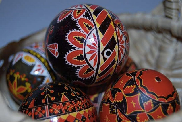
The small village of Ciocanesti in Romania produces the most beautiful hand-painted Easter eggs I’ve ever seen. This video is a wonderful look at the process and tradition.
Here’s how it works:
First, the (duck, goose, chicken, or even ostrich) egg is drained, through a tiny hole. Then, using a method akin to batik, it is dipped in dye and painted one color at a time, with the painter applying beeswax to those areas she wants to protect from the next round of dying. The painting implement, called a kishitze, is a stick with an iron tip. (Previously, egg-painters would have used thorns or pig bristles.)
And then the wax is melted and wiped off the egg, revealing the colors underneath. So cool. (via @colossal)
In a five part series called “emoji-nation”, Ukrainian Nastya Ptichek mixes the work of well-known painters with graphical elements of new media. In the second part of the series, the works of Edward Hopper are augmented with social media interface icons:
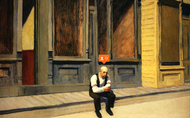
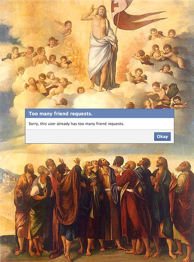
The first part finds emoji doppelgangers for works of fine art while the third part uses paintings as movie poster imagery for the likes of Kill Bill and Home Alone (paired with Munch’s The Scream). For part four, Ptichek places modal dialogs over art works:
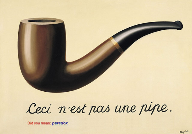
And part five plays around with several Google interface elements:
Love this kind of thing. Feels like I’ve seen something like it before though. Anyone recall?
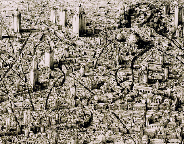
Ben Sack makes these amazingly detailed maps of cities, all drawn by hand.
And just so you can get a sense of how large these drawings are:
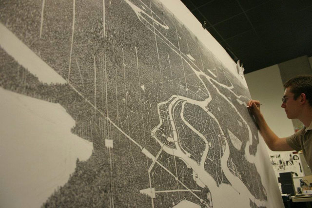
Here’s a peek at his process:
Reminiscent of Stephen Wiltshire’s work. And every time I see something like this, I think about when I went to the Met a few years ago and noticed the sketchbook of this guy working the membership desk. It was filled with beautifully intricate drawings of NYC-style city streets. I chatted with him about them briefly, but I wish I’d asked if he had put any of it online. Would have been neat to share his drawings with you. (via waxy)
I don’t know exactly what my expectations were of how lettering is painted on city streets, but this was not it. The level of precision and artistry is surprising.
Reminds me of this video of a hand-lettering master at work.
Update: Sure, he’s using a vehicle, but this guy is pretty good at line painting as well.
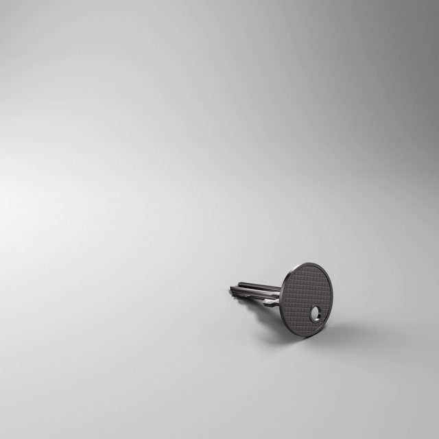
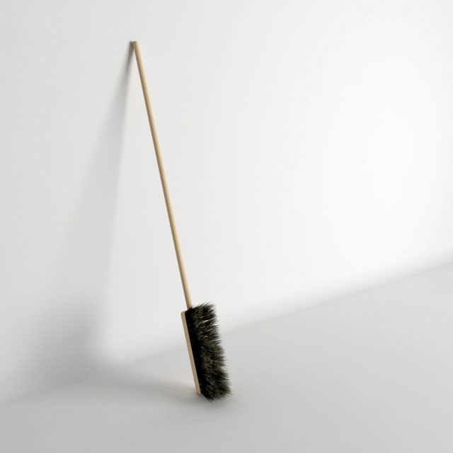
For her Uncomfortable Project, Katerina Kamprani redesigned useful objects; they’re still technically functional but are a pain in the ass to use. Like this key:
Or this awkward broom:
The very first of Marcel Duchamp’s readymades — ordinary manufactured objects that became art through a minimal artistic process — was called Bottle Rack. This is a replica housed at the Philadelphia Museum of Art:
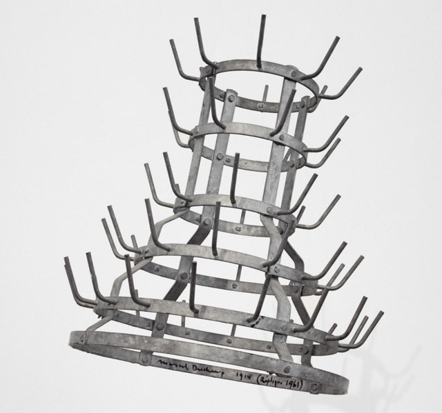
The original piece was purchased by Duchamp at BHV, a historic Parisian department store in the 4th arrondissement. It was sold as a rack for drying bottles. Duchamp intended to finish the piece by signing his name on it, but his sister had already thrown it out.
Legend has it that Duchamp’s second readymade didn’t fare so well either. “En prévision du bras cassé” (“In advance of the broken arm”) was a snow shovel on which its title was painted. A replica of the piece was allegedly mistaken for an actual shovel at a show in Chicago and used to clear sidewalks. But perhaps Duchamp wasn’t very much put out by the mistake because the snow-clearing artist inadvertently turned the shovel into what Duchamp called a “readymade réciproque” or “reciprocal readymade”.
He said that this would be a work of art used as an everyday, readymade object, such as “using a Rembrandt as an ironing board.” The readymade took an everyday mass-produced object and treated it as art. The assisted readymade took a mass-produced reproduction of a work of art and made it into a unique commentary on that work. The reciprocal readymade took a unique work of art and treated it like a mass-produced utilitarian object.
Ah, the circle of life.
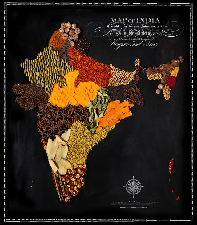
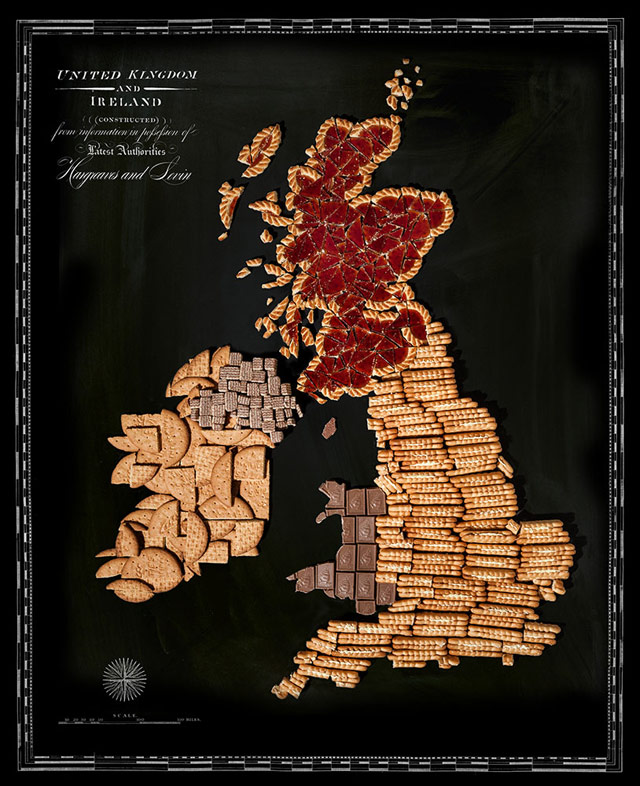
Henry Hargreaves and Caitlin Levin favor food as a medium for creating art. Their country maps made from native foods were cute at first glance, but in many cases the maps also reveal a link between a country’s food and its culture that I’d never really thought about before. For instance, the maps of India and British Isles feel very representative of their respective cultures to me:
Denis Medri illustrates scenes from Star Wars as if Luke, Leia, Han, and the rest of the gang were teenagers in an 80s movie like Back to the Future, Karate Kid, or Breakfast Club.
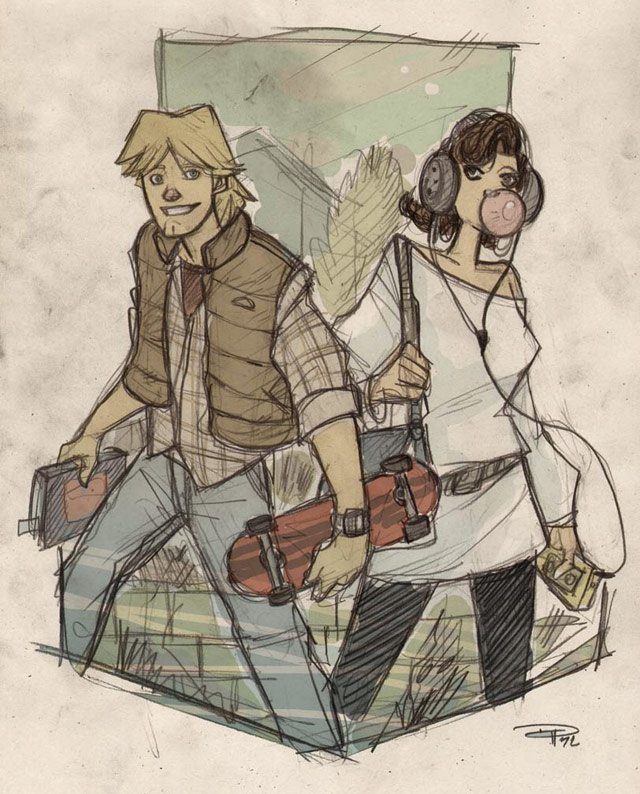
Great Scott, the Force is strong in these two.
Love these voxelated animal sculptures by New Zealand artist Ben Foster.
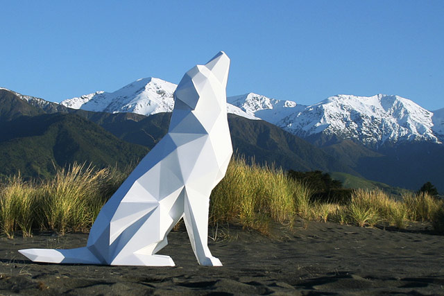
Very aesthetically (but perhaps not conceptually) New Aesthetic. (via colossal)
Pop Chart Lab has produced a print of grammatical diagrams of the opening lines of notable novels. Here’s Hemingway’s The Old Man and the Sea:
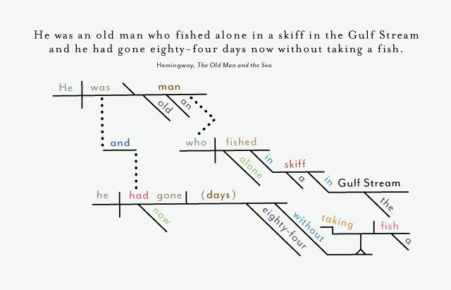
There are also sentences from DFW, Plath, and Austen. Prints start at $29.
For his Classic Movies in Miniature Style series, Murat Palta illustrated scenes from movies using traditional Ottoman motifs. Here’s A Clockwork Orange and Kill Bill:
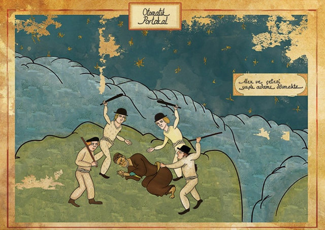
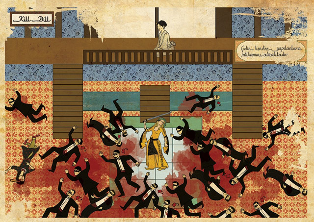
Great stuff. (via @pieratt)
Newer posts
Older posts

Socials & More