Periodic table of swearing
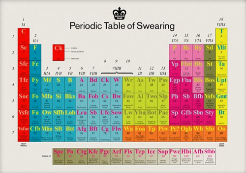
I would be fucking remiss in my duties here if I didn’t inform you of this bloody awesome periodic table of swearing, you bunch of stupid old wankers.

There’s goddamned prints available. (via clusterflock)


This site is made possible by member support. 💞
Big thanks to Arcustech for hosting the site and offering amazing tech support.
When you buy through links on kottke.org, I may earn an affiliate commission. Thanks for supporting the site!
kottke.org. home of fine hypertext products since 1998.
Beloved by 86.47% of the web.
I would be fucking remiss in my duties here if I didn’t inform you of this bloody awesome periodic table of swearing, you bunch of stupid old wankers.

There’s goddamned prints available. (via clusterflock)
Ferris Bueller. Fight Club. You see where this is headed, right?
Well done. (via matt)
Golan Levin and Kyle McDonald took some old code for converting between polar and cartesian geometries and hacked it to flatten out photos of flowers into panoramic landscapes.


Polar-to-cartesian unwrapping of flower photographs is the new flattening flowers between the pages of books. The Processing source code is available. NotCot applied the effect to chandeliers. I dorked around in Photoshop a little and you can get similar results using the “Polar Coordinates” filter…you just have to stretch out the image first. (via today and tomorrow)
Stieg Larsson is back with a previously unreleased Lisbeth Salander short story from his rumored extensive back catalog: The Girl Who Fixed the Umlaut.
She tried to remember whether she was speaking to him or not. Probably not. She tried to remember why. No one knew why. It was undoubtedly because she’d been in a bad mood at some point. Lisbeth Salander was entitled to her bad moods on account of her miserable childhood and her tiny breasts, but it was starting to become confusing just how much irritability could be blamed on your slight figure and an abusive father you had once deliberately set on fire and then years later split open the head of with an axe.
Considering the New Yorker’s umlaut policy, this is an unusual stone throw.
This mashup of Star Trek with Kesha’s Tik Tok just makes me really really happy.
Turns out there’s a whole mess of Kirk/Spock musical slash fiction (mash fiction?) on YouTube…there’s Kirk/Spock vs. Lady Gaga’s Monster, Kirk/Spock vs. She Blinded Me With Science, Kirk/Spock vs. I Kissed a Boy, Kirk/Spock vs. Jerry Mungo’s In the Summertime, Kirk/Spock/McCoy vs. The Beatles’ Come Together, Kirk/Spock vs. You Spin Me Round and many more. (via david)
Update: And here is Kirk/Spock vs. Closer by NIN, perhaps the Citizen Kane of Kirk/Spock musical slash fiction:
(thx, mark)
Warning: this video contains spoilers, violence, and cinematic greatness.
Many friends after seeing my video “Tarantino vs Coen Brothers” requested me to do a new video duel of directors, so I decided to do now a tribute to my two favorite directors, Stanley Kubrick and Martin Scorsese, were 25 days re-watching 34 films, selected more than 500 scenes, and a hard work editing.
Tarantino vs. Coen Brothers is here; and here’s Scorsese on Kubrick, in which I was delighted to learn that Scorsese thinks, as I do, that Eyes Wide Shut is underrated.
Woody = McNulty, Buzz = Stringer, and Mr. Potato Head = Bunk. (via stevey)
I’ve probably posted these before but they’re still neat: iconic photographs recreated in Lego.

The original version of the above can be seen here. (via @matthiasrascher)
The Economist redraws the map of Europe with some countries in new places.
In Britain’s place should come Poland, which has suffered quite enough in its location between Russia and Germany and deserves a chance to enjoy the bracing winds of the North Atlantic and the security of sea water between it and any potential invaders.
Love it. Robin Sloan has previously discussed this type of “production as performance” video on Snarkmarket but Pomplamoose has started using the term “VideoSong”:
This cover is a VideoSong, a new medium with 2 rules:
1. What you see is what you hear (no lip-syncing for instruments or voice).
2. If you hear it, at some point you see it (no hidden sounds).
As NPR explains, the band is actually making a living from their covers…they sold 100,000 songs last year. Here’s their album of covers on iTunes.
Pixelized video game characters lay waste to NYC.
Give it a few seconds to get going…things get good right around Tetris time.
Anthony Bourdain’s potty mouth + Ruth Reichl’s Twitter account = the luxuriously rude Twitter stylings of Ruth Bourdain.
Have you ever smoked tangerine zest in a bong? Incredible! Me and the cat are sky high
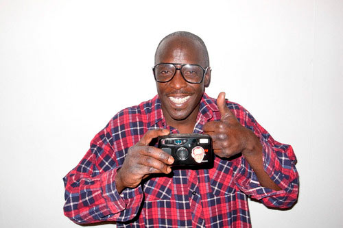
For the ten of you who watch The Wire *and* know who Terry Richardson is, this is for you.

I would very very much like to unsee this image.

From a collection of upside down celebrities…the Adam Sandler one might be even freakier.
Martin Becka and Cedric Delsaux are a pair of photographers who feature Burj Dubai in their work. Becka’s Burj comes from his Dubai, Transmutations project in which he uses the photogravure processing technique to make images of brand-new Dubai that look as though they were taken in 1880.

Delsaux’s Burj image comes from a project called The Dark Lens, which features images of Star Wars characters populating the circa-2008 Earth. I believe that’s the Millennium Falcon docking at the Burj:

Many more of The Dark Lens images are available on Delsaux’s site.
Working quickly, the DMTheatrics theater company has put together a stage performance of The Two Gentlemen of Lebowski beginning March 18 in NYC. The Two Gentlemen of Lebowski, if you don’t remember, is the what-if-Shakespeare-wrote-it version of The Big Lebowski that I linked to last week.
What if The Big Lebowski had been written by Shakespeare?
It was of consequence, I should think; verily, it tied the room together, gather’d its qualities as the sweet lovers’ spring grass doth the morning dew or the rough scythe the first of autumn harvests. It sat between the four sides of the room, making substance of a square, respecting each wall in equal harmony, in geometer’s cap; a great reckoning in a little room. Verily, it transform’d the room from the space between four walls presented, to the harbour of a man’s monarchy.
Yep, it’s the entire screenplay. The Knave abideth, indeed. (thx, conor)
A bunch of clips from movies and TV that show people enhancing things on computer screens:
And a more artful collection of hyperspace scenes from movies:
Both are via Andy, Mr. Supercuts himself.
This video of what Earth would look like with Saturnine rings is pretty ho-hum, yeah, there’s a shot from orbit of the Earth with Saturn’s rings around it, and then BAM! here’s what it would look like at night in NYC:

The view from Ecuador is pretty great too.
Update: Greg Allen wants an iPhone app that adds in Saturn’s rings to any shot you take with the camera.
With the combination of GPS and orientation data that’s baked in to so many digital photographs, it should be possible to create a filter — I hear the kids call them apps now — that automatically inserts properly positioned Saturn rings into any sky you want.
An augmented reality app would be nice too.
Jesus, this is nerdy (and hilarious): a Lady Gaga parody about a typeface.
(via @caterina)
What the world needs is a great flag, a flag of pure bliss. Here’s one of the intermediate steps to the finished product; it’s an average of all the world’s countries’ flags weighted by population.

Scenes from several movies that depict New York being destroyed (Day After Tomorrow, Ghostbusters, Independence Day, etc.) accompanied by George Gershwin’s Rhapsody in Blue, which famously accompanies a similar but less violent montage at the beginning of Woody Allen’s Manhattan.
Or…
Watch New York get fucking destroyed in the movies!!!
This is amazing: a stop-motion recreation of the Neo-dodges-bullets-on-the-roof scene from The Matrix done entirely in Lego.
Map of the US Interstate system in the style of the London Tube map.

Go large for detail. (via coudal)
Somehow Ricardo Autobahn has constructed a coherent mix-video song from all sorts of movie and TV clips. It’s just flat-out awesome; watch it:
See also Christian Marclay. (via fimoculous)
Just out. Haven’t listened yet (downloading now) but if the last three are any indication, this is gonna be a great Monday for listenin’. Sample tracks:
5. Lil Wayne (feat. Babyface) vs Royksopp - Comfortable Up Here
15. Michael Jackson vs Ratatat - Billie “Wildcat” Jean
19. R. Kelly (feat. Keri Hilson) vs Sally Shapiro - Number One Christmas
31. Ghostface Killah vs Beirut - Save Me Concubine
Socials & More