kottke.org posts about photography
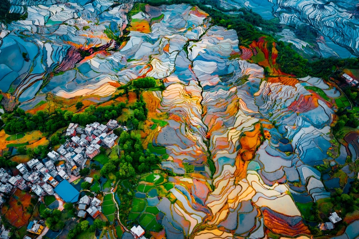
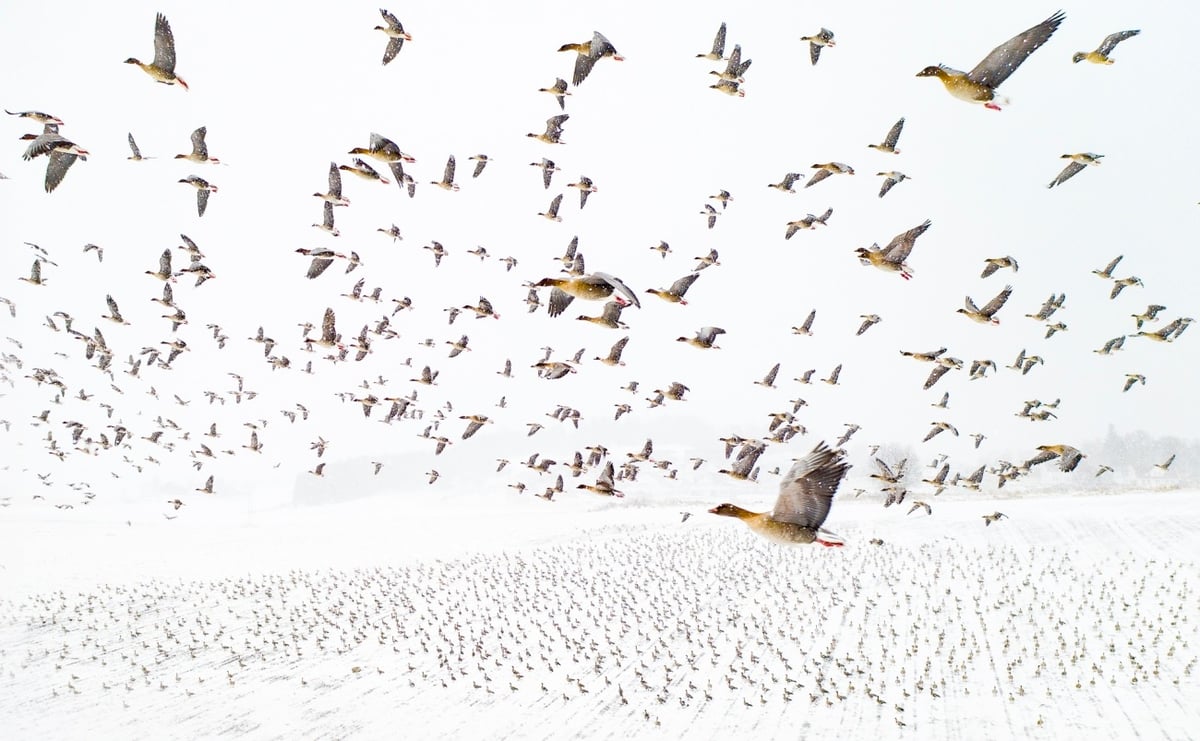
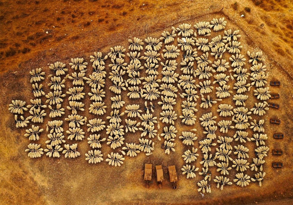
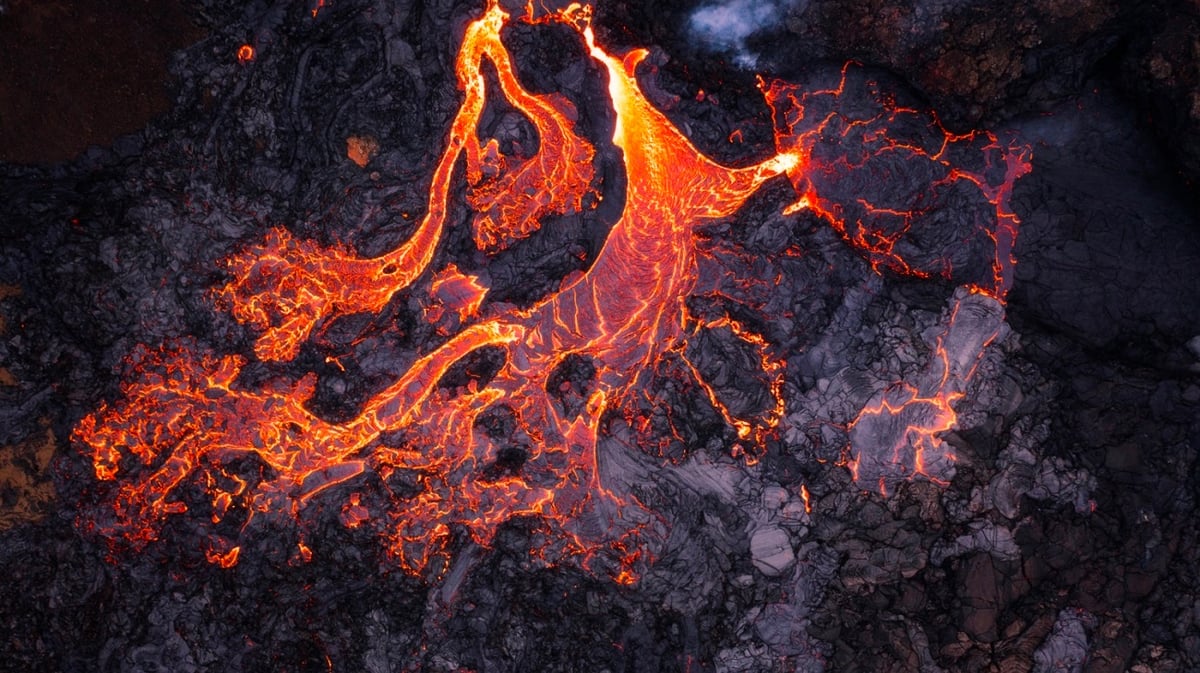
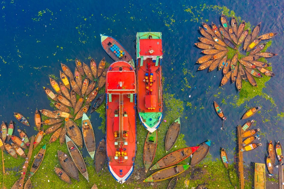
Drones have been around for awhile now, but I have yet to tire of the bird’s-eye images captured from above this remarkable planet of ours. The gallery of the winning images in the 2021 Drone Photo Awards is full of tiny doses of the overview effect. I’ve chosen a few of my favorites above. Photo credits, from top to bottom: Ran Tian, Terje Kolaas, Yoel Robert Assiag, Oleg Rest, and Md Tanveer Hassan Rohan.
See also this drone photo of Cao Bang, Vietnam that I shared recently. (thx, caroline)
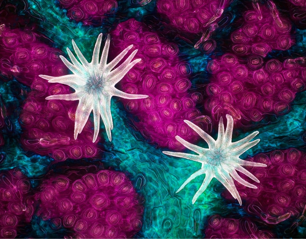
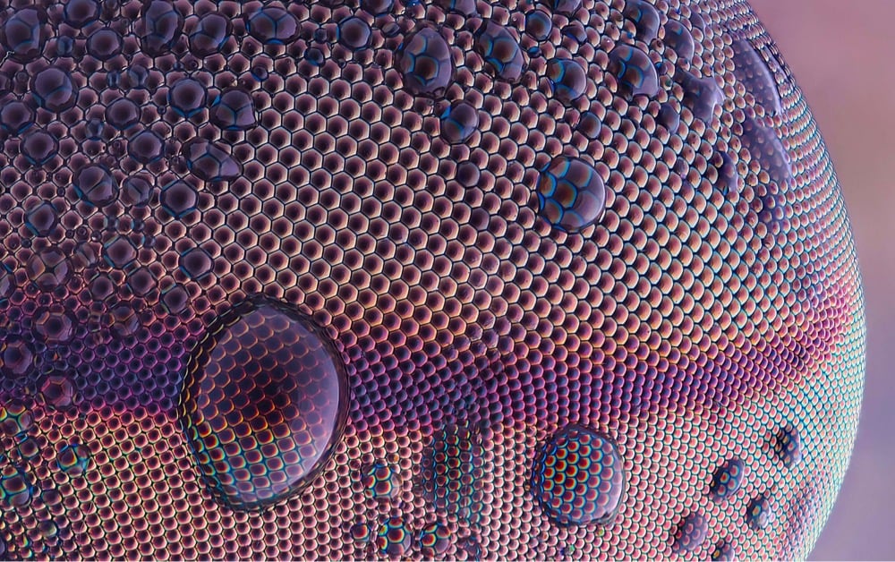
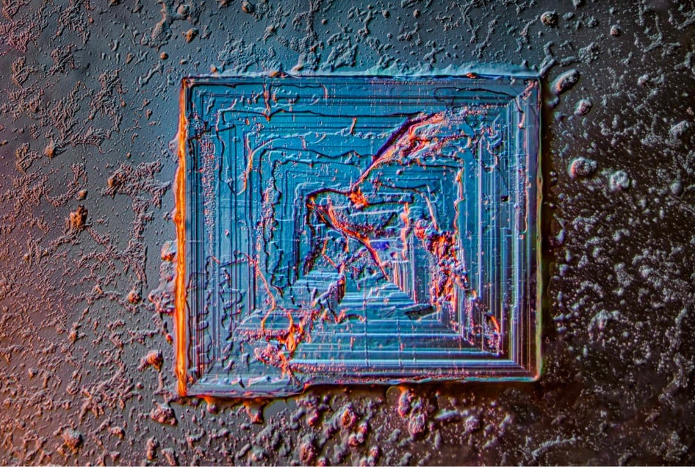
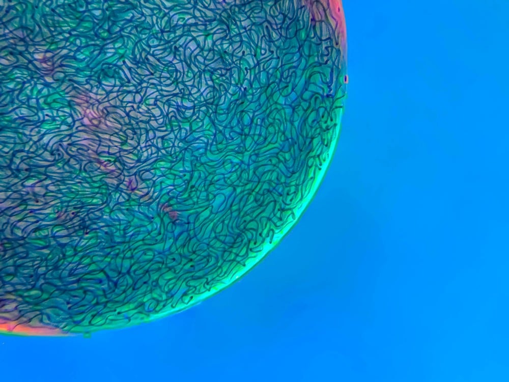
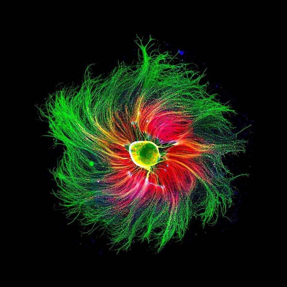
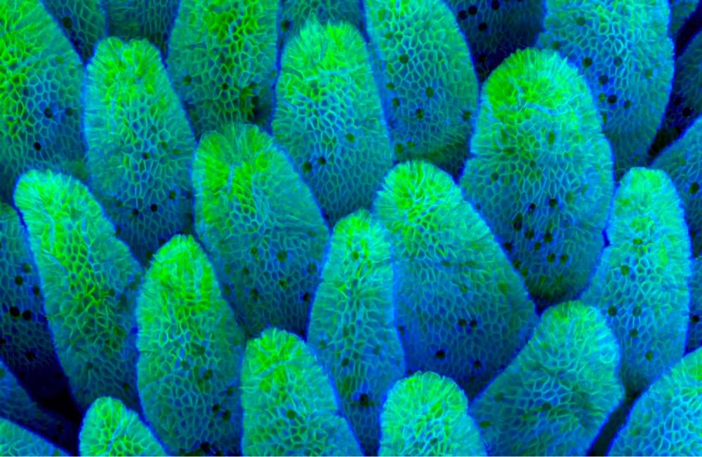
This is always a favorite of mine… Nikon has announced the winners of the Small World Photomicrography Competition for 2021. As always, I’ve shared a few of my favorites above. Photo credits from top to bottom: Jason Kirk, Oliver Dum, Saulius Gugis, Martin Kaae Kristiansen, Paula Diaz, and Caleb Dawson.
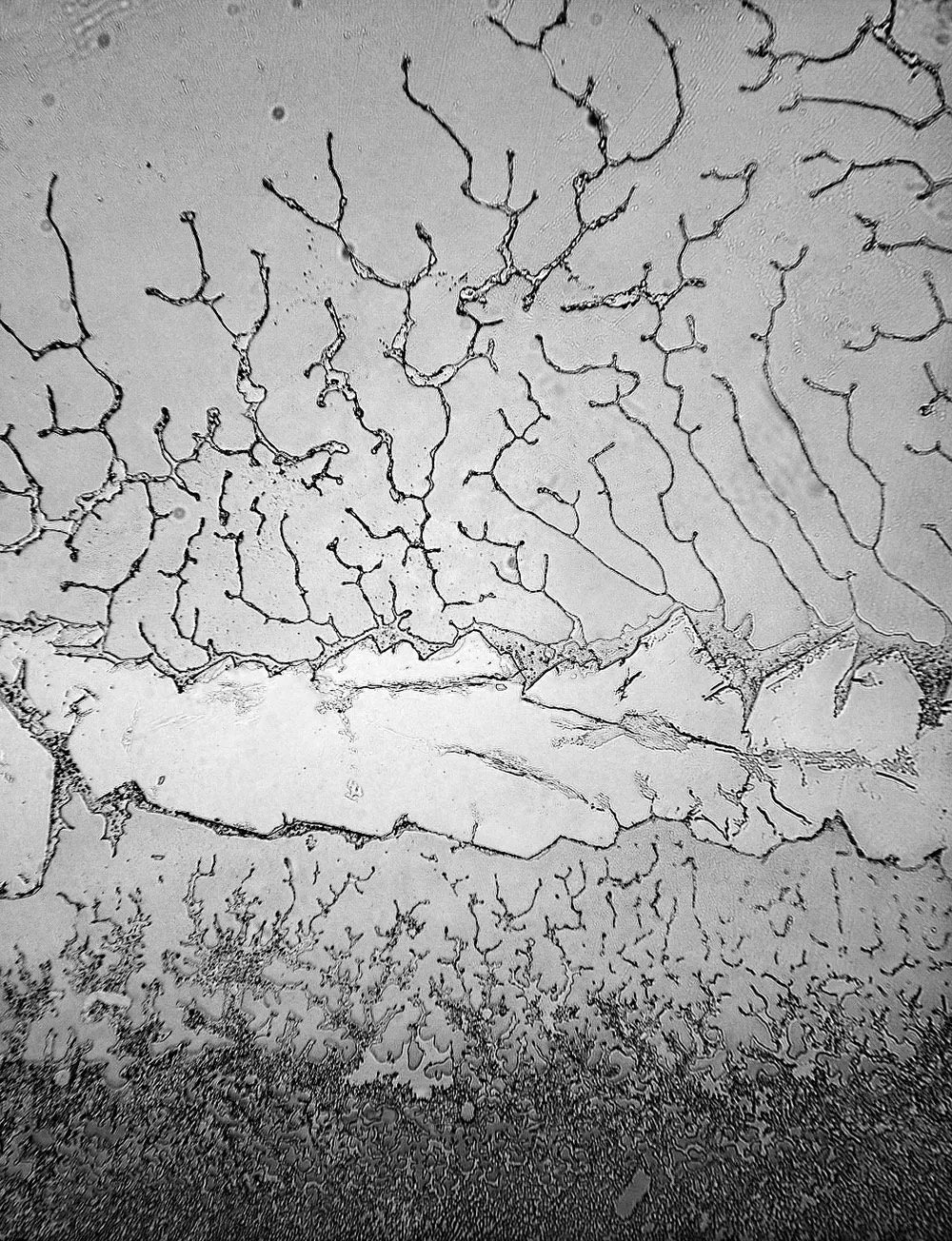
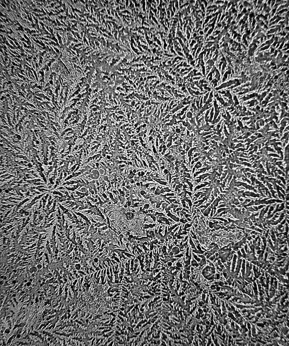
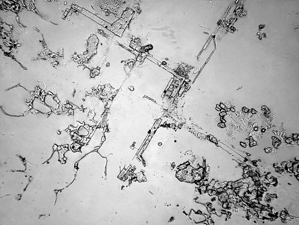
For her project Topography of Tears, Rose-Lynn Fisher used a microscope to photograph the crystalized patterns of dried human tears. Part of why the images all look different is because tears are made up of varying chemicals depending on why they’re made.
Scientifically, tears are divided into three different types, based on their origin. Both tears of grief and joy are psychic tears, triggered by extreme emotions, whether positive or negative. Basal tears are released continuously in tiny quantities (on average, 0.75 to 1.1 grams over a 24-hour period) to keep the cornea lubricated. Reflex tears are secreted in response to an irritant, like dust, onion vapors or tear gas.
All tears contain a variety of biological substances (including oils, antibodies and enzymes) suspended in salt water, but as Fisher saw, tears from each of the different categories include distinct molecules as well. Emotional tears, for instance, have been found to contain protein-based hormones including the neurotransmitter leucine enkephalin, a natural painkiller that is released when the body is under stress.
This project is also available in book form. (via austin kleon)
Update: Per an email from the photographer, I’ve corrected the post above to note that these images were taken with a normal optical microscope, not a scanning electron microscope. Thx, Rose-Lynn!
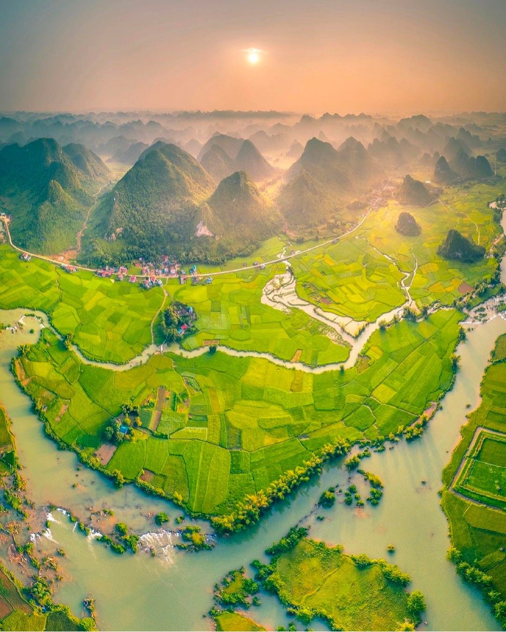
Stunning photo by Pham Huy Trung of Cao Bằng, Vietnam. When I first saw this on Instagram, I thought it was an illustration; it took several looks to convince myself it wasn’t.
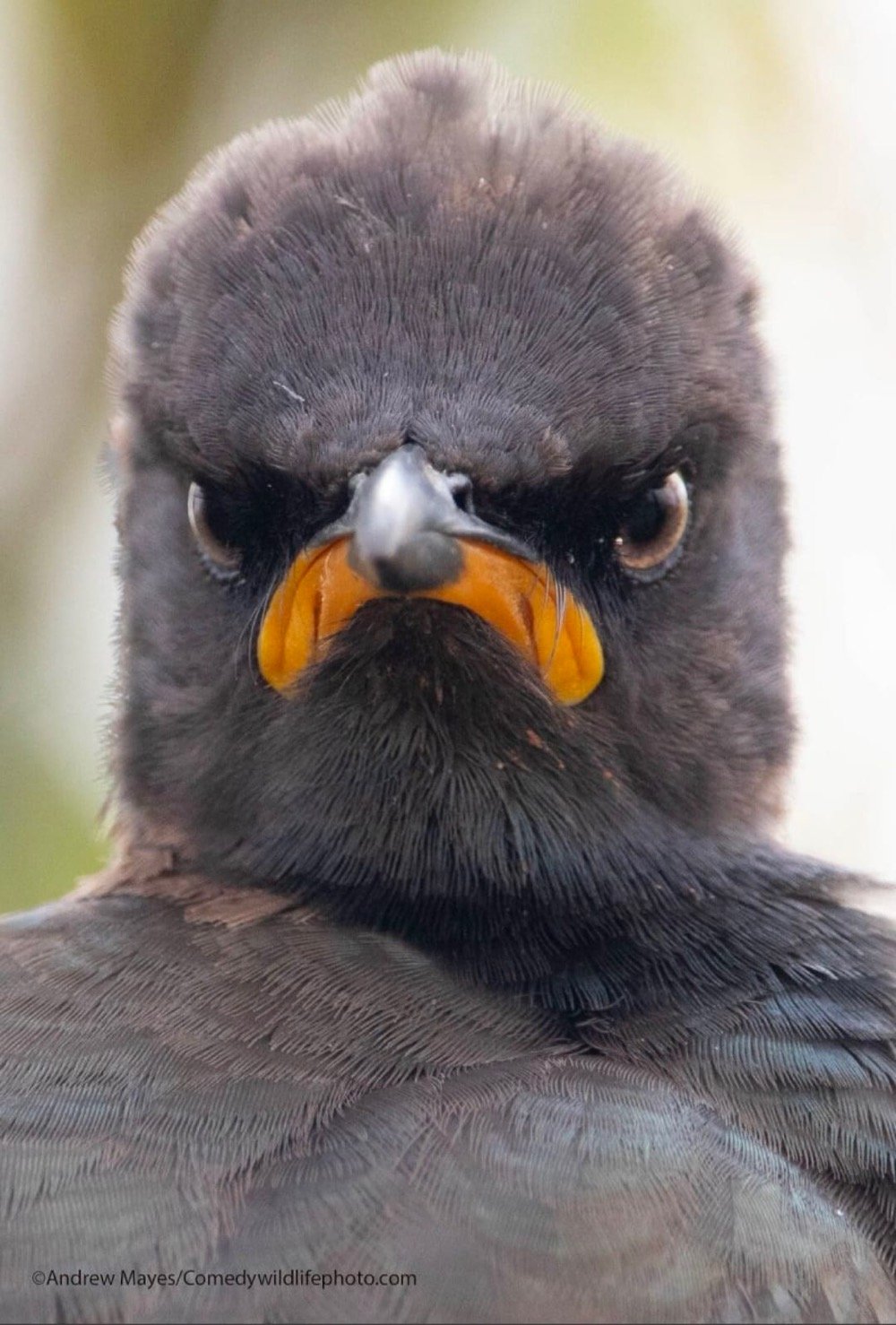
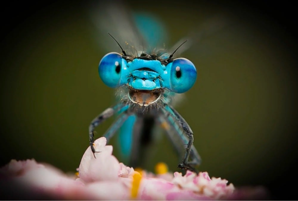
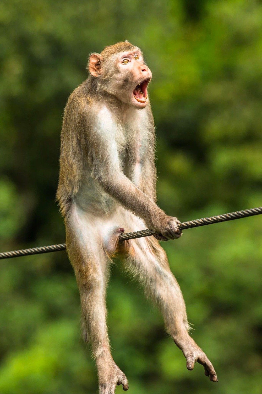
The Comedy Wildlife Photography Awards: always a bright spot in the world these days. This year, the thousands of photos have been narrowed down to 42 finalists, including the three very expressive animals above. Good luck to all the contestants — the winners will be announced in October.

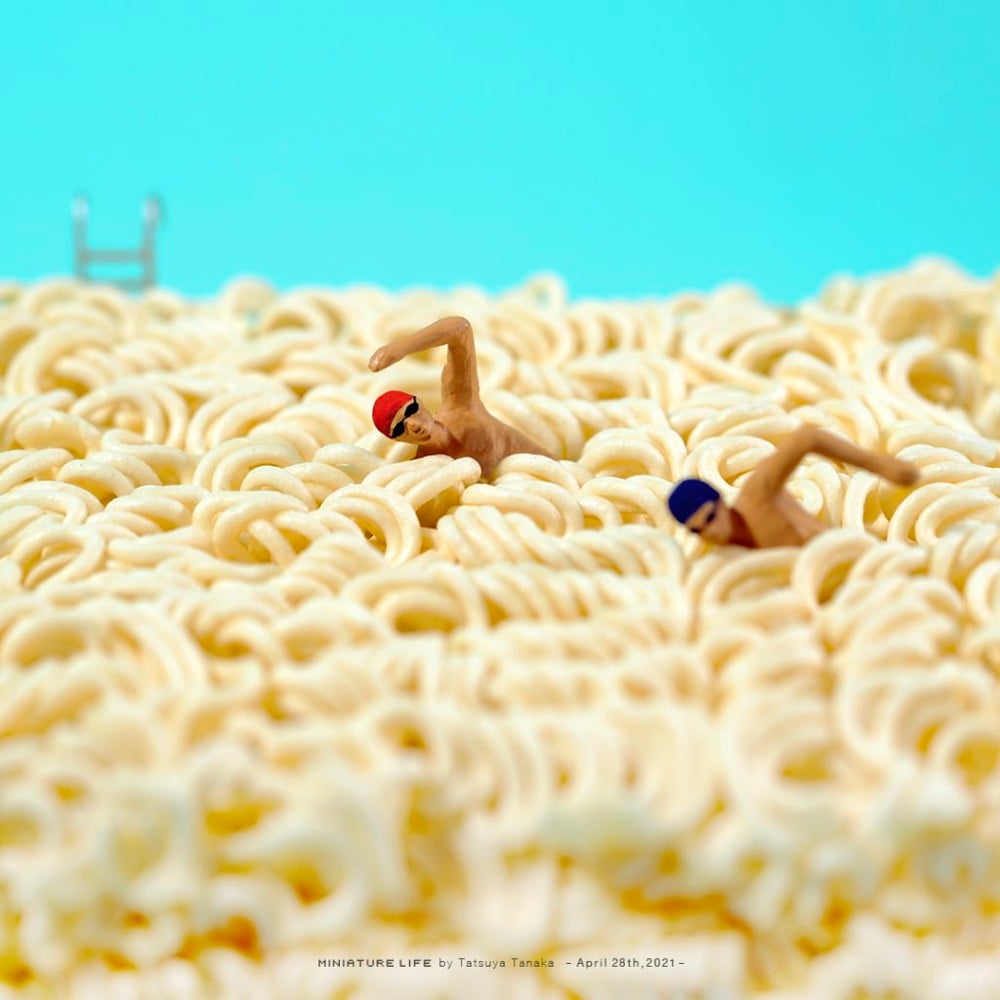
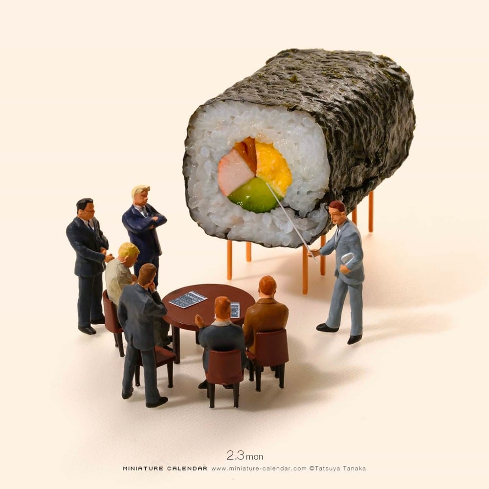
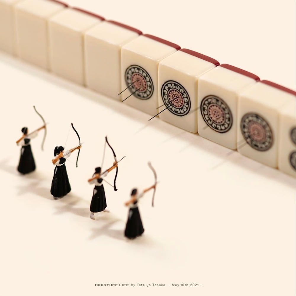
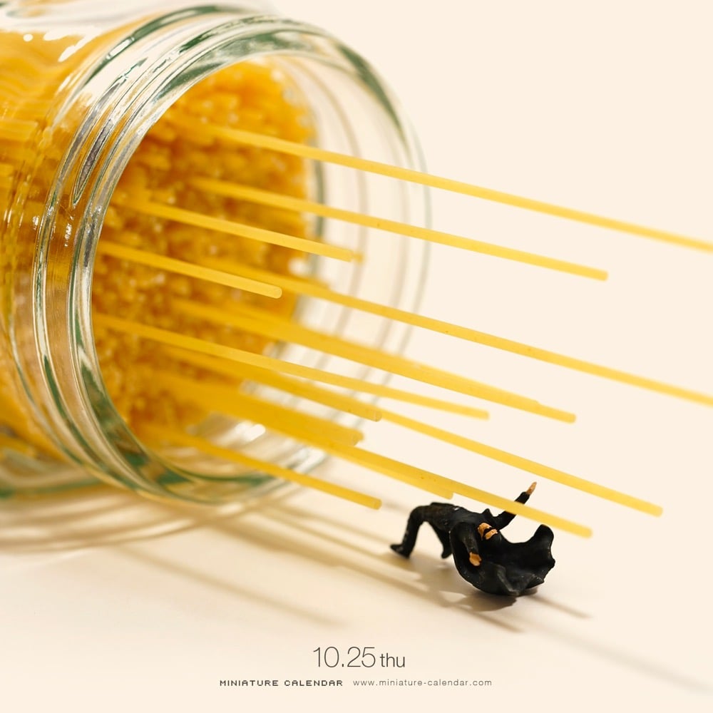
Since 2011, Tatsuya Tanaka has been creating daily images of miniature people in the midst of everyday items that resemble bigger things (think broccoli as trees, rows of staples as countertops, floating leaves as boats). Here’s a short video of Tanaka at work on his miniatures:
You can follow his work on his website or on Instagram. (thx, porter)
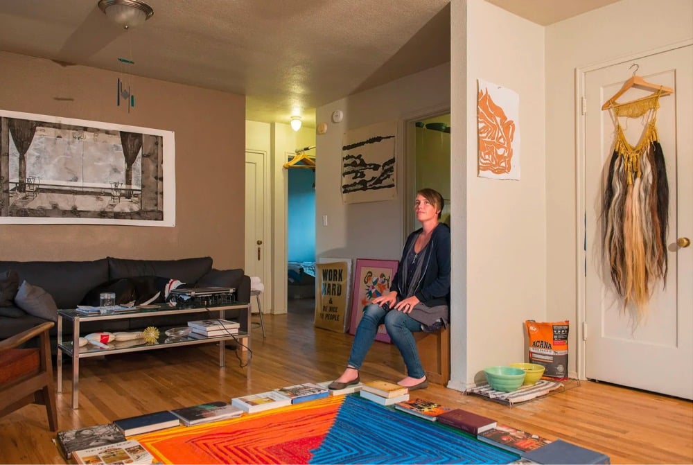
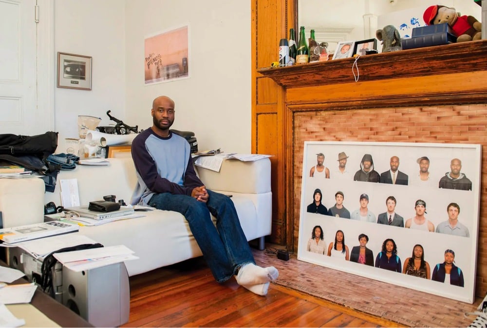
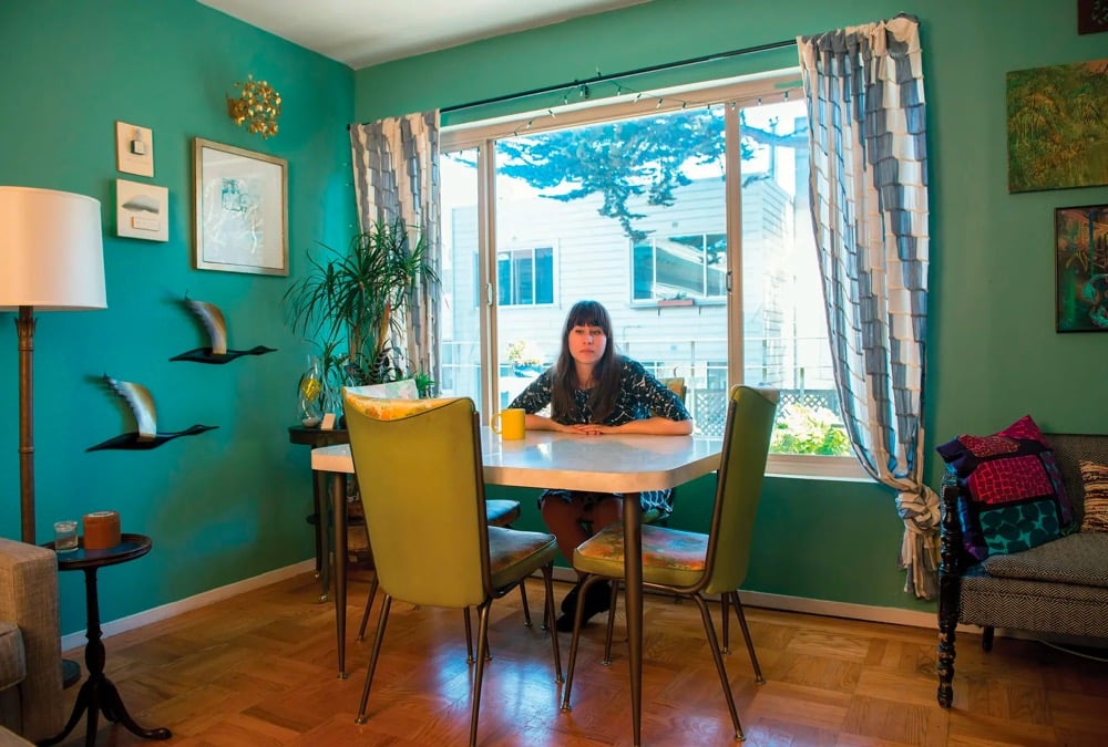
Americans are collectively almost $15 trillion in debt, most of it related to housing (i.e. mortgage debt). For the New Yorker, Margaret Talbot shares some images from Brittany Powell’s The Debt Project, a series of 99 portraits of Americans in debt.
Powell set about photographing ninety-nine Americans who owe money (she ended up with a few more, including herself, but started with that figure as a reference to the slogan “We are the ninety-nine per cent”) and asked them to handwrite accompanying text about how much they owe, and to whom. The litany of reasons gets repetitive, because that’s how it goes — difficulty finding a job in one’s field after graduating during the recession, a bad marriage, a bad divorce, vertiginous rents in expensive cities, medical crises, many, many student loans. Occasionally, there are epic and awful variations: one woman’s mother took out credit cards in her name and, in a ten-year period, racked up “a mortgage worth of debt” to fund her “compulsive shopping and hoarding habits.”
The Debt Project is also available in book form.
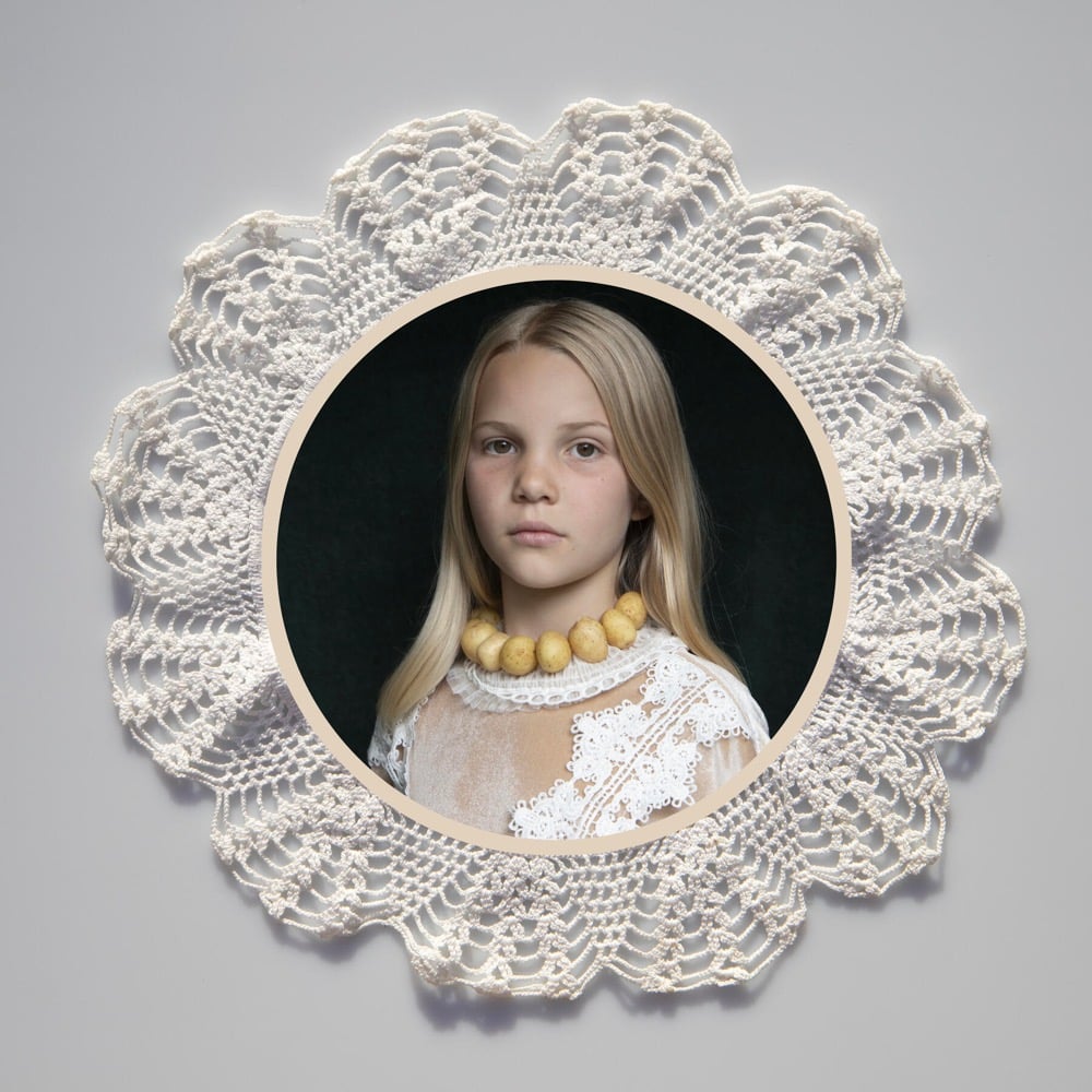
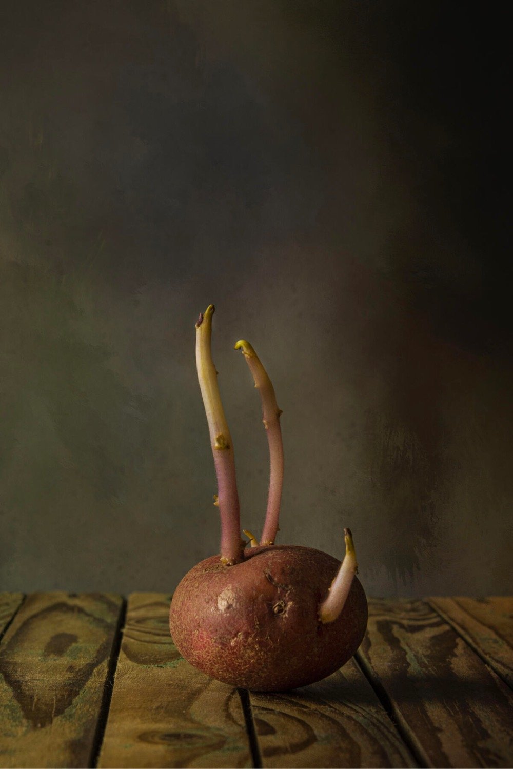


I am a little embarrassed (and surprised!) at how up my alley this is, but behold: the winners of the Potato Photographer of the Year competition for 2021. (via @jackisnotabird)

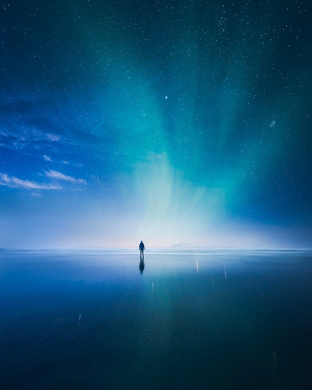
Finnish photographer Mikko Lagerstedt creates striking, ethereal, and atmospheric photographs — check out his work on his website and Instagram.
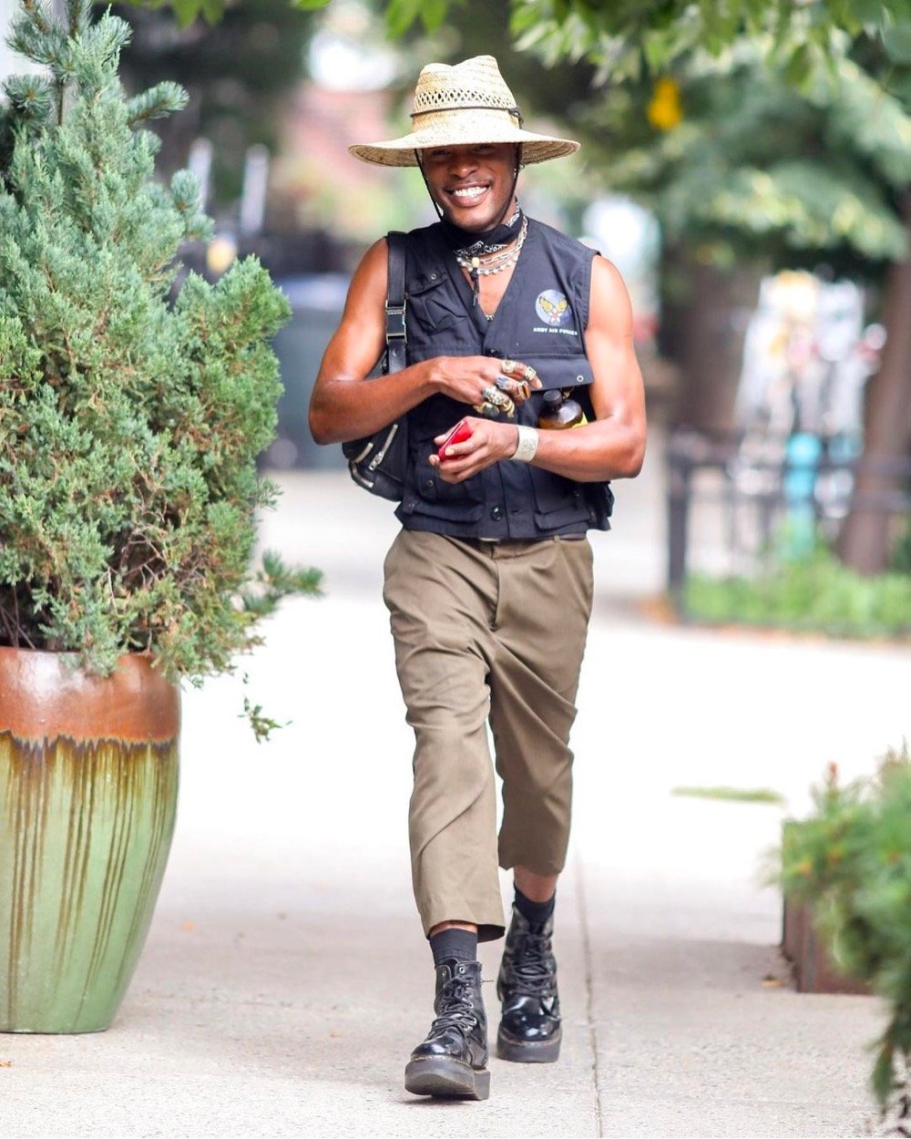
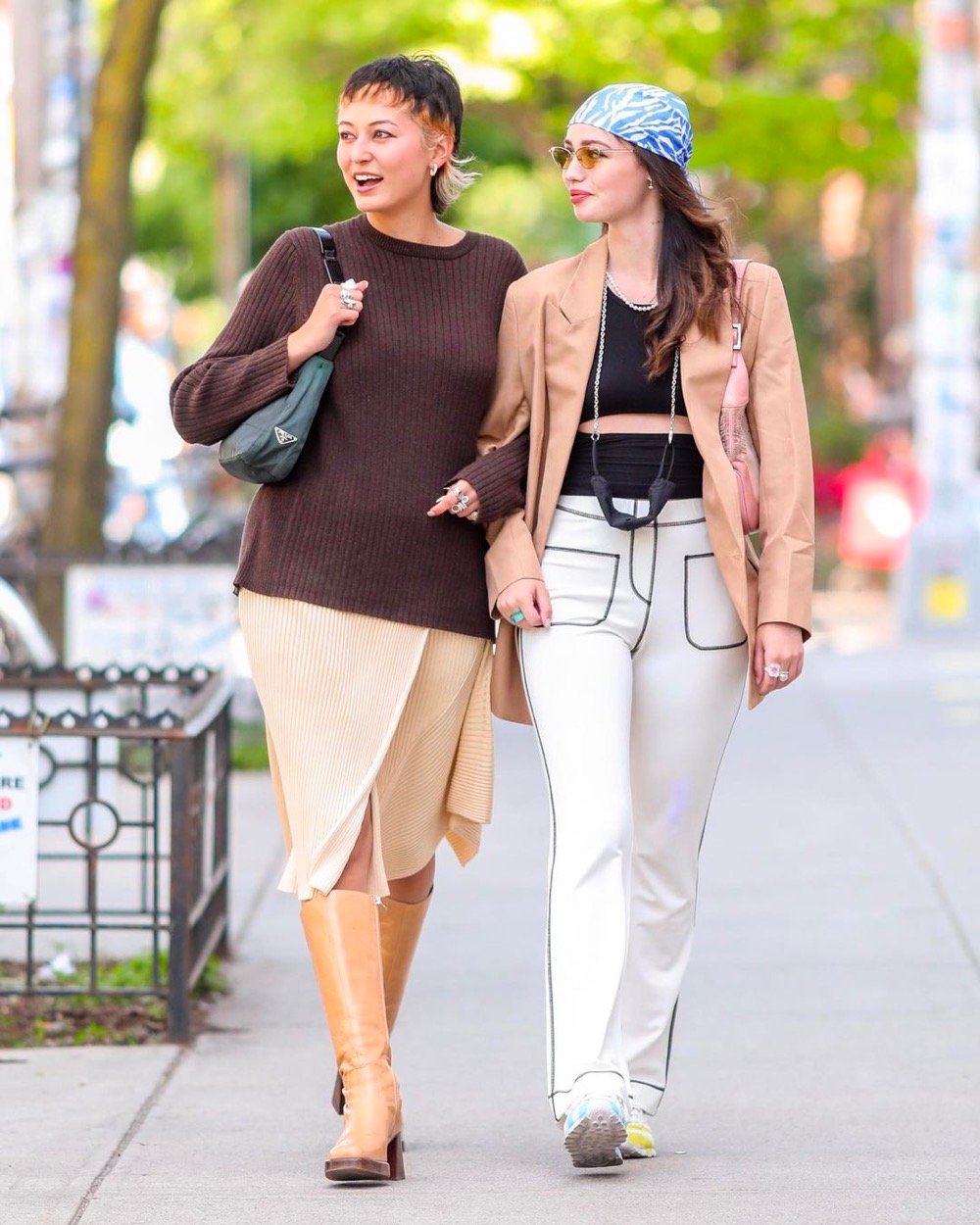

Johnny Cirillo photographs people on the streets of New York in the style of paparazzi (half a block away with a long lens) and posts them, with permission, to his Instagram account. From an interview with Cirillo in Vogue:
I decided early-on that if I was going to shoot candids of New Yorkers, I didn’t want it to be with a wide lens, up-close in their faces. I started using a 200mm lens so that I could be half a city block away from the subject. It’s similar to the way paparazzi shoot, and all my subjects are celebrities to me, so it’s fitting in that respect.
(via life is so beautiful)
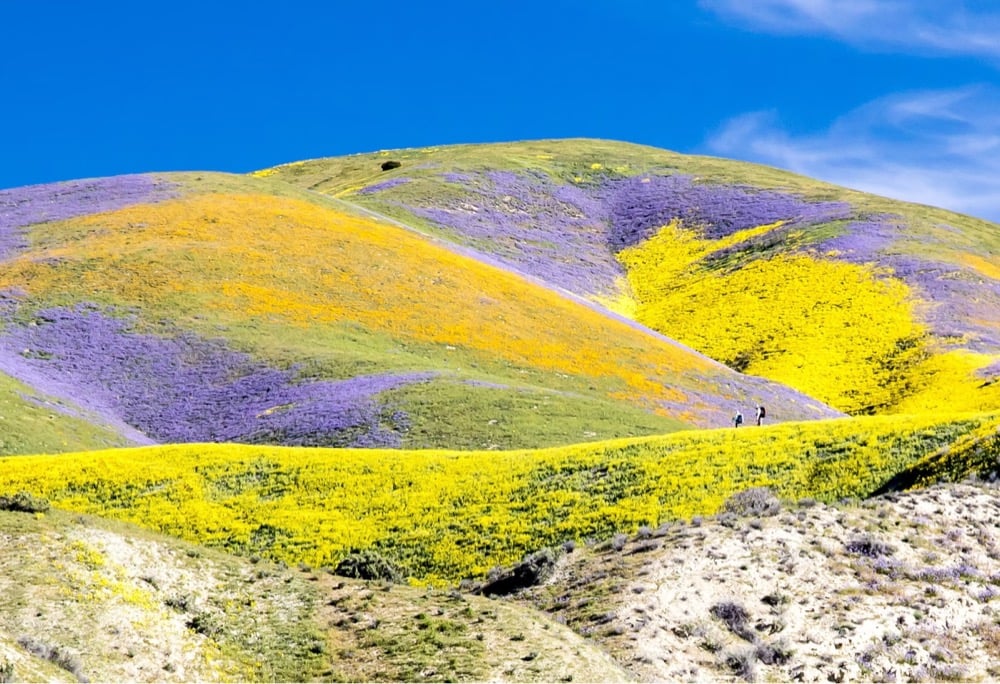
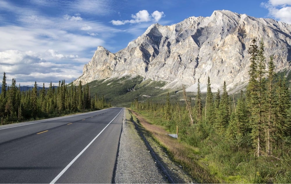
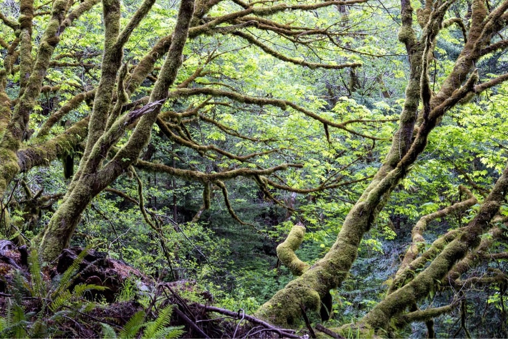
Over at In Focus, Alan Taylor is highlighting the work of Bob Wick, a photographer for the U.S. Bureau of Land Management who recently retired after 33 years of service.
In a recent interview, Bob reflected on his career. “It has been extremely fulfilling to see my photos used in BLM, across the Department, and non-profits and getting to showcase the beauty of public lands and the resources we see,” he said. “When you see things on paper in words, it’s one thing, but when you see the image of the lands that you’re affecting with that resource decision, it’s a more powerful way to communicate the message.”
Bob added, “I like bringing joy to people with photos. A lot of people are armchair travelers and can’t go to remote places, but they get the satisfaction of seeing the beauty through my photos. I’m always happy to be able to share that beauty. I also think that images help build pride among employees as reminders of the vast and irreplaceable places that BLM manages.”
You can follow Wick’s continuing photo adventures on Instagram.
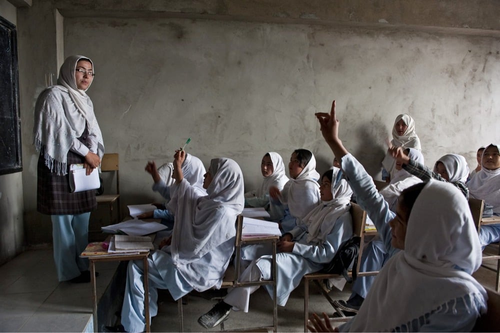
Pulitzer prize-winning photojournalist Lynsey Addario has covered Afghanistan for the past 20 years. In the Atlantic, she writes about the effect of the return to power of the oppressive Islamic-fundamentalist Taliban will have on the country’s citizens, particularly women and girls. Here she describes life under the Taliban in 2000 and 2001:
Perhaps the silence of life under the Taliban sits with me more than anything. There were very few cars, no music, no television, no telephones, and no idle conversation on the sidewalks. The dusty streets were crowded with widows who had lost their husbands in the protracted war; banned from working, their only means of survival was to beg. People were scared, indoors and out. Those who were brave enough to venture out spoke in hushed voices, for fear of provoking a Taliban beating for anything as simple as not having a long-enough beard (for a man) or a long-enough burka (for a woman), or sometimes for nothing at all. Shiny brown cassette tape fluttered from the trees and wires and signs and poles everywhere-a warning to those who dared to play music in private. Matches in Kabul’s Ghazi Stadium had been replaced with public executions on Fridays after prayer. Taliban officials used bulldozers or tanks to topple walls onto men accused of being gay. People who stole had their hand sliced off; accused adulterers were stoned to death.
After the Taliban fell in 2001, Addario observed women returning to public life:
I photographed the defeat of the Taliban in Kandahar in late 2001, and returned to the country with my camera at least a dozen times in the subsequent two decades. From Kabul to Kandahar to Herat to Badakhshan, I photographed women attending schools, graduating from universities, training as surgeons, delivering babies, working as midwives, running for Parliament and serving in government, driving, training to be police officers, acting in films, working — as journalists, translators, television presenters, for international organizations. Many of them were dealing with the impossible balancing act of working outside the home while raising children; of being a wife, a mother, a sister, or a daughter in a place where women were cracking glass ceilings daily, and often at great peril.
Now those women, especially those involved in politics or activism, are in danger now that the Taliban have seized power in Afghanistan again.
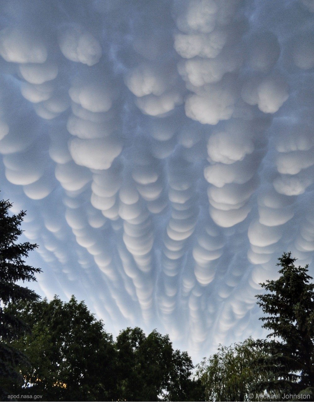
Back in 2012, Michael F. Johnston captured a particularly spectacular mammatus cloud over Regina, Saskatchewan. I don’t know how much of a cloud enthusiast Johnston is, but I got pretty excited when I captured these mammatus clouds at sunset a couple of years ago.
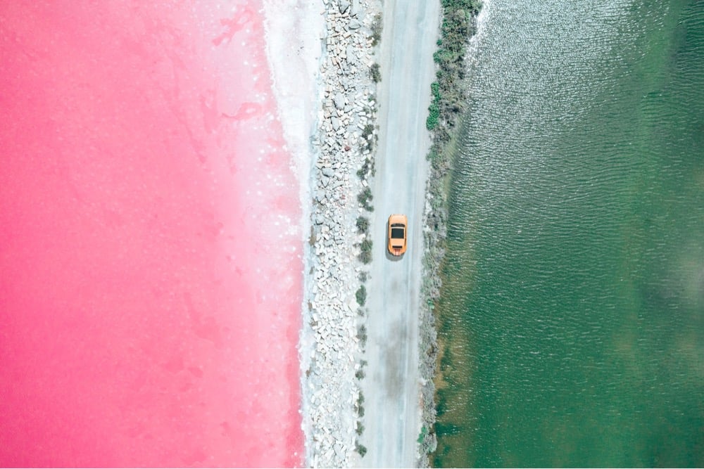
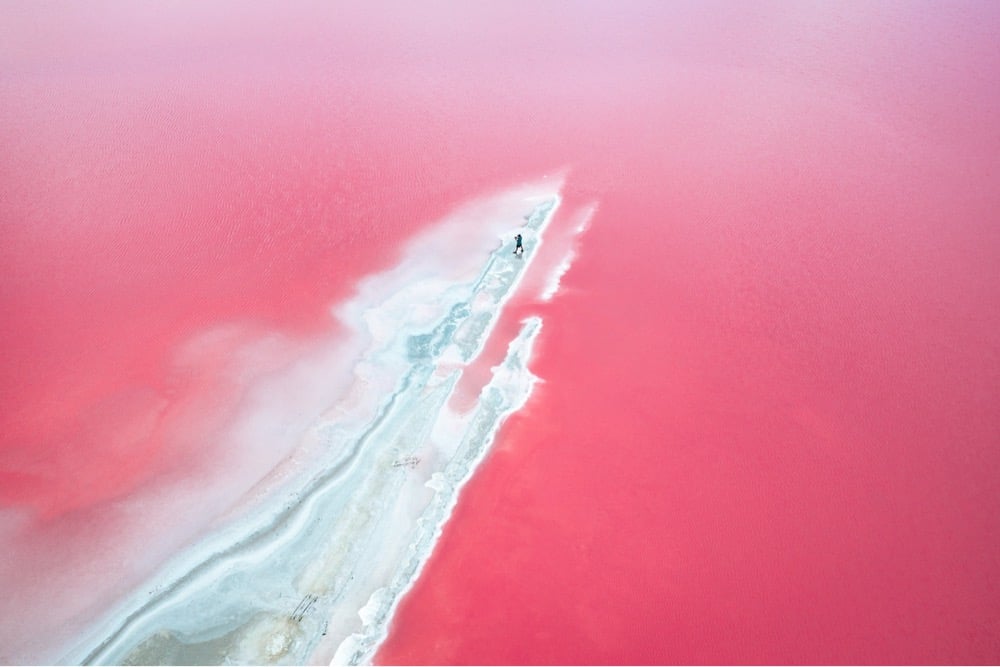
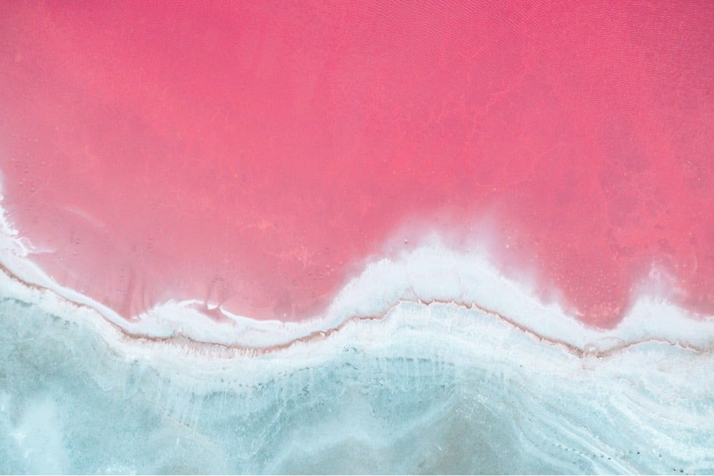
Check out Italian photographer Paolo Pettigiani’s photos of the evaporation ponds of Camargue, France. While these ponds are industrially harvested for their salt, the pink color of the water is naturally occurring in the salt marshes of the area, caused by halophile dunaliella salina algae. The area is also an important bird habitat and is one of the few places in Europe that flamingos live, which might seem like a coincidence until you learn that flamingos gain their pink color from eating the algae and shrimp that also feed on the algae. (via moss & fog)
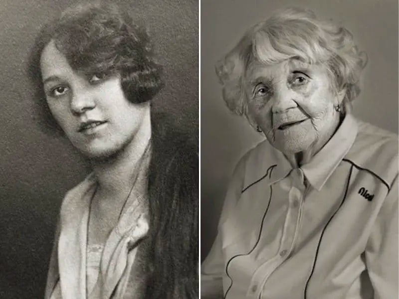
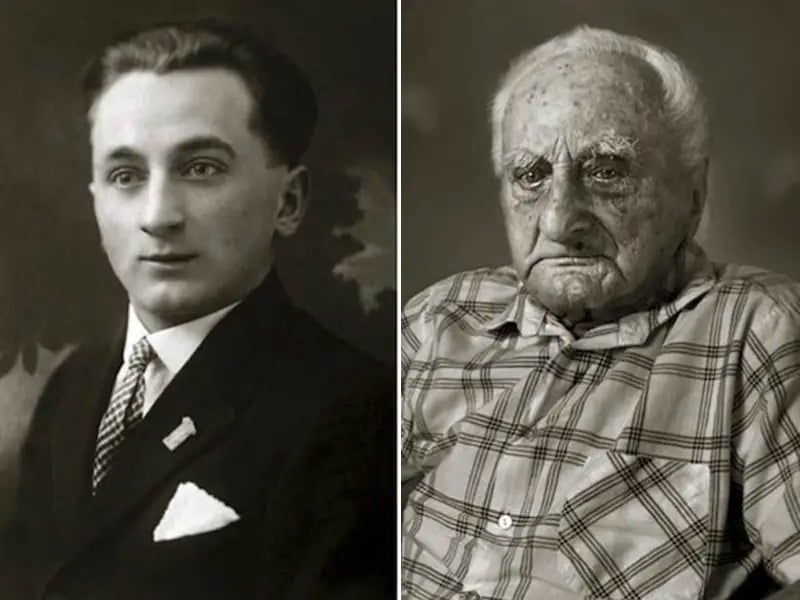
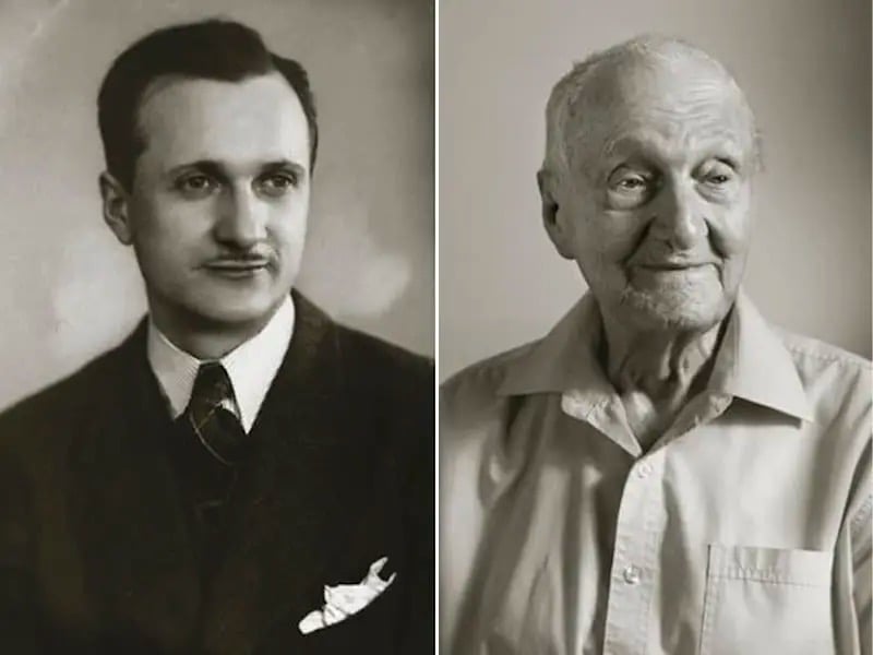
For his Faces of Century project, photographer Jan Langer made portraits of Czech people who are 100+ years old that mimic the style of photos of those same people 70 or 80 years before. If you click on the ⓘ below each pair of photographs, you can read a short biography of each person. All of these folks lived through two world wars, the Cold War, the space age, the computer age, and so much more. Incredible. (via life is so beautiful)
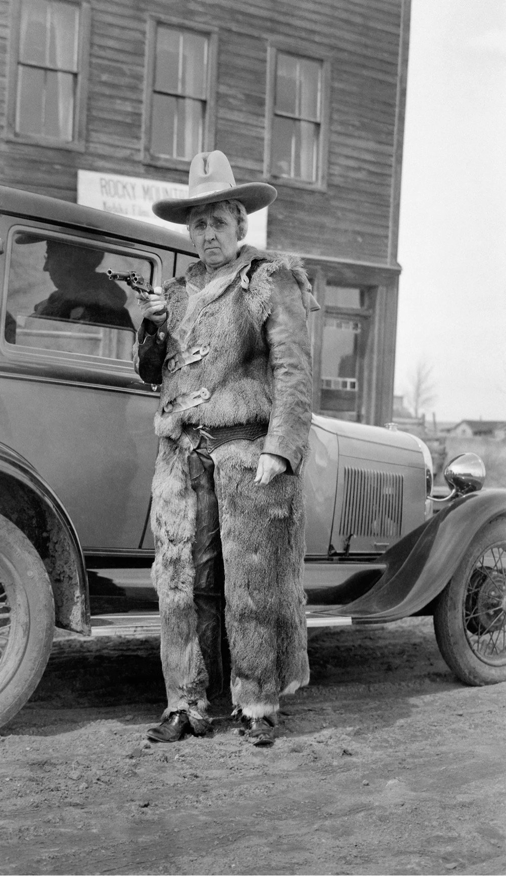
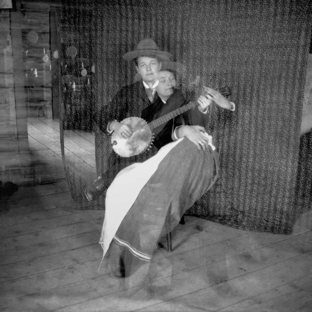
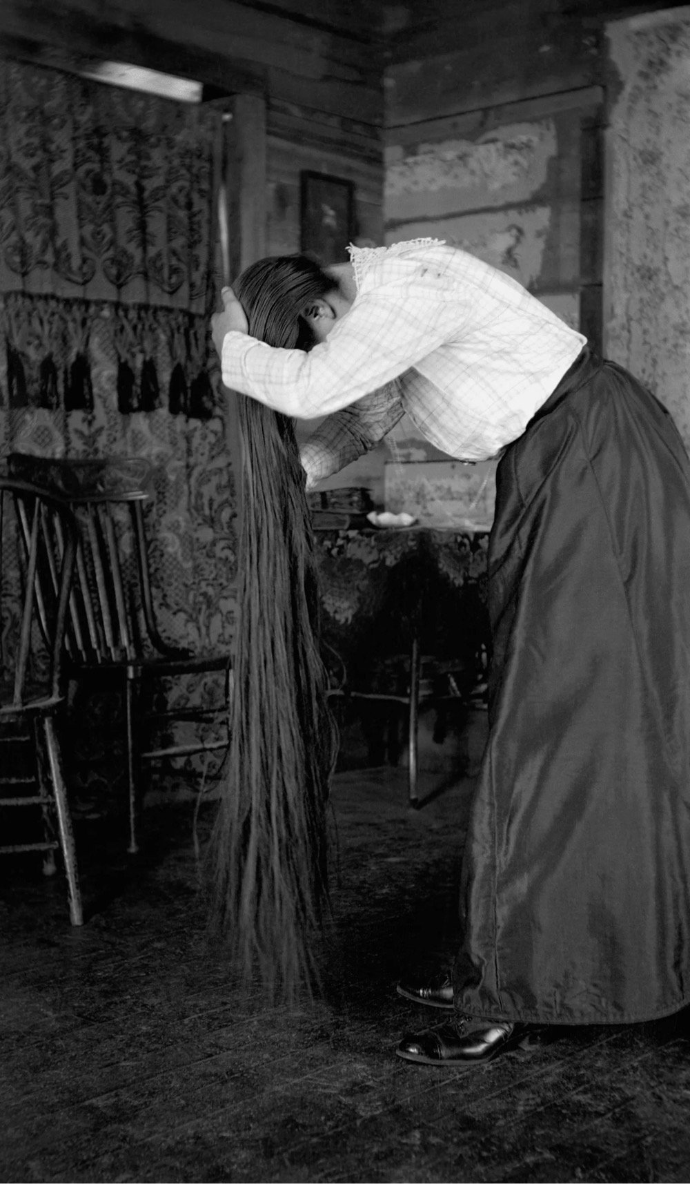
This is fantastic: for more than 60 years beginning in 1899, Lora Webb Nichols captured and collected about 24,000 photographs of life in a small copper-mining town in Wyoming.
On October 28, 1899, Lora Webb Nichols was at her family’s homestead, near Encampment, Wyoming, reading “Five Little Peppers Midway,” when her beau, Bert Oldman, came to the door to deliver a birthday present. The sixteen-year-old Nichols would marry the thirty-year-old Oldman the following year, and divorce him a decade later. The gift, however — a Kodak camera — would change the course of her life. Between 1899 and her death, in 1962, Nichols created and collected some twenty-four thousand negatives documenting life in her small Wyoming town, whose fortunes boomed and then busted along with the region’s copper mines. What Nichols left behind might be the largest photographic record of this era and region in existence: thousands of portraits, still-lifes, domestic interiors, and landscapes, all made with an unfussy, straightforward, often humorous eye toward the small textures and gestures of everyday life.
You can browse the collection of her photos at the American Heritage Center at the University of Wyoming.

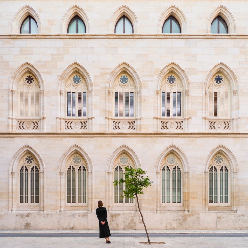
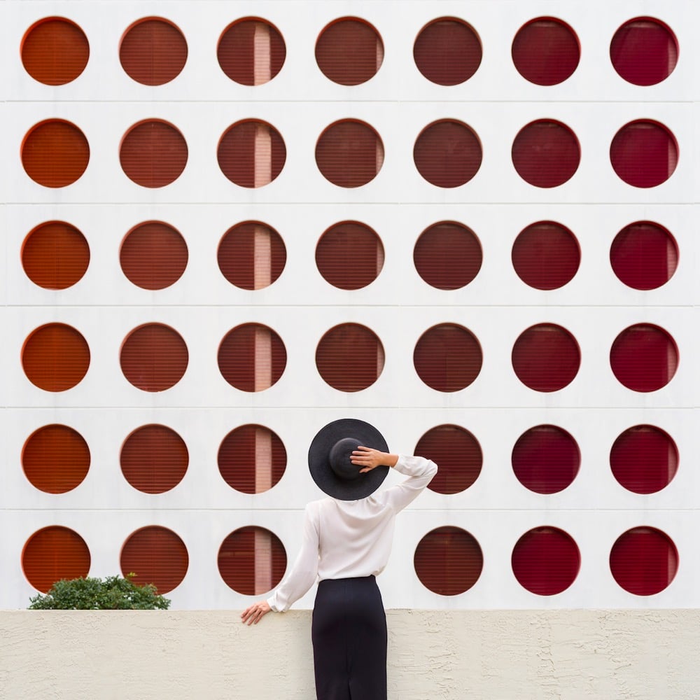
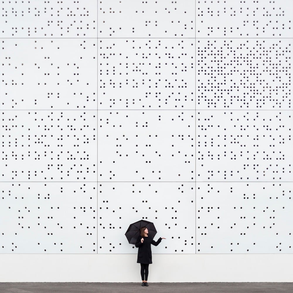
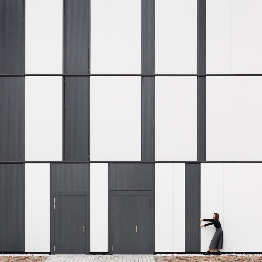
Spanish photographers Anna Devís and Daniel Rueda cleverly use landscapes and architectural elements to create minimalist and fun portraits of themselves. You can check out more of their work on Instagram. (via moss & fog)
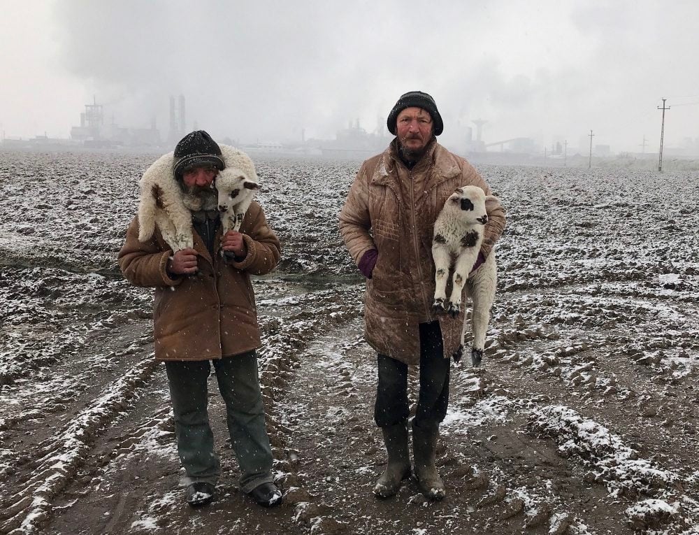
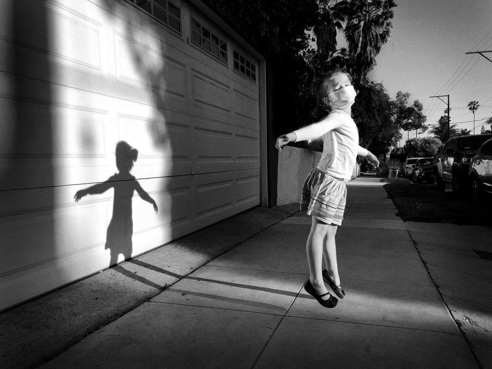
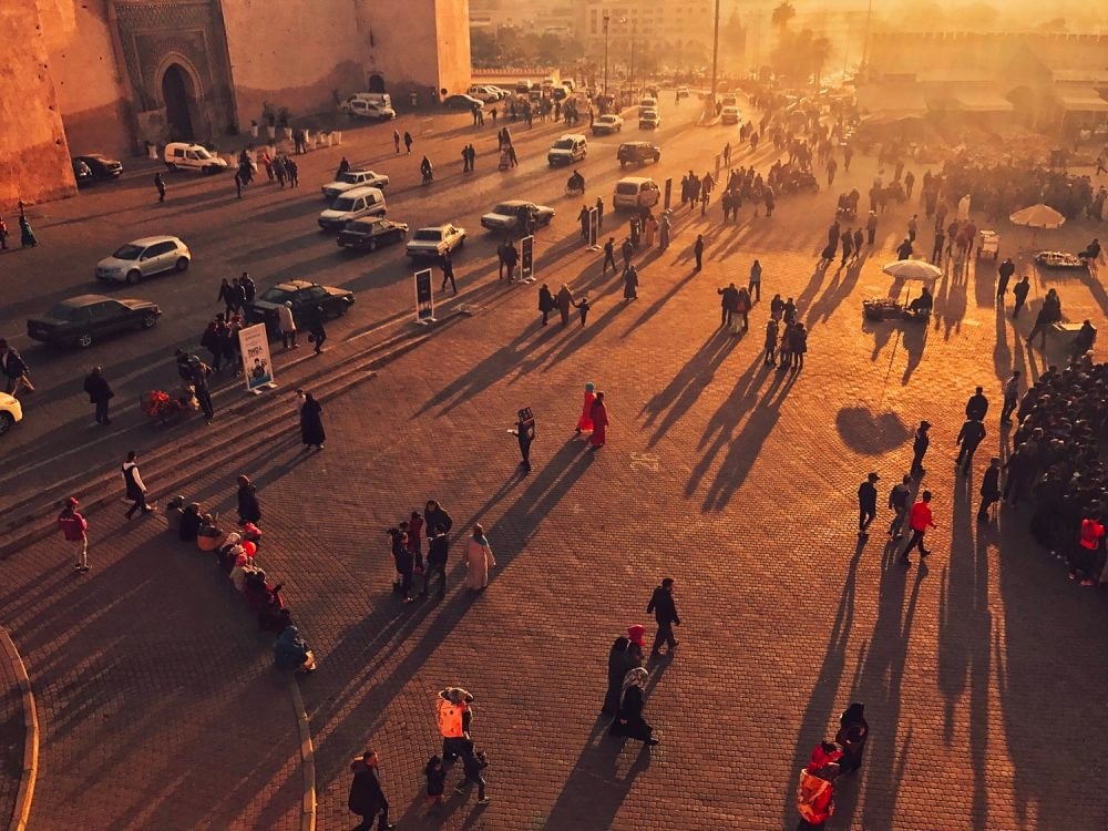
The IPPA Photographer of the Year Award is open to photographers who use an iPhone or iPad to take photos, and the winners of the 2021 competition demonstrate just how capable these devices are (and how much photography is not about your equipment). I’m struck by how many of the winners were not taken with the latest phones — the grand prize winner (above, top) was shot with an iPhone 7, which came out in 2016. Photos above by Istvan Kerekes, Jeff Rayner, and Enhua Ni.
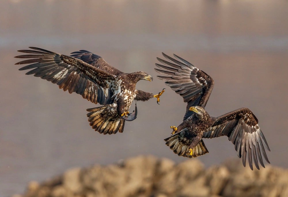
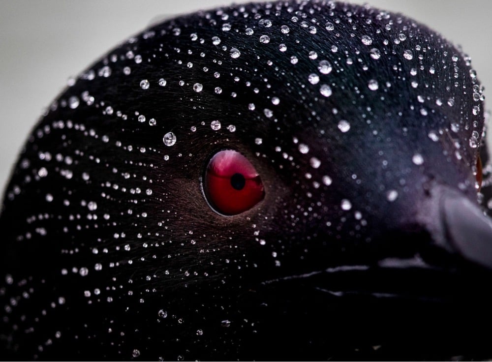
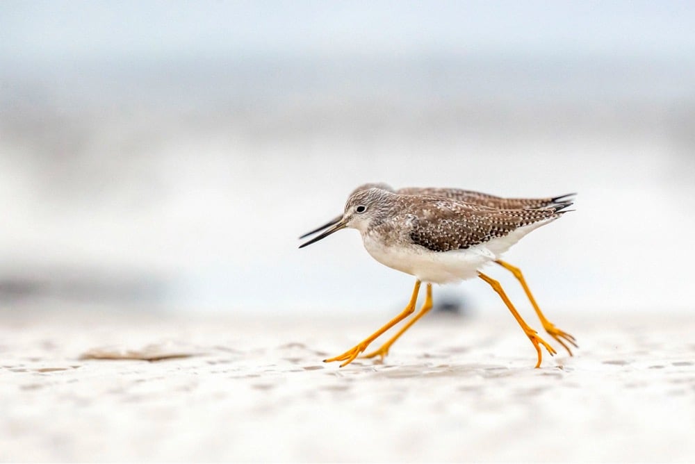
The National Audubon Society has announced the winners of the their photography competition for 2021. They also selected a top 100 from the rest of the submissions to complement the winners. The photos above are by Jerry am Ende, Sue Dougherty, and Tim Timmis. (via in focus)
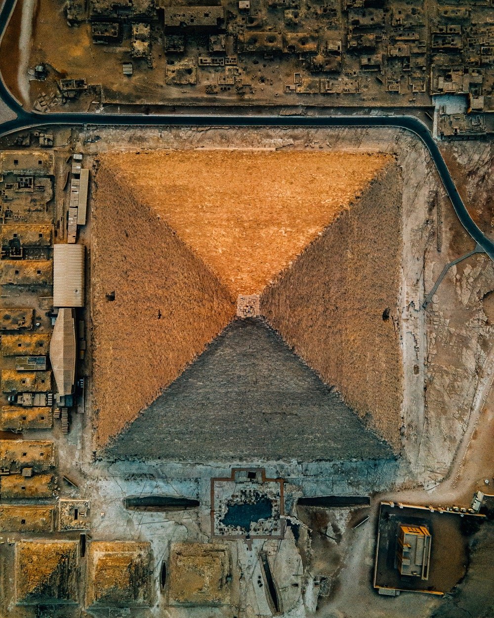
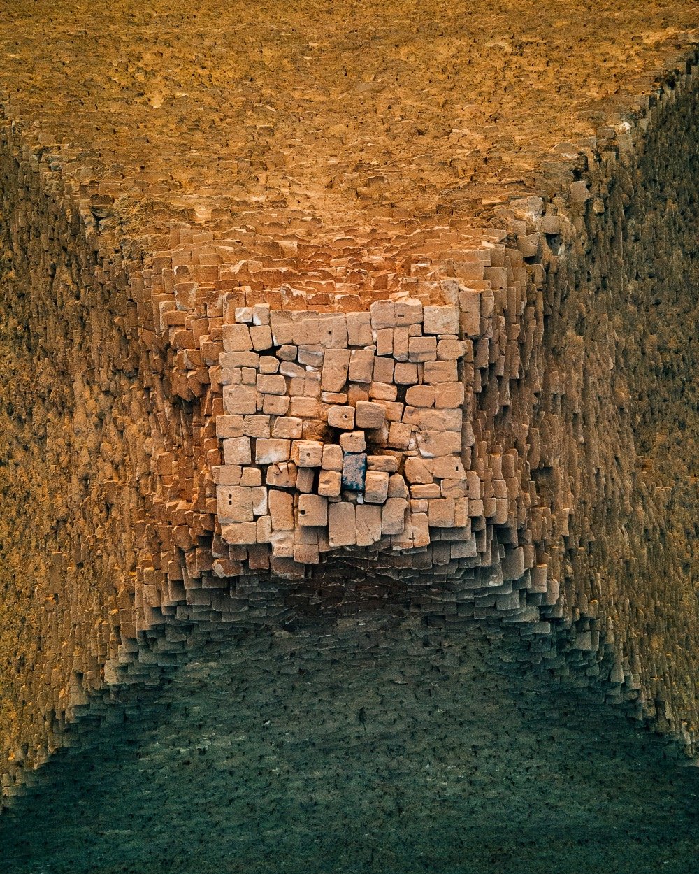
Alexander Ladanivskyy recently photographed the Great Pyramid at Giza from an unusual vantage point: straight overhead with a drone. The final photo in the series is so close-up that you can see the graffiti on the stones at the tip of the pyramid. (via colossal)
See also How the Great Pyramid at Giza Looked in 2560 BCE.
For more than 21 years, Noah Kalina has taken a photograph of himself. Periodically, he makes video compilations of the photos — you’ve probably seen them here or elsewhere. For his latest video, he’s collaborated with Michael Notter (visuals) and Paul O’Mara (sound) on a video called 7777 Days.
In a first step, Michael used the machine learning library dlib (http://dlib.net/) and some custom Python code to detected in each of Noah’s photos 5 face landmarks (i.e. both eyes, the nose and the two corners of the mouth). These landmarks were then used to align the faces in all photos, so that the eyes and corner of the mouth were horizontally oriented and always an equal distance apart. After that, some small image intensity correction were applied to make very dark images a bit brighter and very bright ones a bit darker. This was followed by an upscaling of all images (where needed) to a 4K resolution.
The result is a 2-minute video (reminiscent of Jason Salavon’s work) that spans half of Kalina’s life — in the video he ages 2 months every second and 10 years a minute.
Update: Kalina and Notter explain how this video came about and how it was made.
In a family house, Mathieu Stern found a box of treasures hidden away by a little girl some 120 years ago. Inside was a pair of glass plate negative images of some pets, which Stern developed using the cyanotype technique. Film development is just straight-up magic.
See also I Found a Mystery Film in a 60-Year-Old Camera.


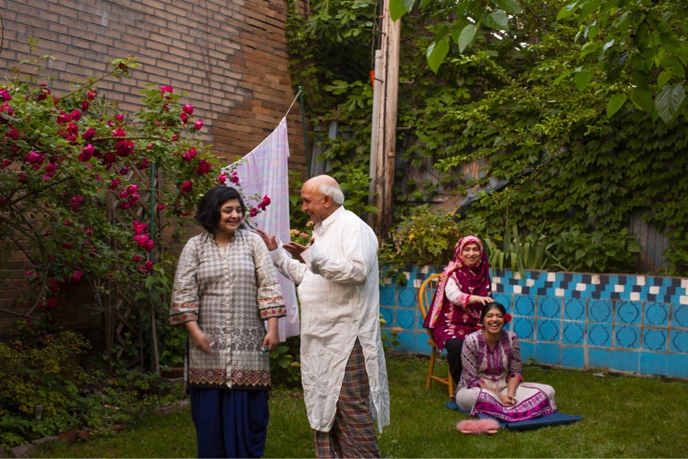
Just as they did last month in capturing motherhood, The Luupe has curated a collection of photos taken by women and non-binary photographers called 100 Visions of Fatherhood. Photos above by Amanda Addison, Kari Grimsby, and Hanifa Haris.
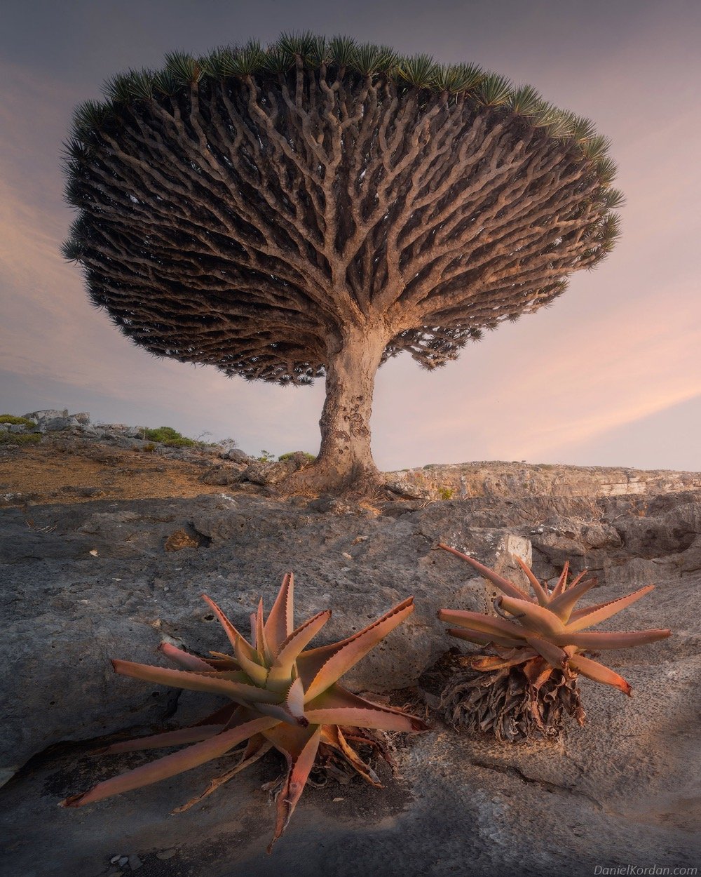
This is a dragon’s blood tree from the island of Socotra off the coast of Yemen in the Arabian Sea. You can see the mathematics of nature at work here — self-similarity at different scales, growing to fill the available space, efficient branching behavior…I bet there’s some cool Fibonacci shit going on here too. The photo was taken by Daniel Kordan — you can see more of this series at Colossal, on Instagram, or at Fstoppers. (via colossal)
Photographer Sails Chong recorded something we don’t hear much of these days: the sounds of camera shutters. Accompanied by a song by Arcade Fire from the Her soundtrack, Chong presents the shutter sounds of 18 different cameras, from 35mm all the way up to large format cameras. Interestingly, the lineup does not include the iconic Leica shutter sound — “a photograph sounds like a kiss”. (thx, david)
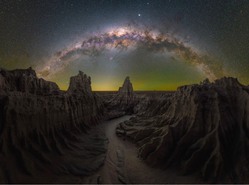
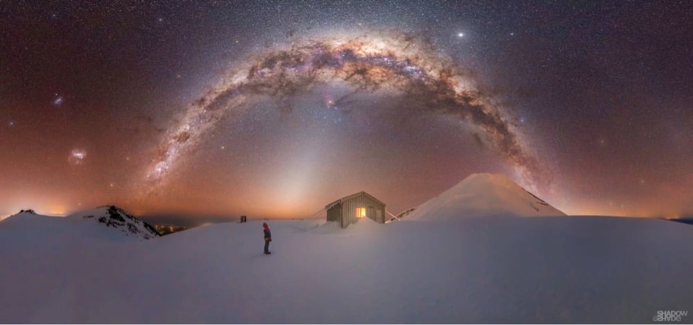
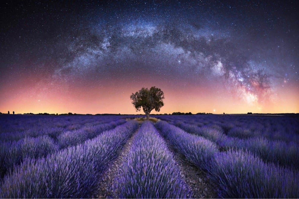
To inspire folks to seek out their own galactic vistas, Capture the Atlas has chosen the best photos of the Milky Way for 2021. The top photo was taken by Daniel Thomas Gum in Australia and the bottom one by Larryn Rae in New Zealand. Check out the rest of the selections here.

This is a photo of a tiny tiny snippet of the universe, taken by the Hubble Space Telescope. Every object you see in the photo is a staggeringly massive galaxy that contains hundreds of billions of stars along with all sort of other things.
Our own galaxy, the Milky Way, is well over one hundred thousand light years across. We only see a pitiful portion of it. Although it contains several hundred billion stars in its expanse, we can only see a fraction of a fraction of them.
And even that doesn’t fully capture the essence of a galaxy, which also has planets, gas, dust, dark matter, and more. Galaxies are colossal objects, their true nature only becoming apparent to us a century ago.
I know I’ve posted photos like this before, but every time I see something like this, my mind boggles anew at the sheer scale and magnitude of it all and I just have to share it.
P.S. And Earth contains the only sentient life in the entire universe? Lol.

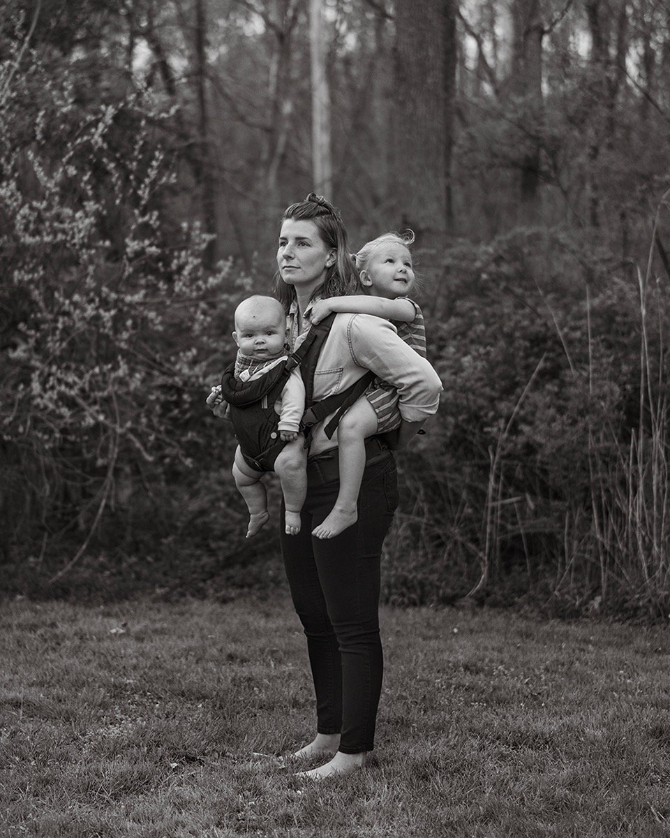
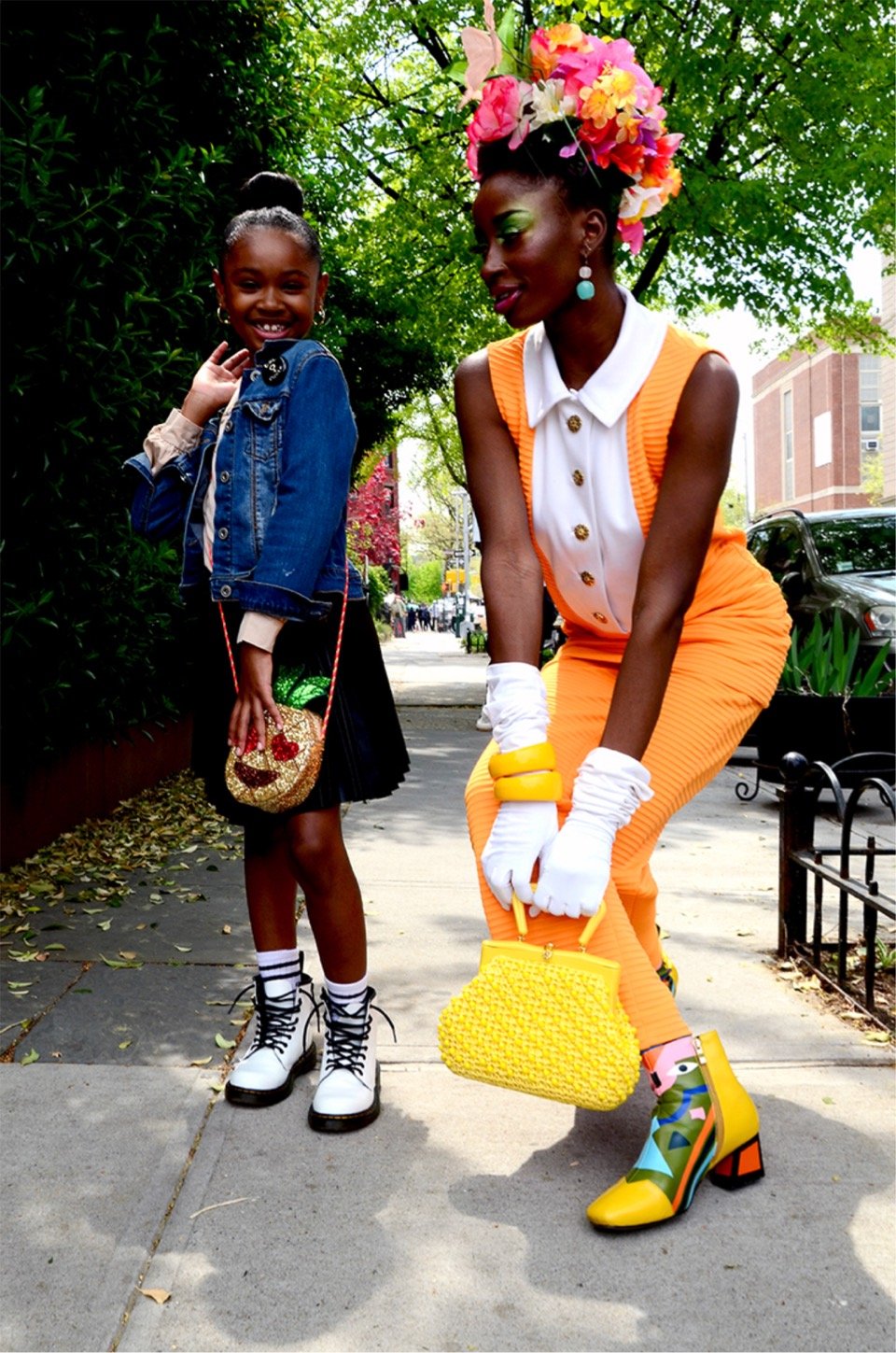
Curated by The Luupe, this is “a collection of photographs and words celebrating the complexities of motherhood”. And somehow even 100 photographs don’t adequately capture the vast experience of motherhood around the world. Photos above by Dee Williams, Brittany Marcoux, Diane Allford (via storythings)
Newer posts
Older posts









Socials & More