kottke.org posts about astronomy
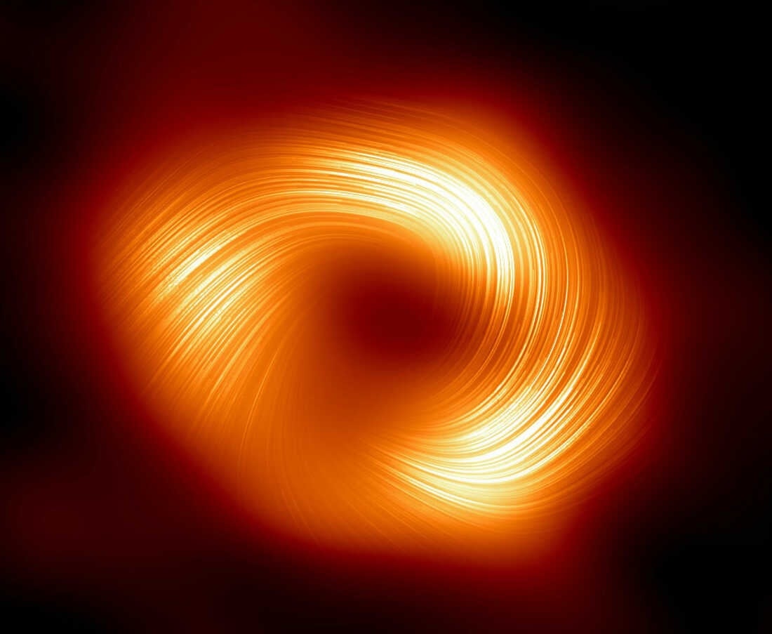
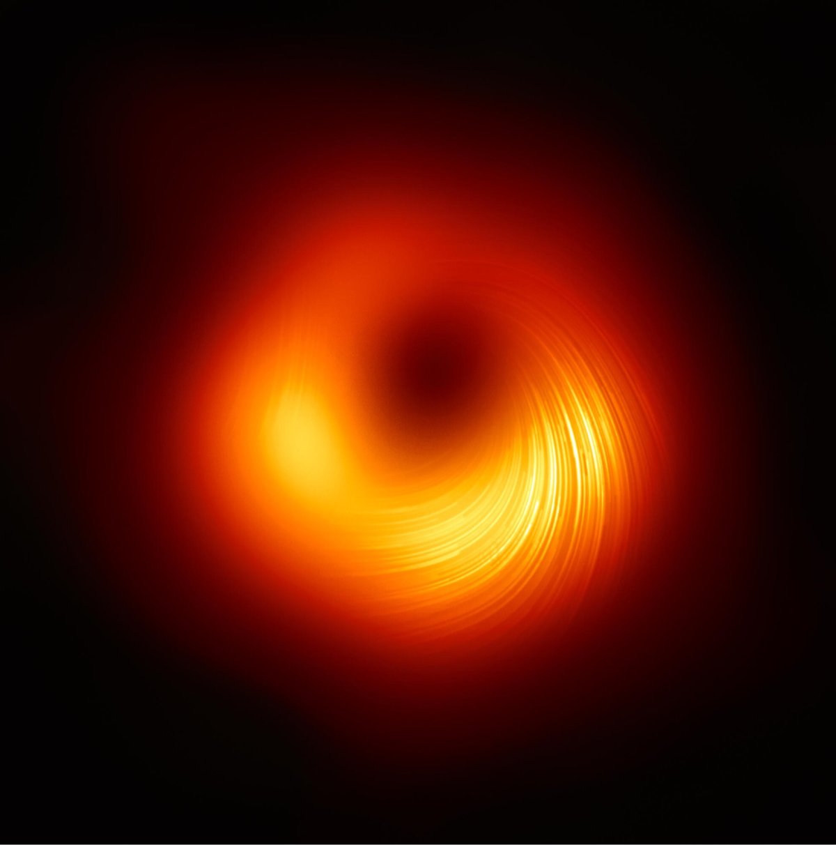
It’s been about five years since scientists captured the first blurry image of a black hole. Using what they learned from that experience, they’ve teased out some more detailed images of the black holes at the centers of the Milky Way galaxy (top) and the M87 galaxy (bottom). The process of collecting the data for these images is interesting:
The only way to “see” a black hole is to image the shadow created by light as it bends in response to the object’s powerful gravitational field. As Ars Science Editor John Timmer reported in 2019, the EHT isn’t a telescope in the traditional sense. Instead, it’s a collection of telescopes scattered around the globe. The EHT is created by interferometry, which uses light in the microwave regime of the electromagnetic spectrum captured at different locations. These recorded images are combined and processed to build an image with a resolution similar to that of a telescope the size of the most distant locations. Interferometry has been used at facilities like ALMA (the Atacama Large Millimeter/submillimeter Array) in northern Chile, where telescopes can be spread across 16 km of desert.
In theory, there’s no upper limit on the size of the array, but to determine which photons originated simultaneously at the source, you need very precise location and timing information on each of the sites. And you still have to gather sufficient photons to see anything at all. So atomic clocks were installed at many of the locations, and exact GPS measurements were built up over time. For the EHT, the large collecting area of ALMA-combined with choosing a wavelength in which supermassive black holes are very bright-ensured sufficient photons.
The images of the two black holes look similar, which was somewhat unexpected:
While this idea may initially sound somewhat mundane, it is anything but. The result is surprising because Sgr A*’s mass is about 4.3 million times that of the Sun, while M87*’s is about 6.5 billion times that of the Sun. Despite the significant difference in mass between the two supermassive black holes, the fact that their magnetic fields behave similarly and are both well-organized is an incredible discovery.
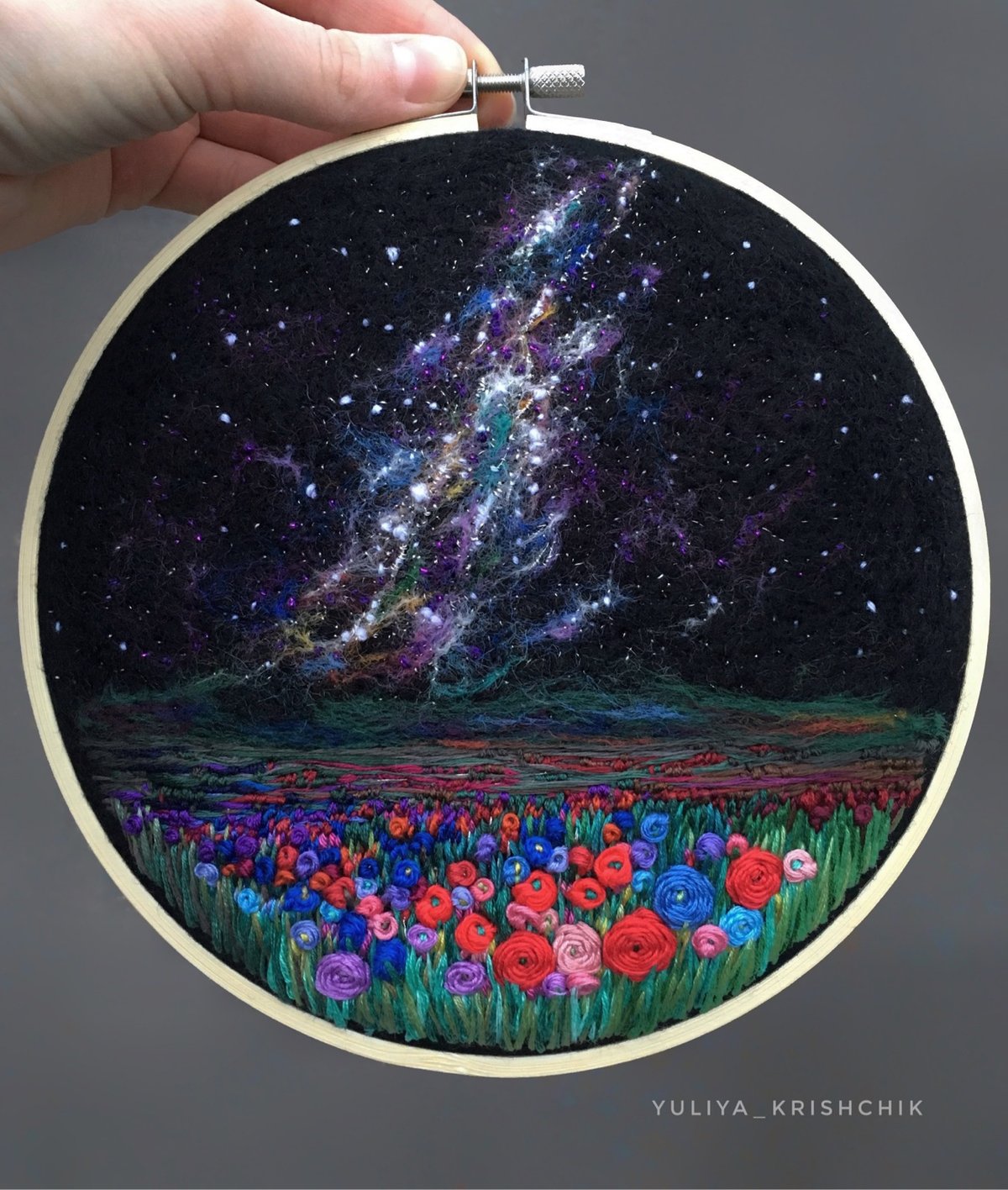
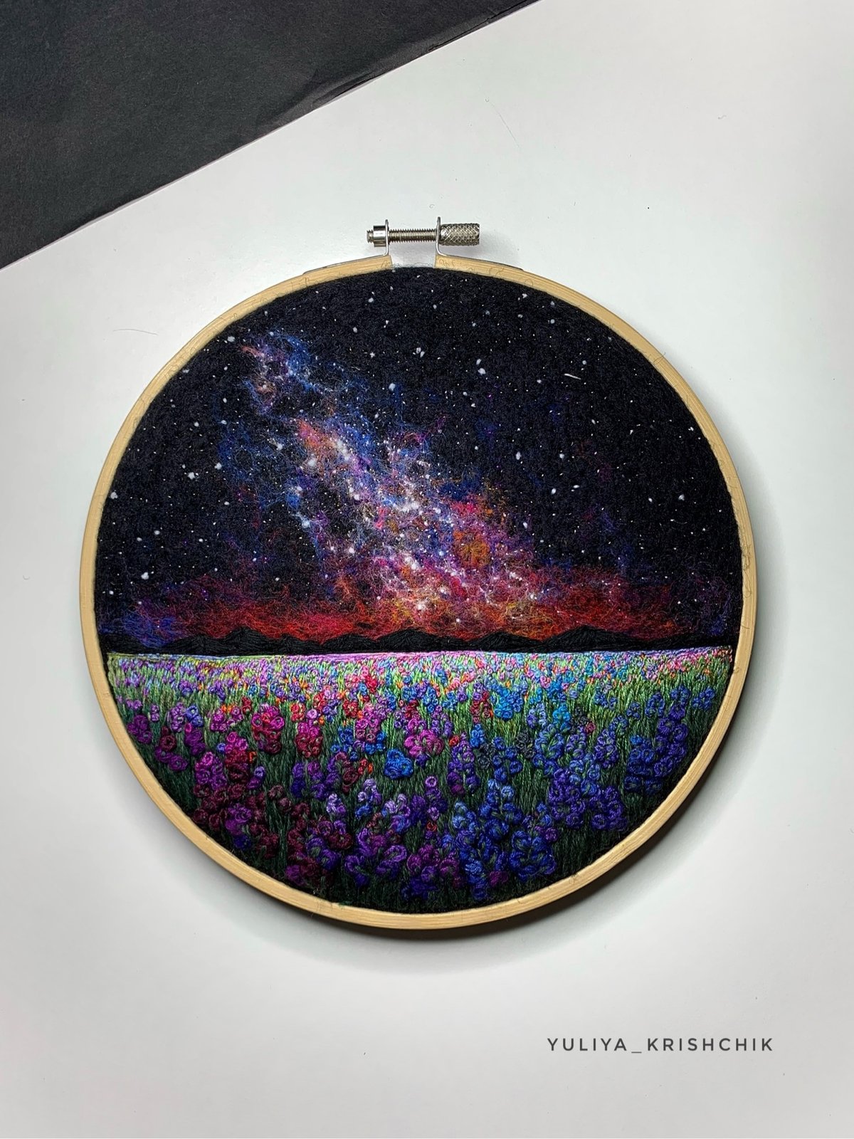
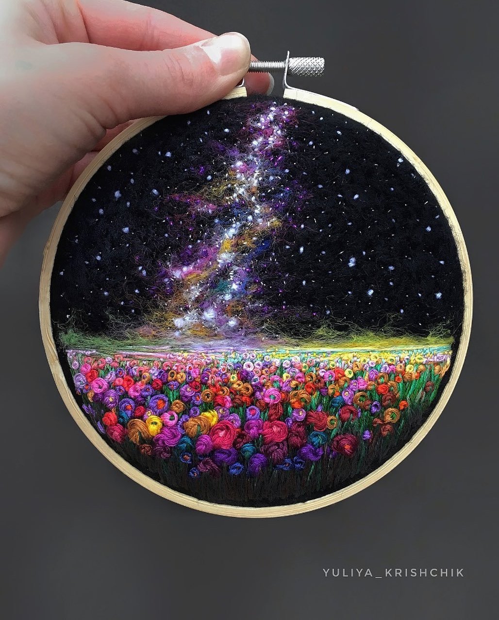
I love Yuliya Krishchik’s space-themed embroidery pieces, especially the ones featuring Milky Way-like star fields — she calls them “surreal space landscapes”. If you watch one of Krishchik’s videos, you can see that her pieces are just a bit 3D…a cool effect.
You can find more of her work on Instagram and her blog or buy original pieces in her store (they go quickly though).
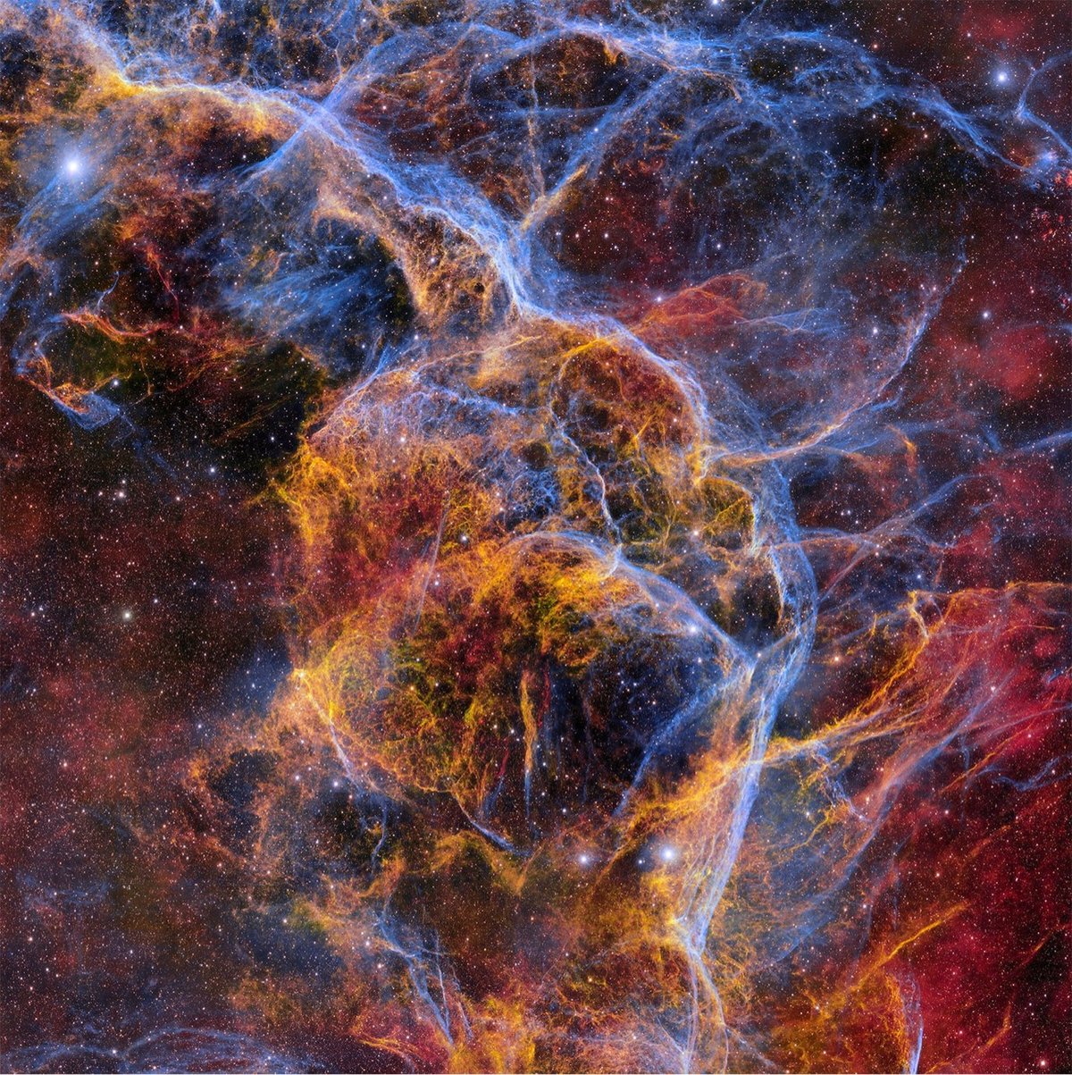
This stunning 1.3 gigapixel image of the Vela supernova remnant comes to us courtesy of the Dark Energy Camera at the Cerro Tololo Inter-American Observatory in Chile. From PetaPixel:
The Vela Supernova remnant, located about 800 light-years away from Earth, is the cosmic corpse of a massive star that exploded 11,000 years ago. It is one of the closest supernova remnants to Earth and the perfect subject for the remarkable Dark Energy Camera.
The supernova is a vast cosmic structure about 100 light-years across. For context, one would have to travel around the Earth 200 million times to have traveled a single light-year.
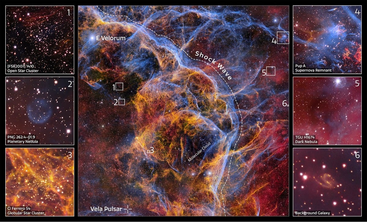
The full image of the supernova remnant is worth exploring. You can also watch this zoom-in of the image to observe the high level of detail available.
(via colossal)
Using a scale model of the solar system the size of New York City and some dazzling visual effects, Epic Spaceman explains that black holes are generally smaller than you might think (because they’re so dense) — even the supermassive black hole at the center of our galaxy. But when you consider some of the biggest black holes we’ve discovered…wow.
Back in 2015, as the New Horizons probe was approaching Pluto, NASA posted an illustration of the dwarf planet’s orbital timeline:
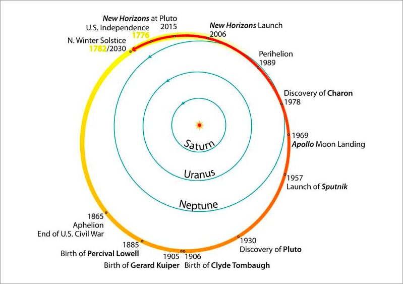
A short piece on Vox then noted:
The entire history of the United States has unfolded in the time it’s taken Pluto to orbit the Sun once.
And that’s still true! But just barely. Pluto takes 247.94 Earth years to orbit the Sun. According to my calculations, the Plutonian year that started on July 4, 1776 will end this year on June 12, 2024 (give or take a few hours).
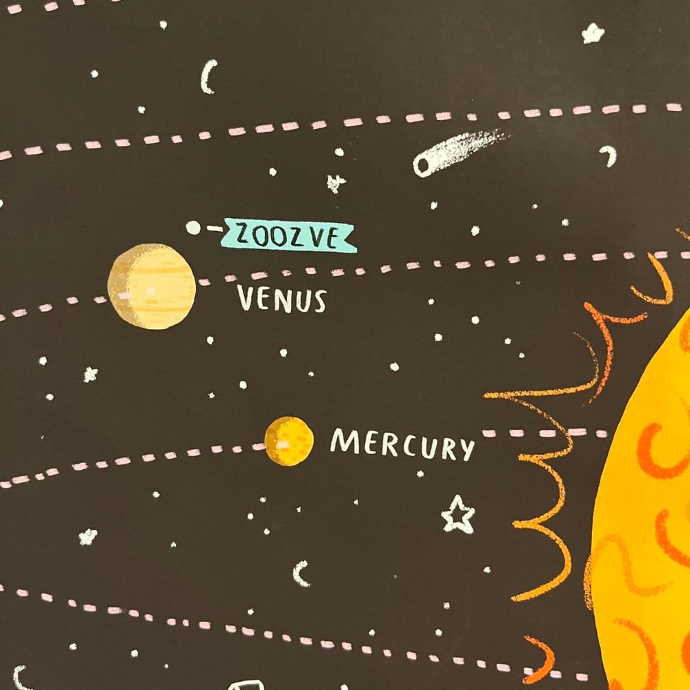
A couple of weeks ago, Radiolab aired an episode about a puzzling object on a children’s poster of the solar system: a Venusian moon called Zoozve. Venus doesn’t have any moons and “Zoozve” didn’t show up on Google at all, so co-host Latif Nasser went on a bit of a mission to find out what the heck this object was. He talked to someone at NASA, the poster’s designer, and various astronomers and physicists, including the person who had discovered Zoozve (aka 2002 VE68).
So begins a tiny mystery that leads to a newly discovered kind of object in our solar system, one that is simultaneously a moon, but also not a moon, and one that waltzes its way into asking one of the most profound questions about our universe: How predictable is it, really? And what does that mean for our place in it?
It’s an entertaining listen and you’ll want to catch the follow-up as well, which I won’t spoil for you. And if you’re a reader rather than a listener, this piece at space.com recaps the whole thing.
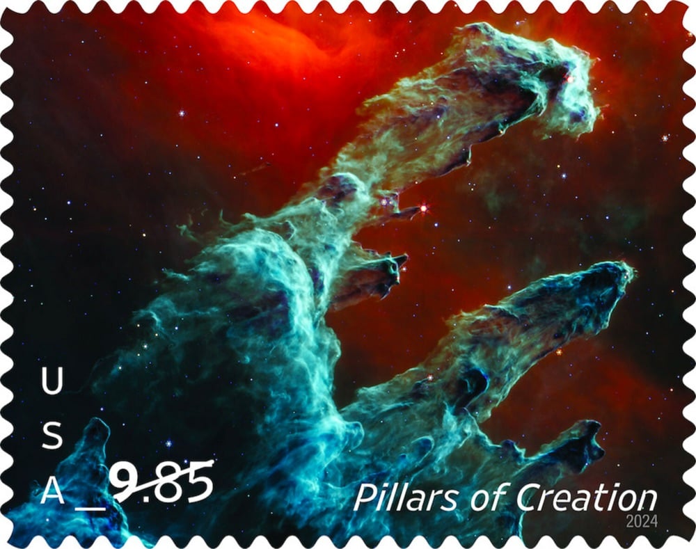
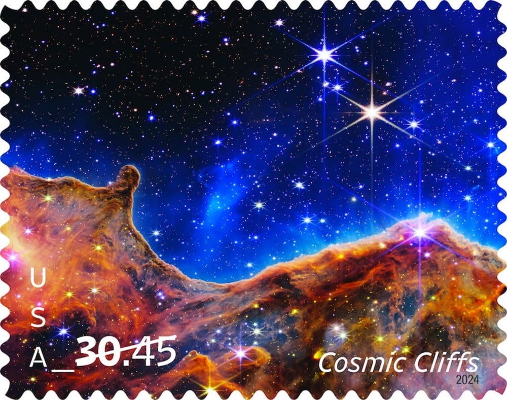
The USPS has released two new Priority Post stamps featuring imagery captured by the JWST: Pillars of Creation (NASA original) and Cosmic Cliffs (NASA original). From the USPS press release:
Captured by the James Webb Space Telescope, this extremely high-definition infrared image shows the magnificent Pillars of Creation formation within the Eagle Nebula. By assigning color to various wavelengths, the digitized image allows us to see a landscape otherwise invisible to the human eye. Red areas toward the end of the pillars show burgeoning stars ejecting raw materials as they form, while the relatively small red orbs scattered throughout the image show newly born stars.
This remarkable image from the James Webb Space Telescope is a digitally colored depiction of the invisible bands of mid-infrared light emitted by the Cosmic Cliffs of the Carina Nebula. Red and yellow flares scattered throughout the cliffs show developing and newly born stars. The orange-and-brown clouds in the lower third of the image are swirls of dust and gas. Additional stars, in our Milky Way and in distant galaxies, appear in the blue and black regions above and beyond the nebula.
This is a video slideshow of some of the best images from the Mars missions — Spirit, Opportunity, Curiosity, and Perseverance — presented in 4K resolution at 60fps. These look amazing on the biggest hi-res screen you can find. (via open culture)

NASA has announced that the mission of the Ingenuity helicopter has come to an end on the surface of Mars.
While the helicopter remains upright and in communication with ground controllers, imagery of its Jan. 18 flight sent to Earth this week indicates one or more of its rotor blades sustained damage during landing and it is no longer capable of flight.
Originally designed as a technology demonstration to perform up to five experimental test flights over 30 days, the first aircraft on another world operated from the Martian surface for almost three years, performed 72 flights, and flew more than 14 times farther than planned while logging more than two hours of total flight time.
Nice job, little flying rover! Rest well.
Using a custom hydrogen alpha solar telescope, Jason Kurth took a collection of high-resolution photographs of the recent annular solar eclipse and arranged them into an 8K video of the event. The level of detail here is incredible — you can see solar flares and features on the surface of the Sun pulsing and shifting as the Moon moves across it. You can see a bit of Kurth’s setup on Instagram.
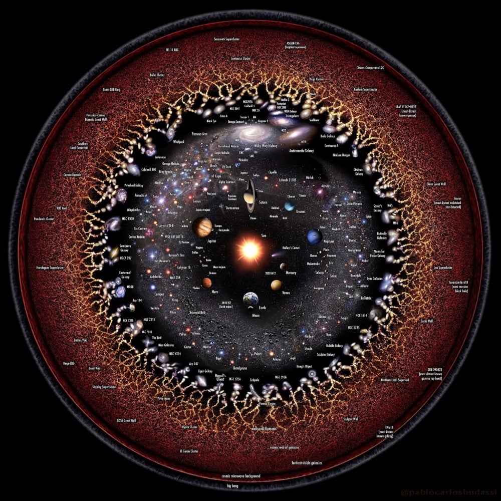
From illustrator Pablo Carlos Budassi, this is a circular map of the universe.
The solar system is located in the center. Towards the edges, the scale is progressively reduced to show in detail the most distant and biggest structures of the observable universe sphere.
There are several other representations of the universe on Budassi’s site, including links to prints, posters, and other products.
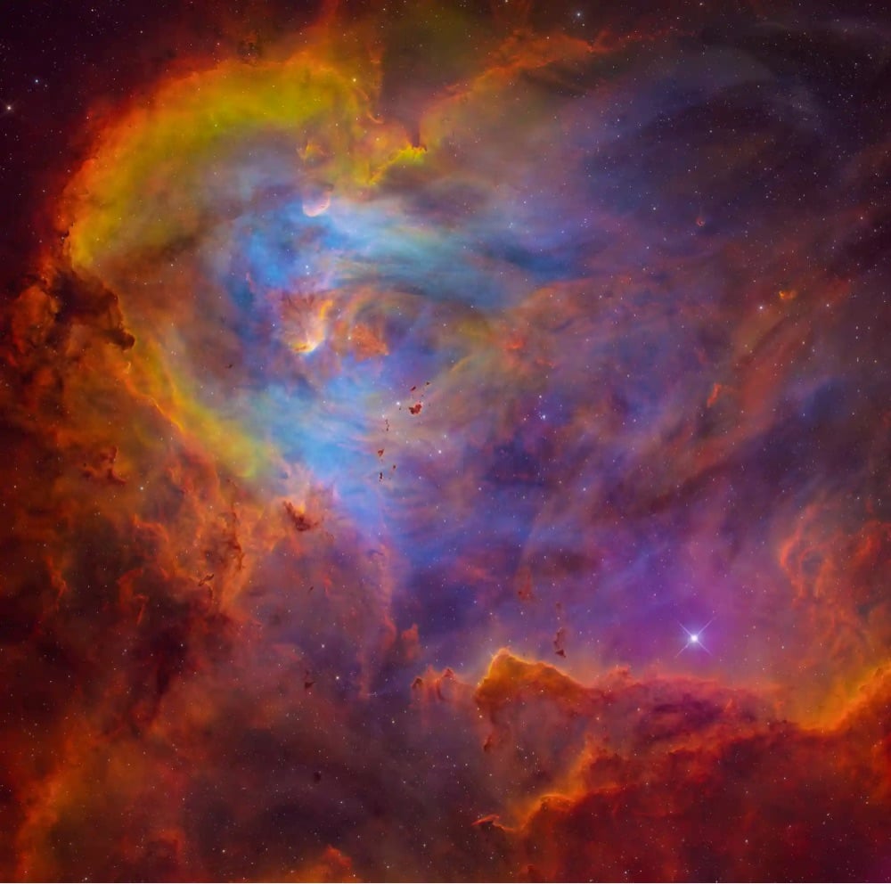
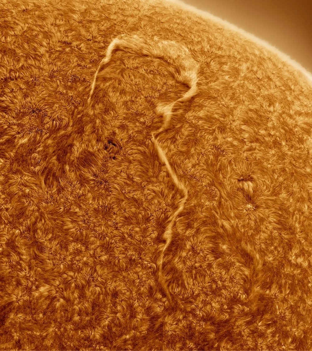
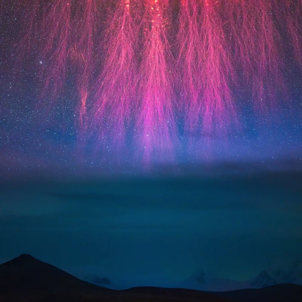
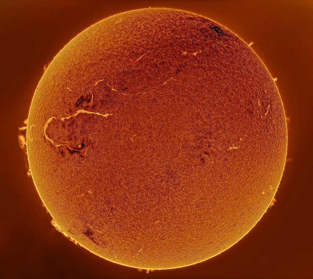
The Royal Observatory Greenwich in London has announced the winners of the Astronomy Photographer of the Year 2023 competition and as you can see from the selection above, there were some amazing shots. From top to bottom:
- Runwei Xu and Binyu Wang for their photo of The Running Chicken Nebula.
- Eduardo Schaberger Poupeau for capturing a question mark on the Sun. I will never tire of looking at the detail of the Sun’s surface.
- Angel An. “This is not, as it might first appear, an enormous extraterrestrial, but the lower tendrils of a sprite (red lightning)! This rarely seen electrical discharge occurs much higher in the atmosphere than normal lightning (and indeed, despite the name, is created by a different mechanism), giving the image an intriguingly misleading sense of scale.”
- Mehmet Ergün. More Sun!
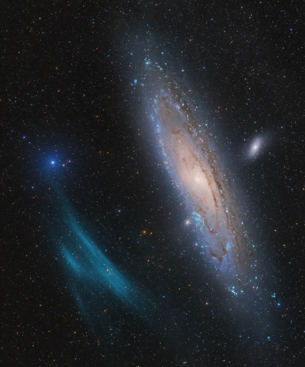
- Marcel Drechsler, Xavier Strottner and Yann Sainty for their shot of the Andromeda galaxy.
The last shot was the overall winner. While not as dramatic as some of the others, it documented the discovery of a previously unknown feature of a nearby cosmic neighbor:
The Andromeda galaxy is the closest spiral galaxy to our own Milky Way, and one of the most photographed deep-sky objects. Yet this particular photo, captured by an international trio of amateur astronomers, revealed a feature that had never been seen before: a huge plasma arc, stretching out across space right next to the Andromeda galaxy.
“Scientists are now investigating the newly discovered giant in a transnational collaboration,” explain the photographers. “It could be the largest such structure nearest to us in the Universe.”
You can see the rest of the winning images on the Royal Observatory site as well as coverage from the BBC, the Guardian, Colossal, and Universe Today.
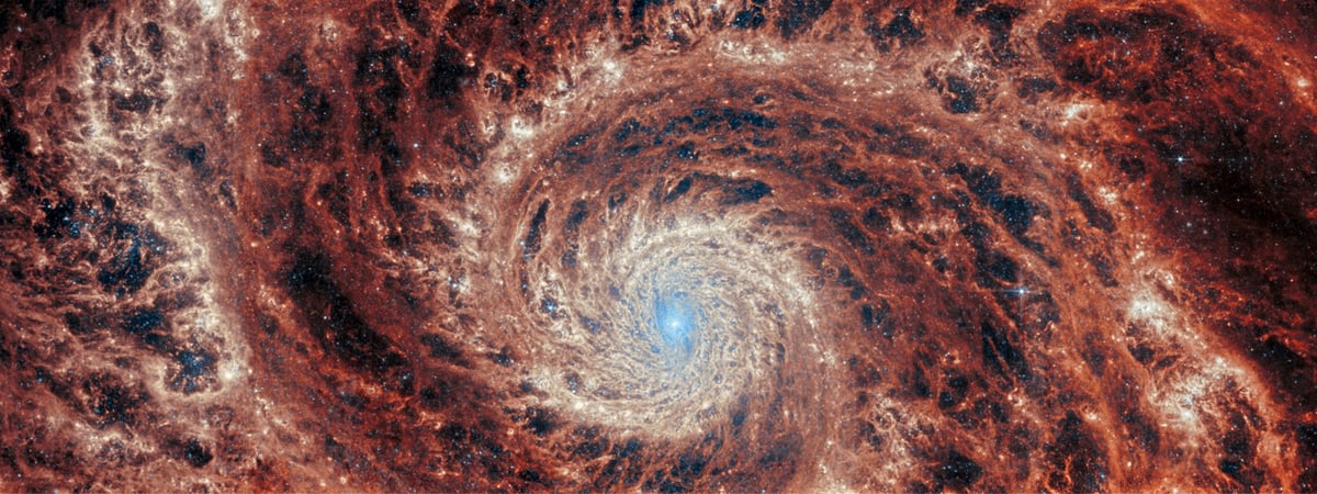
Love this recent JWST shot of the M51 spiral galaxy.
The graceful winding arms of the grand-design spiral galaxy M51 stretch across this image from the NASA/ESA/CSA James Webb Space Telescope. Unlike the menagerie of weird and wonderful spiral galaxies with ragged or disrupted spiral arms, grand-design spiral galaxies boast prominent, well-developed spiral arms like the ones showcased in this image. This galactic portrait was captured by Webb’s Mid-InfraRed Instrument (MIRI).
In this image the reprocessed stellar light by dust grains and molecules in the medium of the galaxy illuminate a dramatic filamentary medium. Empty cavities and bright filaments alternate and give the impression of ripples propagating from the spiral arms. The yellow compact regions indicate the newly formed star clusters in the galaxy.
(via bad astronomy)
This short, relaxing, mesmerizing video of an Martian impact crater called Aram Chaos was taken by the HiRISE camera on the Mars Reconnaissance Orbiter. The images were run through an enhanced color red-green-blue filter, which tends to highlight the structure and geology rather than the true color. For example, the blue in the video often represents basalt, an igneous rock of volcanic origin.
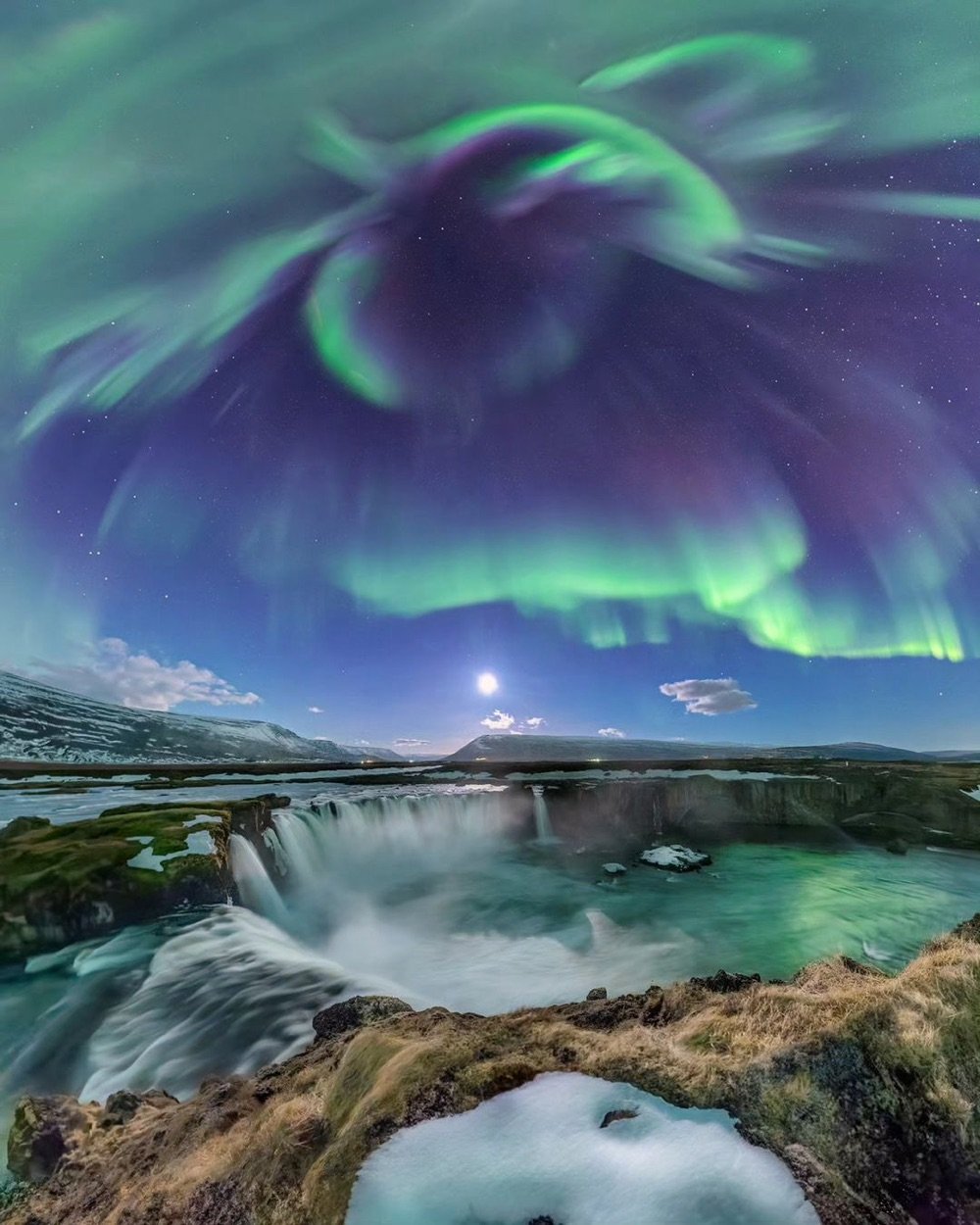
Astrophotographer Cari Letelier caught this amazing shot of the aurora borealis over the Goðafoss waterfall in Iceland. We live in a truly magical world — if science fiction authors made something like this up, you wouldn’t believe it’d ever be real. You can check out more of Letelier’s astrophotography on Instagram or on her website.
I found this via the Astronomy Picture of the Day site, a gem of the old school web that’s been sharing astronomy photos since 1995.
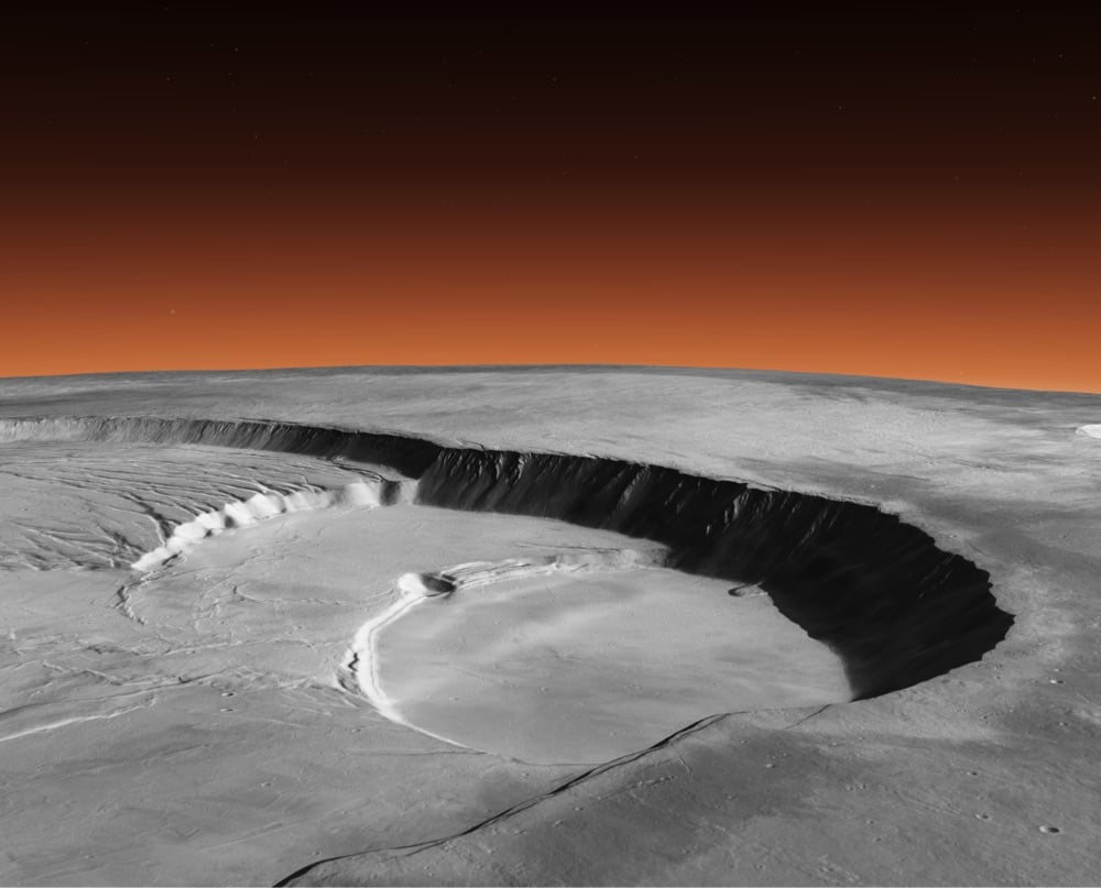
Using imagery from the Mars Reconnaissance Orbiter, the Bruce Murray Laboratory for Planetary Visualization at Caltech has created a 5.7 terapixel mosaic image that covers 99.5% of the surface of Mars. The whole image is available to navigate with a 3D viewer in your browser.
Astronomers believe that there’s a black hole at the center of almost every large galaxy in the universe. Some of those black holes are particularly energetic, chewing up the galaxies in which they reside and releasing massive amounts of energy out into the cosmos. Those black holes and the energy emitted from matter and gas falling towards their centers are what astronomers call quasars.
But if we look closely, we see who is actually in charge. Small as a grain of sand compared to the filaments, the centers of some of these galaxies shine with the power of a trillion stars, blasting out huge jets of matter, completely reshaping the cosmos around them. Quasars, the single most powerful objects in existence, so powerful that they can kill a galaxy.
Blackstar is a relaxing and meditative 45-minute video of the Sun made by Seán Doran using footage from the Solar Dynamics Observatory. Instead of the familiar yellow, Doran has chosen to outfit our star in vivid blue and black, which lends the video a sort of alien familiarity. This looks absolutely stunning in 4K.
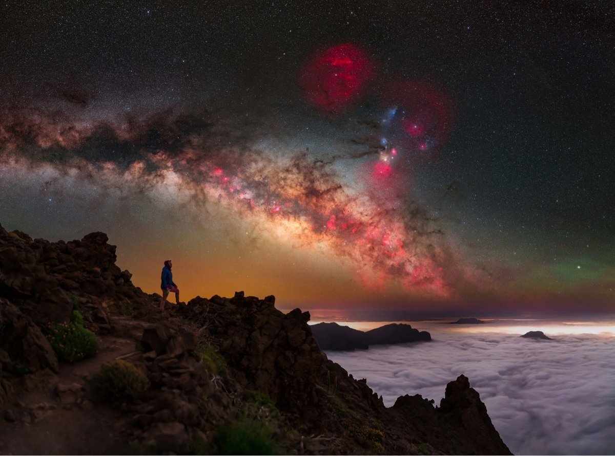
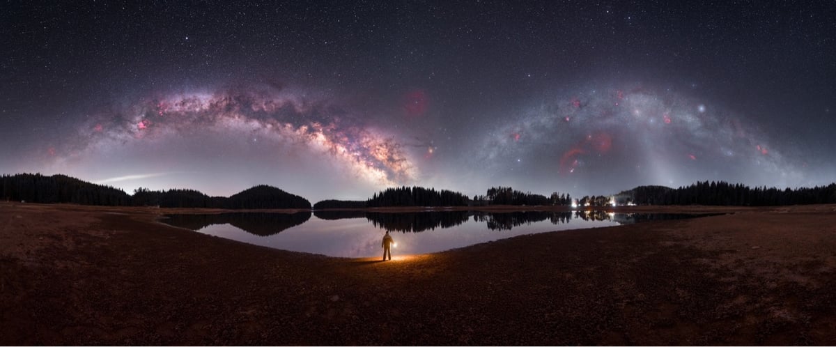
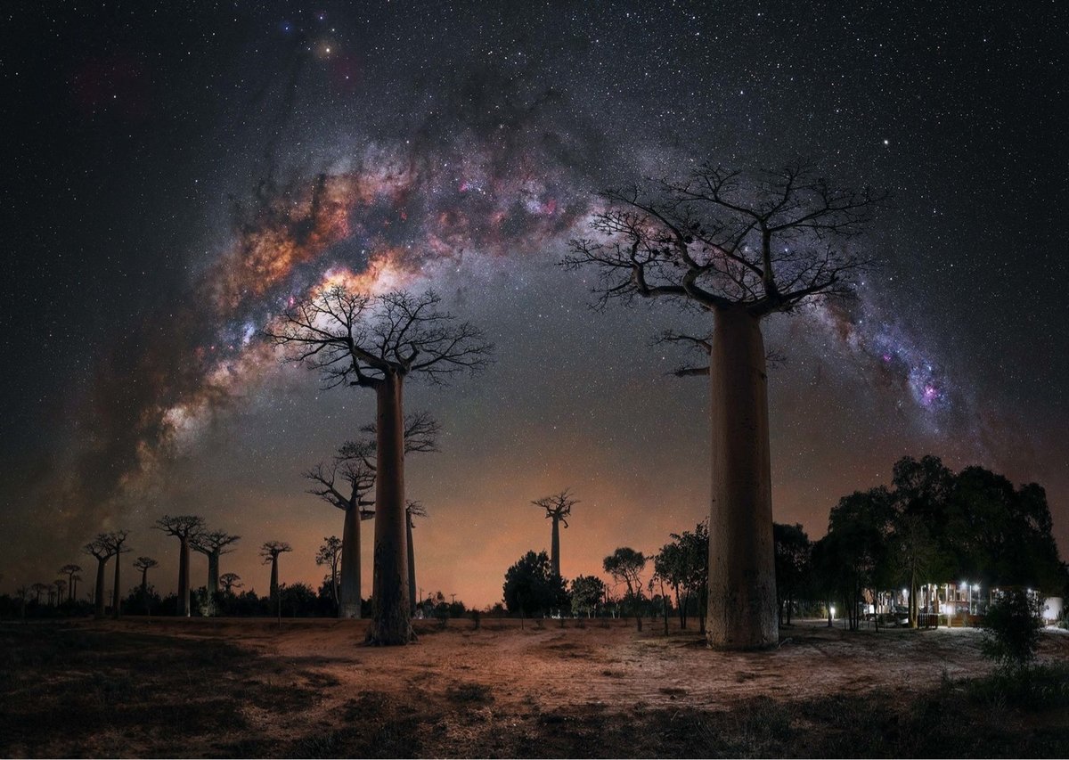
Capture the Atlas have announced their picks for the 2023 Milky Way Photographer of the Year competition. As usual, I’ve included a few of my favorites here — from top to bottom: Jakob Sahner’s photo from the Canary Islands, Mihail Minkov’s composite shot of the Milky Way as it looks in both the summer & winter, and Steffi Lieberman amongst the baobab trees in Madagascar. Here’s Minkov explaining his full-galactic view:
I’ve always wondered what the night sky would look like if we could see the two Milky Way arches from the winter and summer side by side. This is practically impossible, since they are part of a whole and are visible at different times of the day.
However, this 360-degree time-blended panorama shows us what they would look like. The two arches of the Milky Way represent one object in the starry sky, with part of it visible in winter and part of it in summer. Therefore, they are called the winter and summer arches. The winter arch includes objects that we can observe from October to March, primarily associated with the constellation Orion.
On the other hand, the summer arch features the Milky Way core, visible from March to September, which is the most characteristic and luminous part of the night sky, representing the center of our galaxy.
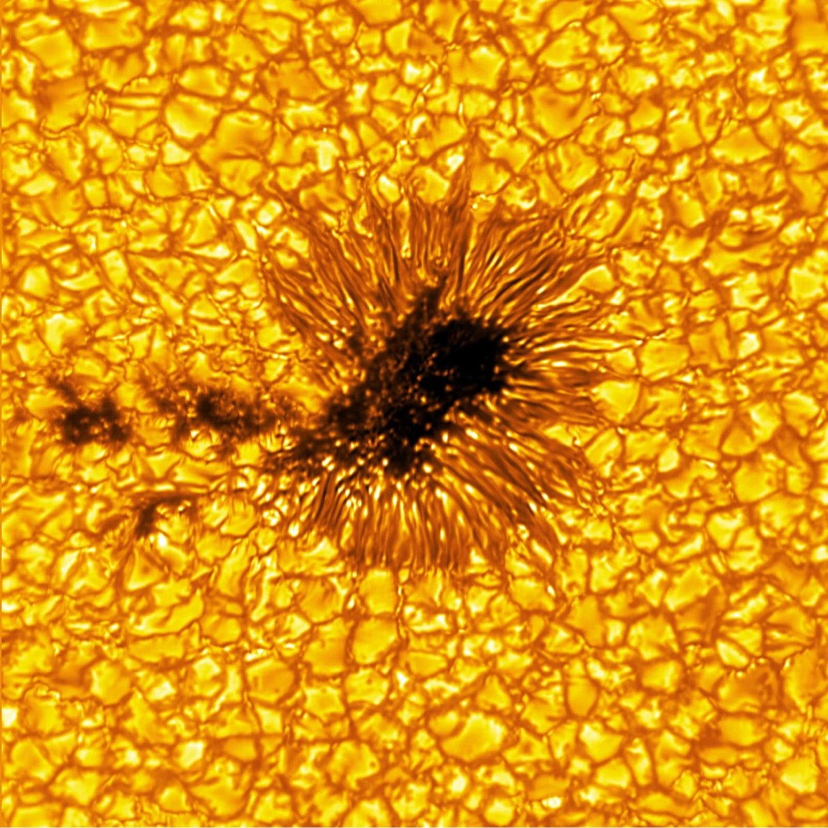
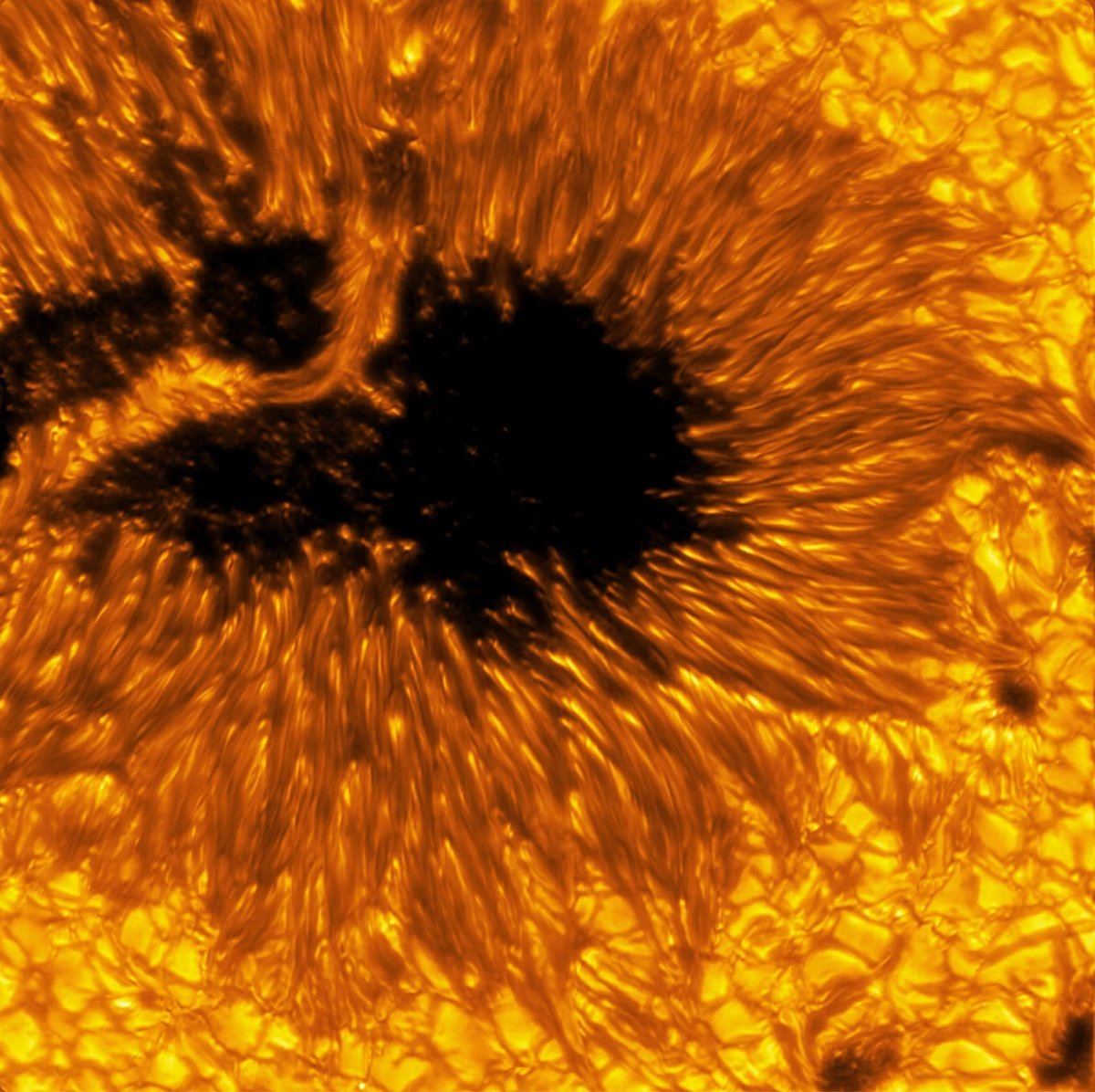
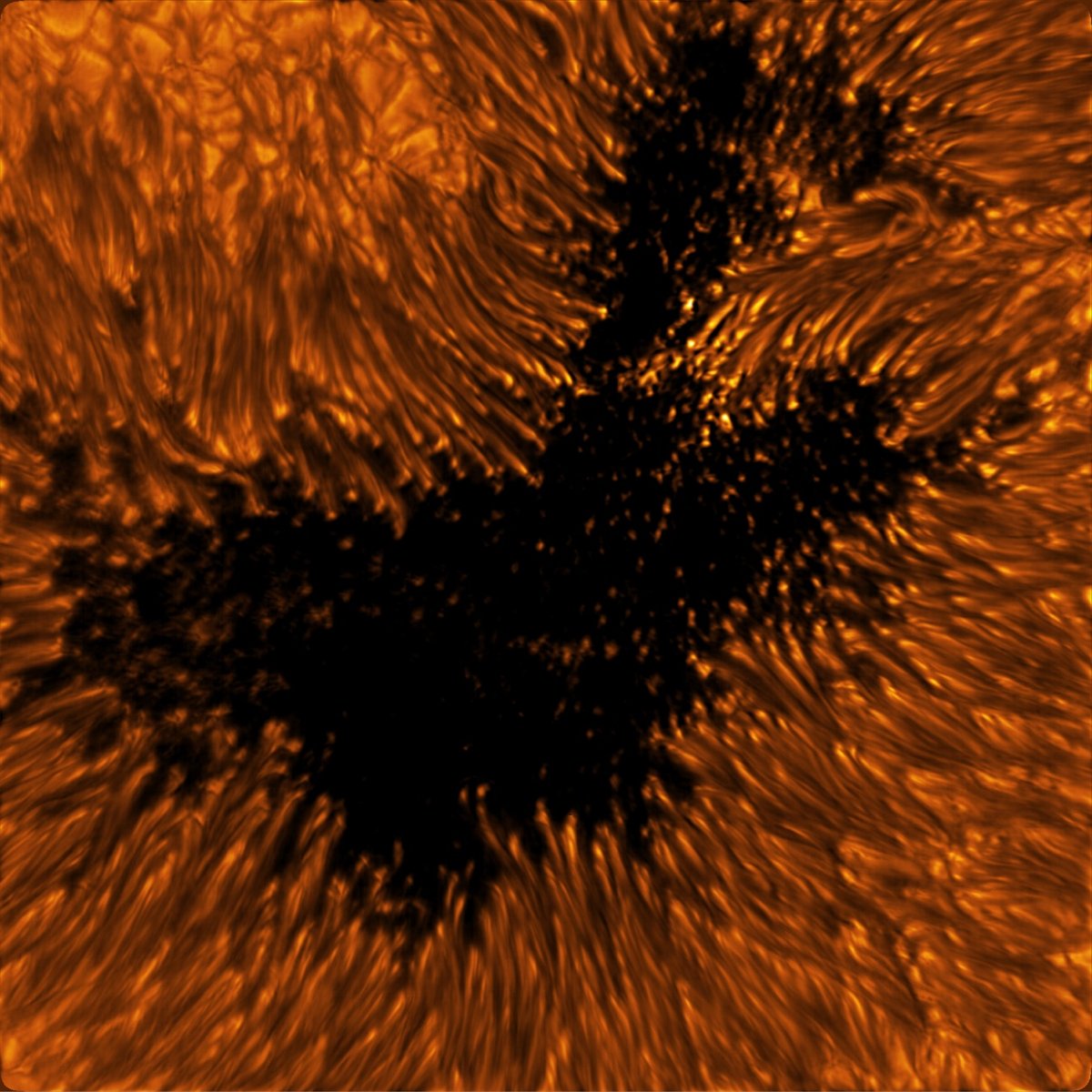
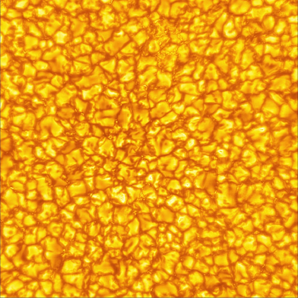
The Inouye Solar Telescope is the largest and most powerful solar telescope in the world. The telescope is still in a “learning and transitioning period” and not up to full operational speed, but scientists at the National Solar Observatory recently released a batch of images that hint at what it’s capable of. Several of the photos feature sunspots, cooler regions of the Sun with strong magnetic fields.
The sunspots pictured are dark and cool regions on the Sun’s “surface”, known as the photosphere, where strong magnetic fields persist. Sunspots vary in size, but many are often the size of Earth, if not larger. Complex sunspots or groups of sunspots can be the source of explosive events like flares and coronal mass ejections that generate solar storms. These energetic and eruptive phenomena influence the outermost atmospheric layer of the Sun, the heliosphere, with the potential to impact Earth and our critical infrastructure.
In the quiet regions of the Sun, the images show convection cells in the photosphere displaying a bright pattern of hot, upward-flowing plasma (granules) surrounded by darker lanes of cooler, down-flowing solar plasma. In the atmospheric layer above the photosphere, called the chromosphere, we see dark, elongated fibrils originating from locations of small-scale magnetic field accumulations.
(via petapixel)
This short animation from NASA shows the sizes of some of the supermassive black holes that feature at the center of galaxies. Some are relatively small:
First up is 1601+3113, a dwarf galaxy hosting a black hole packed with the mass of 100,000 Suns. The matter is so compressed that even the black hole’s shadow is smaller than our Sun.
While others are much larger than the solar system…and this isn’t even the biggest one:
At the animation’s larger scale lies M87’s black hole, now with a updated mass of 5.4 billion Suns. Its shadow is so big that even a beam of light — traveling at 670 million mph (1 billion kph) — would take about two and a half days to cross it.
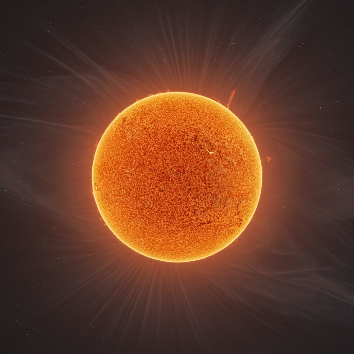
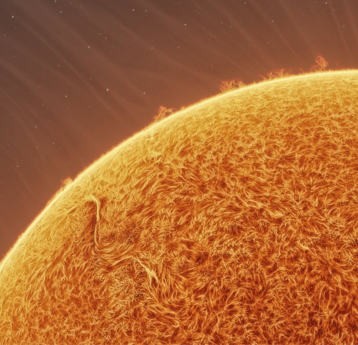
Good morning, sunshines! Well, amateur astrophotographer Andrew McCarthy has done it again. Collaborating with Jason Guenzel, he has produced this absolutely gobsmacking image of the Sun.
The aptly named “Fusion of Helios” is a fusion from the minds of two astrophotographers, Andrew McCarthy and Jason Guenzel. Using a custom-modified hydrogen alpha solar telescope, the combined data from over 90,000 individual images was jointly processed to reveal the layers of intricate details within the solar chromosphere. A geometrically altered image of the 2017 eclipse as an artistic element in this composition to display an otherwise invisible structure. Great care was taken to align the two atmospheric layers in a scientifically plausible way using NASA’s SOHO data as a reference.
I’ve included the full image and my favorite crop (the solar tornado the height of 14 Earths was a close second) above, but do yourself a big favor and check out the largest image available (which is still way smaller than the 140 megapixel final image they produced). If you’re curious about the process, here’s how McCarthy gets his Sun photos:
So how do I resolve atmospheric details, like spicules, prominences, and filaments? The trick is tuning the telescope to an emission line where these objects aren’t drown out by the bright photosphere. Specifically, I’m shooting in the Hydrogen-alpha band of the visible spectrum (656.28nm). Hydrogen Alpha (HA) filters are common in astrophotography, but just adding one to your already filtered telescope will just reduce the sun’s light to a dim pink disk, and using it without the aperture filter we use to observe the details on the photosphere will blind you by not filtering enough light. If you just stack filters, you still can’t see details. So what’s the solution?
A series of precisely-manufactured filters that can be tuned to the appropriate emission line, built right into the telescope’s image train does the trick! While scopes built for this purpose do exist (look up “coronado solarmax” or “lunt solar telescope” I employ a heat-tuned hydrogen alpha filter (daystar quark) with an energy rejection filter (ERF) on a simple 5” doublet refractor. That gives me a details up close look at our sun’s atmosphere SAFELY. I’ve made a few custom modifications that have helped me produce a more seamless final image, but am not *quite* yet ready to share them, but just the ERF+Quark on a refractor will get you great views.
Photography has always been a combination of technology, artistry, and wrangling whatever light you can get to best express the feeling that you’re going for — astrophotography certainly dials that wrangling up to 11.
Prints of this image (and some digital downloads) are available in various sizes from McCarthy and Guenzel.
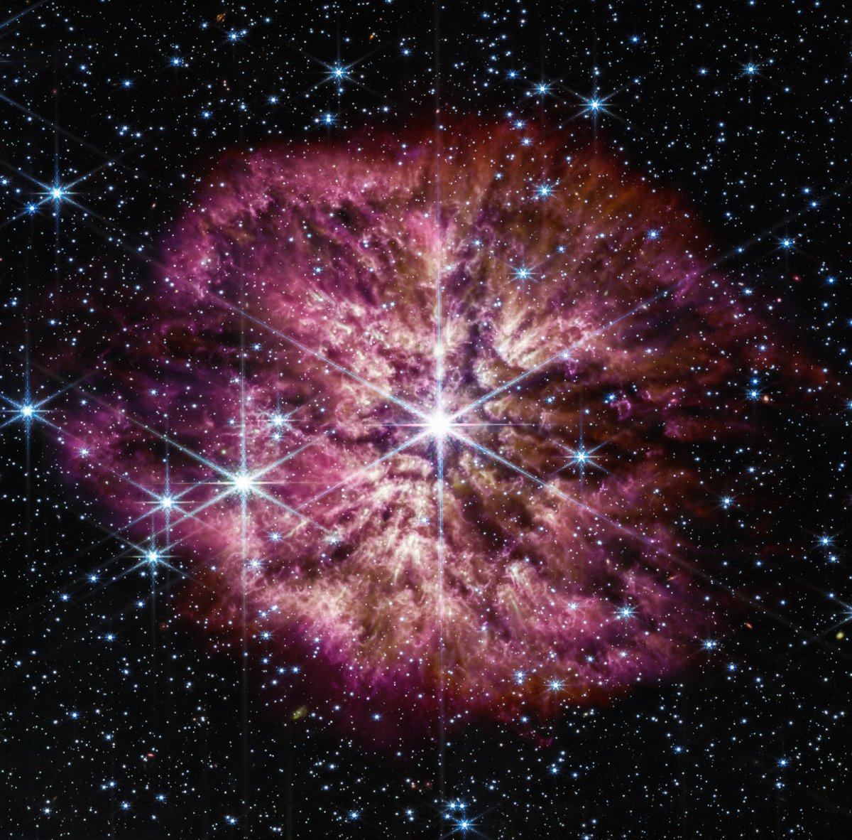
Folks, I told you that this was going to become a JWST fan blog and if you didn’t hear me the first time, consider yourself notified. NASA’s newest space telescope is still stretching its legs, but even back in its early days last summer, it captured this breathtaking near-infrared and mid-infrared image of a star preparing to go supernova.
The 10 light-years-wide nebula is made of material cast off from the aging star in random ejections, and from dust produced in the ensuing turbulence. This brilliant stage of mass loss precedes the star’s eventual supernova, when nuclear fusion in its core stops and the pressure of gravity causes it to collapse in on itself and then explode.
Images like these are useful for studying dust, which sounds a little boring but actually is fascinating (italics mine):
The origin of cosmic dust that can survive a supernova blast and contribute to the universe’s overall “dust budget” is of great interest to astronomers for multiple reasons. Dust is integral to the workings of the universe: It shelters forming stars, gathers together to help form planets, and serves as a platform for molecules to form and clump together — including the building blocks of life on Earth. Despite the many essential roles that dust plays, there is still more dust in the universe than astronomers’ current dust-formation theories can explain. The universe is operating with a dust budget surplus.
Currently imagining a sci-fi office dramedy about the dust budget surplus — someone over at HBO Max or Apple+ get on this.
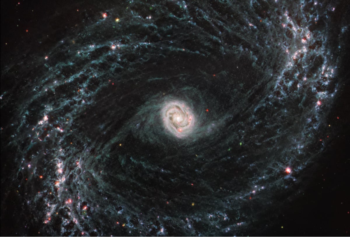
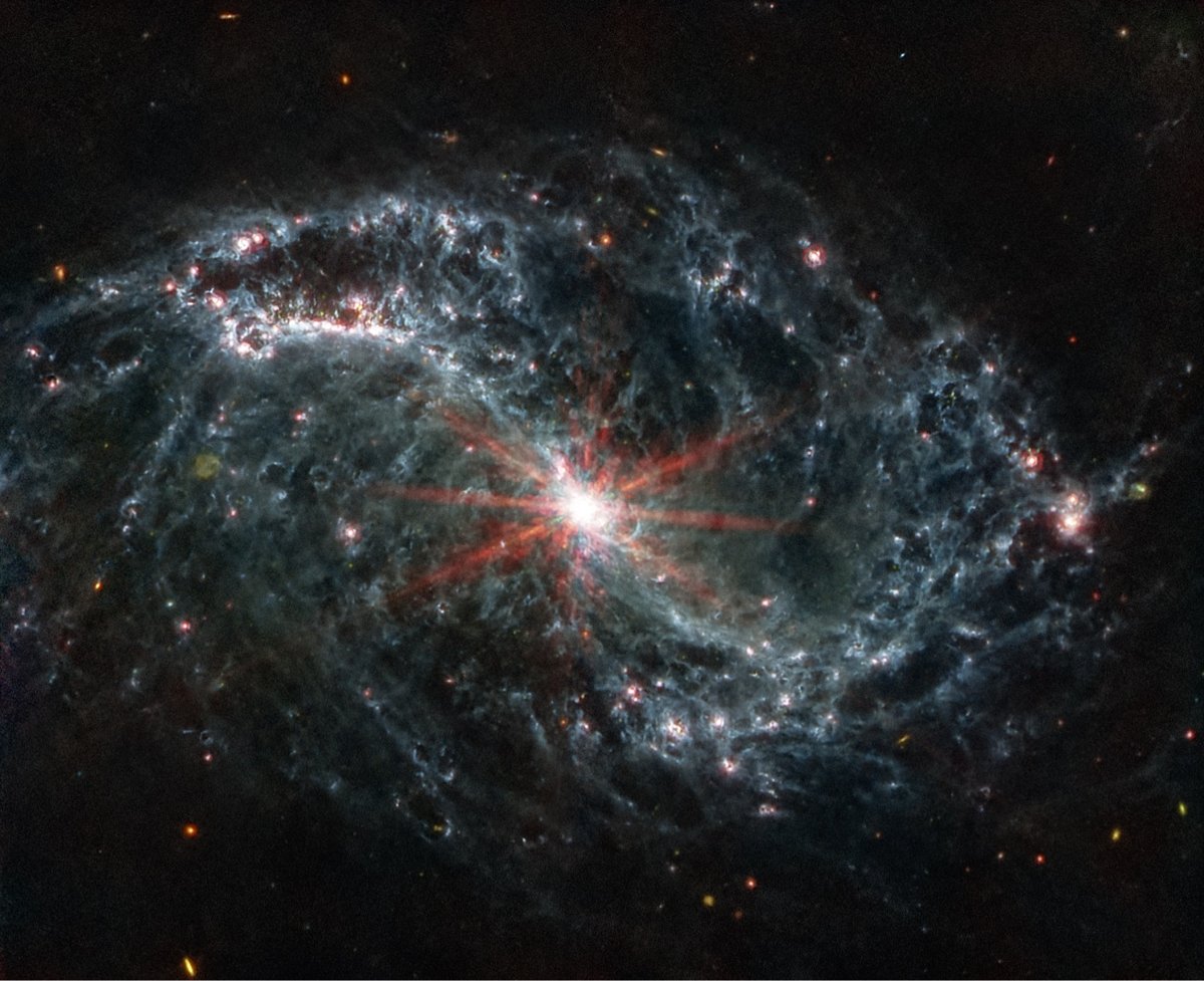
I don’t know how kottke.org isn’t going to turn into a JWST-only blog — it seems like there’s some never-before-seen imagery released every other week that just absolutely knocks my socks off. Like these unprecedented images of nearby galaxies that were taken to help study how individual stars affect galactic structure.
The saying goes, ‘From a tiny acorn grows the mighty oak.’ This is accurate not just here on Earth, but in our solar system and beyond. Even on a galactic scale, where individual stars and star clusters can sculpt a galaxy’s overall structure. Scientists say NASA’s James Webb Space Telescope is perfectly primed to study these phenomena, and the first data is astounding astronomers.
New imagery from Webb’s Mid-Infrared Instrument is revealing never-before-seen details into how young, newly forming stars influence the structure of the gas and dust of nearby galaxies, and therefore how they evolve over time. Areas of galaxies that once appeared dim and dark in visible light, now under Webb’s infrared eye, are glowing cavities and huge cavernous bubbles of gas and dust.
A group of astronomers say they have evidence that links supermassive black holes at galactic centers with dark energy, the mysterious force that accounts for roughly 68% of the energy in the universe. Here’s the news release and the paper. From the Guardian:
Instead of dark energy being smeared out across spacetime, as many physicists have assumed, the scientists suggest that it is created and remains inside black holes, which form in the crushing forces of collapsing stars.
“We propose that black holes are the source for dark energy,” said Duncan Farrah, an astronomer at the University of Hawaii. “This dark energy is produced when normal matter is compressed during the death and collapse of large stars.”
The claim was met with raised eyebrows from some independent experts, with one noting that while the idea deserved scrutiny, it was far too early to link black holes and dark energy. “There’s a number of counter-arguments and facts that need to be understood if this claim is going to live more than a few months,” said Vitor Cardoso, a professor of physics at the Niels Bohr Institute in Copenhagen.
And here’s a short video explainer:
It’s a radical claim to be sure — it’ll be interesting to see how it shakes out in the weeks and months to come as other scientists interpret the results.

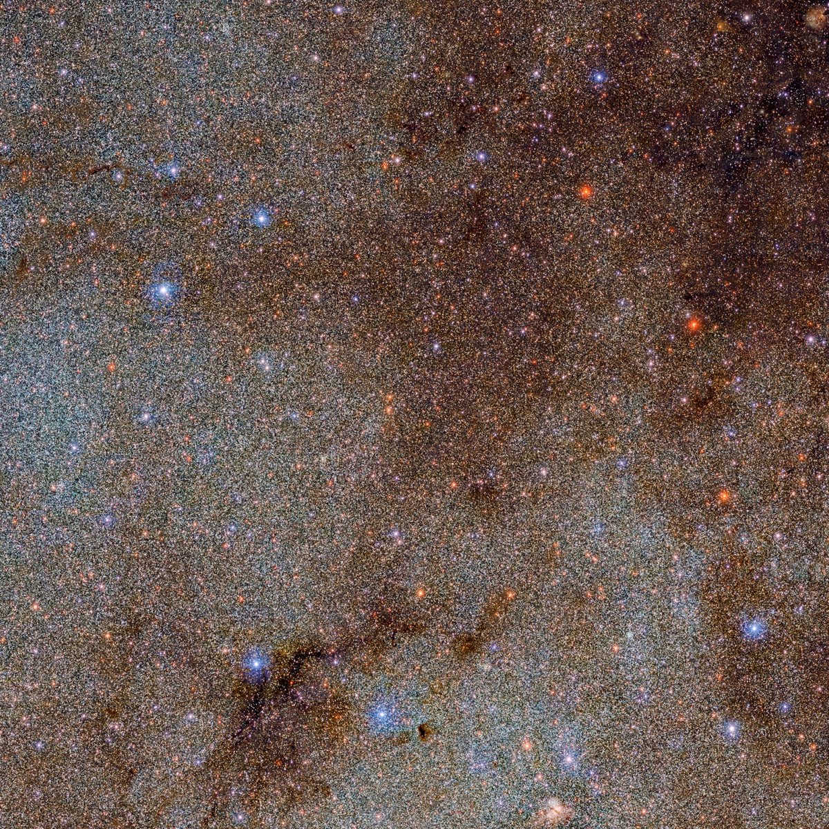
Thanks to a planet-wide collaboration, scientists have released an image of the Milky Way that contains 3.32 billion individually identifiable objects, most of which are stars.
Gathering the data required to cover this much of the night sky was a Herculean task; the DECaPS2 survey identified 3.32 billion objects from over 21,400 individual exposures. Its two-year run, which involved about 260 hours of observations, produced more than 10 terabytes of data.
Most of the stars and dust in the Milky Way are located in its spiral disk — the bright band stretching across this image. While this profusion of stars and dust makes for beautiful images, it also makes the galactic plane challenging to observe. The dark tendrils of dust seen threading through this image absorb starlight and blot out fainter stars entirely, and the light from diffuse nebulae interferes with any attempts to measure the brightness of individual objects. Another challenge arises from the sheer number of stars, which can overlap in the image and make it difficult to disentangle individual stars from their neighbors.
It’s worth checking out the largest size of the image published on the web (which is actually much smaller than the image’s actual size) as well as a tiny portion of the full image (second image above) that shows just how much detail is there. A zoomable interface for the entire image is available here.
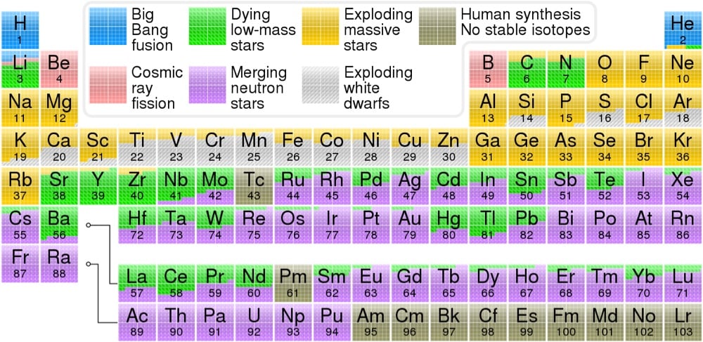
From Wikipedia contributor Cmglee and Astronomy Picture of the Day, a color-coded periodic table that displays which cosmic events — the Big Bang, exploding stars, merging neutron stars, etc. — was responsible for creating each element, according to our present understanding of the universe.
The hydrogen in your body, present in every molecule of water, came from the Big Bang. There are no other appreciable sources of hydrogen in the universe. The carbon in your body was made by nuclear fusion in the interior of stars, as was the oxygen. Much of the iron in your body was made during supernovas of stars that occurred long ago and far away. The gold in your jewelry was likely made from neutron stars during collisions that may have been visible as short-duration gamma-ray bursts or gravitational wave events.
The data for the table came from OSU’s Jennifer Johnson, who quotes Carl Sagan:
The nitrogen in our DNA, the calcium in our teeth, the iron in our blood, the carbon in our apple pies were made in the interiors of collapsing stars. We are made of starstuff.
(thx, caroline)
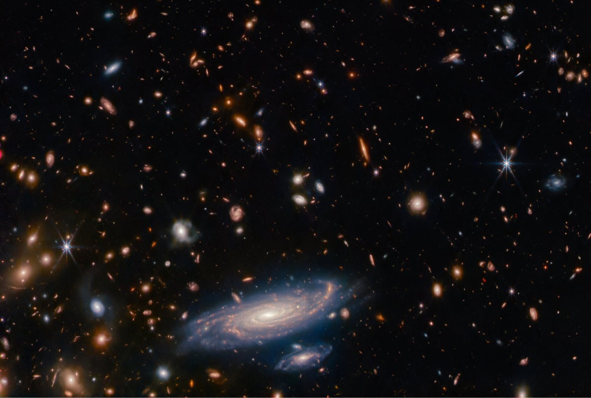
The European Space Agency has released a gobsmacking deep field image of thousands of galaxies taken by the James Webb Space Telescope.
A crowded field of galaxies throngs this Picture of the Month from the NASA/ESA/CSA James Webb Space Telescope, along with bright stars crowned with Webb’s signature six-pointed diffraction spikes. The large spiral galaxy at the base of this image is accompanied by a profusion of smaller, more distant galaxies which range from fully-fledged spirals to mere bright smudges. Named LEDA 2046648, it is situated a little over a billion light-years from Earth, in the constellation Hercules.
I know we’ve seen deep field images from the Hubble, but I don’t know how you can tire of looking at actual images created by human technology that shows thousands of galaxies, billions of years, trillions of stars, quadrillions of planets, untold numbers of potential intelligences & civilizations, and who really knows what else. It boggles the mind, every time.
You can download/view a massive high-res copy of this image right here.
Update: Here’s a video that zooms in from a wide view of the Milky Way all the way into galaxy LEDA 2046648 pictured above.
Wow. (via @cparnot)
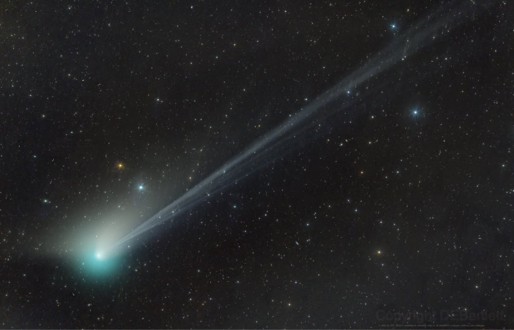
A comet called Comet C/2022 E3 (ZTF) is currently visible in northern skies with the naked eye and here’s how you can catch a glimpse for yourself.
Comet C/2022 E3 (ZTF) is currently making its way through the northern skies and should reach its brightest magnitude in early February, according to In-The-Sky.org as it approaches perigee on Feb. 1. To see the comet for yourself, look to the north just after sunset and look for a faint greenish glow. Under the right dark sky conditions, the comet could be visible to the unaided eye, but binoculars will certainly make the job easier.
The comet last visited the Earth about 50,000 years ago and this may be its last visit before it leaves the solar system for good. The unusual green color results from a rare chemical reaction:
The comet itself isn’t green, but its head does appear to glow green thanks to a somewhat rare chemical reaction. The glow likely comes from diatomic carbon (C2) — a simple molecule made of two carbon atoms bonded together. When ultraviolet light from the sun breaks this molecule down, it emits a greenish glow that can last for several days, according to a 2021 study in the journal Proceedings of the National Academy of Sciences.
This eerie light disappears before making its way to the comet’s tail, or coma, which is made of gas. That gas is once again a result of solar radiation - in this case, sunlight causes part of the comet to sublimate, or transition from a solid into a gas without entering a liquid state. That gas streaks behind the comet, often glowing blue from the ultraviolet light.
The best, brightest views of the comet will be right around Feb 1, when it will be near the constellation Camelopardalis (almost due north, in the general vicinity of the Big and Little Dippers) right after sunset — use an app like Sky Guide to help find it. It’s cloudy here in Vermont until Friday…I’m going to try to catch a glimpse of it then.
Amazing photo of Comet C/2022 E3 (ZTF) above by Dan Bartlett.
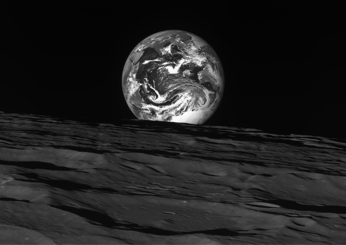
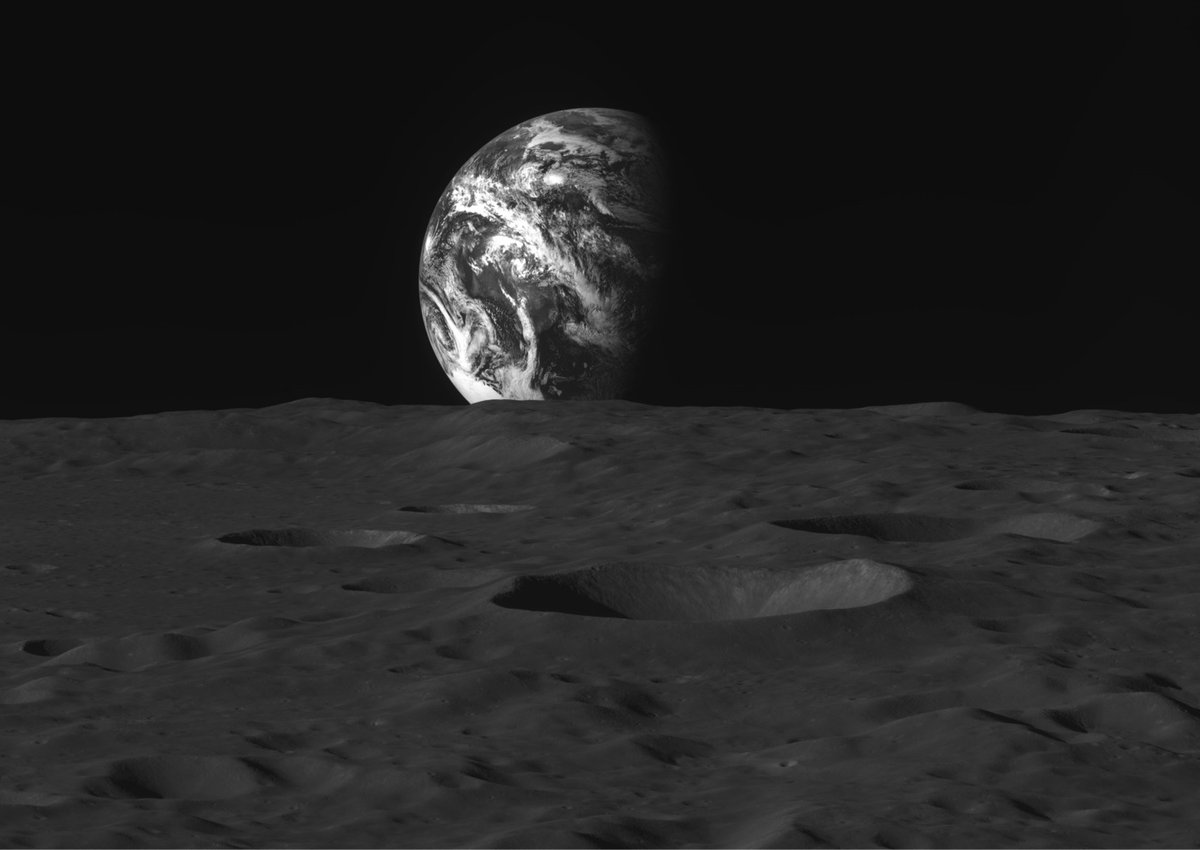
South Korea currently has a probe called Danuri orbiting the Moon at an altitude of about 62 miles above the surface. It’s just begun its mission but has already sent back some black & white photos of the Moon and the Earth, including the two above. Over at EarthSky, Dave Adalian says these shots “rival the work of legendary nature photographer Ansel Adams” and it’s difficult to disagree.
Also worth a look: Danuri’s shot of the Earth and Moon from a distance, hanging in the blackness of space like a pair of pearls. (via petapixel)
Newer posts
Older posts




Socials & More