kottke.org posts about art
Forensic scientist Thiago Piwowarczyk and art historian Jeffrey Taylor are often called upon to authenticate purported paintings by well-known artists. Using a drip painting resembling Jackson Pollock’s work, they show how they use historical research, hardcore science, and good-ol’ human observation. The steps they go through are:
1. Provenance research. Is there any documentation of the artist painting this? Who owned it and when? Forged documentation can be an issue here.
2. Visual analysis. Does the material used for the painting fit the artist and the timeframe? Often, a forger won’t sign a fake to mitigate any potential legal ramifications.
3. Photography and ultraviolet analysis. Was the canvas reused? Is there an under-painting or drawing?
4. X-ray fluorescence spectroscopy. What elements are present in the paint? Do they match those in the paints normally used by the artist?
5. Microscopy & Raman spectroscopy. What kind of paint was used? Did that paint exist when the artist was working?
Super interesting. All of the craft aside, Piwowarczyk also says that “if the deal is too good, there’s something wrong”. $25,000 for a Pollack? Nope. (via open culture)
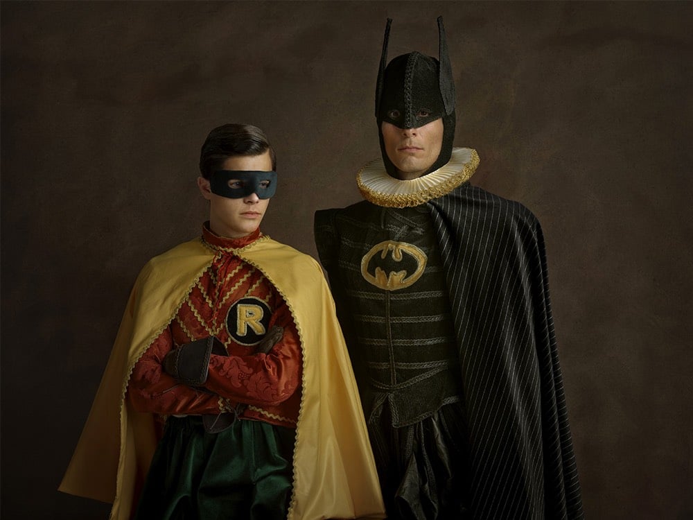
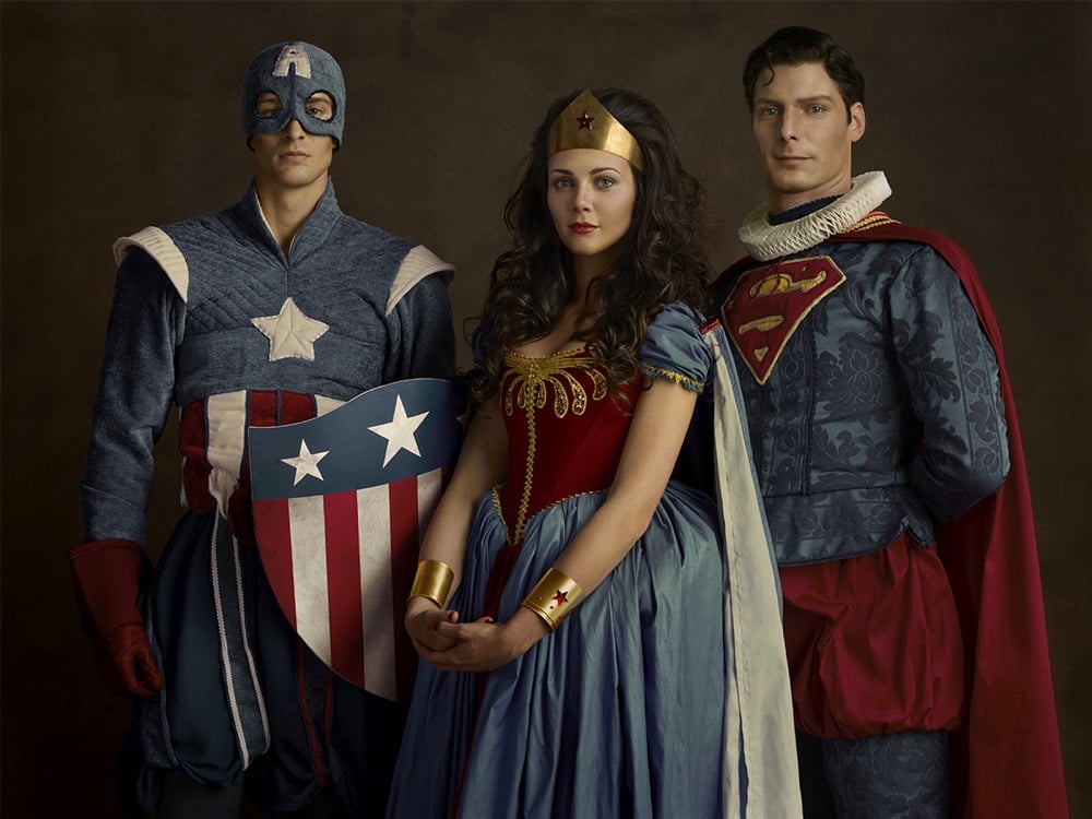
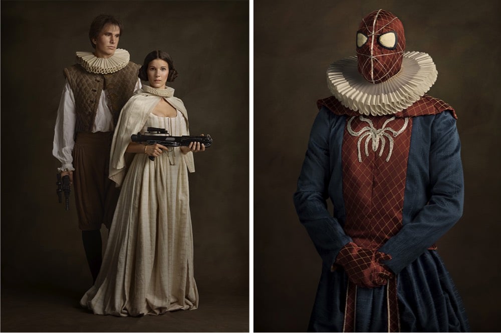
Sacha Goldberger made a series of portraits of characters from Star Wars and superhero comics as if they were the subjects of 16th-century Flemish paintings, ruffs and all. (thx, anna)
For a cultural program to accompany the 2012 Olympics in London, artist Sue Austin created a video of herself exploring a coral reef in a wheelchair outfitted with motors and wings to help it steer and go through the water.
It’s a tiny bit surreal to see how freely she moves around in something that many of us associate with an absence of a particular type of movement. But as Austin explains in her 2013 TED Talk, she thinks of her wheelchair in terms of freedom of movement, which is highlighted for others by the underwater video. (via colossal)
The last time I posted a video by Vladimir Tomin I struggled to describe what it was about, eventually punting with “just give it 5 seconds and you’ll get the idea”. They’re fun augmented reality sketches — like peeling up a road’s center line with a cursor — what’s not to like?! (via colossal)
Abbie Paulhus is selling copies of this great illustrated poster she made featuring a Wes Anderson alphabet on her Etsy shop.
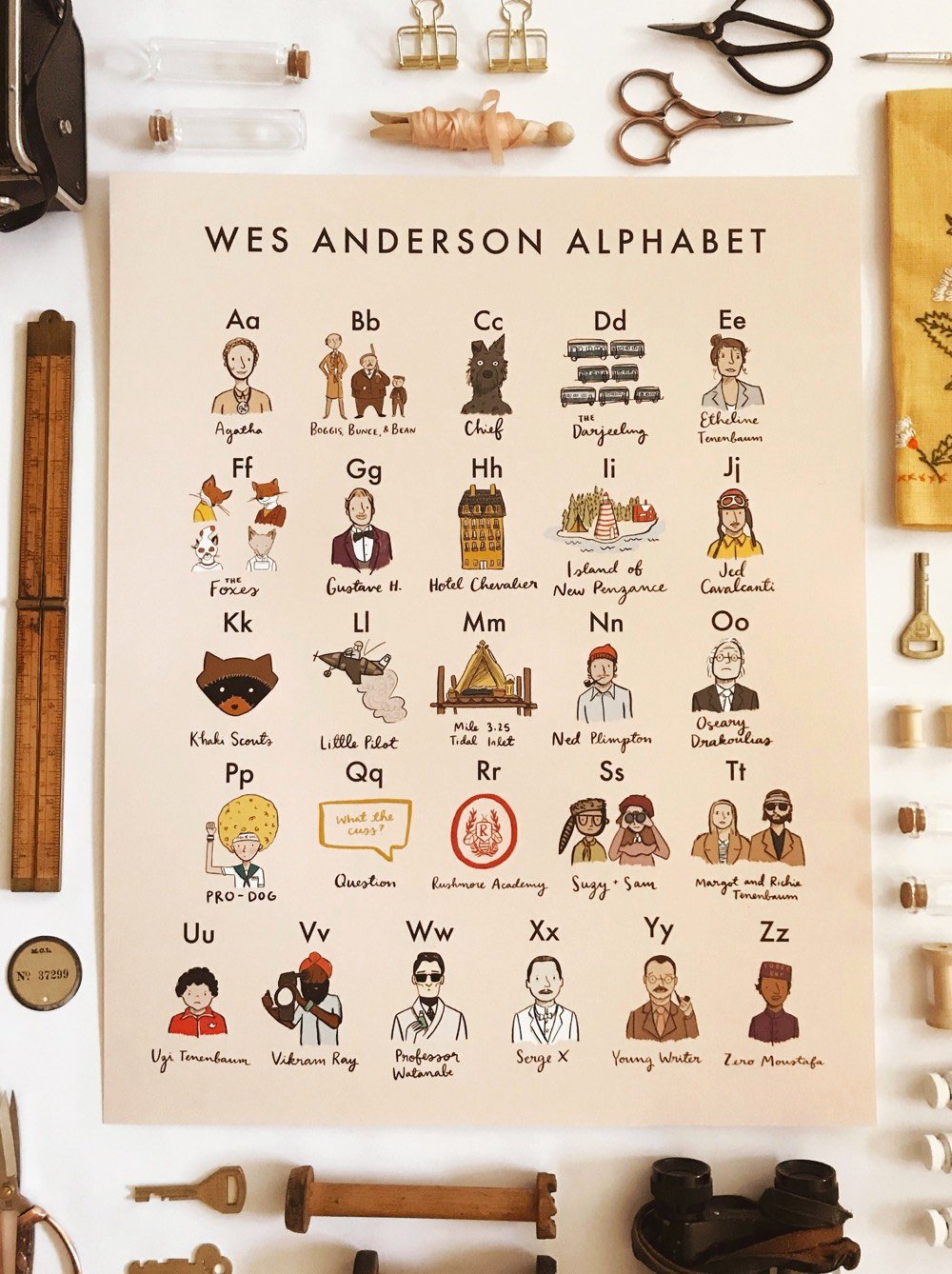
It features people, places, and objects from many of Anderson’s films (I didn’t see any Bottle Rocket references): B is for Boggis, Bunce, and Bean, N is for Ned Plimpton, and T is for Margot and Richie Tenenbaum.
The NY times recently asked eight artists what art projects they would do if they could fly to the Moon. Here’s Kara Walker’s answer:
Gil Scott Heron wrote that famous poem, “Whitey on the Moon”: “The man just upped my rent last night / Cause whitey’s on the moon / No hot water, no toilets, no lights / But whitey’s on the moon.”
I got thinking about a moon colony, which plenty of people have talked about pretty seriously over the years. So what I’d do is this: For every female child born on Earth, one sexist, white supremacist adult male would be shipped to the moon. They could colonize it to their heart’s content, and look down from a distance of a quarter-million miles. It’s a monochrome world up there; probably they’d love it. The colony would be hermetically sealed. And the rest of us could enjoy the sight of them from a safe distance. Maybe there could be some kind of selection ritual involved, something to do with menstruation and the tides — a touch of nature, to add a bit of irony justice to the endeavor.
For the supremacists, maybe traveling so far from home would help inspire a different worldview. And for the rest of us down on Earth, perhaps this is an opportunity to focus on the nature of our home planet with the same dreamy reverence we once reserved for the moon.
Here’s Scott-Heron’s Whitey on the Moon. In contrast, architect Daniel Libeskind would turn the Moon into a square by painting part of it black:
My son Noam is an astrophysicist at the Leibniz Institute in Germany, and we did some calculations about how it could work. We thought the best way would be to paint sections of it black, so they no longer reflect the sun’s light. To account for the curvature, you’d need to paint four spherical caps on the moon’s surface. That would create a kind of frame that looks square when you see it from earth.
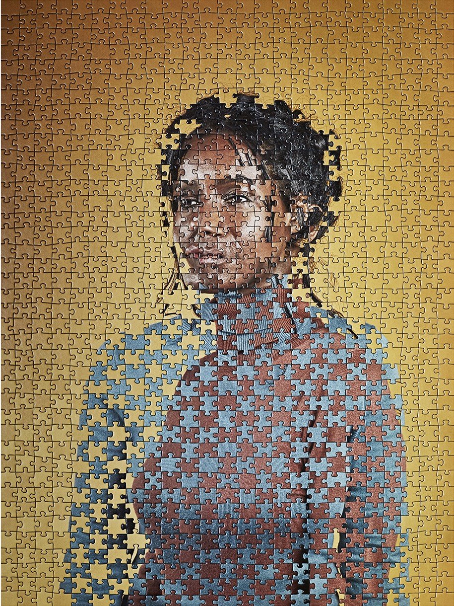
Taking advantage of the fact that puzzle manufacturers typically use the same cut patterns to make many different puzzles, Tim Klein uses the interchangeable pieces to create surrealist mashups of puzzles.

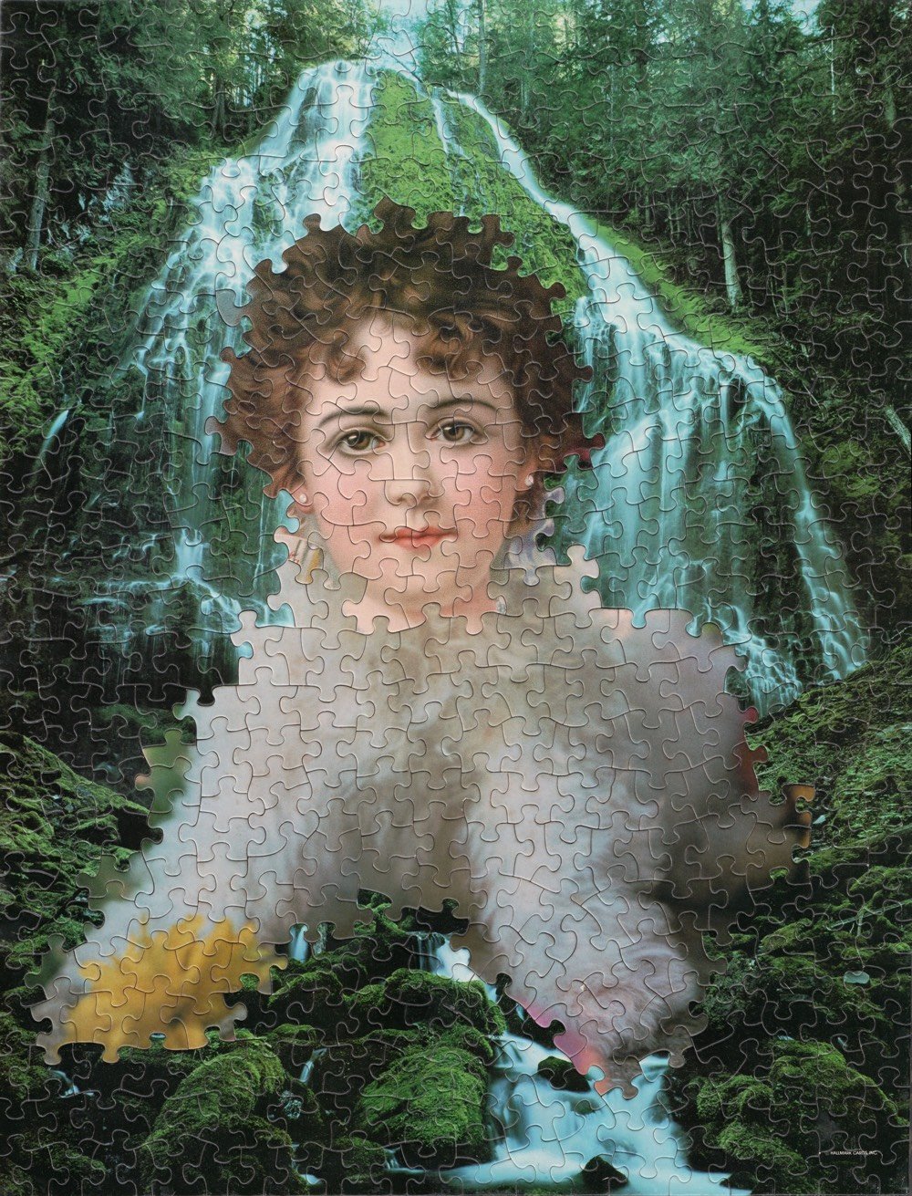
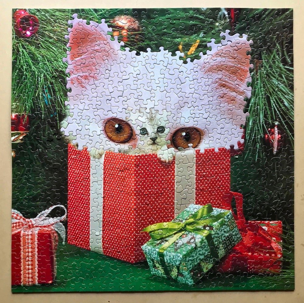
Artist Alma Haser used this technique for her Within 15 Minutes project in which she melded identically cut puzzles of portraits of identical twins.
(via @john_overholt)
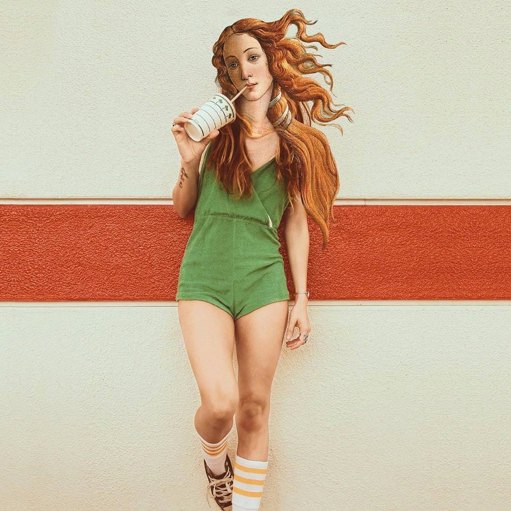
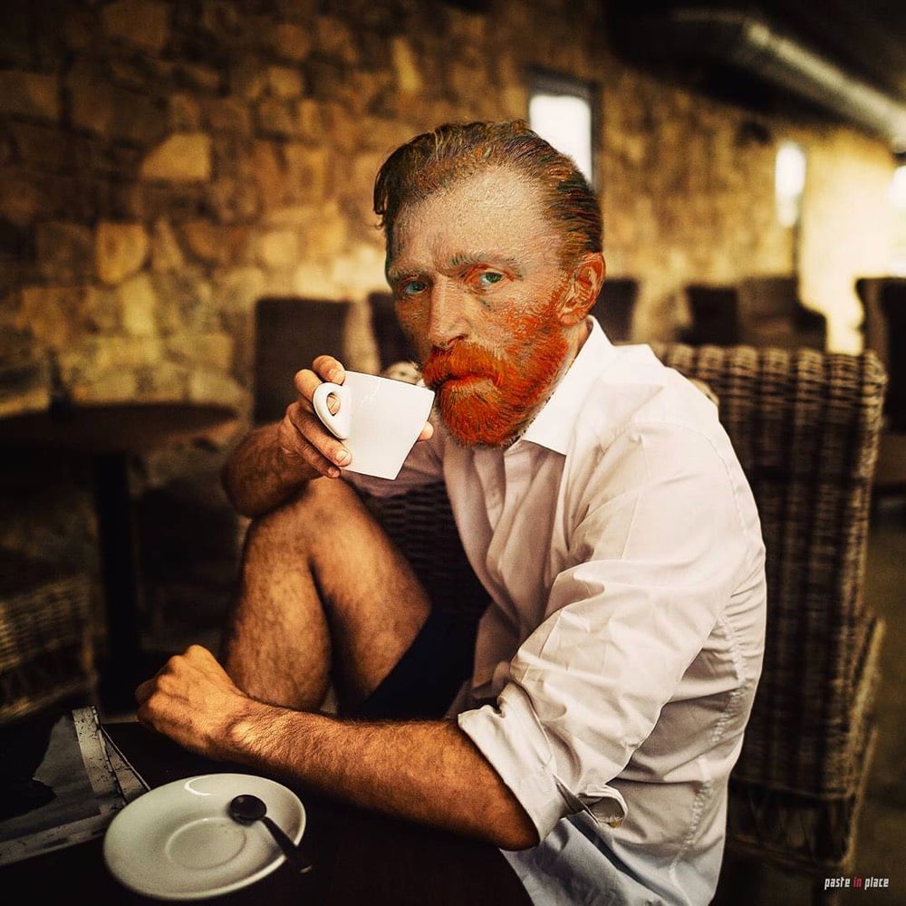

I seemingly cannot get enough of contemporizing old paintings and works of art. Here, from Rodrigo Pinheiro, are some familiar young people hanging out with modern beverages.
See also Girl with a Pearl Earring and Point-and-Shoot Camera and Art History Comes to Life.
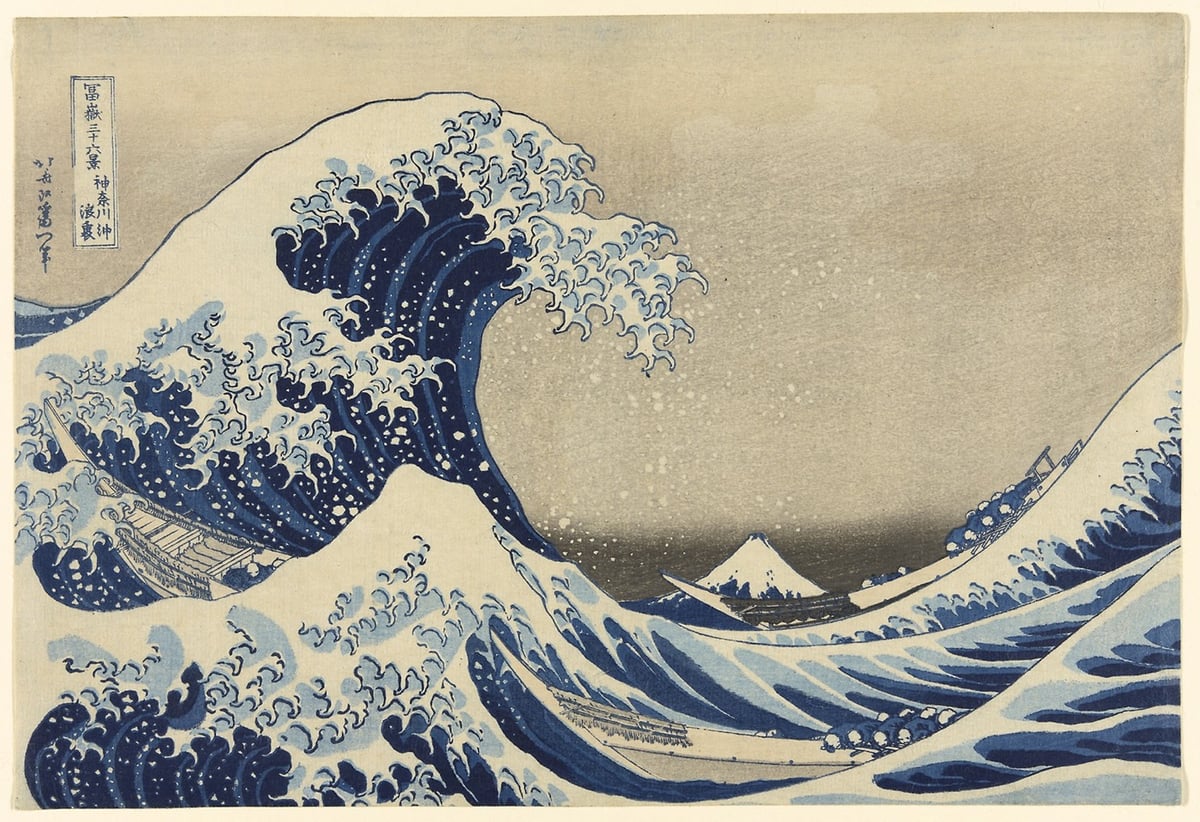
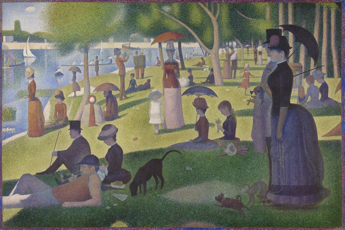
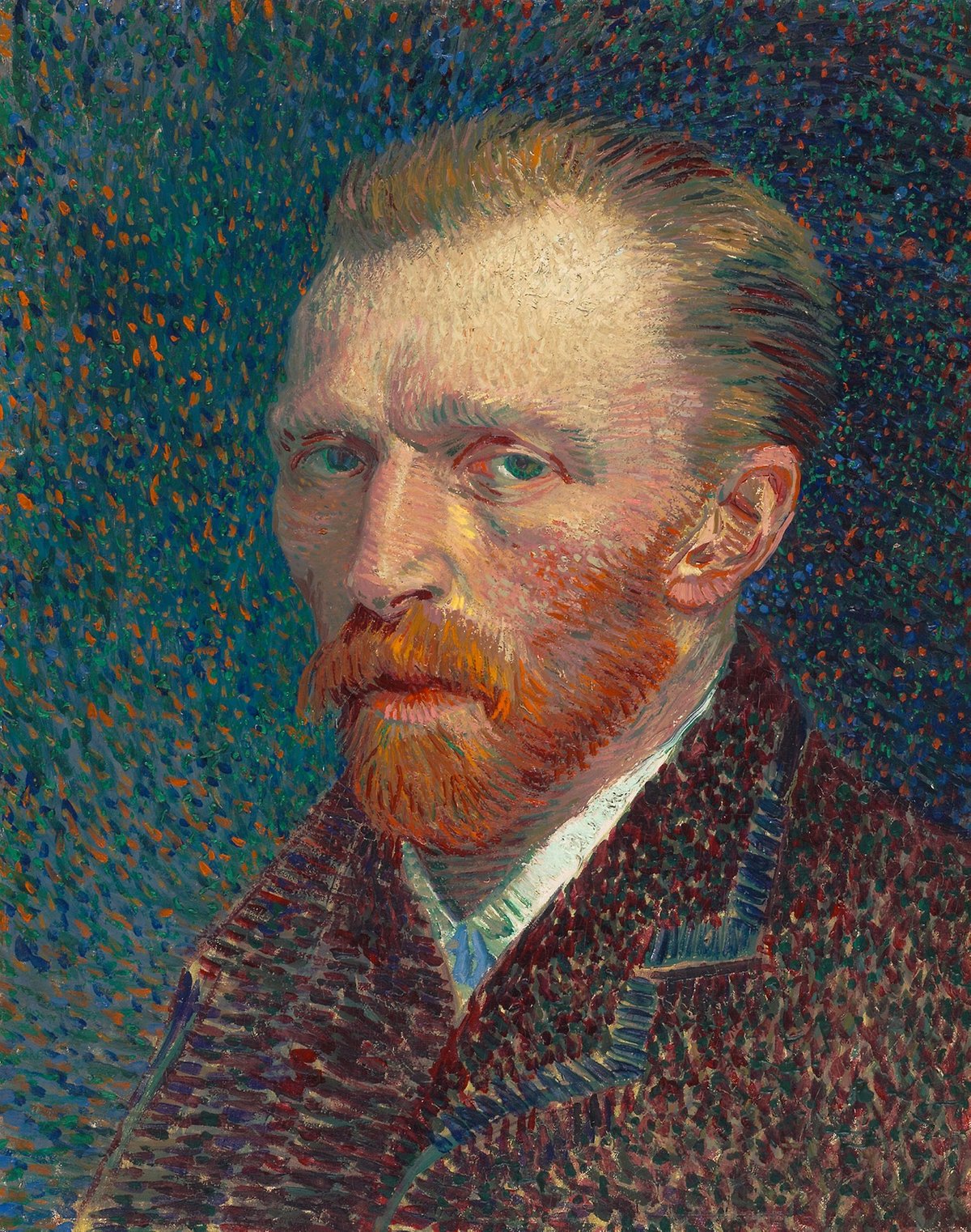
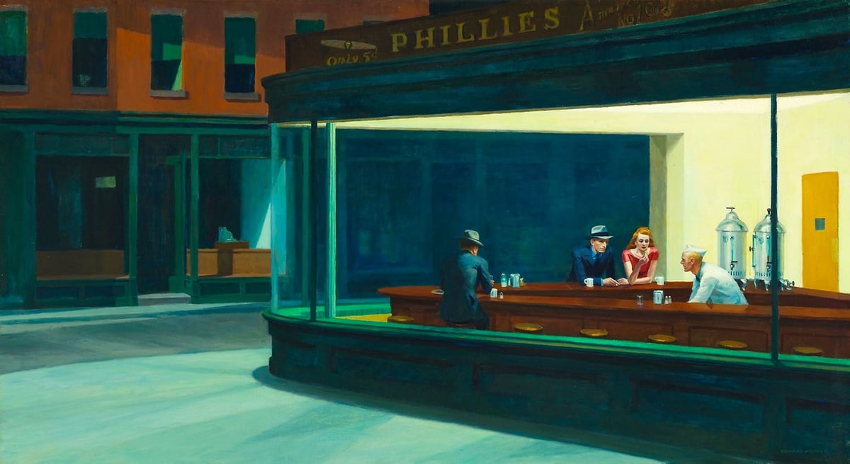
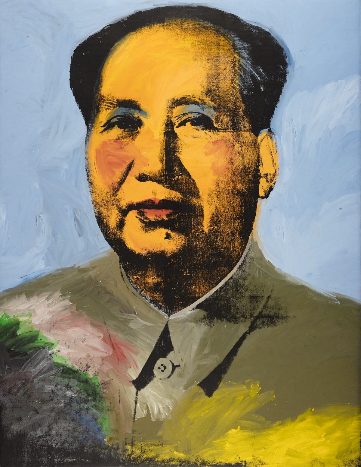
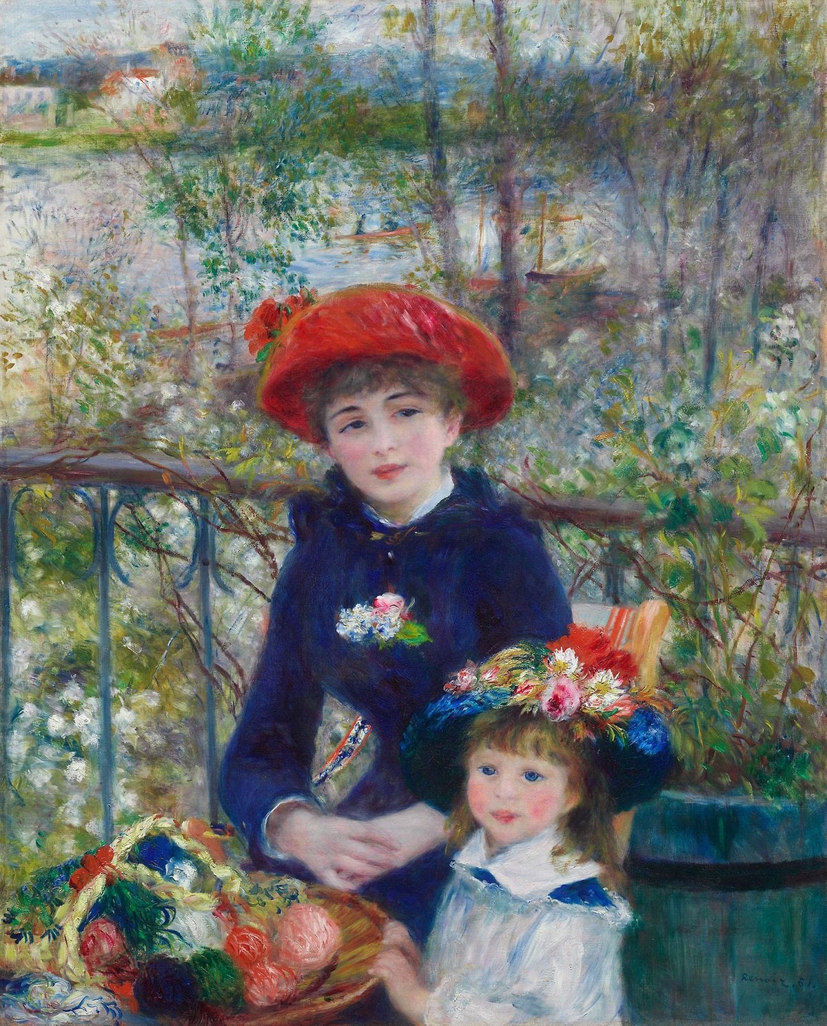
The Art Institute of Chicago recently unveiled a new website design. As part of their first design upgrade in 6 years, they have placed more than 52,000 high-resolution images from their collection online, available to all comers without restriction.
Students, educators, and just regular art lovers might be interested to learn that we’ve released thousands of images in the public domain on the new website in an open-access format (52,438 to be exact, and growing regularly). Made available under the Creative Commons Zero (CC0) license, these images can be downloaded for free on the artwork pages.
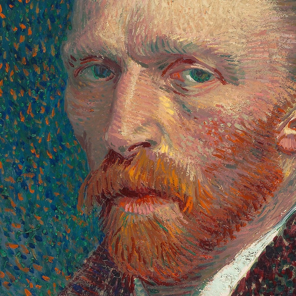
We’ve also enhanced the image viewing capabilities on object pages, which means that you can see much greater detail on objects than before. Check out the paint strokes in Van Gogh’s The Bedroom, the charcoal details on Charles White’s Harvest Talk, or the synaesthetic richness of Georgia O’Keeffe’s Blue and Green Music.
I’ve included a few notable works from their collection above: The Great Wave by Katsushika Hokusai, A Sunday on La Grande Jatte by Georges Seurat (which you can zoom and pretend you’re Cameron in Ferris Bueller’s Day Off), Self-Portrait by Vincent van Gogh, Nighthawks by Edward Hopper, Mao by Andy Warhol, and Two Sisters (On the Terrace) by Pierre-Auguste Renoir. The resolution on the images is high enough to check out the brushstrokes on the paintings. Here’s some detail on the van Gogh:
I love seeing more museums doing this.
This is a real treasure: a free, searchable database of hundreds of thousands of Japanese woodcut prints, from many collections, spanning from the early 18th century to contemporary artists. It’ll even do reverse image search and find alternate prints of the same woodcut.
A few favorites I browsed from the collection:
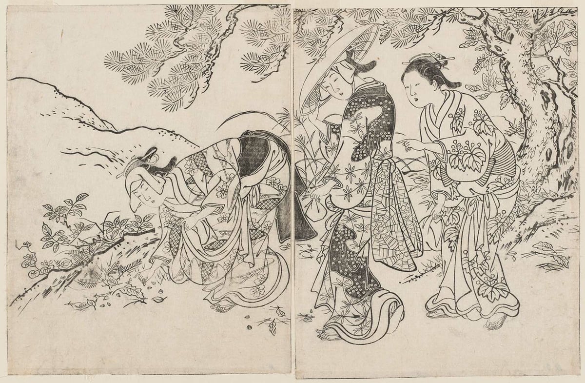
(Nishikawa Sukenobu, 1731)
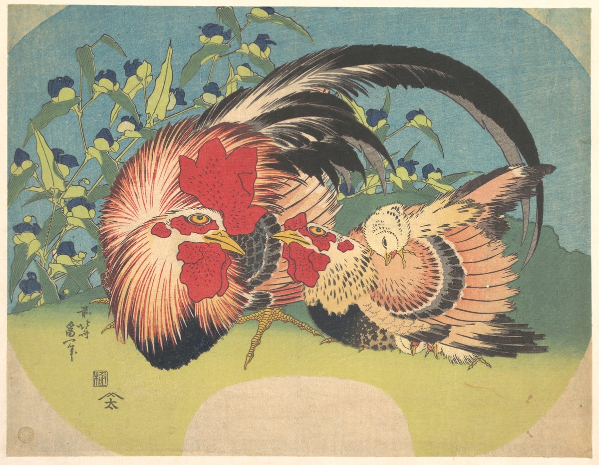
(Katsushika Hokusai, 1830)
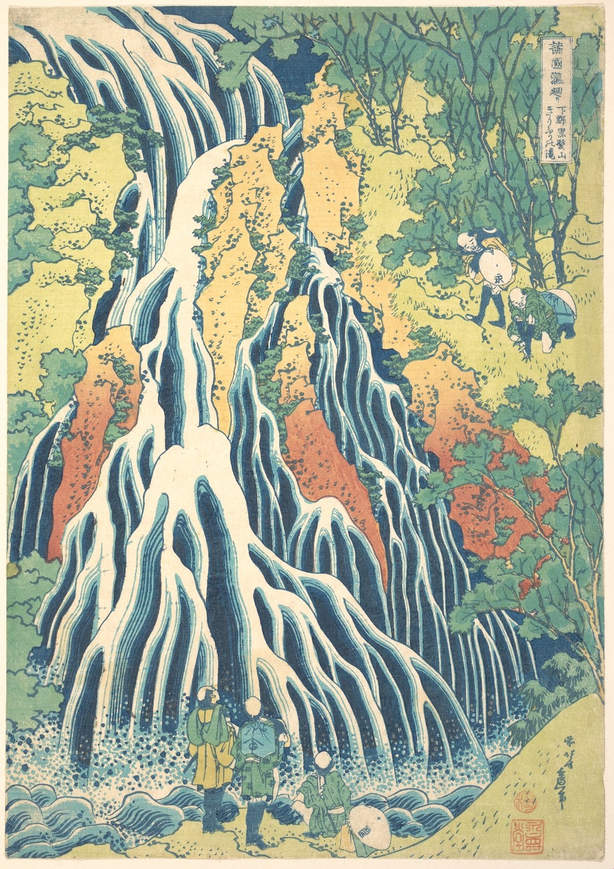
(Katsushika Hokusai, 1832)
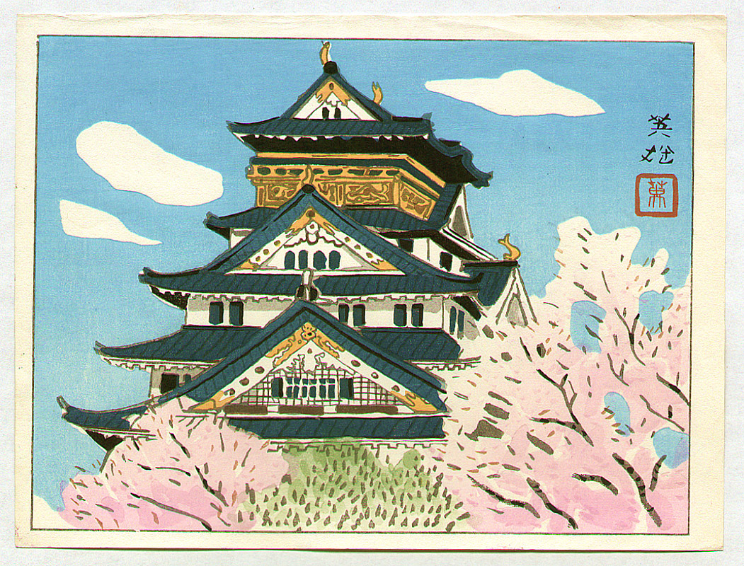
(Hagiwara Hideo, 1950s)
For his newest project IDENTITYCHRIST, Joseph Lee is pushing representational abstract painting to its limits.
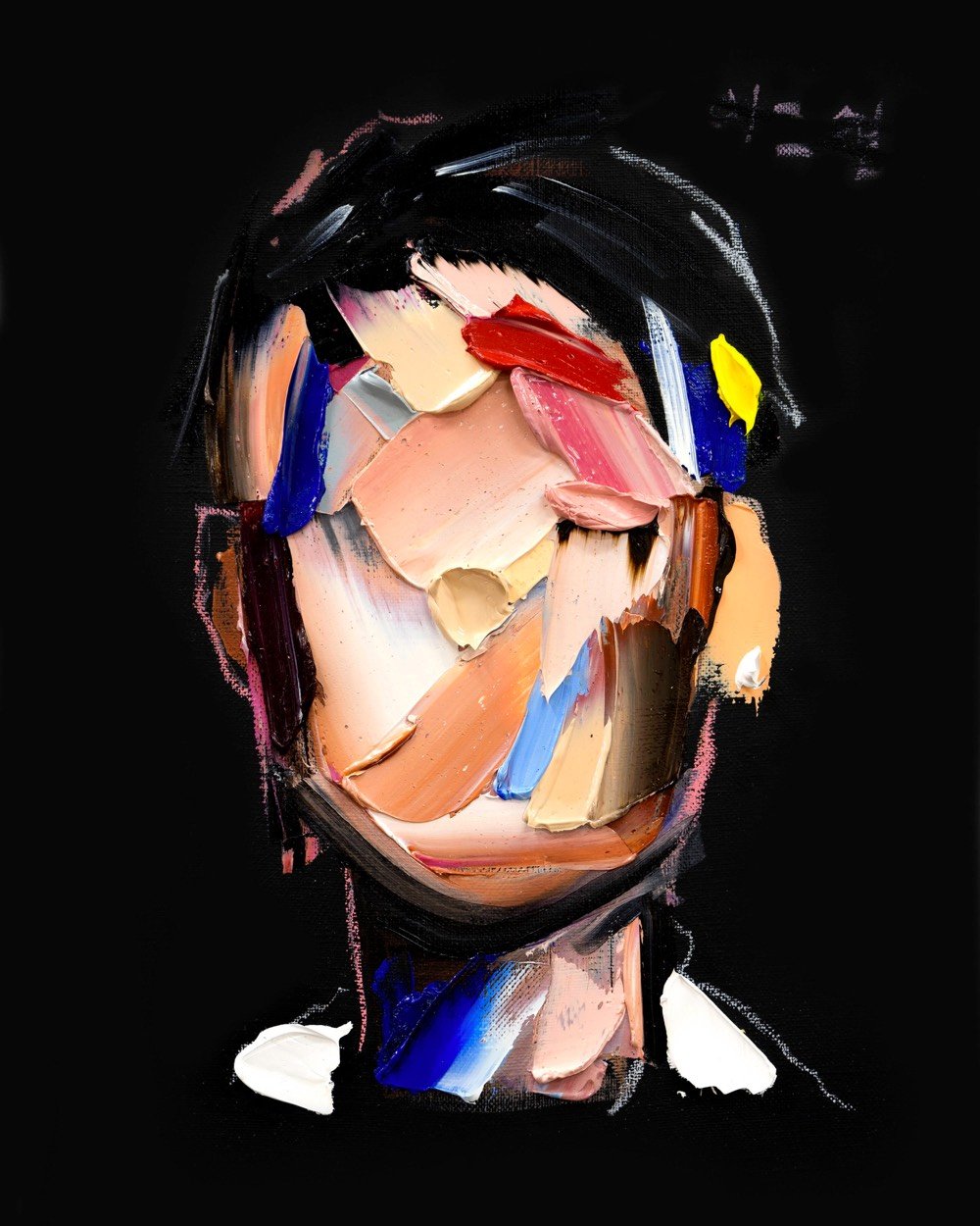
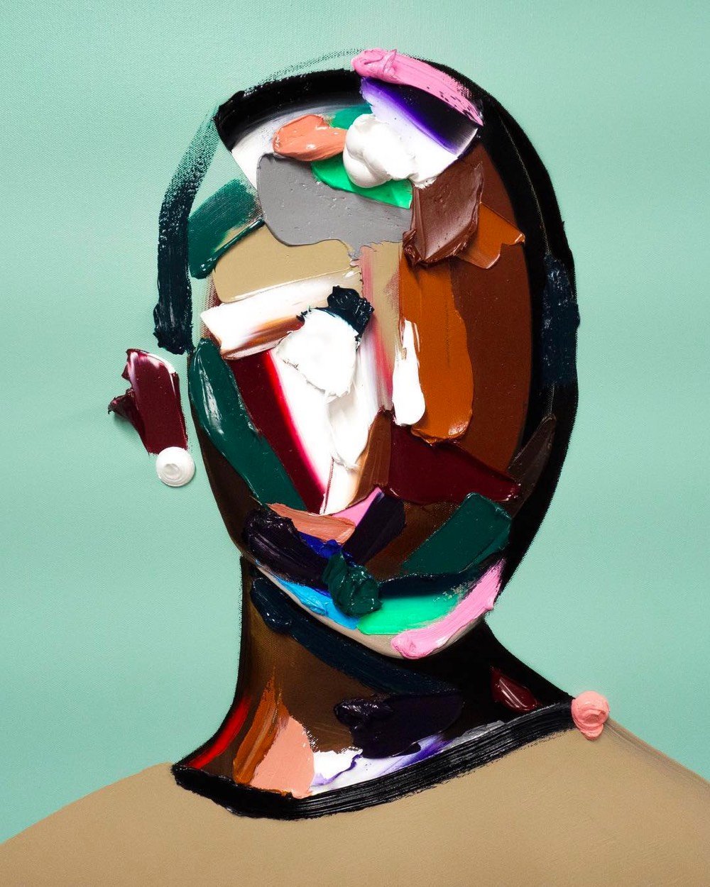
I love how rough these are but you can still tell they’re people. Prints are available.
P.S. Lee is also an actor — you may have seen him playing the brother of the lead character in Searching, which is worth watching if only for the unique way the story is told. (via colossal)
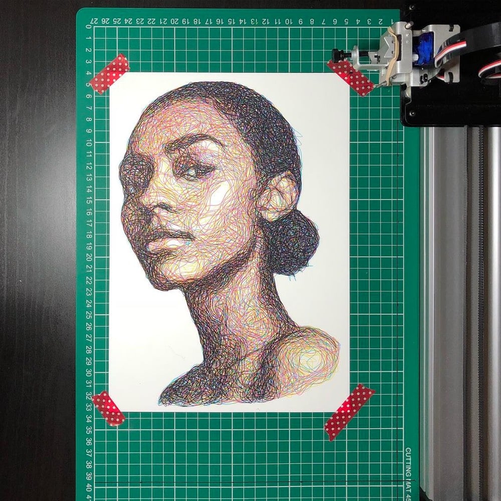
Samer Dabra uses a drawing machine called the AxiDraw and a custom program to generate Impressionistic line drawings of people. The machine builds the portraits using four single lines drawn in the four CMYK colors, one on top of another, with minimal tweaking from Dabra. Rion Nakaya of The Kid Should See This edited together a video of the machine creating drawings.
There is something more than a little Vincent van Gogh & Georges Seurat about these. You can see the results on Instagram.
The Hilma af Klint retrospective at the Guggenheim is by far the trippiest thing I’ve seen within the confines of an esteemed art institution. The show is expansive and stunning and truly transcends time (images in her paintings look like things discovered decades later, from a double helix to the 80s electronic memory game Simon). As if to prove she’s a futurist, she envisioned that her major body of work would be displayed in a spiral temple.
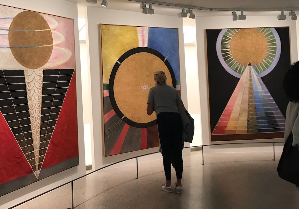
Words cannot fully describe the power or style of her pieces, which are botanical, psychedelic, scientific, occult, and truly mystical. Her abstract paintings, which she started producing five years before Kandinsky or any other of the more famous men of her time created something of the sort, were channeled through her spiritualism. She was influenced by Rosicrucianism, Theosophy, and later in life, anthroposophy.
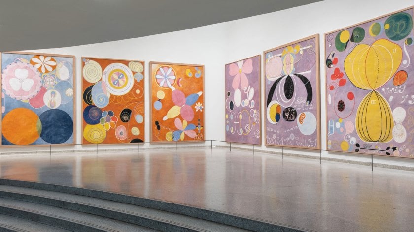
It’s all a bit mind-bending. af Klint knew that the world was not ready for her work, so she specified it not be shown until 20 years after her death. This was likely because, at a visit to her Stockholm studio in 1908, Rudolf Steiner was “unable to decipher the paintings and claims that no one during the coming 50 years will be able to.” She died in 1944, the same year as Kandinsky and Mondrian, and it was over four decades until there was a show that included her paintings.
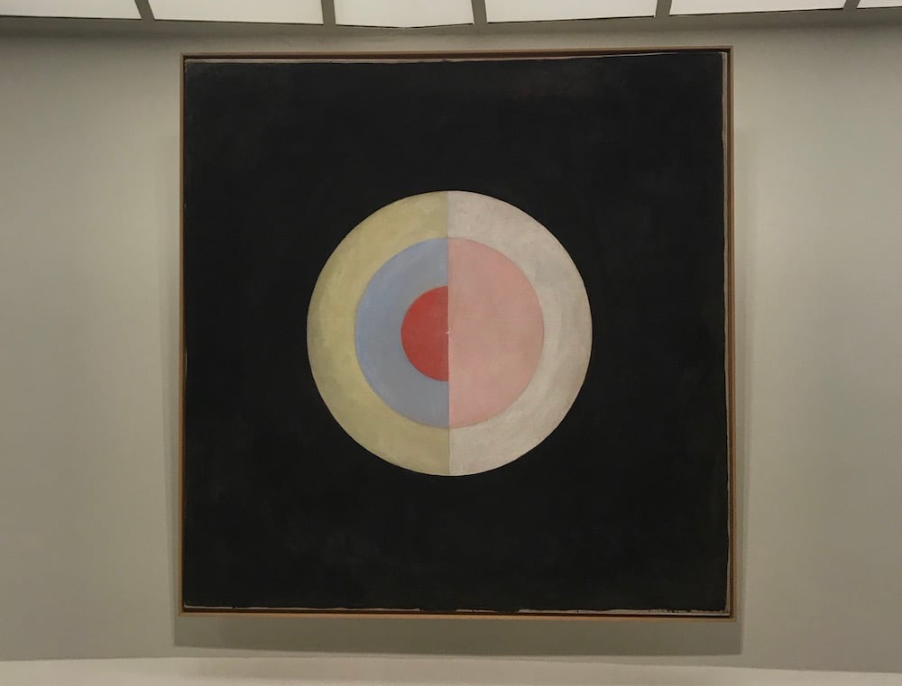
From The New Yorker:
The art is fearfully esoteric. But something about it resonates with a restlessly searching mood in present culture, hostile to old ideas. Af Klint has a lot of people’s rapt attention. From what I hear, young artists of many stripes are mad for her.
Yes, people are ready for it. Never before have I witnessed so many museum-goers studying paintings so up close (see my top photo, above) and really being with the art. And I’d argue our current #MeToo era is fertile ground for retelling origin stories with more representation of women and those who were otherwise overlooked.
The endlessly inspiring Hilma af Klint: Paintings for the Future is up at the Guggenheim in New York until April 23, 2019.
n.b. You may recall that Acne Studios did a capsule collection using Hilma af Klint prints in 2014. (thx Eviana)
Update: Here’s a good video introduction to af Klint’s work:
I somehow didn’t know until recently that Piet Mondrian created a whole series of flowers, including charcoals and watercolors.
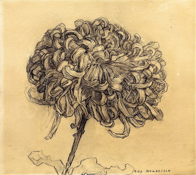
The chrysanthemum, at least, is very Van Gogh. The amaryllis gives a hint of the primary colors to come in his work.
Barbara Kruger, Untitled (Questions)
(1990/2018)
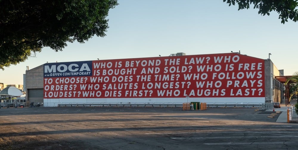
Nine big questions by Barbara Kruger are now on display at MOCA in Los Angeles until November 2020. The museum will also host voter registration events in conjunction with the installation, made possible by an anonymous donor.
It’s worth noting that MOCA is just blocks away from LA’s Skid Row, where about 2,500 people live on the street. It’ll be interesting to see who shows up for their events and how they’ll do outreach.
Newer posts
Older posts




Socials & More