I am offering large printable files to anyone interested at no cost. Computer files are the most easily reproducible information on the planet. In this particular case I see no reason to imbue a false sense of preciousness on the work. The information I gathered to create the collages is publicly availaibe, and the collages themselves are no different.
Trailer for a new film called Guest of Cindy Sherman. It’s a documentary about a man who becomes romantically involved with the famous artist, only to find that his ego can’t handle her fame. I wonder if we actually get to see the real Sherman in the film…the trailer is very teasing about it.
A collection of quirky toilet signage. And for what to read after you’ve latched that door, there are several sites dedicated to writing found on the walls of bathroom stalls. (Warning: most of it does contain language that falls soundly in the “potty mouth” category.)
Please Do Not Throw Toothpicks in The Urinals The Crabs can Pole Vault.
Long experience has taught me this about the status of mankind with regard to matters requiring thought: the less people know and understand about them, the more positively they attempt to argue concerning them, while on the other hand to know and understand a multitude of things renders men cautious in passing judgment upon anything new.
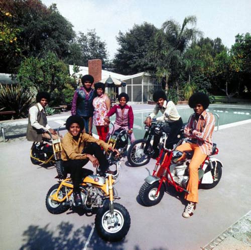
Ian Curtis is as haunting made of tape as he is on tape.
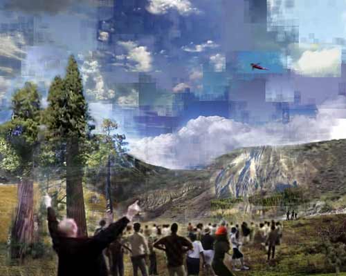
The artist, known as iRI5, is in her mid-twenties and lives in Georgia. Her work features found objects like old magazines, books, playing cards, and trash that she turns into treasure.
Researchers believe that this difference between men and women can best be explained by the fact that the former use eye contact to seek fertile and fit mates. Meanwhile, the latter shy from making eye contact or drawing unwanted attention onto themselves for fear of unwanted pregnancies and single parenthood, it has been said.
The same study found that it takes approximately 8.2 seconds of eye contact for a man to decide if a woman is attractive. It’s hard not to stare at the eyes of photographer Rankin’s hypnotizing Eyescapes for a whole lot longer, but that’s a different type of beauty.
The name Crayola was coined by Alice Binney, wife of company founder Edwin, and a former school teacher. She combined the words craie, which is French for chalk, and ola, for oleaginous, because crayons are made from petroleum based paraffin.
I don’t remember ever having scribbled with sticks of Manatee or Jazzberry Jam, but I do distinctly recall meticulously practicing my hearts and starts with the dulled point of Carnation Pink.
Biogen is an art installation by Hanna von Goeler that’s inspired by the genetic engineering of tomatoes. Consisting of oil paintings, sculptures, a mobile made of tomato skin, and a model of a “tomato six pack,” von Goeler’s work is striking, and notably unappetizing.
Food Fray offers an equally fascinating, though less creative case against GM fruits and veggies. Both the art and the argument raise questions about the dangers of chewing with an open mind.
Brooke Inman’s Everything Color Circle is mesmerizing. As somebody with limited organizational skills, I find it mind-boggling that she was able to put this together. And to think that it could be destroyed in a nanosecond if a sugar-addled kindergartner armed with construction paper wandered into the room. (via design milk)
A system of sculptures that is constantly on the brink of collapse. My intention was to capture and sustain the exact moment of impending catastrophe and endlessly repeat it.
I do this too, only I use chairs and my own body and frequently tip over and hurt myself. Anything for my art.
Kontopoulos also did something called Conversation Piece, inspired by legendary film editor Walter Murch.
Film editor Walter Murch, who edited many of Francis Ford Copolla’s films, developed a theory about edits while working on The Conversation (1974). He noticed that in many cases, the best place to make a cut was when he blinked. Subsequently, Murch wrote about the human blink as a sort of mental punctuation mark: a signifier of a viewer’s comfort with visual material and therefore, a good place to separate two ideas with a cut.
Drain (1975) MTA and unknown artists Mixed Media on Metal and Concrete
Describing the irresistibility of natural urges, and situated thematically near the restroom, this drainage grate offers deliverance. Consequently, here lies an indeliable yellow nitrogen stain, as evidence of the passings of hundreds, if not thousands of strained commuters. Each straphanger, surreptitiously seeking relief, has helped create this totally organic, revolutionary art piece.
For many people he is the round-headed bald man seen on the First Folio of his collected works but evidence was presented yesterday arguing that we should rethink this. Instead we should visualise Shakespeare as a rosy-cheeked, long-nosed man who was something of a looker.
The portrait appear to be in good condition and Shakespeare looks a lot like Joseph Fiennes, who played the Bard in Shakespeare in Love.
On the long list of books I would read if I had the time for such a thing, reading, is Art & Fear. Ted Orland, one of the authors and a working artist himself, describes the book thusly:
This is a book about the way art gets made, the reasons it often doesn’t get made, and about the difficulties that cause so many artists to give up along the way.
The ceramics teacher announced on opening day that he was dividing the class into two groups. All those on the left side of the studio, he said, would be graded solely on the quantity of work they produced, all those on the right solely on its quality. His procedure was simple: on the final day of class he would bring in his bathroom scales and weigh the work of the “quantity” group: fifty pound of pots rated an “A”, forty pounds a “B”, and so on. Those being graded on “quality”, however, needed to produce only one pot — albeit a perfect one — to get an “A”. Well, came grading time and a curious fact emerged: the works of highest quality were all produced by the group being graded for quantity. It seems that while the “quantity” group was busily churning out piles of work - and learning from their mistakes — the “quality” group had sat theorizing about perfection, and in the end had little more to show for their efforts than grandiose theories and a pile of dead clay.
smarthistory is a fantastic substitute for that art history class you never took in college.
smARThistory.org is a free multi-media web-book designed as a dynamic enhancement (or even substitute) for the traditional and static art history textbook.
For all of the talk that Shepard Fairey is just a plagiarist, I think that the clearest indication that his art is above board and adding something new to the world is that until a few days ago, no one knew who had taken the photo of Obama that became the basis of the iconic Hope poster, not even Fairey or the photographer who took it.
Reuters are understandably somewhat put out on their own and Young’s behalf, but like it or not, Fairey’s use of the picture are well within the parameters of “fair use”. His transformative use of the image - both in flipping and re-orienting it, adding jacket and tie and the “O” Obama logo, and converting it to his block print style make it consistent with all legal precedents for use.
A collection of sixty female and male noses, arranged chronologically from people ages 16 - 90. The original pencil drawings (based on arrest photos) are faithfully reproduced on beautifully textured, 100% cotton Hahnemühle paper.
Feeney drew the noses while working as a forensic artist.
Video of Willard Wigan’s work. Wigan makes exceptionally tiny sculptures that fit on pin-heads or within eyes of needles. He once lost a sculpture of Alice in Wonderland:
The stillness of it is very important — you have to control the whole nervous system, you have to work between the heartbeat — the pulse of your finger can destroy the work.
Ortho at Baudrillard’s Bastard found a bunch of Revolutionary War era prints featuring dogs peeing on various things (ministers, maps, tea accessories, etc.) and asks why are these dogs peeing on things?
I Am Sitting in a Room is a piece by composer Alvin Lucier. It consists of an audio recording of Lucier sitting in a room reciting a few lines. That recording is played in the same room and recorded. Then that recording is recorded. And so on.
I am sitting in a room different from the one you are in now. I am recording the sound of my speaking voice and I am going to play it back into the room again and again until the resonant frequencies of the room reinforce themselves so that any semblance of my speech, with perhaps the exception of rhythm, is destroyed. What you will hear, then, are the natural resonant frequencies of the room articulated by speech. I regard this activity not so much as a demonstration of a physical fact, but more as a way to smooth out any irregularities my speech might have.
Here’s a recording of the original performance:
Listening to it, I wonder how much of the distortion at the end is due to the “resonant frequencies of the room” and how much is just artifacts of the rerecording process. (via djacobs)
The frequency of the resulting sound is determined by resonant frequencies in the microphone, amplifier, and loudspeaker, the acoustics of the room, the directional pick-up and emission patterns of the microphone and loudspeaker, and the distance between them.
Socials & More