Low Poly Landscapes
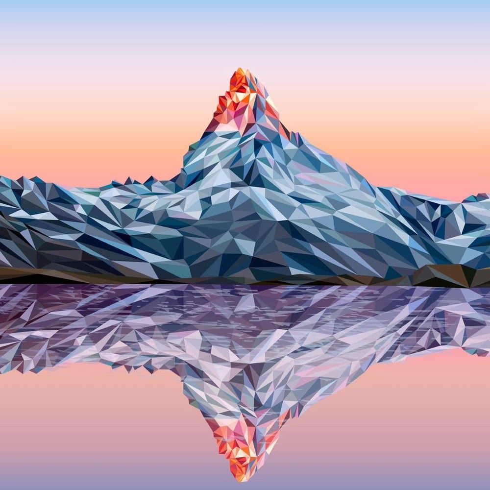
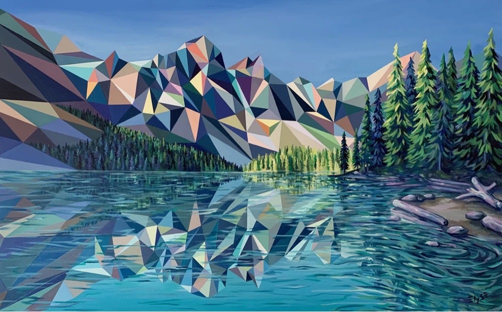
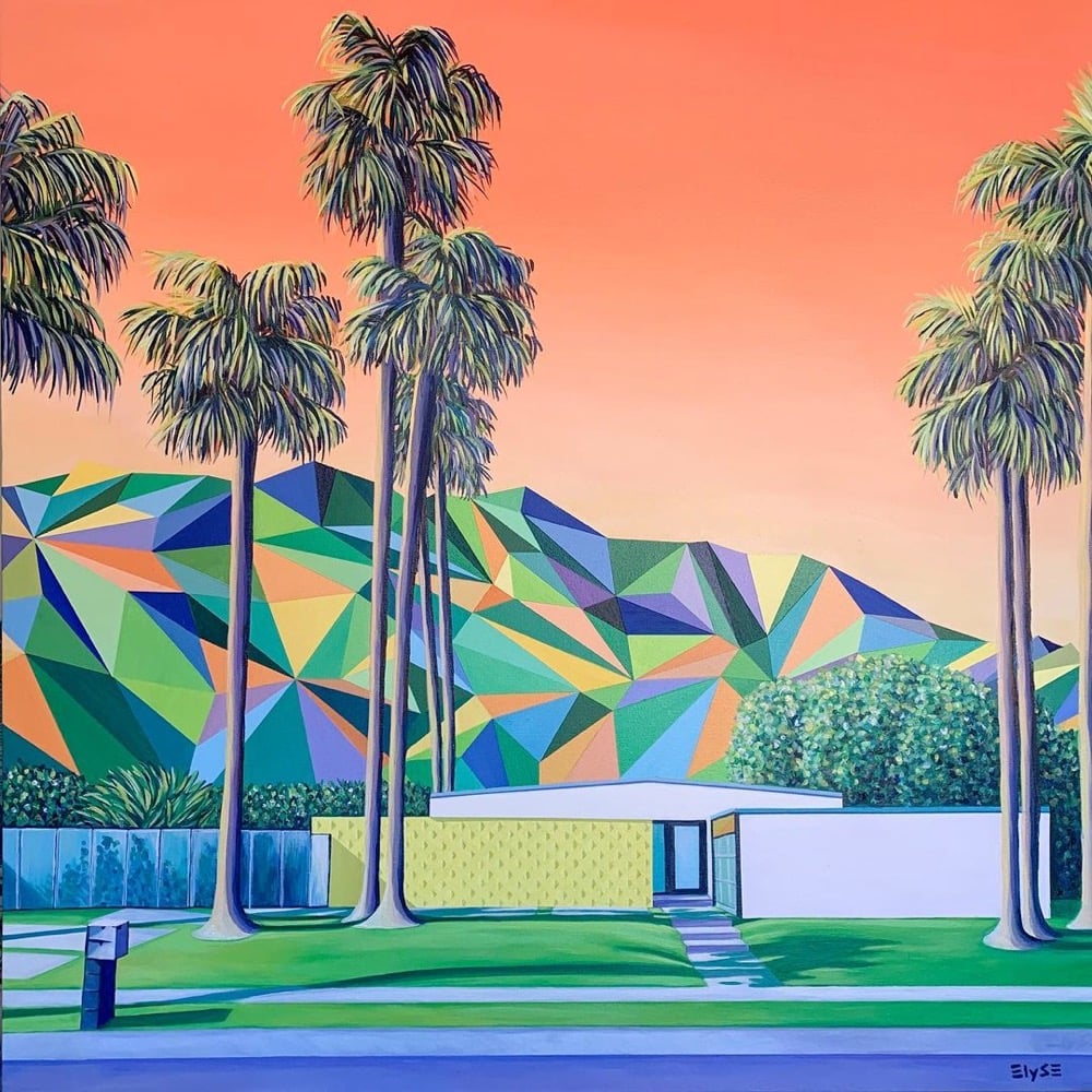

Lovely work here by Elyse Dodge — these look like half-finished renderings by the machine that’s simulating our universe. You can keep up with her work on Instagram or get some for yourself in her shop. (via moss & fog)


This site is made possible by member support. 💞
Big thanks to Arcustech for hosting the site and offering amazing tech support.
When you buy through links on kottke.org, I may earn an affiliate commission. Thanks for supporting the site!
kottke.org. home of fine hypertext products since 1998.
Beloved by 86.47% of the web.


Lovely work here by Elyse Dodge — these look like half-finished renderings by the machine that’s simulating our universe. You can keep up with her work on Instagram or get some for yourself in her shop. (via moss & fog)
After months of lockdown and closure due to the pandemic, Desus Nice & The Kid Mero go to the Met Museum in NYC to take in some art. Would 100% take a tour of any art museum with these two astute cultural commentators.
Always a pleasure to see new work from Reuben Wu, whose stuff I’ve featured here before. For this piece, Wu journeys into the audiovisual realm, combining his light-forward photography with his music production work (he’s a member of the band Ladytron). Colossal, as usual, has the skinny:
For EX STASIS, Wu programmed a stick of 200 LED lights to shift in color and shape above the calm landscapes. He captured the mesmerizing movements in-camera, and through a combination of stills, timelapse, and real-time footage, produced four audiovisual works that juxtapose the natural scenery with the artificially produced light and electronic sounds. “As it gets dark, my surroundings cease to be an exterior experience and become a subliminal space, and that’s when I feel most connected and aware of my sense of being,” Wu says. “This dynamic terrestrial chiaroscuro synchronizes with my sound design and music to form singular looping pieces.”
“Dynamic terrestrial chiaroscuro”!!! Also, this photo from Wu’s Insta is just fricking beautiful. (via colossal)
In this video, artist TM Davy demonstrates how to draw a self-portrait in 11 levels of increasing complexity. As he notes early on, this isn’t so much about the mechanics of art as the levels of thinking that go into creating a portrait. Davy defines complexity as “the layers of thinking that help us to build observational truths that are necessary for a picture that somehow feels right”.
In his journey towards complexity in portraiture, he starts with the “solar head” (basically a smiley face) and moves to individually identifying features, depicting simple volume & proportion, and the more complex geometry of the human face. From there, observation becomes increasingly important — he uses variations on “looking” or “observing” many times in his explanation — as he covers contours, light & shadow, chiaroscuro, and color.
See also Tony Hawk on the 21 Levels of Complexity of Skateboard Tricks and A Demonstration of 16 Levels of Piano Playing Complexity.
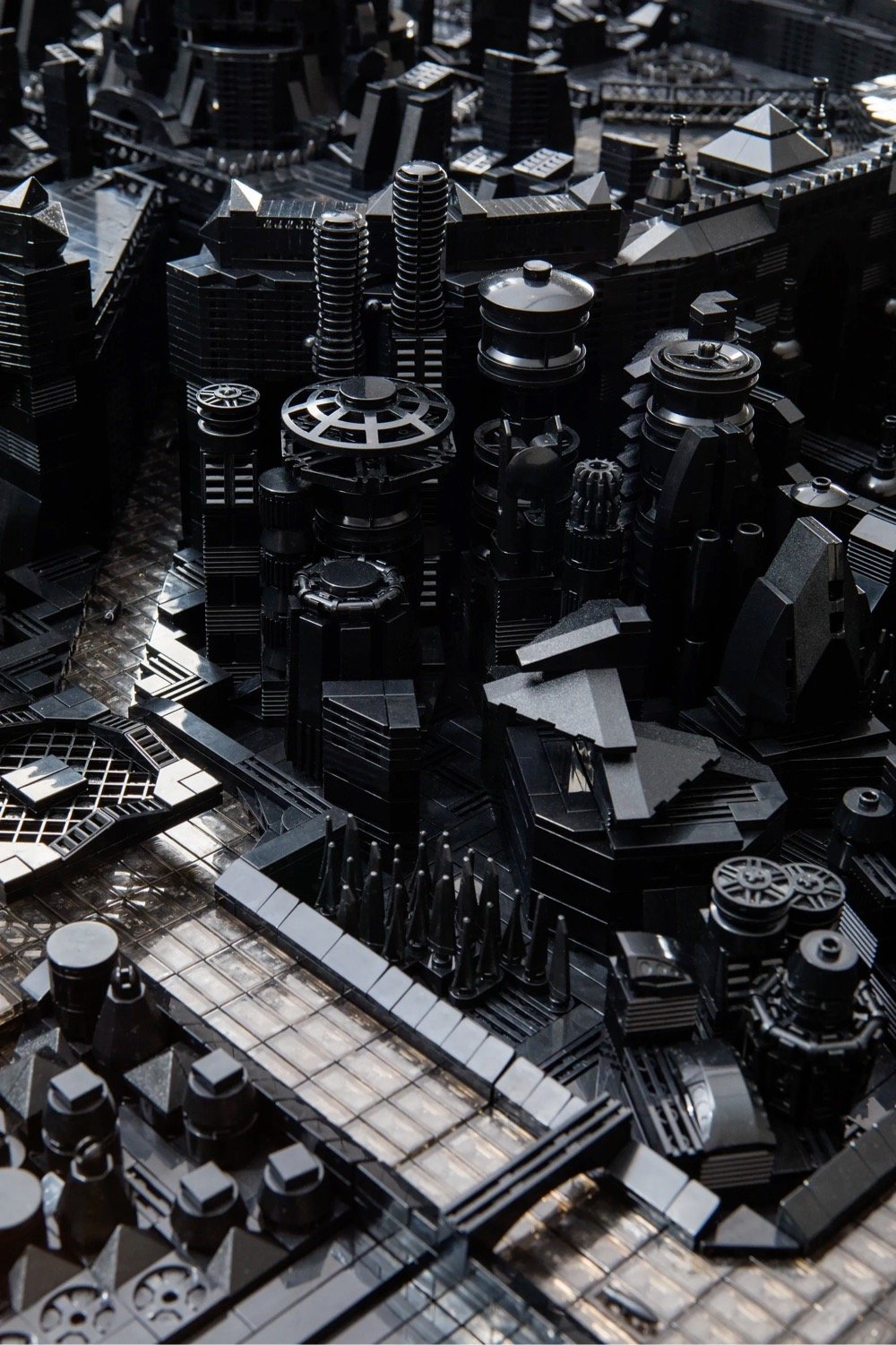
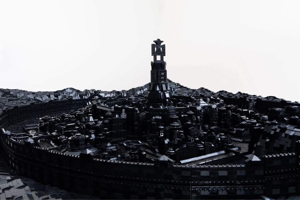
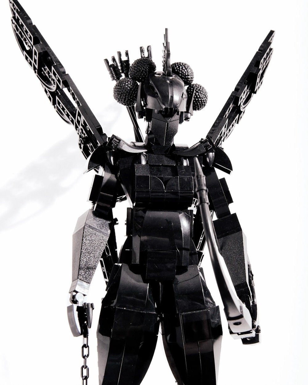
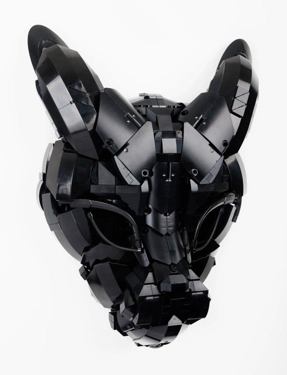
For his series called Building Black, Ekow Nimako uses only black Lego pieces to build fantastical and futuristic sculptures based on West African masks, folklore, and medieval kingdoms. From Colossal:
Running through each of these artworks is a fluid understanding of time and space that blurs the distinction between generations, locations, and histories in order to imagine a new reality. “We are all living proof of our ancestors, all their joy, love, knowledge, and pain. They live in our DNA,” the Ghanaian-Canadian artist says. “Aesthetically, I enjoy taking elements from bygone eras and creating futuristic landscapes, particularly of African utopias to imagine a liberated existence for us all.”
That blurred temporality that foregrounds his sculptures and installations parallels his own trajectory, as well. “My art practice developed when I was four years old, as I constantly told myself I want to do this (play with LEGO) forever, and sometimes it feels as though my future self communicated with my past self, astrally perhaps, to ensure this very specific destiny manifested,” he says, noting that the plastic blocks have remained a fixture in both his personal and professional life since becoming a father.
Vice did a short video feature on Nimako and his work:
(via colossal)
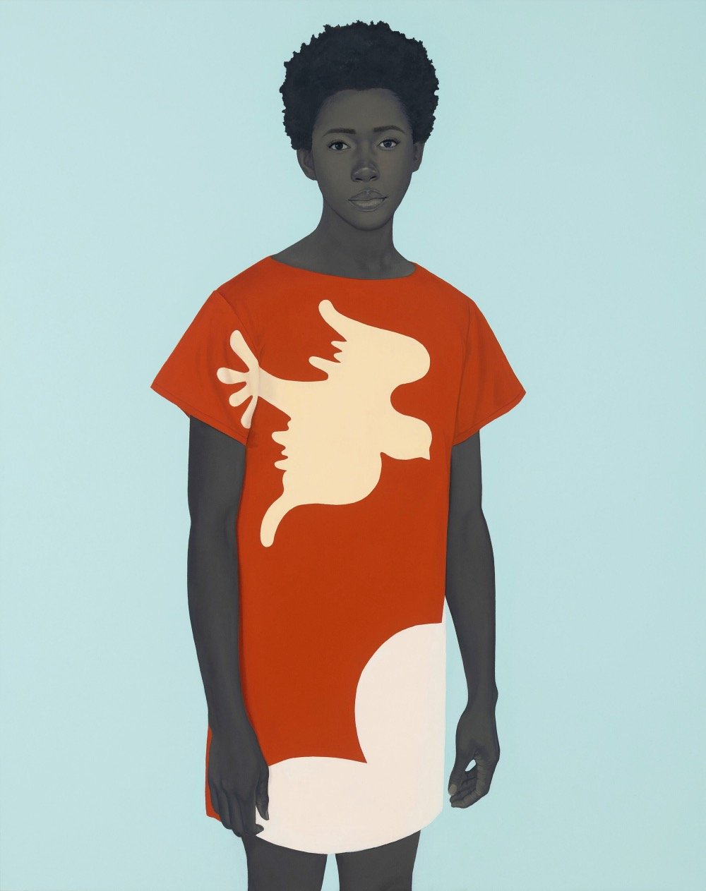
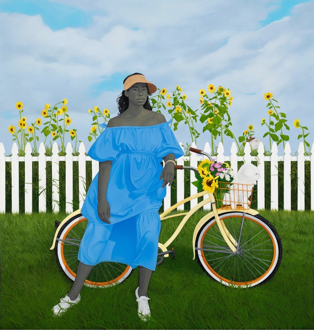
Painter Amy Sherald is displaying new work at the Hauser & Wirth gallery in LA through June 6: The Great American Fact. One thing I really notice in her art now, after watching the excellent documentary Black Art: In the Absence of Light, is how at least one person in her paintings is looking directly at the viewer. Here’s Sherald talking about that in the documentary:
The eyes tell you what’s in the soul and, for me, the people that I paint, they’re no longer themselves in the painting. They are these archetypes that know they are present. These aren’t passive portraits — they’re maybe subversively confrontational, if you will — but it’s definitely a response to a lot of images I saw growing up where our gaze was always averted. Or thinking about the fact that you couldn’t look at a white person in the eye. So, this is my way of nodding my head at that narrative and empowering the image in a way. I like the paintings hung a little lower for that reason so when the viewer walks up, it’s a different conversation. You’re not looking up at it — it’s almost looking directly at you and I think that creates a different kind of sensation.
She also says of her subjects: “It’s important for me that they’re just Black people being Black” and I think that really comes through in this new work. (via colossal)
There are many steps in making traditional Japanese woodblock prints (ukiyo-e), but this short video focuses on the printing process as demonstrated by master printmaker Keiji Shinohara. This is a delight to watch — Shinohara’s deliberate precision is impressive and inspiring.
My absolute favorite part of this video is at the 3:40 mark when he precisely and firmly grasps the pressing tool (called a baren), swipes it on his face three times, and then uses it to press the paper into the inked block. This pre-press face maneuver is repeated several times but otherwise goes unremarked upon in the video — one of the commenters offers this explanation: “The oils from his face help grip the paper, making a firm and even press.” (via open culture)
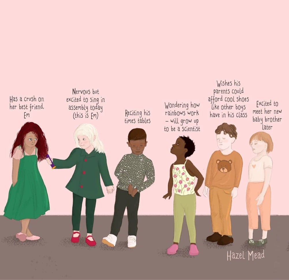
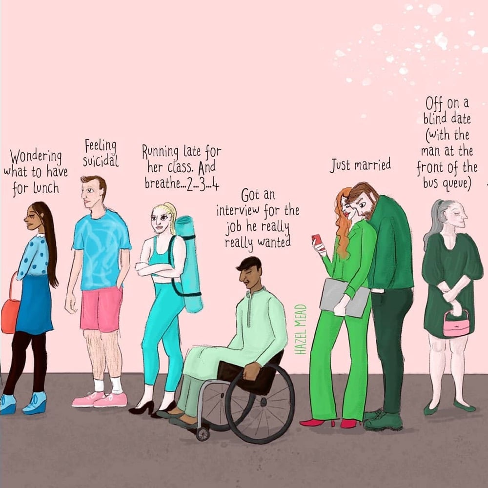
Illustrator Hazel Mead created a pair of pieces called You Don’t Know What’s Going On In People’s Lives: the original version and one featuring children. The images above are snippets from the larger images, both of which are available as prints in Mead’s shop. (via cup of jo)
Update: Several people sent me a link to this video from Cleveland Clinic that is very similar to Mead’s illustrations.
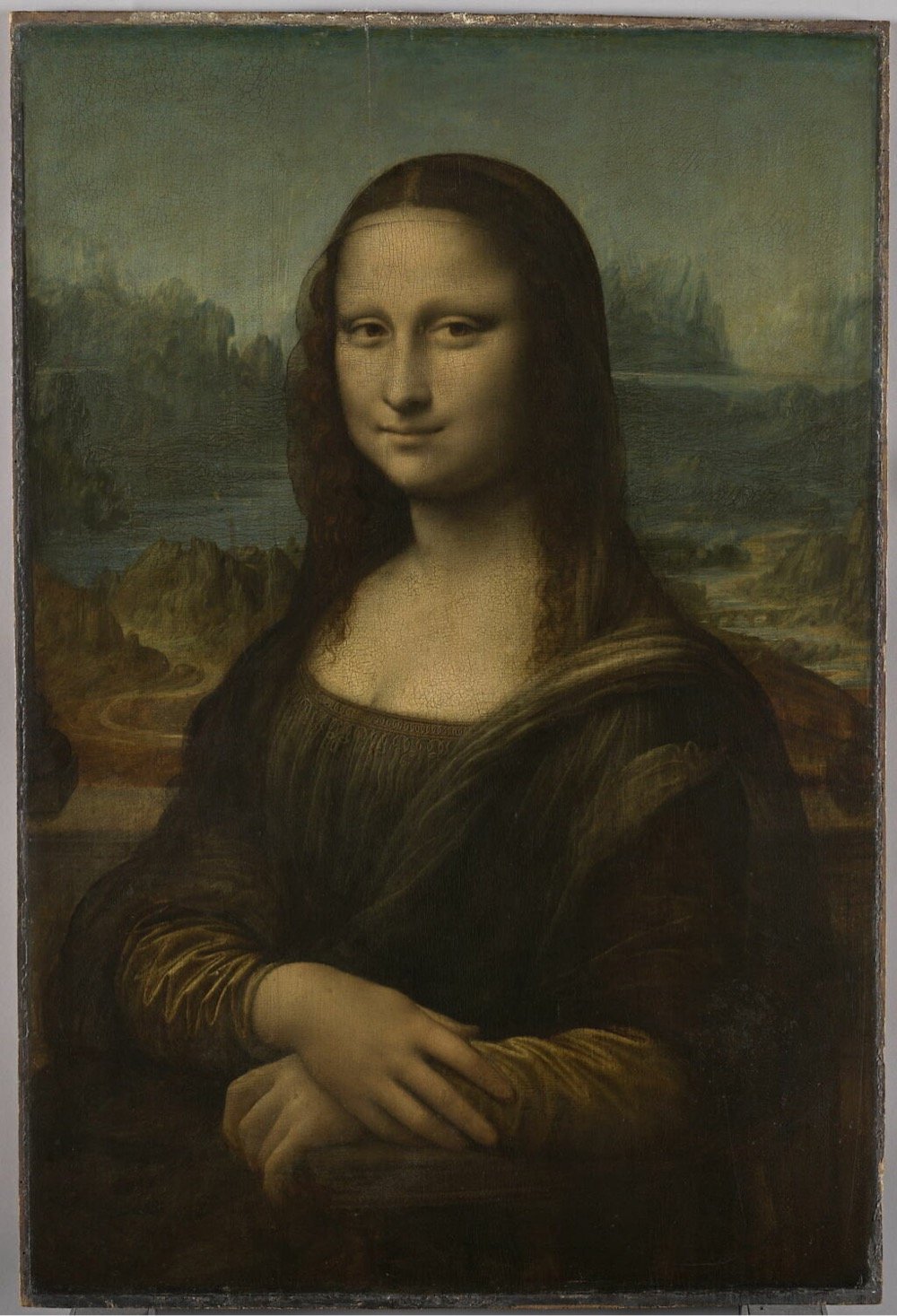
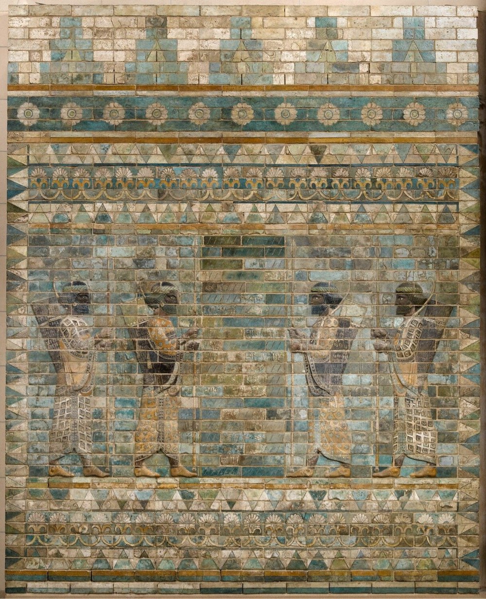
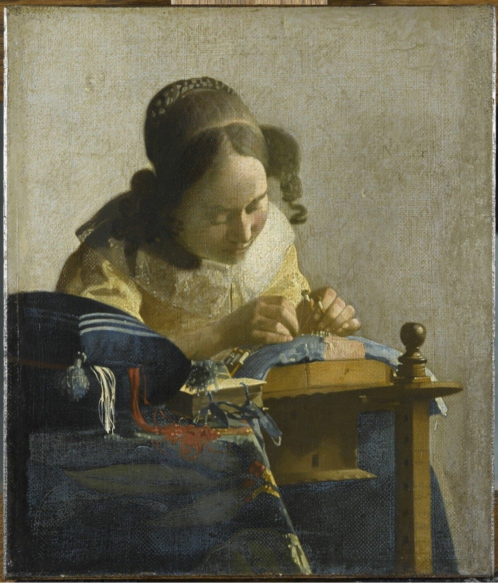
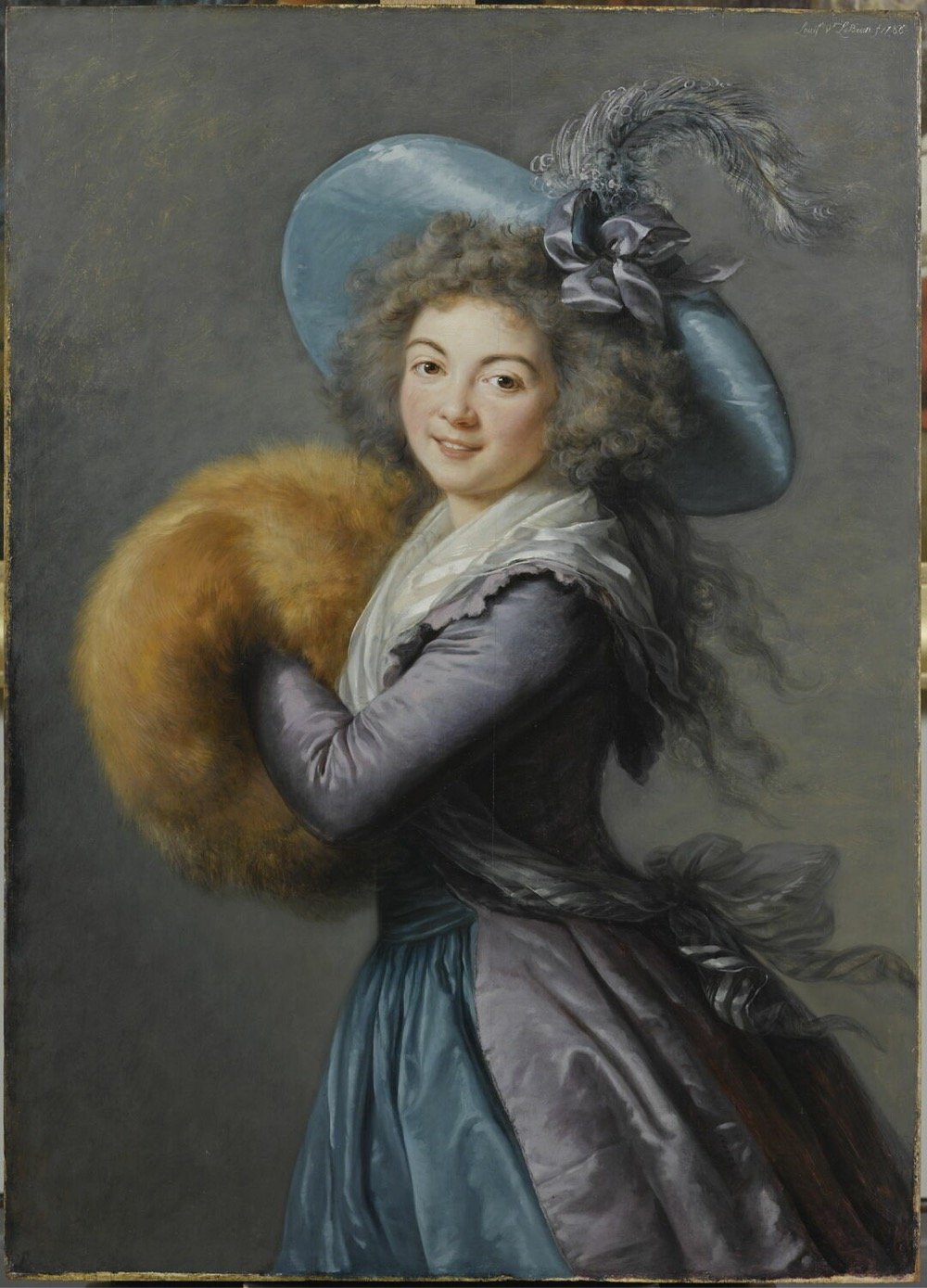
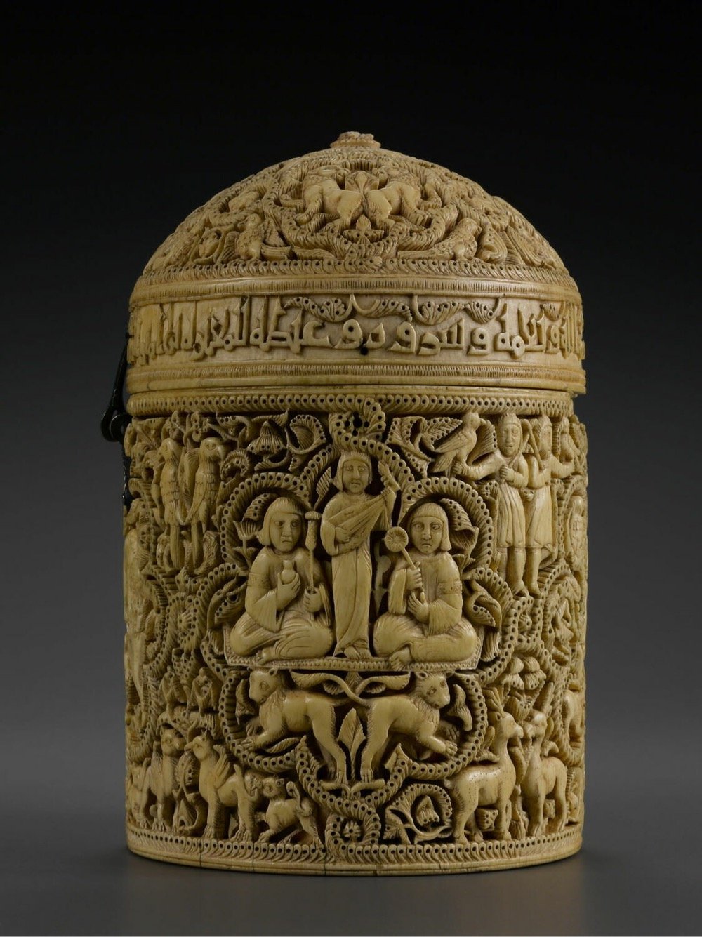
Late last week, the Louvre announced that it had put its entire collection online, over 482,000 works in all.
Designed for both researchers and curious art lovers, the collections.louvre.fr database already contains more than 482,000 entries, including works from the Louvre and the Musée National Eugène-Delacroix, sculptures from the Tuileries and Carrousel gardens, and ‘MNR’ works (Musées Nationaux Récupération, or National Museums Recovery) recovered after WWII and entrusted to the Louvre until they can be returned to their legitimate owners. For the first time ever, the entire Louvre collection is available online, whether works are on display in the museum, on long-term loan in other French institutions, or in storage.
With so many works, where to start? Try these “playlists” created by the museum, e.g. Masterpieces of the Louvre or Major Events in History. Or try the search function and find, for instance, all of the museum’s works by Leonardo da Vinci or Élisabeth Louise Vigée Le Brun (one of the very few women whose art is on display at the museum).
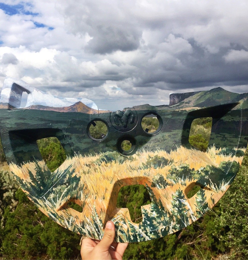
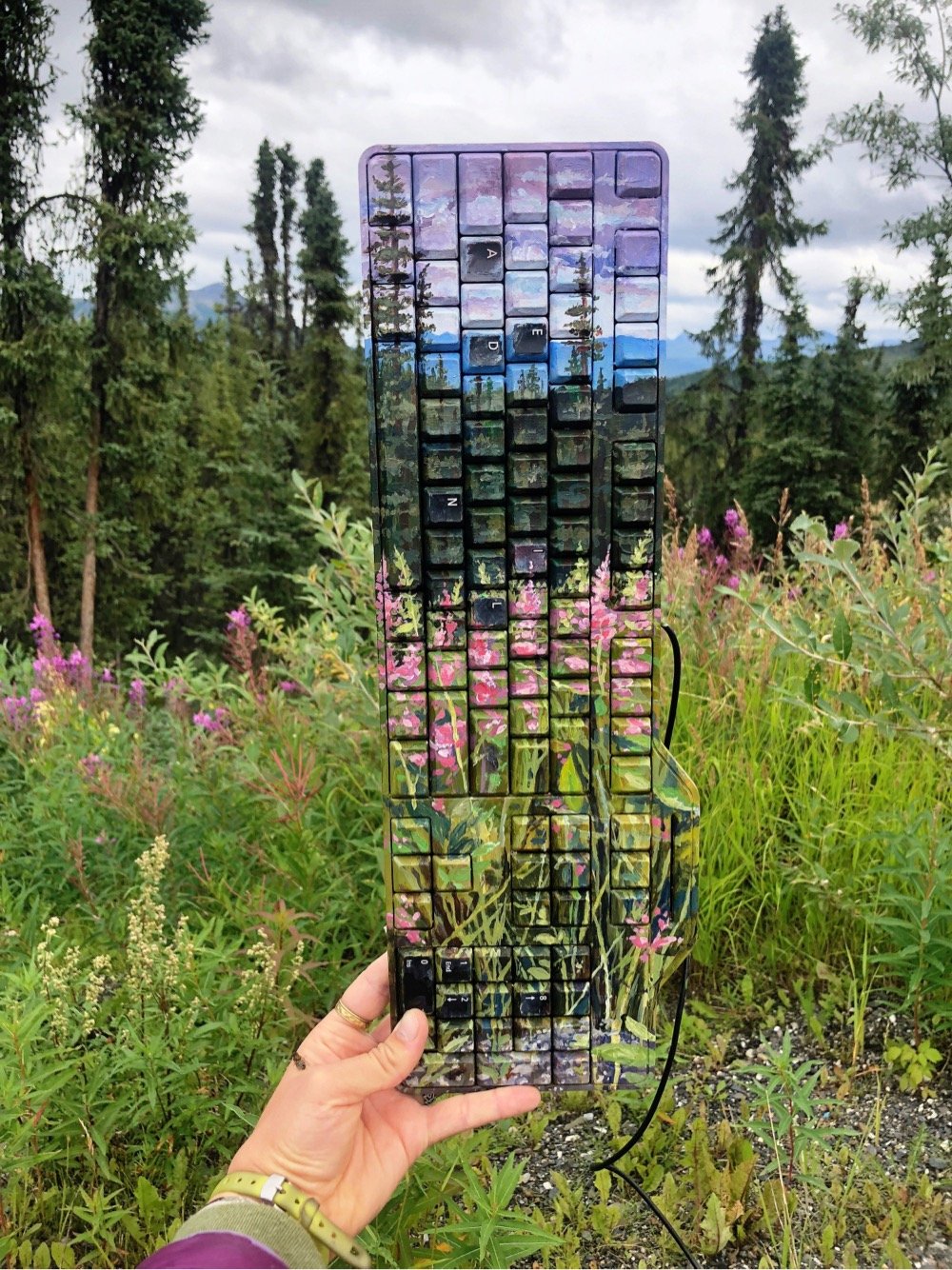
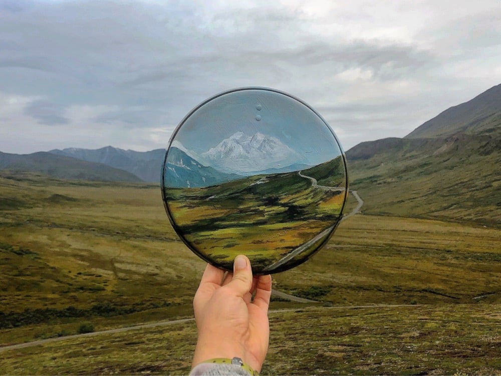
Eco-artist Mariah Reading finds discarded objects in National Parks, on native lands, and in other natural environments and paints impressionistic landscapes on them so they blend into the backgrounds of the places they were found. Atlas Obscura has an interview with Reading about her work.
The first piece I did that was a single object, not a bunch of [objects] stuck together. I was working at Guadalupe Mountains National Park and along its edge there was a major highway. I would walk along it and find a lot of car parts, just a lot of scrap things that fall off as the cars are whizzing past. I found half of a hubcap, and I took a closer look at it and realized it had cracked perfectly to form the silhouette of the mountain range I was standing in front of. I had a vision that I would just paint the land onto it and use the shape of the object to inform the piece. That’s when I started getting more into photography, too. Then my finished work shifted to not just being the painting, but also the painting photographed in the land where it was found.
That piece, called “El (Hub)Capitan”, is pictured at the top of this post. You can check out more of Reading’s work on her website and on Instagram. (via the morning news)
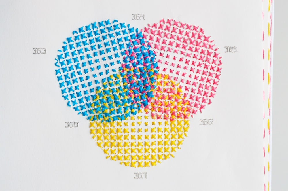
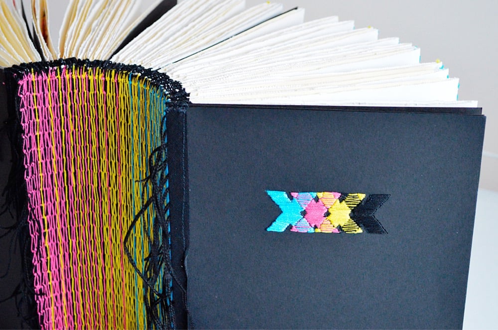

Back in January, Clive Thompson asked his Twitter followers for links to books of unusual dimensions. In the resulting thread, people shared images and links to books of all different shapes and sizes, from Irma Boom’s miniature books to the Codex Gigas to a book of Kraft American Singles (my contribution). Designer Evelin Kasikov’s XXXX Swatchbook, a handmade book about CMYK printing constructed entirely of embroidery thread and paper, would fit nicely into that collection.
XXXX Swatchbook shows the range of colours that can be achieved in handmade printing technique. But it also twists the idea of print by turning quick reproduction process into slow handmade process. It’s a book about a process, and with no less than six years in the making, the book itself is a process. It’s a catalogue of colour, a unique art book and an object of book art. The book documents 400 hand-stitched colour swatches in CMYK embroidery. The line screen in my book is incredibly low and ranges between 4 to 7 lines per inch (as opposed to 300 lpi in standard printing).
See also Embroidery that Breaks the Fourth Wall and The Embroidered Computer. (via colossal)
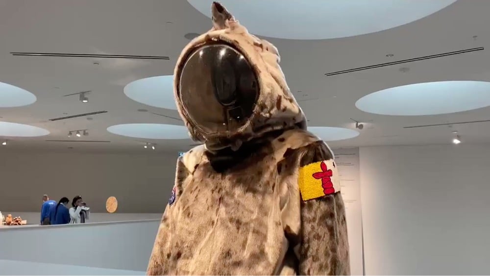
Working with Dr. Heather Igloliorte at Montreal’s Concordia University, Inuit artist Jesse Tungilik and a group of students designed and built a spacesuit made out of seal skin. Tungilik was inspired by the feelings he’d had as a child, bundled up in hunting clothes made by his mother out of caribou hide.
When Jesse Tungilik was a child, his mother made him traditional caribou hunting clothes. While wearing the bulky, heavy handmade outfit, he often imagined that he was in a spacesuit.
“That memory stuck with me when I heard about this opportunity here at Concordia, with its future-themed focus, and the two ideas met in the middle,” Tungilik says.
The image above is a still from a video taken by Brittany Hobson of the spacesuit on display in an exhibition at the Qaumajuq museum in Winnipeg. She says “the video doesn’t do it justice” but the suit looks pretty amazing in that video — I would love to see this in person someday. Dr. Igloliorte, who co-curated the exhibition, talked about the suit and its creation in this video:
Via CBC, you can see a photo of Tungilik as a kid, bundled up in his homemade “spacesuit” while out hunting with his father. Aww. (via @UnlikelyWorlds)
Riffing on a byōbu folding screen of the Battle of Sekigahara painted in the 1700s, Yusuke Shigeta made a pixel animated version for a recent exhibition. The video above is a tantalizingly short preview of the work — I could have watched these tiny pixel vignettes all day.
Well, add stone lithography to the list of cool hobbies I will do once I’m done sitting in this chair watching videos about things like stone lithography.
Henri de Toulouse-Lautrec revolutionised the world of graphic design with his striking posters at the end of the nineteenth century. This was in some ways due to his innovative approach to stone lithography to create his colourful designs.
If you think this video is too brief, you can check out this longer one. (via the kid should see this)
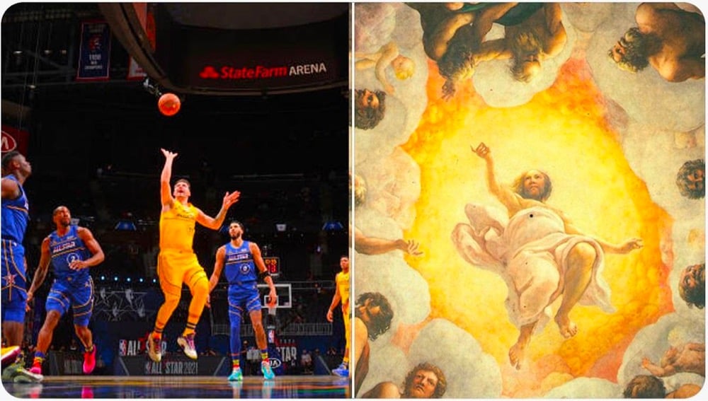
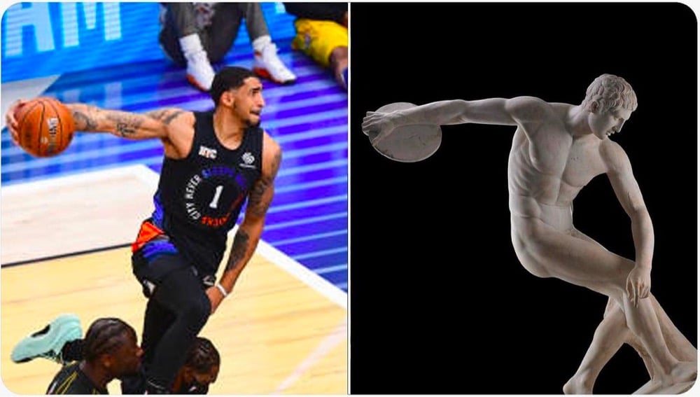
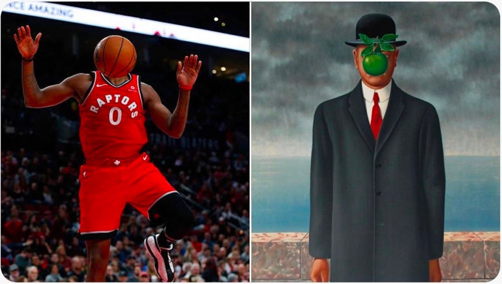
The @ballhaus Instagram acct is pairing photos of basketball players with art. From top to bottom: Luka Dončić × Correggio, Obi Toppin × Myron, C.J. Miles × René Magritte. (via austin kleon)
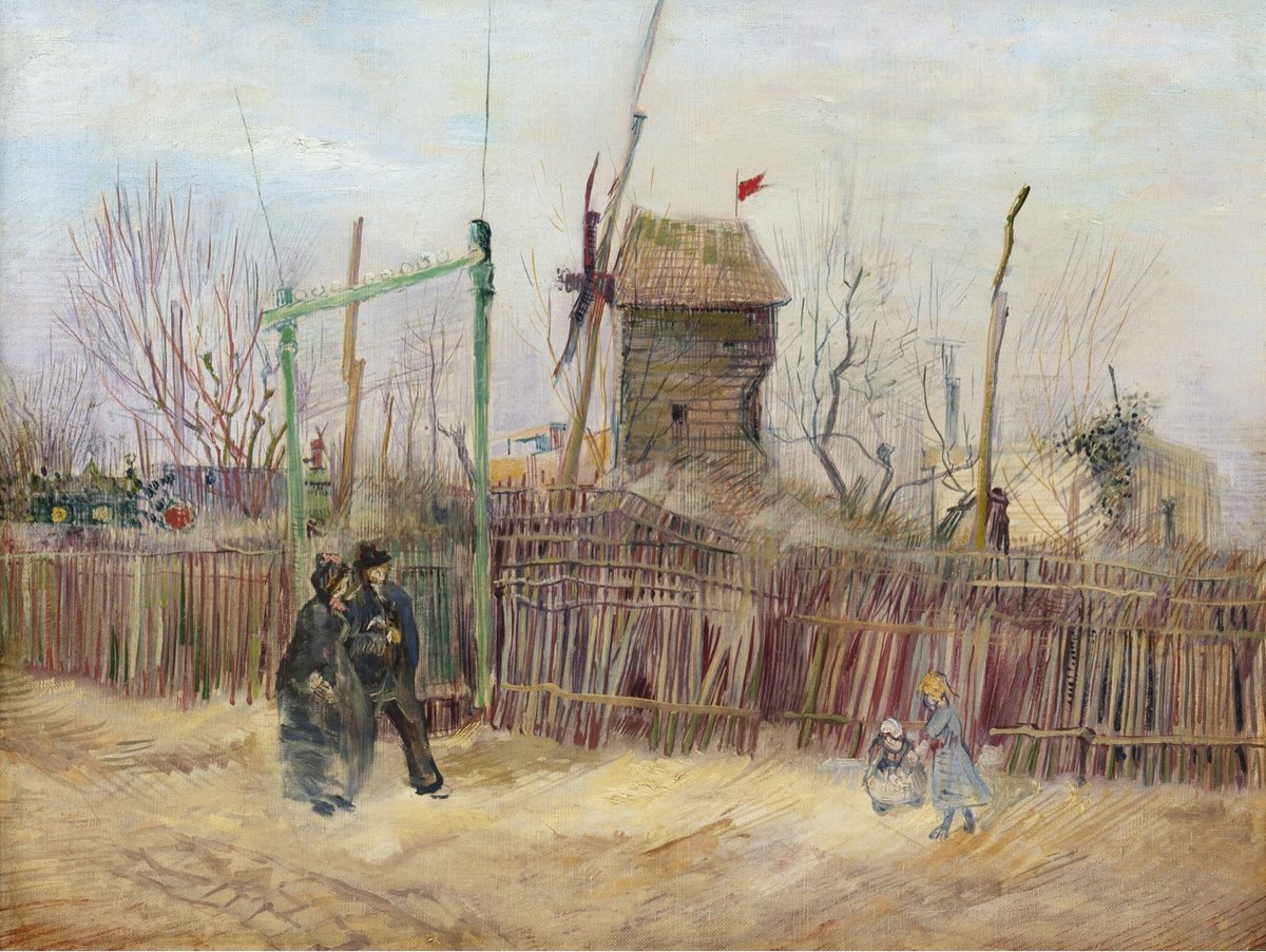
A painting by Vincent van Gogh that hasn’t been exhibited for the public since it was painted in 1887 is up for auction this month. The Paris landscape was created by the Dutch master on the cusp of his impressionist phase:
The work reflects Van Gogh’s exploration of a new city as well as his first encounter with the Impressionists and other avant-garde painters in Paris, which in turn sparked a transformation of his palette. “Gone were the dark tones of his early works, replaced with color in all its brilliance,” Sotheby’s writes in a statement. “It was in Montmartre, during these formative years, that the foundations of his inimitable style were established.”
There’s some press release sales bluster here, but looking at the painting, you can see inklings of his signature kinetic style — the flag appears to flutter, the trees wave in the wind, and the windmill spins. The whole thing is alive with motion. Wonderful. Here it is with the (assumed) original frame:
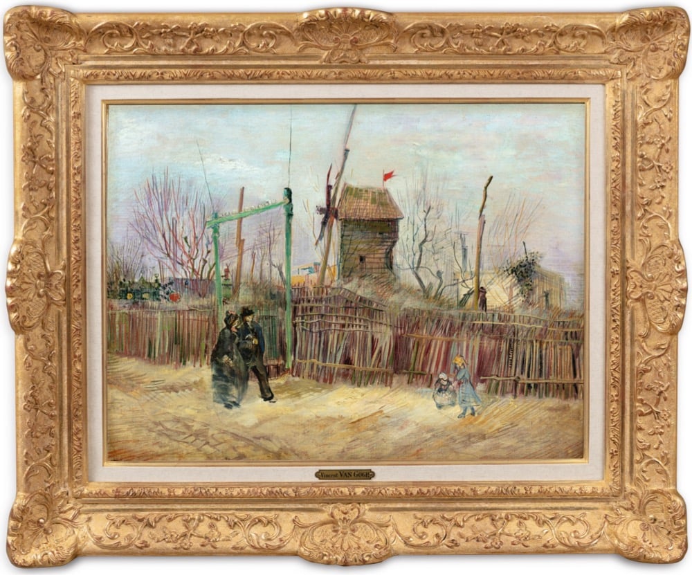
I hope that whoever buys it makes it available for public display; I’d love to see it someday.
Banksy took some Bob Ross narration from The Joy of Painting and dubbed it over video footage that shows the street artist painting an image of an escaping inmate on the wall of a former prison in the dead of night. Colossal has more info on why Banksy picked the wall of this particular prison to do:
The expansive and unblemished prison wall was a daring and perfect spot for a Banksy piece. It’s best known for its most famous inmate: Oscar Wilde served two years in the prison from 1895-1897 for the charge of “gross indecency” for being gay. The work is clearly a tribute to the poet, as the escape mechanism appears to be a long strand of paper emerging from a typewriter in place of the usual bed sheets.
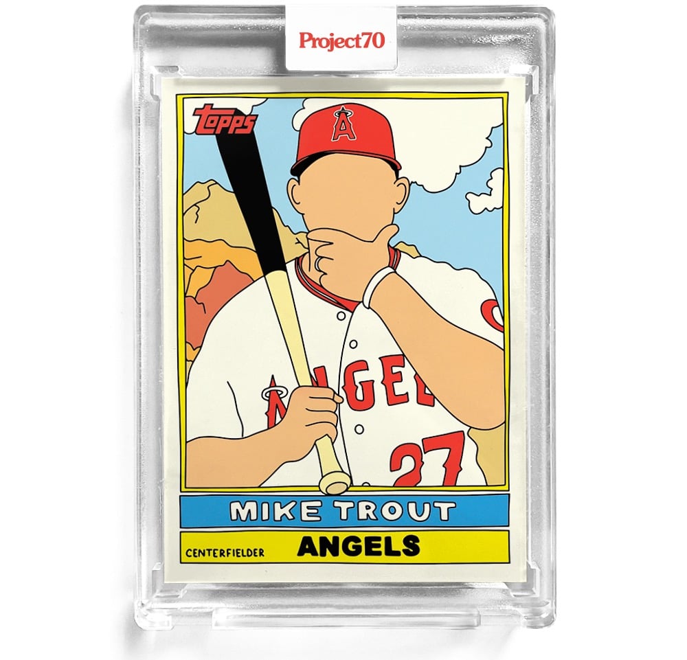
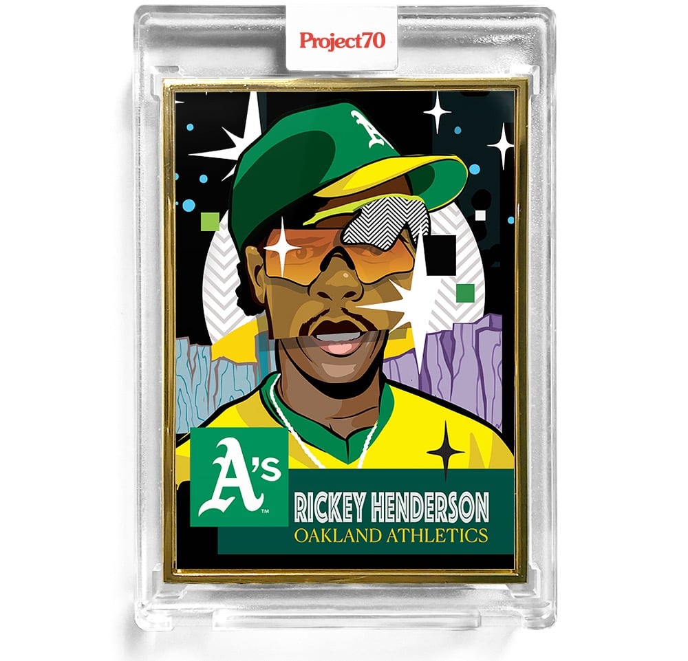
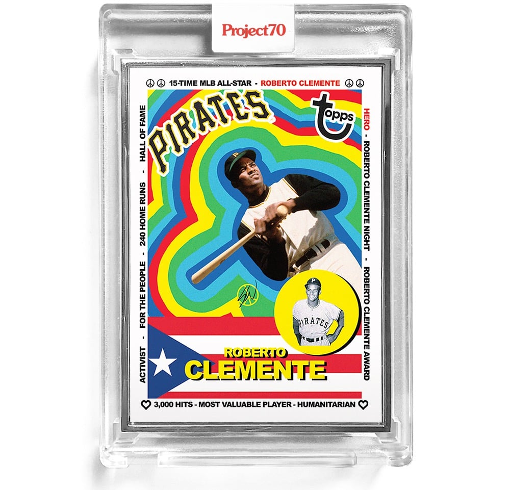
In 1951, Topps released their first set of baseball cards, hoping to entice people into buying their chewing gum. Instead, they created a sports collectable industry that’s still going strong 70 years later. To celebrate the anniversary, “artists and creatives around the globe are revisiting and reimagining 70 years of iconic baseball card designs” as part of Project70.
They’re releasing a few cards at a time for a limited time — you can find the current selection in the Topps online store. I’ve included three of my favorites above: 1976 Mike Trout by Fucci, 1953 Rickey Henderson by Pose, and 1983 Roberto Clemente by Sean Wotherspoon.
Question: Since the case is now part of the collectable being sold, do you have to put the whole thing in a bigger case to preserve its overall mint condition? Where does this end? (via print)
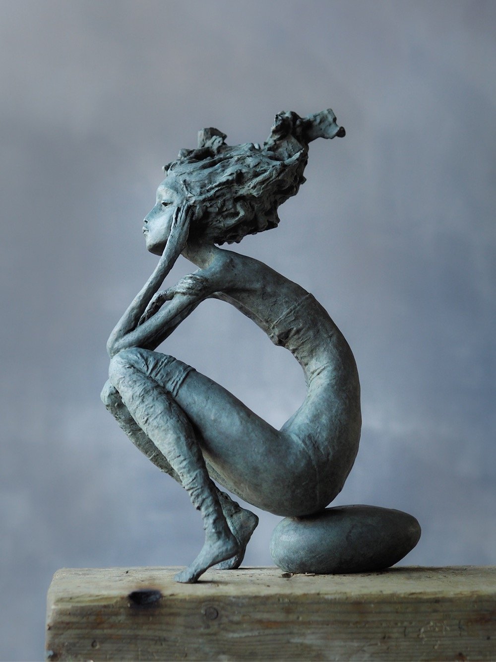
I love this bronze sculpture by French artist Valérie Hadida. You can find more of her work on Colossal and Artsy.
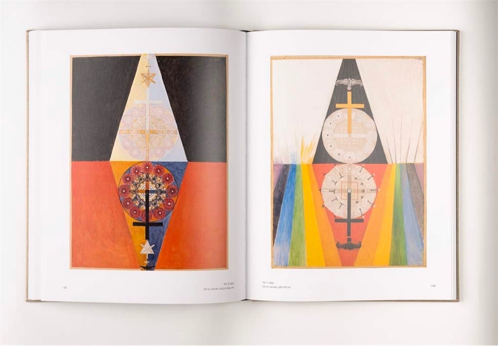
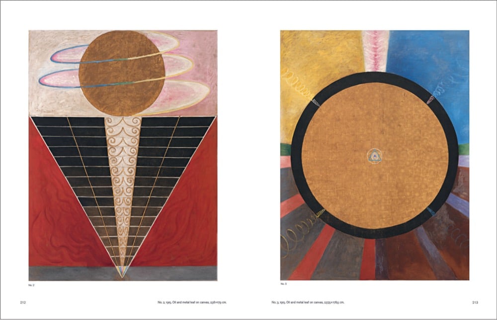
Abstract art pioneer Hilma af Klint created hundreds of artworks during her lifetime, and a new seven-volume book series is celebrating that work in a big way: Hilma AF Klint: The Complete Catalogue Raisonné: Volumes I-VII. The complete set is available for preorder and ships in November, but you can get the first three volumes right now. (via colossal)
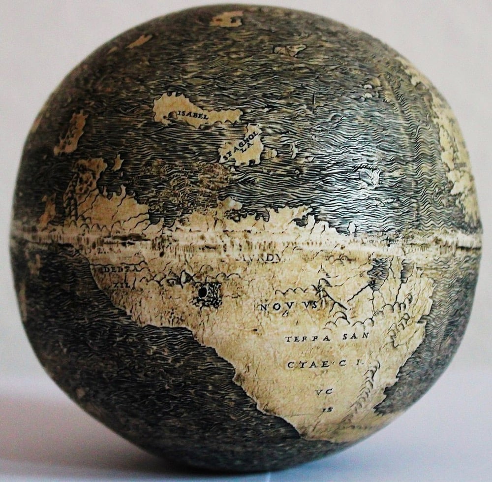
The Ostrich Egg Globe, made in/around 1504, is the earliest-known European globe to depict the Americas. And there’s evidence that it was made by Leonardo da Vinci. Open Culture has the story:
Missinne, a real estate developer, collector, and globe expert originally from Belgium, discovered the globe in 2012 at the London Map Fair. It was purchased “from a dealer who said it had been part of an important European collection for decades,” and its buyer and owner remain anonymous. After the globe appeared, Missinne “consulted more than 100 scholars and experts in his year-long analysis,” putting “about five years of research into one year,” says Sander, calling the research “an incredible detective story.”
Missinne’s investigation seems to substantiate his claims that the globe was made by Leonardo or his workshop. The evidence, some of which you can find on the Cambridge Scholars Publishing site, includes a 1503 preparatory map in da Vinci’s papers; the presence of arsenic, which only Leonardo was known to use at the time in copper to keep it from losing its lustre; “The use of chiaroscuro, pentienti, triangular shapes, the mathematics of the scale reflecting Leonardo’s written dimension of planet earth”; and a 1504 letter from Leonardo himself stating, “my world globe I want returned back from my friend Giovanni Benci.”
As with all things newly attributed to Leonardo in recent decades, there’s disagreement about this claim. You can read about the evidence collected by Stefaan Missinne, the discoverer of the globe and primary champion of its Leonardo connection, and decide for yourself. My brief, amateur take: if the first point in your analysis of a connection between this globe and Leonardo da Vinci is based on Salvator Mundi, which itself has disputed authorship and all but disappeared after its 2017 purchase, you’ve chosen a tough path towards persuasion.
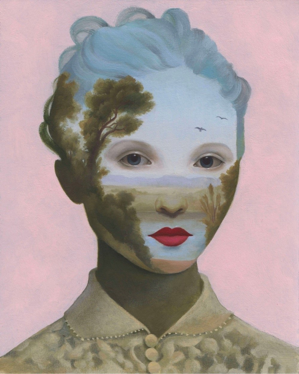
This oil painting by Aniela Sobieski is really tickling all my brain cells right now. You can check out more of her work on her website, Instagram, and Etsy. (via colossal)
After the salt harvesting video I posted this afternoon, I got on a mini-roll watching videos from Eater’s Handmade series — specifically two Korean pottery videos. In the first video, master craftsman Yu Myeong Sik from the Kwangjuyo Group demonstrates how to make incredibly beautiful and delicate handmade bowls:
While in this one, Heo Jin Kyu shows how he makes huge pots used for fermenting kimchi called onggi:
As you might expect from the finished products, there are striking differences in their respective processes, but the level of craftsmanship and respect for traditional materials & practices are very similar.

With regard to the Chicago’s street numbering system, Madison Street is the boundary between the North and South Sides of Chicago. Because of discriminatory housing policies and practices, especially during the Great Migration, Chicago is one of the most segregated cities in America. Generally speaking, a predominantly white North Side has had better access to resources and higher home values while a largely Black South Side has had lower home values and less access to resources.
Artist Tonika Johnson’s Folded Map Project explores the differences and similarities across this boundary by comparing an addresses on the North Side with the corresponding addresses on the South Side. She does this through paired photos of the houses and the residents living at each twinned address, and video interviews with those “map twin” residents, as well as a movie, an installation, workshops, and even a stage play. The image at the top of the post is of one of the address pairs (6329 S. Paulina and 6330 N. Paulina).
Colossal recently posted an interview with Johnson about the project:
The ultimate point that I was trying to get across was that Chicago’s history of segregation is still with all of us today. I wanted to prove this point for people who might not make that connection [between] the disparity that exists and the history behind it. I wanted the project to be an entree into expanding people’s minds of Chicago’s history of segregation through thinking about their own lived experience. I really appreciated being able to do that through art, through photos and portraits and video because I wasn’t blaming people who live on these different sides. I was offering them insight into the larger question of, “did you really choose this? Does our segregation reflect how we want to interact? And if it doesn’t, then you have to question why is it this way?”
There is this narrative that people think [Chicagoans] don’t interact. But we do, a lot, especially through art. That’s how we know the city is segregated. (laughing) We know that we’re disrupting this segregation when we come together. And that’s why I think art is such a beautiful common denominator.
From photographer and filmmaker Roman De Giuli, Satellike is a fluid abstract video that simulates satellite imagery of river deltas, etc. As De Giuli explains, the effects he uses here are entirely practical, not digital.
What you see in SATELLIKE are very long shots of watery ink in motion on several coats of half dried paint. Drying the paint leads to organic structures which can be brought to life again with water, ink and sour flow release mediums. The results look different from my usual approach, way more realistic and less otherworldly.
The organic nature of fluids in motion is very tough to duplicate digitally with the accuracy to feel, I don’t know, relaxing. I don’t know how you quantify or categorize this feeling/intuition, but watching this video feels very much like watching a river or the ocean flow. You can see more of De Giuli’s fluid work on his website.
Several years ago, I saw an NYC performance of Tree of Codes, a collaboration between choreographer Wayne McGregor, artist Olafur Eliasson, music producer Jamie xx, and dancers from the Paris Opera Ballet based on Jonathan Safran Foer’s book of the same name. The whole performance was dazzling but I was especially taken with Jamie xx’s score.
In the weeks after the performance, I looked online for the score, hoping against hope that a recording was out there. No dice. As time went on, whenever one of Jamie xx’s songs popped up in a mix I was listening to, I’d do a bit of searching for the score, always without success. Until the other day, when I discovered this bootleg version on Soundcloud:
So happy to hear this again — for as long as this link lasts. I’m still crossing my fingers for an official release at some point…
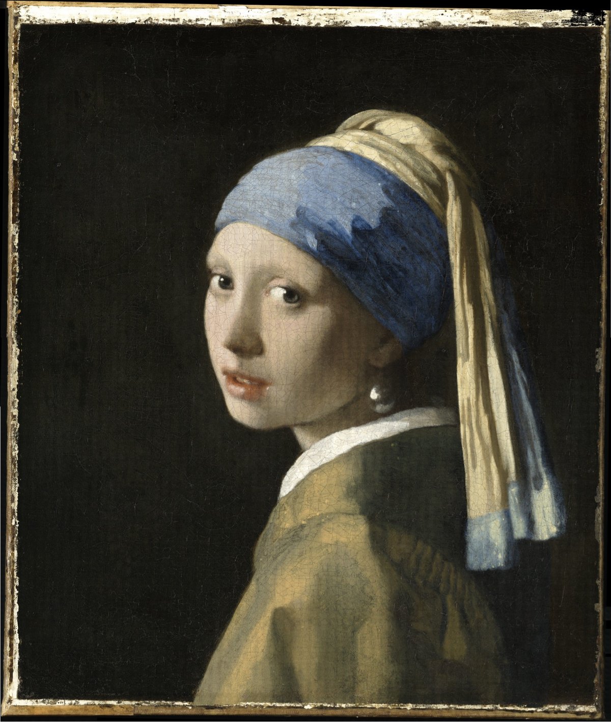
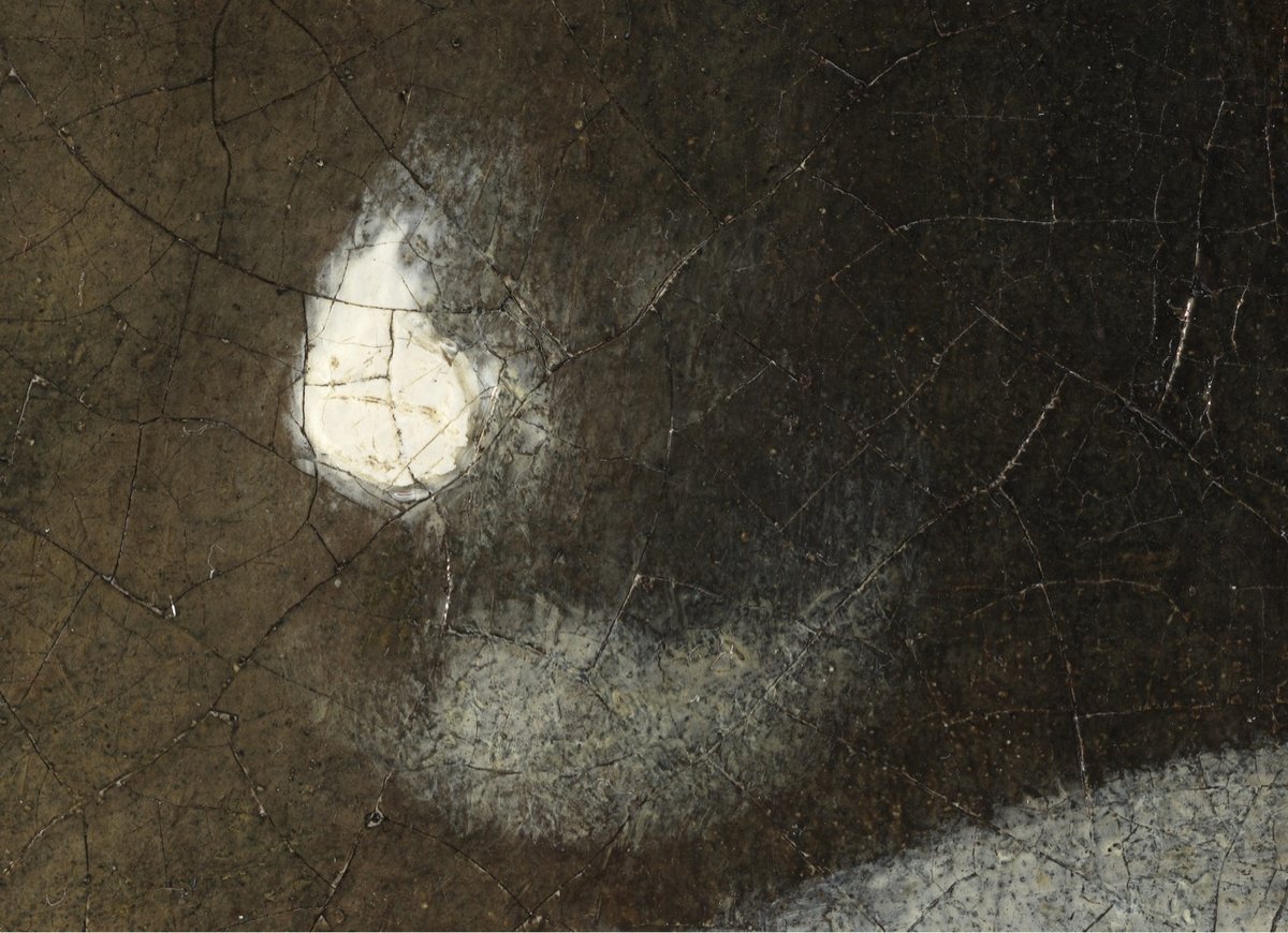
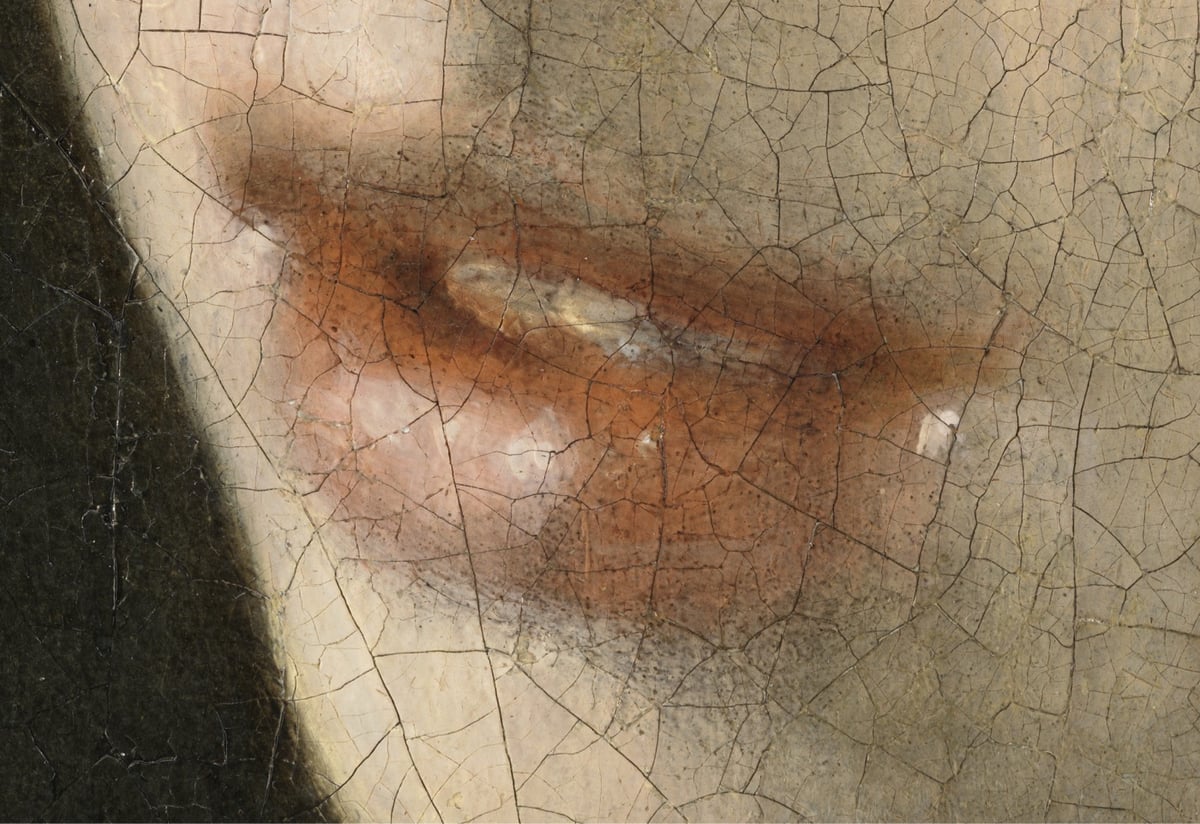
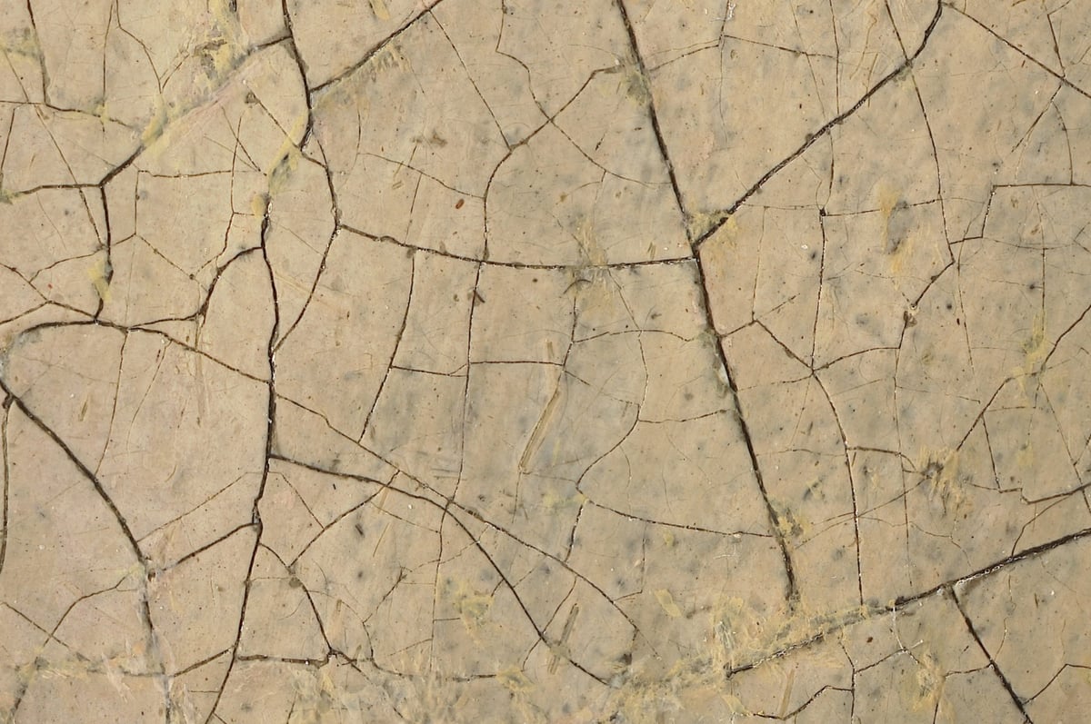
Well hell, would you look at this: an interactive 10-gigapixel scan of Johannes Vermeer’s iconic painting Girl With a Pearl Earring made by stitching together thousands of photos from a digital microscope. From top to bottom above: the entire painting, the earring (not even fully zoomed in), her lips (again, not full zoom), and a full-zoom image of the skin on her cheek. The detail is incredible — each pixel is 4.4 microns (0.0044 mm) across. The microscope also captured 3D data about the painting — click on the “3D” button in the viewer to see the 3D views. <— Seriously, don’t miss this.
For a look at how they captured this image, check out this behind-the-scenes video.
See also The Rijksmuseum Has Released a 44.8 Gigapixel Image of Rembrandt’s The Night Watch. (via colossal)
The rhetorical highlight of the Biden/Harris inauguration was Amanda Gorman reciting her poem, The Hill We Climb — I thought it was fantastic. It begins:
When day comes we ask ourselves,
where can we find light in this never-ending shade?
The loss we carry,
a sea we must wade
We’ve braved the belly of the beast
We’ve learned that quiet isn’t always peace
And the norms and notions
of what just is
Isn’t always just-ice
And yet the dawn is ours
before we knew it
Somehow we do it
Somehow we’ve weathered and witnessed
a nation that isn’t broken
but simply unfinished
We the successors of a country and a time
Where a skinny Black girl
descended from slaves and raised by a single mother
can dream of becoming president
only to find herself reciting for one
Here’s a transcript courtesy of CNN. You can read about how Gorman composed the poem in the NY Times:
“I had this huge thing, probably one of the most important things I’ll ever do in my career,” she said in an interview. “It was like, if I try to climb this mountain all at once, I’m just going to pass out.”
Gorman managed to write a few lines a day and was about halfway through the poem on Jan. 6, when pro-Trump rioters stormed into the halls of Congress, some bearing weapons and Confederate flags. She stayed awake late into the night and finished the poem, adding verses about the apocalyptic scene that unfolded at the Capitol that day.
The Times also has a lesson for students about Gorman and her poem. And from NPR:
Gorman is no stranger to having to change her work midstream. Like Biden, who has spoken openly about having stuttered as a child, Gorman grew up with a childhood speech impediment of her own. She had difficulty saying certain letters of the alphabet — the letter R was especially tough — which caused her to have to constantly “self-edit and self-police.”
Her delivery was amazing — powerful and lyrical. Brava!
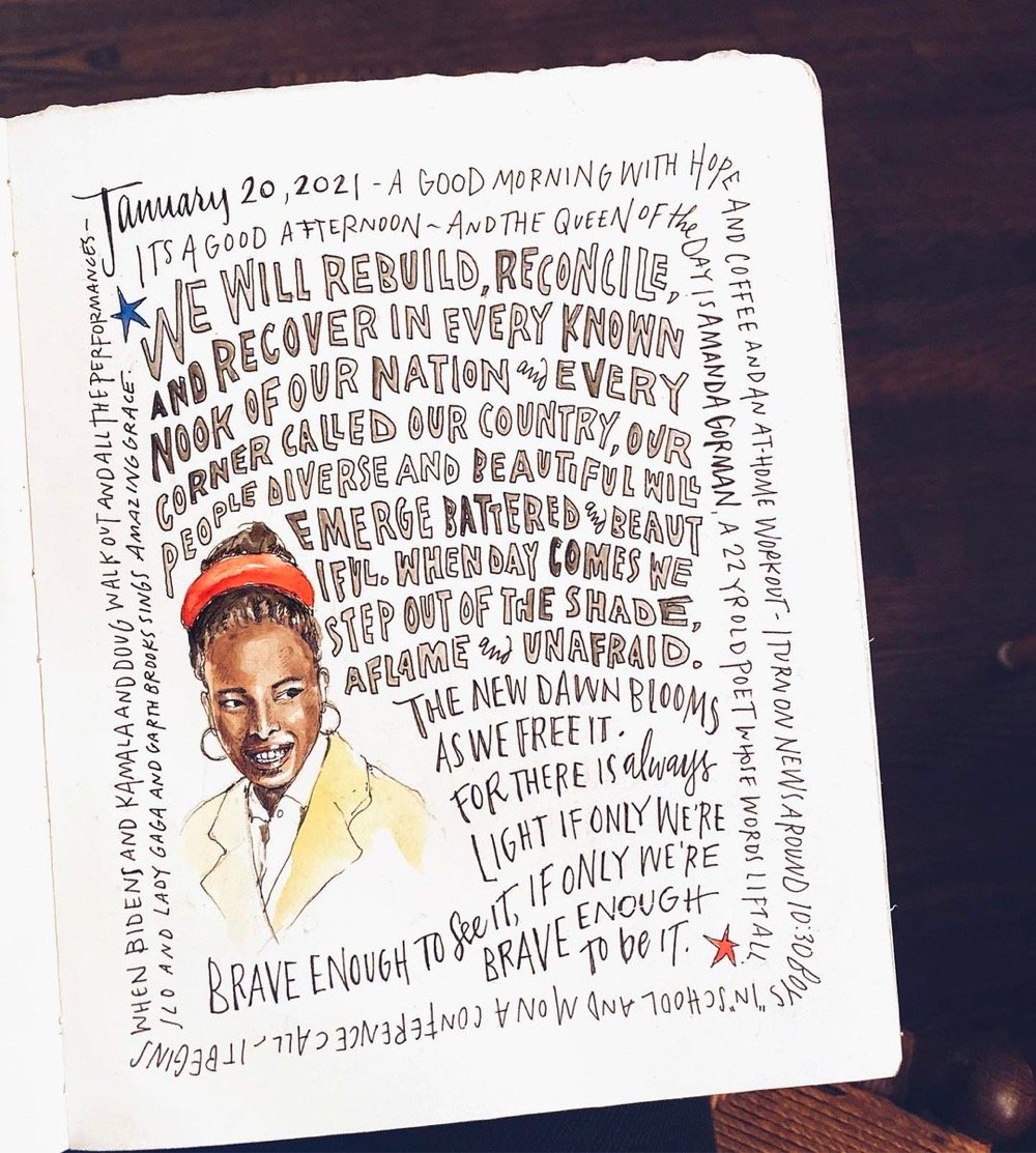
Update: I included a link to a transcript of the poem above. I also wanted to include this illustration by Samantha Dion Baker because art inspires art.
Update: A book version of Gorman’s inaugural poem will be out in April and is available for preorder.


Canadian artist Jeff Bartels makes these stunningly hyperrealistic oil paintings of things like cameras, typewriters, and vehicles. And they’re pretty large too — here’s his painting of the Leica in progress:

That must take for-ev-er to do. Check out more of his work on Instagram. (via claire salvo)
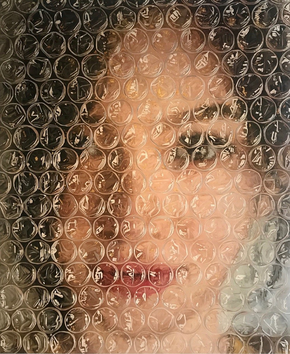
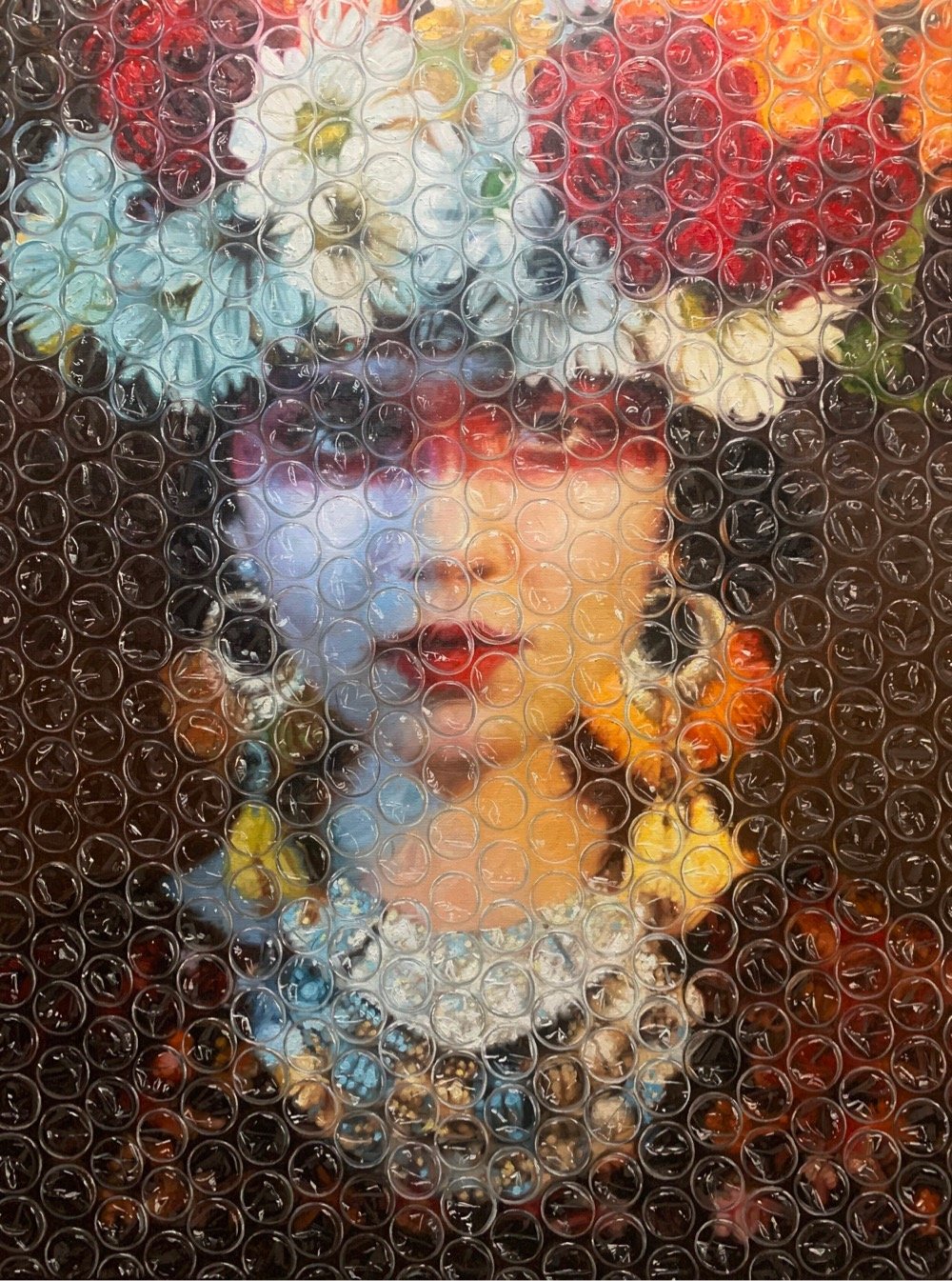
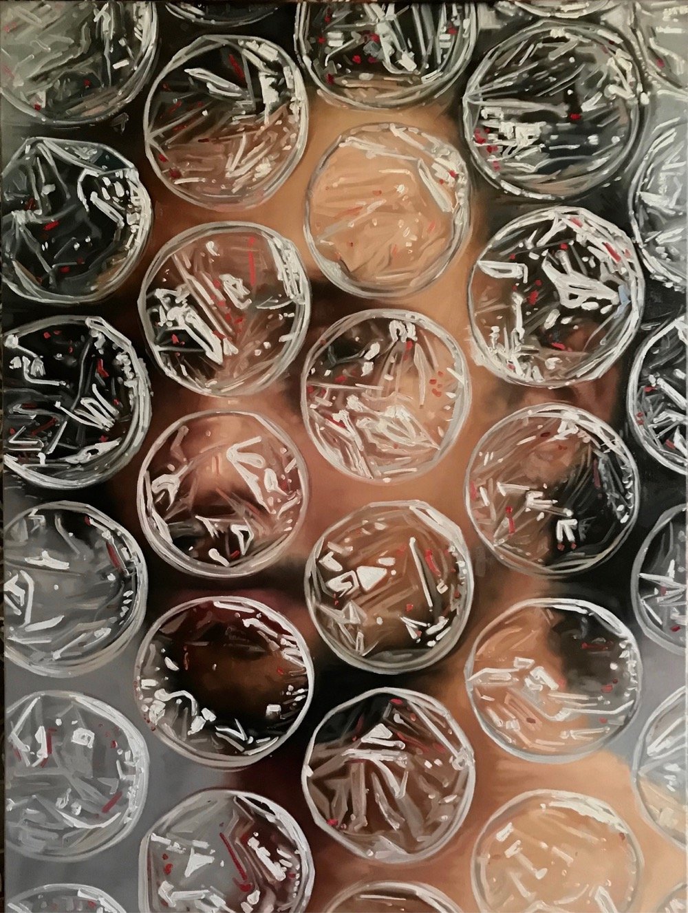
Cuban-born Darian Mederos does oil portraits that look like they are covered in bubble wrap. You can check out more of his work on Instagram.
Socials & More